Adaptive Price ZoneThe Adaptive Price Zone was developed by Lee Leibfarth in 2006, and it attempts to create a band for mean-reversal strategies. It works by taking the double-smoothed average of the volatility from 5 days and adding/subtracting it from the average price of the day (hl2).
If you are planning to use it, remember that it changes throughout the day , so you might want to use an offset. You can also choose to use the true range for the volatility instead of the high and low difference.
在腳本中搜尋"zone"

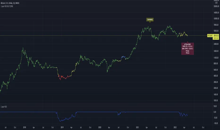
1 year ROI BUY ZONEThis indicator is comparing price with price 1 year ago. This will generate ROI which could be positive or negative.
If ROI switches from negative to positive or vice versa it will generate zone
This zone could have minimum days to filter false signals
Buy signal could be added when ROI reaches some value ( -65% for example)
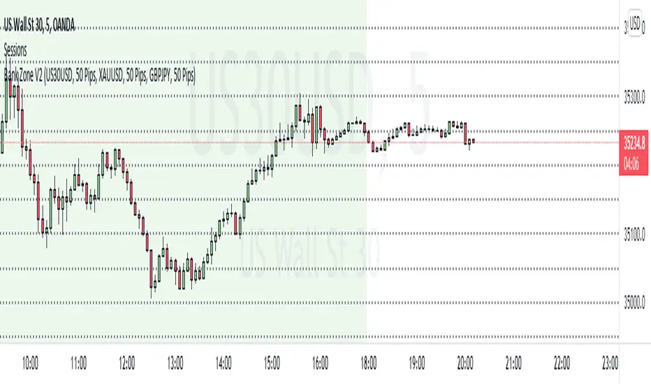
Bank Zone V2This indicator finds the current price and dynamically plots bank zone levels that's incremented by 50 or 100 pips.
Levels are displayed on all time frames and will work for ALL forex pairs and indices.
How to use this indicator.
Select Pair - Choose a pair that's in your watchlist
Increment By - Plots lines in increments of 50 or 100 pips
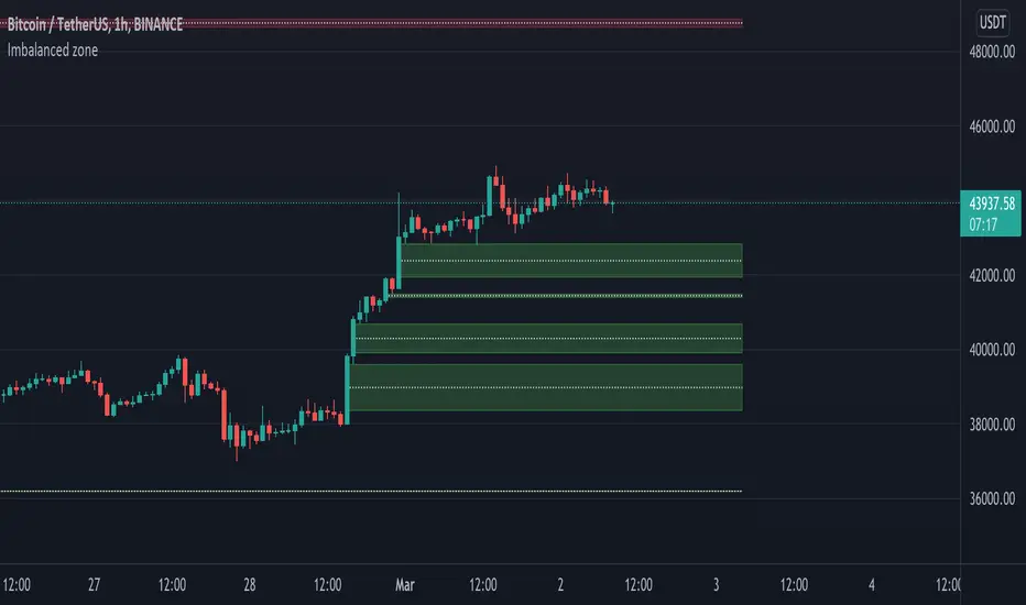
Imbalanced zoneImbalance, this is a zone / gap created when the price move with force in a given direction. It identify a zone where the price could
potentially go back. This gives perfect targets for your trades.
Imbalance is created from the high and low of 3 candles. When the wicks the of 1st and 3rd candle does not fully overlap the middle one.
You can define the penetration ratio which will delete a tested zone from the chart. Usually find that 20% (0.2) is pretty accurate.
DMI Trade Zone [Alorse]Through the DMI Trade Zone you can find safe areas to trade in the Spot market.
The logic behind the indicator is:
- If the Positive Directional Movement (+DI) is greater than the Negative Directional Movement (-DI) then the Average Directional Movement Index (ADX) will be green with an opaque white background.
- If the Positive Directional Movement (+DI) is less than the Negative Directional Movement (-DI) then the Average Directional Movement Index (ADX) will be red.

Market inbalance zone boxes [LM]HI Traders,
I would like to introduce you Market inbalance zone boxes, the idea is to look for big volatile candle and candle before and after. Big candle is result of big money orders and it creates zone where either bulls or bears where dominant. So it's a good place to look for support or resistance
The zone created if it meets volatility (atr) condition and if the candle has some percentage of body over wick. Top and bottom is determined by candles before and after this candle occures
In setting there is an option to shrink the gap as the the price continues advance more into the box. If the price will reach exceeds on it's way the box the gap is completely closed.
I hope you will enjoy it

No Trading Zone (NZT)The script highlights Frankfurt's opening range up until New York's close. It is described as No Trading Zone in Gabrielle Fabris's The Price in Time book.
Projections of the Frankfurt range are potential supports and resistances and they are used in trade management & for taking profits in his system.
Full rules are not mine to share. You have to read the book to understand his system and run your own backtest on each pair to find out what management method you will be most comfortable with.

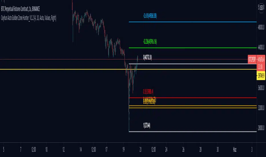
Ceyhun Auto Golden Zone Hunter_V1.2Ceyhun Auto Golden Zone Hunter_V1.2 indikatörünü içermektedir güncellemeler için takipte kalın..
Action zone with BB% by PhysioGuyHow to Use : For Swing trending in TF 1-2 hour
When EMA crossover Green is uptrend
Red is downtrend
When have a circle it mean high volatility
When have a triangle it mean extreme volatility
Thankyou for based script CDC Action zone V.3 and Bollinger band %B

Volume Zone Oscillator [xdecow]Volume Zone Oscillator (VZO) is an indicator that presents a different way of looking at OBV.
VZO is a difference (delta) between OBV and an exponential moving average.
The EMA becomes the baseline 0.
And in this way we can observe the strength of the movements, overbought and oversold (when the OBV is far from the average) and divergences.

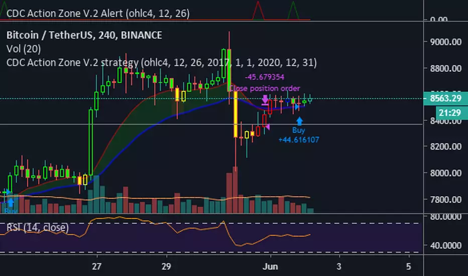
CDC Action Zone 20201117 Bougth / Sold DaysCDC Action Zone 20201117 Bought /Sold Day
1)This scrip are display the number of bars since Bought or Sold ( Bars )
2)Buy : condition using moving average 12 Bars of price cross over moving average of 26 bars
3)Sell : condition using moving average 12 Bars of price cross under moving average of 26 bars
4)Bars count for bought start from Buy until Sell ( Green Color )
5)Bars count for Sold start from Sell until Buy ( Red Color )
6) Can Adjust
6.1) Number of both 2 ema
6.2) Type of input Price
6.3) Color of TEXT

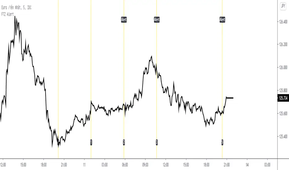
Fib Time Zone with Alert* Fib Time Zone with Alert will draw a series of vertical lines on chart. They are spaced at the Fibonacci intervals of 1, 2, 3, 5, 8, 13, 21, 34, 55 and 89. Trader defined the zero line and the 1 line, then Fib Time Zone with Alert auto draw the rest and display alert when price touch the line.
* Alert condition available in the Create Alert dialog box with title "Fib Time Zone Alert".
* Line 0 was defined by Date, Month, Year, Hour, Minute (use Exchange Timezone).
* Line 1 was defined by number of bars between Line 0 and Line 1.
* Line 2,3,5,8,13,21,34,55 and 89 auto draw.
NSDT Daily Gap RangeSimple script that plots the range between the previous day close and the current day open. This makes it easier to reference the gap up or gap down zone throughout the day.

ict newyork kill zone for Indian timethis is a indicator for ict New York kill zone for India standard time

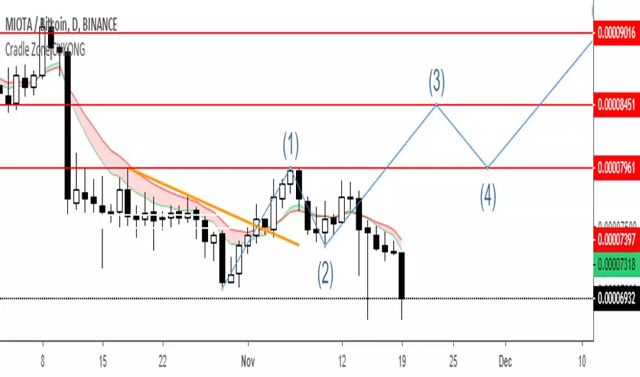
Cradle zone with BBand & SARHi All,
I have combined a number of indicators all into this 1 option.
It has the following:
> The Cradle zone represents a methodology to using the 10 and 20 EMA's at your selected time-frame.
Where the shading between the 10 and 20 EMA is green for an uptrend and red for a downtrend.
Default EMAs
10, 12, 20, and 50
> Those who are familiar using the Cradle method will find this option convenient.
> I have also added the Bollinger Band and Parabolic SAR as additional options to this item, to help give additional information by default.
Good luck with your trading strategy.
Please don't forget to give me a tick\like, as I would appreciate it.
Regards,
S.Sari /CryptoProspa

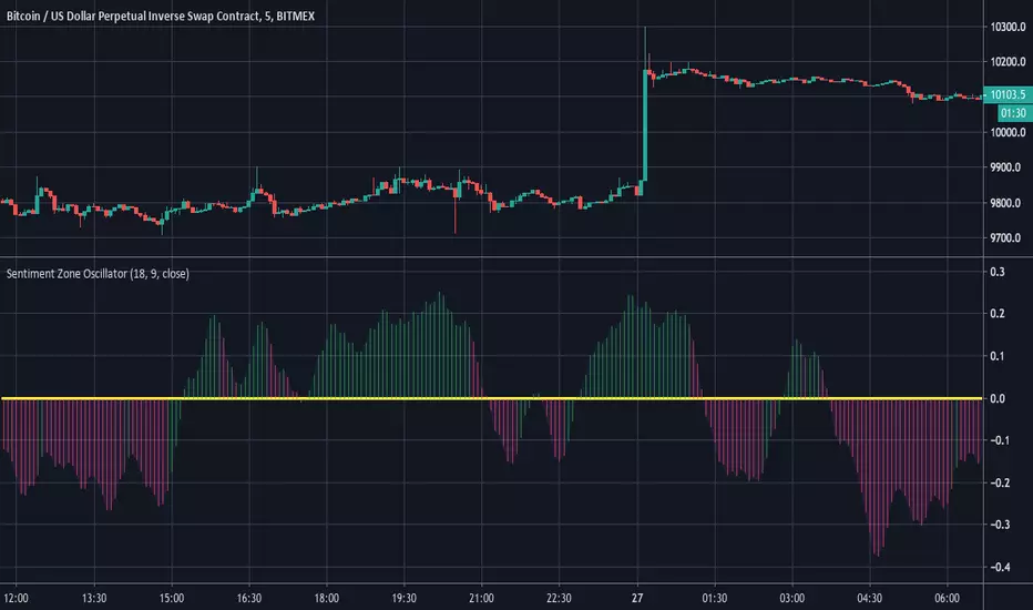
Sentiment Zone OscillatorHere's a (forgotten but still useful) Sentiment Zone Oscillator. The Sentiment Zone Oscillator takes a sum of positive price candles over a user-specified window length. Normally, a triple exponential moving average of the sum is used, but we opted to just go with a double EMA for the sake of more responsiveness. When the histogram is green it is bullish and red/pink means bears.
CDC Action Zone V.2 Alertวิธีใช้ให้ตั้งค่า ดังนี้
Condition = CDC Action Zone V.2 Alert
= Short หรือ Long (ขาย หรือ ซื้อ)
= Crossing Down
= Value
= 0.9
หมายเหตุ : ที่ต้องเลือก Crossing Down เพื่อให้มีการยืนยันแท่งเขียวแรกก่อน ซึ่งจะตรงกับ strategy ด้วย
Strategy Ref:
HTF High/LowThis simple script draws the previous higher timeframe candle high/low to your chart.
You can also make the script paint the zone between the low/open and the high/close.


Two moving averages with zone coloringTwo EMA's with the zone between them colored based on the trend direction.

Multiple moving averages with zone coloringEMA's 20 to 200. The zone between EMA 20 and EMA 200 is colored based on the trend direction.

Time zoneRegular script to allocate the specified time range within a day.
TradingView in time is specified by UTC. I Moscow time (GMT +3) and the time specified in the script Default 1:00 - 13:00 Moscow time equal 09:00 - 21:00 ie -8 Hours from the Moscow time (-7 in summer).
========== ==========
Обычный скрипт для выделения указанного диапазона времени внутри дня.
Время в TradingView указывается по UTC. У меня московское время (GMT +3) и время указанное в скрипте по умолчания 01:00 - 13:00 по московскому времени равняется 09:00 - 21:00 , т.е. -8 часов от московского времени (-7 в летнее время).
