VOLUME with DOUBLE MAA volume chart with dual moving averages. If you're looking for a volume chart with dual moving averages, this script is for you. By averaging the volume over two periods, you can discover more subtle relationships between price and volume.
成交量

SwiftEdge APEEXSwiftEdge Apeex – Volume-Weighted VWAP + Live POC + True Footprint-Precise Big Trades
This indicator combines three powerful and complementary tools used by professional traders:
1. Volume-Weighted EWMA VWAP with Dynamic Deviation Bands
A smooth, volume-weighted VWAP using an exponentially weighted moving average of variance. The deviation bands (1σ, 2σ, 3σ) dynamically expand and contract with actual market volatility — giving far more realistic support/resistance levels than fixed-percentage bands.
2. Session-Based Live Point of Control (POC)
The classic intraday POC (highest traded volume price) calculated from session start (default 09:00). Resets cleanly at your chosen session time.
3. True 1-Second Footprint-Precise Big Trade Bubbles
Unlike traditional volume spike indicators that only show "where the candle closed", this version uses real 1-second data to calculate the exact delta-weighted price where aggressive buying or selling actually occurred inside the bar.
- All levels from 1.2× to 8× average volume are shown
- Bubble size scales with significance (1.2× = tiny → 8× = huge)
- White outline on 5× and 8× for instant visual impact
- Yellow background highlights bars with significant volume
Why this combination works so well:
- VWAP + deviations give you the macro institutional reference levels
- POC shows where the market actually accepted the most volume
- The footprint-precise bubbles show you exactly where the smart money entered or absorbed — often many ticks away from the candle close
Best used on 1m to 1h timeframes on liquid futures (ES, NQ, CL) or crypto (BTC, ETH).
No lookahead. No repainting. Pure price + volume truth.

CVD Candle Divergence IndicatorThis indicator identifies potential reversal points by comparing the direction of price candles with the direction of cumulative volume delta (CVD) candles, while applying additional filters based on RSI behavior, volume strength, and candlestick wick structure.
It aims to highlight situations where price movement and volume delta disagree, which can signal fading momentum or absorption.
Core Concept
The script combines several independent conditions that must occur simultaneously before a signal is displayed on the chart. A signal appears only when all filters agree, reducing the number of low-quality or noise-based setups.
1. CVD Candle Direction
The indicator uses TradingView’s built-in function for volume delta candles. These candles summarize buying and selling aggression derived from lower-timeframe volume.
A CVD green candle indicates more buyer-initiated volume.
A CVD red candle indicates more seller-initiated volume.
The script looks for instances where price and CVD candles disagree:
Bullish signal: price candle is green while CVD candle is red
Bearish signal: price candle is red while CVD candle is green
This creates a form of divergence using volume delta instead of price highs and lows.
2. RSI Context Filter
Momentum is evaluated through RSI. Instead of relying only on standard overbought/oversold levels, the script also includes a recency filter based on the RSI midline (50 level).
RSI Threshold
Users can specify the RSI value required for bullish and bearish conditions.
Recency Filter
The indicator only allows signals if RSI has crossed the 50 level within a user-defined number of bars. This prevents signals during extended one-directional trends where divergence is less meaningful.
3. Volume Strength Filter
Signals are filtered through a volume-based requirement:
Current volume must exceed a moving average of volume multiplied by a user-defined factor.
This ensures that signals appear only during periods with sufficient participation and reduces noise during low-volume consolidation.
4. Wick-to-Body Ratio Filter
To incorporate price-action characteristics, the script evaluates the wick structure of each candle:
Bullish signals require a sufficiently large lower wick relative to the total candle range.
Bearish signals require a sufficiently large upper wick relative to the total candle range.
The wick percentage is fully configurable.
This adds a rejection or absorption component to the logic and prevents signals on weak or indecisive candles.
Signal Conditions
A bullish signal appears when all of the following are true:
Price candle is green
RSI is below the bullish threshold
CVD candle is red
Volume is above its threshold (if enabled)
RSI has interacted with the 50 level recently
Lower wick meets the wick-percentage requirement
A bearish signal requires the opposite conditions:
Price candle is red
RSI is above the bearish threshold
CVD candle is green
Volume is above its threshold (if enabled)
RSI recently interacted with the 50 level
Upper wick meets the wick-percentage requirement
Signals appear as arrows directly on the chart.
Use Cases
This indicator is intended for traders who work with:
Momentum shifts
Volume delta analysis
Candle structure-based confirmation
Reversal or exhaustion setups
Divergence concepts beyond price highs/lows
It does not predict market direction. Instead, it highlights areas where multiple conditions suggest a potential imbalance between price movement and volume delta.
I would strongly suggest to use this indicator only on timeframes 2-15m.
Here are a few examples:

GYD-VOLinesCalculate support and resistance lines through the volume of large-level cycles, so that when subsequent candlesticks reach these lines, they can serve as a reference for trading decisions! The larger the cycle, the better the support and resistance effect!
通过大级别周期的成交量计算出支撑阻力线,以便后续K线表达到这里的时候,为交易决策做参考!越大周期的线,撑压效果越好!

Liquidity Radar by DGTLiquidity Radar is an advanced indicator designed to uncover and visualize critical liquidity zones on the price chart. These zones mark areas where stop orders and limit orders are densely concentrated—price levels where large-scale liquidation events are more likely to occur. Such areas are often targeted by institutional players to spark volatility or to optimize trade execution.
The indicator dynamically draws horizontal levels that reflect real-time liquidity buildup based on volume and price activity. When multiple liquidation levels cluster near the same price, overlapping lines highlight zones of elevated liquidity—helping traders identify potential hotspots for price reactions, reversals, or volatility spikes.
KEY FEATURES
⯌ Magnet Zones
Clusters of liquidation levels may act as magnets for price, pulling market movement toward them. Traders often use these zones to forecast directional bias and identify high-probability setups.
⯌ Support/Resistance Zones
Densely packed liquidity often behaves as dynamic support or resistance. These zones can provide major players with optimal entry or exit points, potentially leading to sharp reactions or market reversals.
⯌ Rapid Move Zones
Areas with sparse liquidity levels often experience faster price movement, as fewer resting orders are available to absorb aggressive taker orders. These zones can lead to quick price sweeps and momentum surges.
INSIGHTS
What Happens After Price Reaches a High Liquidity Zone?
Liquidity is "Grabbed"
These zones are typically filled with stop-losses or resting orders. When price reaches them, large volumes are executed — often suddenly. This is known as a liquidity grab or stop hunt .
Increased Volatility
The execution of clustered orders often triggers bursts of volatility. This can result in large wicks, rapid price movements, or deceptive “fakeouts” around the zone.
Price Reaction Scenarios
Stall or Consolidation : After liquidity is grabbed, price may pause or range, especially if market participants are indecisive.
Reversal : If the liquidity grab flushes out weak hands, price may reverse sharply — often where institutional players are already positioned in the opposite direction.
Continuation : Sometimes, the zone acts as a launchpad — price consumes the liquidity and continues strongly in the same direction.
What Happens When Price Is Between Liquidity Zones?
Faster Price Moves
In areas with fewer clustered liquidity levels, price often moves quicker due to fewer resting orders absorbing aggressive taker orders, enabling market orders to push price rapidly through these zones.
Higher Probability of Market (Taker) Orders
Sparse liquidity encourages taker orders, which “take” liquidity instantly, causing sharp and sometimes unpredictable price swings.
Reduced Support or Resistance
The lack of dense liquidity means fewer natural price barriers, allowing price to sweep through these zones with less friction until it nears the next liquidity cluster.
Increased Volatility and Potential Whipsaws
Rapid movement in low liquidity zones can trigger stop losses or cause fakeouts, resulting in sudden volatility and quick reversals.
Opportunity for Breakouts or Trend Acceleration
Price breaking from a liquidity zone into a sparse area may gain momentum quickly, leading to strong directional moves or trend continuation.
Liquidity zones aren’t just price targets — they’re high-stakes decision points. Once tapped, they often serve as temporary barriers where price may reverse, stall, or continue, depending on the prevailing order flow and participant intent. In leveraged markets, liquidations play a crucial role in shaping price behavior and positioning. The Liquidity Levels indicator helps traders spot where these impactful moments are most likely to occur — enhancing both strategic edge and decision-making confidence.
LIMITATIONS
Due to a technical limitation in Pine Script, a maximum of 500 horizontal levels can be drawn. As a result, some historical liquidity levels from earlier bars may not appear on the chart.
DISCLAIMER
This script is intended for informational and educational purposes only. It does not constitute financial, investment, or trading advice. All trading decisions made based on its output are solely the responsibility of the user.
付費腳本

Multi Timeframe Signal DashboardShows 10 indicators across 6 timeframes (5M, 15M, 30M, 1H, 4H, 1D):
EMA 50/100 crossover
RSI (with oversold/overbought highlighting)
MACD
DMI (DI+/DI-)
Stochastic (with extremes)
CCI
Bollinger Bands
VWAP
EMA 200 Trend
Momentum
Each cell shows ▲ (bullish/green) or ▼ (bearish/red), with scores per row and column, plus an overall BUY/SELL/HOLD signal.

EMA/Volume/Institutional Candle (Deep)This indicator is designed for short-term swing trading and intraday trend identification using a combination of EMA structure, momentum shifts, volume confirmation, and institutional footprint analysis.
🔹 Key Features
1. EMA Trend Framework (9, 20, 50, 200)
✔ EMA 9 & EMA 20: Ultra-short-term momentum; ideal for fast trend shifts.
✔ EMA 50: Medium-term trend guide; helps identify pullbacks vs. reversals.
✔ EMA 200: Long-term trend bias and major dynamic support/resistance.
2. EMA 9/20 Crossover Signal
✔ Bullish Crossover → EMA 9 crossing above EMA 20 indicates momentum expansion and early trend reversal.
✔ Bearish Crossover → EMA 9 crossing below EMA 20 shows momentum weakening and possible short-side opportunity.
3. High-Volume Zone Detection
✔ Highlights candles with volume spikes above average, signaling institutional interest.
✔ Useful for identifying breakout validity, liquidity grabs, or trap candles.
4. Institutional Candles (Smart Money Footprint)
✔ Automatically marks institutional order blocks, imbalance zones, or large displacement candles.
✔ Helps traders identify where smart money entered the market and potential mitigation zones.
🎯 How This Indicator Helps You Trade
✔ Quickly spot trend direction with multi-EMA alignment
✔ Identify high-probability entries with EMA 9/20 crossover + volume confirmation
✔ Find institutional zones for sniper-style entries
✔ Filter fake breakouts using volume spikes
✔ Perfect for stocks, indices, crypto, and forex

GARCH Volume VolatilityGARCH Volume Volatility (GV)
Description
Concept This indicator applies GARCH (Generalized Autoregressive Conditional Heteroskedasticity) concepts to Volume rather than Price. While most traders analyze volume as a raw figure, this script calculates the volatility of volume changes.
By understanding how stable or erratic volume flow is, traders can identify periods of institutional accumulation (often stable, high volume) versus panic or exhaustion (erratic, exploding volume volatility). The script uses an EWMA (Exponentially Weighted Moving Average) model to smooth squared volume returns, providing a highly responsive metric for volume variance.
How It Works The calculation follows a strict statistical methodology to ensure accuracy:
Returns Calculation: First, the script calculates the period-over-period change in volume. Users can select between Logarithmic Returns (ideal for handling the skew in volume data) or standard percentage change.
Variance Proxy: These returns are squared to calculate the raw variance.
EWMA Smoothing (The GARCH Component): Instead of a simple moving average, the script applies an EWMA filter. This uses a lambda (decay factor) to weigh recent variance more heavily than past variance.
Formula logic: Variance_t = lambda * Variance_{t-1} + (1 - lambda) * Returns^2_t
This recursive calculation mimics the "RiskMetrics" approach to volatility, adapting quickly to sudden volume shocks.
Dynamic Thresholds: The script calculates a Mean and Standard Deviation (Z-Score bands) of the resulting volatility to generate dynamic Overbought/Oversold zones for volume stability.
Visuals & usage The indicator displays a histogram representing the current Volume Volatility, color-coded by its intensity relative to the dynamic bands:
Red (High Band): Indicates extreme volume volatility (3+ Standard Deviations). This often occurs during capitulation bottoms or euphoric tops where volume consistency breaks down completely.
Maroon (Above Mean): Indicates elevated volatility. Volume is changing rapidly, suggesting active fighting between buyers and sellers.
Green (Low Band): Indicates low volatility. This suggests volume is flowing consistently. In trends, consistent volume (low volatility) often confirms a sustainable move.
Settings
Use EWMA: Toggles the recursive GARCH-style calculation. If disabled, it reverts to a simple SMA of variance.
Log Returns: Recommended true. Uses log-change for smoother handling of massive volume spikes.
EWMA Lambda: The decay factor (Default 0.94). Higher values make the indicator smoother; lower values make it more reactive to immediate shocks.
Threshold Lookback: The length of the window used to calculate the dynamic bands (High/Low zones).
Disclaimer This tool is designed for technical analysis of volume patterns and does not guarantee future price direction. Volume analysis is subjective and should be used in confluence with price action.

Breakout Scanner Checklist for Swing Trades📈 EOD Breakout Scanner Checklist Overview
This indicator combines Mark Minervini's legendary Trend Template criteria with additional breakout detection enhancements, specifically optimized for end-of-day (EOD) scanning and Qullamaggie-style momentum trading.
Perfect for swing traders who scan stocks after market close and execute breakout entries on the first 5-minute candle after market open.
🎯 Core Features
1. Complete Minervini Trend Template (8 Criteria)
Implements all 7 rules from Mark Minervini's trend template methodology:
- Price above 150 & 200 day EMAs (long-term uptrend)
- EMA(150) above EMA(200) (trend alignment)
- EMA(200) trending up for at least 1 month (sustained trend)
- EMA(50) above both 150 & 200 EMAs (intermediate strength)
- Current price above EMA(50) (short-term momentum)
- Price at least 25% above 52-week low (sufficient rally)
- Price within 25% of 52-week high (near strength)
- (additional) Price within 10% above EMA(10) (not overextended)
2. Enhanced Breakout Detection (Toggle On/Off)
Three powerful enhancements that can be individually enabled:
Stage Analysis - Identifies stocks in Weinstein Stage 2 (advancing phase)
- Confirms proper EMA alignment
- Validates upward slope of 200 EMA
- Filters out late-stage or declining trends
Volatility Squeeze - Detects "coiled spring" setups
- ATR compression (recent volatility < 80% of average)
- Bollinger Band squeeze detection
- Identifies tight consolidations before explosive moves
Price Action Quality - Measures clean accumulation
- Up/down day ratio (prefers >1.2 ratio)
- Controlled price range (< 20% over 20 days)
- Filters erratic, whipsaw price action
3. Dual Table System
Main Table - Focus on what matters
- Shows only enabled enhanced criteria
- 🚀 BREAKOUT SIGNAL - Clear YES/NO verdict
- Clean visual hierarchy
Support Table (Optional) - Deep dive analysis
- All 8 Minervini criteria with status
- Can be toggled on/off for cleaner charts
- Perfect for understanding why a signal triggered
🔧 How To Use
For EOD Scanning:
- Run this indicator on your stock universe after market close
- Look for stocks showing 🚀 BREAKOUT SIGNAL = YES for quick scan or use the support table to reach more details for deep down analysis
- Add the stocks falls with your criteria to your watchlist for the next trading day
For Intraday Execution:
- At market open, watch your watchlist from EOD scan
- Identify the pivot point (recent resistance high, possible PDH)
- Wait for price to break above pivot on first 5-min candle
- Confirm with volume
- Enter if both price + volume confirm breakout
Note on Volume:
This indicator intentionally does NOT include volume confirmation in the signal, as it's designed for EOD scanning. You should manually verify volume when the actual breakout occurs at market open.
🎨 Visual Features
- EMA(10) Zone: Purple shaded area showing 10% zone above EMA(10)
- 52-Week High/Low Lines: Orange reference lines (toggleable)
- Modern Dark Theme: Low-contrast, professional design easy on the eyes
- Clean Status Indicators: ✓ for pass, ✗ for fail
⚙️ Customizable Settings
Display Options:
- Toggle 52-week high/low lines
- Toggle EMA(10) +10% zone
- Adjust lookback periods
Enhanced Detection:
- Enable/disable Stage Analysis
- Enable/disable Volatility Squeeze
- Enable/disable Price Action Quality
Panel Settings:
- Position tables (top/middle/bottom, left/center/right)
- Show/hide Minervini criteria support table
📚 Best For
✅ Swing traders looking for momentum breakouts
✅ Traders using EOD scanning + intraday execution
✅ Minervini/O'Neil CANSLIM methodology followers
✅ Qullamaggie-style breakout traders
✅ Anyone seeking high-probability setups with institutional backing
💡 Trading Strategy Context
This indicator is based on proven methodologies:
- Mark Minervini: SEPA (Specific Entry Point Analysis) and Trend Template
- Kristjan Qullamaggie: Momentum breakouts with volume confirmation
- Stan Weinstein: Stage Analysis for market cycle timing
Combined, these create a powerful framework for identifying stocks with:
- Strong institutional sponsorship
- Proper trend structure
- Tight consolidation (coiled energy)
- Clean accumulation patterns
- High probability of continuation
⚠️ Disclaimer
This indicator is a screening and analysis tool, not a trading system. It helps identify potential setups but does not provide entry/exit signals. Always:
- Verify volume at actual breakout
- Use proper position sizing
- Set stop losses
- Manage risk appropriately
- Do your own due diligence
Past performance does not guarantee future results.
📖 Credits
Based on Mark Minervini's Trend Template methodology and enhanced with modern breakout detection techniques. Original code/influence by yogy.frestarahmawan.
Happy Trading! 🚀
If you find this indicator useful, please give it a thumbs up and share your feedback!

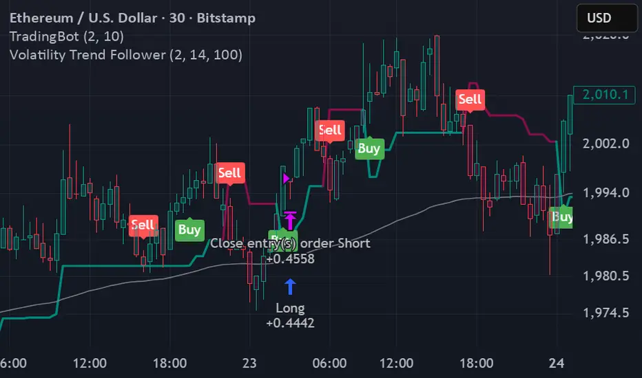
SuperLazyTradeSuperLazyTrade transforms SuperTrend into a professional day-trading system with intelligent quality filtering.
Instead of showing every signal, it rates each setup on a 100-point scale analyzing:
- Signal Freshness - Catch moves early
- Volume Strength - Confirm momentum
- VWAP Alignment - Trade with institutions
- Volatility Regime - Optimal market conditions
- RSI Confirmation - Momentum validation
The system blocks 35-40% of low-quality signals automatically, enforcing discipline with clear verdicts:
✅ JUMP (80+) - Best setups
⚡ TRADE (65-79) - Strong entries
⚠️ CAUTION (55-64) - Proceed carefully
🟡 TREND (45-54) - Mid-trend opportunities
🔴 AVOID (0-44) - Skip it
Features live P&L tracking, professional 11-row dashboard, and anti-repainting architecture. Perfect for traders who value quality over quantity.
⚠️ DISCLAIMER
This indicator does not guarantee profits. Trading involves substantial risk of loss. Past performance is not indicative of future results. Use at your own risk.

Footprint Imbalance Reversal ZonesThe script detects blowouts and displays buy and sell volume as levels.
Green lines = bullish zones (potential support / buying pressure)
Red lines = bearish zones (potential resistance / selling pressure)
---------------
Trade ideas:
---------------
Price approaching a green zone → potential bounce/support.
Price approaching a red zone → potential rejection/resistance.
Combine with other indicators or price action for confirmation.
-----------------
Configuration
-----------------
Inputs:
Imbalance Threshold (%) → higher = only very strong imbalances trigger zones
Bars to form cluster → number of consecutive imbalance bars needed
Zone Extend Bars → how far each zone line extends into the future
Minimum bar volume → ignore low-volume bars for cleaner zones
Use tick-rule volume estimate → leave true if no real bid/ask data
Max saved zones → max number of zones stored (oldest removed if exceeded)
------
Tips
------
Best used on intraday or short-term charts where volume imbalances are meaningful.
Adjust Minimum bar volume to filter out low-volume noise.
Combine with candlestick patterns, RSI, or moving averages for higher-probability trades.
For long-term charts, consider increasing Bars to form cluster to capture stronger levels.
Combine with price action, candlestick patterns, or other indicators for better trade signals.

Volume Crisis Created by Alphaomega18
🎯 What is the Crisis Detector Pro?
The Crisis Detector Pro is an advanced multi-component indicator that detects market crisis situations by simultaneously analyzing:
Volume: Anomalies and volume spikes
VIX: Volatility Index (S&P 500)
ATR: True volatility (all assets)
Open Interest: Estimated open interest (futures contracts)
The indicator calculates a Composite Crisis Score (0-100) that combines these elements to alert you to critical market moments.
📊 Indicator Components
1️⃣ Volume Analysis
Anomaly detection: Compares current volume to its moving average
Classification:
🟡 Moderate: 1.5x - 2x average
🟠 High: 2x - 3x average
🔴 Extreme: > 3x average
Bollinger Bands: Detects volume breakouts
Clusters: Identifies 3+ consecutive days of anomalies
2️⃣ VIX (Fear Index)
S&P 500 only
Default thresholds:
🟡 Moderate: VIX > 20
🟠 High: VIX > 30
🔴 Extreme: VIX > 40
3️⃣ ATR (Average True Range)
Measures true volatility
Compatible with all assets (stocks, futures, forex, crypto)
Compares current ATR to its average
4️⃣ Open Interest (OI)
Estimation based on Volume / 2
Detects changes > 25%
Inverted colors:
🔴 Red: OI increase (new positions)
🟢 Green: OI decrease (position closing)
⚙️ Main Parameters
Calculations:
Moving Average Period: 20 (default)
Standard Deviation Period: 20
ATR Period: 14
Volume Thresholds:
Moderate: 1.5x
High: 2.0x
Extreme: 3.0x
Composite Score (Weights):
Volume: 35%
VIX: 25%
ATR: 20%
Open Interest: 20%
📈 Visual Signals
Top of Chart:
🟡 Yellow triangle: Moderate alert (Score 50-70)
🟠 Orange triangle: High alert (Score 70-85)
🔴 Red triangle: EXTREME CRISIS (Score 85-100)
⚠️ Purple cross: Reinforced signal (Volume + Volatility simultaneous)
Bottom of Chart:
💎 Purple diamond: 50-day volume record
⬛ Fuchsia square: Cluster (3+ abnormal days)
Volume Bars:
Gray: Normal volume
🟡 Yellow: Moderate volume
🟠 Orange: High volume
🔴 Red: Extreme volume
Open Interest Curve:
🔵 Blue: Normal variation
🔴 Red: Increase > 25%
🟢 Green: Decrease > 25%
🎯 How to Use the Indicator
1. Initial Setup
For S&P 500 / US Indices:
Enable VIX ✅
Enable ATR ✅
Enable OI ✅
Composite Score ✅
For Other Assets (Forex, Crypto, Stocks):
Disable VIX ❌
Enable ATR ✅
Enable OI (optional)
Composite Score ✅
2. Crisis Score Interpretation
ScoreLevelMeaningAction0-50Normal ✅Calm marketNormal trading50-70Vigilance 🟡Volatility risingIncreased monitoring70-85Danger 🟠Critical situationReduce exposure85-100Crisis 🔴MAXIMUM ALERTCapital protection
3. Trading Strategies
Directional Trading:
Reinforced signal ⚠️ = Powerful move in progress
Enter in direction of movement with confirmation
Tight stops, quick targets
Risk Management:
Score > 70 → Reduce position size by 50%
Score > 85 → Stop trading or ultra-short positions
Cluster detected → Avoid new trades
Scalping/Day Trading:
Extreme volume 🔴 = Scalping opportunities
Wait for confirmation before entering
Exit quickly on spikes
Swing Trading:
Avoid opening swings during crises
Protect existing positions (trailing stops)
Wait for return to normal (Score < 50)
4. Open Interest (Futures):
OI Increase (🔴 Red):
New positions opened
Strong market conviction
Movement may intensify
OI Decrease (🟢 Green):
Position closing
Profit-taking or stop losses
Possible reversal
🔔 Configurable Alerts
The indicator includes 8 types of alerts:
🟡 Moderate Crisis Alert: Score 50-70
🟠 HIGH Crisis ALERT: Score 70-85
🔴 MAJOR CRISIS: Score 85-100
⚠️ REINFORCED SIGNAL: Extreme Volume + Volatility simultaneous
💎 RECORD Volume: Highest volume over 50 days
📊 Cluster DETECTED: 3+ consecutive abnormal days
📈 OI SPIKE >25%: Sharp Open Interest increase
📉 OI DECLINE >25%: Sharp Open Interest decrease
Setup: Right-click on chart → "Add Alert" → Select alert
💡 Optimization Tips
Scalping (1-5min):
MA Period: 10-15
Moderate Threshold: 1.3x
High Threshold: 1.8x
Volume Weight: 50%
Day Trading (15min-1H):
MA Period: 20 (default)
Thresholds: Default
Composite Score: Enabled
Swing Trading (4H-Daily):
MA Period: 30-50
StdDev Multiplier: 2.5
ATR Period: 20
Volatile Markets (Crypto):
Moderate Threshold: 1.8x
High Threshold: 2.5x
Extreme Threshold: 4.0x
ATR Weight: 30%
📊 Statistics Table
The real-time table displays:
Crisis Score: 0-100 with color coding
Current volume: Value and ratio
Volume Score: Contribution to total score
Open Interest: Estimated value and % change
VIX: Current value (if enabled)
ATR: Ratio to average
Global STATUS: Normal ✅ / Vigilance 🟡 / Danger 🟠 / Crisis 🔴
⚠️ Warnings and Limitations
❌ Limitations:
Open Interest is estimated (Volume / 2), not real value
VIX only works for S&P 500
False signals possible in very volatile markets
✅ Best Practices:
Always combine with classic technical analysis
Never trade solely on alerts
Adapt thresholds to your asset and timeframe
Backtest before using live
Respect your risk management plan
🎓 Real Use Cases
Example 1: Flash Crash
Extreme volume 🔴 + Extreme ATR 🔴 + Reinforced signal ⚠️
Composite score > 90
Action: No new trades, protect existing positions
Example 2: Fed Announcement
VIX > 35 + Moderate volume 🟡 + OI rising 🔴
Composite score: 65
Action: Reduce position size, widen stops
Example 3: Volatility Squeeze
Cluster detected + Volume record 💎 + OI declining 🟢
Action: Scalping opportunity in breakout direction
📈 Performance
Real-time detection (0 lag)
Compatible all markets and timeframes
Low resource consumption
Complete history preserved

Institutional Dominance/Trapped Trader Profile @MaxMaserati 3.0📊 Institutional Dominance & Trapped Trader Delta Profile
@MaxMaserati 3.0
═════════════════════════════════════════════════════════════
🎯 OVERVIEW
The IDT Auction Profile is a professional-grade volume order flow analysis tool that reveals where institutional traders hold Positional Advantage and where retail participants are Trapped. Unlike traditional Volume Profile indicators, the IDT Profile integrates Volume Point Delta (VPD) analysis with advanced pattern recognition to identify the exact price levels where profitable institutional positions create support/resistance, and where losing positions are forced to exit.
This indicator answers the critical questions: Who is in profit? Who is trapped? And where will they defend or exit their positions?
═════════════════════════════════════════════════════════════
✨ FEATURES
═════════════════════════════════════════════════════════════
⚡ Quick Presets - One-click configuration for:
• Scalper (1m-5m): 75 bars, 50 rows, ★3 confluence
• Day Trader (15m-1h): 150 bars, 60 rows, ★3 confluence
• Swing Trader (4h-D): 300 bars, 80 rows, ★4 confluence
🔔 Price Alerts - Get notified when price touches:
• VAH (Value Area High) - Resistance zone
• VAL (Value Area Low) - Support zone
• Adjustable sensitivity (0.05% - 1.0%)
📏 POC Line Extensions - Historical context lines extending left from key institutional levels
👻 Previous Session POCs - Dotted reference lines showing prior period levels (carry-over zones)
📊 Real-Time Statistics Panel:
• Total Volume
• Net Delta
• Buy/Sell Pressure %
🎨 Visual Enhancements:
• Column dividers for clarity
• Transparency controls
• Profile auto-hide when price moves away
• Cached color schemes for 30% performance boost
═════════════════════════════════════════════════════════════
🧠 CORE CONCEPT: DOMINANCE VS TRAPPED POSITIONING
═════════════════════════════════════════════════════════════
The indicator categorizes all market participants into two strategic positions based on their entry price relative to current market price:
📍 ABOVE CURRENT PRICE (Resistance Zones)
🔴 Aggressive Sellers in Profit - Sold higher, currently winning. Will defend positions or add to winners.
🟥 Trapped Buyers at Loss - Bought higher, currently losing. Must exit at breakeven, creating resistance.
📍 BELOW CURRENT PRICE (Support Zones)
🟢 Aggressive Buyers in Profit - Bought lower, currently winning. Will defend positions or add to winners.
🟩 Trapped Sellers at Loss - Sold lower, currently losing. Must cover at breakeven, creating support.
⚡ MAXIMUM CONFLUENCE ZONES
When Dominant (Profitable) and Trapped (Loss) positions align at the same level, you get the strongest support/resistance zones:
🟧 Orange Boxes (Above Price) = Aggressive Sellers + Trapped Buyers = STRONGEST RESISTANCE
🟨 Yellow Boxes (Below Price) = Aggressive Buyers + Trapped Sellers = STRONGEST SUPPORT
═════════════════════════════════════════════════════════════
📊 VOLUME ANALYSIS COLUMNS
═════════════════════════════════════════════════════════════
1️⃣ VPD Column (Volume Point Delta)
Net aggressive pressure at each price level (Buying Volume - Selling Volume)
- Bullish Delta (Green): Buyers dominated the auction at this level
- Bearish Delta (Red): Sellers dominated the auction at this level
- Smart Coloring: Automatically highlights institutional patterns
2️⃣ VPS Column (Volume Point of Sell - ASK Volume)
Aggressive buying volume that "lifted the offer" by hitting ask prices
- Represents participants who paid the ask price to enter long
- When price is below this level = These buyers are in profit
- When price is above this level = These sellers who got hit are in profit
- Shows institutional bid volume absorption
3️⃣ VPB Column (Volume Point of Buy - BID Volume)
Aggressive selling volume that "hit the bid" by taking bid prices
- Represents participants who sold at bid price to enter short
- When price is above this level = These sellers are in profit
- When price is below this level = These buyers who got hit are in profit
- Shows institutional ask volume absorption
4️⃣ SVP Column (Optional - Session Volume Profile)
Traditional combined volume profile without bid/ask separation
═════════════════════════════════════════════════════════════
🔍 ADVANCED INSTITUTIONAL PATTERNS DETECTION
═════════════════════════════════════════════════════════════
The indicator uses statistical analysis (standard deviation, moving averages, hit counting) to identify institutional footprints:
⚡ Failed Auctions - "BUYERS TRAPPED" or "SELLERS TRAPPED" labels
• High volume entered, but price immediately reversed
• Creates extreme concentrations of losing positions
• Trading Implication: High-probability reversal zones where trapped participants must exit
📈 Volume Spikes - Bright green/red bars in VPD column
• Volume exceeds average by 2+ standard deviations
• Represents aggressive institutional entry
• Trading Implication: Potential trend continuation or setup for failed auction
🛡️ Absorption Zones - Yellow/Orange colored bars
• Large passive orders absorbing aggressive volume without price movement
• Indicates accumulation (bullish) or distribution (bearish)
• Trading Implication: Institutional positioning before major moves
🧊 Iceberg Orders - Cyan colored bars with high hit counts
• Same price level shows repeated volume without clearing
• Reveals hidden institutional limit orders split into small pieces
• Trading Implication: Strong liquidity magnets, price often returns here
💜 Volume Exhaustion - Purple colored bars
• Sharp volume drop (50%+) after spike
• Momentum exhausted, participants depleted
• Trading Implication: Potential reversal or consolidation ahead
═════════════════════════════════════════════════════════════
🎨 SMART INSTITUTIONAL COLORING
═════════════════════════════════════════════════════════════
Colors bars based on detected patterns vs simple red/green:
🟨 Yellow = Bullish battles won (buyers + trapped sellers)
🟧 Orange = Bearish battles won (sellers + trapped buyers)
🔵 Cyan = Iceberg orders (hidden liquidity)
🟣 Purple = Large passive orders
🟢 Bright Green = Buying spikes (institutional aggression)
🔴 Bright Red = Selling spikes (institutional aggression)
═════════════════════════════════════════════════════════════
⭐ CONFLUENCE SCORING SYSTEM
═════════════════════════════════════════════════════════════
Each price level receives 1-5 stars based on:
★★ Volume spike presence (+2 stars)
★ Absorption pattern (+1 star)
★ Large passive orders (+1 star)
★ Proximity to Value Area (+1 star)
★★ Iceberg detection (+2 stars)
★★ Failed auction (+2 stars)
Minimum Signal Strength filter lets you show only levels with ★3+ confluence for highest-quality signals.
═════════════════════════════════════════════════════════════
🎯 VALUE AREA ANALYSIS
═════════════════════════════════════════════════════════════
VAH (Value Area High) - Blue Line
- Top of the 70% volume acceptance zone
- Price at VAH often rejects downward (resistance)
- Alert triggers when price approaches
VAL (Value Area Low) - Red Line
- Bottom of the 70% volume acceptance zone
- Price at VAL often bounces upward (support)
- Alert triggers when price approaches
Trading Applications:
- Price outside Value Area → Mean reversion opportunity
- Price breaks VA with volume → Trend continuation
- Price oscillates within VA → Range-bound, fade extremes
- Previous session VA lines show carryover levels
═════════════════════════════════════════════════════════════
📋 EXPECTED PRICE BEHAVIOR AT KEY LEVELS
═════════════════════════════════════════════════════════════
⚠️ IMPORTANT: These are observed behavioral patterns for educational purposes and backtesting research. Always validate with 250-500+ backtest trades before risking capital.
1️⃣ POC BOX ZONES (Highest Statistical Relevance)
🟨 Yellow Boxes (Below Current Price - SUPPORT)
Expected Behavior:
- Price approaching from above typically encounters buying pressure
- Both profitable institutional buyers and trapped short sellers create demand
- Common reaction: Price slows, consolidates, or bounces
- Failed bounces often lead to rapid breakdown (trapped buyers capitulate)
What Often Happens:
- Initial dip into zone → Weak bounce attempt
- Second test → Stronger bounce (trapped sellers covering + buyers defending)
- Break below → Quick acceleration as both groups exit
🟧 Orange Boxes (Above Current Price - RESISTANCE)
Expected Behavior:
- Price rallying into zone typically encounters selling pressure
- Both profitable institutional sellers and trapped long buyers create supply
- Common reaction: Price stalls, consolidates, or rejects
What Often Happens:
- Initial push into zone → Weak rejection
- Second test → Stronger rejection (trapped buyers exiting + sellers defending)
- Break above → Quick acceleration as resistance becomes support
2️⃣ FAILED AUCTION ZONES
"SELLERS TRAPPED" Labels (Below Price):
- High-volume selling that immediately reversed = maximum trapped shorts
- When price returns, trapped sellers face pressure to cover
- Typical pattern: Price approaches → Initial hesitation → Sharp bounce
"BUYERS TRAPPED" Labels (Above Price):
- High-volume buying that immediately failed = maximum trapped longs
- Price returning forces trapped buyers to exit at breakeven
- Typical pattern: Price approaches → Distribution → Rejection
3️⃣ VALUE AREA DYNAMICS
Price Outside Value Area (VAH/VAL):
- Price beyond 70% volume zone = statistical outlier
- Two outcomes: Mean reversion OR trend continuation
- Key differentiator: Presence of confluence zones
Mean Reversion Pattern (No Strong Confluence):
- Price extends 1-2% beyond VA → Typically reverts toward POC
- Weak volume on extension → Higher probability of reversal
Breakout Pattern (With ★4+ Confluence):
- Price breaks VA with institutional patterns → Often continues
- Strong volume + confluence = New value area forming
4️⃣ ICEBERG ORDER BEHAVIOR
Cyan Bars with High Hit Counts:
- Repeated volume at same level = Large hidden order absorbing
- Price typically "tests" iceberg multiple times before resolution
- Two outcomes: Absorption complete (break) OR rejection (bounce)
5️⃣ VOLUME SPIKE PATTERNS
Bright Green/Red Bars (Institutional Aggression):
- Extreme delta spikes indicate institutional entry
- Trend Continuation Spikes: Spike aligned with trend = Often continues
- Exhaustion Spikes: Spike against trend = Failed auction forming
═════════════════════════════════════════════════════════════
⚙️ CONFIGURATION GUIDE
═════════════════════════════════════════════════════════════
🎯 QUICK START
1. Select your trading style preset (Scalper/Day/Swing)
2. Enable VAH/VAL alerts in settings
3. Adjust alert sensitivity (0.1% recommended)
4. Add alert condition to TradingView alert system
📊 CORE SETTINGS
- Lookback Period: How many bars to analyze
- Scalping: 50-100 bars
- Day Trading: 100-200 bars
- Swing Trading: 200-500 bars
- Price Row Granularity: How finely to divide price
- 40-50 rows = Fast markets
- 60-80 rows = Balanced (RECOMMENDED)
- 100+ rows = Maximum precision
- Minimum Signal Strength: Filter weak signals
- ★3 = Balanced quality/quantity (RECOMMENDED)
- ★4-5 = Highest quality, fewer opportunities
🎨 VISUAL SETTINGS
- Color Theme: Classic/Institutional/Monochrome/Bold/Minimal/Custom
- Smart Coloring: ON (recommended) - Shows institutional patterns
- Transparency: Adjust profile opacity
- Column Dividers: Visual separators between columns
- POC Extensions: Show historical level significance
📈 ADVANCED FEATURES
- Auto-Hide Distance: Hide profile when price moves X% away
- Statistics Panel: Real-time metrics display
- Previous POCs: Show prior session levels
- Alert Sensitivity: How close price must be to trigger alerts
═════════════════════════════════════════════════════════════
💡 BEST PRACTICES
═════════════════════════════════════════════════════════════
✅ Start with defaults (200 lookback, 60 rows, ★3 confluence, Smart Coloring ON)
✅ Focus on POC boxes first - These are your highest-probability zones
✅ Combine with price action - Use the profile to explain WHY support/resistance exists
✅ Watch for alignment - Yellow/Orange boxes = strongest levels
✅ Respect failed auctions - "TRAPPED" labels are extreme reversal setups
✅ Use Value Area for context - Price outside VA = mean reversion opportunity
✅ Trust confluence scores - ★4-5 signals are institutional-grade setups
✅ Set up alerts for VAH/VAL touches - Don't miss key levels
✅ Check previous session POCs - Institutions defend same zones across sessions
✅ Monitor statistics panel - Understand market conviction in real-time
═════════════════════════════════════════════════════════════
🔧 TECHNICAL SPECIFICATIONS
═════════════════════════════════════════════════════════════
Calculation Method: Enhanced delta using OHLC and volume with wick ratio analysis
Update Frequency: Real-time on every bar close
Performance: Optimized with color caching and pre-calculated values (~30% faster)
Max Capacity: Supports up to 1500 bars lookback and 250 price rows
Compatibility: Works on all symbols and timeframes
Memory Usage: Efficient array management with proper initialization
Alert System: Built-in VAH/VAL touch detection with visual markers
═════════════════════════════════════════════════════════════
🎯 UNIQUE VALUE PROPOSITION
═════════════════════════════════════════════════════════════
Unlike standard Volume Profile indicators that only show where volume occurred, the IDT Auction Profile:
✅ Separates bid vs ask volume to reveal true order flow
✅ Identifies who is profitable vs who is trapped at each level
✅ Detects institutional patterns (icebergs, absorption, failed auctions)
✅ Calculates confluence scores combining multiple factors
✅ Provides clear POC boxes showing exact institutional positioning
✅ Maps positional advantage rather than just volume density
✅ Alerts you to key level touches in real-time
✅ Shows historical context with POC extensions
✅ Displays live statistics for market conviction
This transforms Volume Profile from a historical volume chart into a strategic positioning map showing institutional dominance and trapped participants.
═════════════════════════════════════════════════════════════
📖 HOW TO INTEGRATE WITH YOUR STRATEGY
═════════════════════════════════════════════════════════════
✅ PROPER USES:
- Entry refinement within your existing setups
- Intelligent stop placement beyond institutional levels
- Objective profit targets at next confluence zones
- Trade filtering (only take setups at ★4+ zones)
- Understanding market positioning before entry
- Alert-based monitoring of key support/resistance levels
❌ WHAT IT CANNOT DO:
- Predict direction with certainty
- Replace risk management
- Account for news/external events
- Guarantee profitability
- Work in all market conditions
═════════════════════════════════════════════════════════════
📚 DEVELOPMENT PATH (12-16 Weeks)
═════════════════════════════════════════════════════════════
Weeks 1-2: Observation Only
- Watch price behavior at key levels
- Document patterns without trading
- Set up alerts and observe responses
Weeks 3-8: Paper Trading
- Simulate trades, track all metrics
- Minimum 100 paper trades
- Test different confluence thresholds
Weeks 9-16: Small Size Testing
- Minimal capital, real market conditions
- Continue tracking, refine rules
- Adjust alert sensitivity based on results
After Proven Edge you could potentially include it in your set-up
═════════════════════════════════════════════════════════════
⚠️ CRITICAL DISCLAIMERS
═════════════════════════════════════════════════════════════
⚠️ Past volume ≠ Future price action
⚠️ Institutional positions change rapidly - these are static snapshots
⚠️ No indicator works 100% - risk management is mandatory
⚠️ Market conditions change - adapt your approach
⚠️ Backtest with YOUR style, YOUR timeframe, YOUR risk tolerance
⚠️ Alerts are notifications, not trade signals - you decide the action
The indicator reveals WHERE institutions are positioned and HOW they might behave. YOU decide IF, WHEN, and HOW to trade that information.
═════════════════════════════════════════════════════════════
📞 SUPPORT & UPDATES
═════════════════════════════════════════════════════════════
For questions, suggestions, or bug reports:
- Comment below the indicator
- Follow for updates and new features
- Check documentation for detailed examples
═════════════════════════════════════════════════════════════
Not financial advice. For educational and research purposes only.

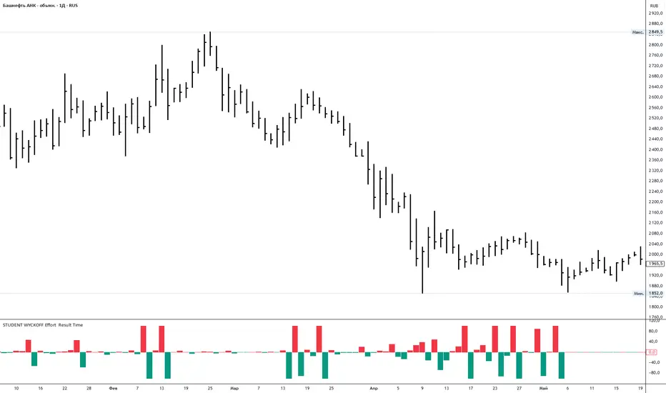
Student Wyckoff Effort Result Time **STUDENT WYCKOFF Effort vs Result**
This tool measures how *hard* the market is working on every bar and compares the current effort with the previous one. It is built in the spirit of Wyckoff: first we look at the effort (volume), then at the result (price progress), and only after that compare them.
---
### Calculation (logic in simple terms)
For each bar the script:
1. Takes an **ERT window (N bars)** – by default 2 bars:
* **Effort (E)** = sum of volume over the last N bars.
* **Time (T)** = number of bars in the window = N.
* **Result (R)** = absolute % price change from the first bar in the window to the last bar.
2. Computes **ERT** as the “effort per unit of result”:
* More volume and smaller price move → higher ERT (movement is heavy).
* Less volume and bigger price move → lower ERT (movement is easy).
3. Plots a **histogram of ΔERT** – the difference between the current ERT and the previous ERT:
* **Red bar above 0** – current ERT > previous ERT →
*the last N bars were heavier than the previous N bars*.
* **Teal bar below 0** – current ERT < previous ERT →
*the last N bars were easier than the previous N bars*.
4. Optional **normalization window** rescales ΔERT over the last M bars, so extreme spikes do not destroy the readability of the whole histogram. It does not change the logic, only the visual scale.
---
### How to use
* Look for **clusters of high red bars** – segments where price needs noticeably more effort than before to make progress. On up-moves this often appears before slowing, churning or topping; on down-moves it often appears near potential stopping zones.
* Look for **deep teal bars** – segments where price moves easier than before. On rallies this can confirm a strong trend; on declines it can confirm strong selling pressure.
* Divergences between price and the pattern of heavy/light ΔERT can highlight zones where the balance between effort and result is shifting.
Inputs:
* **ERT window (bars)** – how many bars are used to measure effort and result (N).
* **Normalize ΔERT for readability** – on/off for visual normalization.
* **Normalization window (bars)** – how many last bars are used to adapt the scale.
* Colors for “current ERT heavier than previous” and “current ERT lighter than previous”.
Volume Analysis🙏🏻 (signed) Volume Analysis is 2 of 2 structural layer / ordeflow analysis scripts, while the first one is Liquidity Analysis. Both are independent so can’t be released together as a single script, but should be used together.
The same math used in this script can be applied to other types of aggressive volume data: non-aggregated flow of market orders, volume traded of put vs call options.
There’s no universal agreement about terminology, but this script works with volumes signed by the aggressor who initiated a transaction. Then these volumes get aggregated by time and a cumulative sum is calculated. Mostly this is widely known as Cumulative Volume Delta.
However this script works with 'inferred' volumes vs the provided ones. It’s the better choice for equities, bonds; neutral choice for currencies; and suboptimal choice for natural and artificial commodities.
Contents:
Output description;
How to analyze & use the outputs;
How to use it together with Liquidity Analysis script;
How did I use both scripts to finish The Leap profitably and skipped many losses.
1. Output description
Color of the CVD line reflects (signed) volume imbalance state: red is negative, purple is neutral, blue is positive.
3 purple lines are lower deviation (lower band), basis (middle band), upper deviation (upper band): used to generate signals by a ruleset that would be explained in a minute
Gray number in the script’s status line is the advised input you may put into Inferred volume multiplier in script’s setting, I will explain it
Vertical dash line marks the moving window end, this way you can be certain over what exact data you see the profile was built.
2. How to analyze & use the outputs
Setup up the script:
Moving window length: set it to ~ ¼ of your data analysis window. E.g if you see on your charts and use ~ 256 bars, set the length to 64.
Inferred volume multiplier: you can easily leave it 256, this is not a critical factor for the math, it’s mostly there if you want to ~ equate inferred volumes with real ones in scale. For this, use the gray number in the script status line, it’s calculated as ratio of long term real volumes weighted avg to long term inferred volumes weighted avg.
Again, changing the inferred volume multiplier won’t affect the math.
Use 2 timeframes: main one and a far lower one 3 steps down, just like on the screenshot.
Find out current volume imbalance state:
As mentioned before, based on CVD line color, it can be negative, neutral or positive. This is the state variable that changes slowly and denies/confirms the signals generated by crossovers of CVD line and 3 purple thresholds.
For this I use my own very fast and lightweight metric that is totally statistically grounded, utilizes temporal information, and calculates volume imbalance without using heavy math like regressions as it’s usually done. It also provides a natural neutral zone, when volume imbalance is not strong enough to be confirmed.
...
CVD-based signals:
First you need to understand what precisely a touch of a threshold is:
Touch: an event when either of these 2 happens:
One CVD datapoint is above the threshold, and the next CVD datapoint is below the threshold
One CVD datapoint is below the threshold, and the next CVD datapoint is above the threshold
These are usually called crossovers/crossunders.
Now with the 3 purple thresholds we follow this logic:
Monitor the last touched threshold;
Once another threshold is touched, here we may generate a signal but only once !, after the first generated signal at that threshold we can’t generate more signals on this threshold, we need to wait when CVD comes to another threshold.
If CVD touches one threshold, and then goes down and touches another threshold downwards, we wait when CVD makes a datapoint above this threshold. When it happens, we register a long signal
If CVD touches one threshold, and then goes up and touches another threshold upwards, we wait when CVD makes a datapoint below this threshold. When it happens, we register a short signal
However, don’t open new trades against the current volume imbalance state. So don’t open shorts when the CDV line is blue, and don’t open longs when CVD line is red.
Btw, this technique I call it “reclaim” of a level/threshold. It can be applied to horizontal levels, and it’s very powerful especially when you fade levels on very volatility assets like BTC. This technique allows you to Not fade a level straight away, but wait when price goes past the level a bit, and then comes back and reclaims it, only there you enter, and moreover you now have a very well defined risk point.
The last part is multi-timeframe logic. Prefer to act when a lower timeframe is Not against the main timeframe. That’s all, no multiple higher timeframes are needed.
3. How to use it together with Liquidity Analysis script.
That script also has a mean to generate its own signals, and another state variable called Liquidity Imbalance.
So now you’re not only looking at volume imbalance but also at liquidity imbalance that would deny/confirm the CVD based signal. You need at least one of these two to favor your long or short.
This is the same logic widely used in HFT, where MM bots cancel/shift/resize orders when book is too onesided And ordeflow is one sided as well.
4. How did I use both scripts to finish The Leap profitably and skipped many losses.
Even tho you can use structural information as your main strategic layer, as many so-called orderflow traders do, I traded in objective style: my fade signals were volatility based in essence, and I used ordeflow for better entries and stops, but most importantly to skip losses.
When ‘both‘ liquidity imbalance and volume imbalance (in their main timeframes) were against my trades, I skipped them all, saving many ~$500 stop losses (that was my basis risk unit for the Leap). Unless I had a very strong objective signal, i.e. confluence of several signals, or just one higher timeframe signal, I did all these skips.
I traded ~ intraweek timeframe, so I was analyzing either the last 230 30min bars or 1380 5min bars. Both Liquidity Analysis and (signed) Volume Analysis scripts were set to moving window length 46 or 276 for either granularity.
I finished the leap with 9% profit and max DD ~ 5%, a bit short of my goal of 12.5%. If not these 2 scripts I would’ve finished a bit above breakeven I think.
,,,
Another thing, I made these 2 scripts invite-only because they are made particularly for trading, particularly for certain types of market data. These are tools adapted for particular use case, not like my other posts with general math entities like Kernel Density Estimation or Kalman filter, that you can take and apply properly on any data you need yourself.
However these are made from general math entities like everything else. ‘All’ the components are available in my other scripts, ideas, and other sources related to me. If you want to reverse-engineer these, you can find all the components you need in my already posted open source work.
∞
Goldfishyes I love Fortnite yes I love Fortnite yes I love Fortnite yes I love Fortnite yes I love Fortnite yes I love Fortnite yes I love Fortnite yes I love Fortnite yes I love Fortnite yes I love Fortnite yes I love Fortnite yes I love Fortnite yes I love Fortnite yes I love Fortnite yes I love Fortnite

VSA Visual RenkoWith this script you will be able to identify absorption, exhaustion, and a possible end of movement.

Goldfishuse these levels with context sfhkuhuahdhaskdhaskdshadhaskjdhasjkdhasjkdhaskdhasdhaskjdhaskjdhsakjdhasjkdhaskjdhsakjdhsahdaskhdsakdhasjkhdsajkhdaskhdsakjhdsakjhdasjkdhsajkdhsakjdhsakjdhsakdhsakhdsakdhsakdhaskjdhsakjdhsakdjhsakjdhsakjdhsakjdhsajk

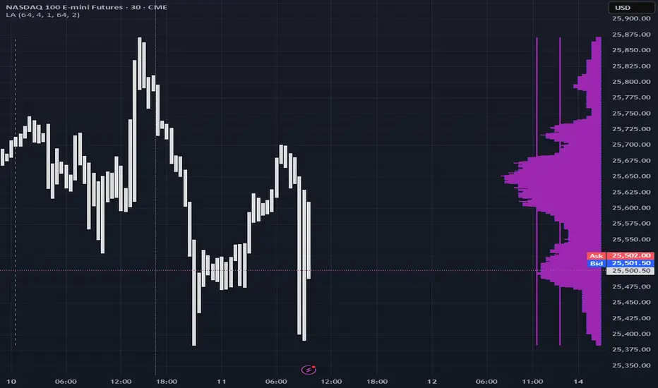
(SM3) Volume Profile Tool-kitCore Concept
This indicator is a right-aligned fixed-range Volume Profile + SMT-style tools:
Volume Profile
Shows volume distribution over a fixed lookback window
Bars are colored by volume delta:
Teal = buyers (bullish volume ≥ bearish volume)
Fuchsia = sellers (bearish volume > bullish volume)
POC: highest volume price level
Value Area: price region containing X% of total volume (default 68%)
Liquidity Sweeps
Marks Buy-side Liquidity Sweeps (BSL) and Sell-side Liquidity Sweeps (SSL) based on pivot highs/lows
PDH/PDL Liquidity Boxes
Previous Day High (PDH) zone = red box
Previous Day Low (PDL) zone = green box
Based on the prior full calendar day’s high/low
Boxes extend across the current day only, adjusting bar by barCore Concept
This indicator is a right-aligned fixed-range Volume Profile + SMT-style tools:
Volume Profile
Shows volume distribution over a fixed lookback window
Bars are colored by volume delta:
Teal = buyers (bullish volume ≥ bearish volume)
Fuchsia = sellers (bearish volume > bullish volume)
POC: highest volume price level
Value Area: price region containing X% of total volume (default 68%)
Liquidity Sweeps
Marks Buy-side Liquidity Sweeps (BSL) and Sell-side Liquidity Sweeps (SSL) based on pivot highs/lows
PDH/PDL Liquidity Boxes
Previous Day High (PDH) zone = red box
Previous Day Low (PDL) zone = green box
Based on the prior full calendar day’s high/low
Boxes extend across the current day only, adjusting bar by bar

(SM3) Volume Profile Tool-kit1st pine script. It is a work in progress. I use this to mark previous day high and low value areas as well as overnight volume profile for NYSE open strategy.

Volume-Based Candle Shading Pro [LTS]Overview
Volume-Based Candle Shading Pro is a visual aid that highlights how “unusual” each bar’s volume is compared to recent activity. It adjusts candle colors based on whether volume is above, below, or near its average, helping you quickly spot high-activity pushes and quiet rotations on any symbol or timeframe.
How it works
For each bar, the script calculates a simple moving average of volume over a user-defined lookback. It then compares the current bar’s volume to that average.
Bullish candles start from a bullish base color, and bearish candles from a bearish base color. Depending on the volume ratio, that base color is blended toward a “high volume mix” color when volume is elevated, or toward a “low volume mix” color when volume is muted. The strength of the blend increases as the bar’s volume moves further away from the average, so extreme volume stands out visually while average bars remain close to the base colors.
Colors are applied with the built-in barcolor() function, so the indicator only affects candle appearance; it does not modify price, volume, or any other chart values.
Inputs
Bullish Base Color / Bearish Base Color
Primary colors used for up and down candles when volume is close to its average.
High Volume Mix Color
Color that is blended into the base color when volume is above its moving average. This is typically chosen as a darker or more intense shade to make heavy-volume bars stand out.
Low Volume Mix Color
Color that is blended into the base color when volume is below its moving average. Many users choose a lighter shade to visually de-emphasize low-participation bars.
Volume MA Length
Number of previous bars used to compute the average volume. Shorter lengths make the shading respond more quickly to recent changes in activity; longer lengths provide a smoother, more stable baseline.
Typical use cases
Highlighting high-volume breakouts, breakdowns, or rejection candles without adding extra panels or indicators.
Distinguishing between strong, well-participated moves and low-volume drifts that may be less significant.
Combining with your existing price-action tools to visually filter which candles deserve more attention based on relative volume.
All calculations are based on historical volume and the current bar only; the script does not use future data or repaint past candles. It is intended as a visual aid and should be combined with your own analysis and risk management.

Volatility Trend FollowerThe script combines several classic technical analysis techniques:
SuperTrend / Adaptive Band - The main idea comes from the SuperTrend indicator, which uses ATR (Average True Range) to create a trailing band that adapts to volatility
ATR (Average True Range) - A volatility measure developed by J. Welles Wilder Jr.
EMA (Exponential Moving Average) - Used as a global trend filter
Heikin Ashi - An option to smooth prices and reduce noise
Liquidity Analysis🙏🏻 Liquidity Analysis is 1 of 2 structural layer / orderflow layer analysis scripts. Both are independent so can’t be released together as a single script, but should be used together. The second one which is called (Signed) Volume Analysis is incoming.
The same math used in this script can be applied on other types of profile-like data: orderbooks, trading volumes of all options for each strike.
Important: market or volume profile, just as orderbooks and options traded volume by strikes, are all liquidity ‘estimates’, showing where liquidity is more likely or less likely to be. These estimates however, especially combined with other info, are really useful and reliable.
This script works with inferred volumes vs the provided one. It's the better choice for equities, bonds; neutral choice for currencies; and suboptimal choice for natural & artificial commodities.
Contents:
Output description;
How to analyze & use the outputs;
How to use it together with upcoming (Signed) Volume Analysis script;
How did I use both scripts to finish The Leap profitably and skipped many losses.
1. Output description
Color of the profile reflects the liquidity imbalance state: red is negative, purple is neutral, blue is positive.
Bar coloring represents history values of liquidity imbalance for backtesting purposes. It can be turned on/off in the script's Style settings.
Two purple vertical lines represent calculated borders of excessive liquidity (HVN), scarce liquidity (LVN), and sufficient liquidity (NVN) zones.
Vertical dash line marks the moving window end, this way you can be certain over what exact data you see the profile was built.
2. How to analyze & use the outputs
Setup up the script:
Moving window length: set it to ~ ¼ of your data analysis window. E.g if you see on your charts and use ~ 256 bars, set the length to 64.
Native tick size multiplier: leave it at 0 to calculate optimal number of rows automatically, or set it manually to match native tick size multiples you desire.
Use 2 timeframes: main one and a far lower one 3 steps down, just like on the screenshot.
Native lot size multiplier allows to round profile rows themselves to nearest multiples of native lot size. I added this just in case any1 needs it.
Find out current liquidity imbalance state:
As mentioned before, based on profile color, it can be negative, neutral or positive. This is the state variable that changes slowly and denies/confirms the signals that would be explained in the minute.
I use my own statistically grounded imbalance metric (no hardcoded/learned thresholds), that unlike mainstream imbalance metrics (e.g orderbook imbalance as sum of bids vs sum of asks) provides a natural neutral zone, when liquidity imbalance is ofc there but not strong enough to be considered.
…
Profile-based signals: look at profile shape vs 2 vertical purple lines.
where profile rows exceed the left purple line, these prices are considered HVN. Too much potential liquidity is there.
where profile rows don’t exceed the right purple line, these prices are considered LVN. Potential thin/lack of liquidity is expected there.
where profile rows are in between these 2 purple lines, these are NVN, or neutral liquidity zones.
Trading ruleset itself is based on couple of simple rules:
Only! Use limit orders hence provide liquidity in LVNs and Only! use stop-market orders hence consume liquidity in HVNs;
These orders should be put in advance ‘only’. This is how you discover the direction or orders: you can only put sell limit orders above you and buy limit orders below you, and you can only put buy stop orders above you, and sell stop orders below you.
This is really it. It may look weird, but once you just try to follow these 2 rules letter by letter for 1 hour, you’ll see how liquidity trading works.
Now once you know that, just don’t open new trades against the liquidity imbalance state. So don’t open shorts when the profile is blue, and don’t open longs when it’s red.
The last part is multi-timeframe logic. Prefer to act when a lower timeframe is Not against the main timeframe. That’s all, no multiple higher timeframes are needed.
3. How to use it together with upcoming (Signed) Volume Analysis script.
That upcoming script would also have a mean to generate its own signals, and another state variable called volume imbalance.
So now you’re not only looking at liquidity imbalance but also at volume imbalance that would deny/confirm a profile based signal. You need at least one of these to favor your long or short.
This is the same logic widely used in HFT, where MM bots cancel/shift/resize orders when book is too onesided And ordeflow is one sided as well.
4. How did I use both scripts to finish The Leap profitably and skipped many losses.
Even tho you can use structural information as your main strategic layer, as many so-called orderflow traders do, I traded in objective style: my fade signals were volatility based in essence, and I used ordeflow for better entries and stops, but most importantly to skip losses.
When ‘both‘ liquidity imbalance and volume imbalance (in their main timeframes) were against my trades, I skipped them all, saving many ~$500 stop losses (that was my basis risk unit for the Leap). Unless I had a very strong objective signal, i.e confluence of several signals, or just one higher timeframe signal, I did all these skips.
I traded ~ intraweek timeframe, so I was analyzing either the last 230 30min bars or 1380 5min bars. Both Liquidity Analysis and (signed) Volume Analysis scripts were set to moving window length 46 or 276 for either granulary.
I finished the leap with 9% profit and max DD ~ 5%, a bit short of my goal of 12.5%. If not these 2 scripts I would’ve finished a bit above breakeven I think.
∞