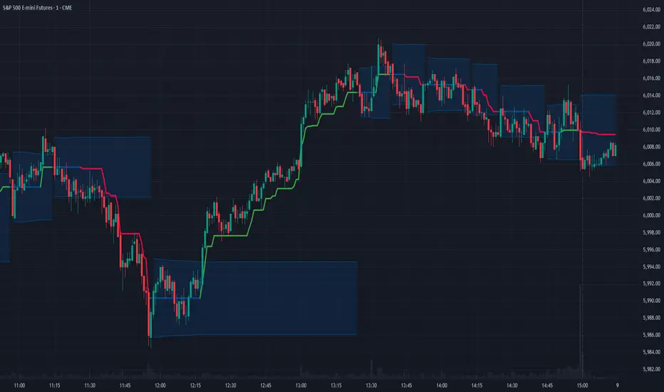
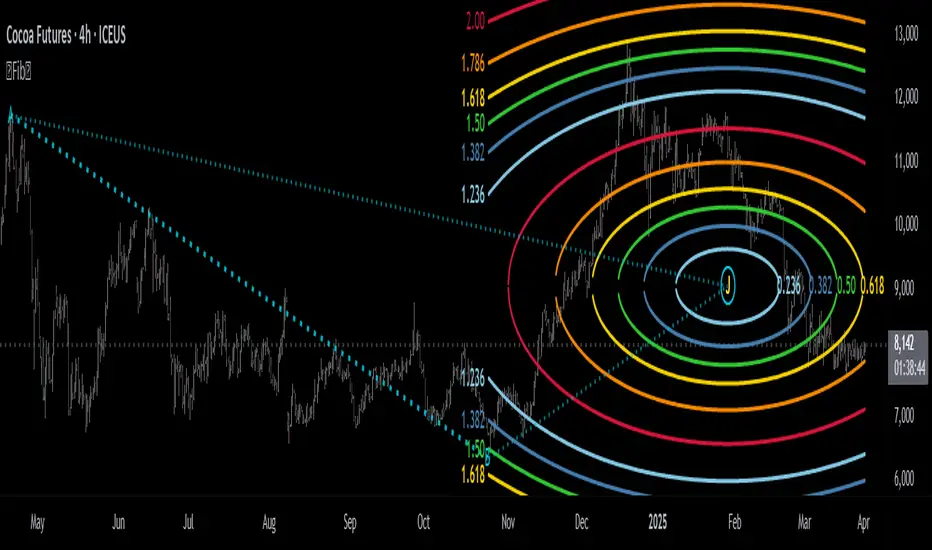
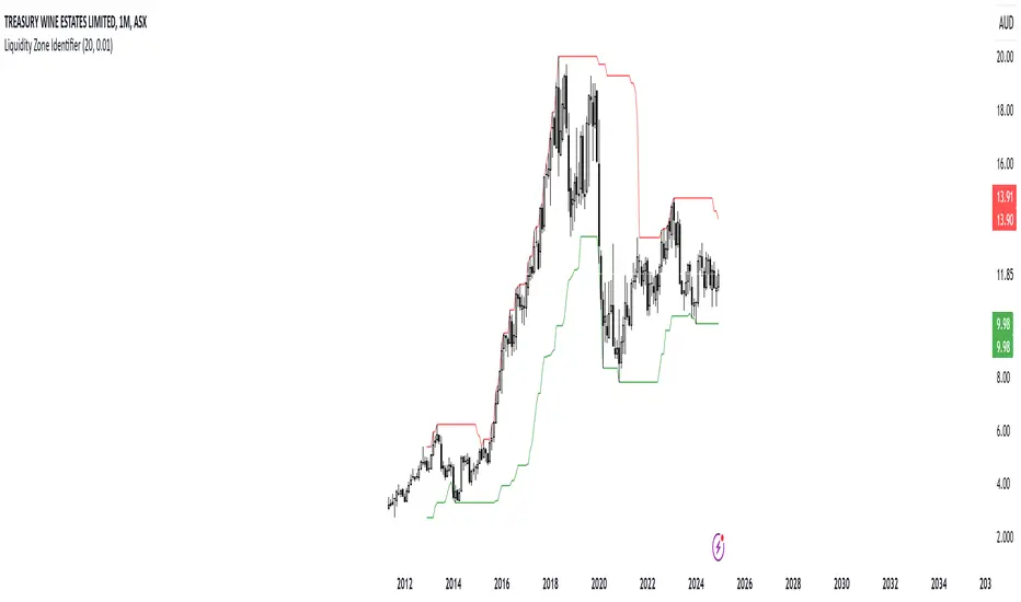
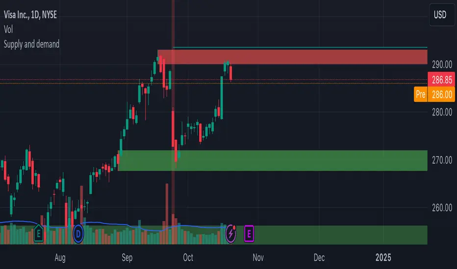
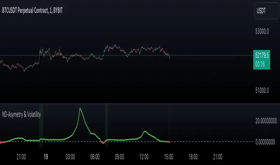
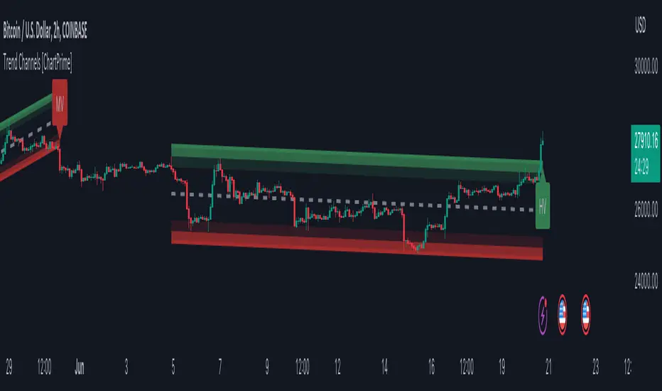
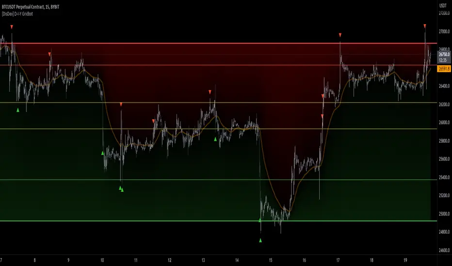
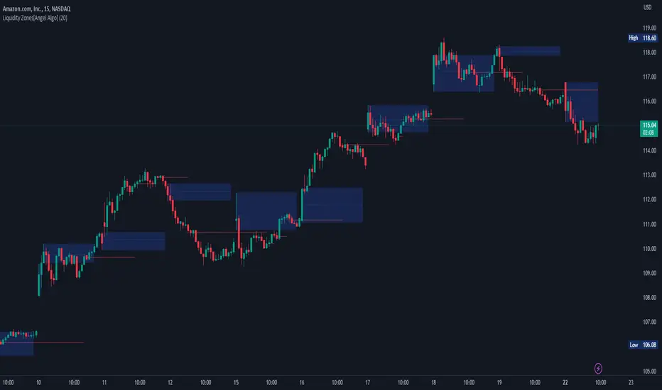
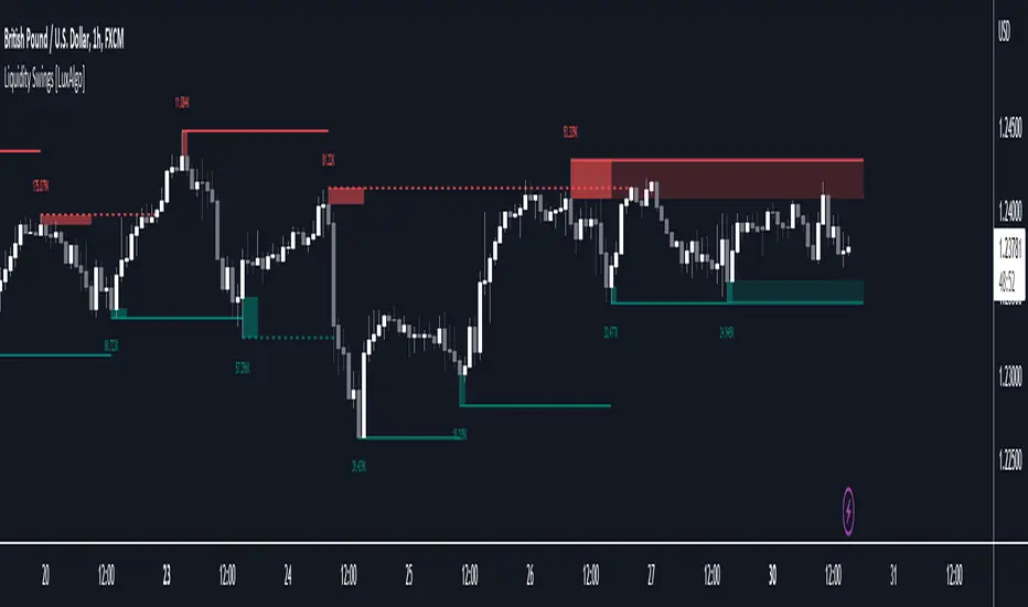
Supply & Demand Zones Liquidity & Stop Hunt [LunqFX]Supply and demand zones are where price reacts — but most indicators draw every swing as a box and leave you to guess which one matters. Liquidity Zones ranks them: it marks the key supply and demand zones, scores each one by how much liquidity it holds, and shows whether it is still fresh — so you know which level to trade and which to ignore.
❶ WHAT EACH ZONE SHOWS
Every zone is a coloured block — magenta = SUPPLY (sellers, above), teal = DEMAND (buyers, below) — and carries three readings that are original to this script:
LIQ SCORE (0–100) — how much volume traded inside the zone versus the strongest zone on the chart. 100 = the heaviest zone (the real magnet); a low score = a thin, weak level.
VOLUME ▲ / ▼ — the up-volume vs down-volume that built the zone: did buyers or sellers do the work inside it.
FRESH / TESTED N× — FRESH = price has not returned yet (strongest reaction expected); TESTED N× = already retested N times, weaker each time.
❷ HOW TO TRADE IT
1 — Read the BIAS in the panel. ▲ BUY-SIDE = favour longs, ▼ SELL-SIDE = favour shorts. Trade with it, not against it.
2 — Pick a zone with a HIGH LIQ Score (70+). Low-score zones are thin and unreliable — skip them.
3 — Prefer FRESH zones. A FRESH high-LIQ zone is the highest-probability reaction. A many-times-TESTED zone is more likely to break than hold.
4 — Wait for price to return to that zone. The bright edge line is your reference level.
5 — Enter on the reaction: LONG — bias BUY-SIDE, price drops into a FRESH teal DEMAND zone, LIQ 80, Volume ▲ (buyers dominant). Long on the reaction, stop below the zone, target the next supply zone above. SHORT — bias SELL-SIDE, price rallies into a FRESH magenta SUPPLY zone, LIQ 76, Volume ▼ (sellers dominant). Short on the reaction, stop above the zone, target the next demand zone below.
❸ WHAT TO AVOID
Trading low-LIQ zones — they hold little liquidity. Fading a zone whose Volume split disagrees with its side (e.g. a supply zone built on heavy up-volume) — the level is weak. Chasing a many-times-TESTED zone expecting a clean bounce.
Works on any symbol and timeframe — forex, gold (XAUUSD), indices, crypto and stocks — intraday and higher timeframes alike.
❹ DASHBOARD
The panel lists every zone with its price, LIQ Score, FRESH/TESTED status and side (BUY/SELL), plus a LIQ-weighted overall bias — the full picture at a glance. Optional neon candles can be turned off to keep your own style.
❺ HOW IT WORKS
1 — Swing highs and lows are found from confirmed pivots (closed bars — no repainting). Each swing high opens a supply zone, each swing low a demand zone. 2 — Each zone is a block centred on the swing, its height scaled to ATR so it fits the instrument's volatility. 3 — For every zone the script measures the volume traded inside it, the up/down-volume split, and how many separate times price entered it. 4 — LIQ Score = the zone's volume ÷ the strongest zone's volume, scaled 0–100. 5 — The bias is weighted by LIQ Score, so one heavy zone counts for more than several thin ones — an honest read of whether liquidity leans buy or sell.
No repainting
Zones are built only from confirmed pivots and rendered on the last bar over a fixed lookback. A zone that appears in a screenshot is a zone that was there live — history is never recalculated.
This indicator is an educational market-analysis tool, not financial advice. Zone strength and past reactions describe historical behavior and do not guarantee future results. Always confirm with your own analysis and manage risk. 指標

EonMetrics MTF Supply & Demand ZonesMTF SUPPLY & DEMAND ZONES
What it does
A "supply and demand zone" is a small area on the chart where price paused quietly for a few candles, and was then immediately followed by one strong, decisive candle that shot away from it in one direction. That quiet pause is where this indicator draws its zone — the idea being that this is where a large amount of buying or selling built up right before the big move, so price is likely to react again if it ever comes back to that exact area.
The key part of this tool is that it does this search across up to six different timeframes at the same time — your current chart's timeframe plus up to five higher ones (like 15-minute, 1-hour, 4-hour, Daily) — and draws all of them directly onto the chart you're actually looking at. This means if you trade on a 5-minute chart, you can still see a major 4-hour or Daily zone approaching, without ever switching your chart away from the 5-minute view.
How to actually use it (step by step)
Watch price as it approaches a colored box. Green boxes are "demand" zones (expect a possible bounce upward). Red boxes are "supply" zones (expect a possible bounce downward).
Pay more attention to boxes tagged with a bigger timeframe (like "4H" or "D") — these represent more significant, longer-term levels than a box tagged "5m" or "15m".
When price actually returns into a box, a small "R" letter appears — that's your cue that a retest is happening right now, worth watching closely for a reaction.
If a box's tag shows more than one timeframe at once (for example "15m, 1H"), it means multiple timeframes agree on almost the exact same price level — generally a stronger, more meaningful zone than one confirmed by only a single timeframe.
If a box gets fully broken through (depending on your settings, either by a wick or by a candle closing past its far edge), that zone has failed and should no longer be trusted — either it disappears from the chart or stays visible dimmed out, depending on your setting.
Every setting explained
Detection group
Sensitivity — controls how strong and sudden the "breakout candle" must be before its pause area counts as a zone. Lower numbers require a much stronger candle (fewer zones, but stronger ones); higher numbers accept weaker candles (more zones, more frequent but less significant).
Min Base Candles — the minimum number of small pause candles required right before the strong candle for it to count as a real zone. A higher number demands a proper, visible pause; a lower number (like 1) also accepts a zone built from just a single quiet candle.
Max Base Candles — how far back the script is allowed to look for pause candles. This mostly just prevents extremely long pauses from creating unusually oversized zones.
Base Candle Max Size (x impulse) — how small each pause candle must be compared to the strong breakout candle to actually count as "part of the pause." Lower values demand a very obvious size difference between the quiet candles and the big one.
Zone Size Multiplier — makes every drawn zone box slightly bigger or smaller than its natural measured size, without changing where it's centered.
Min Zone Height (x ATR) — throws out zones that are too thin/flat to be meaningful (basically just noise). Raise this if you keep seeing tiny, unhelpful zones.
Max Zone Height (x ATR) — throws out zones that are too tall — a pause that large usually isn't really a tight pause, just a wide sideways range, and produces low-quality zones.
Timeframes group
Six on/off + timeframe pairs — turn each timeframe slot on or off, and pick which timeframe it should scan. Leaving a timeframe box empty means "use whatever timeframe my chart is currently on."
Zone Behavior group
Retest Trigger — decide what counts as price "returning" to a zone: any wick poking into it ("Wick" — earliest, most sensitive), or a full candle close inside it ("Close" — stricter, fewer false signals).
Zone Invalidation — decide what counts as a zone being broken/failed: a candle closing all the way through the far edge ("Close" — recommended, survives brief stop-hunt wicks), or any wick trading through it ("Wick" — kills the zone immediately, more sensitive).
Skip Overlapping Zones — when a new zone from one timeframe lands on almost the same price as an existing zone from another timeframe, this merges them into a single box (showing both timeframe tags) instead of drawing two overlapping duplicates.
Overlap Threshold — how much two zones need to overlap before they're considered "the same level" and merged together. Lower values merge more aggressively; higher values keep each timeframe's version separate more often.
Max Active Zones per Timeframe — the maximum number of zones from a single timeframe kept on the chart at once (the oldest one is dropped once you go over this). Since several timeframes can be active at once, the total on-screen count adds up across all of them.
Keep Broken Zones on Chart — when turned on, a zone that fails stays visible but dimmed with a dashed border (useful for reviewing which levels didn't hold). When off, failed zones are removed immediately.
Zone Display Range (x ATR) — temporarily hides zones that are currently very far away from price, just to reduce clutter. Hidden zones keep working in the background and reappear automatically once price gets close again. Set to 0 to always show every zone regardless of distance.
Style group
Supply / Demand — the fill colors for red (supply) and green (demand) zones.
Show Timeframe Label — prints which timeframe each zone came from directly inside the box.
Show Zone Mid-Line — adds a dotted line through the exact middle of every zone, sometimes used as a more precise reaction point.
Show Retest Markers — turns the small "R" touch-markers on or off.
Alerts group
New Zone / Zone Retest / Zone Break — turn each alert type on or off individually. In TradingView's own "Create Alert" window, choose "Any alert() function call" to receive the full, detailed messages (direction, timeframe, exact prices) for all of them at once. 指標

Median Point of ControlMedian Point of Control calculates and displays the median OHLC4 price for customizable time periods, along with percentage-based upper and lower bands. It provides a statistical reference framework for identifying potential support, resistance, and mean-reversion zones.
What It Does
This indicator computes the median of all OHLC4 values within a defined period and plots three horizontal levels:
Median Line — The statistical middle price of the period
Upper Band — Median + user-defined percentage
Lower Band — Median - user-defined percentage
The current period's levels update dynamically as new bars form. Completed periods are preserved as historical reference lines.
Why Median Instead of Average?
The median is the "middle" value when all prices are sorted. Unlike the mean (average), the median is resistant to outliers — a single extreme wick or price spike won't distort the level. This makes it more representative of typical price action during the period.
Two Calculation Modes
Timeframe Mode Define periods using standard timeframes: 4H, Daily, Weekly, Monthly, etc. The indicator automatically detects when each period begins and ends.
Bars Mode Define periods by a fixed number of bars (e.g., every 50 bars, every 100 bars). Useful for non-time-based analysis or custom period lengths that don't align with standard timeframes.
Settings
Calculation Mode: Choose between Timeframe or Bars
Timeframe: Period length when using Timeframe mode
Bars: Number of bars per period when using Bars mode
Band Distance (%): Percentage offset for upper/lower bands from median
Line Colors: Customize colors for median, upper, and lower bands
Line Width: Thickness of the plotted lines
Historical Transparency: Opacity of completed period lines
Max Historical Periods: Number of past periods to display
How To Use
Identify the range: The upper and lower bands create a price envelope based on the period's median. When price approaches these levels, watch for reactions.
Mean reversion reference: The median line represents the "fair value" of the period. Price tends to oscillate around this level.
Breakout detection: If price breaks and holds beyond a band, it may signal trend continuation rather than reversion.
Multi-timeframe analysis: Use Daily median on intraday charts to see where price stands relative to the day's statistical center.
Important Notes
This indicator does not predict price direction. It provides statistical reference levels only.
The current period's median updates with each new bar — this is expected behavior, not repainting.
Historical period lines are fixed once their period closes.
For best results, use on liquid instruments (stocks, forex majors, major crypto pairs).
指標

Rejection Block Matrix [ZOM]Rejection Block Matrix maps supply and demand rejection blocks from failed swing sweeps and confirmed pivot wick rejection.
What it shows:
- Demand and supply blocks built from wick/body rejection structure
- Failed high/low sweep blocks for tape-reading style reversal context
- Tested and broken block state tracking, with broken context hidden by default to reduce clutter
- Reclaim/rejection marks when price retests a live block
- A compact dashboard showing visible demand/supply blocks, tested count, latest source, bias, and quality
How I use it:
The blocks are structure zones, not automatic entries. I use them to see where price rejected prior liquidity, then watch how later candles behave when they revisit those blocks. It is especially useful on liquid intraday markets such as ES, NQ, crypto, and major FX pairs.
Open-source script. Educational tool only; not financial advice. 指標

Liquidity Void Zone Map [ZOM]Liquidity Void Zone Map is a clean imbalance and fair-value-gap style zone mapper built to highlight where displacement left thin liquidity behind.
What it shows:
- Bull and bear liquidity void bands built from three-candle imbalance geometry
- Capped zone height so the bands stay readable instead of becoming huge slabs
- Active, tapped, and broken-state tracking
- Reclaim/rejection retest marks when price revisits a void with directional confirmation
- A compact dashboard showing active bull/bear zones, tapped count, broken count, state, and best quality score
How I use it:
The bands are context, not standalone entries. I look for price to return into a void, then watch the reclaim/rejection behavior around the band while considering trend, volatility, and broader market structure. It is designed for ES/NQ/crypto/forex intraday structure reads, but it can be adapted to other liquid markets.
Open-source script. Educational tool only; not financial advice. 指標

指標

Liquidity Vault [Dojo La Nuit]Liquidity Vault maps resting liquidity on your chart as clean horizontal levels and tracks what happens to them — without any buy/sell signals or predictions. It is a pure visualization tool for traders who read price around liquidity.
HOW IT WORKS
The script detects swing pivots and clusters nearby highs (and nearby lows) into single liquidity zones using an ATR-based tolerance, so the levels travel across instruments without re-tuning. Each zone gets a strength score from 0 to 100 built from three factors:
• Touches — how many times price reacted at the level
• Freshness — recent levels score higher and decay over time (configurable half-life)
• Volume — relative volume that accumulated at the level
HOW TO READ IT
• Red lines = sell-side liquidity (resting above price)
• Green lines = buy-side liquidity (resting below price)
• Opacity = strength: the stronger the zone, the more solid the line
• Dimmed, dotted lines = zones that have already been swept (price wicked through the level). They are kept as context, not removed.
SETTINGS
• Zone Detection — adaptive or fixed pivot length, clustering tolerance, lookback, max live zones
• Zone Strength — minimum score to display, freshness half-life, volume weighting on/off
• Visuals — theme (auto/dark/light), strength-based intensity, keep swept zones, line width
• Colors — fully customizable buy-side / sell-side colors
NOTES
Strength is shown through line opacity by design, to keep the chart minimal. Zones are recalculated on confirmed bars. This tool highlights where liquidity rests and when it gets taken — it does not generate entries, targets or signals.
This indicator is for educational and analytical purposes only. It is not financial advice. Always do your own research and manage your own risk.
─────────────────────────
🌙 LIQUIDITY VAULT — Dojo La Nuit
Liquidity Vault mostra la liquidità presente sul grafico come livelli orizzontali puliti e ne traccia l'evoluzione, senza segnali di acquisto/vendita e senza previsioni. È uno strumento puramente visivo per chi opera attorno alla liquidità.
COME FUNZIONA
Lo script individua i pivot di mercato e raggruppa i massimi (e i minimi) vicini in un'unica zona di liquidità tramite una tolleranza basata sull'ATR, così i livelli funzionano su strumenti diversi senza dover ritoccare i parametri. A ogni zona viene assegnato un punteggio di forza da 0 a 100, calcolato su tre fattori:
• Tocchi — quante volte il prezzo ha reagito al livello
• Freschezza — i livelli recenti pesano di più e si attenuano nel tempo (half-life configurabile)
• Volume — il volume relativo accumulato sul livello
COME SI LEGGE
• Linee rosse = liquidità sell-side (sopra il prezzo)
• Linee verdi = liquidità buy-side (sotto il prezzo)
• Opacità = forza: più la zona è forte, più la linea è piena
• Linee attenuate e puntinate = zone già spazzate (il prezzo ha bucato il livello con un'ombra). Restano come contesto, non vengono rimosse.
IMPOSTAZIONI
• Rilevamento zone — pivot adattivo o fisso, tolleranza di clustering, lookback, numero massimo di zone attive
• Forza zone — punteggio minimo da mostrare, half-life della freschezza, peso del volume on/off
• Visual — tema (auto/scuro/chiaro), intensità in base alla forza, mantieni zone spazzate, spessore linea
• Colori — colori buy-side / sell-side completamente personalizzabili
NOTE
La forza è rappresentata tramite l'opacità della linea, per scelta, per mantenere il grafico minimale. Le zone vengono ricalcolate sulle barre confermate. Lo strumento evidenzia dove si trova la liquidità e quando viene presa: non genera entrate, target o segnali.
Questo indicatore è a scopo puramente didattico e di analisi. Non è consulenza finanziaria. Fai sempre le tue valutazioni e gestisci il tuo rischio. 指標

Smart SR Zones [JOAT]SMART SR ZONES
Support / resistance done properly. Most public SR scripts paint a horizontal line at every pivot, which produces wallpaper, not analysis. Smart SR Zones does the opposite — pivots are first detected with a volatility-aware engine, then clustered into zones, then scored by volume and touches, then filtered by spacing and distance. What ends up on the chart is the small handful of levels that actually matter for the current market state.
Pivot detection — preset-driven
A single Strength Preset selects the personality of the pivot engine:
Scalp — 4 left / 2 right, 0.4× ATR clustering tolerance, 4-bar minimum spacing. For 1–5m charts.
Local — 6 / 4, 0.5×, 8-bar. Tight zones from recent structure.
Swing — 15 / 8, 0.9×, 20-bar. The balanced default.
Major — 35 / 15, 1.4×, 50-bar. Wide macro zones.
Custom — every parameter is exposed for manual tuning.
The preset abstraction means you do not need to refit anything across timeframes — pick the read you want and the engine does the rest.
Clustering, not stacking
When two pivots fall within Cluster Tolerance × ATR of each other they are merged into a single zone, with the box span widened to cover both extremes. This is the difference between a "level" and a "zone": a level pretends price is precise, a zone respects the fact that liquidity sits in a band. The cluster tolerance is ATR-relative so the same setting works across symbols.
Touch counting, properly gated
A pivot must contribute to a cluster from a minimum bar spacing (preset-driven). Without this filter a chop within a zone gets counted as ten separate touches and inflates the strength score. With it, a zone earns its touch count from genuinely independent visits.
Volume-weighted strength + star rating
Each cluster accumulates the bar volume at every contributing pivot. The aggregate is converted to a 1–3 star rating relative to the strongest zone currently on the chart, and is shown in the zone label alongside the touch count. Zones can optionally be coloured by volume share so the visually loudest box is the one carrying the most demonstrated activity.
Zone of Interest (ZOI) — the headline filter
A zone earns the ZOI badge when all of these are true at the same time:
It has met the minimum-touches threshold (so it is real structure).
Its volume share is above the ZOI volume threshold (so it is meaningfully active).
It has not been touched recently — at least ZOI Quiet bars since the most-recent touch.
In other words, a ZOI is a high-quality level that the market is conspicuously not testing — and these are usually the next levels that matter. The ZOI gets a bright burlywood border with an optional animated pulse so it visually separates from the rest of the SR stack.
Distance hiding
A "Hide zones farther than %" input drops anything whose centre price is too far from current — so when you scroll into history the chart does not get cluttered with macro zones from another era. Set to 0 to keep everything visible.
Broken zones and dropped zones
Two optional historical layers:
Broken — zones that were physically closed through. Renders in a desaturated palette so you can see where structure failed without confusing it for active level.
Dropped — zones that were removed not by a break but by reorganisation, because newer / stronger pivots reshuffled the cluster set.
Both are off by default so a working chart stays clean.
Optional signal layer
Three small markers (all off by default) for traders who want execution hints rather than just structure:
Successful test — circle on bars that touched an active zone and rejected.
Retest — diamond when price returns to a broken zone from the opposite side, inside a configurable window.
Zone reaction — small diamond on a touch-with-hold, plus a text label on physical break events.
A configurable cooldown prevents back-to-back markers from the same zone.
Dashboard
A compact diagnostic table, positionable to any of nine corners, monospaced. Shows nearest support / resistance with distance, current ZOI status, active zone count per side, and the preset in use. A compact mode hides descriptions for narrow layouts.
Alerts
A single high-signal alert is exposed: Zone of Interest activation — fires on the first bar a zone qualifies as a ZOI. The other layers are visual diagnostics, not alert-grade; this is intentional, because the ZOI rule is the strongest filter in the script and is what you actually want to be notified about.
How to read it
Look at the chart and ignore everything except the ZOI-tagged zones and the stars. The stars tell you which historical levels have the most demonstrated activity; the ZOI badge tells you which of those have been deliberately avoided recently. The intersection — a star-rated ZOI close to price — is the cleanest level read this script can produce. Use the volume score and the touch count as a tiebreaker when multiple ZOIs are in play.
Suggested settings
Default Swing preset works well from 1H through 1D on liquid futures, FX, and crypto. Drop to Local for intraday execution and Scalp for tape-reading on minute charts. Major is for weekly / monthly macro reads. The ZOI volume threshold (70%) is intentionally strict — drop it to 50–60% if you want more frequent ZOI candidates.
Originality / what's reused
The vocabulary (pivot, cluster, touch count, broken zone, retest) is public-domain market-structure language. The implementation — the preset-driven engine, the ATR-clustering, the volume-weighted star rating, the ZOI rule (touches + volume share + quiet-period), the dropped-zone reorganisation logic, and the volume-share intensity colouring — is JOAT-original and tuned together as a single system. No third-party code reused.
Open source
Published open-source under the default Mozilla Public License 2.0. The source is fully documented inline — every helper is sectioned, every input has a tooltip, and the structural layers are separable so you can learn from any specific piece. Forks welcome with credit.
Limitations
SR is structural context, not a signal generator. Smart SR Zones does not print buy / sell labels — it prints zones, ratings, and a single high-quality ZOI alert. On extremely illiquid instruments the volume-share rankings will be noisy and the ZOI rule will fire less often; that is the right behaviour. Zones beyond the Pivot Memory horizon are dropped to stay under TradingView's 500-object cap.
—
-made with passion by jackofalltrades
指標

Structure Break Chain (SBC) [SharpStrat]Structure Break Chain (SBC)
Every trader has been there. You're in a trade, the trend looks healthy, and then suddenly price flips on you. You had no warning. You held too long. The trend was already breaking down you just couldn't see it clearly enough.
That's exactly what Structure Break Chain was built to solve.
SBC is a market structure tracking tool that reads how price is actually moving swing by swing, break by break and builds a real-time picture of trend health. Not with a smoothed line or a lagging oscillator, but by watching the raw structure of the market, the sequence of higher highs and lower lows that every trend is made of.
What is a Break of Structure (BOS)?
In any uptrend, price makes a series of higher highs. Every time price closes above a previous swing high, that's a Break of Structure confirmation that the bull trend is still alive and continuing. In a downtrend, it's the opposite: price keeps breaking below previous swing lows.
SBC detects every single one of these breaks automatically and marks them on your chart with a labeled arrow green for bullish, red for bearish. No manual drawing. No guessing.
What is a CHoCH (Change of Character)?
A CHoCH fires when price breaks structure in the opposite direction to the current trend for the first time. In a bull trend, that means price has just broken below a prior swing low. That single event doesn't confirm a full reversal but it's the earliest possible warning that something has changed in the market's behavior.
Most indicators won't catch this until several bars later. SBC marks it the moment it happens, in yellow so it stands out from the regular BOS signals as shown in the image below.
The Chain Counter
Here's what makes SBC different from a standard structure indicator.
Every time a BOS happens in the same direction without interruption, the chain count goes up by 1. When a CHoCH happens, the chain resets to 1 and starts counting in the new direction.
A chain of 4 means price has broken structure 4 times in a row in the same direction. That's a mature, committed trend. A chain of 1 after a CHoCH means the new trend is unproven and fragile you should be cautious about entries.
A live label on the right edge of your chart shows the current chain count in real time as shown in image above. It updates every bar.
Break Quality Score
When price barely scrapes past a swing level by a few ticks on low momentum, that's a very different signal from a strong, high-volume candle closing well beyond the level.
SBC scores every break as STRONG, NORMAL, or WEAK based on two factors:
How far price closed beyond the broken level (relative to ATR)
How large and decisive the breaking candle's body was
STRONG breaks have brighter, more vivid label colors. WEAK breaks are dimmed and semi-transparent as shown in image below. This lets you visually filter the breaks that matter from the noise.
Failed BOS
Sometimes price breaks a level, you get excited, and then it immediately reverses back inside. That's a trap and it's one of the most common ways retail traders get hurt.
SBC watches every confirmed break for the next 1-3 bars (adjustable). If price closes back inside the broken level within that window, the indicator marks it as a FAILED break in purple as shown in image above. This is your earliest possible warning that the breakout wasn't real, often appearing few bars before the CHoCH confirms the reversal.
Using Failed BOS + CHoCH together gives you two layers of confirmation before you act on a potential trend change.
Pullback Entry Zones
After every confirmed BOS, SBC draws a semi-transparent box between the broken level and the previous swing reference as shown in image below. This is the area where price is most likely to pull back before continuing in the trend direction, the optimal entry zone.
The box extends forward by a user defined number of bars and disappears automatically when a new BOS or CHoCH occurs.
Multi-Timeframe Overlay
You can optionally enable a higher timeframe (HTF) structure overlay. When turned on, SBC also tracks BOS and CHoCH events from your chosen higher timeframe and plots them directly on your current chart as dimmed labels as shown in image above, so you always know what the bigger picture is doing.
Note: HTF labels are designed to appear only once per HTF bar, not on every sub-bar. So on a 15-minute chart with a 1-hour HTF, you'll see the HTF label appear once on the first 15-minute candle of that hour not repeated across all four candles.
The dashboard also shows whether your current timeframe trend and the HTF trend are aligned or in conflict. Trading a bull BOS on the 15-minute chart while the 1-hour is bearish is a generally riskier than when both are pointing in same direction.
The Dashboard Panel
A compact information table sits in the corner of your chart (position is adjustable). It shows everything at a glance without you having to read the price action:
Current trend direction (Bullish / Bearish / Neutral)
Live chain count
Quality of the last break (STRONG / NORMAL / WEAK)
HTF direction and alignment status
HTF chain count
Maximum chain ever recorded on this chart
Average chain length across all completed trends
Total BOS count
Total CHoCH count
The chain count in the table turns yellow when it reaches your milestone number (customizable in settings) a visual nudge that the trend is mature.
How to use SBC
Wait for a CHoCH, this is your signal that the previous trend is over and a new one may be starting. Don't trade it immediately.
Watch the first BOS in the new direction if it's STRONG quality, that's confirmation the new trend has real momentum behind it.
Look for a pullback into the entry zone, the green or red dashed box SBC draws is your optimal entry area.
Check the chain count, if you're entering at chain count 1 you're probably early. If you're entering at 6 or 7 the trend is probably mature and a reversal is likely so adjust your expectations accordingly.
Check HTF alignment, if both your timeframe and the higher timeframe are showing the same direction, the trade has more conviction behind it.
Watch for Failed BOS and CHoCH these are your exit warnings. A Failed BOS followed by a CHoCH is a reliable signal to close or tighten your stop.
Settings guide
Structure settings
Pivot Length - how many bars left and right are needed to confirm a swing high or low. Higher values = fewer but cleaner pivots.
BOS Confirmation - "Close" waits for a candle to close beyond the level (safer, recommended). "High/Low" triggers on the wick (faster but noisier).
Failed BOS Window - how many bars after a break to watch for failure.
Show Swing Lines - draws dashed horizontal lines at each detected pivot.
Show Pullback Entry Zones - draws the dashed box after each BOS.
Zone Extend Right - how far the zone box extends to the right in bars.
Shade Trend Background - adds a background color based on current trend direction.
Visual settings
Full color customization for Bull, Bear, CHoCH, Failed BOS, and Swing Lines.
Toggle quality labels, chain bubble, and dashboard panel on/off.
Choose dashboard position (Top Right / Top Left / Bottom Right / Bottom Left).
Adjust label size.
Multi-timeframe settings
Enable or disable HTF overlay.
Choose any HTF timeframe.
Adjust HTF label transparency.
Why this is better than basic Structure break indicators
Most structure indicators on TradingView detect BOS and CHoCH but stop there. SBC adds three things:
A chain counter that tracks consecutive structural breaks turning raw signals into a measure of trend maturity and health over time.
A break quality scoring system that grades every break on two factors so you aren't chasing noise.
A Failed BOS detector that watches the confirmed break for the next few bars and warns you before the CHoCH even happens giving you a head start that most traders don't have.
Note - Works on all markets and timeframes. Stocks, forex, crypto, indices, futures etc, if it has candles SBC probably works on it. The pivot length and ATR based quality scoring adapt automatically to the volatility of whatever asset you apply it to. 指標

Exhaustion Zones (Momentum Episodes) [HermesCore]WHAT THIS INDICATOR DOES
Exhaustion Zones (Momentum Episodes) watches RSI, the Relative Strength Index, a standard momentum gauge that runs from 0 to 100. When it closes beyond a threshold (70 high, 30 low by default), a saturation episode begins. While the episode lasts I track two things: the most extreme price it prints, and the highest or lowest RSI it reaches. The moment RSI closes back inside, the episode is over and one event fires.
That event leaves a zone on the chart. Not an arbitrary band: the zone is the wick of the bar that printed the episode extreme. That wick is the exact range where the last buyers or sellers ran out. The question this script keeps asking is simple: where did price stand when the fuel ran out, and does that place get respected afterwards?
Every zone gets a 0 to 6 quality score at birth, and from then on the script counts what happens: held or broken, per grade, with sample sizes shown.
WHY IT IS DIFFERENT
Most overbought and oversold tools mark the moment and move on. An arrow prints at RSI 70 and nobody ever counts what happened next. My rules are:
- An episode is one event, not a stream of signals. RSI can sit above 70 for thirty bars; that is still one episode, one zone. The state machine needs no cooldown tricks because episodes are naturally separate: RSI has to leave and come back.
- The zone is price structure, not decoration. It spans the wick of the episode-extreme bar, padded to a minimum thickness when the wick is thin, rejected entirely when a single mega-candle would paint an unusable block (the dashboard counts those rejections too).
- The score never changes after birth. It is built only from facts known the moment the episode ends.
- Every zone resolves and every resolution is counted. Held versus broken, per grade, with n. If grade A zones hold no better than grade C zones on your chart, the dashboard will tell you so.
- Everything updates on confirmed bars only. An episode cannot start, peak or end within a forming candle. No intrabar flicker, no repainting events.
HOW TO READ THE CHART
- Zone box: red above price (exhaustion high, resistance), green below (exhaustion low, support). A label like "Exh High A S:5 RSI:77" reads: exhaustion high, grade A, score 5, the episode peaked at RSI 77.
- The saturated inner band at the extreme side is the core: the final half ATR (Average True Range, a standard volatility measure) of the wick, where the move was most exhausted. The fainter remainder is the rest of the wick.
- The vivid one-candle stripe inside the zone marks the exact bar that printed the extreme.
- Gold color with a soft glow: the grade is A or S. Those are the premium zones.
- Thicker border: the zone was touched, price came back to it at least once.
- Faint grey boxes without text: resolved history. A slightly stronger outline means the zone held, a weaker one means it broke. History whispers, it does not shout.
- Zones farther than 6 ATR from price render dimmed, so your eye goes to what is in play.
THE SCORE
- Saturation depth: peak RSI reached 80 or beyond (20 or below for lows), +2. Just past the threshold, +1.
- Climax volume: the extreme bar traded above its own volume average, +1.
- Fast fade: RSI closed back inside within 5 bars of its peak, a fast rejection, +1.
- Episode divergence: price printed a more extreme level than the previous episode while peak RSI stayed less extreme, +1. Compared episode to episode, and stated as such.
- Wick quality: the rejection wick of the extreme bar is at least 45 percent of its body, +1.
Grades: S (6), A (5), B (4), C (3), D (0 to 2). The strength filter is off by default: episodes are scarce enough to show them all and let the grade speak. Turn it on if you only want premium zones.
HELD VERSUS BROKEN
A zone is broken when price closes beyond its far edge. A zone is held when it survives to its maximum age (400 bars by default) without that happening. Every resolved zone lands in the per-grade statistics: "18% held 32 / 149 (n=181)" reads as 32 held, 149 broken, 181 judged in total.
Be aware what the definition means: held is a strict standard. Surviving 400 bars unbroken is a long time, so the absolute percentages run low by design. What matters is the ordering. On my charts S grades hold clearly better than A and B, which hold better than C. That ordering is the evidence that the score measures something real, and your own dashboard will show you whether it does on your market.
DASHBOARD
RSI now with its state. Episode now: when a saturation episode is live you see its running extreme and peak RSI update bar by bar, so you watch the zone being born. Active zone count per side. Five grade rows with held percentage, raw counts and n. Lifetime events per side plus total touches. Guard rejects, the oversized zones that were refused. Heat bars are proportional.
HOW I USE IT
This script is deliberately timeframe agnostic: an RSI episode means the same thing on every chart, only the rhythm changes.
- 4H is where I read regime. Episodes are scarce there and the zones land on swing highs and lows you would have marked by hand. An A or S exhaustion high on 4H is a place I expect sellers to defend.
- 1H is the middle ground: more events, still clean structure.
- 15m is the execution and evidence frame. Episodes are frequent, so the statistics build n fast, and I use the zones as intraday reaction levels. Expect more mediocre grades here; the dashboard shows you exactly how mediocre.
My core read is the combination of grade and first touch. A fresh A or S zone that gets its first touch is the highest quality moment this script produces: price returning to the exact range where the last push died, while the statistics tell me how often that place held in the past. A D zone breaking is not a surprise, it is the base rate.
SETTINGS THAT MATTER
- Saturation Level High and Low (70/30): the episode thresholds. Widen to 75/25 for fewer, heavier episodes.
- Deep Saturation Level (80): the line between +1 and +2 for depth.
- Zone Max Age (400 bars): the held standard. Lower it and held becomes easier to earn; the statistics will recalculate accordingly. Neither setting is the truth, they answer different questions.
- Min Zone Thickness (0.25 ATR) and Max Zone Height (3.0 ATR): the zone sanity guards.
- Broken Zones Become: greyed history or deleted. Your choice of how loud the past is.
- Show Exhaustion Core, Highlight Extreme Candle, Focus Fade: the visual layers, all styling only, all on by default.
ALERTS
New Exhaustion High Zone, New Exhaustion Low Zone, Exhaustion High First Touch, Exhaustion Low First Touch, Exhaustion Zone Broken, New A/S Exhaustion Zone. Touch alerts fire on the first touch only.
CALCULATION DETAILS
- All state changes happen on confirmed bars. Episodes start, extend and end on closes only.
- RSI length 14 on close by default. The episode tracks the running price extreme and RSI peak; both freeze the moment the episode ends.
- The zone spans from the episode extreme to the body edge of the extreme bar, padded to the minimum thickness, rejected above the height cap.
- Divergence needs a previous episode on the same side to compare against, so the first episode per side can never score that point.
- The statistics are computed from the bars your chart loads, so they differ per timeframe and per symbol. Neither is wrong, they measure different samples.
HONEST LIMITATIONS
- The statistics describe the past. They tell you how often these zones held on the loaded history, not what the next one will do.
- Held is defined as surviving the maximum age. That is a strict standard and it keeps the absolute percentages modest. Read the ordering between grades, not the raw numbers, and recalibrate the age to your own horizon.
- Scores on a fresh chart need history: volume averages and the previous episode for divergence take time to fill in.
- RSI is calculated on the chart's candles. On Heikin Ashi, Renko or other synthetic chart types the closes are not real prices and every result is distorted. Use standard candles.
- A zone is a place where exhaustion happened, not a guarantee of reversal. Strong trends break exhaustion zones routinely; that is exactly what the broken counts are there to show you.
ORIGINALITY
Overbought and oversold are as old as RSI itself. The episode state machine, the wick-anchored zone construction, the 0 to 6 scoring, the held versus broken accounting per grade and the visual language are my own work, built from scratch in Pine v6. Every number on the dashboard is recomputable from the rules in this description.
Questions and suggestions are welcome in the comments. Enjoy.
指標

Strong Rejection Zones | ProjectSyndicateSTRONG REJECTION ZONES
Strong Rejection Zones marks the prices where the market keeps getting pushed back, and grades every one of them so you can tell at a glance which levels are worth respecting and which are likely to fold. It scans for three independent signatures of rejection — swing pivots, dominant rejection wicks, and volume spikes — folds overlapping hits at the same price into a single zone, and assigns each zone a live 0–10 power score built only from measurable level quality. Heavily-confirmed zones are drawn bold and solid; thin, one-off levels stay faint. An on-chart leaderboard ranks every live zone, so the whole support-and-resistance map is readable in one look.
🎯 0–10 POWER SCORE
Each zone earns a live grade from four weighted, sign-stable factors:
Confluence — how many separate detections stack at the level, with diminishing returns so one isolated touch never scores high on its own.
Diversity — a level confirmed by pivots AND wicks AND volume outranks one confirmed a single way.
Detection strength — volume versus its baseline, wick dominance, and range expansion on the candle that formed the level.
Recency — recently defended levels rank above stale ones, with a configurable decay.
ELITE (9–10) is intentionally hard to reach: in practice it takes all three footprint types lining up on a strong, fresh, well-confirmed level — so the grade reflects real edge, not decoration. All four weights are adjustable.
🏷️ IN-ZONE LABELS
Every graded zone carries a tag above the band — side (BULL / BEAR), tier, the X/10 score, a star rating, the confluence count (×N detections), and live distance from price in both percent and pips. The tag is pinned to the zone's right edge and grows inward, so it never hangs off the box.
🧲 CONFLUENCE MERGING
Same-side detections that land within the cluster tolerance are folded into one zone and raise its grade, instead of littering the chart with a separate line for every swing. One graded level per pool.
🥇 ELITE HIGHLIGHT
The top tier is rendered in a brighter shade of its side colour with a heavy accent border, so the levels that matter jump out before you read a single number. Tier ladder: FAINT → WEAK → MEDIUM → STRONG → ELITE.
🎨 STRENGTH-SHADED FILL
Fill opacity tracks the score — strong zones print solid, weak ones stay faint — so relative importance is visible without reading any text.
📊 RANKED DASHBOARD
A leaderboard sorts active zones by power and shows rank, side, tier, exact price, score with stars, and distance + direction from price (▲ above / ▼ below). Choose any of four corners, four text sizes (Tiny → Large), and how many rows to show. A header line summarises how many ELITE / STRONG / active zones are live.
📍 ORIGIN-ANCHORED ZONES
Each zone is drawn from the bar where its level first formed and extended to the right. It stays anchored to that price — it does not drift or re-center as new detections arrive, so the band always sits on the price action that created it.
🔒 STABLE, LOCK-IN ZONES
Zones are built only on confirmed bars and updated in place. A zone keeps its grade, tier and position once it is drawn; it only changes state when price genuinely breaches it (by close or by wick — your choice), at which point it either clears or stays on as a faded broken level.
🧹 CLEAN-UP FILTERS
Hide any zone under a chosen power score, enforce a minimum separation between same-side zones, and suppress zones forming right on top of current price.
🔔 NATIVE ALERTS
Dedicated alerts for an ELITE cluster forming, a STRONG cluster forming, a zone being breached, fresh bullish and bearish detections, and price approaching a STRONG or an ELITE zone.
🔧 FULLY ADJUSTABLE
Detection toggles and sensitivity (pivot length, wick-dominance ratio, volume-spike multiple, baseline length); clustering tolerance and minimum separation; zone geometry (ATR length, height, max active zones, right-extension); the four score weights plus confluence-for-full-credit, decay length and decay floor; score and distance filters, breach method (close or wick), and keep-or-clear on breach; the full colour theme (bull, bear, broken, accent), fill-opacity range and ELITE border width; label size and which scores get labelled; dashboard position, rows and text size; and alert thresholds.
🚀 Works on gold (XAUUSD), silver, forex, crypto and indices, on any timeframe.
────────────────────────
HOW TO TRADE IT — TWO APPROACHES
The score chooses the playbook. High-grade zones tend to hold and reverse; thin zones tend to give way. So treat them differently.
FADE THE ZONE — reversion (STRONG / ELITE, score ≥ 7)
Use when price is approaching a high-grade zone — the most-confirmed levels, and statistically the most likely to react.
Wait for price to tap the zone (the dashboard distance shows it closing in).
Look for a wick into the band and a close back outside it.
Enter on the rejection back out of the zone.
Stop just past the far edge — a sustained close through it means the level failed.
Target the next zone on the dashboard, then the nearest strong zone on the opposite side.
TRADE THE BREAK — continuation (WEAK / MEDIUM, or once a strong zone breaches)
Use on thin, single-type or stale levels — the ones most likely to break.
Wait for a decisive close through the zone on expanding volume, not a single wick.
The zone switching to a broken state is your confirmation it is a real break, not a stop-hunt.
Enter with the break beyond the zone, or on a retest of the broken level.
Stop back inside the broken zone.
Target the next zone in that direction.
Rule of thumb: high-grade → expect a reaction, fade the tap. Low-grade on volume → expect follow-through, trade the break.
────────────────────────
⚠️ This tool highlights high-probability rejection levels and frames fade-versus-break scenarios. It is NOT a standalone buy/sell signal. Always combine it with your own strategy, price-action analysis and risk management to confirm setups. Past statistical behaviour does not guarantee future results. 指標

Momentum Saturation Zones [JOAT]Momentum Saturation Zones
Introduction
Momentum Saturation Zones is an open-source indicator that detects when momentum has reached an extreme and then begins pulling back, marks the price level where that extreme occurred as a zone, and tracks the zone's structural validity until price either respects or invalidates it. The premise is that momentum peaks and troughs at significant price levels leave structural imprints — areas where the market demonstrated conviction — that subsequently act as reference points for support or resistance.
The key differentiator from a simple overbought/oversold indicator is the composite strength scoring: a zone is only created when a configurable minimum score is reached, incorporating the momentum extreme level, the magnitude of the pullback, volume at the peak bar, and whether a divergence is present.
Core Concepts
1. Multi-Source Momentum
The momentum signal is selectable from five sources: RSI, Rate of Change (normalized), MFI, Stochastic RSI, or a composite average of all four. The composite mode averages RSI, normalized ROC, MFI, and StochRSI into a single signal, reducing single-indicator noise while retaining each component's contribution:
float momSeries = (rsiRaw + rocNorm + mfiRaw + stochD) / 4.0
2. Adaptive Pullback Detection
The saturation trigger fires when momentum has pulled back from a rolling peak by more than a configurable percentage threshold. The threshold is adaptive — scaled by the current ATR relative to its 50-bar average. In high-volatility regimes the required pullback is larger; in low-volatility regimes it is smaller. This prevents premature triggers in noisy markets and late triggers in calm ones.
3. Composite Strength Scoring (0-100)
Each potential zone is scored before creation. The score combines four components: how extreme the momentum peak was (0-40 points), how far beyond the threshold the pullback reached (0-20 points), the volume ratio at the peak bar relative to average (0-20 points), and whether momentum divergence is present (0-20 points). Only zones meeting the minimum score gate are created:
float extrem = math.max(0.0, math.min(40.0, (peakAbsMom - 50.0) * 40.0 / 50.0))
float pbScore = math.max(0.0, math.min(20.0, (actualPb - adaptPct) * 2.0 + 10.0))
float volScore = math.max(0.0, math.min(20.0, (volRatio - 1.0) * 20.0))
float divScore = bearDiv and i_useDiv ? 20.0 : 0.0
4. Zone Anchor Logic
Bear resistance zones are anchored at the candle high of the peak bar with the zone extending upward by one ATR multiple — the bottom edge sits exactly at the candle high so price must reach up to touch the zone. Bull support zones are anchored at the candle low of the trough bar with the zone extending downward — the top edge sits at the candle low so price must come back down to touch it.
5. Zone Lifecycle and Touch Counting
Each zone tracks how many times price has returned to it (touch counter displayed in the label). When price closes beyond the invalidation offset, the zone is deleted entirely — no ghost boxes remain. A proximity check before creation prevents duplicate zones from stacking at the same price level.
Features
Five momentum sources: RSI, ROC, MFI, StochRSI, or Composite average
Adaptive pullback threshold: ATR-normalized trigger scaled to current volatility regime
Composite strength scoring (0-100): Extremity, pullback depth, volume, and divergence components
ATR-anchored zones: Three-layer gradient zones (outer, mid, core) with center line
Proper candle anchoring: Resistance bottoms at candle high; support tops at candle low
Touch counting: Zone labels update each time price retests the zone
Proximity deduplication: No duplicate zones within 1.5 ATR of same-side existing zones
Clean invalidation: Zones deleted entirely on invalidation — no ghost boxes
Divergence detection: Momentum divergence contributes bonus points to strength score
Candle coloring: Candles tinted when price is inside or within 0.5 ATR of a valid zone
Dashboard: Momentum value, pullback threshold, volatility regime, active zone count, and directional strength scores
Input Parameters
Momentum Configuration:
Momentum Source: RSI, ROC, MFI, StochRSI, or Composite (default: Composite)
Momentum Length: Period for all momentum calculations (default: 14)
Peak Lookback Bars: Rolling window for peak/trough detection (default: 50)
Saturation Trigger:
Adaptive ATR Threshold toggle (default: on)
Pullback % from Peak: Required pullback to trigger (default: 10%)
RSI Overbought/Oversold: Absolute extreme levels for gate (default: 70/30)
Cooldown Bars: Minimum bars between zone creation events (default: 10)
Zone Settings:
Max Active Zones: Simultaneous zone cap (default: 4)
ATR Length: ATR period for zone sizing (default: 14)
Zone Width (x ATR): Zone height as ATR multiple (default: 1.0)
Invalidation Offset %: Margin beyond zone for invalidation trigger (default: 0.3%)
How to Use This Indicator
Step 1: Read the Zone Strength
Zones display their strength score (0-100) in the label. Higher-scoring zones represent confluences of multiple factors and are historically more likely to produce price reactions.
Step 2: Use Touch Count for Context
A zone touched twice and holding is more significant than a freshly-created zone. A zone touched three or more times that eventually breaks is exhausted — expect the break to accelerate.
Step 3: Watch for Candle Color Changes Near Zones
The candle coloring activates when price enters the zone or comes within 0.5 ATR of it. This provides a passive alert that price is approaching a structural reference.
Indicator Limitations
Momentum peaks do not always coincide with price extremes — the zone is placed at the price of the peak momentum bar, which may differ from the highest/lowest price in the lookback
In strongly trending markets, zones on the trend side may be repeatedly invalidated as trend continues
The strength score is a composite heuristic, not a backtested predictor of zone success rate
Originality Statement
The composite strength scoring system — combining momentum extremity, pullback depth, volume, and divergence into a single 0-100 gate — applied to zone creation is the original analytical contribution. The proper candle-edge anchoring (resistance bottom at candle high, support top at candle low), proximity deduplication, and clean deletion on invalidation are implementation details not present in most published support/resistance zone indicators.
Disclaimer
This indicator is provided for educational and informational purposes only. It is not financial advice. Momentum saturation zones are historical reference levels and do not predict future price reactions. Trading involves substantial risk of loss.
-Made with passion by jackofalltrades
指標

Liquidity Hunter Pro [Rehan Khanani]🎯 Liquidity Hunter Pro — Institutional Liquidity Zone Detector
Stop trading random support/resistance. This indicator finds real institutional liquidity zones where smart money operates — and tells you exactly WHEN to enter using 4 advanced reversal signals.
🔴 What are BSL and SSL Zones?
BSL (Buy-Side Liquidity) = Zones ABOVE price where stop losses of short sellers are resting. Institutions hunt these to fill their sell orders.
SSL (Sell-Side Liquidity) = Zones BELOW price where stop losses of buyers are resting. Institutions hunt these to fill their buy orders.
When price sweeps these zones and REVERSES — that is your trade opportunity.
⚡ 4 Reversal Signals Explained
🔴 ABS (Absorption) — Big players aggressively absorbed the sweep. Strongest signal. Institutions trapped the move.
🟡 EXH (Exhaustion) — Dry sweep with minimal volume. Market ran out of fuel. Reversal due to weakness, not force.
🟠 DIV (Delta Divergence) — FOMO trap. High volume entered but price failed to break. Retail trapped = reversal fuel.
🟢 REJ (Snapback Rejection) — Sweep followed by immediate strong rejection candle. Clean and easy to trade.
✨ Key Features
★★★★★ Zone Strength Score — Focus only on high-quality institutional zones. 1 to 5 stars based on volume and pivot size.
Zone Health % (Decay) — Each zone shows live health %. When health drops to 0%, zone is exhausted and sweep is likely.
Auto R:R Lines — SL and TP levels drawn automatically when signal fires. No manual drawing needed.
Premium / Discount Labels — Zones above 50% of range = Premium (sell area). Below = Discount (buy area). ICT concept made visual.
Sweep Test Counter — Tracks how many times price tested each zone. First-touch zones are strongest.
Volume Delta Inside Zones — See exactly where buying or selling pressure is concentrated across 4 quadrants inside every zone.
Live Signal Dashboard — Win % for each signal type shown on your chart in real time. Know your edge before you trade.
Built-in Alerts — Get notified when price enters or sweeps a zone. No need to watch screen all day.
👥 Who Is This For?
✅ Smart Money / ICT concept traders
✅ Forex traders (XAUUSD, EURUSD, GBPJPY and all majors)
✅ Crypto traders (BTC, ETH, altcoins)
✅ Price action traders who want volume confirmation
✅ Beginners learning institutional trading concepts
✅ Busy traders who rely on alerts
📖 How To Use
Add to chart. Set Pivot Length (default 15 works for daily/4H).
Look for zones with 3 stars or more — ignore weak zones.
Wait for price to reach the zone — do NOT enter early.
Wait for a signal label (ABS / EXH / DIV / REJ) to appear.
Use the auto-drawn SL and TP lines for your trade plan.
Check the dashboard to see which signal type performs best on your asset.
⚙️ Settings You Can Adjust
Pivot Length — Controls zone detection sensitivity
Max Zones per Side — Clean up your chart
Zone Volume Capacity — Controls how fast zone health decays
Risk:Reward Target — Default 2:1, adjust to your style
Show/Hide: Strength Stars, Premium/Discount Labels, Sweep Counter, R:R Lines, Dashboard
指標

指標

指標

CISD Projection Ledger [JOAT]CISD Projection Ledger
Introduction
CPL CISD Projection Ledger is an open-source projection overlay that detects confirmed directional delivery shifts, then projects a structured target ledger from the qualifying run range.
The indicator focuses on one job: finding a qualifying run, confirming the open-cross shift on a closed bar, and tracking which projection tiers have been reached or invalidated.
Core Concepts
1. Directional Run Engine
Bars are grouped into directional runs based on close-to-close progression. A run must meet the minimum bar count before it can qualify.
2. Edge Filter
The prior run must form near the upper or lower region of the recent lookback range before a CISD event can trigger.
3. Open-Cross Confirmation
A bullish CISD requires a prior bearish run and a confirmed close back above the prior run open. Bearish logic is mirrored.
4. Projection Ledger
Five tiers are projected from the confirmed run range using configurable multipliers.
5. Reached and Invalid States
Each tier fades after it is reached. The whole ledger invalidates if price closes beyond the opposite reference side.
Features
Confirmed CISD trigger: Uses closed-bar open-cross confirmation
Range edge filter: Avoids projecting every minor run flip
Five-tier ledger: Customizable projection multipliers
Reached-level tracking: Levels visually fade after completion
Invalidation logic: Opposite-side failure changes state
Ledger band: Transparent fill from base to furthest target
Top-right dashboard: Shows base, range, tier prices, reached status, and active state
Alerts: Includes bullish and bearish CISD confirmations
Input Parameters
Run Engine:
Minimum Run Bars
Range Lookback
Edge Window
Ledger:
Tier 1 through Tier 5 multipliers
How to Use
Step 1: Wait for a confirmed bullish or bearish CISD state in the dashboard.
Step 2: Use the base level and projected tiers as a structured map of possible delivery objectives.
Step 3: Watch reached status. Faded levels indicate completed tiers.
Step 4: Respect invalidation. An invalid ledger means the original delivery thesis failed.
Limitations
Projection levels are analytical references, not guaranteed targets
Strong reversals can invalidate a ledger quickly
The edge filter may skip valid-looking setups that are not near the configured range edge
The indicator should not be used without independent trade management
Originality Statement
CPL is an original JOAT implementation that transforms directional run logic into a confirmed CISD ledger with tier tracking, invalidation, and a restrained institutional visual system.
Disclaimer
This script is for educational and informational purposes only. It is not financial advice and does not guarantee future results. Trading involves risk, and users should apply their own risk management.
Made with passion by jackofalltrades
指標

指標

Reaction Quality Heat Zones [AGPro Series]Reaction Quality Heat Zones
🧠 Core Idea
Is price reacting with clean quality, or is the zone only producing weak noise and failure pressure?
📌 Overview / What it does
Reaction Quality Heat Zones is a premium TradingView overlay that evaluates the quality of price reactions around a live reference zone. It studies wick rejection, close location, participation, follow-through, and failed-reaction pressure to determine whether the current reaction area deserves attention.
The script produces a forward-projected heat zone, centered zone label, compact event labels, right-side state tags, and an AGPro-style panel. It is designed to show whether a reaction is clean, weak, absorbing pressure, failing, or producing follow-through.
It does not predict price direction, automate trading, or provide guaranteed entries. It is a visual context tool for reading reaction quality.
🎯 Purpose & Design Philosophy
This script was built because many traders can see a reaction after it happens, but struggle to judge the quality of that reaction in real time.
Reaction Quality Heat Zones helps traders evaluate whether a level, area, or market response is actually meaningful, or whether price is only producing low-quality movement around noise.
The mindset is quality-first: not every bounce, rejection, or reaction deserves the same weight.
⚡ Why This Script Is Different
Most tools mark support, resistance, or candle reactions as isolated events.
This script does NOT treat every wick or bounce as equally important.
Instead, it evaluates reaction quality as a combined structure: wick quality, close behavior, participation, follow-through, and failure pressure are all interpreted together.
⚙️ Methodology
1. Context Detection
The script identifies the dominant reaction side by comparing bullish and bearish reaction quality.
2. Reference Mapping
It builds a heat zone around the most relevant recent reaction boundary.
3. Reaction Evaluation
It scores the zone using wick rejection, close quality, participation, follow-through, and distance from the reaction boundary.
4. Visual Output
It displays a projected heat zone, event labels, state tags, and a structured panel.
🗺️ How to Read the Chart
Zones represent areas where reaction quality is being evaluated.
The centered zone label shows the active reaction heat score.
Labels mark clean reactions, weak reactions, absorption risk, failed reactions, and follow-through events.
Colors represent state context:
• Green = clean or follow-through reaction
• Pink = failed reaction pressure
• Yellow = absorption risk
• Indigo = weak or building reaction
The panel summarizes reaction state, direction, heat score, failure pressure, wick quality, follow-through, and next context.
🚦 Signals & States
• CLEAN REACTION → reaction quality is strong and failure pressure is controlled
• FOLLOW-THROUGH → reaction quality is strong and continuation is visible
• WEAK REACTION → reaction quality is not strong enough yet
• ABSORPTION RISK → quality exists, but failure pressure is also elevated
• FAILED REACTION → failure pressure dominates the reaction area
• REACTION BUILD → no decisive reaction state is confirmed
🔔 Alerts Logic
Alerts trigger when a new clean reaction, follow-through reaction, failed reaction, absorption risk, or weak reaction is detected.
Alerts are attention markers only. They are not trade instructions.
🧩 Confluence Logic
The strongest reaction context appears when wick rejection, close quality, participation, and follow-through align.
The weakest reaction context appears when reaction quality is low and failure pressure increases.
📊 When to Use
• Support and resistance reactions
• Breakout retests
• Range boundary reactions
• Pullback reaction checks
• Intraday and swing market-structure review
⚠️ When NOT to Use
• Very low-liquidity symbols
• Random chop without clear reaction areas
• News-driven spikes
• Charts where spreads or data quality distort candles
🎛️ Key Inputs
• Reaction Lookback → controls the recent window used to build the heat zone
• Follow-Through Length → controls continuation evaluation after reaction
• Heat Threshold → defines how strong a reaction must be to qualify
• Failure Threshold → defines when failure pressure becomes important
• Zone Projection Bars → keeps all zone edges visible for publication screenshots
• Panel and label settings → control readability and layout
🖥️ Interface & Visual Design
The interface is built for fast visual interpretation.
The heat zone carries the main story, while the panel provides structured confirmation. Right-side tags keep the current state readable without burying the candles.
The visual design is intentionally premium, compact, and publication-ready.
🧪 Practical Usage Workflow
1. Read the panel state.
2. Check the active heat zone.
3. Compare heat score with failure pressure.
4. Look for clean reaction or follow-through confirmation.
5. Interpret the result within broader market structure.
🔍 Interpretation Guidelines
High heat with controlled failure pressure suggests a cleaner reaction.
High heat with high failure pressure suggests absorption risk.
Low heat suggests the reaction may not be meaningful yet.
Failed reaction pressure does not guarantee reversal. It shows that the reaction area is losing quality.
🚫 What This Script Is NOT
This script is not a prediction engine.
It is not financial advice.
It is not an automated trading system.
It does not provide guaranteed buy or sell signals.
It does not replace risk management.
⚠️ Limitations & Transparency
Reaction quality can change quickly.
Different timeframes may show different reaction behavior.
Volatility, liquidity, market sessions, and sudden news can affect how zones behave.
Outputs should always be interpreted with broader market context.
🧠 Market Context Notes
A good reaction is not only a wick.
It also needs close quality, participation, and follow-through. This script is designed to make that difference visible.
🧾 Use Case Examples
When price reacts from a zone with strong wick quality, strong close behavior, and follow-through, the heat score can confirm a cleaner reaction.
When price reacts but failure pressure rises, the zone may be vulnerable.
When price stays inside the zone without quality, the script may show weak reaction or reaction build context.
🧱 System Philosophy
AGPro Series scripts are designed to make complex market context easier to read without reducing the market to simplistic signals.
This script follows that philosophy by focusing on reaction quality instead of generic support or resistance marks.
🔐 Non-Promise Statement
No script can guarantee future price movement.
This tool provides structured context, not certainty.
📉 Risk Disclosure
Trading involves risk.
Users remain responsible for their own decisions, position sizing, and risk management.
This script does not provide financial advice or guaranteed trading outcomes.
📚 Educational Note
Use this script to study how price reacts around important areas and to compare clean reactions with weak or failed reactions across different market conditions.
指標

Liquidity Vacuum Recovery Map [AGPro Series]Liquidity Vacuum Recovery Map
🧠 Core Idea
Did price leave a liquidity vacuum, and is the market repairing that vacuum or rejecting the repair attempt?
📌 Overview / What it does
Liquidity Vacuum Recovery Map is a price-action visualization tool built to study displacement, imbalance, liquidity void behavior, and repair progress after a strong directional candle.
The script identifies high-quality displacement candles, builds an active vacuum zone from the body of that move, tracks how deeply price revisits the zone, measures repair progress, highlights rejection risk, and summarizes the full recovery context inside a compact AG Pro panel.
It does not predict future price, automate trades, or claim that every vacuum must be filled. It is a structured map for reading whether a thin participation area is still open, partially repaired, fully repaired, or being rejected.
🎯 Purpose & Design Philosophy
Many traders can see a fast displacement move after it happens.
The harder question is what comes next:
Is the market repairing the move, respecting the void, or rejecting the return into that area?
This script was built to answer that question visually. It helps traders read imbalance recovery, repair quality, rejection pressure, and next-context conditions without turning the chart into a generic signal board.
⚡ Why This Script Is Different
Most liquidity void tools focus on drawing static gaps, imbalance boxes, or historical void areas.
This script does NOT treat a vacuum as a passive rectangle on the chart.
Instead, it tracks the life cycle of the vacuum after displacement: creation, first repair, half repair, full repair, and rejection risk. The focus is not only where the vacuum is. The focus is whether the market is actively repairing it or refusing to repair it.
⚙️ Methodology
1. Displacement Detection
The script reviews candle range expansion, candle body commitment, close drive, and volume participation to identify a meaningful displacement candle.
2. Vacuum Zone Mapping
When the displacement qualifies, the script builds a vacuum zone from the strongest portion of the candle body. Bullish displacement leaves a repair zone below price. Bearish displacement leaves a repair zone above price.
3. Repair Progress Tracking
The script tracks how far price penetrates back into the active vacuum zone and converts that movement into a repair progress percentage.
4. Rejection Evaluation
If price enters the zone but moves away before full repair, the script evaluates whether the repair attempt is being rejected.
5. Quality Scoring
Vacuum quality combines range expansion, body commitment, close drive, and volume participation into a 0-100 score.
6. Visual Output
The chart displays the active vacuum zone, repair progress fill, midpoint reference, right-side repair tags, event labels, alerts, and a compact AG Pro decision panel.
🗺️ How to Read the Chart
Liquidity Vacuum Zone = the thin participation area left behind by a strong displacement candle.
Repair Progress Fill = the portion of the vacuum that price has already revisited.
VAC HIGH / VAC LOW = the active upper and lower boundaries of the vacuum zone.
REPAIR tag = the current repair progress score on the right side of the chart.
VACUUM OPEN = a qualified vacuum exists, but repair has not meaningfully started.
REPAIRING = price has started revisiting the vacuum zone.
REPAIR COMPLETE = price has repaired most or all of the active vacuum.
REJECTION RISK = price entered the vacuum zone but moved away before full repair.
Panel = summarizes vacuum state, quality score, vacuum type, repair progress, rejection risk, target zone, and next context.
🚦 Signals & States
• BULL VACUUM LEFT → bullish displacement created a vacuum below price.
• BEAR VACUUM LEFT → bearish displacement created a vacuum above price.
• REPAIR START → price has started entering the active vacuum zone.
• REPAIR HALF → price has repaired at least half of the active vacuum zone.
• REPAIR COMPLETE → price has repaired most or all of the active vacuum zone.
• REPAIR REJECTION → price entered the vacuum zone but rejected away before full repair.
🔔 Alerts Logic
Alerts can trigger when a qualified vacuum is created, repair starts, half repair is reached, full repair is reached, or repair rejection appears.
These alerts are attention markers only.
They are not trade instructions, entry signals, exit signals, or guaranteed outcomes.
🧩 Confluence Logic
The context becomes stronger when a high-quality displacement candle creates a clear vacuum, price revisits the zone, repair progress reaches a meaningful threshold, and rejection risk remains low.
The context becomes weaker when the vacuum is old, repair progress is incomplete, and price repeatedly rejects away from the zone.
📊 When to Use
• After strong displacement candles
• During imbalance and liquidity void analysis
• Around fast breakout or breakdown moves
• When evaluating whether a move is being repaired
• When studying continuation versus retracement behavior
• On liquid markets where candles and volume are meaningful
⚠️ When NOT to Use
• In extremely low-liquidity markets
• During highly erratic news candles
• On symbols with unreliable volume data
• When price is moving in tiny noisy candles without displacement
• As a standalone buy or sell system
🎛️ Key Inputs
• Minimum Displacement Range → controls how large a candle must be relative to average range.
• Minimum Body / Range → controls how committed the displacement candle body must be.
• Minimum Close Drive → controls how strongly the candle must close toward its direction.
• Vacuum Zone Body Share → controls how deep the vacuum zone is drawn inside the displacement body.
• Repair Start / Half / Complete Percent → controls the repair progress thresholds.
• Rejection Buffer ATR → controls how far price must move away before rejection risk is detected.
• Projection Bars → controls how far the active zone extends to the right.
• Label and Panel Font Size → controls chart readability.
🖥️ Interface & Visual Design
The visual design is built around one active story:
Where is the vacuum, how much of it has been repaired, and what is the current repair state?
The zone creates the main map, the repair fill shows progress, right-side tags keep the structure readable, event labels mark important moments, and the AG Pro panel summarizes the decision context.
🧪 Practical Usage Workflow
1. Read the panel first.
2. Check whether the script shows an active vacuum.
3. Review the vacuum quality score.
4. Look at repair progress.
5. Check whether rejection risk is low, medium, or high.
6. Use the vacuum boundaries as context areas, not automatic trade levels.
7. Confirm the broader market structure independently.
🔍 Interpretation Guidelines
A vacuum left behind by strong displacement can remain open for a long time.
Repair progress means price has revisited part of the zone.
Full repair means the active vacuum has mostly been revisited.
Rejection risk means the market attempted to repair the zone but moved away before completing the repair.
None of these states guarantee what happens next.
🚫 What This Script Is NOT
This script is not a prediction engine.
It is not a financial advice tool.
It is not an automated trading system.
It does not guarantee that price will fill a vacuum.
It does not guarantee continuation after rejection.
It does not replace risk management or independent analysis.
⚠️ Limitations & Transparency
Vacuum detection depends on candle behavior, volatility, volume, and timeframe.
Different timeframes may show different vacuum structures.
Some markets repair quickly, while others leave open void areas for long periods.
Volume-based scoring may be less reliable on symbols with incomplete or synthetic volume.
High volatility can create visually large zones that should be interpreted with extra caution.
🧠 Market Context Notes
Liquidity vacuums are most useful when interpreted as participation gaps rather than guaranteed magnets.
A repaired vacuum can signal that the market revisited a prior thin area.
A rejected vacuum can signal that the market respected the displacement path and refused deeper repair.
The best interpretation comes from combining vacuum context with structure, volatility, liquidity, and higher-timeframe conditions.
🧾 Use Case Examples
When price leaves a strong bullish displacement candle and later returns into the vacuum zone, traders can monitor whether repair progress increases smoothly or gets rejected near the upper part of the zone.
When price leaves a strong bearish displacement candle and later returns into the vacuum zone, traders can monitor whether the market fully repairs the move or rejects back below the zone.
When repair progress reaches half repair but rejection risk rises, the active context may become more fragile.
🧱 System Philosophy
Liquidity Vacuum Recovery Map is part of the AGPro Series approach:
Build visual tools that explain market context clearly, avoid hype, avoid prediction claims, and support structured decision-making.
The goal is not to tell users what to do.
The goal is to help users see what the market is doing more clearly.
🔐 Non-Promise Statement
No script can remove uncertainty from trading.
This tool does not promise accuracy, certainty, profitability, or future performance.
📉 Risk Disclosure
Trading involves risk.
Market conditions can change quickly.
Users are responsible for their own decisions, position sizing, risk management, and interpretation.
This script is for educational and analytical purposes only and does not provide financial advice.
📚 Educational Note
Use this script as a structured way to study displacement, liquidity vacuum behavior, repair progress, and rejection context.
The most valuable output is not a single label.
The value is the full map: vacuum, repair, rejection, quality, and next context.
指標

Volume Ledger [JOAT]JOAT Volume Ledger
Introduction
JOAT Volume Ledger is an open-source participation and volume-zone framework designed to identify where meaningful activity occurred, what type of activity it likely was, and which of those zones still matter now.
It is built around the idea that not all large volume is equal.
Some high-volume behavior represents sponsorship.
Some represents exhaustion.
Some represents churn or absorption.
Some leaves behind a meaningful footprint that the market later reacts to.
The problem the script solves is translation.
Raw volume bars alone do not explain whether heavy activity created useful levels.
They also do not organize those levels for later use.
Volume Ledger attempts to do both.
It begins with relative-volume heat and participation metrics.
It then uses confirmed pivot-based logic to create candidate zones.
Those zones are merged, ranked, extended, and reclassified as support or resistance based on how price returns to them.
Higher-timeframe carry-forward levels can also be displayed.
Core Concepts
1. Relative-Volume Heat
The script normalizes current volume against a baseline and color-grades it.
2. Delta, Churn, and Participation
A delta proxy, churn estimate, and participation line classify the quality of activity.
3. Confirmed Pivot-Zone Creation
When significant participation coincides with confirmed pivots, the script stores those prices as candidate zones.
4. Zone Merging and Ranking
Nearby zones are merged and stronger zones are prioritized.
5. Higher-Timeframe Carry-Forward Levels
Important HTF zones can be projected into the current chart.
6. Retest Logic
The script distinguishes whether an active zone is currently acting as support or resistance.
7. Overlay Box and Line Projection
Zones are projected forward into current chart space using managed boxes, lines, and labels.
8. Participation State Readout
The dashboard summarizes the dominant volume condition, active zones, and current participation quality.
Features
Relative-volume heatmap: current activity is normalized and color-graded
Delta, churn, sigma, and participation analytics: classifies the character of activity
Confirmed volume-origin zones: maps price areas linked to meaningful participation
Zone merging and ranking: reduces clutter and prioritizes stronger regions
Projected overlay boxes and lines: extends active zones into current price
Higher-timeframe ledger context: broader levels can be carried forward
Support / resistance retest logic: distinguishes how price is interacting with the zone
Bar tint and backdrop state: strong participation conditions are easy to spot
Dashboard: summarizes volume state and dominant zone structure
Input Parameters
Ledger Core:
Volume Comparison
Ledger Window
Participation Smoothing
Delta and Churn Settings
Relative Volume Thresholds
Zone Engine / Display:
Zone Extension
Merge Threshold
Zone Ranking Rules
Projected Levels
Higher-Timeframe Carry-Forward
Show Dashboard
Show Average
Show Participation Line
Show Projected Levels
Show Backdrop
Show Bar Tint
How to Use This Indicator
Step 1: Read current participation quality using the relative-volume state and participation line.
Step 2: Identify the dominant projected zones on the chart.
Step 3: Watch retests into those zones and compare them to current participation behavior.
Step 4: Compare active zones with higher-timeframe carry-forward levels.
Step 5: Use the script as confirmation beneath trend, liquidity, or retracement narratives.
Indicator Limitations
Volume proxies do not provide true exchange-level order-flow
High participation does not guarantee reversal or continuation
Very noisy markets can generate many candidate zones before merging and ranking simplify them
The script identifies footprints of activity, not certain turning points
Originality Statement
This script is original in the way it combines relative-volume heat, effort classification, pivot-zone construction, merging, ranking, higher-timeframe carry-forward, and retest-aware styling into a single participation ledger.
The purpose is not merely to show volume.
It is to preserve the most useful consequences of volume.
Disclaimer
This indicator is provided for educational and informational purposes only.
It is not financial advice.
Volume and participation footprints do not guarantee future support or resistance.
Always use independent analysis and risk management.
Best Use Cases
Studying where strong participation likely left a usable footprint
Comparing current price retests to historical participation zones
Separating constructive activity from churn-heavy activity
Adding participation context to trend, liquidity, or retracement narratives
Interpretation Notes
Not every high-volume event deserves the same weight.
The script is most useful when strong participation aligns with structural pivots and later retests.
Higher-timeframe carry-forward levels can be especially helpful when local price is approaching an older but still meaningful participation zone.
The strongest zones are not simply the largest bars.
They are the most meaningful surviving footprints after merging, ranking, and retest context are applied.
Publication Notes
This script is intended to be published with a clean chart where the dominant projected zones and the current participation state are clearly identifiable.
The chart should not be overloaded with extra unrelated studies.
The image should make the volume-to-zone relationship understandable to a first-time viewer.
-Made with passion by jackofalltrades
指標

Svopex S&D ScanSvopex S&D Scan
Multi-symbol Supply & Demand zone scanner that displays the status of up to 40 instruments in a single table. Built on the same detection logic as Svopex Supply &
Demand Zones (base + explosive ATR candle pattern), but extended to portfolio-wide screening with on-chart zone drawing for the active symbol.
What it does
For each of up to 40 user-defined symbols (default: NAS100, XAU, EURUSD, US30, SPX500, WTICO, XAG, BTC + 27 main and cross OANDA currency pairs), the scanner detects
supply and demand zones in real time and shows in the result table where price currently sits relative to those zones.
Detected statuses (priority order: IN > NEAR > WAS_IN > none):
- IN SUPPLY / IN DEMAND — price is currently inside an active zone
- NEAR SUPPLY / NEAR DEMAND — price is within nearMult × ATR of the zone edge
- WAS IN SUPPLY / WAS IN DEMAND — price was inside a zone within the last N closed bars but is no longer in/near it (zone has been broken). Useful as a follow-up
signal after price entered a zone and the zone was invalidated
- (blank) — no relevant state
The table can be filtered to show only hits, and rows update as the chart timeframe changes — the scanner always operates on the chart's current TF.
Zone detection logic (identical to Svopex Supply & Demand Zones):
- 1 to N "base" candles with body ≤ baseBodyPct × ATR
- Followed by an explosive candle with body ≥ explMult × ATR
- The high/low of the base candles defines the zone boundaries
- The zone is invalidated when price breaks through it according to breakPct threshold (with optional wick or body-only mode)
On-chart zone drawing
For the current chart symbol, the scanner also draws supply (red) and demand (green) boxes the same way as Svopex S&D Zones — so you can use it as a single-symbol
indicator and as a multi-symbol scanner in one. Switching the chart to any other symbol redraws the boxes for that symbol.
---
Parameters
Symbols (1–40)
- Each slot accepts a BROKER:TICKER format (e.g. OANDA:EURUSD, BINANCE:BTCUSD). Empty slots are skipped (mapped to chart symbol internally and deduplicated by Pine).
Zone detection
- Max base candles (default 3, range 1–6) — maximum number of base candles that can precede the explosive move.
- Base body ≤ ATR × (default 0.5) — the body of base candles must be at most this multiple of ATR.
- Explosive body ≥ ATR × (default 1.5) — the body of the explosive candle must be at least this multiple of ATR.
- ATR length (default 14) — period for ATR calculation.
- Max active zones per side (default 20, range 1–100) — how many supply/demand zones to track per symbol; oldest are dropped when the limit is exceeded.
Zone Break
- Include wicks (else body only) (default true) — when ON, the break check uses candle high/low (wicks); when OFF, only body (max/min of open, close).
- Break threshold (%) (default 0, range 0–100) — how far price must penetrate the zone to invalidate it. 0 = zone breaks at first touch of the near edge, 50 = breaks
at midline, 100 = breaks only after fully crossing the zone.
Proximity
- Near threshold (ATR ×) (default 1) — distance from zone edge (in ATR units) within which price counts as "NEAR".
Was-in zone
- Bars back for 'was in zone' (default 10, range 1–50) — lookback window for the WAS_IN status. If price was inside a zone within the last N confirmed bars but is no
longer there, the symbol shows WAS IN SUPPLY / WAS IN DEMAND. Only triggers when no IN/NEAR status applies.
Current-symbol zones
- Draw zones for current chart symbol (default true) — toggles zone box rendering on the chart.
- Max drawn zones per side (default 20) — limit for boxes drawn on chart.
- Supply fill / Demand fill (default red 80% / green 80%) — zone box colors.
Table
- Position (default top_right) — top/bottom × left/right/middle.
- Show only hits (default true) — hides symbols with no signal.
- Text size (default normal) — tiny / small / normal / large / huge.
- Strip exchange prefix (default true) — shows EURUSD instead of OANDA:EURUSD.
---
Typical usage
- Open any chart and timeframe — the scanner immediately shows which symbols in your watchlist are in/near a zone.
- When you change the chart timeframe, the scanner recomputes all symbols on the new TF.
- When you switch the chart to a symbol from the list, you see its zones rendered as boxes directly on the chart.
Limitations
- Pine Script enforces a hard limit of 40 unique request.security calls per indicator — hence the 40-symbol cap. Empty slots are mapped to the chart symbol and
deduplicated, so the actual call count depends on how many distinct tickers you populate.
- Zone boxes are drawn only for the active chart symbol (price-axis scaling makes cross-symbol overlay meaningless).
- With breakPct=0 and useWicks=true, zones have a short life (a single wick touch invalidates them) — the WAS_IN status acts as a follow-up signal in that mode.
Tip: For longer-lived zones, raise breakPct to 50–100% — IN/NEAR statuses will then persist as long as price holds the zone. For a classic S&D screener, the
recommended combination is useWicks=true + breakPct=0 + wasInLookback=10. 指標

IrishGOD PDH/PDL Zones + Pre-Market H/L + MA RibbonPDH/PDL Zones + Pre-Market H/L + MA Ribbon
A comprehensive overlay indicator for TradingView (Pine Script v5) that combines three institutional-grade tools on a single chart: historical previous-day high/low zones drawn from full candle wicks, intraday pre-market extremes, and a fully configurable multi-timeframe moving average ribbon. Designed for intraday traders who need clean, actionable levels without switching between charts or timeframes.
Pine Script v5
Overlay
Intraday
Multi-Timeframe
Alerts Included
1
Previous Day High / Low Zones
Automatically identifies the highest and lowest candle of each prior session and draws a shaded zone that spans the full wick of that candle — from the wick tip (the session extreme) down to the candle body edge (max or min of open/close). This provides a realistically sized supply or demand zone rather than a single horizontal line, accurately representing the price range where the reversal originated. Zones are stored across up to 50 prior trading days and drawn efficiently on the last bar to avoid unnecessary repainting.
Lookback
Up to 50 previous days retained and displayed simultaneously
Zone geometry
Wick tip → candle body edge; minimum 4-tick thickness for doji candles
Extension
Most recent zone optionally extends to the right edge of the chart
Labels
PDH / PDL price labels on the latest zone; four size options
Color picker
Border width 0–4px
Adjustable opacity
Toggle on/off
2
Pre-Market High / Low
Tracks the highest high and lowest low recorded during the configurable pre-market window (default 4:00–9:30 AM Eastern Time) and draws horizontal lines at those levels the moment the regular session opens. These levels are widely watched by professional traders as the first potential support and resistance areas of the day, and are particularly relevant on gap-up or gap-down open days. All time calculations are anchored to America/New_York to handle daylight saving time correctly.
Session window
Fully configurable start hour, end hour, and end minute (24h ET)
Line style
Solid, dashed, or dotted; line width 1–4px
Extension
Lines optionally extend rightward through the rest of the session
Labels
"PM High" / "PM Low" labels with exact price values
Requires a TradingView subscription that includes extended-hours data. Levels reset each new trading day.
3
Multi-Timeframe MA Ribbon
A ribbon of up to 8 independent moving averages rendered directly on the price chart. Each MA is fully self-contained: it has its own toggle, length, color, and — critically — its own timeframe selector. This allows a single ribbon to simultaneously display a short-term trend on the current chart timeframe alongside higher-timeframe MAs (e.g. a daily 21 EMA or a weekly 50 SMA) without opening additional chart panes. When an alternate timeframe is active, the value label automatically appends a tag for instant visual identification.
MA types available
SMA
EMA
WMA
VWMA
HMA
DEMA
TEMA
RMA
LSMA
Ribbon count
8 MAs; MAs 1–5 enabled by default (lengths 8, 13, 21, 34, 55)
Per-MA timeframe
Each MA resolves on its own timeframe via request.security(); blank = current chart
Fill
Gradient color fill between consecutive MA lines; adjustable opacity
Value labels
Live price labels pinned to the right edge; show tag for HTF MAs
Source
Configurable price source: close, open, high, low, hl2, hlc3, ohlc4, etc.
Line width
Global line width control (1–4px) applied to all active MAs
lookahead=barmerge.lookahead_off is enforced on all request.security() calls to prevent higher-timeframe data leakage into historical bars.
4
Alerts
Five built-in alert conditions, configurable from TradingView's alert dialog:
Price enters the most recent PDH zone (within 0.1%)
Price enters the most recent PDL zone (within 0.1%)
Price enters either PDH or PDL zone
MA1 crosses above MA2 — bullish signal
MA1 crosses below MA2 — bearish signal
5
Technical notes
Compatibility
Intraday charts (1m – 4h). Requires extended-hours data for pre-market feature.
Object limits
max_boxes_count 500 · max_lines_count 500 · max_labels_count 200
Rendering
PDH/PDL boxes drawn only on barstate.islast to eliminate per-tick redraw overhead
DST handling
All session time logic uses America/New_York timezone natively 指標

Trailing Stop Quality [AGPro Series]Trailing Stop Quality
🧠 Core Idea
Is the current trailing reference defending the move cleanly, or is it creating noise that deserves a risk review?
📌 Overview / What it does
Trailing Stop Quality is a trade-management planner built for traders who want more context around active trailing stops, defense rails, and risk-shift conditions.
The script compares a swing defense rail with a volatility defense rail, evaluates trend-defense quality, measures pullback depth, checks volatility expansion, and converts the result into a 0-100 trailing stop quality score.
It produces trail rails, a centered risk-shift zone, a target-room guide, compact state labels, alerts, and a clean AGPro panel. It does not predict price direction, automate trading, or tell users what to buy or sell.
🎯 Purpose & Design Philosophy
Many trailing stop tools show a stop line, but they do not explain whether the current trail is structurally clean, too close to noise, too loose, or in conflict with another management reference.
This script was built to fill that gap.
It helps traders who already have a move in progress and want to evaluate whether the active trail is still defending the move with enough quality to keep monitoring.
The design philosophy is simple: manage context before reacting to the line.
⚡ Why This Script Is Different
Most tools focus on plotting a trailing stop line, flipping side, or marking stop transitions.
This script does NOT clone a Chandelier Exit flip-zone tool, does not act as a stop-loss optimizer, and does not print direct trade commands.
Instead, it scores the quality of the current trail using swing defense, volatility defense, trend slope, pullback depth, volatility expansion, and rail conflict. The result is a management-readiness layer, not another raw stop signal.
⚙️ Methodology
1. Context Detection
The script reads the active management side automatically or lets the user force long-side or short-side evaluation.
2. Reference Mapping
It maps two trail references: a swing defense rail and a volatility defense rail. The tighter reference becomes the active defense rail.
3. Reaction Evaluation
It scores whether the active trail is balanced, too near, too loose, conflicted, or already broken.
4. Visual Output
It displays the active defense rail, swing rail, volatility rail, risk-shift zone, target guide, compact labels, alerts, and AGPro panel state.
🗺️ How to Read the Chart
Zones = the risk-shift zone shows the gap between the swing defense rail and volatility defense rail. Its centered label summarizes the active conflict or quiet state.
Labels = labels mark TRAIL HOLDS, RISK SHIFT, MONITOR, NOISE, ROOM LIMITED, or DEFENSE LOST contexts.
Colors = green highlights clean defense, pink highlights lost defense, amber highlights risk review, and indigo highlights monitor context.
Panel = the panel summarizes Trail Quality, Stop Distance, Trend Defense, Risk Shift, and Action.
🚦 Signals & States
• TRAIL HOLDS → the active trail is defending cleanly with enough score and no major risk-shift conflict.
• RISK SHIFT → price is close to the active rail or swing and volatility rails disagree enough to deserve review.
• MONITOR → trail quality is acceptable but not strong enough for a clean defense state.
• NOISE → the current trail reference is low quality or too unstable.
• ROOM LIMITED → forward room is limited relative to the active trail risk.
• DEFENSE LOST → price crossed the active defense rail and the current trail context should be reviewed.
🔔 Alerts Logic
Alerts trigger when the script detects a clean trail-hold state, risk-shift state, monitor state, noisy trail state, defense-loss event, or limited target-room condition.
Alerts are attention markers only.
They are not trade instructions and should be interpreted within broader market context.
🧩 Confluence Logic
The strongest context appears when swing defense and volatility defense are aligned, the active trail distance is balanced, trend slope supports the management side, pullback depth is controlled, and volatility is expanding without becoming chaotic.
When those conditions align, the 0-100 trail quality score improves.
📊 When to Use
• During active trend-following management
• After a move has already started and trailing references matter
• When comparing swing-based trail behavior with volatility-based defense
• During pullbacks where the trail may be too close to price
• When evaluating whether a move still has reasonable room before the next structure edge
⚠️ When NOT to Use
• Very low-liquidity symbols with erratic wick behavior
• Extremely noisy chop where no stable management side exists
• Event-driven spikes where volatility changes too quickly
• Charts where the user wants entry signals instead of trail-quality context
🎛️ Key Inputs
• Management Side → controls Auto, Long Management, or Short Management mode.
• Swing Trail Lookback → controls the structural defense rail.
• Volatility Rail Multiple → controls the ATR-based volatility defense rail.
• Sensitivity → adjusts how strict the trail-quality scoring model is.
• Minimum Clean Score → defines when the trail can qualify as a clean defense state.
• Target Guide R Multiple → sets the forward planning reference used for target-room context.
• Visual settings → control rails, risk-shift zone, target guide, labels, panel location, panel theme, and font sizes.
🖥️ Interface & Visual Design
The interface is intentionally chart-first.
The rails show the actual management references, the zone shows swing-versus-volatility conflict, and the panel gives a fast decision read without turning the script into a crowded dashboard.
The AGPro panel uses a single merged blue header row and keeps the key state visible at a glance.
🧪 Practical Usage Workflow
1. Read the panel Trail Quality state.
2. Check whether the active defense rail is still below price in long management or above price in short management.
3. Review the risk-shift zone to see whether swing and volatility references agree.
4. Check whether the target guide still has reasonable forward room.
5. Use the label state as an attention marker, then confirm with broader structure and market context.
🔍 Interpretation Guidelines
Think of the output as trail-quality context, not a trade signal.
A high score means the active trail is better aligned with structure, volatility, trend defense, and pullback depth.
A low score means the current trailing reference may be too noisy, too close, too loose, or already losing defensive value.
🚫 What This Script Is NOT
• Not a prediction engine
• Not financial advice
• Not auto trading
• Not guaranteed signals
• Not a Chandelier Exit clone
• Not a stop-loss optimizer
• Not a buy or sell signal tool
⚠️ Limitations & Transparency
Trailing stop quality can change quickly when volatility expands, contracts, or when price moves into noisy pullback conditions.
Different timeframes may produce different trail rails and score behavior.
Fast markets, low liquidity, and abnormal wick behavior can reduce the usefulness of any rule-based trail-quality model.
🧠 Market Context Notes
Trail quality is not only about distance from price.
It also depends on whether structure is still defending the move, whether volatility is stable enough to support the rail, and whether the next target area leaves enough room relative to current trail risk.
🧾 Use Case Examples
When price trends higher and both swing defense and volatility defense remain below price with a strong score, the script may mark TRAIL HOLDS.
When price compresses toward the active trail or swing and volatility rails separate too much, the script may mark RISK SHIFT.
When price crosses the active defense rail, the script may mark DEFENSE LOST so the user can review the management context.
🧱 System Philosophy
Trailing Stop Quality belongs to the AGPro planner-style family: tools designed to help traders evaluate context before decisions, rather than simply adding another signal to the chart.
🔐 Non-Promise Statement
No output from this script guarantees a result.
No score represents certainty.
📉 Risk Disclosure
Trading involves risk.
Users are responsible for their own decisions, position sizing, and risk management.
This script is for educational and analytical purposes only and does not provide financial advice.
📚 Educational Note
The goal is to make trailing stop context easier to inspect by separating clean defense, risk shift, noisy trails, limited room, and lost defense states.
指標