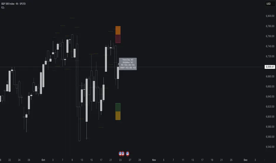
Reversal Zones// This indicator identifies likely reversal zones above and below current price by aggregating multiple technical signals:
// • Prior Day High/Low
// • Opening Range (9:30–10:00)
// • VWAP ±2 standard deviations
// • 60‑minute Bollinger Bands
// It draws shaded boxes for each base level, then computes a single upper/lower reversal zone (closest level from combined signals),
// with configurable zone width based on the expected move (EM). Within those reversal zones, it highlights an inner “strike zone”
// (percentage of the box) to suggest optimal short-option strikes for credit spreads or iron condors.
// Additional features:
// • Optional Expected Move lines from the RTH open
// • 15‑minute RSI/Mean‑Reversion and Trend‑Day confluence flags displayed in a dashboard
// • Toggles to include/exclude each signal and adjust styling
// How to use:
// 1. Adjust inputs to select which levels to include and set the expected move parameters.
// 2. Reversal boxes (red above, green below) show zones where price is most likely to reverse.
// 3. Inner strike zones (darker shading) guide optimal short-strike placement.
// 4. Dashboard confirms whether mean-reversion or trend-day conditions are active.
// Customize colors and visibility in the settings panel. Enjoy disciplined, confluence-based trade entries!
頻帶和通道
Lanxang Swing Trade V.2- Suggested settings: Base SMA Strength: 38 - ATR Multipier: 3.4 - ATR Length: 100

TrendLinePro IndicatorTrendLinePro Indicator — Simple Market Direction & Flip Detector
The TrendLinePro Indicator combines the precision of Supertrend, Money Line, and Heikin Ashi logic to create a smooth, adaptive trend line that responds intelligently to volatility using the ATR (Average True Range).
When momentum shifts, TrendLinePro instantly highlights the flip level and labels the new trend direction — helping traders stay aligned with the market’s true structure and avoid misleading noise.
Key Features
Automatic Trend Detection
Quickly identifies whether the market is in a bullish or bearish phase with a seamless color transition.
Flip Level Marker
Shows the exact price level where sentiment flipped — the line updates live as new candles form.
Visual Clarity
Green line for bullish conditions, red for bearish — clean, intuitive, and easy to read.
Smart Labels
“Bullish” and “Bearish” markers automatically appear at each reversal for instant visual confirmation.
Alerts Ready
Get notified the moment a flip occurs — stay informed without watching charts all day.
Clean Design
Minimalist and optimized for visibility — integrates effortlessly with any chart setup.
How to Use
Use the line’s direction and flips to time entries and exits with confidence.
Combine with support/resistance, volume, or order block tools for added confluence.
Adjust ATR Length and Factor to fine-tune responsiveness to your trading style.
For swing trading, the 4H or Daily chart offers the highest reliability.
For scalping, reduce the ATR period for quicker, more responsive flips.
Website: trendlineproindicator.com

The Vishnu Zone Ver 2 by Dr. Sudhir Khollam## 📜 **The Vishnu Zone — Trade When the Brahma Zone Ends**
**Author:** Dr. Sudhir Khollam (SALSA© Method of Astrology & Market Psychology)
**Category:** Volatility Phase Detection / Bollinger Band Expansion Analysis
---
### 🔶 **Concept Overview**
In the **SALSA© Market Philosophy**, every market phase follows a cosmic rhythm —
* **Brahma Phase** represents *creation and expansion* (high volatility and strong directional movement).
* **Vishnu Phase** represents *maintenance and stability* (where expansion cools down and balanced opportunities appear).
**“The Vishnu Zone”** indicator identifies the exact moments when the **Brahma Phase ends** — signaling that the expansion has completed and the market is likely to enter a more stable, tradable state.
This is a **precision-timing indicator** that helps traders avoid entering at the end of impulsive phases and instead prepare for equilibrium-based trades (mean reversion, range setups, or steady trends).
---
### ⚙️ **How It Works**
The indicator measures **Bollinger Band Width (BBW)** to quantify expansion and contraction in volatility.
1. It calculates the **adaptive expansion threshold** using the average BBW over a rolling lookback period.
2. When the current BBW **drops below** this adaptive threshold **after being above it**, the script marks it as the **end of the Brahma Phase**.
3. This moment is shown visually as:
* 🕉 **“Vishnu” label** above the candle
* A **horizontal dotted line** extending for several bars
Together, these mark a **Vishnu Zone**, where the market transitions from expansion to consolidation — an ideal time for stabilization or entry planning.
---
### 📊 **Inputs & Settings**
| Parameter | Description |
| ---------------------------------- | ------------------------------------------------------------------------------ |
| **Bollinger Band Length** | The number of bars used for SMA and standard deviation (default 20). |
| **Bollinger Multiplier** | Determines the width of Bollinger Bands (default 2.0). |
| **Adaptive Lookback Period** | Rolling window to calculate the mean BBW for dynamic adjustment (default 150). |
| **Expansion Multiplier** | Multiplies the mean BBW to define the expansion threshold (default 1.35). |
| **Horizontal Line Extension Bars** | Number of bars to extend the Vishnu Zone line into the future (default 40). |
| **Show End-of-Brahma Labels?** | Toggle 🕉 labels on/off. |
| **Show Horizontal Lines?** | Toggle Vishnu Zone lines on/off. |
---
### 🔔 **Alerts**
When the **Brahma Phase ends**, the indicator triggers an alert:
> *“Brahma Phase Ends, Vishnu has taken over.”*
This helps traders receive real-time notification of volatility contraction and possible entry zones.
---
### 🧠 **Best Practices**
* Works effectively on **5-minute to 1-hour timeframes** for intraday trading.
* Best paired with **momentum or volume filters** to confirm trend exhaustion.
* Avoid entering during rapid expansion (Brahma phase). Wait for a Vishnu signal to ensure market stabilization.
---
### 🌌 **Philosophical Interpretation (SALSA© Principle)**
Just as Vishnu sustains the universe after Brahma’s creation, the market too enters a **maintenance phase** after every burst of expansion.
Recognizing this shift allows traders to align with **cosmic rhythm and price psychology**, not just technical metrics.
---
### 🧩 **Summary**
✅ Detects when expansion volatility ends
✅ Marks transition zones between impulsive and stable phases
✅ Sends real-time alerts
✅ Adaptive and self-adjusting across markets and assets
✅ Simple, clean visualization — ideal for disciplined trading
---
### ⚡ **Use Case**
Perfect for traders who:
* Prefer **low-risk entries** after volatility spikes
* Trade **mean reversion**, **range breakouts**, or **volatility collapses**
* Believe in the **cyclic nature of market energy**
---

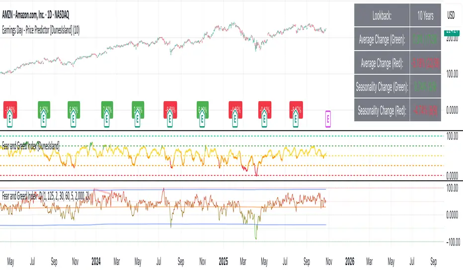
Earnings Day - Price Predictor [DunesIsland]It's designed to analyze and visualize historical stock price movements on earnings report days, focusing on percentage changes.
Here's a breakdown of what it does, step by step:
Key Inputs and Setup
User Input: There's a single input for "Lookback Years" (default: 10), which determines how far back in time (approximately) the indicator analyzes earnings data. It uses a rough calculation of milliseconds in that period to filter historical data.
Data Fetching: It uses TradingView's request.earnings function to pull actual earnings per share (EPS) data for the current ticker. Earnings days are identified where EPS data exists on a bar but not on the previous one (to avoid duplicates).
Price Change Calculation: For each detected earnings day, it computes the percentage price movement as (close - close ) / close * 100, representing the change from the previous close to the current close on that day.
Processing and Calculations (on the Last Bar)
Lookback Filter: It calculates a cutoff timestamp for the lookback period and processes only earnings events within that window.
Overall Averages:
Separates positive (≥0%) and negative (<0%) percentage changes.
Seasonality (Next Quarter Prediction):
Identifies the most recent earnings quarter (latest_q).
Predicts the "next" quarter (e.g., if latest is Q4, next is Q1;
Again, separates positive and negative changes, computing their respective averages.
Visual Outputs
Lookback: How far to fetch the data in years.
Average Change (Green): Showing the average of all positive changes.
Average Change (Red): Showing the average of all negative changes.
Seasonality Change (Green): Showing the average of positive changes for the predicted next quarter.
Seasonality Change (Red): Showing the average of negative changes for the predicted next quarter.
Purpose and Usage
This indicator helps traders assess a stock's historical reaction to earnings announcements. The overall averages give a broad sense of typical gains/losses, while the seasonality focuses on quarter-specific trends to "predict" potential movement for the upcoming earnings (based on past same-quarter performance). It's best used on daily charts for stocks with reliable earnings data. Note that quarter inference is calendar-based and may not perfectly match fiscal calendars for all companies—it's an approximation.

EchoFlowEchoFlow — Where Intelligence Becomes Rhythm
Powered by next-gen AI, EchoFlow transforms data, code, and creativity into seamless motion.
It doesn’t just automate — it anticipates.
From thought to execution, EchoFlow is the pulse of intelligent systems, syncing every action with precision, speed, and intuition.

TriAnchor Elastic Reversion US Market SPY and QQQ adaptedSummary in one paragraph
Mean-reversion strategy for liquid ETFs, index futures, large-cap equities, and major crypto on intraday to daily timeframes. It waits for three anchored VWAP stretches to become statistically extreme, aligns with bar-shape and breadth, and fades the move. Originality comes from fusing daily, weekly, and monthly AVWAP distances into a single ATR-normalized energy percentile, then gating with a robust Z-score and a session-safe gap filter.
Scope and intent
• Markets: SPY QQQ IWM NDX large caps liquid futures liquid crypto
• Timeframes: 5 min to 1 day
• Default demo: SPY on 60 min
• Purpose: fade stretched moves only when multi-anchor context and breadth agree
• Limits: strategy uses standard candles for signals and orders only
Originality and usefulness
• Unique fusion: tri-anchor AVWAP energy percentile plus robust Z of close plus shape-in-range gate plus breadth Z of SPY QQQ IWM
• Failure mode addressed: chasing extended moves and fading during index-wide thrusts
• Testability: each component is an input and visible in orders list via L and S tags
• Portable yardstick: distances are ATR-normalized so thresholds transfer across symbols
• Open source: method and implementation are disclosed for community review
Method overview in plain language
Base measures
• Range basis: ATR(length = atr_len) as the normalization unit
• Return basis: not used directly; we use rank statistics for stability
Components
• Tri-Anchor Energy: squared distances of price from daily, weekly, monthly AVWAPs, each divided by ATR, then summed and ranked to a percentile over base_len
• Robust Z of Close: median and MAD based Z to avoid outliers
• Shape Gate: position of close inside bar range to require capitulation for longs and exhaustion for shorts
• Breadth Gate: average robust Z of SPY QQQ IWM to avoid fading when the tape is one-sided
• Gap Shock: skip signals after large session gaps
Fusion rule
• All required gates must be true: Energy ≥ energy_trig_prc, |Robust Z| ≥ z_trig, Shape satisfied, Breadth confirmed, Gap filter clear
Signal rule
• Long: energy extreme, Z negative beyond threshold, close near bar low, breadth Z ≤ −breadth_z_ok
• Short: energy extreme, Z positive beyond threshold, close near bar high, breadth Z ≥ +breadth_z_ok
What you will see on the chart
• Standard strategy arrows for entries and exits
• Optional short-side brackets: ATR stop and ATR take profit if enabled
Inputs with guidance
Setup
• Base length: window for percentile ranks and medians. Typical 40 to 80. Longer smooths, shorter reacts.
• ATR length: normalization unit. Typical 10 to 20. Higher reduces noise.
• VWAP band stdev: volatility bands for anchors. Typical 2.0 to 4.0.
• Robust Z window: 40 to 100. Larger for stability.
• Robust Z entry magnitude: 1.2 to 2.2. Higher means stronger extremes only.
• Energy percentile trigger: 90 to 99.5. Higher limits signals to rare stretches.
• Bar close in range gate long: 0.05 to 0.25. Larger requires deeper capitulation for longs.
Regime and Breadth
• Use breadth gate: on when trading indices or broad ETFs.
• Breadth Z confirm magnitude: 0.8 to 1.8. Higher avoids fighting thrusts.
• Gap shock percent: 1.0 to 5.0. Larger allows more gaps to trade.
Risk — Short only
• Enable short SL TP: on to bracket shorts.
• Short ATR stop mult: 1.0 to 3.0.
• Short ATR take profit mult: 1.0 to 6.0.
Properties visible in this publication
• Initial capital: 25000USD
• Default order size: Percent of total equity 3%
• Pyramiding: 0
• Commission: 0.03 percent
• Slippage: 5 ticks
• Process orders on close: OFF
• Bar magnifier: OFF
• Recalculate after order is filled: OFF
• Calc on every tick: OFF
• request.security lookahead off where used
Realism and responsible publication
• No performance claims. Past results never guarantee future outcomes
• Fills and slippage vary by venue
• Shapes can move during bar formation and settle on close
• Standard candles only for strategies
Honest limitations and failure modes
• Economic releases or very thin liquidity can overwhelm mean-reversion logic
• Heavy gap regimes may require larger gap filter or TR-based tuning
• Very quiet regimes reduce signal contrast; extend windows or raise thresholds
Open source reuse and credits
• None
Strategy notice
Orders are simulated by TradingView on standard candles. request.security uses lookahead off where applicable. Non-standard charts are not supported for execution.
Entries and exits
• Entry logic: as in Signal rule above
• Exit logic: short side optional ATR stop and ATR take profit via brackets; long side closes on opposite setup
• Risk model: ATR-based brackets on shorts when enabled
• Tie handling: stop first when both could be touched inside one bar
Dataset and sample size
• Test across your visible history. For robust inference prefer 100 plus trades.
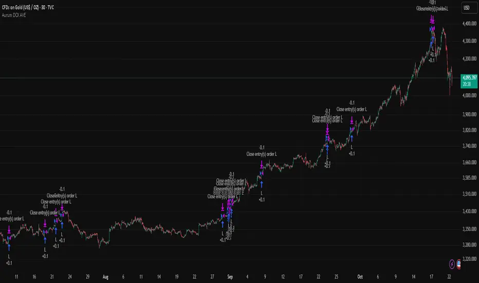
Aurum DCX AVE Gold and Silver StrategySummary in one paragraph
Aurum DCX AVE is a volatility break strategy for gold and silver on intraday and swing timeframes. It aligns a new Directional Convexity Index with an Adaptive Volatility Envelope and an optional USD/DXY bias so trades appear only when direction quality and expansion agree. It is original because it fuses three pieces rarely combined in one model for metals: a convexity aware trend strength score, a percentile based envelope that widens with regime heat, and an intermarket DXY filter.
Scope and intent
• Markets. Gold and silver futures or spot, other liquid commodities, major indices
• Timeframes. Five minutes to one day. Defaults to 30min for swing pace
• Default demo used in this publication. TVC:GOLD on 30m
• Purpose. Enter confirmed volatility breaks while muting chop using regime heat and USD bias
• Limits. This is a strategy. Orders are simulated on standard candles only
Originality and usefulness
• Unique fusion. DCX combines DI strength with path efficiency and curvature. AVE blends ATR with a high TR percentile and widens with DCX heat. DXY adds an intermarket bias
• Failure mode addressed. False starts inside compression and unconfirmed breakouts during USD swings
• Testability. Each component has a named input. Entry names L and S are visible in the list of trades
• Portable yardstick. Weekly ATR for stops and R multiples for targets
• Open source. Method and implementation are disclosed for community review
Method overview in plain language
You score direction quality with DCX, size an adaptive envelope with a blend of ATR and a high TR percentile, and only allow breaks that clear the band while DCX is above a heat threshold in the same direction. An optional DXY filter favors long when USD weakens and short when USD strengthens. Orders are bracketed with a Weekly ATR stop and an R multiple target, with optional trailing to the envelope.
Base measures
• Range basis. True Range and ATR over user windows. A high TR percentile captures expansion tails used by AVE
• Return basis. Not required
Components
• Directional Convexity Index DCX. Measures directional strength with DX, multiplies by path efficiency, blends a curvature term from acceleration, scales to 0 to 100, and uses a rise window
• Adaptive Volatility Envelope AVE. Midline ALMA or HMA or EMA plus bands sized by a blend of ATR and a high TR percentile. The blend weight follows volatility of volatility. Band width widens with DCX heat
• DXY Bias optional. Daily EMA trend of DXY. Long bias when USD weakens. Short bias when USD strengthens
• Risk block. Initial stop equals Weekly ATR times a multiplier. Target equals an R multiple of the initial risk. Optional trailing to AVE band
Fusion rule
• All gates must pass. DCX above threshold and rising. Directional lead agrees. Price breaks the AVE band in the same direction. DXY bias agrees when enabled
Signal rule
• Long. Close above AVE upper and DCX above threshold and DCX rising and plus DI leads and DXY bias is bearish
• Short. Close below AVE lower and DCX above threshold and DCX falling and minus DI leads and DXY bias is bullish
• Exit and flip. Bracket exit at stop or target. Optional trailing to AVE band
Inputs with guidance
Setup
• Symbol. Default TVC:GOLD (Correlation Asset for internal logic)
• Signal timeframe. Blank follows the chart
• Confirm timeframe. Default 1 day used by the bias block
Directional Convexity Index
• DCX window. Typical 10 to 21. Higher filters more. Lower reacts earlier
• DCX rise bars. Typical 3 to 6. Higher demands continuation
• DCX entry threshold. Typical 15 to 35. Higher avoids soft moves
• Efficiency floor. Typical 0.02 to 0.06. Stability in quiet tape
• Convexity weight 0..1. Typical 0.25 to 0.50. Higher gives curvature more influence
Adaptive Volatility Envelope
• AVE window. Typical 24 to 48. Higher smooths more
• Midline type. ALMA or HMA or EMA per preference
• TR percentile 0..100. Typical 75 to 90. Higher favors only strong expansions
• Vol of vol reference. Typical 0.05 to 0.30. Controls how much the percentile term weighs against ATR
• Base envelope mult. Typical 1.4 to 2.2. Width of bands
• Regime adapt 0..1. Typical 0.6 to 0.95. How much DCX heat widens or narrows the bands
Intermarket Bias
• Use DXY bias. Default ON
• DXY timeframe. Default 1 day
• DXY trend window. Typical 10 to 50
Risk
• Risk percent per trade. Reporting field. Keep live risk near one to two percent
• Weekly ATR. Default 14. Basis for stops
• Stop ATR weekly mult. Typical 1.5 to 3.0
• Take profit R multiple. Typical 1.5 to 3.0
• Trail with AVE band. Optional. OFF by default
Properties visible in this publication
• Initial capital. 20000
• Base currency. USD
• request.security lookahead off everywhere
• Commission. 0.03 percent
• Slippage. 5 ticks
• Default order size method percent of equity with value 3% of the total capital available
• Pyramiding 0
• Process orders on close ON
• Bar magnifier ON
• Recalculate after order is filled OFF
• Calc on every tick OFF
Realism and responsible publication
• No performance claims. Past results never guarantee future outcomes
• Shapes can move while a bar forms and settle on close
• Strategies use standard candles for signals and orders only
Honest limitations and failure modes
• Economic releases and thin liquidity can break assumptions behind the expansion logic
• Gap heavy symbols may prefer a longer ATR window
• Very quiet regimes can reduce signal contrast. Consider higher DCX thresholds or wider bands
• Session time follows the exchange of the chart and can change symbol to symbol
• Symbol sensitivity is expected. Use the gates and length inputs to find stable settings
Open source reuse and credits
• None
Mode
Public open source. Source is visible and free to reuse within TradingView House Rules
Legal
Education and research only. Not investment advice. You are responsible for your decisions. Test on historical data and in simulation before any live use. Use realistic costs.
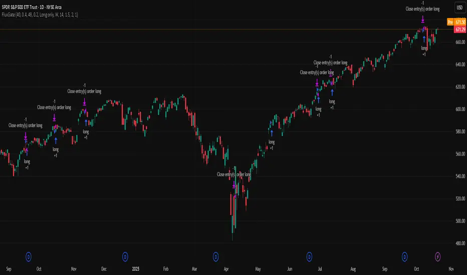
FluxGate Daily Swing StrategySummary in one paragraph
FluxGate treats long and short as different ecosystems. It runs two independent engines so the long side can be bold when the tape rewards upside persistence while the short side can stay selective when downside is messy. The core reads three directional drivers from price geometry then removes overlap before gating with clean path checks. The complementary risk module anchors stop distance to a higher timeframe ATR so a unit means the same thing on SPY and BTC. It can add take profit breakeven and an ATR trail that only activates after the trade earns it. If a stop is hit the strategy can re enter in the same direction on the next bar with a daily retry cap that you control. Add it to a clean chart. Use defaults to see the intended behavior. For conservative workflows evaluate on bar close.
Scope and intent
• Markets. Large cap equities and liquid ETFs major FX pairs US index futures and liquid crypto pairs
• Timeframes. From one minute to daily
• Default demo in this publication. SPY on one day timeframe
• Purpose. Reduce false starts without missing sustained trends by fusing independent drivers and suppressing activity when the path is noisy
• Limits. This is a strategy. Orders are simulated on standard candles. Non standard chart types are not supported for execution
Originality and usefulness
• Unique fusion. FluxGate extracts three drivers that look at price from different angles. Direction measures slope of a smoothed guide and scales by realized volatility so a point of slope does not mean a different thing on different symbols. Persistence looks at short sign agreement to reward series of closes that keep direction. Curvature measures the second difference of a local fit to wake up during convex pushes. These three are then orthonormalized so a strong reading in one does not double count through another.
• Gates that matter. Efficiency ratio prefers direct paths over treadmills. Entropy turns up versus down frequency into an information read. Light fractal cohesion punishes wrinkly paths. Together they slow the system in chop and allow it to open up when the path is clean.
• Separate long and short engines. Threshold tilts adapt to the skew of score excursions. That lets long engage earlier when upside distribution supports it and keeps short cautious where downside surprise and venue frictions are common.
• Practical risk behavior. Stops are ATR anchored on a higher timeframe so the unit is portable. Take profit is expressed in R so two R means the same concept across symbols. Breakeven and trailing only activate after a chosen R so early noise does not squeeze a good entry. Re entry after stop lets the system try again without you babysitting the chart.
• Testability. Every major window and the aggression controls live in Inputs. There is no hidden magic number.
Method overview in plain language
Base measures
• Return basis. Natural log of close over prior close for stability and easy aggregation through time. Realized volatility is the standard deviation of returns over a moving window.
• Range basis for risk. ATR computed on a higher timeframe anchor such as day week or month. That anchor is steady across venues and avoids chasing chart specific quirks.
Components
• Directional intensity. Use an EMA of typical price as a guide. Take the day to day slope as raw direction. Divide by realized volatility to get a unit free measure. Soft clip to keep outliers from dominating.
• Persistence. Encode whether each bar closed up or down. Measure short sign agreement so a string of higher closes scores better than a jittery sequence. This favors push continuity without guessing tops or bottoms.
• Curvature. Fit a short linear regression and compute the second difference of the fitted series. Strong curvature flags acceleration that slope alone may miss.
• Efficiency gate. Compare net move to path length over a gate window. Values near one indicate direct paths. Values near zero indicate treadmill behavior.
• Entropy gate. Convert up versus down frequency into a probability of direction. High entropy means coin toss. The gate narrows there.
• Fractal cohesion. A light read of path wrinkliness relative to span. Lower cohesion reduces the urge to act.
• Phase assist. Map price inside a recent channel to a small signed bias that grows with confidence. This helps entries lean toward the right half of the channel without becoming a breakout rule.
• Shock control. Compare short volatility to long volatility. When short term volatility spikes the shock gate temporarily damps activity so the system waits for pressure to normalize.
Fusion rule
• Normalize the three drivers after removing overlap
• Blend with weights that adapt to your aggression input
• Multiply by the gates to respect path quality
• Smooth just enough to avoid jitter while keeping timing responsive
• Compute an adaptive mean and deviation of the score and set separate long and short thresholds with a small tilt informed by skew sign
• The result is one long score and one short score that can cross their thresholds at different times for the same tape which is a feature not a bug
Signal rule
• A long suggestion appears when the long score crosses above its long threshold while all gates are active
• A short suggestion appears when the short score crosses below its short threshold while all gates are active
• If any required gate is missing the state is wait
• When a position is open the status is in long or in short until the complementary risk engine exits or your entry mode closes and flips
Inputs with guidance
Setup Long
• Base length Long. Master window for the long engine. Typical range twenty four to eighty. Raising it improves selectivity and reduces trade count. Lowering it reacts faster but can increase noise
• Aggression Long. Zero to one. Higher values make thresholds more permissive and shorten smoothing
Setup Short
• Base length Short. Master window for the short engine. Typical range twenty eight to ninety six
• Aggression Short. Zero to one. Lower values keep shorts conservative which is often useful on upward drifting symbols
Entries and UI
• Entry mode. Both or Long only or Short only
Complementary risk engine
• Enable risk engine. Turns on bracket exits while keeping your signal logic untouched
• ATR anchor timeframe. Day Week or Month. This sets the structural unit of stop distance
• ATR length. Default fourteen
• Stop multiple. Default one point five times the anchor ATR
• Use take profit. On by default
• Take profit in R. Default two R
• Breakeven trigger in R. Default one R
Usage recipes
Intraday trend focus
• Entry mode Both
• ATR anchor Week
• Aggression Long zero point five Aggression Short zero point three
• Stop multiple one point five Take profit two R
• Expect fewer trades that stick to directional pushes and skip treadmill noise
Intraday mean reversion focus
• Session windows optional if you add them in your copy
• ATR anchor Day
• Lower aggression both sides
• Breakeven later and trailing later so the first bounce has room
• This favors fade entries that still convert into trends when the path stays clean
Swing continuation
• Signal timeframe four hours or one day
• Confirm timeframe one day if you choose to include bias
• ATR anchor Week or Month
• Larger base windows and a steady two R target
• This accepts fewer entries and aims for larger holds
Properties visible in this publication
• Initial capital 25.000
• Base currency USD
• Default order size percent of equity value three - 3% of the total capital
• Pyramiding zero
• Commission zero point zero three percent - 0.03% of total capital
• Slippage five ticks
• Process orders on close off
• Recalculate after order is filled off
• Calc on every tick off
• Bar magnifier off
• Any request security calls use lookahead off everywhere
Realism and responsible publication
• No performance promises. Past results never guarantee future outcomes
• Fills and slippage vary by venue and feed
• Strategies run on standard candles only
• Shapes can update while a bar is forming and settle on close
• Keep risk per trade sensible. Around one percent is typical for study. Above five to ten percent is rarely sustainable
Honest limitations and failure modes
• Sudden news and thin liquidity can break assumptions behind entropy and cohesion reads
• Gap heavy symbols often behave better with a True Range basis for risk than a simple range
• Very quiet regimes can reduce score contrast. Consider longer windows or higher thresholds when markets sleep
• Session windows follow the exchange time of the chart if you add them
• If stop and target can both be inside a single bar this strategy prefers stop first to keep accounting conservative
Open source reuse and credits
• No reused open source beyond public domain building blocks such as ATR EMA and linear regression concepts
Legal
Education and research only. Not investment advice. You are responsible for your decisions. Test on history and in simulation with realistic costs
Trend Telescope v4 Basic Configuration
pine
// Enable only the components you need
Order Flow: ON
Delta Volume: ON
Volume Profile: ON
Cumulative Delta: ON
Volatility Indicator: ON
Momentum Direction: ON
Volatility Compression: ON
📊 Component Breakdown
1. Order Flow Analysis
Purpose: Identifies buying vs selling pressure
Visual: Histogram (Green=Buying, Red=Selling)
Calculation: Volume weighted by price position
Usage: Spot institutional order blocks
2. Delta Volume Values
Purpose: Shows volume imbalance
Bull Volume (Green): Volume on up bars
Bear Volume (Red): Volume on down bars
Usage: Identify volume divergences
3. Anchored Volume Profile
Purpose: Finds high-volume price levels
POC (Point of Control): Price with highest volume
Profile Length: Adjustable (default: 50 bars)
Usage: Identify support/resistance zones
4. Cumulative Volume Delta
Purpose: Tracks net buying/selling pressure over time
Trend Analysis: Rising=Buying pressure, Falling=Selling pressure
Divergence Detection: Price vs Delta divergences
Usage: Confirm trend strength
5. Volatility Indicator
Purpose: Measures market volatility with cycle detection
Volatility Ratio: ATR as percentage of price
Volatility Cycle: SMA of volatility (identifies periods)
Histogram: Difference between current and average volatility
Usage: Adjust position sizing, identify breakout setups
6. Real-time Momentum Direction
Purpose: Multi-factor momentum assessment
Components: Price momentum (50%), RSI momentum (30%), Volume momentum (20%)
Visual: Line plot with color coding
Labels: Clear BULLISH/BEARISH/NEUTRAL signals
Usage: Trend confirmation, reversal detection
7. Volatility Compression Analysis
Purpose: Identifies low-volatility consolidation periods
Compression Detection: True Range below threshold
Strength Meter: How compressed the market is
Histogram: Red when compressed, Gray when normal
Usage: Predict explosive moves, prepare for breakouts
⚙️ Advanced Configuration
Optimal Settings for Different Timeframes
pine
// Scalping (1-15 min)
Profile Length: 20
ATR Period: 10
Momentum Length: 8
Compression Threshold: 0.3
// Day Trading (1H-4H)
Profile Length: 50
ATR Period: 14
Momentum Length: 14
Compression Threshold: 0.5
// Swing Trading (Daily)
Profile Length: 100
ATR Period: 20
Momentum Length: 21
Compression Threshold: 0.7
Alert Setup Guide
Enable "Enable Alerts" in settings
Choose alert types:
Momentum Alerts: When momentum changes direction
Compression Alerts: When volatility compression begins
Set alert frequency to "Once Per Bar"
Configure notification preferences
🎯 Trading Strategies
Strategy 1: Compression Breakout
pine
Entry Conditions:
1. Volatility Compression shows RED histogram
2. Cumulative Delta trending upward
3. Momentum turns BULLISH
4. Price breaks above POC level
Exit: When Momentum turns BEARISH or Compression ends
Strategy 2: Momentum Reversal
pine
Entry Conditions:
1. Strong Order Flow in opposite direction
2. Momentum divergence (price makes new high/low but momentum doesn't)
3. Volume confirms the reversal
Exit: When Order Flow returns to trend direction
Strategy 3: Institutional Accumulation
pine
Identification:
1. High Cumulative Delta but flat/sideways price
2. Consistent Order Flow in one direction
3. Volume Profile shows accumulation at specific levels
Trade: Enter in direction of Order Flow when price breaks level
📈 Interpretation Guide
Bullish Signals
✅ Order Flow consistently green
✅ Cumulative Delta making higher highs
✅ Momentum above zero and rising
✅ Bull Volume > Bear Volume
✅ Price above POC level
Bearish Signals
✅ Order Flow consistently red
✅ Cumulative Delta making lower lows
✅ Momentum below zero and falling
✅ Bear Volume > Bull Volume
✅ Price below POC level
Caution Signals
⚠️ Momentum divergence (price vs indicator)
⚠️ Volatility compression (potential big move coming)
⚠️ Mixed signals across components
🔧 Troubleshooting
Common Issues & Solutions
Problem: Indicators not showing
Solution: Check "Show on Chart" is enabled
Problem: Alerts not triggering
Solution: Verify alert is enabled in both script and TradingView alert panel
Problem: Performance issues
Solution: Reduce number of enabled components or increase timeframe
Problem: Volume Profile not updating
Solution: Adjust Profile Length setting, ensure sufficient historical data
Performance Optimization
Disable unused components
Increase chart timeframe
Reduce historical bar count
Use on lower timeframes with fewer indicators enabled
💡 Pro Tips
Risk Management
Use Volatility Indicator for position sizing
Monitor Cumulative Delta for trend confirmation
Use POC levels for stop-loss placement
Multi-Timeframe Analysis
Use higher timeframe for trend direction
Use current timeframe for entry timing
Correlate signals across timeframes
Market Condition Adaptation
Trending Markets: Focus on Momentum + Order Flow
Ranging Markets: Focus on Volume Profile + Compression
High Volatility: Use smaller position sizes
Low Volatility: Prepare for compression breakouts
📚 Educational Resources
Key Concepts to Master
Volume-price relationships
Market microstructure
Institutional order flow
Volatility regimes
Momentum vs mean reversion
Recommended Learning Path
Start with Order Flow + Momentum only
Add Volume Profile once comfortable
Incorporate Volatility analysis
Master multi-component correlation
🆘 Support
Getting Help
Check component toggles are enabled
Verify sufficient historical data is loaded
Test on major pairs/indices first
Adjust settings for your trading style
Continuous Improvement
Backtest strategies thoroughly
Keep a trading journal
Adjust parameters based on market conditions
Combine with price action analysis
Remember: No indicator is perfect. Use this tool as part of a comprehensive trading plan with proper risk management. Always test strategies in demo accounts before live trading.
Happy Trading! 📈

Dual ATR Trailing Stop with Buy/Sell SignalsThis indicator applies two ATR-based trailing stops (Fast and Slow) together with a four-state market classifier to visualize trend strength and place crossover Buy/Sell markers. It is a trend-following tool and does not predict future prices. Use it alongside independent analysis and risk management.
How it works
The Fast trail uses ATR with period 5 and multiplier 0.5 by default. The Slow trail uses ATR with period 10 and multiplier 3.0 by default. When price remains above the prior trail, the new trail equals the maximum of the previous trail and close minus the stop-loss distance derived from ATR. When price remains below the prior trail, the new trail equals the minimum of the previous trail and close plus that distance. On a side switch the trail is re-anchored from the current bar. The Fast trail reacts more quickly, while the Slow trail aims to confirm direction and filter noise.
Signals
Buy is when the Fast trail crosses above the Slow trail. Sell is when the Fast trail crosses below the Slow trail. These crossovers are continuation cues rather than standalone trade advice.
Four-state coloring
Strong Bull occurs when Fast is above Slow, the close is above Slow, and the low is above Slow. Bull with Pullback occurs when Fast is above Slow and the close is above Slow, but the low dips below Slow. Strong Bear occurs when Slow is above Fast, the close is below Slow, and the high is below Slow. Bear with Bounce occurs when Slow is above Fast and the close is below Slow, but the high pierces above Slow.
Directional bias
Bias is inferred by comparing which of Strong Bull or Strong Bear occurred more recently using a barsSince comparison. The most recent state defines the current bias and can help filter frequent flips in ranges.
Inputs
You can adjust Fast ATR period from 1 to 50 and its multiplier from 0.1 to 5.0. You can adjust Slow ATR period from 1 to 50 and its multiplier from 0.1 to 10.0. Optional toggles control candle coloring, trail visibility, fill between trails, alerts, and the information panel.
On-chart outputs
The indicator plots the Fast trail and the Slow trail, with optional fill between them. It can show Buy and Sell markers at crossovers. The optional information panel can display last signal side, entry price, current price, P&L since last signal, current market state, Fast and Slow ATR values, and inferred bias.
Alerts
Available alerts are Fast crossing above Slow, Fast crossing below Slow, entering Strong Bull, and entering Strong Bear.
Usage guidelines
For trend following, many users wait for a Buy crossover together with Strong Bull coloring and then manage risk against the Slow trail. For scalping, consider lower timeframes and a smaller Fast ATR such as period 3 and multiplier 0.3, while avoiding over-optimization. When publishing screenshots, use a clean chart with the symbol, timeframe, and the indicator’s name visible.
Limitations and realism
The tool works best in directional markets; ranging conditions may cause frequent side switches. It is designed for standard OHLC charts only and is not intended for Heikin Ashi, Renko, Kagi, Point & Figure, or Range charts. No claims are made about accuracy, profits, or future performance. Always use position sizing, stop-losses, and additional confirmation.
Compatibility and version
Pine Script v6. Default inputs in the publication match the values described above. Version 1.0 initial public release.
Notes
For questions and feedback, please use the comments section on the script page.

Smooth Theil-SenI wanted to build a Theil-Sen estimator that could run on more than one bar and produce smoother output than the standard implementation. Theil-Sen regression is a non-parametric method that calculates the median slope between all pairs of points in your dataset, which makes it extremely robust to outliers. The problem is that median operations produce discrete jumps, especially when you're working with limited sample sizes. Every time the median shifts from one value to another, you get a step change in your regression line, which creates visual choppiness that can be distracting even though the underlying calculations are sound.
The solution I ended up going with was convolving a Gaussian kernel around the center of the sorted lists to get a more continuous median estimate. Instead of just picking the middle value or averaging the two middle values when you have an even sample size, the Gaussian kernel weights the values near the center more heavily and smoothly tapers off as you move away from the median position. This creates a weighted average that behaves like a median in terms of robustness but produces much smoother transitions as new data points arrive and the sorted list shifts.
There are variance tradeoffs with this approach since you're no longer using the pure median, but they're minimal in practice. The kernel weighting stays concentrated enough around the center that you retain most of the outlier resistance that makes Theil-Sen useful in the first place. What you gain is a regression line that updates smoothly instead of jumping discretely, which makes it easier to spot genuine trend changes versus just the statistical noise of median recalculation. The smoothness is particularly noticeable when you're running the estimator over longer lookback periods where the sorted list is large enough that small kernel adjustments have less impact on the overall center of mass.
The Gaussian kernel itself is a bell curve centered on the median position, with a standard deviation you can tune to control how much smoothing you want. Tighter kernels stay closer to the pure median behavior and give you more discrete steps. Wider kernels spread the weighting further from the center and produce smoother output at the cost of slightly reduced outlier resistance. The default settings strike a balance that keeps the estimator robust while removing most of the visual jitter.
Running Theil-Sen on multiple bars means calculating slopes between all pairs of points across your lookback window, sorting those slopes, and then applying the Gaussian kernel to find the weighted center of that sorted distribution. This is computationally more expensive than simple moving averages or even standard linear regression, but Pine Script handles it well enough for reasonable lookback lengths. The benefit is that you get a trend estimate that doesn't get thrown off by individual spikes or anomalies in your price data, which is valuable when working with noisy instruments or during volatile periods where traditional regression lines can swing wildly.
The implementation maintains sorted arrays for both the slope calculations and the final kernel weighting, which keeps everything organized and makes the Gaussian convolution straightforward. The kernel weights are precalculated based on the distance from the center position, then applied as multipliers to the sorted slope values before summing to get the final smoothed median slope. That slope gets combined with an intercept calculation to produce the regression line values you see plotted on the chart.
What this really demonstrates is that you can take classical statistical methods like Theil-Sen and adapt them with signal processing techniques like kernel convolution to get behavior that's more suited to real-time visualization. The pure mathematical definition of a median is discrete by nature, but financial charts benefit from smooth, continuous lines that make it easier to track changes over time. By introducing the Gaussian kernel weighting, you preserve the core robustness of the median-based approach while gaining the visual smoothness of methods that use weighted averages. Whether that smoothness is worth the minor variance tradeoff depends on your use case, but for most charting applications, the improved readability makes it a good compromise.


Constant Auto Trendlines (Extended Right)📈 Constant Auto Trendlines (Extended Right)
This indicator automatically detects market structure by connecting swing highs and lows with permanent, forward-projecting trendlines.
Unlike standard trendline tools that stop at the last pivot, this version extends each trendline infinitely into the future — helping traders visualize where price may react next.
🔍 How It Works
The script identifies pivot highs and lows using user-defined left/right bar counts.
When a new lower high or higher low appears, the indicator draws a line between the two pivots and extends it forward using extend.right.
Each new confirmed trendline stays fixed, creating a historical map of structure that evolves naturally with market action.
Optional filters:
Min Slope – ignore nearly flat trendlines
Show Latest Only – focus on the most relevant trendline
Alerts – get notified when price crosses the most recent uptrend or downtrend line
🧩 Why It’s Useful
This tool helps traders:
Spot emerging trends early
Identify dynamic support/resistance diagonals
Avoid redrawing trendlines manually
Backtest structure breaks historically
⚙️ Inputs
Pivot Left / Right bars
Min slope threshold
Line color, width, and style
Show only latest line toggle
Alert options

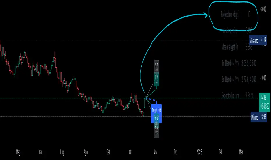
Statistical Projection over N Days (drift + σ) – v1.2 [EN]🧭 Overview
“Statistical Projection over N Days (drift + σ)” is a quantitative forecasting model that estimates the expected future price range of any asset over a chosen horizon (default = 10 days).
It combines average drift (trend direction) and historical volatility (σ) to produce a probabilistic cone of future price movement.
The indicator displays:
a blue dashed line (expected price path),
1σ / 2σ deviation bands (volatility envelopes),
and a summary table with the key forecast values and expected return.
⚙️ Core Logic (Explained Simply)
The indicator analyses recent price behavior to estimate two key elements:
the average daily tendency of the market (called drift), and
the average daily variability (called volatility).
Here’s how it works, step by step:
Measures daily percentage changes (using logarithmic returns) to understand how much the price typically moves from one bar to the next.
It then calculates the average of those returns over a chosen historical window (for example, 70 bars).
If the average is positive → the market has a rising tendency (upward drift).
If the average is negative → the market tends to decline (downward drift).
At the same time, it computes the standard deviation of those returns — this shows how “wide” the movements are, i.e. how volatile the asset is.
Using these two measures — drift and volatility — it estimates where the price is statistically expected to move over the next N bars:
The mean projection (blue dashed line) represents the most likely price path.
The 1σ and 2σ lines (teal and gray) define confidence zones, where price is expected to remain about 68% and 95% of the time, respectively.
The model updates continuously with every new bar, recalculating both drift and volatility, so the projection cone expands, contracts, or changes direction depending on the latest market behavior.
📉 Interpretation of the Blue Line
The blue dashed line (pMean) is the statistical forecast path of price over the next N bars.
🔹 When the blue line is below the current price
The recent drift (average log return) is negative → the model expects a gradual decline.
Interpretation:
The prevailing statistical bias is bearish — the market is expected to move lower toward equilibrium.
🔹 When the blue line is above the current price
The recent drift is positive → the model expects a continued rise.
Interpretation:
The price is statistically likely to trend upward, maintaining momentum in the direction of the current drift.
🔹 When the blue line is sloping upward
The mean projection pMean is rising with each new bar.
Indicates positive drift → the average daily return is positive.
Interpretation:
The asset is in a growth phase; volatility bands act as potential expansion corridors.
🔹 When the blue line is sloping downward
The mean projection pMean decreases bar after bar.
Indicates negative drift → average daily return is negative.
Interpretation:
The asset is in a corrective or declining phase, with volatility determining potential drawdown limits.
🔹 When the blue line is flat
The drift (μ) is approximately zero.
Interpretation:
The model sees no directional bias; price equilibrium dominates.
Expect a sideways range unless new volatility (σ) expansion occurs.
📈 How to Read the Entire Projection
Blue dashed line → expected mean path (most probable price trajectory).
Teal lines (±1σ) → statistically normal range (≈68% of future outcomes).
Gray lines (±2σ) → extreme bounds (≈95% of outcomes).
Labels on the right show exact forecast prices for each band.
If the actual price moves outside the gray 2σ range →
→ it signals volatility breakout or regime shift, meaning the past volatility no longer explains the present movement.
🧮 Summary Table
Located at the top-right corner, it provides:
Field Description
Projection (days) Number of bars used for projection (h).
Anchor price Starting close used for forecast.
Mean target (h) Expected price after h bars (blue line endpoint).
1σ Band (↓ / ↑) 68% confidence interval.
2σ Band (↓ / ↑) 95% confidence interval.
Expected return Projected % change from current close to mean target.
Colors can be customized — for example:
white headers,
aqua for anchor price,
lime for target,
orange/red for σ bands,
yellow for expected return.
🧠 Practical Meaning
Blue Line State Interpretation Bias
Above price, rising Ongoing positive drift Bullish
Below price, falling Negative drift Bearish
Flat, near price Neutral drift Sideways
Steep slope Strong directional momentum Trend confirmation
Price > +2σ band Excess volatility / overextension Possible correction
Price < −2σ band Undervaluation or panic Reversion likely
⚡ Summary
Aspect Description
Purpose Statistical forecast of expected price range
Method Drift (μ) + Volatility (σ) from log returns
Outputs Mean projection (blue), 1σ & 2σ bands, expected return
Interpretation Directional bias from blue line and its slope
Recommended timeframe Daily
Best use Trend confirmation, probabilistic target estimation, volatility analysis.
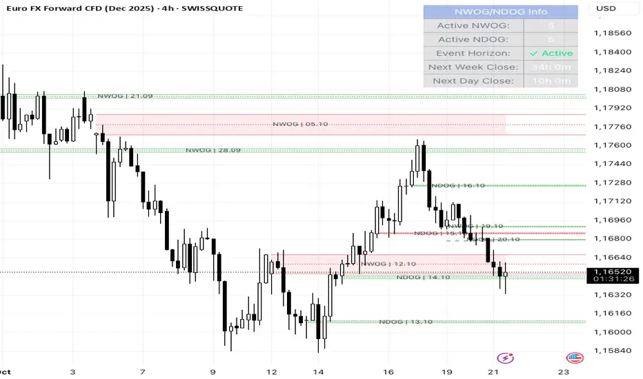
NWOG/NDOG + EHPDA🌐 ENGLISH DESCRIPTION
Hybrid NWOG/NDOG + EHPDA – Advanced Gaps & Event Horizon Indicator
(Enhanced with Real-Time Alerts and Info Table)
📊 Overview
This advanced indicator combines automatic detection of weekly gaps (NWOG) and daily gaps (NDOG) with the Event Horizon (EHPDA) concept, now featuring customizable alerts and a real-time info table for a more efficient trading experience. Designed for traders who operate based on institutional price structures, liquidity zones, and SMC/ICT confluences.
✨ Key Features
1. Gap Detection & Visualization
NWOG (New Week Opening Gap): Identifies and visualizes the gap between Friday’s close and Monday’s open.
NDOG (New Day Opening Gap): Detects daily gaps on intraday timeframes.
Enhanced visualization: Semi-transparent boxes, price levels (top, middle, bottom), and lines extended to the current bar.
Customizable labels: Display gap formation date and price levels (optional).
2. Event Horizon (EHPDA)
Automatically calculates the Event Horizon level between two non-overlapping gaps.
Dashed line marking the equilibrium zone between bullish and bearish gaps.
3. Advanced 5pm-6pm Mode
Special option to detect the Sunday-Monday gap using 4H bars.
4. Real-Time Alerts
New gaps (NWOG/NDOG): Immediate notification when a new gap forms.
Gap fill: Alert when price completely fills a gap.
Event Horizon active: Notification when the Event Horizon level is triggered.
5. Info Table
Real-time display: number of active gaps, Event Horizon status, time remaining until weekly/daily close.
Customizable: position, size, and style.
🎨 Customization
Configurable colors for bullish gaps, bearish gaps, and Event Horizon line.
Customizable price labels and date format.
📈 Use Cases
Reversal trading, price targets, liquidity zones, SMC/ICT confluences.
⚙️ Recommended Settings
Timeframes: Daily and intraday (15m, 1H, 4H, etc.).
NWOG: Enable on all timeframes.
NDOG: Enable only on intraday.
Max Gaps: 3-5 for clean charts, 10-15 for historical analysis.
📝 Important Notes
Works best on 24/5 markets (Forex, Crypto).
Gaps automatically close when filled.
Event Horizon only appears with at least 2 non-overlapping gaps.
VBE Pro - Advanced Volatility Bands with Zero Lag & PredictionVBE Pro: Zero-Lag Predictive Bands
A next-gen volatility envelope that blends zero-lag smoothing with forward-looking volatility models (EWMA/GARCH/HAR/ML) to keep bands tight in calm markets, responsive in shocks, and adaptive across regimes.
What it does
Builds volatility from multiple methods (ATR, StDev, Parkinson, Garman-Klass, Rogers-Satchell, Yang-Zhang).
Projects near-term vol with your choice of predictor, then blends it via a weight slider.
Applies zero-lag smoothing (ZLEMA/ZLMA/DEMA/TEMA/HMA/JMA/Ehlers/Kalman/T3) to cut delay without over-shoot.
Auto-adapts band width by regime (high/low/normal) and can expand dynamically with price acceleration.
Optional displacement to align with your execution style.
On-chart
Upper/Lower zero-lag bands with optional fill.
Middle line (ZL-smoothed source).
Regime-tinted background (High/Low).
Displacement marker (if used).
Compact top-right info table: current vs predicted vol, regime, squeeze, multiplier, methods, ZL gain, est. lag reduction.
Signals & Alerts
Break↑ / Break↓ when price crosses the bands.
Vol↑ / Vol↓ expansion/contraction sequences.
“Squeeze” when band width compresses vs its ZL average.
“ZL” marker when significant zero-lag is active.
Prediction divergence ⚠ when projected vol deviates > threshold.
Built-in alertconditions for all of the above.
Quick start
Method: ATR or Hybrid for robustness.
Smoothing: ZLEMA, length 5–8, ZL gain 2–3 (push higher only if you accept more projection).
Bands: Multiplier 2.0, Adaptive on, Dynamic off to start.
Prediction: EWMA, weight 0.25–0.35. Move to GARCH in mean-reverty tapes; HAR-RV for mixed regimes.
Regime lookback: 50.

PulseRPO Zero-Lag BandsPulseRPO is a momentum and volatility timing suite built on a zero-lag Relative Price Oscillator. It pairs an RPO (fast vs slow MA spread, in %) with adaptive volatility envelopes that tighten or widen as conditions change, so you can spot true momentum bursts, exhaustion and “quiet-before-the-move” squeezes—without the usual MA lag.
What it shows
Zero-Lag RPO: Choose EMA, SMA, WMA, RMA, HMA or ZLEMA for the base, then apply ZLEMA/DEMA/TEMA/HMA zero-lag smoothing to cut delay.
Adaptive Bands: StdDev, ATR, Range or Hybrid volatility; bands auto-tighten in high vol and widen in quiet regimes.
Dynamic OB/OS: Levels scale with current regime so extremes mean something even as volatility shifts.
Signal & Histogram: Classic signal cross plus histogram for quick read of acceleration vs deceleration.
Squeeze Paint: Subtle background highlight when band width compresses below its average.
Divergences & Triggers: Optional bullish/bearish divergence tags, plus band-cross and signal-cross alerts out of the box.
How to use it (general guide)
Momentum entries: Look for RPO crossing up its signal from below or snapping out of a squeeze; extra weight if it also re-enters from below the lower band.
Trend continuation: RPO riding outside the upper (or lower) band with rising histogram = power move; trail risk on pullbacks to the signal line.
Exhaustion / fades: Taps beyond dynamic OB/OS or band re-entries can mark mean-revert windows—confirm with price/volume.
Risk filter: During squeeze, size down and prepare for expansion; after expansion, respect extremes.
Tweak the MA type, band method and zero-lag strength to match your timeframe. PulseRPO is designed to be a self-contained read: regime → setup → trigger → alert.

Trend Strength Detector TSDTrend Strength Detector (TSD)
*Objective Trend Quality Measurement for Educational Market Analysis*
Note: This mathematical framework is a proprietary quantitative model developed by Ario Pinelab, inspired by classical EMA, ADX, RSI and MACD principles, yet not documented in any public technical or academic publication.
## 🎯 Purpose & Design Philosophy
The ** Trend Strength Detector- TSD ** is an educational research tool that provides **quantitative measurement of trend quality** through two independent scoring systems (0-100 scale). It answers the analytical question: *"How strong and aligned is the current market trend environment?"*
This indicator is designed with a **modular, complementary approach** to work alongside various analysis methodologies, particularly pattern-based recognition systems.
## 🔗 Complementary Research Framework
### Designed to Work With Pattern Detection Systems
This indicator provides **environmental context measurement** that complements qualitative pattern recognition tools. It works particularly well alongside systems like:
- **RMBS Smart Detector - Multi-Factor Momentum System**
- Traditional chart pattern analyzers
- Any momentum-based pattern identification tools
🔍 **To find RMBS Smart Detector:**
- Search in TradingView Indicators Library: `" RMBS Smart Detector - Multi-Factor Momentum System"`
- Look for: *Multi-Factor Momentum System*
- By author: ` `
### Why This Complementary Approach?
**Trend Quality Measurement** (TSD - this tool) provides:
- ✅ Structural trend alignment (0-100 score)
- ✅ Momentum intensity levels (0-100 score)
- ✅ Environment classification (Strong/Moderate/Weak)
- 📌 **Answers:** *"HOW STRONG is the underlying trend environment?"*
### Educational Research Value
When used together in a research context, these tools enable systematic study of questions like:
- How do reversal patterns behave when Strength Score is above 70 vs below 30?
- Do continuation patterns in weakening environments (declining scores) show different characteristics?
- What is the correlation between high Alignment Scores and pattern "success rates"?
- Can environment classification help identify genuine trend initiation vs false starts?
⚠️ **Important Note:** Both tools are **independent and work standalone**. TSD provides value whether used alone or with other analysis methods. The relationship with RMBS (or any pattern tool) is **complementary for research purposes**, not dependent.
---
###Mathematical Foundation
##TSA Formula: scoring method developed by Ario
-Trend Model (0 – 100)
TAS = EMA Alignment (0–40) + Price Position (0–30) + Trend Consistency (0–30)
EMA Alignment checks EMA_fast vs EMA_slow vs EMA_trend structure.
Price Position evaluates if Close is above/below all EMAs.
Consistency = 3 × max(bullish,bearish bars within 10 candles).
-Strength Model (0 – 100)
Strength = ADX (0–50) + EMA Slope (0–25) + RSI (0–15) + MACD (0–10)
ADX measures trend energy; Slope shows EMA momentum %;
RSI assesses zone positioning; MACD confirms directional agreement.
Note: This formula represents a proprietary quantitative model by Ario_Pinelab, inspired by classical technical concepts but not published in any external reference.________________________________________
📊 Environment Classification
Based on Total Strength Score:
🟢 Strong Environment: Score ≥ 60
→ Well-defined momentum, clear directional bias
🟡 Moderate Environment: 40 ≤ Score < 60
→ Mixed signals, transitional conditions
🔴 Weak Environment: Score < 40
→ Ranging, choppy, low conviction movement
Color Coding:
• Green background: Strong (≥60)
• Yellow background: Moderate (40-59)
• Red background: Weak (<40)
________________________________________
📈 Visual Components
Main Chart Display
Score Labels (Top-Right Corner):
┌─────────────────────────────────┐
│ 📊 Alignment: 75 | Strength: 82 │
│ Environment: Strong 🟢 │
└─────────────────────────────────┘
Color-Coded Background:
• Environment strength visually indicated via background color
• Helps quick identification of market regime
• Customizable transparency (default: 90%)
Reference Lines:
• Dotted line at 60: Strong/Moderate threshold
• Dotted line at 40: Moderate/Weak threshold
• Mid-line at 50: Neutral reference
________________________________________
🔧 Customization Settings
Input Parameters
The best setting is the default mode.
🚫 Important Disclaimers & Limitations
What This Indicator IS:
✅ Educational measurement tool for trend quality research
✅ Quantitative assessment of current market environment
✅ Complementary analysis tool for pattern-based systems
✅ Historical data analyzer for systematic study
✅ Multi-factor scoring system based on technical calculations
What This Indicator IS NOT:
❌ NOT a trading system or signal generator
❌ NOT financial advice or trade recommendations
❌ NOT predictive of future price movements
❌ NOT a guarantee of pattern success/failure
❌ NOT a substitute for comprehensive risk management
________________________________________
Known Limitations
1. Lagging Nature:
⚠️ All components (EMA, ADX, RSI, MACD) are calculated
from historical price data
→ Scores reflect CURRENT and RECENT conditions
→ Cannot predict sudden reversals or black swan events
→ Trend measurements lag actual price turning points
2. Whipsaw Risk:
⚠️ In choppy/ranging markets, scores may fluctuate rapidly
→ Moderate zone (40-60) can see frequent transitions
→ Low timeframes more susceptible to noise
→ Consider higher timeframes for stable measurements
3. Component Conflicts:
⚠️ Individual components may disagree
→ Example: Strong ADX but weak RSI alignment
→ Scores average these conflicts (may hide nuance)
→ Check individual components for deeper insight
4. Not Predictive:
⚠️ High scores do NOT guarantee continuation
⚠️ Low scores do NOT guarantee reversal
→ Measurement ≠ Prediction
→ Use for CONTEXT, not SIGNALS
→ Combine with comprehensive analysis
________________________________________
Risk Acknowledgments
Market Risk:
• All trading involves substantial risk of loss
• Past performance (even systematic studies) does not guarantee future results
• No indicator, system, or methodology can eliminate market risk
Measurement Limitations:
• Scores are mathematical calculations, not market predictions
• Environmental classification is descriptive, not prescriptive
• Strong measurements can deteriorate rapidly without warning
Educational Purpose:
• This tool is designed for LEARNING about market structure
• Not designed, tested, or validated as a standalone trading system
• Any trading decisions are user’s sole responsibility
No Warranty:
• Indicator provided “as-is” for educational purposes
• No guarantee of accuracy, reliability, or profitability
• Users must verify calculations and apply critical thinking
Open Source
Full Pine Script code available for educational study and modification. Feedback and improvement suggestions welcome.
“All logic is presented for research and educational visualization.”
---
**Attribution & Fair Use Notice**
The Trend Strength Detector (TSD) scoring framework (Multi-Factor Momentum System) was originally designed and formulated by *Ahmadrezarahmati( Ario or Ario_ Pine Lab)*.
If you build upon, modify, or republish this logic—please include proper attribution to the original author. This request is made under a spirit of open collaboration and educational fairness.
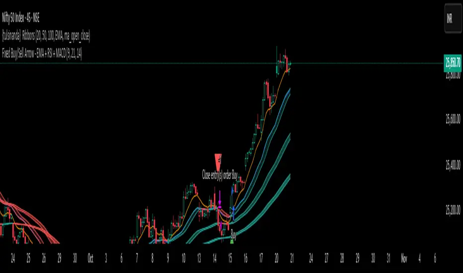
tulsinanda Ribbonsbest above any band buy n cross down sell .bbbbbbbbbbbbbbbbbbbbbbbbbbbbbbbbbbbbbbbbbbbbbbbbbbbbbbbbbbbbbbbbbbbbbbbbbbbbbbbbbbbbbbbbbbbbbbbbbbbbbbbbbbbbbbbbbbbbbbbbbbbbbbbbbbbbbbbbbbbbbbbbbbbbbbbbbbbbbbbbbbbbbbbbbbbbbbbbest indicator here line above is buy n lines down is sell .here analysis wave n price up n down we want tobest indicator here line above is buy n lines down is sell .here analysis wave n price up n down we want tobest indicator here line above is buy n lines down is sell .here analysis wave n price up n down we want tobest indicator here line above is buy n lines down is sell .here analysis wave n price up n down we want tobest indicator here line above is buy n lines down is sell .here analysis wave n price up n down we want tobest indicator here line above is buy n lines down is sell .here analysis wave n price up n down we want to
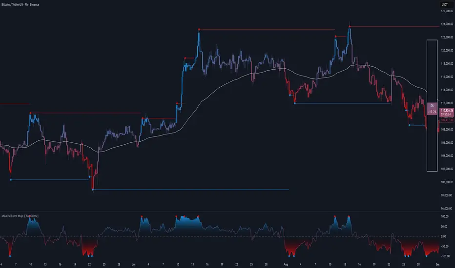
MA Oscillator Map [ChartPrime]⯁ OVERVIEW
The MA Oscillator Map transforms moving average deviations into an oscillator framework that highlights overextended price conditions. By normalizing the difference between price and a chosen moving average, the tool maps oscillations between -100 and +100 , with gradient coloring to emphasize bullish and bearish momentum. When the oscillator cools from extreme levels (-100/100), the indicator marks potential reversal points and extends short-term levels from those extremes. A compact side table and dynamic bar coloring make momentum context visible at a glance.
⯁ KEY FEATURES
Oscillator Mapping (±100 Scale):
Price deviation from the selected MA is normalized into a percentage scale, allowing consistent overbought/oversold readings across assets and timeframes.
// MA
MA = ma(close, maLengthInput, maTypeInput)
diff = src - MA
maxVal = ta.highest(math.abs(diff), 50)
osc = diff / maxVal * 100
Customizable MA Types:
Choose SMA, EMA, SMMA, WMA, or VWMA to fine-tune the smoothing method that powers the oscillator.
Extreme Signal Diamonds:
When the oscillator retreats from +100 or -100, the script plots diamonds to flag potential exhaustion and reversal zones.
Dynamic Levels from Extremes:
Upper and lower dotted lines extend from recent overextension points, projecting temporary barriers until broken by price.
Gradient Bar Coloring:
Candles and oscillator values adopt a bullish-to-bearish gradient, making shifts in momentum instantly visible on the chart.
Compact Momentum Map:
A table at the chart’s edge plots the oscillator position with a gradient scale and live percentage label for precise momentum tracking.
⯁ USAGE
Watch for diamonds after the oscillator exits ±100 — these mark potential exhaustion zones.
Use extended dotted levels as short-term reference lines; if broken, trend continuation is favored.
Combine gradient bar coloring with oscillator shifts for confirmation of momentum reversals.
Experiment with different MA types to adapt sensitivity for trending vs. ranging markets.
Use the side momentum table as a quick-read gauge of trend strength in percent terms.
⯁ CONCLUSION
The MA Oscillator Map reframes moving average deviations into a visual momentum tracker with extremes, reversal signals, and dynamic levels. By blending oscillator math with intuitive visuals like gradient candles, diamonds, and a live gauge, it helps traders spot overextension, exhaustion, and momentum shifts across any market.
om bdethis is to make research this is to make research this is to make research this is to make research