頻帶和通道
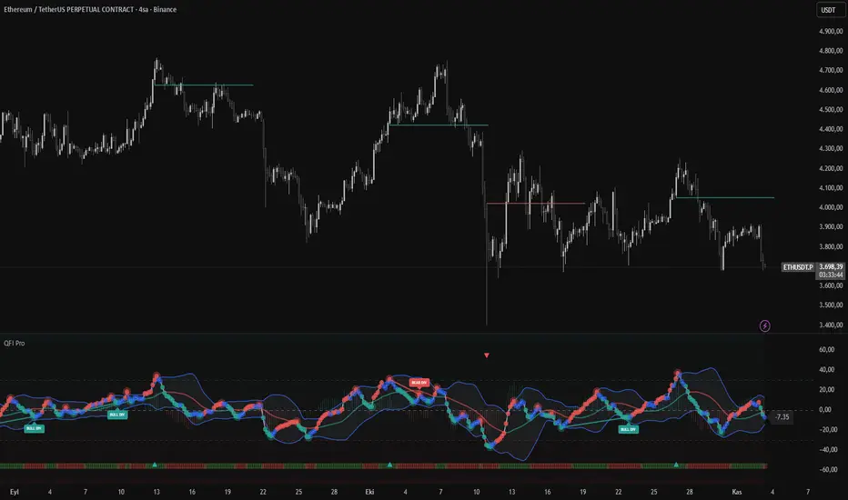
QFI Pro - Adaptive Flow with SCT & Divergence Scanner█ OVERVIEW
QFI Pro is an advanced momentum oscillator combining adaptive volume flow analysis, pattern recognition, and multi-timeframe divergence detection. Features proprietary Support/Challenge/Test (SCT) line system with infinite extension capability for dynamic price level identification.
█ COMPLETE FEATURE SET
Core Oscillator:
- Quantum Flow Index: -100 to +100 normalized scale
- Adaptive kernel smoothing with volatility-based bandwidth
- Volume-weighted momentum with optional RSI fusion
- Real-time and historical pivot detection
- QFI Candle visualization mode
Pattern Recognition:
- Automatic divergence detection (regular & hidden)
- Multi-divergence scanner with threshold filtering
- Higher High/Higher Low/Lower Low/Lower High labeling
- Head and shoulders pattern identification
- Trend breakout detection
SCT System:
- Dynamic support/resistance from momentum shifts
- Infinite or fixed-length line extensions
- Multi-divergence SCT with enhanced confirmation
- Chart overlay or oscillator panel display modes
- Customizable line styles (solid/dotted/dashed)
Technical Overlays:
- Multiple MA types: SMA/EMA/WMA/HMA/ALMA/VWMA
- Bollinger Bands with adjustable deviation
- Stochastic QFI (K/D with smoothing)
- QFI-MA histogram for momentum visualization
- MACD histogram overlay on QFI values
- Normal bar marking for non-pivot candles
Visual Components:
- Overbought/Oversold dot markers
- Real-time QFI value label
- Optional information table with component breakdown
- Customizable color schemes
- Background highlighting for extreme zones
█ SIGNAL INTERPRETATION
Primary Signals:
- QFI crosses above 30 → Bullish signal + Green SCT line
- QFI crosses below -30 → Bearish signal + Red SCT line
- QFI > 70 → Strong bullish/overbought zone
- QFI < -70 → Strong bearish/oversold zone
Divergence Signals:
- BULL DIV: Price makes lower low, QFI makes higher low
- BEAR DIV: Price makes higher high, QFI makes lower high
- Multi-Divergence: Divergence + extreme QFI levels (blue/orange SCT)
Pattern Labels:
- HH = Higher High (bearish continuation)
- LH = Lower High (bearish reversal)
- HL = Higher Low (bullish reversal)
- LL = Lower Low (bearish continuation)
█ ALERT CONDITIONS
The indicator includes 6 customizable alerts:
1. QFI Buy Signal (crosses above threshold)
2. QFI Sell Signal (crosses below threshold)
3. Strong Buy Condition (QFI > 70)
4. Strong Sell Condition (QFI < -70)
5. Stochastic Oversold (K crosses above 20)
6. Stochastic Overbought (K crosses below 80)
█ INPUT PARAMETERS
Core Configuration:
- Lookback Period : Sensitivity control
- Buy Threshold : Bullish signal trigger
- Sell Threshold : Bearish signal trigger
Component Weights (must sum to 100%):
- Volume Weight : Volume flow influence
- Pattern Weight : Pattern detection influence
- Momentum Weight : Momentum calculation influence
- Volatility Weight : Volatility factor influence
- RSI Weight : RSI fusion influence (when enabled)
SCT System:
- Max SCT Lines : Concurrent lines displayed
- SCT Bars : Line extension length
- Infinite Lines: Toggle infinite extension
- Display Mode: Chart overlay vs oscillator panel
Divergence Settings:
- Divergence Lookback : Pivot detection period
- High Threshold : Multi-divergence overbought level
- Low Threshold : Multi-divergence oversold level
- Show HH/HL/LL/LH: Toggle pattern labels
Display Options:
- Moving Average Type & Length
- Bollinger Band StdDev multiplier
- Stochastic K/D/Smooth periods
- QFI Candles toggle
- Info Table toggle
- Various visual elements toggles
█ TECHNICAL METHODOLOGY
Mathematical Foundation:
- Hyperbolic tangent (tanh) normalization for bounded outputs
- Gaussian kernel regression with adaptive bandwidth
- Volume-price divergence via OBV trend analysis
- Multi-period momentum aggregation (5/10/20 bars)
- ATR-based volatility scoring with historical comparison
Calculation Pipeline:
1. Adaptive bandwidth determination from market volatility
2. Component calculation (volume/pattern/momentum/volatility)
3. Weighted aggregation with normalized coefficients
4. EMA smoothing for final QFI output
5. Secondary calculations (MA, Stochastic, Divergence)
█ RECOMMENDED SETTINGS
Scalping (1-15min):
- Lookback: 20-30, SCT Bars: 20-30, Max Lines: 2-3
Day Trading (15min-1H):
- Lookback: 35-50, SCT Bars: 50, Max Lines: 3-5
Swing Trading (1H-4H):
- Lookback: 50-75, SCT Bars: 100, Max Lines: 3-5, Infinite: ON
Position Trading (Daily+):
- Lookback: 75-100, SCT Bars: 200+, Max Lines: 5-10, Infinite: ON
█ BEST PRACTICES
- Use on liquid instruments with reliable volume
- Combine with price action for confirmation
- SCT lines are dynamic - adjust stops accordingly
- Divergences work best in ranging markets
- Monitor multiple timeframes for confluence
- Reduce position size in low volatility periods
█ LIMITATIONS
- Requires volume data (not suitable for some instruments)
- May lag during rapid price movements
- SCT lines are projections, not guarantees
- False signals possible during news events
- Divergences need additional confirmation
- Not optimized for markets with frequent gaps
█ DISCLAIMER
This indicator is for educational and informational purposes only. It should not be considered as financial advice or a recommendation to buy or sell any financial instrument. Past performance does not guarantee future results. Trading involves substantial risk of loss. Always conduct your own analysis and consider your financial situation before making trading decisions.
█ VERSION
Version 1.0 | Pine Script™ v5
Tested on: Forex, Indices, Cryptocurrencies, Stocks
Minimum timeframe: 15 minutes recommended
© 2025 Professional Trading Tools
────────────────────
For support and updates, check the comment section below.
KZ One — Scalping Training StrategyKZ One is a scalping strategy developed for M1 and M5 timeframes. It is designed to help traders study and practice short-term market behavior by using structured zones to highlight potential entry and exit areas. The strategy allows customization of Risk (USD) and Take Profit (R multiple) parameters for flexible trade management. Additional tools include ATR-based filters to skip low-volatility conditions and a Pre-Alert Lead (bars) option that notifies users ahead of possible setups. KZ One is intended for educational and analytical purposes, promoting disciplined and consistent trading practice.

RAFEN-G - Kill Zones & Institutional Gaps🔍 What It Does
Kill Zones (KZ1, KZ2, KZ3)
Automatically highlights the main intraday liquidity windows such as the London open, NY AM, and NY PM sessions — customizable by time, color, and transparency.
Perfect for timing setups, identifying liquidity sweeps, or backtesting session behavior.
Institutional GAP Detection (NY 11:00 → 03:00)
Anchored on the New York H1 clock, the script automatically draws the “institutional gap” between the 11:00 close and the 03:00 open of the next trading day.
Each gap is drawn as a transparent box with a label showing its size in price units.
Dynamic Cleanup & Color Updates
Automatically removes old boxes beyond your chosen history limit and keeps all visuals perfectly synchronized in real-time.
⚙️ Key Features
3 fully independent and editable Kill Zones
Adjustable timezone (default: America/New_York)
Works on all intraday timeframes
Auto-management of historical data
Clean and lightweight visuals (up to 2000 boxes)
Real-time color and transparency updates
Alerts when each Kill Zone starts
🧠 Ideal For
Traders using ICT, SMC, or institutional frameworks who want clear visual separation of market sessions and automatic tracking of session-to-session gaps for confluence or imbalance analysis.
🕐 Recommended Use
Apply on 5 min / 15 min / 1 h charts, align timezone to NYC, and combine with liquidity or FVG tools for maximum insight.

Short-Timeframe Volume Spike DetectorShort-Timeframe Volume Spike Detector
Description:
The Short-Timeframe Volume Spike Detector is an advanced multi-timeframe (MTF) indicator that automatically detects sudden volume surges and price expansion events on a lower timeframe and displays them on a higher (base) timeframe chart — helping traders identify hidden intraday accumulation or breakout pressure within broader candles.
⚙️ How It Works
Select a Base Timeframe (e.g., Daily, 4H, 1H).
The script automatically fetches data from a Lower Timeframe (e.g., Daily → 1H, 1H → 15m).
Within each base bar, it scans all the lower timeframe candles to find:
Volume Spikes: Volume exceeds average × multiplier or a custom threshold.
Price Strength: Candle shows upward movement beyond a minimum % change.
When both conditions are met, a spike signal is plotted on the higher timeframe chart.
🔍 Features
✅ Automatic Lower Timeframe Mapping — Dynamically selects the most relevant lower timeframe.
✅ Two Detection Modes:
Multiplier Mode: Volume spikes defined as multiple of average lower timeframe volume.
Manual Mode: Custom absolute volume threshold.
✅ Trend Filter Option: Show only signals during uptrends (configurable).
✅ Visual Markers:
Purple “X” = Volume Spike Detected
Dotted red & green lines = Candle range extension
✅ Custom Label Placement: Above High / Below Low / At Spike Price
✅ Debug Mode: Displays full diagnostic info including detected volume, threshold, and % change.
📊 Use Cases
Detect early accumulation in daily candles using hourly or 15-min data.
Identify institutional buying interest before visible breakouts.
Confirm strong continuation patterns after price compression.
Spot hidden intraday activity on swing or positional charts.
🧩 Inputs Overview
Input Description
Base Timeframe Main chart timeframe for analysis
Lookback Bars Number of recent candles to scan
Volume Mode “Multiplier” or “Manual Benchmark”
Volume Multiplier Multiplier applied to average lower timeframe volume
Manual Volume Threshold Fixed volume benchmark
Min Price Change % Minimum lower timeframe candle % move to qualify
Use Trend Filter Only show in uptrend (close > close )
Extend Bars Number of bars to extend dotted lines
Label Position Choose Above High / Below Low / At Spike Price
Debug Mode Show live internal values for calibration
🧠 Tips
Ideal for swing traders and multi-timeframe analysts.
Works best when base = Daily and lower = Hourly or 15m.
Combine with Volume Profile, VWAP, or RRG-style analysis for stronger confluence.
Use Multiplier 1.5–2.5 to fine-tune for your asset’s volatility.
⚠️ Notes
Works only when applied to the base timeframe selected in inputs.
May not display signals on non-standard intraday timeframes (like 3H).
Labels limited to max_labels_count for performance stability.
My Smart Volume Profile – Fixed
Title: 🔹 My Smart Volume Profile – Fixed
Description:
Lightweight custom Volume Profile showing POC, VAH, and VAL levels from recent bars. Highlights the value area, marks price touches, and supports optional alerts.
Developer Note:
Created with precision and simplicity by Magnergy

Pi Toolkit – MAs & Volatility Bands (Label v6 Clean)learning how to code, trying to see if Pi will unlock the secrets of the market!
see if it works for anyone!
thanks again

MINE CBPR Lite ✦MINE CBPR ✦ Lite is the prototype foundation of the MINE CBPR ✦ Pro —
a streamlined, publicly available version built to introduce traders to the system’s advanced Channel Breakout and Pivot Reversal logic.
It retains the essential structural detection engine of the Pro version while simplifying its layers, allowing anyone to experience precise market reversals without complex filters or heavy computation.
Designed for clarity and accessibility, it provides actionable reversal insights across all markets — from crypto futures to indices and stocks.
As the official prototype, MINE CBPR ✦ Lite represents the first step toward the full CBPR ✦ Pro experience.
Test the Lite version, experience its structure, and take your trading further with the complete Pro edition.
When you upgrade to MINE CBPR ✦ Pro, you’ll unlock twice the number of signals, enhanced structural intelligence, and exclusive features of the full CBPR system — all with permanent lifetime access to the indicator.
Experience the complete power of CBPR ✦ Pro, built for precision, performance, and total market adaptability.

EMA Channel – Multi-Timeframe Adaptive Bands📘 Short Description (for TradingView listing)
A powerful, adaptive EMA channel indicator with independent timeframes for each band (Lower / Median / Upper), dynamic colors, and a smart configurable resistance line that can follow price, EMA, or ATR-based volatility.
Perfect for multi-timeframe confluence analysis, support/resistance mapping, and identifying early trend reversals.
🔹 Overview
The EMA Channel – Multi-Timeframe Adaptive Bands creates a dynamic price corridor that adapts to volatility and structure across multiple timeframes.
Each of the three bands (Lower, Median, and Upper) is independently configurable with its own:
Timeframe
EMA length
Source (close, hl2, ohlc4)
Line width, color logic, and visibility
The indicator also features automatic color shifts depending on price position, providing instant trend context.
🔹 Core Features
✅ Lower/Base EMA (Support)
Anchored EMA that defines the lower boundary of the trend channel.
Turns blue when price is above (bullish control) and red when price breaks below.
✅ Median Line (Neutral / Balance Zone)
Can either be its own EMA or automatically calculated as the midpoint between lower and upper bands.
Yellow below price, red above – clear mid-zone visualization.
✅ Upper Band (Dynamic Resistance)
Built above the selected anchor (Lower EMA, Median, Own EMA, or Price).
Configurable by ATR, Percentage offset, or ATR + Percentage combo.
Additional fine-tuning options:
Minimum gap (ATR or % based)
Absolute offset (price units)
EMA smoothing for a cleaner visual curve
Turns green when above price (active resistance) and red if price breaks through.
✅ Multi-Timeframe Engine
Each band is computed in its own timeframe (5D, 1D, 4H, etc.), making the tool highly adaptable for cross-TF confluence setups.
The "Hold HTF value between bars" option ensures smooth visualization when switching chart timeframes.
✅ Optional Channel Fill
Soft gray background fill between Lower and Upper bands for quick recognition of the dominant structure.
🔹 Typical Use Cases
Identify multi-timeframe trend channels and reversals.
Use the Upper band as adaptive resistance and the Lower EMA as dynamic support.
Combine with volume and RSI/MACD for confirmation of breakouts or retests.
Works for crypto, forex, indices, and stocks.
🔹 Technical Notes
Uses request.security() with barmerge.gaps_off and optional lookahead_on to preserve higher-timeframe integrity.
Compatible with all symbols and chart timeframes.
Designed for traders who rely on visual confluence and precision trend detection rather than single EMA signals.
🧠 Credits & Author Note
Developed by Bogdan TOMOIAGA – built for precision trend tracking, multi-timeframe analysis, and dynamic color feedback.
Inspired by institutional-grade volatility envelopes and enhanced with Pine v5 adaptive plotting.
⚠️ Disclaimer
This script is provided for informational and educational purposes only.
It does not constitute financial advice, trading advice, or investment guidance of any kind.
Past performance does not guarantee future results.
Trading involves risk — including the possible loss of capital.
Always do your own research and consult a licensed financial advisor before making any trading decisions.
The author and publisher of this script assume no responsibility or liability for any losses or damages resulting from its use.

My Smart Volume Profile – Fixed
Title: 🔹 My Smart Volume Profile – Fixed
Description:
Lightweight custom Volume Profile showing POC, VAH, and VAL levels from recent bars. Highlights the value area, marks price touches, and supports optional alerts.
Developer Note:
Created with precision and simplicity by Magnergy


Margen de confianzaIt uses two moving averages (20 and 80). Based on their crossovers, you draw parallel bands.
The zone between these bands signals “confidence.” A downside break warns of risk; an upside break suggests price could push to new highs.
Son 2 medias moviles. Una de 20 y otra de 80. Utilizando los cruces se puede trazar lineas paralelas.
En las zonas que quedan entre estas lineas hay "confianza". Si el precio atraviesa para abajo hay peligro y si atraviesa para arriba puede ir a romper maximos

Grok-SuperBand with ADX filterThe Grok Superband with ADX filter (or Grok SADX for short) is a smart, custom trading indicator I helped build for TradingView. It's like a dynamic envelope around price action, designed to adapt to the market's mood—volatility, volume flow, and trend strength—all in one tool. Think of it as a smarter version of Keltner or Bollinger Bands, but with extra brains to filter noise and highlight real opportunities. It's brilliant because it doesn't just slap fixed bands on the chart; it uses clever math to make them "breathe" with the market, giving you a smoother, more reliable view even on noisy standard candles.
The Brilliance in Band Creation
The magic starts with the core "basis" line (the blue middle band), which is calculated from smoothed candle midpoints. It mimics Heikin Ashi smoothing without changing your chart type—averaging open, high, low, and close to cut out choppy wicks and false moves. Then, the upper (green) and lower (red) bands are offset from this basis using a "dynamic multiplier" that's pure genius:
Volatility Base: Built on a smoothed Average True Range (ATR) to measure price swings gently, avoiding overreactions to single wild candles.
Volume Kick: Adds input from the Chaikin Oscillator (tracking buying/selling pressure), so bands widen when volume surges (like during real accumulations or distributions).
Trend Boost: Factors in ADX (trend strength) to expand bands in strong moves, letting price run without premature signals.
This combo makes the bands "adaptive"—they hug price tightly in quiet ranges (for mean-reversion plays) and loosen up in trends (for breakouts). The purple fill between bands highlights the channel visually, and a color-coded background (green for bull, red for bear, yellow for neutral) uses DMI and OBV to show the overall regime, adding context without clutter.
Buy and Sell Logic
The signals are contrarian (mean-reversion style), firing on "fakeouts" where price pokes outside the bands but might snap back:
Buy Signal: Triggers when a candle's low wick dips below the lower red band (potential oversold), but only if ADX is above your threshold (default 25 for strong trends) and it's been at least 10 bars since the last buy (cooldown to avoid spam in downtrends). A green "BUY" arrow appears below the bar.
Sell Signal: Fires when a candle's high wick pokes above the upper green band (potential overbought), with the same ADX and cooldown checks. A red "SELL" arrow shows above the bar.
Alerts pop up with messages, and optional price labels display the close value. It's reversed from typical breakouts (buy low breaks, sell high) to catch reversals at extremes.
Tips for Usage
Best Markets: Great for volatile assets like BTC or stocks on 5-60 min charts—use in trending conditions (blue ADX dots mean go-time).
Customization: Crank up baseMult (to 3+) for wider bands/fewer signals; shorten cooldown (to 5) for more action. Watch the ADX dots at the bottom: White (0-15) = range-bound (avoid trades), orange (15-25) = building trend, blue (>25) = strong move (trust signals).
Trading Strategy: Buy on green arrows in green/yellow backgrounds for pullbacks; sell on red in red/yellow. Always use stops (e.g., below lower band for buys) and combine with RSI (toggle on for overbought/oversold confirmation).
Risk Note: It's not foolproof—test on historical data, and remember, no indicator predicts perfectly. Pair with your own analysis!

Power Law BTC IndicatorPOWER LAW BTC indicator:
A long-term price model that suggests Bitcoin's price follows a power law function over time. Unlike traditional stock market models that assume linear or exponential growth, the power law model suggests that Bitcoin's price scales in a predictable, non-random way over the long run

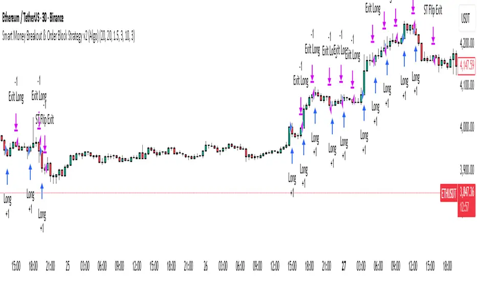
Smart Money Breakout & Order Block Strategy v2 (Algo)⚙️ Smart Money Breakout & Order Block Strategy v2 (Algo)
Created by: Shubham
Category: Smart Money Concepts • Breakout • Order Block • Volatility + Trend Algo
🧠 Description:
Smart Money Breakout & Order Block Strategy v2 (Algo) is an advanced version of the original system that blends Breakout Trading, Order Block Detection, and Supertrend Trend Confirmation .
It’s built to identify institutional-style entries with high momentum and manage them using dynamic ATR-based stops, trailing protection, and volatility-based filters.
This version is a full Algo system — optimized for performance, backtesting, and automated execution.
⚡ Major Improvements Over Older Version:
Supertrend Filter Added – Trades only in confirmed trend direction (Up = Long, Down = Short).
Supertrend Flip Exit – Automatically closes trades when Supertrend changes direction.
Hold N Candles Before Exit – Prevents early exits after entry, improving stability.
Advanced Exit Logic – Tracks bar of entry and allows conditional exit control.
Improved Volatility Filter – Avoids choppy or flat market conditions.
Algo-Only Mode – No visuals, lightweight logic for live or strategy-based execution.
Dynamic ATR Stops – Risk adapts automatically to market volatility.
More Controlled Breakout Logic – Cleaner structure and smarter order-block detection.
🧩 Core Concept:
Detects recent Support & Resistance Breakouts .
Spots Order Block / Gap Reversals for smart-money entry timing.
Confirms strong momentum with a Volatility Filter .
Applies Supertrend Trend Confirmation for direction filtering.
Manages risk using ATR-based dynamic stop loss and trailing protection .
Closes trades automatically on Supertrend Flip or trailing trigger.
Allows holding for a set number of candles before normal exits start.
⚙️ Adjustable Inputs:
Levels Period
Volatility Filter
ATR Multiplier
Hold N Candles Before Exit
Supertrend ATR Length
Supertrend Multiplier
ON/OFF for Supertrend Filter
🎯 Optimized & Tested Conditions:
Specially optimized and backtested for ETH/USDT on the 30-minute timeframe .
Verified and live-tested by me personally for consistency and reliability.
Performs strongly during trending sessions and volatility expansions.
Suitable for Crypto, Forex, and Index pairs with similar behavior.
💡 Trading Logic Summary:
Long Entry: Price breaks resistance → volatility passes filter → Supertrend UP → Buy.
Short Entry: Price breaks support → volatility passes filter → Supertrend DOWN → Sell.
Order Block Entries: Gap or block structure confirmed → entry triggered.
Stop Loss: ATR × Multiplier (auto-scaled).
Trailing Stop: Locks profits as price moves in favor.
Supertrend Flip: Instant exit to secure results.
Hold Period: Trade remains locked for defined bars before normal exit logic starts.
b]📊 Highlights:
Institutional logic simplified into an easy, automated algo.
Combines structure + trend + volatility for high-probability trades.
ATR and Supertrend make the system adaptive to all market conditions.
Fully automated — perfect for backtesting or live algo trading.
Tuned for ETH 30-min chart but can be adapted to other assets.
⚠️ Tips & Notes:
Adjust settings based on instrument volatility.
Use larger “Hold Candles” on lower timeframes to avoid false exits.
Always forward-test before going live on new markets.
Avoid overtrading during low-volume or sideways sessions.
Maintain single active position per direction for clarity.
✅ Summary:
Smart Money Breakout & Order Block Strategy v2 (Algo) combines institutional structure logic, volatility filters, and adaptive ATR risk control into one professional system.
Specially optimized and tested live on ETH 30-minute timeframe , it delivers precise, trend-aligned entries with smart exit management.
A clean, reliable, and automation-ready algo for serious traders.
Advanced Smart Money Algo for ETH (30m) — breakout + order-block entries with volatility and Supertrend filters, ATR-based dynamic stops. Tested live; invite-only soon — test now while it's free.
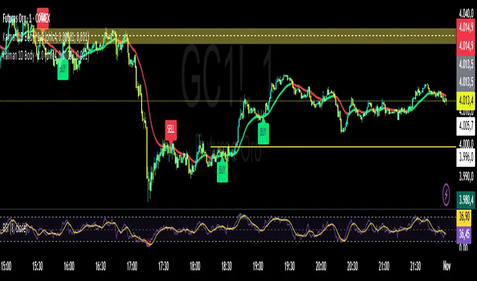
Kalman Filter by TwisterTrades(1D + Body Condition)
## 🧭 **Kalman Filter (1D + Body Condition)
This script implements a **true 1-dimensional Kalman Filter** applied to price data — not a simple moving average.
The Kalman Filter is a **Bayesian optimal estimation algorithm**, designed to separate **market noise** from the **true underlying trend** by dynamically adapting its sensitivity at every new bar.
Unlike **EMA**, **SMA**, or **VWAP**, which use fixed weighting formulas, the Kalman Filter **learns** how much to trust the current price based on how noisy and volatile the market is.
The result is a **smoother and smarter curve** that follows the real market direction while rejecting random fluctuations.
---
### ⚙️ **How It Works**
1. **Prediction:** The filter assumes the trend continues (predicts the next value).
2. **Update:** It compares the prediction with the actual price and updates its estimate based on:
* **Q (Process Noise):** how much the true trend can change.
* **R (Measurement Noise):** how noisy or unreliable the current price is.
3. The **Kalman Gain (K)** adjusts automatically — it becomes more responsive when volatility increases and more stable when the market is calm.
---
### 🎯 **Signals Logic**
The script generates **BUY** and **SELL** labels based on a combination of:
* **Trend direction:** whether the Kalman line is turning up or down.
* **Body confirmation:** the candle body closes entirely **above** or **below** the Kalman line.
**🟩 BUY signal:**
* Trend is turning bullish (line turning green).
* Candle body closes fully **above** the Kalman line.
**🟥 SELL signal:**
* Trend is turning bearish (line turning red).
* Candle body closes fully **below** the Kalman line.
You can enable alerts for both conditions:
```text
Kalman Filter: BUY signal detected (body above filter)
Kalman Filter: SELL signal detected (body below filter)
```
---
### 🔊 **Understanding Noise and Signals**
* **Noise** refers to short-term, random fluctuations in price (e.g. stop-hunts, low-volume spikes, or microstructure volatility).
* **Signal** refers to consistent, directional movement that carries information about the real trend.
The Kalman Filter works as a **signal extractor** — removing meaningless movements while keeping true directional momentum.
If the line is smooth and consistent, it means the market’s directional “signal” is clear.
If the line oscillates frequently, it means **noise dominates** — and trading signals should be taken with caution.
---
### ⏱️ **Recommended Timeframes and Parameters**
The strength of the filter depends on how noisy your timeframe is.
Here’s how to adjust it for different use cases:
| Purpose | Timeframe | Q (Process Noise) | R (Measurement Noise) | Description |
| ----------------------------- | --------- | ----------------- | --------------------- | --------------------------------------- |
| **Scalping / Microstructure** | 1m – 3m | 0.001 | 0.05 | Reacts faster, filters tick-level noise |
| **Intraday Bias / Trend** | 5m – 15m | 0.0001 | 0.01 | Balanced reactivity and smoothness |
| **Swing / Macro Bias** | 1H – 4H | 0.00001 | 0.001 | Very stable, great for clean trend bias |
💡 **Pro tip:**
* If the filter lags too much → increase **Q** slightly.
* If it reacts too much (too noisy) → increase **R** slightly.
* Always backtest adjustments visually for your market’s volatility (e.g. XAU/USD or NAS100).
---
### 📈 **Comparison with Other Indicators**
| Indicator | Adaptivity | Noise Filtering | Reactivity | Ideal Use |
| -------------------- | ---------------- | --------------- | ------------- | ---------------------------- |
| **SMA** | ❌ Fixed weights | ❌ Poor | ⚠️ Slow | Clean long trends |
| **EMA** | ⚠️ Semi-adaptive | ⚠️ Medium | ✅ Fast | Intraday direction |
| **VWAP** | ⚠️ Volume-based | ⚠️ Moderate | ✅ Good | Session-level bias |
| **Kalman Filter 1D** | ✅ Fully adaptive | ✅ Excellent | ✅ Intelligent | Any noisy or volatile market |
---
### 📊 **Usage Tips**
* Use the Kalman Filter as a **directional bias tool**, not a signal generator alone.
* Combine it with **price action**, **volume**, or **market structure** to confirm entries.
* Works exceptionally well on assets with **high noise and volatility** (e.g. XAU/USD, NASDAQ, BTCUSD).
* You can use the Kalman line instead of EMA50 or EMA100 — it provides a cleaner trend estimate without lagging as much in choppy conditions.
---
### ⚠️ **Disclaimer**
The Kalman Filter is not a predictive tool but a **state estimator** — it helps reveal the *true underlying direction* by filtering out noise.
It should be used together with sound risk management and a clear trading plan.
NY ORB - Full Dynamic SystemNY ORB - Full Dynamic Strategy Summary
1. Opening Range and Session Timing
Opening Range (ORB) Calculation: The strategy identifies the ORB High and ORB Low by tracking the highest high and lowest low during the specified New York pre-market window, which is set by default from 8:30 to 8:45 (New York time).
Entry Window: Trading activity is restricted to a specific entry period, typically starting shortly after the ORB is established (default: 8:50 to 12:00).
Hard Exit Time: Any remaining open positions are automatically closed at a fixed exit time (default: 13:25).
2. Trade Entry Logic and Filters
An entry (Long or Short) is generated when the price breaks out of the established ORB, provided it passes a series of optional filters:
Direction Control: The user can restrict the strategy to trade Long Only, Short Only, or Both.
Second Breakout Logic: An optional filter that requires the price to break out, reverse back into the range, and then break out again, confirming momentum after a consolidation.
Confirmation Candle Count: An optional filter that checks the close of a previous candle (e.g., 1 or 2 candles ago) to ensure the price was still inside the range, preventing premature entry.
Technical Filters (Optional): The entry is only executed if it aligns with selected indicators:
RSI: Filters for non-overbought (Long) or non-oversold (Short) conditions.
MACD: Requires the MACD line to be above/below the Signal line for alignment.
VWAP: Requires the price to be above/below the Volume-Weighted Average Price.
Trend Filter (SMMA): Requires the price to be above/below a 50-period Simple Moving Average.
3. Dynamic Risk and Exit Management
This strategy features highly configurable stop-loss and profit-taking mechanics:
Primary Stop Loss Methods: The Stop Loss distance can be dynamically chosen from four types:
Fixed: A fixed number of ticks.
ATR: Based on a multiple of the Average True Range (ATR).
Capped ATR: ATR-based, but with a hard maximum tick limit.
OR-Based: Based on a multiple of the actual ORB High-to-Low range.
Dynamic Profit Target: The Take Profit level is calculated dynamically based on a multiplier of either the ATR or the ORB Range.
Breakeven Stop:
If enabled, the Stop Loss automatically moves to the entry price (Breakeven) once the price moves a predetermined distance in the profitable direction.
An Adaptive Breakeven option allows the trigger distance to be calculated as a percentage of the overall ATR Profit Target.
Trailing Stop: The strategy uses a trailing stop, which can be custom-set (fixed ticks) or dynamically tied to the ATR. An optional feature Auto Tighten Trailing reduces the trailing multiplier once the breakeven level is hit.
MA Cross Exit: An alternative, counter-trend exit mechanism that closes the trade if the price crosses back over the chosen Moving Average (either SMMA or VWAP), overriding the pending profit target.
4. Daily Account Management
The strategy includes crucial daily risk controls to protect capital and lock in profits:
Daily Profit Limit: If the total daily PnL (realized and unrealized) hits a predefined maximum profit threshold (in ticks), all trades are closed, and new entries are blocked for the remainder of the trading day.
Daily Loss Limit: Conversely, if the total daily PnL hits a predefined maximum loss threshold, all trades are closed, and new entries are blocked for the remainder of the day.

Real Order Block Finder (Smart v1.0) (BIGAL)BigAl w/AI
I am sick of fake order block and ask for help from my dear AI friend.This the one my friend created.

Multi-Anchor VWAP | Trade Symmetry🧩 Multi-Anchor VWAP
Description:
Dynamic VWAP anchored to Session, Week, Month, Quarter, and Year — all in one view.
Full Description:
This indicator plots multiple VWAPs (Volume-Weighted Average Prices) simultaneously — each anchored to a different time period:
Session, Week, Month, Quarter, and Year.
💡 Ideal for traders who track institutional mean reversion and liquidity zones across multiple timeframes.
Features
✅ Session, Weekly, Monthly, Quarterly, and Yearly Anchored VWAPs
✅ Independent color and visibility controls for each anchor
✅ Adjustable label position and size
✅ Option to hide VWAPs on Daily or higher charts
✅ Clean and efficient performance
This tool helps you visualize volume-weighted mean levels where price often reacts — offering a clear map of bias and equilibrium across all major time horizons.

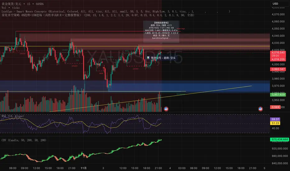
量化多空策略 4H趋势+15M进场(高胜率高R:R·完整报警版)这是一套结合多周期结构(4小时趋势 + 15分钟入场)的量化交易策略,
核心理念是「顺势而为 + 动量二次确认 + 高R:R风险控制」。
策略特点:
• 使用 4H EMA 趋势判定方向
• 结合 15m RSI + MACD 动量信号确认入场
• 二次确认(2~3 根内突破 + 动量共振)过滤假信号
• 自适应止盈止损(基于 ATR 和 ADX)
• 全自动计算 R:R、冷却周期、成交量放大过滤
适用场景
• 加密货币(BTC、ETH、SOL、BNB 等)
• 黄金 / 外汇 / 指数CFD
• 15m~1h短线趋势盯盘
• 适合希望提高信号质量、过滤假突破的交易者
注意事项
• 该策略为研究与教学用途,不构成投资建议
• 实盘前请先在回测与模拟盘验证参数
• 适度调整「确认根数」「R:R」「ADX阈值」以适应不同市场波动性
This is a multi-timeframe quantitative trading strategy combining the 4-hour trend with 15-minute entry signals.
Its core philosophy is “Trend following + Momentum confirmation + High R:R risk control.”
Key Features
• Uses 4H EMA structure to determine market trend
• Combines 15m RSI + MACD momentum for entry confirmation
• Dual confirmation within 2–3 bars (breakout + momentum alignment) to filter false signals
• Adaptive take-profit and stop-loss based on ATR and ADX
• Automatically calculates Risk/Reward ratio, cooldown period, and volume expansion filters
Best Use Cases
• Cryptocurrencies (BTC, ETH, SOL, BNB, etc.)
• Gold / Forex / Index CFDs
• Short-term trend tracking (15m–1h)
• Traders aiming to improve signal quality and avoid false breakouts
Notes
• This strategy is for research and educational purposes only — not financial advice.
• Always backtest and paper trade before live deployment.
• Adjust confirmation bars, R:R ratio, and ADX threshold to suit different market volatilities.
Addikro_V1📌 Description – Trend+Entry+Risk Indicator
This indicator combines statistically proven trading concepts into a complete trading framework:
✅ Trend Filter (EMA200)
All trades follow the higher-timeframe trend. Trend direction is clearly visualized.
✅ Entry Signals (you can choose):
EMA Crossover (EMA50 crossing EMA200) — classic trend-following entry
Breakout of recent highs/lows (20-bar range) — optionally only valid after a pullback to EMA50
✅ ATR-Based Risk Management:
Dynamic Stop Loss (SL) and Take Profit (TP1/TP2) levels using ATR
The last entry is saved — SL/TP lines stay visible on the chart
Optional position size suggestion based on % risk of account
✅ Smart Filters for Higher Accuracy:
RSI filter: e.g., only long if RSI > 50
Volume filter: signal only if volume is above SMA × multiplier
✅ Fixed Chart HUD (Table Overlay):
Displays live information anchored to the chart (does not move with candles)
Shows: Trend direction, entry mode, RSI, ATR, SL/TP multiplier, position size suggestion
Position can be set: top-left / top-right / bottom-left / bottom-right
✅ Signals & Alerts:
Visual arrows on the chart for long/short signals
Custom alert conditions included (works with mobile, email, webhook, bots)
🎯 Why this indicator works
It follows the same logic used by many successful systematic and hedge fund strategies:
Trend direction + statistically solid entries + strict risk management → no repainting, no guessing, no emotion.