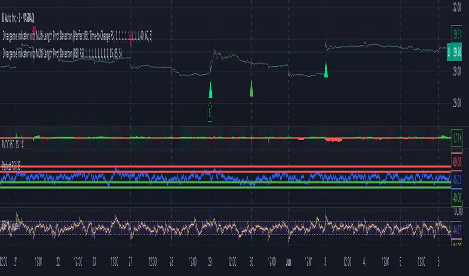
[AlbaTherium] Volume Venturius Premium Volume Venturius Premium
Introduction
The Volume Venturius Premium is an advanced market analysis tool designed to deeply investigate the behavior of active market participants. By focusing exclusively on executed market orders, Volume Venturius offers traders a unique perspective on buy and sell volumes. Unlike traditional order books that track passive orders, this indicator isolates active orders, shedding light on real market dynamics.
Chapter 1: Understanding Market Participants
1.1 Categories of Market Participants
Market participants can be classified into several categories based on their:
Size : The volume of trades executed.
Influence : Their ability to initiate bull or bear campaigns.
Strategy : The trading methods employed, such as scalping, swing trading, or high-frequency trading.
Objectives : Whether their focus is on speculation, hedging, or arbitrage.
Time Horizon : Short-term versus long-term goals.
Behavioral Patterns : Their reaction to liquidity levels or price movements.
1.2 Objectives of Market Participants
Each category pursues specific objectives, such as profit-making or risk management. Regulatory reports like the Commitment of Traders (COT) provide weekly insights into the positions and intentions of major players.
Chapter 2: The Philosophy of Volume Analysis
2.1 Active Orders vs. Passive Orders
Unlike passive orders waiting to be filled at specific prices, active orders directly impact market prices. By focusing on these executed orders, Volume Venturius Premium provides traders with actionable insights into market trends and momentum.
2.2 Wyckoff’s Market Dynamics
According to Wyckoff, markets operate in two primary phases:
Manipulation: Where large participants accumulate or distribute positions to prepare for a move.
Expansion: The phase where price trends begin to unfold, either in a bullish or bearish direction.
Wyckoff’s theory emphasizes understanding how major players manipulate the market to identify accumulation or distribution zones. Volume Venturius Premium aids in pinpointing these manipulative actions by analyzing volume and order flow data.
Chapter 3: The Secrets of Order Flow and Volume
3.1 Unveiling Market Control
By studying the positioning and execution volumes of large players, traders can discern who holds control in the market. Volume Venturius Premium identifies the balance of power and tracks shifts that signal potential trend reversals.
3.2 Behavioral Patterns in Volume
Key metrics tracked by Volume Venturius Premium include:
Volume Clusters : Areas of concentrated buying or selling activity.
Directional Bias : Whether market participants are net buyers or sellers.
Momentum Shifts : Changes in execution speed and volume that may precede major moves.
3.2.1 Volume Clusters, Directional Bias and Directional Bias: Areas of Concentrated Buying or Selling Activity
Volume clusters play a crucial role in understanding market dynamics by highlighting areas where aggressive buying or selling activity is most concentrated. These clusters often serve as key decision zones, providing insights into potential reversals, breakouts, or continuations. To better visualize and interpret these zones, a distinct color-coding system has been implemented. Each color represents a specific market condition or level of activity, allowing for a more intuitive analysis of volume behavior and its influence on price movement.
Below is a detailed explanation of the color logic used to represent these clusters and their significance within the trading framework.
Color Interpretation and Meaning :
Extra Extreme Zones
These zones highlight areas where clusters of aggressive buyers or sellers are most heavily concentrated. They represent critical levels for identifying potential reversals or strong continuations.
Bright Red (#ff003c) : Represents extra-extreme sell zones, where aggressive sellers dominate.
Meaning: Indicates extreme selling pressure, often signaling potential exhaustion of sellers.
Bright Blue (#001eff) : Represents extra-extreme buy zones, where aggressive buyers are most active.
Meaning: Shows extreme buying pressure, possibly marking a saturation point for buyers.
Main Zones
These zones help identify key levels based on volume activity and well-defined clusters.
Dark Red (#d60033) : Represents strong selling pressure.
Orange (#ff8000) : Indicates significant selling pressure that begins to fade.
Yellow (#ffff00) : Represents moderate selling pressure, signaling a potential slowdown.
White (#ffffff) : Marks transition zones, which are interesting entry points for potential reversals or continuations.
Transition Zones (Frontier Zones)
These zones indicate intermediate movements and potential shifts in momentum.
Transparent Black (#000000, 50) : Represents transition areas, where the market tests boundaries between buyers and sellers.
Meaning: These are critical decision points.
Neutral Zone (Sea Zone)- Trend Zones
These zones represent more balanced market activity, where neither buyers nor sellers dominate clearly.
Transparent Green (#00e040, 25) : Indicates slight bullish activity in a neutral zone.
Transparent Red (#e01a00, 25) : Indicates slight bearish activity in a neutral zone.
This color logic allows you to pinpoint areas where volume clusters show a clear dominance, exhaustion, or optimal entry opportunities.
3.3 Divergences Between Price and Volume
Divergences between price and volume are critical for identifying key shifts in market sentiment. Volume Venturius Premium distinguishes two main types of divergences: Lack of Participation and Absorption, each offering valuable signals for potential reversals or continuations.
Lack of Participation
This divergence occurs when price movements are not supported by corresponding volume dynamics, signaling a reduction in activity from significant market participants.
1. Bullish Lack of Participation:
Characteristics : Price is making lower lows, but volume is making higher lows.
This indicates waning selling pressure as prices drop.
Inference : A potential bullish reversal may occur. Traders could consider looking for opportunities to go long.
2.Bearish Lack of Participation:
Characteristics : Price is making higher highs, but volume is making lower highs. This suggests diminishing buying pressure even as prices rise.
Inference : A potential bearish reversal might follow. Traders might position to go short.
Absorption
Absorption occurs when larger market participants neutralize the pressure from smaller participants, often leading to significant market moves.
1.Bullish Absorption:
Characteristics : Price is making higher bottoms, but volume is making lower bottoms.
This reflects sellers being trapped as their selling efforts are absorbed by larger buyers.
Inference : A potential upward breakout is likely. Traders may look for opportunities to go long.
2.Bearish Absorption:
Characteristics : Price is making lower tops, but volume is making higher tops. This indicates buyers being trapped as larger sellers absorb their buying activity.
Inference : A downward breakout is probable. Traders may consider positioning to go short.
Chapter 4: Practical Application and Trading Strategies
4.1 Leveraging Active Order Insights
Learn how to use Volume Venturius Premium to detect hidden accumulation or distribution phases. Strategies include identifying spikes in active volume that signal institutional participation.
4.2 Confirming Bull and Bear Campaigns
Gain confidence in detecting the early stages of bullish or bearish campaigns by analyzing the interplay between active orders and volume flow.
Chapter 5: Real-World Examples
5.1 Analyzing Market Manipulation
See how Volume Venturius Premium can reveal manipulation tactics employed by large players to trigger liquidity events.
5.2 Spotting Trends with Active Orders
Real-life scenarios demonstrate how the tool can be used to identify and ride the market’s dominant trend.
Conclusion
The Volume Venturius Premium is an indispensable tool for traders who seek to understand the underlying mechanics of market movement. By focusing on active order flows and drawing on Wyckoff’s principles, it provides unique insights into market manipulation and expansion phases. Whether you’re an intraday trader or a long-term strategist, this tool empowers you to anticipate market shifts and trade with confidence.
Stay tuned for updates as we continue to refine Volume Venturius Premium to further enhance your trading journey.
在腳本中搜尋"bear"
FVG Chain (Consecutive Fair Value Gaps / Imbalances)This indicator detects fair value gaps that are created out of the touch of older fair value gaps, hence creating an "FVG chain".
It counts +1 for the chain whenever a new price leg's FVG is touched.
You can use the current FVG Chain count, as well as the high, low, and price leg high/low of the current FVG as input source in external indicators. Check the data window to see the plot values.
How FVGs are detected:
Bullish: The low of the current confirmed bar is above the high of 2 bars back.
Bearish: The high of the current confirmed bar is below the low of 2 bars back.
A bullish FVG chain is broken if:
The current FVG's price leg low is broken.
The previous bar closed below the FVG, and the current confirmed bar closed below the previous bar.
A bearish FVG chain is broken if:
The current FVG's price leg high is broken.
The previous bar closed above the FVG, and the current confirmed bar closed above the previous bar.
TheHorsyAlgoPROThe Horsy algo is an automated strategy that uses any minute Higher timeframe range as reference and search for a purge of liquidity on the HTF high or low where buyside or sell side liquidity is, the algo only search this at specific desired times that can be configured according to the time you usually trade, the strategy is known as Turtle soup purge and reverse or lately as CRT.
Why is useful?
The purpose of this Algorithm is to help turtle soup traders to quickly identify when the market is likely to reverse the algo evaluates if the opportunity is worth it, base on risk reward and other desired filters. Also this strategy can help to quickly backtest the trader strategy it can be configured in different timeframes and adapt to the trader personality, they can easily see the results and statistics and notice if its profitable or not.
This algo is useful for intraday traders looking for a purge and reverse at a key times and at key HTF price levels this only looks the previous HTF highs and lows but is important to also monitor Order blocks, FVGs, gaps, or wicks to have the best results.
How it works and how it does it?
The Horsy algo simply Jumps from one type of liquidity to another one buyside to sell side or vice versa. In order for the algo to trigger an entry it has to meet these conditions
1. Take HTF liquidity, trade above a HTF high or below a HTF low in the selected time window
2. Make a change in the state of delivery with a close below the previous candle low for shorts and close above previous candle high for longs.
3. Allow for a reasonable risk reward, it will use the highest high for shorts and the lowest low for longs. The default take profit is the opposite side of the range.
4. Validate others user filters this include enter only trades aligned with the HTF bias, or trades aligned with the LTF bias or booth. The algo have the option to enter only premium and discount entries. And finally, an option to allow for different contract sizes depending of the maximum percent of the account we want to risk default is 1%. For this last option is important to check the initial balance and leverage are configured correctly, is disable by default because it requires more capital to perform well.
We can see the algo performing in the picture below with a short trade, notice there are some white lines, they are the high or the low of HTF candle that start generating inside candles in the HTF meaning a possible consolidation. The algo plots the HTF ranges in a shaded boxes as you can see below
The HTF bias as you can see in the picture is calculated based on the last close of the HTF meaning close above previous HTF high is bullish close below previous HTF low is bearish. This HTF bias level is also the last HTF mid-price or 50%. By default, this line is enabled.
The LTF bias is calculated based on the range created from the expansion outside the previous HTF range is also the mid-price. If the LTF close above previous HTF high is bullish and if the LTF close below previous HTF low is bearish. By default this LTF bias line is disable.
This strategy includes an original and personal developed code that uses dealing ranges to recognize if the market is expanding, retracing, reversing or consolidating. This allow the algo to exit the position when it detects a retracement or at the end of the expansion. This is the default exit type.
You can monitor the previous dealing ranges created in history with an option than can be enable, by default is disable, this ranges are created after price takes buyside and then sell side or vice versa. So this dealing ranges can be useful also to identify minor pools of liquidity and premium and discount in the lower timeframe.
The picture below is a long example, the exit in this case is just at the high of the range. The normal take profit is in a blue line for longs.
How to use it?
First select the desired HTF timeframe recommended is from 30min to 240min then you setup the chart on the lower timeframe you want to trade recommended is from 1min to 15min to enter. By default This strategy is designed to work for intraday during key times when price take stops and then moves quickly away from them. You can select as much as 6 different times or just one. After you select the desired time window where the algo will look for the purge and reverse, They are highlighted in the candles that change colors excluding the gray ones that indicates consolidation.
Then the Algo allow to performs several additional filters in the entries you can select if you want to trade only longs or shorts trades, you can select when to move the stop loss to Break even. In deviations of the risk or you can just select to remove risk when price hits the 50% of previous HTF range.
You can select the minimum desired risk reward of the trade before is allow to be taken. Once is configured correctly the algo should trigger signals with a triangle up or down plus the strategy entry.
At the beginning of the picture there are some blue lines in the HTF high low and close, this is to easily identify that the market is in the Asia session, the time can be configured by the user, these lines are normally gray.
On the right top of the screen you can see some statistics about the strategy how many trades it took, ARR is an approximated value of the accumulated total risk reward of all the trades when they get closed in the simulation.
Profit factor and percent profitable are also shown should be green it means that the strategy makes money over time. But apart from that is important to notice how it makes money it is stable over time? it is a roller coaster? that why I Include this other measurements MxcsTps is the maximum consecutives take profits and Mxcsls is the maximum consecutive stop losses it takes, the slash number after it is the consecutive Break evens. So this way you know what to expect and what is normal in the strategy.
The algo shows all the times the stop loss, take profit and break even level if enable in the colored red lines for short and blue lines for longs. You can also select how price will manage the profit or stoploss point meaning that you can choose to wait for the candle to close to invalidate your idea or to take profit. This is good to avoid liquidity sweeps but can also lead to mayor loses if the idea is wrong. The default setting is to close the trade when price takes the high or low where the stoploss is, the take profit is taken after a retracement to allow to profit on expansions. You can select also to exit on a reversal if you want to ride all the move. This last option has to be used with caution because sometimes price just retrace or reverse very fast decreasing the trade profit and overall strategy performance.
The algo have the option to use standard deviation from the normal risk if you prefer to prevent liquidity sweeps near the stop level this make wider stops but can lead to increased loses so it has to be used carefully.
Below is a picture that show the entry stop and take profit levels with an exit on a retracement activated.
Strategy Results
The backtesting results are obtained simulating a 2000usd account in the Micro Nasdaq using 1 contract per trade. Commission are set to 2usd per contract, slippage to 1tick. You can see in list of trades we are not risking more than 1 % percent of the account. The backtested range is from august to November 2024. This strategy doesn’t generate too much trades because of the time filters and conditions that has to be meet to take an entry but you can see the results of the last 4months with the available data that are around 32 trades.
The default settings for this strategy is HTF as 240min designed to work on a LTF 5min chart, the default purge times are 245-300, 745-800, 845-900, 1045-1100 and 1245-1300 UTC-4, the algo will look for shorts or longs, with a minimum risk reward of 2.0. With an additional filter of the HTFBias. The take profit is by default taken on the first retracement after hitting the target. The default settings are optimized to work on the Nasdaq or Spy, but can also perform well in other assets with the correct adjustments.
Remember entries constitute only a small component of a complete winning strategy. Other factors like risk management, position-sizing, trading frequency, trading fees, and many others must also be properly managed to achieve profitability. Past performance doesn’t guarantee future results. To really take advantage of this strategy you have to study turtle soup and the HTF key levels use this only as a confirmation that your overall idea will play out and use it to backtest your model.
Summary of features
·Adaptable strategy to different HTF timeframes from 1-1440min
· Select up to 6 different purge time windows UTC-4, UTC-5
· Choose desired Risk Reward per trade
· Easily see the HTF high low close and 50% key levels in the LTF
· Identify HTF consolidations that generate key major liquidity pools
· HTF/LTF bias filters to trade in favor of the big trend or in sync
· Shaded boxes that indicate if the market is bullish, bearish or consolidating
· See the current midpoint of the last expansion move
· Optimal trade entry filter to trade only in a discount or premium
· Customizable trade management take profit, stop, breakeven level
· Option to exit on a close, retracement or reversal after hitting the take profit level
· Option to exit on a close or reversal after hitting stop loss
· Configurable breakeven point with standard deviations or at 50% of the HTF
· Calculate different contract sizes depending of a percentage of the initial balance
· Standard deviations from normal risk can be used to prevent liquidity sweeps
· See dealing ranges history to check minor pools of liquidity and premium or discount
· Dashboard with instant statistics about the strategy current settings
Weis Wave Max█ Overview
Weis Wave Max is the result of my weis wave study.
David Weis said,
"Trading with the Weis Wave involves changes in behavior associated with springs, upthrusts, tests of breakouts/breakdowns, and effort vs reward. The most common setup is the low-volume pullback after a bullish/bearish change in behavior."
THE STOCK MARKET UPDATE (February 24, 2013)
I inspired from his sentences and made this script.
Its Main feature is to identify the largest wave in Weis wave and advantageous trading opportunities.
█ Features
This indicator includes several features related to the Weis Wave Method.
They help you analyze which is more bullish or bearish.
Highlight Max Wave Value (single direction)
Highlight Abnormal Max Wave Value (both directions)
Support and Resistance zone
Signals and Setups
█ Usage
Weis wave indicator displays cumulative volume for each wave.
Wave volume is effective when analyzing volume from VSA (Volume Spread Analysis) perspective.
The basic idea of Weis wave is large wave volume hint trend direction. This helps identify proper entry point.
This indicator highlights max wave volume and displays the signal and then proper Risk Reward Ratio entry frame.
I defined Change in Behavior as max wave volume (single direction).
Pullback is next wave that does not exceed the starting point of CiB wave (LH sell entry, HL buy entry).
Change in Behavior Signal ○ appears when pullback is determined.
Change in Behavior Setup (Entry frame) appears when condition of Min/Max Pullback is met and follow through wave breaks end point of CiB wave.
This indicator has many other features and they can also help a user identify potential levels of trade entry and which is more bullish or bearish.
In the screenshot below we can see wave volume zones as support and resistance levels. SOT and large wave volume /delta price (yellow colored wave text frame) hint stopping action.
█ Settings
Explains the main settings.
-- General --
Wave size : Allows the User to select wave size from ① Fixed or ② ATR. ② ATR is Factor x ATR(Length).
Display : Allows the User to select how many wave text and zigzag appear.
-- Wave Type --
Wave type : Allows the User to select from Volume or Volume and Time.
Wave Volume / delta price : Displays Wave Volume / delta price.
Simplified value : Allows the User to select wave text display style from ① Divisor or ② Normalized. Normalized use SMA.
Decimal : Allows the User to select the decimal point in the Wave text.
-- Highlight Abnormal Wave --
Highlight Max Wave value (single direction) : Adds marks to the Wave text to highlight the max wave value.
Lookback : Allows the User to select how many waves search for the max wave value.
Highlight Abnormal Wave value (both directions) : Changes wave text size, color or frame color to highlight the abnormal wave value.
Lookback : Allows the User to select SMA length to decide average wave value.
Large/Small factor : Allows the User to select the threshold large wave value and small wave value. Average wave value is 1.
delta price : Highlights large delta price by large wave text size, small by small text size.
Wave Volume : Highlights large wave volume by yellow colored wave text, small by gray colored.
Wave Volume / delta price : highlights large Wave Volume / delta price by yellow colored wave text frame, small by gray colored.
-- Support and Resistance --
Single side Max Wave Volume / delta price : Draws dashed border box from end point of Max wave volume / delta price level.
Single side Max Wave Volume : Draws solid border box from start point of Max wave volume level.
Bias Wave Volume : Draws solid border box from start point of bias wave volume level.
-- Signals --
Bias (Wave Volume / delta price) : Displays Bias mark when large difference in wave volume / delta price before and after.
Ratio : Decides the threshold of become large difference.
3Decrease : Displays 3D mark when a continuous decrease in wave volume.
Shortening Of the Thrust : Displays SOT mark when a continuous decrease in delta price.
Change in Behavior and Pullback : Displays CiB mark when single side max wave volume and pullback.
-- Setups --
Change in Behavior and Pullback and Breakout : Displays entry frame when change in behavior and pullback and then breakout.
Min / Max Pullback : Decides the threshold of min / max pullback.
If you need more information, please read the indicator's tooltip.
█ Conclusion
Weis Wave is powerful interpretation of volume and its tell us potential trend change and entry point which can't find without weis wave.
It's not the holy grail, but improve your chart reading skills and help you trade rationally (at least from VSA perspective).
ADX and DI Trend meter and status table IndicatorThis ADX (Average Directional Index) and DI (Directional Indicator) indicator helps identify:
Trend Direction & Strength:
LONG: +DI above -DI with ADX > 20
SHORT: -DI above +DI with ADX > 20
RANGE: ADX < 20 indicates choppy/sideways market
Trading Signals:
Bullish: +DI crosses above -DI (green triangle)
Bearish: -DI crosses below +DI (red triangle)
ADX Strength Levels:
Strong: ADX ≥ 50
Moderate: ADX 30-49
Weak: ADX 20-29
No Trend: ADX < 20
Best Uses:
Trend confirmation before entering trades
Identifying ranging vs trending markets
Exit signal when trend weakens
Works well on multiple timeframes
Most effective in combination with other indicators
The table displays current trend direction and ADX strength in real-time
Wick Length Display + Alert conditionsDescription of the Wick Length Display (Advanced) script
Originality and purpose of the script
The Wick Length Display (Advanced) script is an innovative tool for traders who want to gain detailed insights into the length of candle wicks. It stands out for its versatility and user-friendly customization options. It combines precise technical calculations with visual representation to provide important information about market movements and dynamics right on the chart.
Functionality
The script calculates and displays the length of the upper and lower wicks of each candle on the chart. It also provides additional visual cues such as:
• “Bull pressure”: When green candles do not have upper wicks, this indicates strong buying pressure.
• “Bear pressure”: When red candles do not have lower wicks, this indicates strong selling pressure.
• Threshold conditions: Only displays wicks that exceed a certain threshold (optional).
• Display in pips: Allows you to display wick lengths in pips, which is useful for forex traders.
How it works
The script analyzes each candle using the following calculations:
1. Wick length calculation:
◦ Upper wick length = High - (top of the body)
◦ Lower wick length = (bottom of the body) - Low
2. Display conditions:
◦ It distinguishes between bullish and bearish candles.
◦ It checks if the calculated wicks exceed the defined thresholds before displaying them.
3. Dynamic labels:
◦ Labels are placed above or below the respective candles.
◦ Size, color and type of labels are fully customizable.
4. Limitation of labels:
◦ To ensure clarity, a maximum number of labels is defined.
Usage
1. Customization:
◦ Open the script in the Pine Script Editor in TradingView.
◦ Use the input options to customize parameters such as color selection, label size, thresholds and other details according to your requirements.
2. Enable thresholds:
◦ Enable thresholds to show labels only for relevant wicks (default is 6).
◦ Define the minimum wick lengths for bullish (green) and bearish (red) candles.
3. Show in pips:
◦ Enable the “Show wick length in pips” option to show the results in pips (especially suitable for Forex).
4. Edit pressure labels:
◦ Turn the “Bull Pressure” and “Bear Pressure” features on or off depending on your analysis settings.
Concepts behind the calculations
• Technical market analysis: Wick lengths can indicate buying or selling pressure and provide important information on market psychology.
• Thresholds and filtering: The script uses thresholds to avoid visual overload and highlight only essential data.
• Label display: Dynamic labels improve chart readability and give the user instant feedback on market developments.
Usage
This script is great for:
• Intraday trading: Analyzing short-term movements using wick lengths.
• Forex trading: Tracking market momentum using the pip indicator.
• Swing trading: Identifying buying or selling pressure in key markets.
• Visual support: Ideal for traders who prefer a graphical display.
Description of the Wick Length Display (Advanced) script
Originality and purpose of the script
The Wick Length Display (Advanced) script is an innovative tool for traders who want to gain detailed insights into the length of candle wicks. It stands out for its versatility and user-friendly customization options. It combines precise technical calculations with visual representation to provide important information about market movements and dynamics right on the chart.
Functionality
The script calculates and displays the length of the upper and lower wicks of each candle on the chart. It also provides additional visual cues such as:
• “Bull pressure”: When green candles do not have upper wicks, this indicates strong buying pressure.
• “Bear pressure”: When red candles do not have lower wicks, this indicates strong selling pressure.
• Threshold conditions: Only displays wicks that exceed a certain threshold (optional).
• Display in pips: Allows you to display wick lengths in pips, which is useful for forex traders.
How it works
The script analyzes each candle using the following calculations:
1. Wick length calculation:
◦ Upper wick length = High - (top of the body)
◦ Lower wick length = (bottom of the body) - Low
2. Display conditions:
◦ It distinguishes between bullish and bearish candles.
◦ It checks if the calculated wicks exceed the defined thresholds before displaying them.
3. Dynamic labels:
◦ Labels are placed above or below the respective candles.
◦ Size, color and type of labels are fully customizable.
4. Limitation of labels
Alert conditions:
Alerts are triggered when the wick length of a bullish or bearish candle exceeds the defined thresholds.
Alert function:
alert() is used to issue messages with a frequency of once per candle when the conditions are met.
How to set up alerts
Save the script and add it to your chart.
Open the alert settings in TradingView.
Select the script's custom message as a trigger.
Adjust the frequency and notification type (popup, email, etc.).
Now you have a powerful tool with visual analysis and alert function!
Prometheus Markov ChainThe Prometheus Markov Chain Indicator is a custom-built tool designed to predict potential future price movements using a Markov Chain approach. A Markov Chain is a statistical model that assumes the probability of moving to a future state depends solely on the current state. In this indicator, states represent price movement classifications—bullish, bearish, or neutral—and are determined based on historical price changes (percentage returns). The indicator builds a transition matrix to calculate probabilities of transitioning from one state to another, enabling traders to identify patterns and forecast likely price actions.
Core Functionality and Transition Matrix
The transition matrix is the backbone of the Markov Chain. It captures the frequency of transitions between states in the historical price data and normalizes these counts into probabilities. For example, if the price was in a bearish state and transitioned to a bullish state 3 out of 10 times, the probability of transitioning from bearish to bullish would be 0.3. The matrix is created dynamically using the stateFunc function to classify states, which can use either dynamic thresholds (highest and lowest returns over a lookback period) or a user-defined percent return threshold. Below is the snippet that updates the transition matrix:
transitionMatrix = matrix.new(dimension, dimension, 0.0)
for i = 0 to array.size(vec) - 2
fromState = array.get(vec, i)
toState = array.get(vec, i + 1)
transitionMatrix.set(fromState, toState, transitionMatrix.get(fromState, toState) + 1)
for i = 0 to dimension - 1
rowSum = 0.0
for j = 0 to dimension - 1
rowSum += transitionMatrix.get(i, j)
for j = 0 to dimension - 1
prob = transitionMatrix.get(i, j) / rowSum
transitionMatrix.set(i, j, prob)
This snippet iterates through historical price movements, counts state transitions, and then normalizes each row of the matrix so that the sum of probabilities for all possible transitions from a given state equals 1.
How the Indicator Predicts Future States
After constructing the transition matrix, the indicator calculates the current state of the price based on the latest percentage return and then uses the matrix to compute probabilities for transitioning to other states. The state with the highest probability is predicted as the next state, which is displayed on the chart using color-coded labels: green for bullish and red for bearish. The following snippet demonstrates how the current state and predictions are calculated:
current_chng = (close - close ) / close
var int current_state = na
if not use_custom_thresh
highest_chng = ta.highest(current_chng, int(size) * 2)
lowest_chng = ta.lowest(current_chng, int(size) * 2)
current_state := stateFunc(current_chng, highest_chng, lowest_chng)
else
current_state := stateFunc(current_chng, custom_thresh)
predicted_probs = array.new(dimension, 0.0)
for j = 0 to dimension - 1
array.set(predicted_probs, j, transitionMatrix.get(current_state, j))
The indicator evaluates which state has the highest transition probability (highest_prob) and places corresponding labels on the chart. For example, if the next state is predicted to be bullish, a green "Bullish" label is placed below the current bar. This predictive functionality helps traders anticipate potential reversals or continuations in price trends based on historical behavior patterns.
Usage:
Here we see the indicator at work on $PLTR. The states predicted are bullish then bearish. In this example we then see price move in a way that verifies those predictions.
On this 4 Hour NASDAQ:AMZN chart we see predictions play out in a short trade style. States quickly move from one to another but not without giving traders a way to take advantage.
This is the perspective we aim to provide. We encourage traders to not follow indicators blindly. No indicator is 100% accurate. This one can give you a different perspective market state. We encourage any comments about desired updates or criticism!
Super CCI By Baljit AujlaThe indicator you've shared is a custom CCI (Commodity Channel Index) with multiple types of Moving Averages (MA) and Divergence Detection. It is designed to help traders identify trends and reversals by combining the CCI with various MAs and detecting different types of divergences between the price and the CCI.
Key Components of the Indicator:
CCI (Commodity Channel Index):
The CCI is an oscillator that measures the deviation of the price from its average price over a specific period. It helps identify overbought and oversold conditions and the strength of a trend.
The CCI is calculated by subtracting a moving average (SMA) from the price and dividing by the average deviation from the SMA. The CCI values fluctuate above and below a zero centerline.
Multiple Moving Averages (MA):
The indicator allows you to choose from a variety of moving averages to smooth the CCI line and identify trend direction or support/resistance levels. The available types of MAs include:
SMA (Simple Moving Average)
EMA (Exponential Moving Average)
WMA (Weighted Moving Average)
HMA (Hull Moving Average)
RMA (Running Moving Average)
SMMA (Smoothed Moving Average)
TEMA (Triple Exponential Moving Average)
DEMA (Double Exponential Moving Average)
VWMA (Volume-Weighted Moving Average)
ZLEMA (Zero-Lag Exponential Moving Average)
You can select the type of MA to use with a specified length to help identify the trend direction or smooth out the CCI.
Divergence Detection:
The indicator includes a divergence detection mechanism to identify potential trend reversals. Divergences occur when the price and an oscillator like the CCI move in opposite directions, signaling a potential change in price momentum.
Four types of divergences are detected:
Bullish Divergence: Occurs when the price makes a lower low, but the CCI makes a higher low. This indicates a potential reversal to the upside.
Bearish Divergence: Occurs when the price makes a higher high, but the CCI makes a lower high. This indicates a potential reversal to the downside.
Hidden Bullish Divergence: Occurs when the price makes a higher low, but the CCI makes a lower low. This suggests a continuation of the uptrend.
Hidden Bearish Divergence: Occurs when the price makes a lower high, but the CCI makes a higher high. This suggests a continuation of the downtrend.
Each type of divergence is marked on the chart with arrows and labels to alert traders to potential trading opportunities. The labels include the divergence type (e.g., "Bull Div" for Bullish Divergence) and have customizable text colors.
Visual Representation:
The CCI and its associated moving average are plotted on the indicator panel below the price chart. The CCI is plotted as a line, and its color changes depending on whether it is above or below the moving average:
Green when the CCI is above the MA (indicating bullish momentum).
Red when the CCI is below the MA (indicating bearish momentum).
Horizontal lines are drawn at specific levels to help identify key CCI thresholds:
200 and -200 levels indicate extreme overbought or oversold conditions.
75 and -75 levels represent less extreme levels of overbought or oversold conditions.
The 0 level acts as a neutral or baseline level.
A background color fill between the 75 and -75 levels helps highlight the neutral zone.
Customization Options:
CCI Length: You can customize the length of the CCI, which determines the period over which the CCI is calculated.
MA Length: The length of the moving average applied to the CCI can also be adjusted.
MA Type: Choose from a variety of moving averages (SMA, EMA, WMA, etc.) to smooth the CCI.
Divergence Detection: The indicator automatically detects the four types of divergences (bullish, bearish, hidden bullish, hidden bearish) and visually marks them on the chart.
How to Use the Indicator:
Trend Identification: When the CCI is above the selected moving average, it suggests bullish momentum. When the CCI is below the moving average, it suggests bearish momentum.
Overbought/Oversold Conditions: The CCI values above 100 or below -100 indicate overbought and oversold conditions, respectively.
Divergence Analysis: The detection of bullish or bearish divergences can signal potential trend reversals. Hidden divergences may suggest trend continuation.
Trading Signals: You can use the divergence markers (arrows and labels) as potential buy or sell signals, depending on whether the divergence is bullish or bearish.
Practical Application:
This indicator is useful for traders who want to:
Combine the CCI with different moving averages for trend-following strategies.
Identify overbought and oversold conditions using the CCI.
Use divergence detection to anticipate potential trend reversals or continuations.
Have a highly customizable tool for various trading strategies, including trend trading, reversal trading, and divergence-based trading.
Overall, this is a comprehensive tool that combines multiple technical analysis techniques (CCI, moving averages, and divergence) in a single indicator, providing traders with a robust way to analyze price action and spot potential trading opportunities.
Indicator DashboardThis script creates an 'Indicator Dashboard' designed to assist you in analyzing financial markets and making informed decisions. The indicator provides a summary of current market conditions by presenting various technical analysis indicators in a table format. The dashboard evaluates popular indicators such as Moving Averages, RSI, MACD, and Stochastic RSI. Below, we'll explain each part of this script in detail and its purpose:
### Overview of Indicators
1. **Moving Averages (MA)**:
- This indicator calculates Simple Moving Averages (“SMA”) for 5, 14, 20, 50, 100, and 200 periods. These averages provide a visual summary of price movements. Depending on whether the price is above or below the moving average, it determines the market direction as either “Bullish” or “Bearish.”
2. **RSI (Relative Strength Index)**:
- The RSI helps identify overbought or oversold market conditions. Here, the RSI is calculated for a 14-period window, and this value is displayed in the table. Additionally, the 14-period moving average of the RSI is also included.
3. **MACD (Moving Average Convergence Divergence)**:
- The MACD indicator is used to determine trend strength and potential reversals. This script calculates the MACD line, signal line, and histogram. The MACD condition (“Bullish,” “Bearish,” or “Neutral”) is displayed alongside the MACD and signal line values.
4. **Stochastic RSI**:
- Stochastic RSI is used to identify momentum changes in the market. The %K and %D lines are calculated to determine the market condition (“Bullish” or “Bearish”), which is displayed along with the calculated values for %K and %D.
### Table Layout and Presentation
The dashboard is presented in a vertical table format in the top-right corner of the chart. The table contains two columns: “Indicator” and “Status,” summarizing the condition of each technical indicator.
- **Indicator Column**: Lists each of the indicators being tracked, such as SMA values, RSI, MACD, etc.
- **Status Column**: Displays the current status of each indicator, such as “Bullish,” “Bearish,” or specific values like the RSI or MACD.
The table also includes rounded indicator values for easier interpretation. This helps traders quickly assess market conditions and make informed decisions based on multiple indicators presented in a single location.
### Detailed Indicator Status Calculations
1. **SMA Status**: For each moving average (5, 14, 20, 50, 100, 200), the script checks if the current price is above or below the SMA. The status is determined as “Bullish” if the price is above the SMA and “Bearish” if below, with the value of the SMA also displayed.
2. **RSI and RSI Average**: The RSI value for a 14-period is displayed along with its 14-period SMA, which provides an average reading of the RSI to smooth out volatility.
3. **MACD Indicator**: The MACD line, signal line, and histogram are calculated using standard parameters (12, 26, 9). The status is shown as “Bullish” when the MACD line is above the signal line, and “Bearish” when it is below. The exact values for the MACD line, signal line, and histogram are also included.
4. **Stochastic RSI**: The %K and %D lines of the Stochastic RSI are used to determine the trend condition. If %K is greater than %D, the condition is “Bullish,” otherwise it is “Bearish.” The actual values of %K and %D are also displayed.
### Conclusion
The 'Indicator Dashboard' provides a comprehensive overview of multiple technical indicators in a single, easy-to-read table. This allows traders to quickly gauge market conditions and make more informed decisions. By consolidating key indicators like Moving Averages, RSI, MACD, and Stochastic RSI into one dashboard, it saves time and enhances the efficiency of technical analysis.
This script is particularly useful for traders who prefer a clean and organized overview of their favorite indicators without needing to plot each one individually on the chart. Instead, all the crucial information is available at a glance in a consolidated format.
Adaptive DEMA Momentum Oscillator (ADMO)Overview:
The Adaptive DEMA Momentum Oscillator (ADMO) is an open-source technical analysis tool developed to measure market momentum using a Double Exponential Moving Average (DEMA) and adaptive standard deviation. By dynamically combining price deviation from the moving average with normalized standard deviation, ADMO provides traders with a powerful way to interpret market conditions.
Key Features:
Double Exponential Moving Average (DEMA):
The core calculation of the indicator is based on DEMA, which is known for being more responsive to price changes compared to traditional moving averages. This makes the ADMO capable of capturing trend momentum effectively.
Standard Deviation Integration:
A normalized standard deviation is used to adaptively weight the oscillator. This makes the indicator more sensitive to market volatility, enhancing responsiveness during high volatility and reducing sensitivity during calmer periods.
Oscillator Representation:
The final oscillator value is derived from the combination of the DEMA-based Z-score and the normalized standard deviation. This final value is visualized as a color-coded histogram, reflecting bullish or bearish momentum.
Color-Coded Histogram:
Bullish Momentum: Values above zero are colored using a customizable bullish color (default: light green).
Bearish Momentum: Values below zero are colored using a customizable bearish color (default: red).
How It Works:
Inputs:
DEMA Length: Defines the period used for calculating the Double Exponential Moving Average. It can be adjusted from 1 to 200 to suit different trading styles.
Standard Deviation Length: Sets the lookback period for standard deviation calculations, which influences the responsiveness of the oscillator.
Standard Deviation Weight (StdDev Weight): Controls the weight given to the normalized standard deviation, allowing customization of the oscillator's sensitivity to volatility.
Calculation Steps:
Double Exponential Moving Average Calculation:
The DEMA is calculated using two exponential moving averages, which helps in reducing lag compared to a simple moving average.
Z-score Calculation:
The Z-score is derived by comparing the difference between the DEMA and its smoothed average (LSMA) to the standard deviation. This indicates how far the current value is from the mean in units of standard deviation.
Normalized Standard Deviation:
The standard deviation is normalized by subtracting the mean standard deviation and dividing by the standard deviation of the values. This helps to make the oscillator adaptive to recent changes in volatility.
Final Oscillator Value:
The final value is calculated by multiplying the Z-score with a factor based on the normalized standard deviation, resulting in a momentum indicator that adapts to different market conditions.
Visualization:
Histogram: The oscillator is plotted as a histogram, with color-coded bars showing the strength and direction of market momentum.
Positive (bullish) values are shown in green, indicating upward momentum.
Negative (bearish) values are shown in red, indicating downward momentum.
Zero Line: A zero line is plotted to provide a reference point, helping users quickly determine whether the current momentum is bullish or bearish.
Example Use Cases:
Momentum Identification:
ADMO helps identify the current market momentum by dynamically adapting to changes in market volatility. When the histogram is above zero and green, it indicates bullish conditions, whereas values below zero and red suggest bearish momentum.
Volatility-Adjusted Signals:
The normalized standard deviation weighting allows the ADMO to provide more reliable signals during different market conditions. This makes it particularly useful for traders who want to be responsive to market volatility while avoiding false signals.
Trend Confirmation and Divergence:
ADMO can be used to confirm the strength of a trend or identify potential divergences between price and momentum. This helps traders spot potential reversal points or continuation signals.
Summary:
The Adaptive DEMA Momentum Oscillator (ADMO) offers a unique approach by combining momentum analysis with adaptive standard deviation. The integration of DEMA makes it responsive to price changes, while the standard deviation adjustment helps it stay relevant in both high and low volatility environments. It's a versatile tool for traders who need an adaptive, momentum-based approach to technical analysis.
Feel free to explore the code and adapt it to your trading strategy. The open-source nature of this tool allows you to adjust the settings and visualize the output to fit your personal trading preferences.
NUTJP CDC ActionZone 20241. Core Components of the Strategy
• Fast EMA and Slow EMA:
• The Fast EMA (shorter period) is more reactive to recent price changes.
• The Slow EMA (longer period) reacts slower and provides a smoother view of the overall trend.
• Relationship Between Fast EMA and Slow EMA:
• When the Fast EMA is above the Slow EMA, the market is considered Bullish.
• When the Fast EMA is below the Slow EMA, the market is considered Bearish.
2. Zones Based on Price and EMAs
The strategy defines six zones based on the position of the price, Fast EMA, and Slow EMA:
1. Green Zone (Buy):
• Bullish trend (Fast EMA > Slow EMA)
• Price is above the Fast EMA.
• Indicates a strong uptrend and suggests buying.
2. Blue and Light Blue Zones (Pre-Buy):
• Price is above the Fast EMA but below or near the Slow EMA.
• Represents potential bullish signals but not strong enough to trigger a buy.
3. Red Zone (Sell):
• Bearish trend (Fast EMA < Slow EMA)
• Price is below the Fast EMA.
• Indicates a strong downtrend and suggests selling or avoiding long trades.
4. Orange and Yellow Zones (Pre-Sell):
• Price is below the Fast EMA but above or near the Slow EMA.
• Represents potential bearish signals but not strong enough to trigger a sell.
These zones help traders visualize the market conditions and determine whether to buy, hold, or sell.
3. Buy and Sell Conditions
• Buy Condition:
A buy signal is triggered when:
• The price enters the Green Zone (Bullish trend and price > Fast EMA).
• It’s the first green candle after a non-green candle.
• Sell Condition:
A sell signal is triggered when:
• The price enters the Red Zone (Bearish trend and price < Fast EMA).
• It’s the first red candle after a non-red candle.
4. Trade Execution Logic
• Buy:
The strategy enters a long position (buy) when the above buy condition is met.
• Sell:
The strategy exits the long position when the sell condition is met.
Note: It doesn’t support short trades, meaning it doesn’t enter sell positions.
5. Momentum-Based Signals (Optional)
The indicator also includes momentum signals using Stochastic RSI to provide additional buy/sell signals:
• These are based on oversold and overbought levels of the Stochastic RSI.
• It filters signals depending on whether the trend is Bullish or Bearish.
6. Visual Features
The indicator is designed to make the trading zones and signals visually intuitive:
• Bar Colors:
Candlesticks are colored based on the current zone (e.g., Green for Buy, Red for Sell).
• EMA Lines:
The Fast EMA and Slow EMA are plotted, making it easy to see crossover points.
• Buy/Sell Signals:
Marked with shapes (e.g., circles) below/above bars for clarity.
7. Strategy Assumptions
• Trend-Following Nature:
This strategy assumes that trends persist. It works best in trending markets but might give false signals in ranging markets.
• Lagging Nature of EMAs:
As EMAs are lagging indicators, buy and sell signals may occur after significant moves have already begun or ended.
• Momentum Confirmation (Optional):
Adding momentum signals can help filter false signals, though it’s not part of the core logic.
8. Usage Recommendations
• Timeframes:
Works on various timeframes but may perform better on higher timeframes (e.g., 1H, Daily) to reduce noise.
• Markets:
Can be applied to stocks, forex, and cryptocurrencies.
• Backtesting and Optimization:
Before live trading, backtest the strategy with different EMA periods and other parameters to find optimal settings for your market and timeframe.
DB369 - Directional Bias 369
DB369 - Directional Bias 369 Indicator
The **DB369** indicator helps traders identify key market levels and trends by combining multiple timeframes' price action analysis. It highlights important **pivot points** on the chart and provides visual cues to help you make more informed buy and sell decisions based on the overall market direction.
Key Features
1. Pivot Points Across Multiple Timeframes**:
- The indicator calculates and displays pivot points for the **Monthly**, **Weekly**, **Daily**, **4-Hour**, and **1-Hour** timeframes (or 30-minute equivalent if desired). These pivots represent significant price levels where the market may retest.
2. **Trend Detection**:
- The indicator evaluates the relationship between the current price and the pivot point for each timeframe. Based on this comparison, it classifies the market as **Bullish**, **Bearish**, or **Neutral** on each timeframe.
3. **Pivot Lines**:
- Horizontal lines are drawn to mark the key pivot points for each selected timeframe. These lines extend into the future and adjust dynamically as the market moves in real time.
- **Customizable**: You can choose which timeframes to display pivot points by enabling/disabling them in the settings.
4. **Trend Table**:
- A **table** is displayed at the top-right of the chart to show the trend for the **Daily**, **4-Hour**, and **30-Minute** timeframes. It provides an easy-to-read view of the trend direction across these timeframes.
5. **Buy/Sell Arrows**:
- **Buy Arrow**: A green arrow will appear when the **Daily**, **4-Hour**, and **30-Minute** trends are all **Bullish** (aligned in the same direction).
- **Sell Arrow**: A red arrow will appear when all three timeframes show a **Bearish** trend.
- These arrows appear only once per alignment change and can be enabled or disabled for alerts. This helps avoid clutter on the chart and ensures that you only see a signal when the alignment occurs or changes.
### **How to Use the DB369 Indicator**:
1. **Pivot Points**:
- The pivot points represent significant price levels where the market might retest in the future. For instance:
- **Bullish Market**: If the price is above the pivot point, the market is considered bullish.
- **Bearish Market**: If the price is below the pivot point, the market is considered bearish.
- **Neutral Market**: When the price is near the pivot point, the market is neither strongly bullish nor bearish.
2. **Trend Alignment**:
- When the **Daily**, **4-Hour**, and **30-Minute** timeframes all show the same trend direction (either **Bullish** or **Bearish**), this alignment signifies a stronger trend.
- You will receive a **Buy Arrow** when all three timeframes are aligned bullish, and a **Sell Arrow** when they are aligned bearish.
- These arrows are displayed at the point when the alignment is first detected and can also trigger **alerts**.
3. **Alerts**:
- You can choose to enable alerts for when a **Buy** or **Sell** arrow appears on the chart. This allows you to be notified in real-time when the alignment conditions are met.
4. **Using the Pivot Points for Entry**:
- **Buy Trade**: Look for a buy trade when the price is near the **pivot line** of the higher timeframes, particularly when the trend across all three timeframes is **Bullish**.
- **Sell Trade**: Similarly, look for a sell trade when the price is near a **pivot line** and the trend is **Bearish**.
5. **Customization**:
- You can customize which timeframes' pivots are shown on the chart by toggling the visibility of the **Monthly**, **Weekly**, **Daily**, **4-Hour**, and **1-Hour** pivots in the settings.
- The indicator automatically adjusts the pivot levels in real-time as the market progresses.
**Important Notes**:
- This indicator does not guarantee successful trades; it is intended to assist in identifying potential trade opportunities based on the alignment of higher timeframe trends.
- Always combine the information from the DB369 indicator with other technical analysis tools and risk management strategies to ensure more accurate trade decisions.
Exposure Oscillator (Cumulative 0 to ±100%)
This Pine Script indicator plots an "Exposure Oscillator" on the chart, which tracks the cumulative market exposure from a range of technical buy and sell signals. The exposure is measured on a scale from -100% (maximum short exposure) to +100% (maximum long exposure), helping traders assess the strength of their position in the market. It provides an intuitive visual cue to aid decision-making for trend-following strategies.
Buy Signals (Increase Exposure Score by +10%)
Buy Signal 1 (Cross Above 21 EMA):
This signal is triggered when the price crosses above the 21-period Exponential Moving Average (EMA), where the current bar closes above the EMA21, and the previous bar closed below the EMA21. This indicates a potential upward price movement as the market shifts into a bullish trend.
buySignal1 = ta.crossover(close, ema21)
Buy Signal 2 (Trending Above 21 EMA):
This signal is triggered when the price closes above the 21-period EMA for each of the last 5 bars, indicating a sustained bullish trend. It confirms that the price is consistently above the EMA21 for a significant period.
buySignal2 = ta.barssince(close <= ema21) > 5
Buy Signal 3 (Living Above 21 EMA):
This signal is triggered when the price has closed above the 21-period EMA for each of the last 15 bars, demonstrating a strong, prolonged uptrend.
buySignal3 = ta.barssince(close <= ema21) > 15
Buy Signal 4 (Cross Above 50 SMA):
This signal is triggered when the price crosses above the 50-period Simple Moving Average (SMA), where the current bar closes above the 50 SMA, and the previous bar closed below it. It indicates a shift toward bullish momentum.
buySignal4 = ta.crossover(close, sma50)
Buy Signal 5 (Cross Above 200 SMA):
This signal is triggered when the price crosses above the 200-period Simple Moving Average (SMA), where the current bar closes above the 200 SMA, and the previous bar closed below it. This suggests a long-term bullish trend.
buySignal5 = ta.crossover(close, sma200)
Buy Signal 6 (Low Above 50 SMA):
This signal is true when the lowest price of the current bar is above the 50-period SMA, indicating strong bullish pressure as the price maintains itself above the moving average.
buySignal6 = low > sma50
Buy Signal 7 (Accumulation Day):
An accumulation day occurs when the closing price is in the upper half of the daily range (greater than 50%) and the volume is larger than the previous bar's volume, suggesting buying pressure and accumulation.
buySignal7 = (close - low) / (high - low) > 0.5 and volume > volume
Buy Signal 8 (Higher High):
This signal occurs when the current bar’s high exceeds the highest high of the previous 14 bars, indicating a breakout or strong upward momentum.
buySignal8 = high > ta.highest(high, 14)
Buy Signal 9 (Key Reversal Bar):
This signal is generated when the stock opens below the low of the previous bar but rallies to close above the previous bar’s high, signaling a potential reversal from bearish to bullish.
buySignal9 = open < low and close > high
Buy Signal 10 (Distribution Day Fall Off):
This signal is triggered when a distribution day (a day with high volume and a close near the low of the range) "falls off" the rolling 25-bar period, indicating the end of a bearish trend or selling pressure.
buySignal10 = ta.barssince(close < sma50 and close < sma50) > 25
Sell Signals (Decrease Exposure Score by -10%)
Sell Signal 1 (Cross Below 21 EMA):
This signal is triggered when the price crosses below the 21-period Exponential Moving Average (EMA), where the current bar closes below the EMA21, and the previous bar closed above it. It suggests that the market may be shifting from a bullish trend to a bearish trend.
sellSignal1 = ta.crossunder(close, ema21)
Sell Signal 2 (Trending Below 21 EMA):
This signal is triggered when the price closes below the 21-period EMA for each of the last 5 bars, indicating a sustained bearish trend.
sellSignal2 = ta.barssince(close >= ema21) > 5
Sell Signal 3 (Living Below 21 EMA):
This signal is triggered when the price has closed below the 21-period EMA for each of the last 15 bars, suggesting a strong downtrend.
sellSignal3 = ta.barssince(close >= ema21) > 15
Sell Signal 4 (Cross Below 50 SMA):
This signal is triggered when the price crosses below the 50-period Simple Moving Average (SMA), where the current bar closes below the 50 SMA, and the previous bar closed above it. It indicates the start of a bearish trend.
sellSignal4 = ta.crossunder(close, sma50)
Sell Signal 5 (Cross Below 200 SMA):
This signal is triggered when the price crosses below the 200-period Simple Moving Average (SMA), where the current bar closes below the 200 SMA, and the previous bar closed above it. It indicates a long-term bearish trend.
sellSignal5 = ta.crossunder(close, sma200)
Sell Signal 6 (High Below 50 SMA):
This signal is true when the highest price of the current bar is below the 50-period SMA, indicating weak bullishness or a potential bearish reversal.
sellSignal6 = high < sma50
Sell Signal 7 (Distribution Day):
A distribution day is identified when the closing range of a bar is less than 50% and the volume is larger than the previous bar's volume, suggesting that selling pressure is increasing.
sellSignal7 = (close - low) / (high - low) < 0.5 and volume > volume
Sell Signal 8 (Lower Low):
This signal occurs when the current bar's low is less than the lowest low of the previous 14 bars, indicating a breakdown or strong downward momentum.
sellSignal8 = low < ta.lowest(low, 14)
Sell Signal 9 (Downside Reversal Bar):
A downside reversal bar occurs when the stock opens above the previous bar's high but falls to close below the previous bar’s low, signaling a reversal from bullish to bearish.
sellSignal9 = open > high and close < low
Sell Signal 10 (Distribution Cluster):
This signal is triggered when a distribution day occurs three times in the rolling 7-bar period, indicating significant selling pressure.
sellSignal10 = ta.valuewhen((close < low) and volume > volume , 1, 7) >= 3
Theme Mode:
Users can select the theme mode (Auto, Dark, or Light) to match the chart's background or to manually choose a light or dark theme for the oscillator's appearance.
Exposure Score Calculation: The script calculates a cumulative exposure score based on a series of buy and sell signals.
Buy signals increase the exposure score, while sell signals decrease it. Each signal impacts the score by ±10%.
Signal Conditions: The buy and sell signals are derived from multiple conditions, including crossovers with moving averages (EMA21, SMA50, SMA200), trend behavior, and price/volume analysis.
Oscillator Visualization: The exposure score is visualized as a line on the chart, changing color based on whether the exposure is positive (long position) or negative (short position). It is limited to the range of -100% to +100%.
Position Type: The indicator also indicates the position type based on the exposure score, labeling it as "Long," "Short," or "Neutral."
Horizontal Lines: Reference lines at 0%, 100%, and -100% visually mark neutral, increasing long, and increasing short exposure levels.
Exposure Table: A table displays the current exposure level (in percentage) and position type ("Long," "Short," or "Neutral"), updated dynamically based on the oscillator’s value.
Inputs:
Theme Mode: Choose "Auto" to use the default chart theme, or manually select "Dark" or "Light."
Usage:
This oscillator is designed to help traders track market sentiment, gauge exposure levels, and manage risk. It can be used for long-term trend-following strategies or short-term trades based on moving average crossovers and volume analysis.
The oscillator operates in conjunction with the chart’s price action and provides a visual representation of the market’s current trend strength and exposure.
Important Considerations:
Risk Management: While the exposure score provides valuable insight, it should be combined with other risk management tools and analysis for optimal trading decisions.
Signal Sensitivity: The accuracy and effectiveness of the signals depend on market conditions and may require adjustments based on the user’s trading strategy or timeframe.
Disclaimer:
This script is for educational purposes only. Trading involves significant risk, and users should carefully evaluate all market conditions and apply appropriate risk management strategies before using this tool in live trading environments.
Inversion Fair Value Gap Oscillator | Flux Charts💎 GENERAL OVERVIEW
Introducing the new Inversion Fair Value Gap Oscillator (IFVG Oscillator) indicator! This unique indicator identifies and tracks Inversion Fair Value Gaps (IFVGs) in price action, presenting them in an oscillator format to reveal market momentum based on IFVG strength. It highlights bullish and bearish IFVGs while enabling traders to adjust detection sensitivity and apply volume and ATR-based filters for more precise setups. For more information about the process, check the "📌 HOW DOES IT WORK" section.
Features of the new IFVG Oscillator:
Fully Customizable FVG & IFVG Detection
An Oscillator Approach To IFVGs
Divergence Markers For Potential Reversals
Alerts For Divergence Labels
Customizable Styling
📌 HOW DOES IT WORK?
Fair Value Gaps are price gaps within bars that indicate inefficiencies, often filled as the market retraces. An Inversion Fair Value Gap is created in the opposite direction once a FVG gets invalidated. The IFVG Oscillator scans historical bars to identify these gaps, then filters them based on ATR or volume. Each IFVG is marked as bullish or bearish according to the opposite direction of the original FVG that got invalidated.
An oscillator is calculated using recent IFVGs with this formula :
1. The Oscillator starts as 0.
2. When a new IFVG Appears, it contributes (IFVG Width / ATR) to the oscillator of the corresponding type.
3. Each confirmed bar, the oscillator is recalculated as OSC = OSC * (1 - Decay Coefficient)
The oscillator aggregates and decays past IFVGs, allowing recent IFVG activity to dominate the signal. This approach emphasizes current market momentum, with oscillations moving bullish or bearish based on IFVG intensity. Divergences are marked where IFVG oscillations suggest potential reversals. Bullish Divergence conditions are as follows :
1. The current candlestick low must be the lowest of last 25 bars.
2. Net Oscillator (Shown in gray line by default) must be > 0.
3. The current Bullish IFVG Oscillator value should be no more than 0.1 below the highest value from the last 25 bars.
Traders can use divergence signals to get an idea of potential reversals, and use the Net IFVG Oscillator as a trend following marker.
🚩 UNIQUENESS
The Inversion Fair Value Gap Oscillator stands out by converting IFVG activity into an oscillator format, providing a momentum-based visualization of IFVGs that reveals market sentiment dynamically. Unlike traditional indicators that statically mark IFVG zones, the oscillator decays older IFVGs over time, showing only the most recent, relevant activity. This approach allows for real-time insight into market conditions and potential reversals based on oscillating IFVG strength, making it both intuitive and powerful for momentum trading.
Another unique feature is the combination of customizable ATR and volume filters, letting traders adapt the indicator to match their strategy and market type. You can also set-up alerts for bullish & bearish divergences.
⚙️ SETTINGS
1. General Configuration
Decay Coefficient -> The decay coefficient for oscillators. Increasing this setting will result in oscillators giving the weight to recent IFVGs, while decreasing it will distribute the weight equally to the past and recent IFVGs.
2. Fair Value Gaps
Zone Invalidation -> Select between Wick & Close price for FVG Zone Invalidation.
Zone Filtering -> With "Average Range" selected, algorithm will find FVG zones in comparison with average range of last bars in the chart. With the "Volume Threshold" option, you may select a Volume Threshold % to spot FVGs with a larger total volume than average.
FVG Detection -> With the "Same Type" option, all 3 bars that formed the FVG should be the same type. (Bullish / Bearish). If the "All" option is selected, bar types may vary between Bullish / Bearish.
Detection Sensitivity -> You may select between Low, Normal or High FVG detection sensitivity. This will essentially determine the size of the spotted FVGs, with lower sensitivies resulting in spotting bigger FVGs, and higher sensitivies resulting in spotting all sizes of FVGs.
3. Inversion Fair Value Gaps
Zone Invalidation -> Select between Wick & Close price for IFVG Zone Invalidation.
4. Style
Divergence Labels On -> You can switch divergence labels to show up on the chart or the oscillator plot.
Arshtiq - Multi-Timeframe Trend StrategyMulti-Timeframe Setup:
The script uses two distinct timeframes: a higher (daily) timeframe for identifying the trend and a lower (hourly) timeframe for making trades. This combination allows the script to follow the larger trend while timing entries and exits with more precision on a shorter timeframe.
Moving Averages Calculation:
higher_ma: The 20-period Simple Moving Average (SMA) calculated based on the daily timeframe. This average gives a sense of the larger trend direction.
lower_ma: The 20-period SMA calculated on the hourly (current) timeframe, providing a dynamic level for detecting entry and exit points within the broader trend.
Trend Identification:
Bullish Trend: The script determines that a bullish trend is present if the current price is above the daily moving average (higher_ma).
Bearish Trend: Similarly, a bearish trend is identified when the current price is below this daily moving average.
Trade Signals:
Buy Signal: A buy signal is generated when the price on the hourly chart crosses above the hourly 20-period MA, but only if the higher (daily) timeframe trend is bullish. This ensures that buy trades align with the larger upward trend.
Sell Signal: A sell signal is generated when the price on the hourly chart crosses below the hourly 20-period MA, but only if the daily trend is bearish. This ensures that sell trades are consistent with the broader downtrend.
Plotting and Visual Cues:
Higher Timeframe MA: The daily 20-period moving average is plotted in red to help visualize the long-term trend.
Buy and Sell Signals: Buy signals appear as green labels below the price bars with the text "BUY," while sell signals appear as red labels above the bars with the text "SELL."
Background Coloring: The background changes color based on the identified trend for easier trend recognition:
Green (with transparency) when the daily trend is bullish.
Red (with transparency) when the daily trend is bearish.
WiseOwl Indicator - 1.0 The WiseOwl Indicator - 1.0 is a technical analysis tool designed to help traders identify potential entry points and market trends based on Exponential Moving Averages (EMAs) across multiple timeframes. It focuses on providing clear visual cues for bullish and bearish market conditions, as well as potential breakout opportunities.
Key Features
Multi-Timeframe EMA Analysis: Calculates EMAs on the current timeframe, Daily timeframe, and 15-minute timeframe to confirm trends.
Bullish and Bearish Market Identification: Determines market conditions based on the 200-period EMA on the Daily timeframe.
Directional Candle Coloring: Highlights candles based on their position relative to EMAs to provide immediate visual feedback.
Entry Signals: Plots buy and sell signals on the chart when specific conditions are met on the 1-hour and 4-hour timeframes.
Breakout Candle Highlighting: Colors candles differently when significant price movements occur, indicating potential breakout opportunities.
How It Works
Market Condition Determination:
Bullish Market: When the close price is above the 200-period EMA on the Daily timeframe.
Bearish Market: When the close price is below the 200-period EMA on the Daily timeframe.
Directional Candle Coloring:
Green Background: Applied when the close is above the 50-period EMA and the market is not bearish.
Red Background: Applied when the close is below the 50-period EMA and the market is not bullish.
Uses the Average True Range (ATR) to define a range threshold.
Suppresses signals when EMAs are within this range, indicating a sideways market.
Plotting Entry Signals:
Plots arrows on the chart for potential long and short entries on the 1-hour and 4-hour timeframes.
Breakout Candle Coloring:
Colors candles blue when a bullish breakout condition is met.
Colors candles orange when a bearish breakout condition is met.
How to Use
Trend Identification: Use the background coloring to quickly identify the overall market trend.
Green Background: Suggests bullish conditions; consider looking for long opportunities.
Red Background: Suggests bearish conditions; consider looking for short opportunities.
Entry Signals: Look for plotted arrows on the chart.
Green Upward Arrow: Indicates a potential long entry signal on the 1-hour or 4-hour timeframe.
Red Downward Arrow: Indicates a potential short entry signal on the 1-hour or 4-hour timeframe.
Breakout Opportunities: Watch for candles colored blue or orange.
Blue Candles: Highlight significant upward price movements.
Orange Candles: Highlight significant downward price movements.
Avoiding Ranging Markets: Be cautious when signals are suppressed due to ranging conditions; the market may not have a clear direction.
Example Usage
Identifying a Bullish Market:
The background turns green.
Price crosses above the 50 EMA.
A green upward arrow appears below a candle on the 1-hour or 4-hour chart.
Identifying a Bearish Market:
The background turns red.
Price crosses below the 50 EMA.
A red downward arrow appears above a candle on the 1-hour or 4-hour chart.
Notes
Open-Source Code: The script is open-source, allowing users to review and understand the logic behind the indicator.
Educational Purpose: This indicator is intended to aid in technical analysis and should not be used as the sole basis for trading decisions.
Disclaimer
This indicator is for educational purposes only and does not constitute financial advice. Trading involves risk, and you should consult with a qualified financial advisor before making any investment decisions.