MC Stats v.41. Automatically draw the opening price line of the first H4 candlestick of the day and change it at the start of the new day.
2. Automatically draw a line +/- 500 points from the opening price line.
3. Display the number of pips of the candlestick body and the total including the wick.
1. ตีเส้นราคาเปิดของ H4 แท่งแรกของวัน โดยอัตโนมัติและเปลี่ยนเม่ือเริ่มวันใหม่
2. ตีเส้น +-500 จุดจากเส้นราคาเปิด โดยอัตโนัมัติ
3. แสดงจำนวน pip ของเนื้อเทียนและทั้งหมดรวมไส้เทียน
Statistics

ATR Based SL & TP Targets from Entry (Long/Short)ATR-based target helper for manual trade planning.
Plots a single entry level plus ATR-based stop loss and take-profit targets on the price scale. The script uses a standard ATR (default 14) and lets you select the position side (Long or Short). For Long positions, it places the stop loss 1× ATR below the entry and take-profit levels at 1, 2, 3, and 4× ATR above. For Short positions, it mirrors this logic, placing the stop 1× ATR above the entry and targets 1–4× ATR below. You can adjust the entry price and ATR multipliers from the settings, and all levels update instantly, giving a clean visual of your risk and reward targets on the price scale.
-------------------
Tip:
After entry, and after I set my SL & TP levels, I hide the indicator until it's needed again.

Diagonal Interest Zones ScannerThis indicator automatically scans and plots diagonal (slanted) interest zones – dynamic trend-parallel channels that identify statistically validated support/resistance levels within a trending price structure. It detects the strongest "bounce" zones where price has repeatedly respected slanted lines without breaking for a specified hold period, ideal for trending markets.
How It Works (Technical Methodology)
Trend Channel Detection
The script calculates a linear trend slope from a user-defined anchor point (start of lookback or fixed date) to the current close.
Range is determined by finding the maximum deviation above/below this trend line over the lookback period.
This creates a "channel envelope" capturing the full price oscillation around the trend.
Data can be sourced from current or higher timeframe for structural alignment.
Stable Update Mechanism
To prevent flickering on live bars:
Full recalculation (scanning + slope) occurs only after user-defined "Update Frequency" bars close (default 50).
All calculated values (slope, channel bottom, levels, scores) are "snapshotted" and frozen until next confirmed update.
Drawing uses these stable snapshots, ensuring zones remain fixed during real-time price movement.
Auto Mode Scanning
When enabled:
Scans the channel height in percentage steps (default 1.0%).
Each candidate creates a thin diagonal zone (thickness % of price, default 0.04%) parallel to the trend.
Counts valid "hits": Price touches zone and holds (no break) for user-defined bars (default 10).
Break source: "Close" (strict) or "Wick" (sensitive).
Direction assumed by close relative to zone center (support/resistance).
Level Selection and Filtering
Ranks by hit count, applies minimum distance (% of channel height) to avoid overlap.
Limits to max zones (default 9), sorted low to high.
Manual mode alternative: Directly uses input percentages (e.g., 0, 50, 100 for channel bottom/mid/top).
Diagonal Zone Construction
Zones are drawn as filled diagonal bands using two parallel lines (top/bottom) with linefill.
Thickness is volatility-adjusted (% of current price).
Optional extension far into future or limited projection.
Colors: Supply (above price, default light gray), Demand (below price, default cyan) – updates live but positions stay stable.
Dashboard and Visuals
Table shows current price at each zone (stable during bar), % level, hit count (green if high).
Update countdown displayed for transparency.
How to Use
Perfect for trending markets – identifies dynamic, parallel support/resistance zones that move with price structure.
High hit counts: Strong diagonal zones – expect bounces or acceleration on retest.
Update Frequency: Higher values (100+) for very stable long-term channels; lower for adaptive intraday.
Validation Bars: Increase for stricter zones (fewer false positives).
Multi-Timeframe: Use higher TF input for major trend channels on lower charts.
Supply Zones (Diagonal above price): Dynamic resistance – potential shorts or profit targets.
Demand Zones (Diagonal below price): Dynamic support – potential longs or trailing stops.
Manual Mode: Quick plotting of fixed % (e.g., channel median, quartiles).
Confluence: Combine with horizontal levels, volume, or order flow for entries.
Zones remain visually stable (no repainting during bar) thanks to snapshot logic – reliable for live trading decisions.
Disclaimer
This indicator is a technical analysis tool and should be used in conjunction with other forms of analysis. Past performance does not guarantee future results. Always use proper risk management.

Wickless Candle Revisit TrackerWickless Candle Revisit Tracker
Identifies wickless candles (strong momentum candles) and tracks whether price revisits their opening level, providing statistical insights into price behavior patterns.
WHAT ARE WICKLESS CANDLES?
• Green wickless: Open = Low (no lower wick) - opened at the low and moved only upward
• Red wickless: Open = High (no upper wick) - opened at the high and moved only downward
These candles represent strong directional momentum, and their opening levels often act as support/resistance zones that price may revisit.
KEY FEATURES:
• Automatic Detection: Identifies wickless candles with configurable tolerance for broker spread
• Real-time Tracking: Monitors each wickless candle until price revisits its opening level
• Visual Indicators:
- Labels show "WL↑" or "WL↓" with bars count when revisited (or "N/A" if pending)
- Horizontal lines mark price levels (gray dashed = pending, green solid = revisited)
• Comprehensive Statistics Table:
- Total wickless candles detected
- Revisit rate percentage
- Min/Max/Average bars until revisit
- Pending count
• History Limit: Configure how far back to analyze (default: 500 bars)
• Customizable: Adjust colors, toggle labels/lines/table, reposition statistics
USE CASES:
• Identify potential support/resistance levels from momentum candles
• Measure how often price fills "fair value gaps" or inefficiencies
• Track mean reversion patterns after strong momentum moves
• Backtest the reliability of wickless candle levels as trading zones
SETTINGS:
• Wick Tolerance: Allow small wicks due to broker spread (e.g., 0.0001 for forex)
• History Limit: Number of bars to analyze (older candles are hidden)
• Visual Controls: Toggle labels, lines, and statistics table
• Color Customization: Adjust line colors for pending/revisited states
ALERTS:
Built-in alerts for wickless candle detection (green, red, or both).
Perfect for traders analyzing price inefficiencies, fair value gaps, and momentum-based support/resistance levels.

Interest Zones ScannerThis indicator automatically scans a user-defined price range (on current or higher timeframe) to detect and plot the strongest horizontal support/resistance zones based on validated price reactions. It intelligently identifies levels where price has repeatedly bounced without breaking for a specified number of bars, prioritizing high-probability reaction areas.
How It Works (Technical Methodology)
Range Calculation
The script determines the high/low range using a configurable method:
"Lookback Bars": User-defined number of bars (default 400) on the target timeframe.
"Fixed Start Date": Bars since a specified date (default dynamic).
Data is fetched via request.security() from a selectable timeframe (default current chart TF) for multi-timeframe alignment.
Auto Mode Scanning
When enabled:
Scans the entire range in small percentage steps (default 1.0%, adjustable down to 0.5%).
For each potential level, creates a thin volatility-adjusted zone (height % of price, default 0.07%).
Counts "valid hits": Instances where price touches the zone and holds (no break) for user-defined bars (default 10).
Break detection: Configurable "Close" (strict) or "Wick" (sensitive).
Assumes support/resistance direction based on close relative to zone center.
Level Selection and Filtering
Ranks candidates by hit count (highest first).
Applies minimum distance filter (% apart, default 8%) to avoid clustering.
Limits to user-defined max zones (default 9) for clean display.
Sorts final zones from low to high price.
Manual Mode Alternative
When auto disabled: Directly uses user-input percentages (e.g., classic Fibo levels like 23.6, 50, 61.8) applied to the range – no validation/scoring.
Zone Construction
Horizontal boxes centered on validated levels, with dynamic height (% of price).
Colored by position: Supply (above close, default light gray), Demand (below close, default cyan).
Optional full extension (both sides) or right-only.
Labeled with percentage from range low.
Dashboard and Visuals
Table (positionable) shows:
% Level, Exact Price, Hit Count (green if >3).
Header with validation details and lookback info.
Vertical line marks range start for reference.
How to Use
This scanner excels at finding statistically validated horizontal zones where price has shown respect – ideal for support/resistance, mean reversion, or breakout setups.
Auto Mode: Best for discovering hidden/non-obvious levels. Higher hit counts = stronger zones (expect reactions/retests).
Validation Bars: Increase (e.g., 20+) for stricter, higher-quality zones in trending markets; lower for more sensitive detection.
Min Distance: Higher % for fewer, separated zones; lower for denser grids.
Multi-Timeframe: Set target TF higher (e.g., Daily) for major structural levels on lower charts.
Supply Zones (Above Price): Potential resistance – shorts or take-profits.
Demand Zones (Below Price): Potential support – longs or stops below.
Confluence: Combine with volume, order blocks, or fibo for entries. Watch for multiple hits + confluence.
Manual Mode: Quick plotting of custom % (e.g., fibo retracements/extensions).
Fine-tune scan step smaller for precision (slower on large lookbacks) or larger for speed.
Disclaimer
This indicator is a technical analysis tool and should be used in conjunction with other forms of analysis. Past performance does not guarantee future results. Always use proper risk management.

Kalman Hull Kijun [BackQuant]Kalman Hull Kijun
A trend baseline that merges three ideas into one clean overlay, Kalman filtering for noise control, Hull-style responsiveness, and a Kijun-like Donchian midline for structure and bias.
Context and lineage
This indicator sits in the same family as two related scripts:
Kalman Price Filter
This is the foundational building block. It introduces the Kalman filter concept, a state-estimation algorithm designed to infer an underlying “true” signal from noisy measurements, originally used in aerospace guidance and later adopted across robotics, economics, and markets.
Kalman Hull Supertrend
This is the original script made, which people loved. So it inspired me to create this one.
Kalman Hull Kijun uses the same core philosophy as the Supertrend variant, but instead of building a Supertrend band system, it produces a single structural baseline that behaves like a Kijun-style reference line.
What this indicator is trying to solve
Most trend baselines sit on a bad trade-off curve:
If you smooth hard, the line reacts late and misses turns.
If you react fast, the line whipsaws and tracks noise.
Kalman Hull Kijun is designed to land closer to the middle:
Cleaner than typical fast moving averages in chop.
More responsive than slow averages in directional phases.
More “structure aware” than pure averages because the baseline is range-derived (Kijun-like) after filtering.
Core idea in plain language
The plotted line is a Kijun-like baseline, but it is not built from raw candles directly.
High level flow:
Start with a chosen price stream (source input).
Reduce measurement noise using Kalman-style state estimation.
Add Hull-style responsiveness so the filtered stream stays usable for trend work.
Build a Kijun-like baseline by taking a Donchian midpoint of that filtered stream over the base period.
So the output is a single baseline that is intended to be:
Less jittery than a simple fast MA.
Less laggy than a slow MA.
More “range anchored” than standard smoothing lines.
How to read it
1) Trend and bias (the primary use)
Price above the baseline, bullish bias.
Price below the baseline, bearish bias.
Clean flips across the baseline are regime changes, especially when followed by a hold or retest.
2) Retests and dynamic structure
Treat the baseline like dynamic S/R rather than a signal generator:
In uptrends, pullbacks that respect the baseline can act as continuation context.
In downtrends, reclaim failures around the baseline can act as continuation context.
Repeated back-and-forth around the line usually means compression or chop, not clean trend.
3) Extension vs compression (using the fill)
The fill is meant to communicate “distance” and “pressure” visually:
Large separation between price and baseline suggests expansion.
Price compressing into the baseline suggests rebalancing and decision points.
Inputs and what they change
Kijun Base Period
Controls the structural memory of the baseline.
Higher values track broader swings and reduce flips.
Lower values track tighter swings and react faster.
Kalman Price Source
Defines what data the filter is estimating.
Close is usually the cleanest default.
HL2 often “feels” smoother as an average price.
High/Low sources can become more reactive and less stable depending on the market.
Measurement Noise
Think of this as the main smoothness knob:
Higher values generally produce a calmer filtered stream.
Lower values generally produce a faster, more reactive stream.
Process Noise
Think of this as adaptability:
Higher values adapt faster to changing conditions but can get twitchy.
Lower values adapt slower but stay stable.
Plotting and UI (what you see on chart)
1) Adaptive line coloring
Baseline turns bullish color when price is above it.
Baseline turns bearish color when price is below it.
This makes the state readable without extra panels.
2) Gradient “energy” fill
Bull fill appears between price and baseline when above.
Bear fill appears between price and baseline when below.
The goal is clarity on separation and control, not decoration.
3) Rim effect
A subtle band around price that only appears on the active side.
Helps highlight directional control without hiding candles.
4) Candle painting (optional)
Candles can be colored to match the current bias.
Useful for scanning many charts quickly.
Disable if you prefer raw candles.
Alerts
Long state alert when price is above the baseline.
Short state alert when price is below the baseline.
Best used as a bias or regime notification, not a standalone entry trigger.
Where it fits in a workflow
This is a context layer, it pairs well with:
Market structure tools, BOS/MSB, OBs, FVGs.
Momentum triggers that need a regime filter.
Mean reversion tools that need “do not fade trends” context.
Limitations
No baseline eliminates chop whipsaws, tuning only manages the trade-off.
Settings should not be copy pasted across assets without checking behavior.
This does not forecast, it estimates and smooths state, then expresses it as a structural baseline.
Disclaimer
Educational and informational only, not financial advice.
Not a complete trading system.
If you use it in any trading workflow, do proper backtesting, forward testing, and risk management before any live execution.

QuantLabs MASM Correlation TableThe Market is a graph. See the flows:
The QuantLabs MASM is not a standard correlation table. It is an Alpha-Grade Scanner architected to reveal the hidden "hydraulic" relationships between global macro assets in real-time.
Rebuilt from the ground up for Version 3, this engine pushes the absolute limits of the Pine Script™ runtime. It utilizes a proprietary Logarithmic Math Engine, Symmetric Compute Optimization, and a futuristic "Ghost Mode" interface to deliver a 15x15 real-time correlation matrix with zero lag.
Under the Hood: The Quant Architecture
We stripped away standard libraries to build a lean, high-performance engine designed for institutional-grade accuracy.
1. Alpha Math Engine (Logarithmic Returns) Most tools calculate correlation based on Price, which generates spurious signals (e.g., "Everything is correlated in a bull run").
The Solution: Our engine computes Logarithmic Returns (log(close/close )) by default. This measures the correlation of change (Velocity & Vector), not price levels.
The Result: A mathematically rigorous view of statistical relationships that filters out the noise of general market drift.
Dual-Core: Toggle seamlessly between "Alpha Mode" (Log Returns) for verified stats and "Visual Mode" (Price) for trend alignment.
Calculation Modes: Pearson (Standard), Euclidean (Distance), Cosine (Vector), Manhattan (Grid).
2. Symmetric Compute Optimization Calculating a 15x15 matrix requires evaluating 225 unique relationships per bar, which often crashes memory limits.
The Fix: The V3 Engine utilizes Symmetric Logic, recognizing that Correlation(A, B) == Correlation(B, A).
The Gain: By computing only the lower triangle of the matrix and mirroring pointers to the upper triangle, we reduced computational load by 50%, ensuring a lightning-fast data feed even on lower timeframes.
3. Context-Aware "Ghost Mode" The UI is designed for professional traders who need focus, not clutter.
Smart Detection: The matrix automatically detects your current chart's Ticker ID. If you are trading QQQ, the matrix will visually highlight the Nas100 row and column, making them opaque and bright while dimming the rest.
Dynamic Transparency: Irrelevant data ("Noise" < 0.3 correlation) fades into the background. Only significant "Alpha Signals" (> 0.7) glow with full Neon Saturation.
Key Features
Dominant Flow Scanner: The matrix scans all 105 unique pairs every tick and prints the #1 Strongest Correlation at the bottom of the pane (e.g., DOMINANT FLOW: Bitcoin ↔ Nas100 ).
Streak Counter: A "Stubbornness" metric that tracks how many consecutive days a strong correlation has persisted. Instantly identify if a move is a "flash event" or a "structural trend."
Neon Palette: Proprietary color mapping using Electric Blue (+1.0) for lockstep correlation and Deep Red (-1.0) for inverse hedging.
Usage Guide
Placement: Best viewed in a bottom pane (Footer).
Assets: Pre-loaded with the Essential 15 Macro Drivers (Indices, BTC, Gold, Oil, Rates, FX, Key Sectors). Fully editable via settings (Ticker|Name).
Reading the Grid:
🔵 Bright Blue: Assets moving in lockstep (Risk-On).
🔴 Bright Red: Assets moving perfectly opposite (Hedge/Risk-Off).
⚫ Faded/Black: No statistical relationship (Decoupled).
Key Improvements Made:
Formatting: Added clear bullet points and bolding to make it scannable.
Clarity: Clarified the "Logarithmic Returns" section to explain why it matters (Velocity vs. Price Levels).
Tone: Maintained the "high-tech/quant" vibe but removed slightly clunky phrases like "spurious signals" (unless you prefer that academic tone, in which case I left it in as it fits the persona).
Structure: Grouped the "Modes" under the Math Engine for better logic.
Created and designed by QuantLabs

Position Avg Line + P/L Table - SightLine LabsPosition Avg – SLL is a lightweight position-tracking indicator designed to display a persistent average price level on the chart along with a real-time position summary table.
This script is non-trading and does not generate signals, entries, or exits. It is intended strictly for position awareness and visual reference.
What this indicator does:
Plots a persistent horizontal average price line (dashed by default)
Displays a live position statistics table showing:
Shares owned
Average price
Current price
Unrealized profit/loss in dollars
Unrealized profit/loss in percent
Updates automatically as price changes
Works across all timeframes
Does not depend on broker integration or strategy logic
Key features:
Average Price Line:
User-defined average price input
Persistent across the entire chart
Adjustable color and width
Visibility toggle
Position Table:
Six selectable table positions:
Top Left, Top Center, Top Right, Bottom Left, Bottom Center, Bottom Right
Adjustable text size (Tiny through Huge)
Optional table background fill
Optional inner grid lines
Optional outer frame border
Independent color control for:
Header background
Header text
Value text
Positive and negative P/L values
Chart Overlay Options:
Optional chart background tint
Does not modify the global chart theme
Inputs overview:
Position Settings:
Shares Owned
Average Price
Visual Settings:
Show or hide average price line
Line color and width
Table Settings:
Table position
Table text size
Color Settings:
Header background and text colors
Value text color
Positive and negative P/L colors
Optional table background, grid, and frame colors
How to use:
Add the indicator to a chart
Open the settings panel
Enter the number of shares and the average price
Adjust table position, size, and colors as desired
Use the average price line and table as a visual reference for trade and risk management
Notes and limitations:
This indicator does not place trades
It does not connect to any broker
All values are manually entered
Unrealized P/L is calculated using the chart’s current price
Commissions, fees, and slippage are not included
Disclaimer:
This script is provided for educational and informational purposes only. It does not constitute financial advice, investment recommendations, or trade signals. All trading decisions are the sole responsibility of the user.
Developed by SightLine Labs.

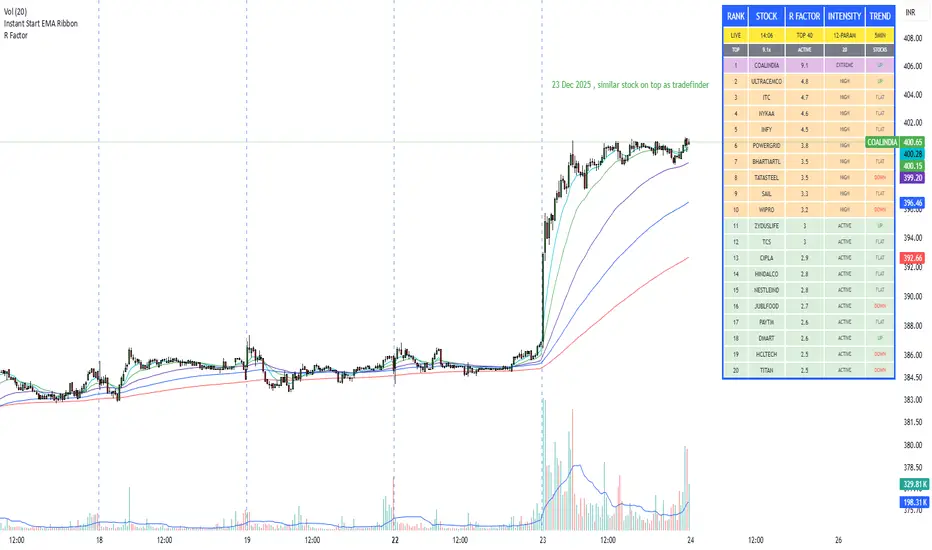
R Factor Advanced Stock Activity Ranking (Experimental) R Factor (relative factor) is a custom logic based 'momentum ranking' parameter, which measures intensity of intraday momentum and volatility. This parameter compared today's activity from last 20 days activity and ranks the stocks according to the intensity of the momentum.
Why momentum ranker?
Because traditional %change sorts intraday stock which show momentum in ascending order of value of % change, for example 3%, 2.5 %, 1% etc. But momentum ranker does not use % change as a sorting parameter for top gainers, or losers. It ranks the stocks, regardless of the direction, according to the intensity it is showing. The value of the momentum ranking has no meaning of itself, just understand that higher the value of momentum ranker, the more intensity the stock is showing.
In this indicator we can only scan 40 F&O stock of Indian Stock Market. This indicator is to be used only on 5 min timeframe.
Tip: Do not change any values in the settings otherwise, the indicator won't work as expected.
Also after applying the indicator, your canvas will shrink, manually fix it by stretching from Y axis, a table will appear showing top 20 stocks. Some times the indicator will glitch & show incorrect names of stocks, refresh the Tradingview website to fix this. Best used on a PC.
Disclaimer/Warning:
This parameter is inspired by TradeFinder and is an attempt to study the momentum of the stocks. This indicator in no way attempts to copy features of the TradeFinder software, this is purely an experimental Indicator, for the people who cannot afford to buy a trading software. This indicator does not provide Buy/Sell signals or nor is an investment advice. This indicator solely for the purpose of study of price and its momentum. Users are responsible for their own actions, profit/loss of the users is not the liability of author.
SMC Post-Analysis Lab [PhenLabs]📊 SMC Post-Analysis Lab
Version: PineScript™ v6
📌 Description
The SMC Post-Analysis Lab is a dedicated hindsight analysis tool built for traders who want to understand what really happened during any historical trading period. Unlike forward-looking indicators, this tool lets you scroll back through time and instantly receive algorithmic classification of market states using Smart Money Concepts methodology.
Whether you’re reviewing a losing trade, studying a successful session, or building your pattern recognition skills, this indicator provides immediate context. The expansion-aware algorithm processes price action within your selected window and outputs clear, actionable classifications ranging from Parabolic Expansion to Consolidation Inducements.
Stop relying on subjective post-trade analysis. Let the algorithm objectively tell you whether institutional players were accumulating, distributing, or running inducements during your trades.
🚀 Points of Innovation
First indicator specifically designed for SMC-based post-trade review rather than live signal generation
Dual-mode analysis system allowing both dynamic scrollback and precise date selection
Expansion-aware classification algorithm that weighs range position against net displacement
Real-time efficiency metrics calculating directional quality of price movement
Integrated visual FVG detection within the analysis window only
Interactive table with clickable date range adjustment via chart interface
🔧 Core Components
Pivot Detection Engine: Uses configurable pivot length to identify significant swing highs and lows for structure break detection
Window Calculator: Determines active analysis zone based on either bar offset or timestamp boundaries
Data Aggregator: Tracks window open, high, low, close and counts bullish/bearish structure break events
State Classification Algorithm: Applies hierarchical logic to determine market state from six possible classifications
Visual Renderer: Draws structure breaks, FVG boxes, and window highlighting within the active zone
🔥 Key Features
Sliding Window Mode: Use the Scroll Back slider to dynamically move your analysis zone backwards through history bar-by-bar
Date Range Mode: Select specific start and end timestamps for precise session or trade review
Six Market State Classifications: Parabolic Expansion (Bull/Bear), Bullish/Bearish Order Flow, Accumulation/Distribution Reversal, and Consolidation/Inducement
Range Position Percentile: See exactly where price closed relative to the window’s high-low range as a percentage
Bull/Bear Event Counter: Quantified count of structure breaks in each direction during the analysis period
Efficiency Calculation: Net move divided by total range reveals trending quality versus chop
🎨 Visualization
Blue Window Highlight: Active analysis zone is clearly marked with blue background shading on the chart
Structure Break Lines: Dashed lines appear at each bullish or bearish structure break within the window
FVG Boxes: Fair Value Gaps automatically render as semi-transparent boxes in bullish or bearish colors
Dashboard Table: Top-right positioned table displays State, Analysis description, and Metrics in real-time
Color-Coded States: Each classification uses distinct coloring for immediate visual recognition
Interactive Tip Row: Optional help text guides users on clicking the table to adjust date range
📖 Usage Guidelines
General Configuration
Analysis Mode: Default is Sliding Window. Choose Date Range for specific timestamp analysis.
Sliding Window Settings
Scroll Back (Bars): Default 0. Increase to move window backwards into history.
Window Width (Bars): Default 100. Range 20-50 for scalping, 100+ for swing analysis.
Date Range Settings
Start Date: Select the beginning timestamp for your analysis period.
End Date: Select the ending timestamp for your analysis period.
Visual Settings
Show Help Tip: Default true. Toggle to hide instructional row in dashboard.
Bullish Color: Default teal. Customize for bullish elements.
Bearish Color: Default red. Customize for bearish elements.
SMC Parameters
Pivot Length: Default 5. Lower values (3-5) catch minor breaks. Higher values (10+) focus on major swings.
✅ Best Use Cases
Post-trade review to understand why entries succeeded or failed
Session analysis to identify institutional activity patterns
Trade journaling with objective algorithmic classifications
Pattern recognition training through historical scrollback
Identifying whether stop hunts were inducements or legitimate breaks
Comparing your real-time read versus what the algorithm detected
⚠️ Limitations
Designed for historical analysis only, not live trade signals
Classification accuracy depends on appropriate pivot length for the timeframe
FVG detection uses simple gap logic without mitigation tracking
State classification is based on window data only, not broader context
Requires manual scrolling or date input to review different periods
💡 What Makes This Unique
Purpose-Built for Review: Unlike most indicators focused on live signals, this is designed specifically for post-trade analysis
Expansion-Aware Logic: Algorithm weighs both position in range AND directional efficiency for accurate state detection
Interactive Date Control: Click the dashboard table to reveal draggable anchors for window adjustment directly on chart
🔬 How It Works
1. Window Definition:
User selects either Sliding Window or Date Range mode
System calculates which bars fall within the active analysis zone
Active zone receives blue background highlighting
2. Data Collection:
Algorithm captures window open, running high, running low, and current close
Structure breaks are detected when price crosses above last pivot high or below last pivot low
Bullish and bearish events are counted separately
3. State Classification:
Range Position calculates where close sits as percentage of high-low range
Efficiency calculates net move divided by total range
Hierarchical logic applies priority rules from Parabolic states down to Consolidation
4. Output Rendering:
Dashboard table updates with State title, Analysis description, and Metrics
Visual elements render within window only to keep chart clean
Colors reflect bullish, bearish, or neutral classification
💡 Note:
This indicator is intended for educational and review purposes. Use it to develop your understanding of Smart Money Concepts by analyzing what institutional order flow looked like during historical periods. Combine insights with your own analysis methodology for best results.

CCI Standard DeviationCCI Standard Deviation – Asymmetric Volatility-Adjusted Trend Filter (CCI SD)
The Commodity Channel Index (CCI), created by Donald Lambert in 1980, measures how far the typical price deviates from its statistical average to identify cyclical momentum and trend strength.
The standard formula is:
CCI = (Typical Price − SMA(Typical Price, n)) / (0.015 × Mean Deviation)
where Typical Price = (High + Low + Close)/3.
CCI is unbounded and centered around zero: sustained readings above zero indicate bullish momentum, below zero bearish. Classic interpretations often use zero-line crosses or fixed levels (±100, ±200, ±250), but these can be unreliable when CCI volatility changes across market regimes.
This indicator was developed to create a more disciplined trend-following tool that aligns with my core risk principle: “always protect to the downside.”
Starting from the standard CCI zero-line concept for trend direction, I experimented with standard deviation bands to make the oscillator volatility-adjusted. I then applied deliberate asymmetry: requiring the lower 1σ envelope (CCI − stdev) to cross above a positive threshold for bullish confirmation (high-probability entry only in robust trends), while exiting immediately on any raw CCI weakness below a negative threshold (quick downside protection). User inputs for both thresholds were added to allow fine-tuning and adaptability across different assets and timeframes.
An optional DEMA-smoothed version of the lower envelope provides additional clarity when desired.
Extreme zones
raw CCI ±240 and lower envelope > 200 or < –200 - are highlighted with background shading to flag rare acceleration or capitulation phases.
How it works
Standard CCI calculated on typical price (default length 38).
Rolling standard deviation of the CCI itself (default length 13) measures the oscillator’s recent volatility.
Lower envelope = CCI − stdev (dn).
Optional DEMA smoothing (default length 12) can be toggled.
Trend logic:
Bullish regime only when lower envelope
→ Long Threshold (default +10)
→ statistical proof of strength
Bearish/neutral immediately when raw CCI
→ Short Threshold (default –25)
→ fast downside protection
Origin and development
The indicator emerged from wanting a cleaner, more reliable CCI for trend direction. After testing volatility-adjusted versions, the asymmetric design proved superior:
it enters only high-conviction uptrends and exits rapidly on weakness, significantly reducing whipsaws while preserving trend capture.
Parameters were optimized through extensive backtests on major assets (BTC, ETH, SOL and many more Cryptos; Magnificent 7 stocks, QQQ, SPX, gold).
The defaults were selected for the best average Sortino ratio and lowest maximum drawdown across this broad universe, ensuring robustness and avoiding single-asset overfitting.
How to use it
Green triangle below bar
→ lower envelope crosses above Long Threshold
→ high-conviction bullish trend confirmed
→ enter or add to longs
Magenta triangle above bar
→ CCI crosses below Short Threshold
→ exit longs or go cash/short
While lower envelope remains above Long Threshold
→ hold bullish positions
Extreme background shading (dn >200 or CCI ±240)
→ rare high-attention zones (potential acceleration or exhaustion)
Recommended defaults
CCI length: 38
SD length: 13
Long threshold: +10
Short threshold: –25
Optional MA length: 12 (DEMA of lower envelope)
All visual elements (bar coloring, signals, background, smoothed line) are toggleable for personal preference.
This indicator is designed as a trend-strength and risk-management filter and is not intended as a standalone trading system.
Disclaimer:
This is not financial advice. Backtests are based on past results and are not indicative of future performance.

ETF-Futures Opening Ratio (Table)This indicator calculates the opening price ratio between an ETF and its corresponding futures contract using the 9:30 AM New York (RTH) opening price.
The ratio is locked at the official market open and remains fixed throughout the session, providing a stable reference for:
Translating ETF price levels into futures equivalents
Comparing relative value and premium/discount behavior
Maintaining consistent cross-instrument analysis during the trading day
The output is displayed in a simple on-chart table for quick reference and minimal chart clutter.

Stochastic Oscillator (Arrows 20/80)Arrows added to study to indicate when the D line is crosses the 20 and 80 line

MartinGale Average Simulator - By LowisOriginality and Utility
This script is not a traditional indicator nor a cosmetic variation of existing tools such as moving averages, oscillators, or common indicator combinations. It is a deterministic averaging and risk modeling engine, specifically designed to simulate, analyze, and validate multi-order averaging (DCA) structures under fully configurable conditions.
The originality of this script lies in the fact that it does not generate trade signals and does not attempt to predict market direction. Instead, it models the mathematical behavior of an entire chained order structure, allowing the user to quantitatively evaluate how an averaging strategy behaves as price evolves.
The script continuously computes and displays:
The dynamic average entry price after each additional order.
The progressive position size growth as orders are added.
The total capital committed, factoring in leverage.
The individual PnL per order and the aggregated PnL of the entire structure, both in absolute and percentage terms.
The real account usage percentage as the averaging sequence progresses.
The sensitivity of the structure to changes in the current or simulated price.
Unlike classic indicators that operate on historical price data to infer probabilities, this tool functions as a deterministic planning and risk-audit system. Its purpose is to help traders answer structural questions that standard indicators do not address, such as:
How much capital is actually committed by the time the Nth order is reached.
The exact resulting average price given a custom percentage distribution across orders.
The structural drawdown required before an averaging strategy becomes profitable.
How changes in leverage, number of orders, or percentage distribution affect overall risk exposure.
The script allows full user control over key parameters, including:
Number of averaging orders.
Custom percentage offsets per order.
Account capital and leverage.
Entry price and current/simulated price.
Decimal precision for price and asset quantity.
Clear visualization through tables and price-level graphics.
This makes the script a trade engineering and risk modeling tool, rather than a signal-based indicator. Its value lies in structural analysis and execution planning, a category not covered by standard open-source scripts in the public library.
The source code is intentionally kept private because the internal averaging, position-sizing, and risk-accumulation engine represents proprietary logic that can be directly reused for commercial products or automated systems. Disclosing this implementation would allow immediate replication without providing additional educational or functional value to the end user, who already has full operational control through exposed inputs.
For these reasons, the script is functionally original, technically useful, and fully justifies closed-source protection, in compliance with TradingView’s publication guidelines.
🔧 How the Indicator Works (Technical Overview)
This indicator implements a deterministic averaging (DCA) simulation engine designed to accurately model the mathematical, financial, and percentage-based behavior of a leveraged position composed of multiple sequential orders.
Unlike traditional indicators that only display static levels or visual signals, this script reconstructs the full internal structure of a position, order by order, allowing the user to analyze its complete evolution under different price scenarios.
📌 Entry Price Calculation per Order
Starting from an initial entry price, the user defines a set of percentage-based distances for each averaging order.
Each new entry price is calculated as:
A percentage deviation relative to the original entry price
Adjusted by trade direction (long or short)
Dynamically rounded according to user-defined price precision
As a result, each order has an independent, deterministic, and reproducible price, without relying on external data or real trade execution.
📌 Position Size and Capital Usage Calculation
For every order, the engine computes:
Asset quantity acquired based on allocated capital and leverage
Actual margin used considering leverage
Progressive accumulation of total deployed capital
Account capital usage percentage per order and in total
This allows the trader to clearly visualize how real account exposure grows as additional averaging orders are added — something that is not evident in standard DCA tools.
📌 Average Entry Price Recalculation
After each new order, the indicator recalculates the weighted average entry price of the entire position by combining:
The previous average price
The new entry price
The updated total asset quantity
This accurately reflects how the real break-even level evolves as the position is averaged, which is critical for aggressive averaging or martingale-style strategies.
📌 Individual and Cumulative PnL Computation
The script supports two evaluation modes:
Current market price
User-defined simulated price, intended for hypothetical or stress-test scenarios
Using the selected price, the indicator calculates:
Individual PnL per order
Total cumulative PnL of the position
PnL percentage relative to the capital used in each order
PnL percentage relative to total deployed capital
Each order maintains its own mathematical identity, avoiding common errors where PnL is diluted or calculated solely against the averaged price.
📌 Structured and Objective Visualization
All calculations are represented through:
Independent horizontal price lines per order
Informational labels anchored to their corresponding price levels
Tabular summaries displaying the exact state of each order, row by row
No classical indicators, predictive signals, or discretionary filters are used.
The system is 100% mathematical, deterministic, and reproducible.
📌 Purpose and Practical Utility
This indicator is designed to:
Evaluate the mathematical viability of averaging schemes
Analyze real leverage-based risk exposure
Compare price scenarios before execution
Understand how small price movements affect large accumulated positions
Identify points where capital usage becomes inefficient or dangerous
It does not execute trades and does not generate trading signals.
Its purpose is structural position analysis, not prediction.
🧭 How to Use the Indicator (Step-by-Step Guide)
This indicator does not require prior trading experience to be used.
It operates entirely through configurable parameters and updates automatically in real time.
1️⃣ Define the Initial Entry Parameters
Start by setting the initial entry price.
This value represents the price at which the first position entry is opened.
Next, define:
Account capital: the total available capital
Entry percentage: the percentage of the account used in the first order
The indicator automatically calculates:
Capital invested
Asset quantity acquired
Real position exposure
2️⃣ Select the Position Direction
Choose whether the position is:
Long (benefits from price increases), or
Short (benefits from price decreases)
This selection automatically adjusts:
Price movement direction
PnL calculations
Averaging percentage behavior
No additional configuration is required.
3️⃣ Configure Leverage and Number of Orders
Set the leverage used for the position.
This value is applied to calculate:
Required margin per order
Total exposure relative to account capital
Then, specify the number of averaging orders.
Each order represents an additional entry that would be placed if price moves against the position.
4️⃣ Define Averaging Percentages
Enter the percentage offsets for each averaging order, separated by commas.
Example:
4, 8, 13, 19, 39, 54
Each value represents how far (in percentage terms) price must move from the original entry before adding a new order.
The indicator automatically calculates:
Exact price level of each order
Updated average entry price
Capital deployed per order
Total capital usage
5️⃣ (Optional) Set a Simulated Price
Optionally, a simulated price can be defined.
This allows users to:
Evaluate hypothetical market scenarios
Analyze deep drawdowns
Simulate price recoveries
Study PnL behavior without waiting for live market movement
Any change to this value instantly recalculates all results.
6️⃣ Interpreting the Results
Once configured, the indicator displays in real time:
Individual order prices
Updated average entry price
Capital invested per order and in total
Individual and cumulative PnL
PnL percentage relative to deployed capital
No buttons or manual refresh are required.
Any parameter change updates the entire simulation automatically.
🎯 Important Notes
The indicator does not execute trades
No buy or sell signals are generated
All calculations are purely mathematical and deterministic
Its purpose is to visualize, analyze, and understand how a multi-entry averaging position behaves under different market conditions.
🔒 Closed-Source Justification
This script is published as closed-source because it implements a custom multi-order position simulation engine that goes beyond standard indicator calculations.
Internally, the script relies on a structured calculation framework that manages:
Order-to-order dependency
Cumulative capital usage across multiple entries
Dynamic average price recalculation
Individual and aggregated PnL modeling
State-aware recalculation logic tied to user-defined parameters
The value of the script resides not in isolated formulas, but in the overall architecture and calculation flow that coordinates these elements into a coherent position analysis model.
Exposing the full source code would effectively reveal the complete framework, making the script trivial to replicate and removing its practical uniqueness.
Despite being closed-source, the script provides full transparency at the output level, allowing users to verify all calculated values directly on the chart through tables, labels, and price-level visualizations.
For this reason, the script is shared as a closed-source publication while still offering complete analytical clarity and educational value to the end user.
⚠️ Disclaimer
This indicator does not provide trade signals, nor does it place or manage real orders.
It is intended strictly for educational, analytical, and risk evaluation purposes.

Strategy Scanner (H4 Trend + Clouds)Here is a trend-following strategy I coded for the H4: it first filters the overall direction via the EMA 200, waits for a precise price correction in the recharge zone (between EMA 13 and 32), and only validates the entry if the Stoch RSI confirms an extreme extension (< 10 or > 90) to maximize the chances of a rebound. With a comprehensive tool designed for Trend Following and Pullback traders. It combines Short-Term Momentum, Long-Term Structure, and Multi-Timeframe (MTF) analysis into a single, clean indicator.
aza
@aza 92i

BTE/TSS - IB 2.0📊 BTE – IB 2.0 (Initial Balance Framework)
BTE – IB 2.0 is a professional Initial Balance (IB) indicator designed for intraday traders who focus on market structure, auction logic, and contextual decision-making — not signal chasing.
The indicator automatically calculates IB High, IB Low, and IB Mid from a user-defined session (default: NY open) and projects IB-based extensions derived from the actual IB range, not arbitrary multipliers.
This is not a predictive tool.
It is a structural framework for understanding market behavior.
📐 What the indicator displays
• IB High & IB Low – core auction boundaries
• IB Mid (50%) – balance point of the auction
• IB Extensions (1×, 2×, 3×) – range-based projections
• Intermediate 50% levels between all extensions
• Optional IB calculation area (boxed range)
• Clean, readable IB level labels directly on the chart
All elements are fully customizable: colors, line styles, extensions, labels, and visibility.
📊 IB Delta & NY Range Analytics
The indicator includes a 20-day statistical table showing:
• IB Range (IB Delta)
• NY Session Range
• Maximum / Mean / Minimum / Current day values
This helps traders:
• evaluate volatility context
• distinguish rotational vs. expansion days
• avoid trading breakouts when statistics do not support them
👤 Who this indicator is for
• Traders using auction market theory
• Traders working with Initial Balance structure
• Traders focused on context, behavior, and reaction
🚫 Who this indicator is NOT for
• Traders looking for buy/sell signals
• Traders expecting predictions
• Traders ignoring session context and structure
🕒 Recommended use
• ES / NQ / YM / RTY
• Futures & index markets
• NY RTH session
• Best combined with Market Profile, order flow, and price action
⚠️ Important note
This indicator does not predict direction.
It defines auction boundaries — execution and bias are the trader’s responsibility.
If you do not understand how to work with Initial Balance, the issue is not the tool.
📩 Contact
For questions, access, or professional use inquiries:
admin@tradingstrategystore.com

Account GuardianAccount Guardian: Dynamic Risk/Reward Overlay
Introduction
Account Guardian is an open-source indicator for TradingView designed to help traders evaluate trade setups before entering positions. It automatically calculates Risk-to-Reward ratios based on market structure, displays visual Stop Loss and Take Profit zones, and provides real-time position sizing recommendations.
The indicator addresses a fundamental question every trader should ask before entering a trade: "Does this setup make mathematical sense?" Account Guardian answers this question visually and numerically, helping traders avoid impulsive entries with poor risk profiles.
Core Functionality
Account Guardian performs four primary functions:
Detects swing highs and swing lows to identify logical stop loss placement levels
Calculates Risk-to-Reward ratios for both long and short setups in real-time
Displays visual SL/TP zones on the chart for immediate trade planning
Computes position sizing based on your account size and risk tolerance
The goal is to provide traders with instant feedback on whether a potential trade meets their minimum risk/reward criteria before committing capital.
How It Works
Swing Detection
The indicator uses pivot point detection to identify recent swing highs and swing lows on the chart. These swing points serve as logical areas for stop loss placement:
For Long Trades: The most recent swing low becomes the stop loss level. Price breaking below this level would invalidate the bullish thesis.
For Short Trades: The most recent swing high becomes the stop loss level. Price breaking above this level would invalidate the bearish thesis.
The swing detection lookback period is configurable, allowing you to adjust sensitivity based on your trading timeframe and style.
It automatically adjusts the tp and sl when it is applied to your chart so it is always moving up and down!
Risk/Reward Calculation
Once swing levels are identified, the indicator calculates:
Entry Price: Current close price (where you would enter)
Stop Loss: Recent swing low (for longs) or swing high (for shorts)
Risk: Distance from entry to stop loss
Take Profit: Entry plus (Risk × Target Multiplier)
R:R Ratio: Reward divided by Risk
The R:R ratio is then evaluated against your configured thresholds to determine if the setup is valid, marginal, or poor.
Visual Elements
SL/TP Zones
When enabled, the indicator draws colored boxes on the chart showing:
Red Zone: Stop Loss area - the region between your entry and stop loss
Green/Gold/Red Zone: Take Profit area - colored based on R:R quality
The color coding provides instant visual feedback:
Green: R:R meets or exceeds your "Good R:R" threshold (default 3:1)
Gold: R:R meets minimum threshold but below "Good" (between 2:1 and 3:1)
Red: R:R below minimum threshold - setup should be avoided
Swing Point Markers
Small circles mark detected swing points on the chart:
Green circles: Swing lows (potential support / long SL levels)
Red circles: Swing highs (potential resistance / short SL levels)
Dashboard Panel
The dashboard in the top-right corner displays comprehensive trade planning information:
R:R Row: Current Risk-to-Reward ratio for long and short setups
Status Row: VALID, OK, BAD, or N/A based on R:R thresholds
Stop Loss Row: Exact price level for stop loss placement
Take Profit Row: Exact price level for take profit placement
Pos Size Row: Recommended position size based on your risk parameters
Risk $ Row: Dollar amount at risk per trade
Position Sizing Logic
The indicator calculates position size using the formula:
Position Size = Risk Amount / Risk per Unit
Where:
Risk Amount = Account Size × (Risk Percentage / 100)
Risk per Unit = Entry Price - Stop Loss Price
For example, with a $10,000 account risking 1% per trade ($100), if your entry is at 100 and stop loss at 98 (risk of 2 per unit), your position size would be 50 units.
Input Parameters
Swing Detection:
Swing Lookback: Number of bars to look back for pivot detection (default: 10). Higher values find more significant swing points but may be slower to update.
Target Multiplier: Multiplier applied to risk to calculate take profit distance (default: 2). A value of 2 means TP is 2× the distance of SL from entry.
Risk/Reward Thresholds:
Minimum R:R: Minimum acceptable Risk-to-Reward ratio (default: 2.0). Setups below this show as "BAD" in red.
Good R:R: Threshold for excellent setups (default: 3.0). Setups at or above this show as "VALID" in green.
Account Settings:
Account Size ($): Your trading account size in dollars (default: 10,000). Used for position sizing calculations.
Risk Per Trade (%): Percentage of account to risk per trade (default: 1.0%). Professional traders typically risk 0.5-2% per trade.
Display:
Show SL/TP Zones: Toggle visibility of the colored zone boxes on chart (default: enabled)
Show Dashboard: Toggle visibility of the information panel (default: enabled)
Analyze Direction: Choose to analyze Long only, Short only, or Both directions (default: Both)
How to Use This Indicator
Basic Workflow:
Add the indicator to your chart
Configure your account size and risk percentage in the settings
Set your minimum and good R:R thresholds based on your trading rules
Look at the dashboard to see current R:R for potential long and short entries
Only consider trades where the status shows "VALID" or at minimum "OK"
Use the displayed SL and TP levels for your order placement
Use the position size recommendation to determine lot/contract size
Interpreting the Dashboard:
VALID (Green): Excellent setup - R:R meets your "Good" threshold. This is the ideal scenario for taking a trade.
OK (Gold): Acceptable setup - R:R meets minimum but isn't optimal. Consider taking if other confluence factors align.
BAD (Red): Poor setup - R:R below minimum threshold. Avoid this trade or wait for better entry.
N/A (Gray): Cannot calculate - usually means no valid swing point detected yet.
Best Practices:
Use this indicator as a filter, not a signal generator. It tells you IF a trade makes sense, not WHEN to enter.
Combine with your existing entry strategy - use Account Guardian to validate setups from other analysis.
Adjust the swing lookback based on your timeframe. Lower timeframes may need smaller lookback values.
Be honest with your account size input - accurate position sizing requires accurate inputs.
Consider the target multiplier carefully. Higher multipliers mean larger potential reward but lower probability of hitting TP.
Alerts
The indicator includes four alert conditions:
Good Long Setup: Triggers when long R:R reaches or exceeds your "Good R:R" threshold
Good Short Setup: Triggers when short R:R reaches or exceeds your "Good R:R" threshold
Bad Long Setup: Triggers when long R:R falls below your minimum threshold
Bad Short Setup: Triggers when short R:R falls below your minimum threshold
These alerts can help you monitor multiple charts and get notified when favorable setups appear.
Technical Implementation
The indicator is built using Pine Script v6 and includes:
Pivot-based swing detection using ta.pivothigh() and ta.pivotlow()
Dynamic box drawing for visual SL/TP zones
Table-based dashboard for clean information display
Color-coded visual feedback system
Persistent variable tracking for swing levels
Code Structure:
// Swing Detection
float swingHi = ta.pivothigh(high, swingLen, swingLen)
float swingLo = ta.pivotlow(low, swingLen, swingLen)
// R:R Calculation for Long
float longSL = recentSwingLo
float longRisk = entry - longSL
float longTP = entry + (longRisk * targetMult)
float longRR = (longTP - entry) / longRisk
// Position Sizing
float riskAmount = accountSize * (riskPct / 100)
float posSize = riskAmount / longRisk
Limitations
The indicator uses historical swing points which may not always represent optimal SL placement for your specific strategy
Position sizing assumes you can trade fractional units - adjust accordingly for instruments with minimum lot sizes
R:R calculations assume linear price movement and don't account for gaps or slippage
The indicator doesn't predict price direction - it only evaluates the mathematical viability of a setup
Swing detection has inherent lag due to the lookback period required for pivot confirmation
Recommended Settings by Trading Style
Scalping (1-5 minute charts):
Swing Lookback: 5-8
Target Multiplier: 1-2
Minimum R:R: 1.5
Good R:R: 2.0
Day Trading (15-60 minute charts):
Swing Lookback: 8-12
Target Multiplier: 2
Minimum R:R: 2.0
Good R:R: 3.0
Swing Trading (4H-Daily charts):
Swing Lookback: 10-20
Target Multiplier: 2-3
Minimum R:R: 2.5
Good R:R: 4.0
Why Risk/Reward Matters
Many traders focus solely on win rate, but profitability depends on the combination of win rate AND risk/reward ratio. Consider these scenarios:
50% win rate with 1:1 R:R = Breakeven (before costs)
50% win rate with 2:1 R:R = Profitable
40% win rate with 3:1 R:R = Profitable
60% win rate with 1:2 R:R = Losing money
Account Guardian helps ensure you only take trades where the math works in your favor, even if you're wrong more often than you're right.
Disclaimer
This indicator is provided for educational and informational purposes only. It is not intended as financial, investment, trading, or any other type of advice or recommendation.
Trading involves substantial risk of loss and is not suitable for all investors. The calculations provided by this indicator are based on historical price data and mathematical formulas that may not accurately predict future price movements.
Position sizing recommendations are estimates based on user inputs and should be verified before placing actual trades. Always consider factors such as leverage, margin requirements, and broker-specific rules when determining actual position sizes.
The Risk-to-Reward ratios displayed are theoretical calculations based on swing point detection. Actual trade outcomes will vary based on market conditions, execution quality, and other factors not captured by this indicator.
Past performance does not guarantee future results. Users should thoroughly test any trading approach in a demo environment before risking real capital. The authors and publishers of this indicator are not responsible for any losses or damages arising from its use.
Always consult with a qualified financial advisor before making investment decisions.

Checklist Fred - Ultimate Pro V6.6
🇬🇧 ENGLISH VERSION (Complete Guide)
Fred’s Checklist - Ultimate Pro V6.2
1. The Philosophy: "Quality at a Fair Price"
This indicator is not a "miracle" signal generator. It is a multi-criteria scoring system that merges the three pillars of investing: Financial Health, Valuation, and Technical Timing.
The goal is simple: To select only exceptional companies that are "taking a breather" (moderate RSI) before a potential trend resumption.
2. How the 10 Criteria Work (The Score)
Each criterion is worth 1 point. A score of 8/10 or higher indicates a favorable statistical alignment.
I. Fundamental Pillar (Quality)
Revenue/EPS Growth: Proof that the company is gaining market share and generating increasing profits.
Net Margin: Filters for profitability. Companies that retain a significant portion of their revenue are more resilient.
ROE (Return on Equity): Measures management's efficiency at generating profits from shareholders’ equity.
Debt/Equity: Ensures the company is not over-leveraged relative to its own capital.
Free Cash Flow (FCF): The company must generate "hard cash" and not just accounting profits.
II. Valuation Pillar (Price)
P/E vs. Index: The script compares the stock's P/E ratio to its market average (S&P 500, NASDAQ, or TSX). This prevents "overpaying" for a stock relative to its peers.
III. Technical Pillar (Timing)
SMA 50 & 200: The price must be above these moving averages to confirm a healthy long-term uptrend.
RSI : This is the "Comfort Zone." We look for stocks that are neither overheating (RSI > 70) nor in a freefall (RSI < 30).
3. Customizable Settings (The Gear Icon)
The tool is fully customizable via the settings panel to suit different investor profiles:
Threshold Adjustments: Modify minimum Margins or ROE targets based on sector requirements.
RSI Zones: Expand or narrow the entry window (e.g., 40-60) depending on your risk tolerance.
Index Updates: Manually enter the current average P/E for the S&P 500, Nasdaq, and TSX. The script automatically detects the stock's origin.
4. Market Context Behavior
Market State Indicator Impact Pro Tip
Bull Market Many stocks will hit 8/10 or 9/10. Be highly selective; aim for 10/10 to avoid "bubble" valuations.
Bear Market Scores drop (often < 5/10). The indicator keeps you safely on the sidelines.
Sideways (Range) RSI becomes the key factor. Look for a return to the 35-55 zone paired with strong FCF.
5. How to Read the Results
10/10 (Green): Rare. Signals a total alignment of all stars.
7/10 to 9/10 (Orange/Green): Interest Zone. Identify the missing point (often a "N/A" data point or an RSI slightly out of range).
Below 7/10: Too many compromises. It is usually better to move on to the next ticker.
Disclaimer: This indicator is for educational and informational purposes only and does not constitute financial advice. Trading involves significant risk of loss. Past performance is not indicative of future results. Always perform your own due diligence before making any investment decision.
____________________________________________________________________________________________________________________________________________________________________

Portfolio P&L Table 10 SlotsOverview
This indicator displays a compact, Excel-style position P&L table directly on your TradingView chart. It is designed to help traders track unrealized profit/loss for a manually-entered position and ensure the calculations only apply to the symbols you actually trade, preventing confusion when switching between tickers.
The script is symbol-aware: it checks the current chart symbol against up to 10 user-defined position slots and shows P&L only when a match is found.
Core Concept
Most P&L scripts on TradingView rely on a single set of inputs (average price, quantity), which remains active even when the user changes chart symbols. That can lead to incorrect P&L displays on instruments where no position exists.
This indicator solves that by combining:
Symbol matching logic (ticker / exchange:ticker / base ticker normalization)
Slot-based position storage (up to 10 positions)
Dynamic real-time P&L calculations driven by the chart’s live price
As a result, the table behaves like a “position panel” that follows the chart, while respecting your actual holdings list.
Matching & Display Logic
Symbol Detection
The indicator compares the current chart symbol to each slot’s symbol using multiple matching methods to reduce false mismatches:
Full symbol (EXCHANGE:TICKER)
Ticker only (TICKER)
Normalized “base ticker” extraction (useful when your chart format differs from inputs)
Position Selection
The first matching slot is selected and displayed.
If no slot matches, the table shows “No position for this symbol” and does not output P&L values.
P&L Calculation Logic
When a valid slot is matched and its values are valid:
Unrealized Gross P&L
Long: (Last Price − Avg Price) × Quantity
Short: (Avg Price − Last Price) × Quantity (handled via direction multiplier)
Unrealized Net P&L (optional)
If fees are enabled, the script subtracts the slot’s total fees from gross P&L.
P&L %
Calculated relative to average price, direction-adjusted for long/short positions.
Breakeven Price
Without fees: breakeven = average price
With fees: breakeven is adjusted using fees / quantity and direction.
The table updates automatically with market movement because all values are recalculated from the chart’s current price.
Inputs and Defaults
General
Include Fees? (default: Off)
Text Size
Table Position (Top/Bottom, Left/Right)
Slots (1 → 10)
Each slot contains:
Symbol (example formats: NVTS, NASDAQ:NVTS, NYSE:PATH)
Side (Long / Short)
Average Price
Quantity
Total Fees (optional; applied only when “Include Fees” is enabled)
Colors (Fully Customizable)
The table supports user-defined colors for:
Header text/background
Body text/background
Positive P&L color
Negative P&L color
Neutral/no-position color
This allows you to match the table visually to any chart theme.
The indicator is intended for :
Quick P&L visibility while charting
Avoiding accidental P&L “carry over” when switching symbols
Tracking a shortlist of positions without external spreadsheets
If you trade more than 10 tickers regularly, the script can be extended further using the same slot architecture.
Limitations
Values are unrealized and based on the chart’s price (close/last available feed).
The script does not track multiple lots per symbol automatically; each slot represents a single consolidated position (avg + total qty).
Disclaimer
This script is provided for educational and analytical purposes only. It does not constitute financial advice, investment recommendations, or an invitation to trade. Trading involves risk, and past performance does not guarantee future results. Always verify your position data and calculations independently before making trading decisions.

Xbirch_Turtle_ Crypto_CalcМодернизированная стратегия Черепах.
Вход/выход по каналу Дончиана, стопы по величине ATR, возможность выбора лонг/шорт/всё. Имеется пирамидинг - добавление по +0,5ATR от первого бая, не более 4х входов. Модернизированный стоп - по ATR от первого бая.
Не финансовый совет.
A modernized Turtle strategy.
Entry/exit based on the Donchian Channel, stops based on the ATR value, and the ability to choose long/short/all options. Pyramiding is available – adding +0.5 ATR from the first buy, with a maximum of four entries. The modernized stop is based on the ATR value from the first buy.
This is not financial advice.

Strategy Scanner (H4 Trend)
Here is a trend-following strategy I coded for the H4: it first filters the overall direction via the EMA 200, waits for a precise price correction in the recharge zone (between EMA 13 and 32), and only validates the entry if the Stoch RSI confirms an extreme extension (< 10 or > 90) to maximize the chances of a rebound.
aza
@aza 92i

Binance futures Funding Rate Sentiment ZonesHello,
This script is pretty much self explanatory.
Instead of having to have Binance open to check the Funding rate for futures USDT coins, it is shown in TradingView.
There are multiple colors that are shown:
-0.05% to 0.05% = neutral funding, no color on background
-+0.05% to -+0.1% = transition zone, long/short population increasing/decreasing
-+0.1% to -+ 2% = extreme positive / negative funding, red color

Daily candle separation + NY open + First hour open Daily candle separation + NY open + First hour open
