Multitimeframe

Multi Time Frame EMAsThree EMAs with the option to hide them on higher timeframes. Simple and easy to use.

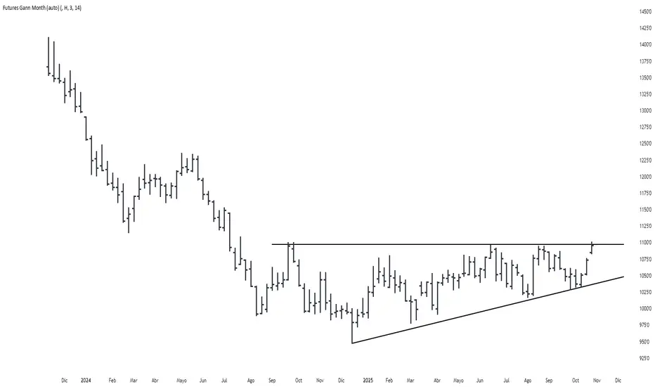
Futures Gann MonthBuilds a a continuous chart of the same month for a futures contract (e.g. ZSH2026).
This means such a chart consists of March '22, March '23, March '24, March '25, March '26...
The script goes back 20 years at most (depending on the current ticker selected in TradingView).
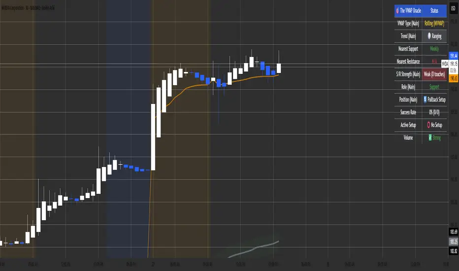
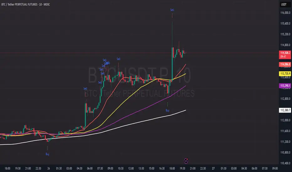
The VWAP OracleOverview
The VWAP Oracle is a sophisticated overlay indicator that elevates VWAP (Volume Weighted Average Price) from a simple benchmark to an intelligent oracle for intraday and swing decisions. It offers flexible anchoring (rolling MVWAP, weekly, monthly, yearly) with session options, augmented by heuristic "AI/ML" elements for trend forecasting, dynamic S/R identification, and mean-reversion pullback strategies. A comprehensive dashboard delivers at-a-glance intel on trends, roles, touch history, and trade stats, complemented by visual zones, entry shapes, and alerts. Tailored for active traders in equities, forex, or futures, this iteration refines state handling and role logic for seamless execution on Pine v6.
Core Mechanics
Built around robust VWAP computations with layered analytics:
VWAP Framework: Primary line via user-selected type—Rolling (volume-weighted over lookback bars for agility), or Anchored (resets on week/month/year changes). HLC3 source standard; regular or 24h sessions. Toggles for secondary lines (e.g., weekly in orange for context).
Heuristic Enhancements: ATR safeguards (min tick fallback) normalize zones (± sensitivity * ATR for touches) and distances (e.g., 3x for setups). Linear regression over lookback derives slope (ATR-scaled for cross-asset comparability), flagging strong trends (> threshold) with rising/falling confirmation and volume >20-bar SMA.
Role & Proximity Engine: Scans enabled VWAPs globally—assigns nearest as support (price above, higher value prioritized) or resistance (below, lower prioritized), e.g., "Weekly" if closest. Tracks main VWAP touches for strength tiers (Weak <3, Moderate 3-4, Strong 5-7, Proven ≥8).
Pullback Strategy: In validated trends (slope + price move + volume), distant deviations (> ATR multiple) trigger "awaiting" state. Confirms entries on fresh touches with directional candles (close > open for longs), setting ATR-based stops (1x offset from VWAP) and targets (2x extension). Manages to hit (success tally) or breach (reset); daily/anchor resets clear stats.
Outputs: Trend-colored VWAP (blue/red in strong regimes, gray in range), role-tinted zones (green/red fill), triangles for entries, labels for outcomes.
Why This Mashup Adds Value & Originality
Traditional VWAPs are passive lines; multi-anchor plots add clutter without synthesis. Here, the fusion of anchored/rolling VWAPs with regression-normalized "AI" slope (volatility-adjusted for invariance) and touch-based strength scoring forms a predictive layer—e.g., "Proven" supports from 8+ interactions signal higher-probability bounces than raw levels. Stateful pullback logic (distant setup → touch entry → managed exit) with explicit breach cancels differentiates it from basic deviation oscillators, while the 11-row dashboard (trend icons, nearest roles, live success %) consolidates what would take multiple indicators. Global role reassignment (no function var limits) ensures accuracy, creating a unified "oracle" for confluence without redundancy—ideal for evolving static VWAP into adaptive decision support.
How to Use
Configuration: Overlay on chart. VWAP: Pick Rolling for scalps (252-bar default); enable weeklies for bias. AI: ATR 14, sensitivity 0.5 (tighter for precision). Trade: 3x min distance setups, 2x/1x target/stop. Visuals: Dashboard top-right, zones on, signals toggled.
Dashboard Readout (semi-opaque black, size-adjustable):
Header/Type: "The VWAP Oracle" + active (e.g., "Rolling (MVWAP)").
Trend: 🔵/🔴 Strong or ⚪ Range—align trades accordingly.
Nearest S/R: "Main" support (green) for bounces; "Monthly" resistance (red) for fades.
Strength/Role: "Strong (5 touches)"; "Support" for current main bias.
Position: "🔄 Pullback Setup" flags opportunity; "⏳ Awaiting" pre-entry.
Success/Setup: "80% (4/5)"; 🟢 Long Active if running; volume "✅ Strong" validates.
Execution: Strong bull + distant alert → Long on green triangle touch → Trail to target label (✓) or stop (✗). Use zones for invalidation; alerts cover setups/hits. Suits 15m-4H on majors like NAS100.
Pro Tips: Backtest resets (daily intraday); tweak slope threshold (1.5) for noise.
Limitations & Disclaimer
Touches and entries confirm on close, introducing minor lag; rolling VWAP smooths but may trail sharp moves. Slope can oscillate in transitions—add manual filters. Stats reset periodically (e.g., daily), so sample sizes vary; "success" is backward-looking. No auto-sizing—cap risk at 1% equity. v6-optimized, but verify on live data. Not advice; simulate trades, as history ≠ future. Feedback welcome in comments.
Camarilla D/W/M, Alerts, TP/SL, ADX, EMA, Volume# Camarilla Levels Pro - Advanced Trading Indicator
## 📊 **Overview**
A sophisticated Camarilla levels indicator with multiple timeframe support, advanced filtering, and comprehensive trading statistics. Designed for professional traders seeking precise entry/exit points with robust risk management.
## 🎯 **Key Features**
### **Multi-Timeframe Camarilla Levels**
- **D/W/M Timeframes**: Calculate levels from Daily, Weekly, or Monthly data
- **Accurate Calculations**: Uses previous period's High, Low, Close for precise level calculation
- **6 Key Levels**: H3, H4, H5 (Resistance) and L3, L4, L5 (Support)
### **Advanced Entry Signals**
- **4 Trading Scenarios**:
- LONG 1: Price crosses above H4 with stop at H3, target at H5
- LONG 2: Price crosses above L3 with stop at L4, target at H3
- SHORT 1: Price crosses below L4 with stop at L3, target at L5
- SHORT 2: Price crosses below H3 with stop at H4, target at L3
### **Smart Filtering System**
- **ADX Filter**: Confirms trend strength (configurable threshold)
- **Volume Filter**: Ensures significant volume participation
- **EMA Filter**: Aligns with trend direction (50-period default)
- **Flexible Combination**: Use any combination of filters
### **Non-Repainting Signals**
- **Signal Protection**: Once triggered, signals don't disappear or repaint
- **Executed Signal Tracking**: Historical record of all filled positions
- **Visual Confirmation**: Clear distinction between potential and executed trades
### **Comprehensive Alert System**
- **Entry Alerts**: Buy/Sell signals with level information
- **Exit Alerts**: TP/SL notifications with profit/loss data
- **Customizable**: Set alerts for specific conditions only
### **Professional Risk Management**
- **Auto TP/SL**: Automatic take-profit and stop-loss levels
- **Position Tracking**: Monitors active trades with real-time P/L
- **Single Position**: Prevents over-trading with one active position rule
### **Advanced Statistics**
- **Trade Analytics**: Total trades, win rate, profitability
- **Performance Metrics**: Total profit %, average trade performance
- **Real-time Monitoring**: Current position status and filter status
- **Visual Table**: Clean statistics display in corner
## ⚙️ **Customization Options**
### **Display Settings**
- Toggle level labels, signals, TP/SL markers, and statistics
- Adjust visual styles and sizes for clarity
- Right-positioned labels to avoid chart clutter
### **Filter Configuration**
- **ADX**: Length (14) and threshold (20) settings
- **Volume**: Period (20) and multiplier (1.2x) adjustment
- **EMA**: Customizable period (50 default)
### **Timeframe Selection**
- Daily levels for intraday trading
- Weekly levels for swing trading
- Monthly levels for position trading
## 📈 **Trading Strategy**
### **Entry Logic**
1. **Breakout Confirmation**: Price must cross and hold beyond level
2. **Filter Validation**: All active filters must pass conditions
3. **Single Position**: No new entries while position is active
### **Exit Logic**
- **Take Profit**: Automatic at calculated target levels
- **Stop Loss**: Automatic at calculated risk levels
- **Visual Feedback**: Green circles for TP, Red X for SL
### **Risk Management**
- Pre-defined risk/reward ratios based on Camarilla mathematics
- No pyramiding or multiple position risks
- Clear visual tracking of active trade parameters
## 🎨 **Visual Features**
- **Clean Level Display**: Gray circles for unobtrusive level marking
- **Signal Markers**: Tiny triangles for executed entries
- **Exit Markers**: Tiny circles (TP) and X (SL) for clear exits
- **Statistics Table**: Professional performance monitoring
- **Right-Aligned Labels**: Prevents chart congestion
## 🔔 **Alert Conditions**
- **Buy Signals**: LONG 1 or LONG 2 conditions met
- **Sell Signals**: SHORT 1 or SHORT 2 conditions met
- **Exit Alerts**: TP or SL hit for both long and short positions
## 💡 **Professional Use Cases**
- **Day Trading**: Use Daily levels with volume filter
- **Swing Trading**: Use Weekly levels with ADX trend confirmation
- **Position Trading**: Use Monthly levels with EMA trend alignment
- **Strategy Testing**: Comprehensive statistics for backtesting
This indicator provides institutional-grade Camarilla analysis with professional risk management tools, making it suitable for traders of all experience levels seeking systematic trading approaches with clear entry/exit rules.

RSI +WMA+ MA + Div SETUPRSI +WMA+ MA + Div SETUP
Индикатор объединяет анализ RSI, скользящих средних RSI (EMA/WMA), дивергенций, автоматические уровни поддержки/сопротивления на RSI, «лестницу цен» для целевых уровней RSI и фильтр тренда со старшего таймфрейма (HTF).
Точки входа формируются строго в месте пересечения RSI с заданным уровнем после выполнения выбранного сетапа. Поддержан режим «без повторов до смены направления».
Что показывает
Линии RSI, EMA(9) от RSI и WMA(45) от RSI.
Фон панели: бычий/медвежий/нейтральный режим импульса RSI (по соотношению EMA и WMA и наклону WMA).
Маркеры ▲/▼ — смена фазы импульса RSI (не торговые сигналы).
Дивергенции (регулярные): Bull/Bear с метками.
Auto SnR на RSI: динамические уровни поддержки/сопротивления по экстремумам RSI.
WMA SnR points: точки ретеста WMA на RSI.
Лестница цен: оценка цены, при которой RSI достигнет выбранных уровней.
HTF-линия: WMA(45) от RSI на старшем ТФ (по желанию).
Торговые сигналы (BUY/SELL)
Сигналы строятся в окне осциллятора RSI ровно в точке кросса:
BUY: (по выбранному сетапу) + пересечение RSI↑ заданного уровня (по умолчанию 40) + (опционально) выполнен HTF-фильтр.
SELL: (по выбранному сетапу) + пересечение RSI↓ заданного уровня (по умолчанию 60) + (опционально) выполнен HTF-фильтр.
Сетапы входа (переключатель)
Setup 1: Div + Cross — требуется подтверждённая дивергенция (Bull/Bear) и кросс RSI уровня в пределах заданного «окна» баров.
Setup 2: Cross only — только кросс RSI уровня, без требования дивергенции.
HTF-фильтр тренда
Расчёт WMA(45) от RSI на настраиваемом HTF (M, H1=60, H4=240, D и т. д.).
Разрешение Лонга, если HTF_WMA45 ≥ L-уровня (например, 50).
Разрешение Шорта, если HTF_WMA45 ≤ S-уровня.
Опция «Только после закрытия HTF-свечи» исключает перерисовку фильтра до закрытия старшего бара.
Основные настройки
RSI Length, Source.
EMA Length / WMA Length (для линий на RSI).
Визуальные уровни RSI (Up/Down) и подсветка фона.
Divergence: пороги показа (RSI ≤ X / ≥ Y), метки.
Price ladder: список целевых уровней RSI и «шаг» вывода цен.
Auto SnR: три окна lookback, цвета линий.
WMA SnR: чувствительность к ретестам WMA.
Entries: выбор сетапа, окно после дивергенции, уровни для Лонга/Шорта (по умолчанию 40/60), «ставить метку по фактическому RSI», без повторов.
HTF Filter: вкл/выкл, ТФ, уровни для Лонга/Шорта, «только по закрытию», показать HTF-линию.
Алерты
BUY: HTF ok + Setup OK + RSI cross up
SELL: HTF ok + Setup OK + RSI cross down
Сообщения алертов — константные строки (совместимы с Pine).
Перерисовка
Локальные сигналы ставятся на закрытии бара кросса RSI — не перерисовываются.
Дивергенции используют pivot-логику (подтверждаются через lookback) — метка появляется после подтверждения.
HTF-фильтр без перерисовки при включённой опции «Только после закрытия HTF-свечи».
Пример использования
H1 фильтр ≥ 50, M5 Setup 1: дождитесь Bull-дивергенции на M5, затем кросса RSI↑40 в течение N баров — получите BUY.
Для входов без дивергенций выберите Setup 2.
English Description
RSI +WMA+ MA + Div SETUP
All-in-one RSI toolkit: native RSI, RSI-based EMA/WMA, divergence detection, automatic RSI Support/Resistance, price ladder (target prices for chosen RSI levels), and a configurable Higher-Timeframe (HTF) trend filter.
Entry markers are printed exactly at the RSI level cross once the selected setup conditions are met. Includes a No-Repeat option to avoid duplicate signals.
Visuals
RSI, EMA(9) of RSI, WMA(45) of RSI.
Background shading for bull/bear/neutral RSI impulse phases (EMA vs WMA and WMA slope).
▲/▼ phase-change markers (context only, not trade signals).
Regular Bull/Bear divergences with optional labels.
Auto RSI SnR lines from RSI extremes.
WMA SnR points (RSI retests of WMA).
Price ladder: estimated price to reach given RSI levels.
Optional HTF line: WMA(45) of RSI calculated on a higher timeframe.
Trade Signals (BUY/SELL)
Signals plot in the RSI pane at the cross point:
BUY: selected setup satisfied + RSI crosses up the chosen level (default 40) + optional HTF filter passes.
SELL: selected setup satisfied + RSI crosses down the chosen level (default 60) + optional HTF filter passes.
Entry Setups (selector)
Setup 1: Div + Cross — requires a confirmed Bull/Bear divergence and an RSI level cross within a user-defined bar window.
Setup 2: Cross only — RSI level cross only (no divergence required).
HTF Trend Filter
Computes WMA(45) of RSI on a configurable higher timeframe (e.g., 60=H1, 240=H4, D, etc.).
Long allowed if HTF_WMA45 ≥ Long threshold (e.g., 50).
Short allowed if HTF_WMA45 ≤ Short threshold.
“Close-only” option ensures the HTF filter updates only after the HTF bar closes (no repaint).
Key Inputs
RSI length/source; EMA/WMA lengths.
Visual RSI up/down levels & background shading.
Divergence thresholds (RSI ≤ / ≥), labels.
Price ladder: target RSI levels & label spacing.
Auto SnR: three lookback windows, colors.
WMA SnR: retest sensitivity.
Entries: setup selector, divergence window, Long/Short levels (40/60 by default), “mark at actual RSI value”, no-repeat.
HTF Filter: enable, timeframe, Long/Short thresholds, close-only, show HTF line.
Alerts
BUY: HTF ok + Setup OK + RSI cross up
SELL: HTF ok + Setup OK + RSI cross down
Alert messages are constant strings (Pine-compatible).
Repaint Notes
LTF entry signals are placed at bar close when the cross occurs — no repaint.
Divergences rely on pivots; labels plot after confirmation.
HTF filter does not repaint when Close-only is enabled.
Example
H1 filter ≥ 50, M5 Setup 1: wait for a Bull divergence on M5 and an RSI cross up 40 within N bars — you’ll get a BUY.
Choose Setup 2 for cross-only entries.

Relative Strength Index + MTF VEIODORIOAn advanced technical indicator that combines multiple RSI (Relative Strength Index) analysis features into a single, comprehensive tool.
Main Features:
1. Traditional RSI
Calculates the standard Relative Strength Index with a configurable period (default: 14)
Displays overbought and oversold levels
Includes colored background fill for better visualization
2. Multi-Timeframe (MTF) Chart
Displays RSI values simultaneously across 8 different timeframes:
1 minute, 5 minutes, 15 minutes, 30 minutes
1 hour, 4 hours, 1 day, 1 week
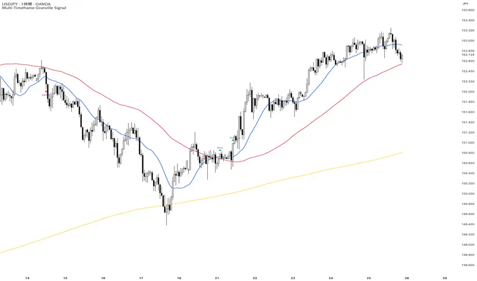
Multi-Timeframe Granville Signal──────────────────────────────────────────
OVERVIEW
──────────────────────────────────────────
MTF Granville Signal is an invite-only Pine Script indicator that assists traders in identifying high-probability entry points based on Granville's Law principles, enhanced with Multi-Timeframe (MTF) structural analysis and dynamic Moving Average Deviation Rate (MADR) filtering.
This indicator is NOT investment advice. It is a technical analysis tool. All trading decisions and outcomes are the sole responsibility of the user.
──────────────────────────────────────────
WHAT MAKES THIS INDICATOR ORIGINAL
──────────────────────────────────────────
While many indicators implement basic Granville's Law or simple moving average crosses, this indicator distinguishes itself through two mathematically rigorous enhancements:
1. Dynamic MADR Filtering with Statistical Foundation
Unlike fixed percentage bands used in conventional overbought/oversold indicators, this system employs adaptive threshold calculation based on rolling standard deviation :
Mathematical Approach:
Calculates price deviation from the reference Simple Moving Average(SMA) as a percentage
Computes standard deviation (σ) over an extended lookback period
Default: 1σ threshold = 68.26% probability zone under normal distribution
User-configurable sigma multiplier (1σ, 2σ, 3σ)
Operational Logic:
Trend-following signals (Granville Rules 1, 2, 3, 5, 6, 7) : Fire only when MADR is within normal range (< threshold), indicating healthy trend conditions
Counter-trend signals (Granville Rules 4, 8) : Fire only when MADR exceeds threshold, indicating statistical over-extension and mean-reversion probability
Why This Matters:
Traditional indicators use arbitrary fixed thresholds (e.g., "overbought above +3%"). Market volatility varies dramatically across assets and time periods. A 3% deviation in EUR/USD may be extreme, while in Bitcoin it's noise. Dynamic MADR automatically adapts to each market's volatility characteristics, maintaining consistent statistical validity across diverse trading instruments.
2. MTF Structural Verification for Cycle-Phase Filtering
This is not merely displaying multiple timeframe SMAs on a chart. The indicator performs structural analysis to determine trend cycle phase :
Verification Mechanism:
Checks if price has recently touched/crossed the higher timeframe SMA within a configurable lookback period
Confirms SMA hierarchy alignment (short-term > mid-term > long-term for uptrends)
Distinguishes between early-cycle trend initiation and late-cycle exhaustion
Why This Matters:
Granville's Law signals can appear throughout a trend cycle, but probability varies significantly:
Early cycle (price recently interacted with higher TF SMA): High probability - catching trend initiation or deep retracements
Late cycle (price extended far from higher TF SMA): Low probability - entering during exhaustion phase
By requiring recent structural interaction with higher timeframe SMAs, the indicator filters out low-probability late-cycle entries, dramatically improving signal quality.
──────────────────────────────────────────
GRANVILLE'S LAW IMPLEMENTATION
──────────────────────────────────────────
This indicator implements all eight of Joseph Granville's classic rules, with a focus on Rules 1, 2, 3,4, 5, 6, 7, and 8 for primary signal generation. Rules 3 and 7 are operationalized through touch-based approximation (see explanation below):
Trend-Following Signals (Rules 1, 2, 3, 5, 6, 7)
Buy Signals:
Short-term SMA crosses above (or touches and bounces off) mid/long-term SMAs
SMA hierarchy confirms uptrend structure
MADR indicates price is NOT over-extended
Price recently interacted with higher timeframe SMA (MTF verification)
Sell Signals:
Mirror logic for downtrends
Counter-Trend Mean-Reversion Signals (Rules 4, 8)
Sell Signals:
Price shows extreme deviation from reference SMA (MADR exceeds threshold)
Price begins reverting toward SMA
Short-term SMA crosses below (or touches and bounces off) mid/long-term SMAs
Recent structural interaction with higher timeframe SMA confirms reversal setup
Buy Signals:
Mirror logic for oversold reversals
How Rules 3 and 7 Are Handled:
Rules 3 and 7 describe "price approaches the SMA." Rather than excluding these rules, this indicator approximates "approaches" as "touches the SMA" to eliminate ambiguity. In practice, defining "approaches" is subjective and adds complexity. By operationalizing "approaches" as "touches/crosses," the indicator maintains mechanical objectivity while still capturing the intent of Rules 3 and 7.
──────────────────────────────────────────
WHY GRANVILLE'S LAW?
──────────────────────────────────────────
Universality: Functions across all markets (forex, stocks, crypto, commodities) and timeframes
Simplicity: Based solely on price-to-moving-average relationships—no complex calculations
Reproducibility: Mechanical rules eliminate emotional bias
60+ Year Track Record: Proven principle since Joseph Granville's 1960 publication
──────────────────────────────────────────
TECHNICAL ARCHITECTURE
──────────────────────────────────────────
Signal Generation Process
Calculate SMAs across multiple timeframes (short/mid/long-term periods)
Compute MADR : Measure price deviation from reference SMA and its statistical significance
Verify MTF Structure : Check recent price interaction with higher timeframe SMA
Evaluate SMA Hierarchy : Confirm trend direction via SMA alignment
Apply Granville Logic : Detect specific Rule patterns (crosses, touches, bounces)
Determining deviation from SMA :
• Trend-following: MADR < threshold (healthy trend)
• Counter-trend: MADR > threshold (over-extension)
Signal Interval Control : Cooldown period prevents alert spam during noise
Why This Combination Works
The synthesis of these three components creates a robust filtering system:
Granville's Law provides the fundamental signal logic (proven over decades)
Dynamic MADR prevents entries at dangerous price extremes (volatility-adaptive risk management)
MTF Structural Verification ensures signals occur at optimal cycle phases (timing optimization)
No single element alone produces high-quality signals. Their integration may generate edge in trending market conditions.
──────────────────────────────────────────
WHAT THIS INDICATOR DOES NOT DO
──────────────────────────────────────────
To set realistic expectations:
❌ Does not predict future price direction with certainty
❌ Does not guarantee profitable trades
❌ Does not work equally well in all market conditions (see below for limitations)
❌ Does not replace risk management, position sizing, or trading discipline
❌ Does not provide trade exit signals (focus is on entry timing)
──────────────────────────────────────────
PARAMETER CONFIGURATION
──────────────────────────────────────────
Mid Term Trend Check Enabled (Default: true)
Activates SMA hierarchy verification for mid-term trend confirmation.
When enabled: Signals require short-term SMA > mid-term SMA (uptrend) or vice versa (downtrend)
When disabled: Only short-term SMA behavior is evaluated
Recommendation : Keep enabled for most use cases to filter weak trends
Long Term Trend Check Enabled (Default: true)
Adds long-term SMA to hierarchy verification for additional trend strength confirmation.
Requires Mid Term Trend Check to be enabled
When enabled: Signals require short-term SMA > mid-term SMA > long-term SMA alignment
Recommendation : Enable on lower timeframes (15m or below) for stronger filtering. Disable on higher timeframes (1h or above) as the additional filter becomes redundant and overly restrictive
Require Touch Higher Timeframe SMA Enabled (Default: true)
Enforces recent price interaction with higher timeframe SMA to filter late-cycle entries.
When enabled: Signals fire only if price touched/crossed mid-term or long-term SMA within lookback period
When disabled: Signals can fire regardless of recent SMA interaction (more signals, lower quality)
Recommendation : Keep enabled. This is a core filter for cycle-phase discrimination
Touch Higher Timeframe SMA Lookback Period (Default: 24 bars)
Defines how far back to search for price-SMA interaction.
Lower values (12-18): Stricter filtering, fewer signals, earlier cycle detection
Higher values (24-36): More lenient filtering, more signals, includes some mid-cycle entries
Recommendation : Adjust based on market volatility. Trending markets: use lower values. Choppy markets: use higher values to capture valid retracements
SMA Short Term Period (Default: 20)
Primary SMA for Granville's Law pattern detection.
Lower values (10-15): More responsive, more signals, higher noise
Higher values (25-40): Smoother, fewer signals, delayed entries
Recommendation : 20 is standard across most markets. Adjust ±5 based on your timeframe preference
SMA Mid Term Period (Default: 80)
Reference SMA for trend hierarchy and MTF verification.
Typically 3-5x the short-term period
Recommendation : 80 works well for intraday (15m, 1h) and swing trading (4h, daily). Maintain ratio relationship with short-term SMA
SMA Long Term Period (Default: 320)
Optional trend strength filter (requires Long Term Trend Check enabled).
Typically 4x the mid-term period
Recommendation : 320 is appropriate for multi-day trend analysis. Not critical for intraday scalping
SMA Period for Divergence (Default: 1920)
Lookback period for calculating MADR standard deviation. Two approaches:
Approach 1: Chart Timeframe SMA (Simple)
Use 20 periods matching your chart timeframe for straightforward deviation measurement.
Example: 20 periods on any timeframe
Approach 2: Higher Timeframe SMA (MTF Analysis)
Use period equivalent to higher timeframe's 20-period SMA for multi-timeframe structural analysis.
Recommendation for day trading :
• 15m chart: 1920 periods (≈ daily 20-SMA: 20 days × 96 bars/day)
• 1h chart: 480 periods (≈ daily 20-SMA: 20 days × 24 bars/day)
• 4h chart: 120 periods (≈ daily 20-SMA: 20 days × 6 bars/day)
Both approaches are valid. Approach 2 incorporates higher timeframe context into MADR filtering.
MADR Standard Deviation Band (Sigma) (Default: 1.00)
Statistical threshold for determining trend overheating vs. healthy conditions.
1.0σ = 68.26% probability zone (default, balanced)
2.0σ = 95.44% probability zone (stricter, fewer counter-trend signals)
3.0σ = 99.74% probability zone (very strict, rare extreme reversals only)
Recommendation : Start with 1.0σ. Increase to 2.0σ if you want to trade only extreme mean-reversion opportunities. Decrease to 0.5σ-0.8σ for more aggressive trend-following
Signal Minimum Interval (Default: 4 hours)
Cooldown period between signals to prevent alert spam during consolidation.
Measured in hours regardless of chart timeframe
0 = no cooldown (all valid signals fire)
2-4 = typical for day trading
8-12 = typical for swing trading
Recommendation : Match to your trading frequency. Day traders: 2-4 hours. Swing traders: 8-12 hours
Buy/Sell Signal Text Color (Default: Blue)
Reversal Buy/Sell Signal Text Color (Default: Purple)
Customize label colors for visual distinction between trend-following and counter-trend signals.
Alert Display Prefix (Default: Auto-detected from chart timeframe)
Prefix for alert messages (e.g., "1h", "15m"). Auto-filled if left blank.
──────────────────────────────────────────
RECOMMENDED CONFIGURATIONS
──────────────────────────────────────────
Configuration 1: Aggressive Day Trading (15m Chart)
SMA Short: 20
SMA Mid: 80
SMA Long: 320
MADR SMA Period: 1920
MADR Sigma: 1.0
Signal Interval: 4 hours
Touch Lookback: 24 bars
Long Term Trend Check: Enabled
Use case: Active day trading, multiple signals per session
Configuration 2: Balanced Day Trading (1h Chart)
SMA Short: 20
SMA Mid: 80
MADR SMA Period: 480
MADR Sigma: 1.0
Signal Interval: 4 hours
Touch Lookback: 24 bars
Long Term Trend Check: Disabled
Use case: Standard day trading, moderate signal frequency
──────────────────────────────────────────
TECHNICAL LIMITATIONS AND UNSUITABLE CONDITIONS
──────────────────────────────────────────
This indicator has known limitations:
1. Range/Choppy Markets
Extended consolidation generates false signals and whipsaw entries. Wait for clear breakout or use higher timeframe trend filters.
2. Low Liquidity Instruments
In exotic pairs, microcap stocks, or illiquid assets, wide spreads and slippage erode edge. Stick to major high-volume instruments.
3. News-Driven Volatility
Fundamental shocks invalidate technical patterns. Avoid trading around scheduled high-impact news events.
4. Algorithmic Regime Changes
Market microstructure evolves over time. Review performance periodically and adjust parameters if edge deteriorates.
5. Extreme Market Regimes
Black swan events and unprecedented volatility cause all technical systems to fail simultaneously. Use circuit breakers and position size limits.
6. Gap Openings
Price gaps over weekends or between sessions invalidate some signals. Reduce position sizing accordingly.
──────────────────────────────────────────
OPEN-SOURCE CODE TRANSPARENCY
──────────────────────────────────────────
While the source code is proprietary and protected, the fundamentals are fully explainable:
SMA calculation : Standard Pine Script ta.sma() function
MADR calculation : (close - sma) / sma * 100 and ta.stdev() for threshold
MTF data retrieval : request.security() for higher timeframe values
Granville pattern detection : Logical comparison of price/SMA positions and crosses
No "black box" algorithms. No hidden magic. Only rigorous application of proven technical principles.
──────────────────────────────────────────
OPEN-SOURCE CODE REUSE
──────────────────────────────────────────
This indicator does NOT reuse code from other TradingView scripts. All logic is proprietary.
Standard Pine Script functions (ta.sma, ta.stdev, request.security, etc.) used per documented API
No third-party libraries or external dependencies
No license conflicts
──────────────────────────────────────────
VERSION INFORMATION
──────────────────────────────────────────
Current Version : 6 (Pine Script v6)
Author : © 2025 mmntmr369. All rights reserved.
Publication Type : Invite-only (Proprietary source code)
──────────────────────────────────────────
DISCLAIMER : This indicator is provided for educational and informational purposes only. It does not constitute investment advice, financial advice, trading advice, or any other type of advice. You should not make any investment decisions based solely on this indicator. Always conduct your own research and consult with a licensed financial professional before making investment decisions. Past performance does not indicate future results. Trading carries substantial risk of loss and is not suitable for all investors.
══════════════════════════════════════════
日本語版 / JAPANESE VERSION
══════════════════════════════════════════
──────────────────────────────────────────
概要
──────────────────────────────────────────
MTF Granville Signalは、グランビルの法則の原則に基づいた高確率エントリーポイントの特定を支援する招待制Pine Scriptインジケーターです。マルチタイムフレーム(MTF)構造分析と動的移動平均線乖離率(MADR)フィルタリングにより強化されています。
本インジケーターは投資助言ではありません。 これはテクニカル分析ツールです。すべての取引判断と結果は、ユーザーの単独責任となります。
──────────────────────────────────────────
本インジケーターの独自性
──────────────────────────────────────────
多くのインジケーターが基本的なグランビルの法則または単純な移動平均クロスを実装していますが、本インジケーターは2つの数学的に厳密な拡張機能によって差別化されます:
1. 統計的基盤を持つ動的MADRフィルタリング
従来の買われ過ぎ/売られ過ぎインジケーターで使用される固定パーセンテージバンドとは異なり、本システムは ローリング標準偏差に基づく適応的閾値計算 を採用しています:
数学的アプローチ:
参照SMAからの価格偏差をパーセンテージとして計算
拡張ルックバック期間にわたって標準偏差(σ)を計算
デフォルト:1σ閾値 = 正規分布下の68.26%確率ゾーン
ユーザー設定可能なシグマ乗数(1σ、2σ、3σ)
操作ロジック:
順張りシグナル(グランビル法則1、2、3、5、6、7) :MADRが正常範囲内(<閾値)にある場合のみ発火し、健全なトレンド状態を示します
逆張りシグナル(グランビル法則4、8) :MADRが閾値を超える場合のみ発火し、統計的過度の拡張と平均回帰確率を示します
重要な理由:
従来のインジケーターは任意の固定閾値(例:「+3%以上で買われ過ぎ」)を使用します。市場のボラティリティは資産と期間によって劇的に変化します。EUR/USDでの3%偏差は極端かもしれませんが、ビットコインではノイズです。動的MADRは各市場のボラティリティ特性に自動的に適応し、多様な取引商品全体で一貫した統計的妥当性を維持します。
2. サイクルフェーズフィルタリングのためのMTF構造検証
これは単にチャート上に複数の時間足SMAを表示するだけではありません。インジケーターは トレンドサイクルフェーズを決定するための構造分析 を実行します:
検証メカニズム:
設定可能なルックバック期間内に価格が上位時間足SMAに最近タッチ/クロスしたかどうかを確認
SMA階層の整列を確認(上昇トレンドでは短期>中期>長期)
初期サイクルトレンド開始と後期サイクル疲弊を区別
重要な理由:
グランビルの法則シグナルはトレンドサイクル全体で出現できますが、確率は大きく異なります:
初期サイクル (価格が最近上位TF SMAと相互作用):高確率 - トレンド開始または深い調整を捕捉
後期サイクル (価格が上位TF SMAから遠く離れている):低確率 - 疲弊フェーズ中のエントリー
上位時間足SMAとの最近の構造的相互作用を要求することで、インジケーターは低確率の後期サイクルエントリーを除外し、シグナル品質を劇的に向上させます。
──────────────────────────────────────────
グランビルの法則実装
──────────────────────────────────────────
本インジケーターはジョセフ・グランビルの古典的な8つの法則すべてを実装しており、 法則1、2、3、4、5、6、7、8 に焦点を当てた主要シグナル生成を行います。法則3と7はタッチベースの近似で運用されます(以下の説明を参照):
順張りシグナル(法則1、2、3、5、6、7)
買いシグナル:
短期SMAが中期/長期SMAを上回って交差する(またはタッチしてバウンス)
SMA階層が上昇トレンド構造を確認
MADRが価格が過度に拡張されていないことを示す
価格が最近上位時間足SMAと相互作用した(MTF検証)
売りシグナル:
下降トレンドの場合は反対のロジック
逆張り平均回帰シグナル(法則4、8)
売りシグナル:
価格が参照SMAから極端に乖離(MADRが閾値を超える)
価格がSMAに向かって反転を開始
短期SMAが中期/長期SMAを下回って交差する(またはタッチしてバウンス)
上位時間足SMAとの最近の構造的相互作用が反転セットアップを確認
買いシグナル:
売られ過ぎ反転の場合は反対のロジック
法則3と7の取り扱い:
法則3と7は「価格がSMAに接近する」と説明しています。これらの法則を除外するのではなく、本インジケーターは曖昧さを排除するために「接近」を「SMAにタッチ」として近似します。実際には、「接近」の定義は主観的で複雑さを追加します。「接近」を「タッチ/クロス」として運用することで、インジケーターは法則3と7の意図を捕捉しながら機械的客観性を維持します。
──────────────────────────────────────────
なぜグランビルの法則?
──────────────────────────────────────────
普遍性: すべての市場(外国為替、株式、暗号、商品)および時間足で機能
シンプルさ: 価格対移動平均の関係のみに基づく - 複雑な計算なし
再現性: 機械的ルールが感情的バイアスを排除
60年以上の実績: ジョセフ・グランビルの1960年の出版以来実証された原則
──────────────────────────────────────────
技術アーキテクチャ
──────────────────────────────────────────
シグナル生成プロセス
SMAを計算 複数の時間足にわたって(短期/中期/長期期間)
MADRを計算 :参照SMAからの価格偏差とその統計的有意性を測定
MTF構造を検証 :上位時間足SMAとの最近の価格相互作用を確認
SMA階層を評価 :SMA整列によってトレンド方向を確認
グランビルロジックを適用 :特定の法則パターンを検出(クロス、タッチ、バウンス)
SMAからの乖離を判定 :
• 順張り:MADR < 閾値(健全なトレンド)
• 逆張り:MADR > 閾値(過度の拡張)
シグナル間隔制御 :クールダウン期間がノイズ中のアラートスパムを防止
なぜこの組み合わせが機能するか
これら3つのコンポーネントの統合が堅牢なフィルタリングシステムを生成します:
グランビルの法則 が基本的なシグナルロジックを提供(数十年にわたって実証)
動的MADR が危険な価格極値でのエントリーを防止(ボラティリティ適応的リスク管理)
MTF構造検証 がシグナルを最適なサイクルフェーズで発生させる(タイミング最適化)
単一の要素だけでは高品質のシグナルは生成されません。それらの統合はトレンド相場環境においてエッジを生み出す可能性があります。
──────────────────────────────────────────
本インジケーターが行わないこと
──────────────────────────────────────────
現実的な期待を設定するために:
❌ 将来の価格方向を確実に予測しない
❌ 収益性のある取引を保証しない
❌ すべての市場環境で等しく機能しない(限界については下記参照)
❌ リスク管理、ポジションサイジング、または取引規律を置き換えない
❌ 取引の手仕舞いシグナルを提供しない(焦点はエントリータイミング)
──────────────────────────────────────────
パラメータ設定
──────────────────────────────────────────
Mid Term Trend Check Enabled(中期トレンドチェック有効) (デフォルト: true)
中期トレンド確認のためのSMA階層検証を有効化。
有効時:シグナルは短期SMA > 中期SMA(上昇トレンド)またはその逆(下降トレンド)を要求
無効時:短期SMAの動作のみを評価
推奨 :弱いトレンドをフィルタリングするため、ほとんどの用途で有効を維持
Long Term Trend Check Enabled(長期トレンドチェック有効) (デフォルト: true)
追加のトレンド強度確認のため、長期SMAをSMA階層検証に追加。
中期トレンドチェックの有効化が必要
有効時:シグナルは短期SMA > 中期SMA > 長期SMAの整列を要求
推奨 :低時間足(15分足以下)でより強力なフィルタリングのため有効化。高時間足(1時間足以上)では追加フィルターが冗長かつ過度に制限的になるため無効化
Require Touch Higher Timeframe SMA Enabled(上位足SMAタッチ要求有効) (デフォルト: true)
後期サイクルエントリーをフィルタリングするため、上位時間足SMAとの最近の価格相互作用を強制。
有効時:シグナルはルックバック期間内に価格が中期または長期SMAにタッチ/クロスした場合のみ発火
無効時:最近のSMA相互作用に関係なくシグナル発火(多くのシグナル、低品質)
推奨 :有効を維持。これはサイクルフェーズ識別のコアフィルター
Touch Higher Timeframe SMA Lookback Period(上位足SMAタッチルックバック期間) (デフォルト: 24バー)
価格-SMA相互作用を検索する遡及期間を定義。
低い値(12-18):厳格なフィルタリング、少ないシグナル、初期サイクル検出
高い値(24-36):寛容なフィルタリング、多くのシグナル、中期サイクルエントリーを含む
推奨 :市場ボラティリティに基づいて調整。トレンド市場:低い値を使用。荒れた市場:有効な調整を捉えるため高い値を使用
SMA Short Term Period(SMA短期期間) (デフォルト: 20)
グランビルの法則パターン検出のための主要SMA。
低い値(10-15):反応的、多くのシグナル、高いノイズ
高い値(25-40):滑らか、少ないシグナル、遅延エントリー
推奨 :20はほとんどの市場で標準。時間足の好みに基づいて±5調整
SMA Mid Term Period(SMA中期期間) (デフォルト: 80)
トレンド階層とMTF検証のための基準SMA。
通常、短期期間の3-5倍
推奨 :80はデイトレ(15m、1h)とスイングトレード(4h、日足)に適している。短期SMAとの比率関係を維持
SMA Long Term Period(SMA長期期間) (デフォルト: 320)
オプションのトレンド強度フィルター(長期トレンドチェック有効時必要)。
通常、中期期間の4倍
推奨 :320は数日間のトレンド分析に適している。デイトレ、スイングには重要でない
SMA Period for Divergence(乖離のためのSMA期間) (デフォルト: 1920)
MADR標準偏差計算のためのルックバック期間。2つのアプローチがあります:
アプローチ1:チャート時間足SMA(シンプル)
チャート時間足と同じ20期間を使用し、シンプルに乖離を測定。
例:どの時間足でも20期間
アプローチ2:上位時間足SMA(MTF分析)
上位時間足の20期間SMA相当の期間を設定し、マルチタイムフレーム構造分析として利用。
デイトレーディング推奨設定 :
• 15分足チャート:1920期間(≈ 日足20-SMA:20日 × 96本/日)
• 1時間足チャート:480期間(≈ 日足20-SMA:20日 × 24本/日)
• 4時間足チャート:120期間(≈ 日足20-SMA:20日 × 6本/日)
両アプローチとも有効。アプローチ2は上位時間足のコンテクストをMADRフィルタリングに組み込む。
MADR Standard Deviation Band (Sigma)(MADR標準偏差バンド(シグマ)) (デフォルト: 1.00)
トレンド過熱と健全状態を判定するための統計的閾値。
1.0σ = 68.26%確率ゾーン(デフォルト、バランス型)
2.0σ = 95.44%確率ゾーン(厳格、少ない逆張りシグナル)
3.0σ = 99.74%確率ゾーン(非常に厳格、稀な極端反転のみ)
推奨 :1.0σから開始。極端な平均回帰機会のみを取引したい場合は2.0σに増加。より積極的な順張りのため0.5σ-0.8σに減少
Signal Minimum Interval(シグナル最小間隔) (デフォルト: 4時間)
保ち合い中のアラートスパムを防ぐためのシグナル間のクールダウン期間。
チャート時間足に関係なく時間で測定
0 = クールダウンなし(すべての有効なシグナルが発火)
2-4 = デイトレード取引の典型
8-12 = スイング取引の典型
推奨 :取引頻度に合わせる。デイトレーダー:2-4時間。スイングトレーダー:8-12時間
Buy/Sell Signal Text Color(買い/売りシグナルテキスト色) (デフォルト: 青)
Reversal Buy/Sell Signal Text Color(反転買い/売りシグナルテキスト色) (デフォルト: 紫)
順張りシグナルと逆張りシグナルの視覚的区別のためのラベル色をカスタマイズ。
Alert Display Prefix(アラート表示プレフィックス) (デフォルト: チャート時間足から自動検出)
アラートメッセージのプレフィックス(例:「1h」、「15m」)。空白の場合自動入力。
──────────────────────────────────────────
推奨設定例
──────────────────────────────────────────
設定1:積極的デイトレ(15分足チャート)
SMA Short: 20
SMA Mid: 80
SMA Long: 320
MADR SMA Period: 1920
MADR Sigma: 1.0
Signal Interval: 4時間
Touch Lookback: 24バー
Long Term Trend Check: 有効
用途: アクティブなデイトレード、セッションあたり複数のシグナル
設定2:バランス型デイトレ(1時間足チャート)
SMA Short: 20
SMA Mid: 80
MADR SMA Period: 480
MADR Sigma: 1.0
Signal Interval: 4時間
Touch Lookback: 24バー
Long Term Trend Check: 無効
用途: 標準的デイトレード、適度なシグナル頻度
──────────────────────────────────────────
技術的限界と不適切な条件
──────────────────────────────────────────
本インジケーターには既知の限界があります:
1. レンジ/荒れた市場
長期の保ち合いが偽シグナルとウィップソーエントリーを生成。明確なブレイクアウトまで待つか、高時間足トレンドフィルターを使用。
2. 流動性の低い銘柄
エキゾチックペア、マイクロキャップ株、流動性の低い資産では、広いスプレッドとスリッページがエッジを侵食。主要な高出来高銘柄に固執。
3. ニュース主導のボラティリティ
ファンダメンタルショックがテクニカルパターンを無効化。予定されている高インパクトニュースイベント前後の取引を避ける。
4. アルゴリズム的レジーム変化
市場マイクロ構造は時間とともに進化。定期的にパフォーマンスをレビューし、エッジが劣化した場合はパラメータを調整。
5. 極端な市場レジーム
ブラックスワンイベントと前例のないボラティリティは、すべてのテクニカルシステムを同時に失敗させる。サーキットブレーカーとポジションサイズ制限を使用。
6. ギャップオープニング
週末またはセッション間の価格ギャップが一部のシグナルを無効化。それに応じてポジションサイジングを削減。
──────────────────────────────────────────
オープンソースコードの透明性
──────────────────────────────────────────
ソースコードはプロプライエタリで保護されていますが、基本は以下で完全に説明できます:
SMA計算 :標準Pine Script ta.sma()関数
MADR計算 :(close - sma) / sma * 100と閾値のためのta.stdev()
MTFデータ取得 :上位時間足値のためのrequest.security()
グランビルパターン検出 :価格/SMAポジションとクロスの論理比較
「ブラックボックス」アルゴリズムなし。隠された魔法なし。実証された技術原則の厳密な適用のみ。
──────────────────────────────────────────
オープンソースコードの再利用
──────────────────────────────────────────
本インジケーターは他のTradingViewスクリプトのコードを 再利用していません 。すべてのロジックは独自です。
標準Pine Script関数(ta.sma、ta.stdev、request.securityなど)は文書化されたAPIに従って使用
サードパーティライブラリや外部依存関係なし
ライセンス競合なし
──────────────────────────────────────────
バージョン情報
現在のバージョン :6(Pine Script v6)
作成者 :© 2025 mmntmr369. 無断転載禁止。
公開タイプ :招待制(プロプライエタリソースコード)
──────────────────────────────────────────
免責事項 :本インジケーターは教育および情報提供目的のみで提供されています。投資助言、金融助言、取引助言、その他いかなる種類の助言も構成しません。本インジケーターのみに基づいて投資判断を行うべきではありません。投資判断を行う前に、必ずご自身で調査を行い、認可された金融専門家に相談してください。過去のパフォーマンスは将来の結果を示すものではありません。取引には多大な損失リスクがあり、すべての投資家に適しているわけではありません。
ICT Session Profile — OHLC CompressionICT Session Profile — OHLC Compression
This indicator compresses each New York-based session into a single OHLC candle — so no matter where you are in the world, everyone sees the exact same session structure.
Sessions follow NYC local time. Select UTC-4 during DST and UTC-5 during standard time to correctly align market opens.
Session logic (ICT interpretation):
• S1 = CPDR range (pre-kill zone reference)
• S2 = Asian kill zone
• S3 = London kill zone
• S4 = NYC kill zone (intraday expansion window)
What it helps you see:
• When Asia → London → NYC manipulate, reverse, or expand a range
• Session-to-session momentum and volatility shifts
• Liquidity highs/lows and market narrative
This tool helps traders apply ICT concepts like PO3, It’s particularly useful for identifying liquidity zones, Killzone reactions, and higher timeframe market structure while executing on a lower timeframe
Built by: abdurahman

CPT - CRT Sessions🧭 CPT - CRT Sessions V3
Automated Killzones, CRT Ranges, FVGs, and Market Structure Anchors — built for precision intraday analysis.
🔹 Overview
CPT - CRT Sessions V3 is an advanced all-in-one price action indicator designed to simplify your intraday charting and speed up trade preparation.
It automatically plots key session killzones, Central Range Times (CRT), Fair Value Gaps (FVGs), and market structure anchors such as NDOG, NWOG, and PDH/PDL, allowing traders to identify premium and discount zones at a glance.
⚙️ Core Features
🕒 CRT Ranges (Central Range Time)
Automatically plots 1HR CRT (for futures) and 4HR CRT (for forex) sessions.
Includes color-coded high/low lines for instant visual reference.
Configurable hours (UTC-4 default) and adjustable forward projection.
📦 Killzones
Automatically draws Asian, London, and New York (AM, Lunch, PM) session boxes.
Each killzone features:
Adjustable start/end times
Independent color and transparency controls
Session labeling inside boxes
Uses the classic ICT-style session structure (Asia: 20:00–23:59 UTC-4 by default).
⚡ Fair Value Gaps (FVGs)
Detects both bullish and bearish FVGs automatically.
Displays each gap with:
Midpoint line
Label inside the box (e.g., “1HR FVG”, “4HR FVG”)
Auto-remove logic once price mitigates the gap.
Works on all timeframes.
🔰 Market Anchors
PDH / PDL — Previous Day High & Low
NDOG / NWOG — New Day & New Week Opening Gaps
Automatically drawn and color-coded for visual clarity.
🎨 Customization
Adjustable line styles, widths, and label sizes
Individual transparency sliders for each session box
Optional 24-hour display filtering
Fully timezone-aware (default: UTC-4, matching Exchange time)
💡 Ideal For
Traders following ICT, Smart Money Concepts, or Session Liquidity Models
Scalpers and intraday traders looking to automate manual markups
Multi-timeframe confluence mapping (FVGs + Killzones + CRTs)
🧠 Notes
This tool is for chart analysis only — not an entry or exit signal.
Always perform your own confluence checks before trading.

One For All Strategy by Anson🏆 Exclusive Indicator: One For All Strategy
.
📈 Works for stocks, forex, crypto, indices
📈 Easy to use, real-time alerts, no repaint
📈 No grid, no martingale, no hedging
📈 One position at a time
.
One For All Strategy by Anson
A multi-indicator TradingView strategy designed to identify long and short trading opportunities by combining trend-following and momentum signals, paired with risk management rules to guide entries and exits.
.
Core Logic & Key Indicator:
X Moving Average: A proprietary adaptive moving average that adjusts its responsiveness to price changes based on market volatility. It uses an efficiency ratio to modify its smoothing behavior—adapting to whether the market is trending or ranging. Users can toggle a setting to let this ratio dynamically adjust the indicator’s sensitivity or use a fixed smoothing factor.
.
Entry Conditions:
.
Long Entry: Triggered when momentum signals strength, price action aligns with a broader upward trend, the X MA indicates short-term upward momentum, and a minimum number of bars have passed since the last trade (to prevent overtrading).
.
Short Entry: Triggered when momentum signals weakness, price action aligns with a broader downward trend, the X MA indicates short-term downward momentum, and a minimum number of bars have passed since the last trade.
.
Exit Conditions:
.
Trailing Stop: Activates after a position has been open for a set number of bars (to avoid premature exits). A trailing stop—based on a percentage of the entry price—locks in profits as the trade moves favorably, adjusting dynamically to protect gains.
.
Additional Features:
Visualisation: Overlays the X MA (orange line) and price (semi-transparent blue) on the chart for clear signal tracking.
.
See the author's instructions on the right to learn how to get access to the strategy.

PDB - RSI Based Buy/Sell signals with 4 MARSI Based Buy/Sell Signals on Price chart + 4 MA System
This indicator plots RSI-based Buy & Sell signals directly on the price chart , combined with a 4-Moving-Average trend filter (20/50/100/200) for higher accuracy and cleaner trade timing.
The signal triggers when RSI reaches user-defined overbought/oversold levels, but unlike a standard RSI, this version plots the signals **on the chart**, not in the RSI window — making entries and exits easier to see in real time.
RSI Levels Are Fully Customizable
The default RSI thresholds are 30 (oversold) and 70 (overbought).
However, you can adjust these to fit your trading style. For example:
> When day trading on the 5–15 min timeframe, I personally use 35 (oversold) and 75 (overbought) to catch moves earlier.
> The example shown in the preview image uses 10-minute timeframe settings.
You can change the RSI levels to trigger signals from **any value you choose**, allowing you to tailor the indicator to scalping, day trading, or swing trading.
4 Moving Averages Included:
20, 50, 100, 200 MAs act as dynamic trend filters so you can:
✔ trade signals only in the direction of trend
✔ avoid false reversals
✔ identify momentum shifts more clearly
Works on all markets and timeframes — crypto, stocks, FX, indices.
PDB - RSI Buy & Sell Zones + SMA (PrintDemBandz)PDB - RSI Buy & Sell Zones
A clean, upgraded version of the RSI with shaded momentum zones to make entries and exits easier to spot. The background is divided into five color-coded zones so you instantly see when the market is shifting from bullish to bearish momentum.
Shaded Zones Explained:
| Zone | RSI Range | Zone Meaning |
| --------------------------- | --------- | ----------------------------------------------------- |
| Strong Buy (Dark Green) | < 30 | Oversold extreme – high probability bounce zone
| Buy Zone (Light Green) | 30–40 | Early accumulation & potential reversal area
| Neutral (Grey) | 40–60 | No edge zone – stay patient and wait for direction |
| Sell Zone (Light Red) | 60–70 | Market heating up – take profit or prepare to short |
| Strong Sell (Dark Red) | > 70 | Overbought extreme – high probability correction zone |
A dashed midline at 50 helps instantly gauge trend bias (above = bullish, below = bearish).
Use this RSI alone or combine with MACD or MA for stronger confirmations.
Search "PDB" in the indicators section for more free indicators.

Synapse Dynamics - Market Structure📊 SYNAPSE DYNAMICS - MARKET STRUCTURE INDICATOR
An educational tool for learning and practicing Smart Money Concepts (SMC) methodology through visual representation of institutional price action patterns.
═══════════════════════════════════════════════════
🎯 WHAT THIS INDICATOR DISPLAYS
This indicator visualizes Smart Money Concepts patterns on your chart:
- Order Blocks (OB) - Supply and demand zones based on institutional order flow theory. The indicator identifies these areas using price action criteria including the final opposing candle before a strong directional move.
- Breaker Blocks - Failed order blocks that may act as support/resistance. These occur when an order block is invalidated but price returns to the zone, potentially reversing its role.
- Fair Value Gaps (FVG) - Three-candle imbalance patterns where price gaps create inefficiencies. The indicator marks these zones for reference in analysis.
- Market Structure - Break of Structure (BOS) and Change of Character (CHoCH) patterns based on swing high/low breaks. These help identify potential trend continuation or reversal points.
- Reference Entry Signals - The indicator calculates potential entry zones with accompanying stop loss and take profit reference levels based on order block and FVG locations. These are for educational reference only.
- Higher Timeframe Context - Optional filter that displays the higher timeframe trend direction to provide additional market context.
- Information Panel - On-screen dashboard showing active reference signals, their status, and relevant price levels.
- Swing Point Mapping - Labels recent higher highs (HH), higher lows (HL), lower highs (LH), and lower lows (LL) based on configurable swing detection parameters.
═══════════════════════════════════════════════════
⚙️ HOW IT WORKS
The indicator uses the following methodology:
**Order Block Detection:** Identifies the last opposing candle before a strong directional move that breaks structure. Filters blocks by size to reduce noise.
**Market Structure Analysis:** Tracks swing points and identifies when price breaks previous highs/lows to determine BOS or CHoCH patterns.
**Fair Value Gap Identification:** Detects three-candle patterns where candle 1's high/low doesn't overlap with candle 3's low/high, creating an imbalance zone.
**Reference Signal Generation:** Combines order block proximity, FVG presence, and market structure breaks to suggest potential study areas. Optional HTF trend filter can be enabled.
**Timeframe Adaptation:** Automatically adjusts swing detection sensitivity based on the chart timeframe (using multipliers for intraday vs. higher timeframes).
═══════════════════════════════════════════════════
📚 EDUCATIONAL PURPOSE & IMPORTANT LIMITATIONS
**This indicator is designed as an educational tool for:**
- Learning Smart Money Concepts methodology
- Practicing pattern recognition
- Understanding institutional price action theories
- Analyzing market structure visually
**Critical Understanding:**
- All signals and levels are REFERENCE POINTS for study - not trading recommendations
- The indicator displays patterns based on historical price action - it cannot predict future movements
- Smart Money Concepts is a theoretical framework - market behavior varies
- Backtested or historical results shown do not guarantee future performance
- No indicator can account for all market variables, news events, or changing conditions
**Proper Use:**
This tool is meant to assist in learning technical analysis concepts. Users must develop their own analysis skills, risk management strategies, and trading plans. The displayed patterns require interpretation within broader market context.
═══════════════════════════════════════════════════
⚙️ CUSTOMIZATION OPTIONS
**Adjustable Parameters:**
- Order Block: Minimum size threshold, maximum count displayed
- Fair Value Gaps: Toggle visibility, maximum count
- Market Structure: Swing detection length, BOS/CHoCH display
- Signals: Entry/SL/TP calculation method, HTF filter toggle
- Visual Settings: Colors, line styles, label sizes, panel position
**Timeframe Compatibility:**
Works on all timeframes from 1-minute to monthly charts. The swing detection automatically scales based on timeframe.
═══════════════════════════════════════════════════
⚠️ DISCLAIMER
This indicator is for educational and informational purposes only. It does not constitute financial advice or trading recommendations. Trading involves substantial risk of loss. Past patterns and historical analysis do not indicate future results. Users are responsible for their own trading decisions and risk management. The author assumes no liability for trading losses.
═══════════════════════════════════════════════════
🔧 ALERT FUNCTIONALITY
Built-in alert conditions notify you when:
- New order blocks are detected
- Market structure changes occur (BOS/CHoCH)
- Reference entry signals appear
Configure alerts through TradingView's alert system.

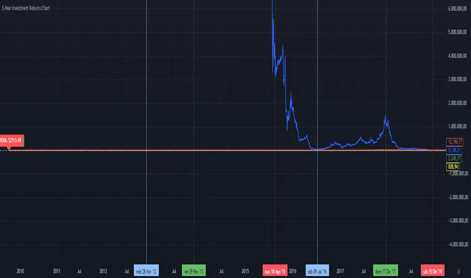
5-Year Returns Chart BTCvsSPXvsGOLDvsNVDACompare between thes 4 assets:
BTC
NVDA
SPX
GOLD
With an initial 1000$ investment in the last 5 years each return
SB LONG ENTRY/EXITBASED on HULL slope average. ISN'T IT VERY ROBUST?
Very good for daily, weekly and monthly timeframes. Stocks especially.....
I prefer it without optonal stop loss on other position protection stops.
Wonderful both equal weight position or with a D'alembert style weighting of positions....
Hold the Hull period parameter between 30 and 60 or more, but it's not so sensitive to this optimization.
All the best,
Sandro Bisotti

ETD-A BELLEarly Trend Detection with Engulfing Pattern Recognitio n
This indicator is designed to identify early trading trend reversals by combining trend-based EMA analysis with candlestick pattern detection. It automatically plots up and down arrows on the chart to signal potential bullish or bearish shifts in market momentum.
A key feature of this tool is its Engulfing Pattern Detection, which highlights strong reversal zones confirmed by price action. When an engulfing pattern aligns with an EMA crossover or momentum change, the indicator provides an early alert helping traders anticipate potential entry or exit points before larger market moves occur.

ETD-A BELL - Early Trend Detection with Engulfing Pattern Early Trend Detection with Engulfing Pattern Recognition
This indicator is designed to identify early trading trend reversals by combining trend-based EMA analysis with candlestick pattern detection. It automatically plots up and down arrows on the chart to signal potential bullish or bearish shifts in market momentum.
A key feature of this tool is its Engulfing Pattern Detection, which highlights strong reversal zones confirmed by price action. When an engulfing pattern aligns with an EMA crossover or momentum change, the indicator provides an early alert helping traders anticipate potential entry or exit points before larger market moves occur.
NY, Asia & London Session Lines + NY First HourEUR/USD last session OHLC Asia + London and first hour NY. defaults to last session if market closed. publishing to save for my self, nothing groundbreaking

MNQ Hybrid Scalper Pro - Advanced NASDAQ Futures Scalping System🎯 Overview
The MNQ Hybrid Scalper Pro is a comprehensive scalping system engineered specifically for NASDAQ futures traders. This indicator implements a modern hybrid approach that combines institutional-grade VWAP analysis with momentum oscillators optimized for the unique volatility characteristics of the NASDAQ market. Developed through extensive research on MNQ/NQ price action patterns, this indicator provides clear, actionable signals while filtering out market noise during high-volatility periods.
✨ Key Features
1. VWAP Foundation
Session-anchored VWAP with automatic reset
Dynamic standard deviation bands (1σ and 2σ)
Color-coded price bars based on VWAP positioning
VWAP test detection with momentum confirmation
2. Optimized Momentum Suite
Fast RSI (7): Aggressive settings (85/15) for quick scalping signals
Scalping MACD (5,13,6): Optimized parameters with SMA option
Quick Stochastic (9,3,3): Tuned for 1-minute chart responsiveness
Divergence Detection: Automated bullish/bearish divergence alerts
3. Multi-Timeframe Trend Filter
Triple EMA system (9, 21, 50) on current and higher timeframes
Trend strength scoring (-3 to +3) for directional bias
Prevents counter-trend trades in strong trending markets
Visual trend alignment indicators
4. Smart Signal Generation
Long Signals: VWAP pullback + RSI oversold + MACD bullish turn + HTF trend alignment
Short Signals: VWAP rally + RSI overbought + MACD bearish turn + HTF trend alignment
Signal cooldown period to prevent overtrading
Session-based filtering for optimal trading windows
5. Risk Management Visualization
Automatic profit target levels (10 & 20 points)
Dynamic stop loss levels (6 & 8 points)
Risk/reward ratio calculation (minimum 1.5:1)
Breakeven level display after 5 points profit
Visual entry, target, and stop lines on chart
6. Session Intelligence
NY opening range highlight (first 30 minutes)
Optimal scalping window shading (9:30-11:30 AM EST)
Major session markers (Asia, Europe, NY)
Session countdown timer
Contract rollover reminders
7. Real-Time Performance Dashboard
Current trend status across timeframes
Signal statistics and win rate tracking
Position relative to VWAP
Momentum indicator status (OB/OS/Neutral)
Volume analysis (relative to 20-period average)
Volatility monitoring with ATR spike detection
8. Professional Alert System
High-probability entry alerts with specific levels
VWAP test notifications with momentum confirmation
Target and stop loss hit alerts
Trend alignment notifications
Comprehensive alert messages with entry, stop, and target prices
📈 How to Use
Optimal Setup:
Timeframe: Best on 1-minute charts (also works on 3-min and 5-min)
Instrument: Optimized for MNQ (Micro E-mini NASDAQ), works with NQ
Session: Most effective during NY session (9:30-11:30 AM EST)
Chart Type: Standard candlestick or bars
Signal Interpretation:
Green Triangle (▲): Long entry signal - all conditions aligned for upward scalp
Red Triangle (▼): Short entry signal - all conditions aligned for downward scalp
DIV Labels: Momentum divergence detected - potential reversal zones
Colored Bars: Green = above VWAP (bullish bias), Red = below VWAP (bearish bias)
Entry Checklist:
Wait for signal arrow to appear
Confirm trend alignment in dashboard (HTF Trend)
Check momentum status isn't extreme
Verify you're within optimal trading window
Enter at market with predetermined stop and target
⚙️ Customization Options
Display Settings:
Toggle individual components on/off
4 color schemes (Professional, Dark, Light, Classic)
Adjustable transparency and visual elements
Dashboard position selection
Signal Settings:
Adjust momentum indicator parameters
Modify risk/reward levels
Configure session filters
Set signal cooldown periods
Advanced Features:
Multi-timeframe period adjustment
Volatility filter sensitivity
Contract type selection (MNQ/NQ)
Alert configuration options
📊 Best Practices
Start in Simulation: Test the indicator in paper trading first
Respect the Trend: Don't fight the higher timeframe trend
Manage Risk: Use the suggested stop losses consistently
Time Your Trades: Focus on the optimal scalping window
Confirm Signals: Best results when multiple confirmations align
⚠️ Important Notes
Supplementary Tool: This indicator supplements but doesn't replace proper market analysis and order flow reading
No Repainting: All signals are confirmed on bar close
Education Required: Understanding of scalping principles recommended
Risk Management: Always use proper position sizing and risk management
Market Conditions: Performance varies with market volatility and conditions
🎓 Educational Value
This indicator serves as an excellent educational tool for:
Learning VWAP-based trading strategies
Understanding momentum indicator optimization
Practicing multi-timeframe analysis
Developing systematic scalping approaches
Risk management visualization
💻 Technical Specifications
Pine Script Version: v6
Calculation Method: Non-repainting, real-time
Performance: Optimized for minimal lag
Compatibility: All TradingView plan levels
Updates: Regularly maintained and improved
🏆 What Makes This Unique
Unlike generic indicators, the MNQ Hybrid Scalper Pro is specifically engineered for NASDAQ futures volatility patterns. It combines institutional trading concepts (VWAP) with retail-friendly visualization and clear signals, bridging the gap between professional and accessible trading tools.
📬 Support & Feedback
Questions, suggestions, or feedback? Leave a comment below or send a private message. Your input helps improve the indicator for the entire community.
CME_MINI:MNQ1!
Disclaimer: This indicator is for educational and informational purposes only. It does not constitute financial advice. Trading futures involves substantial risk of loss and is not suitable for all investors. Past performance is not indicative of future results. Always conduct your own analysis and consult with a qualified financial advisor.

LANS Multi-Timeframe Trend Indicator📈 Displays real-time Bullish/Bearish trends across 1m, 5m, 15m, 1h & 1D using customizable EMA crossovers. Color-coded panel shows individual & overall trends for quick multi-timeframe confirmation.
Ideal for scalpers, day traders, and swing traders:
Quickly check short-term vs long-term trend alignment
Filter trades based on multi-timeframe confirmation
Combine with support/resistance, price action, and volume analysis
⚠ Disclaimer
This indicator is for educational purposes only. It should not be used as standalone financial advice. Always combine with proper risk management and trading strategy before entering trades.
#trend #ema #multitimeframe #dashboard #bullish #bearish #trading #panel #indicator #lans #scalping #daytradin

MTF MACD + RSI (Nikko) v1 for friendsMTF MACD + RSI (Nikko) v1 friends only
🧠 MTF MACD + RSI (Nikko) v1
A professional 2-in-1 Pine Script indicator that merges two powerful systems:
MTF MACD (Multi-Timeframe MACD) — Momentum and trend analyzer
RSI Divergence (Nikko) — Reversal and divergence detector
Easily switch between them with a simple toggle in the indicator settings.
⚙️ Overview
This script provides two distinct analysis modes inside a single indicator:
MTF MACD Mode → Focuses on multi-timeframe trend confirmation and momentum strength.
RSI Divergence Mode → Focuses on reversal detection using RSI and price divergence.
A color-coded label in the indicator pane shows which mode is active:
🔴 MACD Mode
🟢 RSI Mode

EMA HeatmapEMA Heatmap — Indicator Description
The EMA Order Heatmap is a visual trend-structure tool designed to show whether the market is currently trending bullish, trending bearish, or moving through a neutral consolidation phase. It evaluates the alignment of multiple exponential moving averages (EMAs) at three different structural layers: short-term daily, medium-term daily, and weekly macro trend. This creates a quick and intuitive picture of how well price movement is organized across timeframes.
Each layer of the heatmap is scored from bearish to bullish based on how the EMAs are stacked relative to each other. When EMAs are in a fully bullish configuration, the row displays a bright green or lime color. Fully bearish alignment is shown in red. Yellow tones appear when the EMAs are mixed or compressing, indicating uncertainty, trend exhaustion, or a change in market character. The three rows combined offer a concise view of whether strength or weakness is isolated to one timeframe or broad across the market.
This indicator is best used as a trend filter before making trading decisions. Traders may find more consistent setups when the majority of the heatmap supports the direction of their trade. Green-dominant conditions suggest a trending bullish environment where long trades can be favored. Red-dominant conditions indicate bearish momentum and stronger potential for short opportunities. When yellow becomes more prominent, the market may be transitioning, ranging, or gearing up for a breakout, making timing more challenging and risk higher.
• Helps quickly identify directional bias
• Highlights when trends strengthen, weaken, or turn
• Provides insight into whether momentum is supported by higher timeframes
• Encourages traders to avoid fighting market structure
It is important to recognize the limitations. EMAs are lagging indicators, so the heatmap may confirm a trend after the initial move is underway, especially during fast reversals. In sideways or low-volume environments, the structure can shift frequently, reducing clarity. This tool does not generate entry or exit signals on its own and should be paired with price action, momentum studies, or support and resistance analysis for precise trade execution.
The EMA Order Heatmap offers a clean and reliable way to stay aligned with the broader market environment and avoid lower-quality trades in indecisive conditions. It supports more disciplined decision-making by helping traders focus on setups that match the prevailing structural trend.
