BuySell Gold Test Script by Breakout and SR zone I test this for test overall report and set fix price after 14 dec 2018 that i set from manual trade in zone.
will improve to better automate again after this.
在腳本中搜尋"zone"
Disaresta Buyer/Seller ZoneThis indicator was built to show buyer and seller's zone. Use this indicator to compliment your already existing trading system by confirming whether its buyer or seller that have dominance in current price movements.

RSI Bands Multi Time Frame [Jigga + LazyBear]This is a modified version of LazyBear's RSI Bands script. I added the possibility to display multiple RSI bands, so you can see the zones, where it is viable to enter a long or a short. You can also use different time frames, so you can visually see where any specific value of RSI is for your given time frame. This gives you a lot of possibilities. Default settings use 1h time frame and the most common reversal areas for RSI. Feel free to change the settings as you see fit. If the script makes your candles too small, you can go to style and turn off individual RSI bands. After that you will still be able to see the zones, but the scale of your chart won't be affected.
It also displays the middle line, which shows you the current trend and can prevent you from entering a long, when RSI is oversold during a strong downtrend or a short, when RSI is overbought during a strong uptrend.
Do not forget to use a proper stop loss and risk management.
Here you can see it in action in different markets:
BTC - BitMex
NASDAQ Composite - Stocks
EUR / USD - Forex


Better CME Margin Zones 25-200%Better indicator for CME Margin Zones
25%,50%,100%,200% zones included)

Dynamic ZonesA port of the MT4 indicator of Mladen Rakic found at www.mql5.com
which is based on Dynamic Zones that was originally published in Stocks & Commodities 1996 issue.
Dynamic Zones is meant to be applied to oscillators to get dynamic overbought and oversold levels
quantified using statistical methods.

Nexus ZonesAsia and NY Window Zones for Nexus Wyckoff Method. Used to target key Springs and Upthrusts or Order flow manipulation times

Kill Zones (EST 24hr, Custom Colors + Legend)Asian,London, New York Sessions Indicator shows high volume time zones on every time frame for futures and forex

Stochastic RSI | Chill-Zone |Stochastic RSI | Chill-Zone |
This indicator combines Stochastic RSI with a dynamic Chill-Zone that highlights where momentum is holding or starting to shift. It helps filter out noisy %K moves and gives a clearer view of the trend and sustained directional bias rather than short-term momentum spikes like the standard Stoch.
How the Chill-Zone works
The Chill-Zone is built from the %K line of the Stochastic RSI:
- It measures how much %K moves bar to bar (absolute difference).
- This is smoothed using a running moving average (like an ATR for %K).
- A short SMA (2-period) tracks the base trend level.
- When %K breaks beyond the trend level, the zone flips between bullish and bearish.
The zone is shown as a fill between %K and a trailing EMA of %K (set by the user)
The zone color shows the current trend bias:
Blue fill = bullish zone
Red fill = bearish zone
Divergence spotting:
When price keeps rising but the Chill-Zone is red (bearish), it can signal that momentum isn’t supporting the price move — a possible warning of an upcoming reversal.
Similarly, if price keeps falling but the Chill-Zone is blue (bullish), it may point to weakening downward momentum and potential for a reversal upward.
Disclaimer
This is not a standalone signal tool. It’s designed to be used with other technical analysis tools as part of a broader strategy. Always combine with price action, S/R levels, or other indicators for confluence before making trade decisions.

Supply & Demand Zones with Touch CountSupply and demand zones usually mean areas where price reversed multiple times, acting like support (demand) or resistance (supply).


ZY Return ZonesThe ZY Return Zones indicator automatically draws the potential support/resistance levels of the parity and clearly displays them on the chart. Although the default settings are the last support/resistance levels, users can change the settings to show the last 6 support/resistance points in the indicator settings.

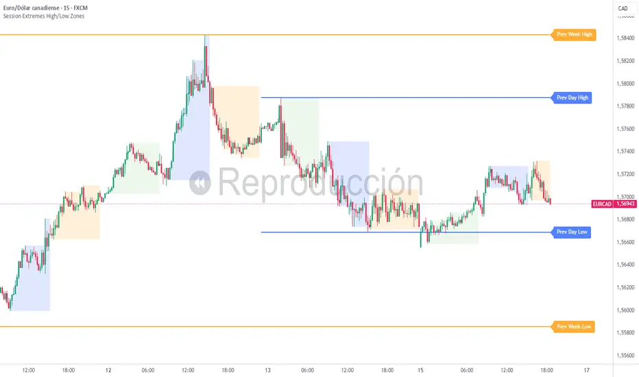
Session Extremes High/Low ZonesThis indicator highlights the High and Low of the three main trading sessions: Asia, London, and New York, based on configurable time ranges and UTC offset.
It also displays the previous day's and previous week's High and Low as dynamic lines with labels for reference.
🛠️ Features:
Customizable session times (HHMM-HHMM format)
Adjustable UTC offset for correct timezone alignment
Styling options for line colors, widths, styles and transparency
Optional session range shading
🔎 Ideal for traders who use intraday support/resistance levels or want to visualize volatility zones during different sessions.
Built with Pine Script v5. No alerts or trading signals included.
This script is intended for educational and informational purposes only.
GCM Supreme Trading System Pro (With Golden Zone)Okay, bro! Here are some notes on your "GCM Supreme Trading System Pro (Dashboard + RSI)" indicator based on the Pine Script code you provided. Think of this as a breakdown of its components, logic, and how you might use it, along with some things to consider.
GCM Supreme Trading System Pro (Dashboard + RSI) - Notes
Overall Concept:
This indicator aims to provide an "all-in-one" visual dashboard and signal system by combining several technical analysis concepts:
Short-Term Trend: Using a fast EMA.
Volatility/Channel: High/Low plot with fill.
Sentiment: Background color based on price vs. EMA.
Price Structure/Pattern: Highlighting potential AMD phases.
Key Price Level: Previous day's specific Fibonacci zone (Golden Zone).
Momentum: RSI Overbought/Oversold status.
Volume Analysis: Identifying volume spikes.
Risk Assessment: Based on ATR volatility.
Signal Generation: Based on EMA direction change confirmed by candle color.
Centralized Summary: A dashboard showing the status of key components.
Key Components & How They Work:
Trend EMA (Length: 3 by default):
What: A very fast Exponential Moving Average of the specified source (close by default).
How: Plots the EMA line. Colors the line green if the EMA is moving up, red if moving down, gray if flat.
Usage: Provides a very quick view of the immediate price direction and momentum.
High/Low Channel Lines & Fill:
What: Plots the current bar's high and low.
How: The area between the high and low is filled. The fill color changes based on whether the Trend EMA is moving up (green fill), down (red fill), or is neutral (gray fill).
Usage: Visualizes the recent price range/volatility and ties it to the immediate trend direction.
Sentiment Background:
What: Colors the chart background.
How: Background is lightly colored green if the close is above the Trend EMA, and red if the close is below the Trend EMA.
Usage: Reinforces the current short-term bias based on price's position relative to the fast EMA.
AMD Pattern Candles:
What: Highlights specific candle patterns often associated with Accumulation, Manipulation, and Distribution phases.
How:
Accumulation (Aqua): Previous candle was Red, current candle is Green (Red -> Green).
Manipulation (Yellow): Previous candle was Green, current candle is Red (Green -> Red).
Distribution (Fuchsia): Two consecutive Red candles where the candle before the first Red was Not Red (Not Red -> Red -> Red).
Usage: Helps visually spot potential shifts in market behavior according to the AMD concept.
Previous Day's Fib Golden Zone (0.55-0.66):
What: Calculates a specific Fibonacci zone (between 55% and 66%) based on the previous day's range (High-Low).
How: Plots a horizontal box on the chart covering the calculated zone level. Uses the previous day's range direction (Green/Red candle) to determine if the zone is calculated up from the low (Green day) or down from the high (Red day).
Usage: Identifies a potential key retracement or support/resistance zone from the previous day's price action that may be relevant for the current day.
RSI (Relative Strength Index):
What: A classic momentum oscillator.
How: Calculates the RSI value based on the specified length and source. The dashboard shows the current value and flags it as Overbought (> OB level), Oversold (< OS level), or Neutral.
Usage: Provides context on momentum extremes. High RSI suggests strong upward momentum (potentially overextended), low RSI suggests strong downward momentum (potentially oversold).
Volume Spike Confirmation:
What: Compares current volume to its Moving Average.
How: Calculates a simple moving average of volume. Identifies a "Spike" if the current volume is significantly higher (multiplied by a factor) than the MA.
Usage: Provides a contextual check for increased activity accompanying price moves. (Note: In the current script, this is calculated and shown on the dashboard but not directly used in the signal label logic, though it could be added).
Risk Assessment (ATR):
What: Uses the Average True Range.
How: Calculates the ATR for the specified length. Compares the current ATR to a longer-term average ATR. Flags "High Risk" if the current ATR is significantly higher than the average.
Usage: Gives an indication of current volatility relative to recent history, which can inform stop-loss placement or position sizing.
Signals (Buy/Sell Labels):
What: Plots "BUY" or "SELL" labels on the chart.
How:
BUY Signal: Triggers when the Trend EMA starts moving Up on the previous bar AND the current bar is Green (close > open).
SELL Signal: Triggers when the Trend EMA starts moving Down on the previous bar AND the current bar is Red (close < open).
Usage: These are your potential entry triggers. They indicate that the fast EMA trend has just changed direction and the current candle is confirming that move with its color.
Dashboard:
What: A 2x5 table displayed on the chart (bottom right by default).
How: Shows the current status of:
Trend (Bull/Bear/Neutral)
Volume (Spike/Normal)
Last Signal (🟢 BUY, 🔴 SELL, or None)
Risk (High/Normal based on ATR)
RSI (Overbought/Oversold/Neutral + Current Value)
Usage: Provides a quick, centralized summary of multiple indicator components without having to visually check every detail on the chart or separate panes.
How to Potentially Use It (Example Interpretation):
Look for a BUY signal (Green label) when:
The dashboard shows "🟢 BUY" as the Last Signal.
Consider additional confirmation: Is Volume status "Spike"? Is Risk "Normal"? Is RSI not "Overbought" (or perhaps just coming out of "Oversold" territory)? Is the price above/interacting positively with the Golden Zone?
Look for a SELL signal (Red label) when:
The dashboard shows "🔴 SELL" as the Last Signal.
Consider additional confirmation: Is Volume status "Spike"? Is Risk "Normal"? Is RSI not "Oversold" (or perhaps just coming out of "Overbought" territory)? Is the price below/interacting negatively with the Golden Zone?
Use the Sentiment Background and High/Low Channel Fill to quickly see the immediate trend and volatility context.
Watch AMD candles around key levels (like the Golden Zone or signal triggers) for potential pattern confirmation.
Check the Dashboard frequently for a summary of all these factors, even without a specific signal.
Strengths & Potential Benefits:
Comprehensive View: Integrates multiple popular trading concepts into a single indicator.
Visual Clarity: Uses colors, fills, labels, and a dashboard for easy interpretation.
Customizable: Inputs allow tuning the sensitivity of the EMA, Volume, ATR, and RSI to different assets/timeframes.
Dashboard Efficiency: Saves time by consolidating key status points.
Non-Repainting Signals: The buy/sell labels trigger and stay based on closed bar data.
Important Considerations & Limitations:
Fast EMA Sensitivity: An EMA length of 3 is very fast and prone to whipsaws, especially in choppy or ranging markets. Signals based solely on this could be frequent and unreliable in non-trending conditions.
Signal Logic: The core signal is only based on EMA direction change + candle color. While simple, it might miss opportunities or generate signals without broader market confirmation (like strong volume, favorable RSI position, or reaction at key levels). The dashboard provides these other factors as context, but they aren't required for the signal label in the current code.
Golden Zone Reliance: The previous day's Fib zone is just one potential level. It won't always be respected, and its relevance might vary significantly across different markets and timeframes.
AMD Patterns: The defined AMD patterns are specific. The market's "real" accumulation/manipulation/distribution might manifest in more complex ways.
Dashboard as Summary, Not Signal: Remember the dashboard shows the current status of all components on the last bar, but the BUY/SELL signal labels are based on a specific historical event (previous bar's EMA turn). You need to look at both: the label for the trigger, and the dashboard for the confluence of other factors right now.
Not a Standalone System: While called a "Trading System," no single indicator guarantees profitability. This tool provides signals and context, but requires a robust trading plan including stop losses, profit targets, position sizing, and potentially confluence with other analysis methods.
Timeframe Dependency: The ideal settings (EMA length, RSI length, etc.) will likely differ significantly between timeframes (e.g., 1-minute vs. 4-hour). Testing and optimization are crucial.
In Summary:
The "GCM Supreme Trading System Pro (Dashboard + RSI)" is a well-designed indicator that consolidates several useful analysis tools into a single view. Its strength lies in providing quick visual context and a clear signal trigger based on short-term trend shifts. However, like any indicator, it's not perfect. Its effectiveness will largely depend on the market conditions, the chosen settings, and how it's integrated into a comprehensive trading strategy, using the dashboard components as essential confirmation and risk assessment tools alongside the primary signal labels.

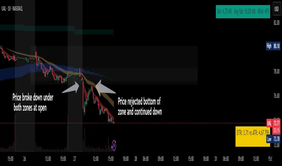
Chop ZonesThis indicator plots two "zones" in the form of shaded boxes, one between PMH and PML and one between PDH and PDL, the area that is shaded more has the highest probability of price action to be "choppy", the lesser shaded area has less probability for "choppy" action whilst outside the shaded areas there is high probability of a trend.
This indicator can be used to determine one of the three types of day:
Chop day
Bullish trend day
Bearish trend day
Chop day example today on AMEX:SPY
Bullish trend day example on NASDAQ:DLTR
Bearish trend day example on NASDAQ:UAL
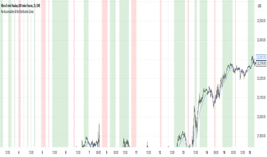
Re-Accumulation & Re-Distribution ZonesHighlights re-accumulation and re-distribution zones based off the idea that price will cross an EMA continue for awhile, retrace for additional orders, and then cross back over.
The EMA length and the number of candles above/below the EMA as configurable parameters.
For Re-Accumulation, the price must first cross above the EMA and then remain above for the set number of candles.
For Re-Distribution, the price must first cross below the EMA and then remain below for the set number of candles.
Fine-tune Inputs: Fourier Smoothed Volume zone oscillator WFSVZ0Use this Strategy to Fine-tune inputs for the (W&)FSVZ0 Indicator.
Strategy allows you to fine-tune the indicator for 1 TimeFrame at a time; cross Timeframe Input fine-tuning is done manually after exporting the chart data.
I suggest using "Close all" input False when fine-tuning Inputs for 1 TimeFrame. When you export data to Excel/Numbers/GSheets I suggest using "Close all" input as True, except for the lowest TimeFrame.
MEANINGFUL DESCRIPTION:
The Volume Zone oscillator breaks up volume activity into positive and negative categories. It is positive when the current closing price is greater than the prior closing price and negative when it's lower than the prior closing price. The resulting curve plots through relative percentage levels that yield a series of buy and sell signals, depending on level and indicator direction.
The Wavelet & Fourier Smoothed Volume Zone Oscillator (W&)FSVZO is a refined version of the Volume Zone Oscillator, enhanced by the implementation of the Discrete Fourier Transform . Its primary function is to streamline price data and diminish market noise, thus offering a clearer and more precise reflection of price trends.
By combining the Wavalet and Fourier aproximation with Ehler's white noise histogram, users gain a comprehensive perspective on volume-related market conditions.
HOW TO USE THE INDICATOR:
The default period is 2 but can be adjusted after backtesting. (I suggest 5 VZO length and NoiceR max length 8 as-well)
The VZO points to a positive trend when it is rising above the 0% level, and a negative trend when it is falling below the 0% level. 0% level can be adjusted in setting by adjusting VzoDifference. Oscillations rising below 0% level or falling above 0% level result in a natural trend.
HOW TO USE THE STRATEGY:
Here you fine-tune the inputs until you find a combination that works well on all Timeframes you will use when creating your Automated Trade Algorithmic Strategy. I suggest 4h, 12h, 1D, 2D, 3D, 4D, 5D, 6D, W and M.
When I ndicator/Strategy returns 0 or natural trend , Strategy Closes All it's positions.
ORIGINALITY & USFULLNESS:
Personal combination of Fourier and Wavalet aproximation of a price which results in less noise Volume Zone Oscillator.
The Wavelet Transform is a powerful mathematical tool for signal analysis, particularly effective in analyzing signals with varying frequency or non-stationary characteristics. It dissects a signal into wavelets, small waves with varying frequency and limited duration, providing a multi-resolution analysis. This approach captures both frequency and location information, making it especially useful for detecting changes or anomalies in complex signals.
The Discrete Fourier Transform (DFT) is a mathematical technique that transforms discrete data from the time domain into its corresponding representation in the frequency domain. This process involves breaking down a signal into its individual frequency components, thereby exposing the amplitude and phase characteristics inherent in each frequency element.
This indicator utilizes the concept of Ehler's Universal Oscillator and displays a histogram, offering critical insights into the prevailing levels of market noise. The Ehler's Universal Oscillator is grounded in a statistical model that captures the erratic and unpredictable nature of market movements. Through the application of this principle, the histogram aids traders in pinpointing times when market volatility is either rising or subsiding.
DETAILED DESCRIPTION:
My detailed description of the indicator and use cases which I find very valuable.
What is oscillator?
Oscillators are chart indicators that can assist a trader in determining overbought or oversold conditions in ranging (non-trending) markets.
What is volume zone oscillator?
Price Zone Oscillator measures if the most recent closing price is above or below the preceding closing price.
Volume Zone Oscillator is Volume multiplied by the 1 or -1 depending on the difference of the preceding 2 close prices and smoothed with Exponential moving Average.
What does this mean?
If the VZO is above 0 and VZO is rising. We have a bullish trend. Most likely.
If the VZO is below 0 and VZO is falling. We have a bearish trend. Most likely.
Rising means that VZO on close is higher than the previous day.
Falling means that VZO on close is lower than the previous day.
What if VZO is falling above 0 line?
It means we have a high probability of a bearish trend.
Thus the indicator returns 0 and Strategy closes all it's positions when falling above 0 (or rising bellow 0) and we combine higher and lower timeframes to gauge the trend.
In the next Image you can see that trend is negative on 4h, negative on 12h and positive on 1D. That means trend is negative.
I am sorry, the chart is a bit messy. The idea is to use the indicator over more than 1 Timeframe.
What is approximation and smoothing?
They are mathematical concepts for making a discrete set of numbers a
continuous curved line.
Fourier and Wavelet approximation of a close price are taken from aprox library.
Key Features:
You can tailor the Indicator/Strategy to your preferences with adjustable parameters such as VZO length, noise reduction settings, and smoothing length.
Volume Zone Oscillator (VZO) shows market sentiment with the VZO, enhanced with Exponential Moving Average (EMA) smoothing for clearer trend identification.
Noise Reduction leverages Euler's White noise capabilities for effective noise reduction in the VZO, providing a cleaner and more accurate representation of market dynamics.
Choose between the traditional Fast Fourier Transform (FFT) , the innovative Double Discrete Fourier Transform (DTF32) and Wavelet soothed Fourier soothed price series to suit your analytical needs.
Image of Wavelet transform with FAST settings, Double Fourier transform with FAST settings. Improved noice reduction with SLOW settings, and standard FSVZO with SLOW settings:
Fast setting are setting by default:
VZO length = 2
NoiceR max Length = 2
Slow settings are:
VZO length = 5 or 7
NoiceR max Length = 8
As you can see fast setting are more volatile. I suggest averaging fast setting on 4h 12h 1d 2d 3d 4d W and M Timeframe to get a clear view on market trend.
What if I want long only when VZO is rising and above 15 not 0?
You have set Setting VzoDifference to 15. That reduces the number of trend changes.
Example of W&FSVZO with VzoDifference 15 than 0:
VZO crossed 0 line but not 15 line and that's why Indicator returns 0 in one case an 1 in another.
What is Smooth length setting?
A way of calculating Bullish or Bearish (W&)FSVZO .
If smooth length is 2 the trend is rising if:
rising = VZO > ta.ema(VZO, 2)
Meaning that we check if VZO is higher that exponential average of the last 2 elements.
If smooth length is 1 the trend is rising if:
rising = VZO_ > VZO_
Use this Strategy to fine-tune inputs for the (W&)FSVZO Indicator.
(Strategy allows you to fine-tune the indicator for 1 TimeFrame at a time; cross Timeframe Input fine-tuning is done manually after exporting the chart data)
I suggest using " Close all " input False when fine-tuning Inputs for 1 TimeFrame . When you export data to Excel/Numbers/GSheets I suggest using " Close all " input as True , except for the lowest TimeFrame . I suggest using 100% equity as your default quantity for fine-tune purposes. I have to mention that 100% equity may lead to unrealistic backtesting results. Be avare. When backtesting for trading purposes use Contracts or USDT.
Variety Step RSI w/ Dynamic Zones [Loxx]Variety Step RSI w/ Dynamic Zones is a stepped RSI calculation with Discontinued Signal Lines. This indicator includes 7 types of RSI to choose from. The addition of the Discontinued Signal Lines allows this indicator to better identify momentum shifts in price so traders have better defined long/short signals.
Enhanced Moving Average Calculation with Stepped Moving Average and the Advantages over Regular RSI
Technical analysis plays a crucial role in understanding and predicting market trends. One popular indicator used by traders and analysts is the Relative Strength Index (RSI). However, an enhanced approach called Stepped Moving Average, in combination with the Slow RSI function, offers several advantages over regular RSI calculations.
█ Stepped Moving Average and Moving Averages:
The Stepped Moving Average function serves as a crucial component in the calculation of moving averages. Moving averages smooth out price data over a specific period to identify trends and potential trading signals. By employing the Stepped Moving Average function, traders can enhance the accuracy of moving averages and make more informed decisions.
Stepped Moving Average takes two parameters:
The current RSI value and a size parameter. It computes the next step in the moving average calculation by determining the upper and lower bounds of the moving average range. It accomplishes this by adjusting the values of smax and smin based on the given RSI and size.
Furthermore, Stepped Moving Average introduces the concept of a trend variable. By comparing the previous trend value with the current RSI and the previous upper and lower bounds, it updates the trend accordingly. This feature enables traders to identify potential shifts in market sentiment and make timely adjustments to their trading strategies.
█ Advantages over Regular RSI:
Enhanced Range Boundaries:
The inclusion of size parameters in Stepped Moving Average allows for more precise determination of the upper and lower bounds of the moving average range. This feature provides traders with a clearer understanding of the potential price levels that can influence market behavior. Consequently, it aids in setting more effective entry and exit points for trades.
Improved Trend Identification:
The trend variable in Stepped Moving Average helps traders identify changes in market trends more accurately. By considering the previous trend value and comparing it to the current RSI and previous bounds, Stepped Moving Average captures trend reversals with greater precision. This capability empowers traders to respond swiftly to market shifts and potentially capture more profitable trading opportunities.
Smoother Moving Averages:
Stepped Moving Average's ability to adjust the moving average range bounds based on trend changes and size parameters results in smoother moving averages. Regular RSI calculations may produce jagged or erratic results due to abrupt market movements. Stepped Moving Average mitigates this issue by dynamically adapting the range boundaries, thereby providing traders with more reliable and consistent moving average signals.
Complementary Functionality with Slow RSI:
Stepped Moving Average and Slow RSI function in harmony to provide a comprehensive trading analysis toolkit. While Stepped Moving Average refines the moving average calculation process, Slow RSI offers a more accurate representation of market strength. The combination of these two functions facilitates a deeper understanding of market dynamics and assists traders in making better-informed decisions.
What is a Discontinued Signal Line (DSL)?
Many indicators employ signal lines to more easily identify trends or desired states of the indicator. The concept of a signal line is straightforward: by comparing a value to its smoothed, slightly lagging state, one can determine the current momentum or state.
The Discontinued Signal Line builds on this fundamental idea by extending it: rather than having a single signal line, multiple lines are used based on the indicator's current value.
The "signal" line is calculated as follows:
When a specific level is crossed in the desired direction, the EMA of that value is calculated for the intended signal line.
When that level is crossed in the opposite direction, the previous "signal" line value is "inherited," becoming a sort of level.
This approach combines signal lines and levels, aiming to integrate the advantages of both methods.
In essence, DSL enhances the signal line concept by inheriting the previous signal line's value and converting it into a level.
Extras
-Alerts
-Signals
Related indicators:
Step RSI
Stochastic Zone Strength Trend [wbburgin](This script was originally invite-only, but I'd vastly prefer contributing to the TradingView community more than anything else, so I am making it public :) I'd much rather share my ideas with you all.)
The Stochastic Zone Strength Trend indicator is a very powerful momentum and trend indicator that 1) identifies trend direction and strength, 2) determines pullbacks and reversals (including oversold and overbought conditions), 3) identifies divergences, and 4) can filter out ranges. I have some examples below on how to use it to its full effectiveness. It is composed of two components: Stochastic Zone Strength and Stochastic Trend Strength.
Stochastic Zone Strength
At its most basic level, the stochastic Zone Strength plots the momentum of the price action of the instrument, and identifies bearish and bullish changes with a high degree of accuracy. Think of the stochastic Zone Strength as a much more robust equivalent of the RSI. Momentum-change thresholds are demonstrated by the "20" and "80" levels on the indicator (see below image).
Stochastic Trend Strength
The stochastic Trend Strength component of the script uses resistance in each candlestick to calculate the trend strength of the instrument. I'll go more into detail about the settings after my description of how to use the indicator, but there are two forms of the stochastic Trend Strength:
Anchored at 50 (directional stochastic Trend Strength):
The directional stochastic Trend Strength can be used similarly to the MACD difference or other histogram-like indicators : a rising plot indicates an upward trend, while a falling plot indicates a downward trend.
Anchored at 0 (nondirectional stochastic Trend Strength):
The nondirectional stochastic Trend Strength can be used similarly to the ADX or other non-directional indicators : a rising plot indicates increasing trend strength, and look at the stochastic Zone Strength component and your instrument to determine if this indicates increasing bullish strength or increasing bearish strength (see photo below):
(In the above photo, a bearish divergence indicated that the high Trend Strength predicted a strong downwards move, which was confirmed shortly after. Later, a bullish move upward by the Zone Strength while the Trend Strength was elevated predicated a strong upwards move, which was also confirmed. Note the period where the Trend Strength never reached above 80, which indicated a ranging period (and thus unprofitable to enter or exit)).
How to Use the Indicator
The above image is a good example on how to use the indicator to determine divergences and possible pivot points (lines and circles, respectively). I recommend using both the stochastic Zone Strength and the stochastic Trend Strength at the same time, as it can give you a robust picture of where momentum is in relation to the price action and its trajectory. Every color is changeable in the settings.
Settings
The Amplitude of the indicator is essentially the high-low lookback for both components.
The Wavelength of the indicator is how stretched-out you want the indicator to be: how many amplitudes do you want the indicator to process in one given bar.
A useful analogy that I use (and that I derived the names from) is from traditional physics. In wave motion, the Amplitude is the up-down sensitivity of the wave, and the Wavelength is the side-side stretch of the wave.
The Smoothing Factor of the settings is simply how smoothed you want the stochastic to be. It's not that important in most circumstances.
Trend Anchor was covered above (see my description of Trend Strength). The "Trend Transform MA Length" is the EMA length of the Trend Strength that you use to transform it into the directional oscillator. Think of the EMA being transformed onto the 50 line and then the Trend Strength being dragged relative to that.
Trend Transform MA Length is the EMA length you want to use for transforming the nondirectional Trend Strength (anchored at 0) into the directional Trend Strength (anchored at 50). I suggest this be the same as the wavelength.
Trend Plot Type can transform the Nondirectional Trend Strength into a line plot so that it doesn't murk up the background.
Finally, the colors are changeable on the bottom.
Explanation of Zone Strength
If you're knowledgeable in Pine Script, I encourage you to look at the code to try to understand the concept, as it's a little complicated. The theory behind my Zone Strength concept is that the wicks in every bar can be used create an index of bullish and bearish resistance, as a wick signifies that the price crossed above a threshold before returning to its origin. This distance metric is unique because most indicators/formulas for calculating relative strength use a displacement metric (such as close - open) instead of measuring how far the price actually moved (up and down) within a candlestick. This is what the Zone Strength concept represents - the hesitation within the bar that is not typically represented in typical momentum indicators.
In the script's code I have step by step explanations of how the formula is calculated and why it is calculated as such. I encourage you to play around with the amplitude and wavelength inputs as they can make the zone strength look very different and perform differently depending on your interests.
Enjoy!
Walker

[blackcat] L1 Chop ZonesLevel: 1
Background
I was inspired by NILX's "Tool: Chop & Trade Zones". This can used as an element for trading system control.
Function
I use my own customized algorithm to replace that core of NILX one, which is targetting to provide smoother and trend for chop and trend judgement.
Since it is quite differnt now but an oscillator within range of 0~100. The pro is it can use the contstant threshold values for all time frames and all trading pairs now.
Remarks
Feedbacks are appreciated.
Adaptive-LB, Jurik-Filtered, Triangular MA w/ Price Zones [Loxx]Adaptive-LB, Jurik-Filtered, Triangular MA w/ Price Zones is a moving average indicator that takes as its input an adaptive lookback period. This is an experimental indicator and I wouldn't use this for trading. It's more to explore different adaptive calculation methods and their applications to moving averages and channels. Unlike the traditional Triangular Moving Average, this one uses Jurik smoothing.
What is the Triangular Moving Average
The Triangular Moving Average is basically a double-smoothed Simple Moving Average that gives more weight to the middle section of the data interval. The TMA has a significant lag to current prices and is not well-suited to fast moving markets. TMA = SUM (SMA values)/ N Where N = the number of periods.
What is Jurik Volty used in the Juirk Filter?
One of the lesser known qualities of Juirk smoothing is that the Jurik smoothing process is adaptive. "Jurik Volty" (a sort of market volatility ) is what makes Jurik smoothing adaptive. The Jurik Volty calculation can be used as both a standalone indicator and to smooth other indicators that you wish to make adaptive.
What is the Jurik Moving Average?
Have you noticed how moving averages add some lag (delay) to your signals? ... especially when price gaps up or down in a big move, and you are waiting for your moving average to catch up? Wait no more! JMA eliminates this problem forever and gives you the best of both worlds: low lag and smooth lines.
Included:
Bar coloring
Signals
Alerts

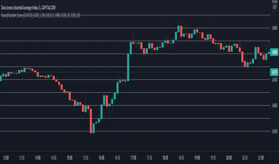
Round Number ZonesThis indicator shows zones of round numbers for 3 custom symbols like US30, EURUSD or GOLD as lines in the chart. The starting price can also be the current or a custom one and you can configure the increments as well. CAPITALCOM:US30