Market Maker Volatility Diameter V2 by Hawkeye Charting***German Description below***
Hey guys,
we are proud to publish the Market Maker Volatility Diameter V2!
Our goal with this indicator is to provide an All-in-one indicator, combining some special tools of open source scripts as well as some of our own developments and the algorithm of our MMVD V1.
We will create a video series very soon, where we will explain each aspect of the tool, your options and of course our trading strategies with this indicator.
You have the following technical tools and information combined in this indicator, which can each be shown and hidden:
- Psychological Ranges (Weekly Opening High/ Low for Crypto and Forex)
- Market Maker Sessions (Sydney, Asia, London, NY)
- Trade Cloud (algorithm developed by Hawkeye Charting)
- Fibonacci Cloud (inspired by watching paid offerings, coded by Hawkeye Charting)
- Display Moving Averages (select the visualization of up to 6 moving averages. You can change for each of these 6 MA's the type and the length.)
- Display Major Trend Cloud (developed by Hawkeye Charting)
- PVSRA Candle Colors
- Vector Candle Zones
- Pivots
- Pivot Fibonacci Levels (developed by Hawkeye Charting)
- OHLC-Levels
- Average Daily, Weekly, Monthly Ranges
- Volume Profile for Intraday Trading for up to 8 days.
We hope especially for people, who can not afford the Pro offering from TradingView, to give access to a good indicator, which includes many tools and alerts.
Our goal is to lower the barriers for new entrants and of course to protect people, to pay for indicators, which are completely insane priced.
Only, that you get an idea: the whole indicator has only cost me about 100 h of work (for a single person!), and I'm no Pine script expert, so don't get fooled when someone offers you insane amounts for an indicator...
There is no holy grail. Each indicator works only with calculations on previous data.
We appreciate seeing that you guys like this work, so please leave a like and a follow and share this indicator.
*****German Description*****
Hey Leute,
wir sind stolz, unsere 2. Version des Market Maker Volatility Diameter zu veröffentlichen!
Unser Ziel ist es, mit diesem Indikator eine All-In-One Lösung anzubieten, welche einige nicht ganz geläufige Tools sowie unsere eigenen Entwicklungen und natürlich den Algorithmus des MMVD V1 vereinen.
Wir werden in naher Zukunft eine Video Serie veröffentlichen, in welcher wir Stück für Stück jeden Aspekt des Werkzeugs, die Einstellungsmöglichkeiten sowie unsere Trading Strategien mit diesem Indikator erklären werden.
Ihr habt die folgenden technischen Werkzeuge und Informationen in diesem Indikator vereint, welche jede einzeln an- oder abgewählt und eingestellt werden können:
- Psychological Ranges (Weekly Opening High/ Low für Krypto and Forex)
- Market Maker Sessions (Sydney, Asia, London, NY)
- Trade Cloud (Algorithmus von Hawkeye Charting entwickelt)
- Fibonacci Cloud (inspiriert von der Beobachtung eines Paid-Indikators, Code geschrieben von Hawkeye Charting)
- Moving Averages (Ihr könnt die Darstellung von bis zu 6 Gleitenden Durchschnitten auswählen und für jeden dieser Durchschnitte den Typ und die Länge ändern.)
- Display Major Trend Cloud (entwickelt von Hawkeye Charting)
- PVSRA Candle Colors
- Vector Candle Zones
- Pivots
- Pivot Fibonacci Levels (entwickelt von Hawkeye Charting)
- OHLC-Levels
- Average Daily, Weekly, Monthly Ranges
- Volume Profile für Intraday Trading, Darstellungsmöglichkeit für 3-8 Tage
Wir hoffen, dass wir speziell für Leute, die sich nicht das PRO-Abo aufwärts von TradingView leisten können, Zugang zu einem guten Indikator, welche viele Werkzeuge und Alarme vereint gewährleisten zu können.
Unser Ziel ist es, die Eintrittsbarrieren für neue Marktteilnehmer senken und natürlich Leute vor wahnsinnigen Paid-Angeboten beschützen zu können.
Nur, damit ihr eine Vorstellung bekommt: den gesamten Indikator hat mich lediglich 100h Arbeit gekostet (für eine einzelne Person!), und ich bin kein Pine Script Experte. Also lasst euch bitte nicht verar******, wenn euch Paid-Angebote erreichen, mit dem Versprechen, den "zu 95% erfolgreich" Indikator erwerben zu können.
Es gibt keinen heiligen Gral, jeder Indikator arbeitet nur mit Berechnung von Vergangenheitswerten.
Wir würden uns riesig freuen, wenn euch diese Arbeit gefällt und ihr uns Likes und Follows hinterlasst und ihr diesen Indikator teilt.
在腳本中搜尋"zone"

Flat Detect By Bollinger BandsThis simple script indicate the potential flat market zones, calculated based on the Bollinger Bands width.
It's showing the Bollinger Bands in red when the market is detected as flat.
You can adjust the Width Threshold with precision on the inputs settings.
Enjoy :)

Consolidation Zone Hunter NPR BasedThis script will search for zones where the range between the high and low is lower than avg % nearest rank of last X bars.
After X(=30) bars of consolidating range it will signal that the market is in a range and draw the top, bottom and middle of that range.
When price breaks the consolidating range the range is cleared, this is where you long/short the breakout. After this it will look for the next range and do the same.
Visual Explanation

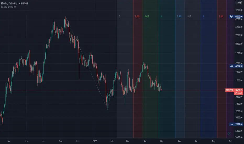
Auto Fib Time Zones and Trend-Based Fib Time by DGTFibonacci time zones, based on the Fibonacci number sequence, are vertical lines that represent potential areas where a swing high, low, or reversal could occur.
Trend-Based Fib Time shows probable price corrections in an existing trend. A useful tool to use in addition to Elliot Wave counting, Fib Time helps to identify how far the wave is likely to travel
Please note, Time zones aren't concerned with price, only time
Disclaimer :
Trading success is all about following your trading strategy and the indicators should fit within your trading strategy, and not to be traded upon solely
The script is for informational and educational purposes only. Use of the script does not constitute professional and/or financial advice. You alone have the sole responsibility of evaluating the script output and risks associated with the use of the script. In exchange for using the script, you agree not to hold dgtrd TradingView user liable for any possible claim for damages arising from any decision you make based on use of the script
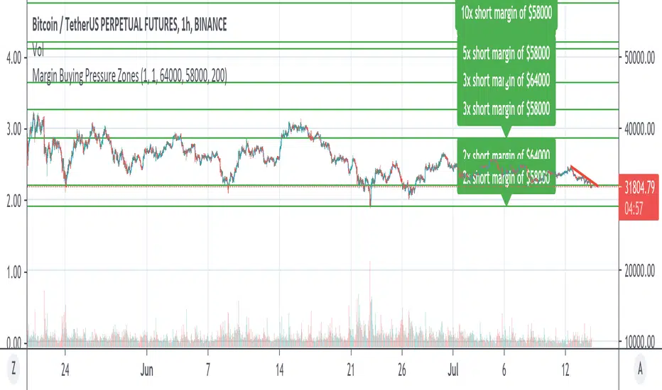
Margin Buying Pressure Zones Longs & ShortsShows the Margin Pressure Zones for longs and shorts Longs & Shorts based on 2 Base prices to be configured by you.
For definition of "Margin Pressure Zones" see: www.investopedia.com
Pivotal Zones-What is Pivotal Zones?
an algorithm taking the guess work out of finding your stop loss and take profit.
-What makes the strategy unique?
it makes it easy for a brand new learner to understand.
-What features does the strategy include?
it finds reversal zones on every time frame allowing you to fit your style of scalping, intraday or swing.
Enjoy :)

Dilip Nifty Trend ZonesExtended version script.
This indicator can be set up for 5 different tickers, so you can fill up your favourite tikers as fixed and switch between them without changing settings options of Tick Count,
Using option "Show default Zones if not Matched" - you can set up default options,
switching off "Show default Zones if not Matched" - will hide indicator for not matched tikers
By default option is Off
I hope it helps,
Note: Since Trend Finding Indicator works in NIFTY only amounts vary across the board. The background height is set to readjust based on the highest bars. This lookback amount is adjustable by the user and it does not affect calculations what so ever.
For access, send me a DM on TradingView

Dilip Banknifty Trend ZonesExtended version script.
This indicator can be set up for 5 different tickers, so you can fill up your favourite tikers as fixed and switch between them without changing settings options of Tick Count,
Using option "Show default Zones if not Matched" - you can set up default options,
switching off "Show default Zones if not Matched" - will hide indicator for not matched tikers
By default option is Off
I hope it helps,
Note: Since Trend Finding Indicator works in BANKNIFTY only amounts vary across the board. The background height is set to readjust based on the highest bars. This lookback amount is adjustable by the user and it does not affect calculations what so ever.
For access, send me a DM on TradingView

SwissKnife DAX ZZBScript dedicated for Dax and listing all zones manually chosen and defined based on Dax observation. Script also allows to define offset that automatically recalculates zones, as original levels are valid for Futures Dax Contract. Levels of 14k and 13k are covered. Enjoy!

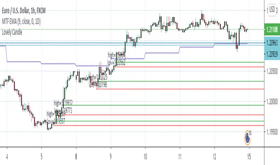
Lovely CandleThis is my Simple Project to make me confidence to take an entry
I always use it in H1 Chart
Add other Indicator like Multi Timeframe EMA Length 9 on 1 Day Period
Just set the sell limit or buy limit to the Lovely candle Zone that touch the EMA 9. Set RR to 1:3 minimum. don't forget to set BEP.
Japanese Candle Patterns Detector in Potential price zoneThis script would find the 8 famous "Japanese Candle Stick Patterns" in your chart.
Please be aware it find patterns in "Potential price zones" only, which help you to avoid none-important patterns during a price trend.
I used RSI and ATR in my codes to find best candle forms and price conditions.
Bellow patterns are detecting:
Hammer | ShootingStar | Engulfing Candle | Doji | Tweezers Top/Buttom | Three White Soldiers/Three Black Crows | Marubozu | Harami
* You can select your preferred patterns from indicator setting.
* Pattern names are abbreviated for better view on chart.
I hope it helps you to improve your trading.

Betelgeuse-Good entry/exit zoneHello everyone and welcome!
This is the my first indicator and also the first version of Betelgeuse script,I hope you will like it.
The indicator was designed to be used on cryptocurrencies
The idea is to be able to identify good entry and exit points in the market, traders often try to identify the minimum or maximum points and this is why Betelgeuse was born.
Betelgeuse should be combined with your analysis and other indicators to find good entry and exit zones and not a precise point.Obviously the more the indicator will be used
over long time frames the more accurate the signals will be.
You can decide to wait for a good signal from the RSI or from the MACD and add up
the Betelegeuse confirmation for a good entry or exit from the market.
The MA based indicator will give you an idea of the direction of the medium term trend.
Direct message me for acces.

Humble Bars Possible Correction ZonesPossible correction zones are calculated based on Humble Bars. Please check Humble Bars and Humble Bars Convergence Divergence indicators for more info.
Note that, these are meant to be correction zones, not turning points. If you take those as entry signals, you should remember, you are probably going against the trend.
Humble Bars
Humble Bars Convergence Divergence

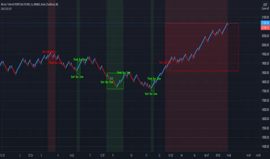
[MACLEN] HODL ZONE RENKO
PLEASE READ!
Trade at your own risk. Please read about renko charts before using this indicator. This indicator is for educational purposes only.
This Indicator is only valid in renko charts with 1 second timeframe. For BTCUSDT . With the traditional method and the size box of 80.
With this indicator we can detect zones of buy and sell. Even that is not recommended to use leverage, I use it to find an entry and use only small leverages. It could be also used to accumulate and HODL bitcoin .
Please, comment anything.
POR FAVOR LEER!
Tradea bajo tu propio riesgo. Por favor lee sobre las graficas renko antes de usar este indicador. Este indicador es solamente con fines educativos.
Este indicador es válido solamente en graficas renko con un timeframe de 1 segundo. Para BTCUSDT . Con cajas del método tradicional de un tamaño de 80.
Con este indicador podemos detectar zonas de compra y venta. A pesar de que no es recomendable usar apalancamiento, yo lo uso para encontrar entradas y solo uso apalancamientos pequeños. También podría usarse para acumular y holdear bitcoin .
Por favor, escríbeme cualquier duda o comentario.
Demo Price Action in RSI Overbought/Oversold zoneCatch Pinbar/Fakey in RSI Overbought/Oversold zone.

NixTrading Margin ZonesCreated by Super55
This one is the most accurate and precise margin zones indicator available. It is fine-tuned for bitcoin trading, but can also be used for all popular assets (XAUUSD , EURUSD , Oil etc.) that have futures traded on Chicago Mercantile Exchange (CME). Margin requirements data for each market is taken from the CME, then a key price for each specific time period is determined. The result is a set of reliable support and resistance zones that are best used for intraday trading. The data should be checked and updated daily.
This is a private, "invite only" indicator. I don't sell nor promote it.
__
For Russian-speaking followers: Предыдущая версия была заблокирована из-за большого количества русских слов. Буду краток: это лучший индикатор маржинальных зон на сегодня. Коэффициенты зон, которые мы используем на биткойне, имеют множитель x2 по сравнению со стандартным процентным обозначением (+50 = +25%). Доступ только для членов нашего сообщества.

Demand/Supply ZonesThis script will draw the supply and demand zone so you can always enter the best places. Cheap stop-loss and BIG Take Profits.
I will leave the scripts available during the weekend and if you want it, send me a message.
Leo Hermoso
Kill Zone Box ASIA LONDRES NYCBox of good time zones to make trade in each session of the market, I can set the time, colors. Mark the high and low of the day and leave the mark to review the day after.

Automatic Multi-timeframes fibonacci zonesHello traders
This is a fancy indicators that will draw for you the fibonacci zones on either daily/weely/monthly timeframes
I use those zones to define my take profit levels for my intraday trading
Hope it will help
Love you all
David
Volume Supply and Demand ZonesDraws supply and demand zones of 3 types, based on 3 different volume threshold parameters.
The timeframe of the script is fixed (you can change it in the options), so for example it is possible to keep Daily S/D zones while looking at 1h chart.

Demand and Supply Zones indicatorThis Script automatically marks Demand and Supply Zone on the chart

SMART4TRADER-ATR Standard DeviationThis indicator is designed to set targets for market reversal. The indicator was developed by me by the author of marginal zones for the foreign exchange market. This indicator is an improved version of margin zones without the need to download data from CME
Это индикатор предназначен для определения целей для разворота рынка. Индикатор разработан мною автором маржинальных зон для валютного рынка. Данный индикатор является улучшенной версией маржинальных зон без потребности загрузки данных с CME
