Genesis Vector Ontology [GVO]Overview:
The Genesis Vector Ontology (GVO) is a high-fidelity market analysis tool designed to identify the "Birth" (Genesis) of market trends by calculating the transition from potential energy to kinetic movement. It treats price action not as a random walk, but as a vibrational field that "collapses" into a directional vector when market mass and tension reach a critical threshold.
Core Mathematical Logic:
Ontological Potential (Ψ): Based on the volatility-vibration principle, Ψ measures the energy stored in the price field. Using a normalized standard deviation, the script identifies "Squeeze" states where energy is compressed and ready for release.
Gravitational Mass (g(m)):
Unlike traditional volume indicators, GVO calculates "Mass" as a ratio of current volume relative to a moving average. A move is only considered "Real" (Ontologically Actualized) if it exceeds the user-defined Mass Threshold.
The Vector Resultant: The final Genesis Vector is the product of Potential, Mass, and Directional Momentum ($Vector = \Psi \cdot g(m) \cdot Direction$). This provides a smoothed representation of the true market wave, filtering out noise.
The Mizan (Fairness) Filter: Unique to the GVO framework is the Fairness Filter. By integrating the Money Flow Index (MFI), the script monitors "Greed" and "Fear" zones. It prevents entries in "Unfair" zones (extremes), ensuring that signals occur only when the market is in a state of balanced participation.
How to Use:
Charging (Grey Columns): Market is in a Squeeze state. Energy is building.
Release (Green/Red Columns): Ontological collapse detected. A new vector has been born.
GVO Signals: Labels appear when a Squeeze is released with high-mass confirmation and directional clarity.
Candlestick analysis

MACD Master Suite [Kodexius]The MACD Master Suite is an advanced momentum and trend framework that takes the familiar MACD concept and wraps it in a modern, trader oriented environment. Instead of a single line + histogram combination, it turns MACD into a structured decision layer with enhanced visualization, confluence and context.
The engine is built around a MACD style core with refined smoothing and normalization, designed to keep shifts in momentum clear while avoiding the noisy flicker that standard settings often produce. On top of this core, the suite adds multi timeframe confirmation, adaptive histogram behavior, trend and exhaustion mapping, divergence detection and a compact visual dashboard so you can read momentum structure at a glance rather than bar by bar.
The goal is not to create a “magic signal”, but to make MACD behave like a proper momentum map: highlighting when trend strength is building, when a leg is stretching into exhaustion, where momentum is quietly rolling over beneath price, and how different timeframes are lining up before major continuation or reversal moves.
This is not classic everyday MACD. This suite extends the standard MACD through normalization and integrated features, designed to assist in analyzing momentum patterns, identifying potential reversals, and supporting multi timeframe strategies. It processes MACD data into structured outputs for use in various market conditions.
⚠️ Note:
This is not a traditional MACD, it uses normalized values, enhanced visual feedback, and a multi timeframe dashboard engine for superior signal quality and clarity.
🔹 Features
🔸 Enhanced MACD Core
- Custom MACD style oscillator that combines classic fast/slow smoothing with an internal normalization step, keeping the main wave readable even when volatility or scale changes.
- Flexible inputs for source, lengths and smoothing type so you can adapt the engine to different instruments and trading styles.
- Optional histogram + line combination, giving you both bar based impulse and a smoother line for regime changes and crossovers.
- Gradient colored oscillator line that visually shifts from red (weak momentum) through yellow (neutral) to green (strong momentum), providing at a glance regime identification.
🔸 Gradient Zones & Regime Context
- Configurable “overextended” zones around the MACD baseline, shaded with gradient fills rather than only hard lines.
- Visual emphasis on when the MACD engine is building a persistent push in one direction vs simply oscillating around the midline.
- The mid region is kept deliberately clearer so you can quickly distinguish between trending pushes, mean reverting swings and neutral chop.
🔸 MACD Channel & Break Behaviour
- Optional channel overlay built directly on top of the MACD oscillator, using volatility style bands (e.g., Bollinger-type or Keltner-type) in MACD space instead of price space.
- Helps you see when MACD is expanding strongly away from its recent equilibrium versus compressing inside a narrow band.
- Channel touches and pushes beyond the band edges can act as an additional cue for exhaustion type behaviour or strong continuation bursts.
🔸 Reversal Signal Markers
- Swing aware reversal markers that trigger when MACD conditions suggest a possible shift after stretching into your defined zones.
- Signals use the relationship between the MACD wave and its internal smoothing, aiming to highlight turning points that stand out from ordinary noise and try to filter out noise, focusing on confirmed shifts that align with broader market context.
- Markers are drawn on the MACD plot instead of the price chart to keep structure and signals in one place.
🔸 Divergence Mapping (Regular & Hidden, with MTF Dashboard Support)
- Automatic detection of regular bullish/bearish and hidden bullish/bearish divergences between price and the oscillator.
- Separate visibility toggles for each divergence type so you can focus only on the signals that fit your approach.
- "Wait for candle close" option ensures conservative confirmation, reducing false positives in fast moving markets.
🔸 Multi-Timeframe Custom MACD Dashboard
- Compact dashboard that summarizes MACD Engine state over multiple user defined timeframes in a small table.
Per timeframe cells can show:
– whether MACD is sitting in overbought/oversold style zones or in the neutral core,
– presence of recent bullish/bearish reversal signals,
– the current divergence bias (bullish, bearish or none),
– simple channel break information (upside/downside, or quiet).
Timeframe labels are formatted into familiar units (e.g., 15m, 1H, 4H, 1D) and the table is designed to be readable even when collapsed to a small area.
🔸 Oscillator Trendlines & Break Detection
- Automatically draws trendlines directly on the MACD oscillator, using momentum swing pivots instead of only price highs and lows, so you see structure shifts where they actually start in the underlying momentum.
- Lines adapt to bullish or bearish phases and are anchored only to “clean” pivots with minimal internal violations, making sustained impulse legs and corrective phases much easier to distinguish.
- When MACD momentum closes through one of these oscillator trendlines, the break is highlighted with labels, providing an additional structural confirmation layer on top of standard signal line crossovers or histogram flips.
🔸 Alerts
- Integrated alert conditions for MACD based reversals and all four divergence types (regular/hidden, bullish/bearish).
- Designed so you can create alerts directly from the indicator, turning key MACD events into actionable notifications.
- Altogether, MACD Master Suite consolidates multiple momentum tools into one cohesive interface, helping you read the “story” of MACD and its derivatives more intuitively and efficiently.
🔹 How To Use
▶ Reading the Core Momentum Engine
The main line serves as the primary momentum indicator: positions held above the midline suggest a bullish environment, whereas those below indicate a bearish setting. The gradient zones for overbought and oversold areas help identify when momentum is becoming extended or starting to ease back, offering a smoother view compared to rigid thresholds.
The channels provides an extra information for context:
• Momentum pushing toward or beyond the outer edges shows extension based on recent patterns.
• When it stays nearer to the center, it often points to balanced or corrective phases.
The histogram adds further detail to the picture: upward bars in varying green tones reflect positive momentum buildup, while downward bars in red tones show negative shifts. Diminishing bar sizes can hint at upcoming changes in direction, making it useful for spotting transitions.
Overall, focus on how these elements interact sustained positions, zone interactions, and histogram patterns to build a sense of the current momentum flow without overcomplicating the read.
▶ Working With Reversals & Divergences
Reversal markers show up after momentum enters extreme zones and starts to shift, acting as flags for areas where direction might change. They're best used as highlights for further review rather than standalone triggers.
For divergences, the tool examines how price movements align or differ from the momentum line:
• Regular types (bullish or bearish) point out possible weakening when price hits new levels but momentum doesn't follow suit.
• Hidden types (bullish or bearish) suggest ongoing trends when price retraces but momentum holds its ground.
Customize by selecting which divergences to show and opting for confirmation only after bars close this reduces clutter and promotes a steadier perspective. Experiment with these settings to match your preferred level of detail, such as enabling all types for in depth scans or limiting to regulars for simpler overviews.
In practice, combine reversals with divergences for layered insights: a reversal marker near a divergence line could strengthen the case for monitoring that area closely.
▶ Reading the Multi-Timeframe Dashboard
This dashboard packs insights from various timeframes into a compact table, allowing quick checks of alignment without switching views. Columns represent each timeframe you select, while rows cover aspects like divergence types, extreme states, general signals, and channel interactions.
A straightforward method is to:
• Look for consistency, such as matching patterns across higher frames signaling a unified trend.
• Spot differences, like shorter frames showing pullbacks while longer ones stay in extremes, which might indicate temporary adjustments.
• Use color cues greens for positive leans, reds for negative to get an at a glance feel before diving deeper.
Treat it as a quick reference tool: before focusing on a specific chart, scan the dashboard to see if broader contexts support or contradict your observations, helping refine your approach across scales.
▶ Trendlines, Breaks & Structure
Trendlines are generated from key swings in the momentum line, mapping out bullish or bearish patterns directly on the panel. This helps visualize hidden structures in momentum that might not be obvious from price alone.
Upward sloping lines often align with building positivity, downward ones with negativity. Breaks in these lines, marked on the display, can indicate when an established pattern is giving way to something different.
It's common to leave this feature disabled for routine checks and activate it for deeper examinations, such as during volatile periods or when confirming longer term shifts.
To get the most out, observe how trendlines evolve over time persistent lines might reinforce a regime, while frequent breaks could signal choppy or transitional conditions, adding another dimension to your momentum assessment.

Price vs Moving Average Cross (Golden & Death Signals)This indicator detects price crossings against multiple moving averages, not crossings between moving averages themselves.
🔹 Core Concept
A Golden Signal occurs when the price (close) crosses above a selected moving average.
A Death Signal occurs when the price (close) crosses below a selected moving average.
⚠️ This is NOT a moving-average-to-moving-average crossover indicator.
It is a price-to-moving-average crossover indicator.
📈 Moving Average Settings
The indicator uses three independent moving averages, each configurable by the user:
1️⃣ Moving Average 1 (Golden Signal)
Default: 20-period
Type: EMA or SMA
Signal:
Price crossing above MA → Golden Signal
2️⃣ Moving Average 2 (Golden Signal)
Default: 50-period
Type: EMA or SMA
Signal:
Price crossing above MA → Golden Signal
3️⃣ Moving Average 3 (Death Signal)
Default: 100-period
Type: EMA or SMA
Signal:
Price crossing below MA → Death Signal
🔔 Signal Logic
Signal Type Condition
Golden Cross 1 Close price crosses above MA 1
Golden Cross 2 Close price crosses above MA 2
Death Cross Close price crosses below MA 3
Each signal is evaluated independently.
📊 Visual Representation
Green Up Arrow → Price crosses above MA 1
Purple Up Arrow → Price crosses above MA 2
Red Down Arrow → Price crosses below MA 3
All moving averages are plotted directly on the price chart.
🎯 Practical Use Cases
Identifying trend initiation points
Confirming pullback breakouts
Acting as an entry timing assistant
Using MA 3 as a trend filter / exit warning
⚠️ Important Notes
This indicator may generate false signals in sideways or ranging markets.
Best used in combination with:
Higher-timeframe trend confirmation
Volume indicators
Support & resistance levels
🧠 Summary
✔️ Price ↔ Moving Average crossover
❌ Moving Average ↔ Moving Average crossover
This indicator is designed for trend-following traders who want clear and simple price confirmation signals.
원하시면
“True MA Golden Cross version”
Scalping-optimized version (3m / 5m)
Trend + Momentum filtered version

NQ 15m (SIGNALS ONLY, LOCKED, No Flip/Repaint)A buy and sell indicator made for the 15 minute NQ1! chart. The script is made to filter out the non tradable candles and looks for entries 3 minutes after the candle fires and then again at 4 minutes after the candle opens.

NQ1! 15m | NO FLIP | BUY/SELL AlertsA buy and sell alert for the 15minute candle NQ1! chart. Indicator is designed to weed out the non tradable candles and fires 4 minutes after the open of a candle.

Quarterly Cycles [Daye's Theory] with LabelsDescription:
This indicator automates the Quarterly Theory (also known as Cycle Days Theory), popularized by traders like Daye. It divides time into four distinct quarters to help traders identify the algorithmic phases of price delivery: Accumulation, Manipulation, Distribution, and Continuation (or Reversal).
Unlike standard cycle indicators that just color the background, this script draws High/Low Boxes around each quarter. This makes it significantly easier to spot SMT Divergences (Smart Money Technique) and liquidity sweeps between correlated assets (e.g., comparing the Q2 box on NQ vs. ES).
Key Features:
Fully Adaptive Timeframes: The indicator automatically switches modes based on your chart:
Intraday (1m - 30m): Shows Daily Cycles (Asia, London, NY AM, NY PM).
Weekly (1H - 2H): Shows Weekly Cycles (Mon, Tue, Wed, Thu).
Monthly (4H+): Shows Monthly Cycles (Week 1, Week 2, Week 3, Week 4).
New York Time Locked: All calculations are hardcoded to New York time (EST/EDT). You do not need to change your chart's timezone settings; the boxes will always appear at the correct algorithmic times.
True Open & Equilibrium:
True Open Line: Automatically plots a line from the Open of Q2 (e.g., Midnight NY). Price above this line suggests a Long bias; below suggests Short.
50% Equilibrium: (Optional) Toggle a midline to easily see if price is in Premium or Discount relative to the quarter's range.
Settings:
Fully customizable colors for Q1-Q4.
Toggle labels, borders, and the "True Open" line.

Gold M5 Scalping [Fixed Timezone]This is the M5 Scalping using Inside / Outside Bar
Only for Timezone +8 (8am - 12pm)
Scalping for king >o<

Night Session Background V1.0This script can achieve the following functions:
Select a specified time period, such as the U.S. trading session, and mark this period on the background of the candlestick chart.
The purpose of doing this:
It allows you to more intuitively observe the candlestick patterns during specific time periods, such as the U.S. trading session.
Day Color CandlesThe script uses TradingView’s built-in dayofweek value (where Monday = 1 and Sunday = 7) to detect the current bar’s weekday.
For each weekday, a specific color is assigned — green for Monday, blue for Tuesday, purple for Wednesday, orange for Thursday, yellow for Friday, gray for Saturday, and red for Sunday.
Instead of plotting new candles, the script uses barcolor() to recolor the existing chart candles. This avoids conflicts with TradingView’s rule that a script may contain only one main declaration. The price data remains unchanged — only the visual appearance of the candles is modified to help the user visually separate trading days.

Main Killer Filter (Sweep + Displacement + Entry Zone) v6 masterMadrid session shading (NY AM + NY Pre-lunch in Madrid time by default)
5m “setup zone” creation (sweep + displacement → then uses nearest FVG as entry zone)
Touch logic: 2nd touch default + optional early entry
1m confirmation labels that only appear when a 5m setup is active (pulled via request.security)
Toggle confirmation mode:
Mode 1: displacement candle out of zone
Mode 2: displacement + BOS


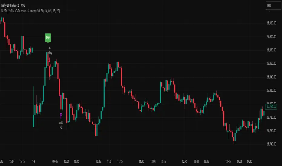
NIFTY_2MIN_CVD_short_StrategySummary
This strategy is an intraday system designed for the Nifty index on a 2-minute timeframe, focusing exclusively on identifying high-probability short (sell) entries. It utilizes a combination of rapid price action and Cumulative Volume Delta (CVD) to detect "Buying Absorption" at local peaks.
Concept & Core Logic
The strategy is engineered to identify "Inverted V-shaped" reversals where aggressive buying pressure is exhausted and absorbed by large-scale limit orders from sellers.
Price Action Trigger: The strategy looks for a specific two-part sequence:
Sudden Bullish Movement: A rapid upward move that often traps late buyers or triggers short-covering.
Sudden Reversal: Immediately followed by a strong, high-momentum bearish (red) candle, signaling a swift rejection of the higher prices.
CVD Absorption Filter: To confirm the validity of the reversal, the strategy analyzes the Cumulative Volume Delta (CVD). It identifies instances where the relative movement of the CVD is significantly higher than the corresponding price movement. This specific divergence highlights "Buying Absorption"—a market condition where aggressive market buy orders are being filled by passive limit sell orders, preventing further price appreciation and creating a heavy ceiling for the reversal.
Risk Management
To maintain a disciplined approach, the strategy employs fixed exit parameters based on the underlying Nifty price:
Take Profit: 25 points.
Stop Loss: 30 points.
Intended Use
This tool is intended for traders who study mechanical, rule-based systems and order flow dynamics. It provides a structured framework for observing how volume delta divergence (CVD) and rapid price rejections interact at potential market turning points.
Disclaimer: This script is for educational and informational purposes only. It is not financial advice. All trading involves risk, and past performance is not indicative of future results. Please conduct your own research and backtesting before making any trading decisions.
ORB FX REPLAY - FINAL SAFEHere is the description in English, written to sound professional and meet all the requirements for publishing on TradingView:
Script Description:
Title: ORB Strategy Backtest Pro - Ultra Compatibility
Description: This is an Opening Range Breakout (ORB) strategy specifically designed for professional backtesting. It is optimized to run smoothly on external platforms like FX Replay and TradingView's replay mode.
Key Features:
Custom Session: Automatically calculates the High and Low of a specific time window (default: 10:00 - 10:15 Bucharest/GMT+2).
Impulse Confirmation: Features a "Min Impulse" filter to ensure entries happen on strong momentum, avoiding "fake-outs" near the range boundaries.
Hard Target Management: Designed for "Set & Forget" backtesting. Once a trade is triggered, the script tracks it until it hits either the Stop Loss (SL) or the final Take Profit 3 (TP3).
Visual Projections: Draws clear, real-time lines for Entry, SL, and TP3 on the chart for easy visual tracking.
Automated Statistics: Includes a dynamic label system that tracks Total Trades, Win Count, and Loss Count based on the TP3/SL logic.
Optimized Code: Built using Pine Script v5 with a focus on stability and compatibility, avoiding complex tables that often cause errors on external engines.

Nifty_2MIN_Rangereversal_Short_StrategySummary
This strategy is an intraday trend-following system designed for the Nifty index on a 2-minute timeframe, focusing exclusively on short (sell) entries. It is engineered to identify failed bounces within established bearish trends.
Concept & Core Logic
The strategy uses a multi-layered approach to confirm downward momentum before triggering an entry:
Trend Confirmation: The script analyzes the slope and positioning of the 20-period and 200-period Exponential Moving Averages (EMA). Short signals are only valid when the EMA configuration confirms a prevailing bearish trend.
Retracement Zone Filtering: To optimize entry pricing, the strategy monitors the daily price range. It looks for the market to be within the 35% to 75% range of the day's movement, specifically identifying a temporary upward "relief rally" or bounce after a significant fall.
Candlestick Trigger: The execution occurs when a specific bearish reversal pattern appears during the relief rally:
Two consecutive bullish candles (representing the temporary bounce).
Followed by a strong, high-momentum bearish candle (signaling the resumption of the primary downtrend).
Risk Management
The strategy utilizes fixed exit parameters based on the underlying Nifty price points:
Take Profit: 28 points.
Stop Loss: 30 points.
Intended Use
This tool is intended for traders who study mechanical, rule-based systems. It demonstrates how moving average trends can be combined with range analysis and price action sequences to time entries during market retracements.
Disclaimer: This script is for educational and informational purposes only. It is not financial advice. All trading involves risk, and past performance is not indicative of future results. Please conduct your own research and backtesting before making any trading decisions.

Nifty_2MIN_ Rangereversal_Long _StrategySummary
This strategy is an intraday trend-following system designed for the Nifty index on a 2-minute timeframe. It focuses exclusively on long entries, seeking to identify high-probability recovery points within an established uptrend.
Concept & Core Logic
The strategy identifies entries based on a confluence of trend direction, price recovery levels, and specific candlestick patterns:
Trend Confirmation: The script utilizes the slope and positioning of the 20-period and 200-period Exponential Moving Averages (EMA). A long signal is only considered when the trend is determined to be positive, ensuring trades align with the broader market momentum.
Recovery Zone Filtering: To avoid buying at local peaks, the strategy filters for entries that occur when the market has retraced but is showing signs of recovery. Specifically, it looks for price to be within the 35% to 75% recovery range relative to the day's high.
Candlestick Trigger: The actual entry trigger is a "Bullish Reversal" sequence:
Two consecutive bearish candles (representing a minor pullback).
Followed immediately by a strong bullish candle (representing the resumption of strength).
Risk Management
The strategy uses fixed point-based exits to maintain a disciplined approach:
Take Profit: 30 points (underlying Nifty price).
Stop Loss: 35 points (underlying Nifty price).
Intended Use
This script is designed for traders interested in mechanical trend-following systems. It provides a structured way to observe how moving average slopes and specific price action sequences interact during intraday recoveries.
Disclaimer: This script is for educational and informational purposes only. It is not financial advice. All trading involves risk, and past performance is not indicative of future results. Please conduct your own research and backtesting before making any trading decisions.

NIFTY_2min_FVG_sell_StrategyThis strategy is designed for scalping Nifty on a 2-minute chart, focusing exclusively on short entries. The script's purpose is to identify and act on specific bearish patterns based on volume analysis and price action.
Concept & Core Logic
The strategy operates on a two-stage confirmation process:
Volume Absorption: The initial condition seeks to identify potential bearish movements by detecting signs of buying pressure being absorbed by sellers. This suggests that a upward move may be losing momentum.
Fair Value Gap (FVG) Confirmation: After a volume absorption signal, the strategy waits for a Bearish Fair Value Gap (FVG) to appear. A short entry signal is generated only after a candle closes below the FVG zone, serving as confirmation of bearish intent.
Risk Management
The strategy employs a fixed take profit and stop loss for each trade, based on the Nifty underlying price:
Take Profit: The exit signal is triggered when a trade reaches a 30-point profit.
Stop Loss: The exit signal is triggered when a trade reaches a 35-point loss.
Intended Use
This tool is intended for traders who:
Utilize mechanical, rule-based systems for intraday trading and scalping.
Are interested in studying a structured approach that combines volume analysis with price action inefficiencies like Fair Value Gaps.

Gold M5 Scalping (Strategy)This is the New Strategy for my new Indicator for M5 Scalping.
Just to test my result.
Will release my indicator soon

ATR Distance from 50 SMA By DanBobDanA simple indicator that measures the distance between current price and the 50 SMA
The average momentum swing trade might run 7 times the ATR before pulling back
Therefore, its recommended to not buy a stock that is beyond 4 times its ATR to the 50 SMA
This script will quickly and easily calculate the 50 SMA to ATR distance for you


SK BAND SK BAND is a powerful TradingView indicator designed to generate clear and reliable Buy & Sell signals by identifying market trend and price momentum. It helps traders make disciplined and confident trading decisions across different market conditions.
🔹 Key Features
✔ Clear BUY and SELL signals on the chart
✔ Works on Stocks, Indices, Forex, Crypto & Commodities
✔ Suitable for Intraday, Swing, and Positional trading
✔ Helps identify trend direction and momentum
✔ Simple, clean, and beginner-friendly
📈 How It Works
BUY signal appears when bullish momentum strengthens
SELL signal appears when bearish momentum increases
For better accuracy:
Use proper risk management
Confirm signals with support & resistance or higher timeframes
Avoid sideways or low-volume markets
⚠ Disclaimer
This indicator is for educational purposes only.
SK BAND does not provide financial advice. Trading involves risk—always confirm signals with your own analysis.

ABC Risk Management SystemOverview
This script is a comprehensive execution engine designed for high-frequency momentum trading (optimized for MES/ES Futures). It solves the problem of "grade inflation" in trading by strictly categorizing setups based on Multi-Timeframe (MTF) alignment and volatility.
How it Works
The script utilizes a 5-Minute Bias Engine to filter a 1-Minute Execution Chart. It relies on the relationship between the CCI (Commodity Channel Index) and its 20-period SMA using Typical Price (HLC3).
The Grading Hierarchy
Grade A+ (The Trend Follower): Triggered when the 5m Trend is strong (ADX > 25) and 1m momentum is perfectly aligned.
Grade B (The Momentum Burst): Triggered in "Lazy Markets" (5m ADX < 25). The script automatically raises the entry requirement to a 140 CCI burst to filter out noise.
Grade C (The Mean Reversion): Triggered when 1m internals (ADX/DI/CCI) are powerful enough to trade against the 5m Bias.
Key Indicators Included
T3 Pulse Lead: A specialized, color-coded trailing line used for dynamic stop-loss management.
Price-Locked Labels: Signals are pinned to the High/Low of the specific candle to provide exact price levels for entry.
🚀 Release Notes: Version 3.0 (The "ABC" Update)
New Features & Logic Fixes:
Strict Binary Bias: Removed all level-based filters for the HTF trend. The bias is now determined solely by the crossover of the 5m CCI and its SMA.
Bullish: 5m CCI > 5m SMA (regardless of positive/negative value).
Bearish: 5m CCI < 5m SMA.
Adaptive ADX Scaling: If 5m ADX falls below 25, the 1m CCI trigger is automatically moved from 100 to 140 to compensate for the lack of trend strength.
Visual Overhaul: Replaced generic shapes with Price-Locked Text Labels.
Longs: Labels appear below the candle (Green/Lime/Purple).
Shorts: Labels appear above the candle (Red/Maroon/Orange).
T3 Pulse Integration: Added the T3 Pulse Lead (8-period) directly into the overlay to facilitate the "T3 Trailing Stop" methodology.
Typical Price Standard: Standardized all calculations to HLC3 to align with professional S&P 500 momentum standards.
How to Setup the Chart:
Apply script to a 1-Minute Chart.
Ensure your 5-minute CCI settings in your separate indicator match (20 SMA, HLC3 Source).
Follow the A/B/C Risk Management Protocol (0.5% / 0.25% / 0.10% risk)

ML Adaptive SuperTrend Strategy [trade_crush]# ML Adaptive SuperTrend Strategy - User Guide
## Introduction
The **ML Adaptive SuperTrend Strategy** is a sophisticated trading tool that combines traditional trend-following logic with **Machine Learning (K-Means Clustering)** to dynamically adapt to market volatility. Unlike standard SuperTrend indicators that use a fixed ATR, this strategy analyzes historical volatility to categorize the current market into distinct clusters, providing more precise entries and exits.
>
> **Special Thanks:** This strategy is based on the innovative work of **AlgoAlpha**. You can explore their extensive library of high-quality indicators and strategies on TradingView: (www.tradingview.com).
---
## Machine Learning Engine (K-Means)
The core of this strategy is its ability to "learn" from recent market behavior.
- **K-Means Clustering**: The script takes the last $N$ bars of ATR data and runs an iterative clustering algorithm to find three "centroids" representing **High**, **Medium**, and **Low** volatility.
- **Adaptive ATR**: Based on the current volatility, the strategy selects the nearest centroid to use as the ATR value for the SuperTrend calculation. This ensures the trailing stop tightens during low volatility and widens during high volatility to avoid "noise".
---
## Key Features
### 1. Non-Repainting Signals
- **Confirm Signals**: When enabled, signals are only triggered after a bar closes. This ensures that the arrows and entries you see on the chart are permanent and reliable for backtesting.
### 2. Intelligent Risk Management
- **Multiple SL/TP Types**: Choose between **Percentage** based stops or **ATR** based stops for both Stop Loss and Take Profit.
- **Trailing Stop Loss (TSL)**:
- Supports both Percentage and ATR modes.
- **Activation Offset**: Only activates the trailing mechanism after the price has moved a certain percentage in your favor, protecting early-stage trades.
### 3. Risk-Based Position Sizing
- **Dynamic Quantity**: If enabled, the strategy automatically calculates the trade size based on your **Risk % Per Trade** and the distance to your **Stop Loss**. This ensures you never lose more than your defined risk on a single trade.
---
## User Input Guide
### SuperTrend & ML Settings
- **ATR Length**: The window used to calculate market volatility.
- **SuperTrend Factor**: The multiplier that determines the distance of the trailing stop from the price.
- **Use ML Adaptive ATR**: Toggle between the ML-enhanced logic and standard ATR.
- **Training Data Length**: How many historical bars the ML engine analyzes to find clusters.
### Risk Management
- **Stop Loss Type**: Set to Percentage, ATR, or None.
- **TS Activation Offset**: The profit buffer required before the trailing stop starts following the price.
- **Use Risk-Based Sizing**: Toggle this to let the script manage your position size automatically.
---
## How to Trade with This Strategy
1. **Monitor the Dashboard**: Check the top-right table to see which volatility cluster the market is currently in.
2. **Observe the Fills**: The adaptive fills (green/red) visualize the "breathing room" the strategy is giving the price.
3. **Execution**: The strategy enters on "ML Bullish" (Triangle Up) and "ML Bearish" (Triangle Down) signals.
4. **Exits**: The script will automatically exit based on your SL, TP, or Trailing Stop settings.
---
## Credits
Original Concept: **AlgoAlpha**
Strategy Conversion & Enhancements: **Antigravity AI**
