Al Brooks - Bar CountIndicator Purpose:
This indicator displays bar counts on the chart to help traders identify important time nodes and cycle transitions
Features smart session filtering with automatic futures/stock detection and appropriate trading session counting
Core Features:
Smart asset detection: Auto-detect futures and stocks
Session filter toggle: Choose all-day or session-specific counting
Auto timezone handling: Chicago time for futures, NY time for stocks
Flexible display control: Customizable display frequency and label size
Session Settings:
8:30-15:15 (CT) / Futures mode: Chicago time 8:30-15:15 (CT)
9:30-16:00 (ET) / Stock mode: New York time 9:30-16:00 (ET)
All-day mode: Count from first bar of the day
Timeframe Correspondence:
Multiples of 3: Correspond to 15-minute chart update cycles
Multiples of 12: Correspond to 1-hour chart update cycles
18: Key nodes, important time turning points
Candlestick analysis

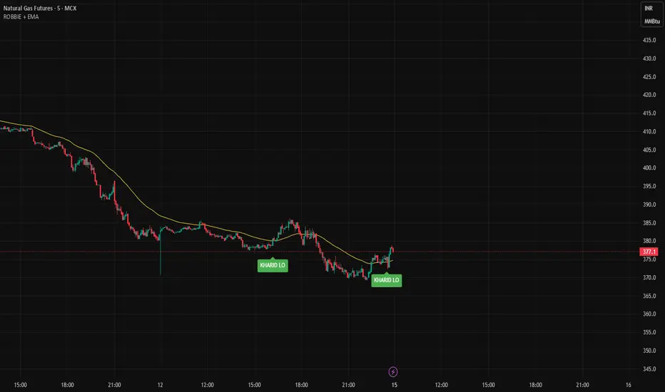
ROBBIE + EMA1️⃣ Purpose
This indicator identifies Knoxville Divergence signals (Rob Booker method) while filtering trades according to trend using an EMA.
Bullish signal: Price shows divergence and is above EMA → buy bias.
Bearish signal: Price shows divergence and is below EMA → sell bias.
It combines price pivots, RSI divergence, momentum, and EMA trend for higher-probability signals.
2️⃣ Key Components
a) Inputs
rsiLength → Period for RSI (default 14)
momLength → Period for Momentum (default 10)
pivotLen → Lookback for pivot detection (default 5)
emaLength → EMA period for trend filter (default 50)
b) Pivot Detection
ta.pivotlow() → detects price and RSI lows
ta.pivothigh() → detects price and RSI highs
Only pivots confirmed after pivotLen bars are used for divergence logic.
c) Knoxville Divergence Logic
Bullish Divergence:
Price forms a lower low
RSI forms a higher low
Momentum > 0
Price above EMA (trend confirmation)
Bearish Divergence:
Price forms a higher high
RSI forms a lower high
Momentum < 0
Price below EMA (trend confirmation)
Robbie BhaiyaMy first indicator. I would like to create something which gives you realtime buy and sell signal.

EMA Market Regime & Real-Time Candle Projection System📌 EMA Market Regime & Real-Time Candle Projection System
EMA Market Regime & Parabolic Projection is a real-time market structure system designed to anticipate candle behavior before it fully forms, by dynamically projecting price levels based on trend strength, acceleration, and market expansion.
Unlike traditional indicators that react after the candle closes, this system continuously adapts to live price data to provide early insight into bullish, bearish, parabolic, and exhaustion phases.
🔍 Core Concept
The system operates on four key dimensions:
Market Structure
Uses a fast and a slow EMA to determine the dominant market regime (bullish or bearish).
Directional Momentum
Measures EMA slope to confirm directional commitment.
Acceleration & Parabolic Detection
Identifies true parabolic movements through acceleration analysis, filtering out weak or range-bound price action.
Expansion Validation
Confirms that movements are supported by genuine market expansion, reducing false signals.
By combining these elements, the indicator projects a dynamic price level in real time, effectively drawing a forward-looking guide that adapts as each candle evolves.
🧠 Real-Time Candle Projection
The projected line represents a dynamic equilibrium level derived from EMA structure and acceleration.
This allows traders to:
Anticipate continuation vs exhaustion
Visualize momentum shifts before candle close
Read potential candle direction and strength in real time
The projection is non-repainting and updates tick-by-tick during the candle’s formation.
🎯 Market Regime Classification
The system automatically classifies the market into distinct states:
Bullish Trend – Positive structure with controlled momentum
Bearish Trend – Negative structure with controlled momentum
Parabolic Expansion – Accelerated trend with strong continuation potential
Parabolic Exhaustion – Loss of acceleration signaling potential reversal or pullback
Neutral / Range – Low momentum and low expansion (no-trade zone)
Each state is visually encoded using subtle, professional coloring, ensuring price candles always remain the primary focus.
🛡️ Professional-Grade Filters
Anti-range and anti-fake breakout filtering
Cooldown logic to prevent repetitive signals
Slope normalization relative to volatility
Designed to remain readable on M1–M5 scalping and higher timeframes
⚙️ Designed For
Scalping & Intraday Trading
Real-time decision-making
Trend continuation & exhaustion timing
Prop-firm and professional trading environments
This system is intended as a market structure and timing tool, not a signal spam indicator.
⚠️ Disclaimer
This indicator does not predict the future and does not provide guaranteed results. It is designed to assist discretionary traders by improving real-time market reading and execution timing.

Daily Upper Wick 0.5 (Date Range)Appearance settings modified: Extend lines OFF, level color, Date Range filter, line thickness, Prices labeled and resized tiny, plot lines OFF.
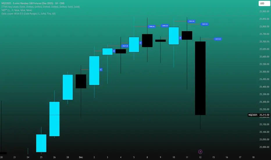
Daily Lower Wick 0.5 (Date Range)Appearance settings modified: Extend lines OFF, level color, Date Range filter, line thickness, Prices labeled and resized tiny, plot lines OFF.

Opening Range Breakout with VWAP & RSI ConfirmationThis indicator identifies breakout trading opportunities based on the Opening Range Breakout (ORB) strategy combined with intraday VWAP and higher timeframe RSI confirmation.
Opening Range: Calculates the high, low, and midpoint of the first 15 or 30 minutes (configurable) after your specified market open time.
Intraday VWAP: A volume-weighted average price calculated manually and reset daily, tracking price action throughout the trading day.
RSI Confirmation: Uses RSI from a user-selected higher timeframe (1H, 4H, or Daily) to confirm signals.
Buy Signal: Triggered when VWAP breaks above the Opening Range High AND the RSI is below or equal to the buy threshold (default 30).
Sell Signal: Triggered when VWAP breaks below the Opening Range Low AND the RSI is above or equal to the sell threshold (default 70).
Visuals: Plots Opening Range levels and VWAP on the chart with clear buy/sell markers and optional labels showing RSI values.
Alerts: Provides alert conditions for buy and sell signals to facilitate timely trading decisions.
This tool helps traders capture momentum breakouts while filtering trades based on momentum strength indicated by RSI.

Ichimoku + VWAP + OBV + ATR Full System (NQ Daytrade)Extended Indicator Description
Ichimoku + VWAP + OBV + ATR Full System is a rule-based intraday trading indicator designed specifically for NQ day trading, focusing on trend alignment, participation confirmation, and volatility-aware execution.
This indicator does not rely on a single signal or crossover. Instead, it integrates multiple market dimensions into one structured framework to help traders identify high-probability trend continuation scenarios while avoiding low-quality, range-bound conditions.
System Philosophy
The core idea of this system is simple:
trade only when trend, price location, volume, and volatility are aligned.
Each component plays a specific role and is not meant to be used in isolation. The indicator works best when all conditions reinforce the same directional bias.
Component Breakdown
Ichimoku Cloud
Used to define the primary market structure and directional bias. The system favors trades only when price action aligns clearly above or below the cloud, helping filter out indecisive or transitional phases.
VWAP
Acts as a session-based equilibrium reference. Price position and distance relative to VWAP are used to confirm whether the market is trending with intent rather than reverting to the mean.
OBV (On-Balance Volume)
Provides participation and flow confirmation. OBV helps validate whether price movement is supported by volume, reducing the likelihood of false breakouts or weak trend signals.
ATR (Average True Range)
Used as a volatility filter and risk-awareness tool. ATR conditions help the system avoid low-volatility environments and support more realistic expectations for intraday movement.
Trade Logic Overview
The system is designed around trend-following pullbacks, not prediction or counter-trend trading.
When trend structure is established and confirmed by VWAP positioning and OBV behavior, pullback zones within the trend become areas of interest. ATR conditions ensure that trades are taken only when sufficient movement potential exists.
Rather than generating frequent signals, the system prioritizes selectivity and clarity, making it suitable for disciplined day traders who value context over quantity.
Intended Use
This indicator is built for:
NQ intraday and day trading
Trend continuation and pullback strategies
Traders who prefer structured, confirmation-based systems
Lower to mid intraday timeframes such as 3-minute, 5-minute, and 15-minute charts
Important Notes
This is not an automated trading system and does not provide guaranteed results. The indicator is designed as a decision-support tool to assist with market context, directional bias, and trade timing. Risk management, execution, and position sizing remain the responsibility of the user.
롱/숏 삼각형 시그널
동그라미 청산 시그널
VWAP 밴드 기반 방향성
OBV 보조지표
이름 (Name)
BTC Scalping Signal – VWAP + OBV
짧은 설명 (Short Description)
VWAP 밴드와 OBV를 기반으로 방향성, 진입·청산 시그널을 제공하는 스캘핑 지표입니다.
긴 설명 (Long Description)
이 지표는 BTC 단기 스캘핑을 위해 설계된 것으로, 특히 15분봉 환경에 최적화되어 있습니다.
VWAP 밴드의 위치와 추세 판별 로직을 기반으로 롱·숏 진입 신호를 제공합니다.
OBV 모멘텀을 보조 필터로 사용하여 돌파 및 되돌림 가능성을 판단합니다.
시장 변동성이 축소되거나 평균회귀 신호가 감지될 때 청산 시그널을 표시합니다.
삼각형(진입), 원형(청산) 등 직관적 시각 요소를 통해 빠른 의사결정을 지원합니다.

Market + Direction + Entry + Hold + Exit v1.5 FINALIndicator Description
Market + Direction + Entry + Hold + Exit is a rule-based intraday trading indicator designed to identify high-quality trend opportunities while filtering out low-probability market conditions.
Instead of relying on a single signal, this indicator combines market activity, trend direction, momentum, structure, and pullback logic into one unified framework. It is built to support disciplined, rule-driven trading rather than discretionary or predictive approaches.
Core Logic
The indicator operates through a multi-layer confirmation process.
First, it evaluates whether the market is active enough to trade. Market activity is determined by volatility expansion, volume participation, and price displacement from VWAP. When sufficient activity is detected, the indicator allows trades to be considered.
Next, directional bias is defined using exponential moving averages and price positioning. This creates a clear long-only or short-only environment and helps avoid counter-trend trades.
Entry Structure
Entries are based on pullbacks within an established trend rather than breakout chasing.
The first valid pullback is marked as the initial entry. If the trend continues and additional controlled pullbacks occur, re-entry opportunities are identified and labeled sequentially. This structure helps traders scale into trends in a systematic and measured way.
Hold Confirmation
While a position is active, the indicator provides hold confirmation using momentum alignment and candle behavior. This is designed to help traders remain in strong trends and reduce premature exits during normal pullbacks.
Exit Logic
Exit signals appear only when two conditions align: market structure failure and clear trend weakening. This approach avoids exits based on minor price noise and focuses on objective trend invalidation.
Intended Use
This indicator is designed for intraday trading and scalping on indices, futures, and cryptocurrency markets. It performs best on lower to mid timeframes such as 3-minute, 5-minute, and 15-minute charts, where trend continuation and pullback behavior are most visible.
Asset Presets
Built-in presets are provided for NQ, Gold, and BTC. Each preset automatically adjusts internal parameters such as volatility thresholds, structure sensitivity, and trend strength filtering.
Important Notes
This indicator does not predict future price movements. It is a decision-support tool designed to help traders align with market conditions, manage entries systematically, and maintain consistency. Risk management, position sizing, and execution remain the responsibility of the user.
지표 설명
Market + Direction + Entry + Hold + Exit는 시장의 흐름이 명확한 구간에서만 거래 기회를 포착하도록 설계된 규칙 기반 인트라데이 트레이딩 지표입니다.
이 지표는 단일 신호에 의존하지 않고, 시장 활성도, 추세 방향, 모멘텀, 가격 구조, 되돌림 조건을 단계적으로 결합하여 낮은 확률의 구간을 걸러내는 데 초점을 둡니다. 예측보다는 정렬과 필터링을 통해 일관된 의사결정을 돕는 것이 목적입니다.
핵심 개념
지표는 여러 단계의 조건을 순차적으로 통과해야 신호를 생성하는 구조로 설계되어 있습니다.
먼저, 현재 시장이 거래하기에 충분히 활성화되어 있는지를 판단합니다. 변동성, 거래량, VWAP 대비 가격 이탈 정도를 기준으로 시장 상태를 평가하며, 일정 기준 이상일 때만 거래를 고려합니다.
이후, 이동평균과 가격 위치를 기반으로 추세 방향을 정의하여 롱 또는 숏 한 방향만 허용합니다. 이를 통해 역추세 진입을 자연스럽게 차단합니다.
진입 구조
진입은 돌파가 아닌 추세 내 되돌림을 기준으로 설계되어 있습니다.
첫 번째 유효한 되돌림 구간을 초기 진입으로 표시하며, 추세가 유지되는 동안 추가적인 되돌림이 발생할 경우 재진입 기회를 순차적으로 제공합니다. 이러한 구조는 감정적인 물타기가 아닌, 규칙 기반의 분할 진입을 가능하게 합니다.
홀드 신호
포지션 보유 중에는 모멘텀 정렬과 캔들 흐름을 통해 추세 지속 여부를 확인할 수 있습니다. 이를 통해 정상적인 조정 구간에서는 성급한 청산을 줄이고, 추세가 유지되는 동안 포지션을 안정적으로 관리할 수 있도록 돕습니다.
청산 로직
청산 신호는 가격 구조 붕괴와 추세 약화가 동시에 확인될 때만 발생합니다. 단기적인 노이즈에 의한 잦은 청산을 피하고, 추세가 객관적으로 무너지는 구간에 집중하도록 설계되었습니다.
활용 대상
이 지표는 인트라데이 트레이딩과 스캘핑에 적합하며, 지수, 선물, 암호화폐 시장에서 활용할 수 있습니다. 특히 3분, 5분, 15분 차트에서 추세와 되돌림 구조가 명확하게 나타나는 환경에서 효과적입니다.
자산 프리셋
NQ, Gold, BTC에 대해 사전 설정된 프리셋이 제공되며, 각 자산의 변동성과 특성에 맞게 내부 파라미터가 자동으로 조정됩니다.
유의 사항
본 지표는 가격의 미래를 예측하지 않습니다. 시장 환경을 정리하고 거래 판단을 보조하는 도구로서 사용되며, 손절 기준과 포지션 사이즈 관리는 사용자 책임입니다.

Daily contextThis indicator automatically marks the Previous Day’s High and Low, as well as the market’s midnight opening price.
These levels are updated at the start of each new trading day and remain visible throughout the entire session.
By providing key daily reference points, the indicator helps establish a clear market context and allows traders to immediately understand where price is positioned relative to the previous day’s range and the daily open.

One Candle 5min Retest Strategy🚀 One Candle 5min Retest Strategy (OCRS) – Your Morning on Autopilot
Less drawing, more trading.
Sick of drawing the opening range manually every single morning? Or catching yourself FOMOing into trades before the candle even closes? The OCRS Indicator automates the heavy lifting for the "First Candle" / "One Candle Retest" strategy (Scarface Trades style).
It’s basically a tool to keep you honest and save you time.
🧠 Why use it?
Forced Patience: The range lines stay PURPLE while the first 5 minutes are playing out. That’s your sign to chill and wait. No early entries.
Instant Levels: Once the range closes, the lines snap to BLUE (High) and ORANGE (Low) . You see the levels immediately.
The "Zone" Finder: If price breaks out, the script finds the specific Order Block for you (the last contrary candle before the move) and draws the retest box.
Bullish Breakout? Catches the last red candle.
Bearish Breakout? Catches the last green candle.
No Confusion: Markets are messy. If price fakes a pump and then dumps, the indicator keeps the old zone and draws the new one. You see exactly what's happening.
🛠️ The Good Stuff:
Set and Forget: Auto-syncs to NY Open (09:30 EST). Works on any timeframe.
Clean Charts: Lines only run for 90 minutes. No clutter for the rest of the day.
Day Separator: A simple vertical line marks the next session. Perfect for backtesting —you know exactly when to hit pause before the next open.
No Wicks: Boxes only paint when the candle actually closes outside the range. Zero fakeouts.
Your Style: Turn boxes on/off or change colors to match your vibe.
🎯 How to trade it:
Chill for the first 5 minutes (09:30 - 09:35 NY). Purple lines = hands off.
Watch for the break.
Candle CLOSES above Blue? Wait for the Blue Box .
Candle CLOSES below Orange? Wait for the Orange Box .
The Setup: Wait for price to tap back into the box.
Entry: Find your confirmation inside that zone and take the trade.
Keep your morning simple. Install OCRS and trade with clarity.
Note: This is just a tool to help with the strategy. Risk management is still on you.

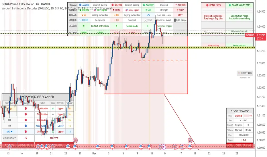
Wyckoff Institutional Decoder [OXE]4 Professional Dashboard Panels
Panel 1: RETAIL VS SMART MONEY INSIGHT (Top-Right)
This is the showstopper - side by side comparison:
🔴 RETAIL SEES🟢 SMART MONEY SEES"Support broke! 📉 SELL!""Spring trap complete ✓ Institutions buying""Breakout! 📈 BUY!""Upthrust trap complete ✓ Institutions selling""Downtrend continuing, Stay short""Accumulation Phase, Institutions loading""Just a pullback, Buy the dip!""Late Distribution, Breakdown approaching"
Plus:
Effort vs Result interpretation
Outcome prediction (Retail: "Gets stopped out 💀" vs Smart Money: "Enters at best price ✓")
Panel 2: MAIN WYCKOFF DASHBOARD (Bottom-Right)
MetricDisplayPhaseACCUMULATION / DISTRIBUTION / MARKUP / MARKDOWNStrength████ 85% (visual progress bar)Sub-PhaseA - Selling Climax, B - Building Cause, C - Spring, etc.Smart MoneySTRONG BUYING / Buying / Neutral / Selling / STRONG SELLINGVolume🔊 EXTREME / 🔉 High / 🔈 Low with ratio (2.3x)Effort/ResultABSORPTION / EASY MOVE / BALANCEDCause Built45 bars (45%) - shows target potentialTarget↑ 2,145.50 (projected price target)◆ ACTIONBUY THE SPRING / SELL THE UPTHRUST / WAIT & OBSERVE
Panel 3: EVENT LOG (Middle-Right)
Real-time chronological log of Wyckoff events:
📋 EVENT LOG
━━━━━━━━━━━━━━━━━
SPRING 🟢 | 3 bars
Test (Spring) | 8 bars
Sign of Strength | 15 bars
Selling Climax | 42 bars
Panel 4: LEGEND (Bottom-Left)
Quick reference for all chart markers:
▲ SPRING = Buy Signal
▼ UTAD = Sell Signal
◆ SOS = Strength Confirmed
◆ SOW = Weakness Confirmed
● SC/BC = Climax Volume
╳ T = Test Event
— — = Creek / Ice levels
📊 Chart Visualizations
Structure Elements
Trading Range Box - Color-coded by phase (blue=accumulation, red=distribution)
Creek Level - Dashed blue line (resistance within accumulation)
Ice Level - Dashed red line (support within distribution)
Target Projection - Arrow showing price target based on "cause"
Event Markers
SPRING ▲ - Green triangle below bar
UTAD (Upthrust) ▼ - Red triangle above bar
SOS ◆ - Green diamond (Sign of Strength)
SOW ◆ - Red diamond (Sign of Weakness)
SC/BC ● - Orange circles (Selling/Buying Climax)
Tests ╳ - Small X markers
LPS/LPSY - Labels for Last Point of Support/Supply
Volume Highlighting
Orange background = Ultra-high volume (institutional activity)
Yellow background = High volume
🧠 Smart Detection Engine
Phase Detection
Automatically identifies:
ACCUMULATION (Smart money buying)
Sub-phases: A (Selling Climax), B (Building Cause), C (Spring), D (SOS), E (Breakout)
DISTRIBUTION (Smart money selling)
Sub-phases: A (Buying Climax), B (Building Cause), C (UTAD), D (SOW), E (Breakdown)
MARKUP (Uptrend)
MARKDOWN (Downtrend)
Event Detection
Selling Climax (SC)
Automatic Rally (AR)
Secondary Test (ST)
Spring
Sign of Strength (SOS)
Last Point of Support (LPS)
Buying Climax (BC)
Upthrust After Distribution (UTAD)
Sign of Weakness (SOW)
Last Point of Supply (LPSY)
Tests (low volume confirmations)
Volume Analysis
Effort vs Result - Detects absorption (high volume, small move)
Stopping Volume - Climax with rejection wicks
No Demand/Supply - Low volume showing lack of interest
Smart Money Score - Composite Operator activity gauge (-10 to +10)
Price Targets
Cause & Effect calculation
Projects targets based on consolidation width
Shows when enough "cause" has built up
⚡ All Alerts Included
Spring detected
Upthrust detected
Sign of Strength
Sign of Weakness
Selling/Buying Climax
Spring/Upthrust Tests
LPS/LPSY
Phase changes (Accumulation → Markup, etc.)
🎨 Optimized for White Backgrounds
All colors carefully selected for:
High contrast on white charts
Easy readability
Professional appearance
No eye strain
Settings You Can Customize
Structure detection length
Pivot sensitivity
Volume spike thresholds
Spring/Upthrust sensitivity
Dashboard size (small/normal/large)
All colors
Toggle each panel on/off
Toggle each visualization element
QM Level Detector by RWBTradeLabQM Level Detector by RWBTradeLab
A clean, non-repainting QM level detector built for traders who track structure shifts and level-break sequences using confirmed candles only.
What this indicator does
This script detects and marks QM Levels based on a strict, rule-based sequence using closed candles only (no running-bar signals).
It identifies two types of QM:
Buy QM
A Buy QM is confirmed when the following sequence completes in order:
* V Level is detected.
* That V Level is broken down by a red candle close below the V Level price.
* After that breakdown, the most recent A Level (formed before the breakdown) is identified.
* When that A Level is later broken out by a green candle close above the A Level price, the original V Level becomes a Buy QM Level .
Sell QM
A Sell QM is confirmed when the opposite sequence completes in order:
* A Level is detected.
* That A Level is broken out by a green candle close above the A Level price.
* After that breakout, the most recent V Level (formed before the breakout) is identified.
* When that V Level is later broken down by a red candle close below the V Level price, the original A Level becomes a Sell QM Level .
Visuals on chart
* A horizontal ray (right-extended) is drawn at the confirmed QM price level.
* Label distance is adjustable via Text Offset (ticks).
Alerts
Built-in alerts trigger only on candle close when a QM is confirmed:
* Buy QM
* Sell QM
Each alert is designed for reliable automation without repainting.
Key settings
* Candle Length (closed candles): Scans the last N closed bars (running candle excluded).
* Buy QM / Sell QM toggles: Show or hide each type.
* Text toggle: Show or hide labels.
* QM Line Color and Text Offset (ticks) customization.
Non-repainting confirmation
All detection, marking, and alerts are based on confirmed candles only.
No running-bar conditions → no repainting .
Disclaimer
This indicator is a level-detection tool, not financial advice. Trading involves risk—always use proper risk management and confirm signals with your own analysis.
Creator: RWBTradeLab
If you find this useful, please leave a like ⭐ and share your feedback.

InspireHER TraderGal RB Matrix Chart, 5m, 15m, 1hr, 4hr🌸 InspireHER TraderGal RB Matrix
Rejection Block Zones — Chart TF + HTF (5m · 15m · 1H · 4H)
📌 Overview
The InspireHER TraderGal RB Matrix is a multi-timeframe Rejection Block (RB) visualization tool designed to highlight institutional rejection zones across:
Current chart timeframe
Higher timeframes: 5m, 15m, 1H, and 4H
RBs are drawn using confirmed pivot logic, projected forward in time, and automatically maintained to avoid duplication, clutter, or repainting.
This indicator is visual-only and does not place trades.
🧱 What Is a Rejection Block (RB)?
A Rejection Block represents a price area where the market strongly rejected higher or lower prices, often leaving:
Long wicks
Sharp reversals
Institutional footprints
RBs are useful for:
Reaction zones
Mean-reversion areas
Entry refinement
Risk placement
Confluence with structure, VWAP, or liquidity
🎛️ RB Range Modes (Key Feature)
You can control how much of the candle is included in the RB zone.
🔘 RB Range Mode Options
Mode Description Use Case
Wick Only Wick → body edge Clean rejection focus
Wick + Body Wick → full candle body Institutional confirmation
Wick to Wick Full candle range (high → low) Volatility / liquidity sweeps
This setting affects both Chart TF and HTF RBs consistently.
⏱️ Timeframe Controls
Chart Timeframe RBs
Uses the current chart timeframe
Automatically adapts visually when switching charts
No duplicate drawing when Chart TF overlaps HTF
Higher Timeframe RBs
You can independently toggle:
5m RBs
15m RBs
1H RBs
4H RBs
Each timeframe uses:
Its own color
Its own transparency
Its own deduplication logic
🎨 Visual Behavior (Important)
RBs are drawn as boxes projected forward
Optional 50% midline (equilibrium of the zone)
Optional labels showing:
RB
Timeframe
Bullish / Bearish direction
Transparency Logic
When viewing a chart:
Chart TF RBs automatically match the active timeframe’s transparency
Prevents darker zones when Chart TF = HTF
Ensures visual consistency across all modes
🔄 Auto-Maintenance Logic
RBs are automatically managed:
❌ Deleted after price invalidates the zone
🧹 Removed after a configurable number of days
🔢 Hard-capped to prevent performance issues
🚫 No duplicate zones from the same pivot
⚙️ Inputs Summary
Rejection Block Engine
Swing lookback length
Right-side extension
Auto-delete days
Maximum active zones
RB range mode
Styling
Colors per timeframe
Midline toggle
Label toggle
Timeframe Toggles
Chart TF
5m / 15m / 1H / 4H
🧠 Best Practices
This indicator works best when combined with:
Market structure
VWAP
Liquidity highs/lows
Session context
HTF bias
RBs are areas of interest, not trade signals by themselves.
⚠️ Notes & Limitations
Uses confirmed pivots only (no repainting)
HTF RBs are projected using request.security
Zones update dynamically as price evolves
Designed for clarity, not signal spam
🌷 TraderGal Philosophy
“Let price tell you where it was rejected — then let structure tell you what to do.”
This tool is built to support calm, structured, and intentional trading, not over-trading.

Daily Upper Wick 0.5 (10 Trading Days + Today)Adjust appearance in settings. (Line thickness, color, price labels, extended lines, line plot option.)
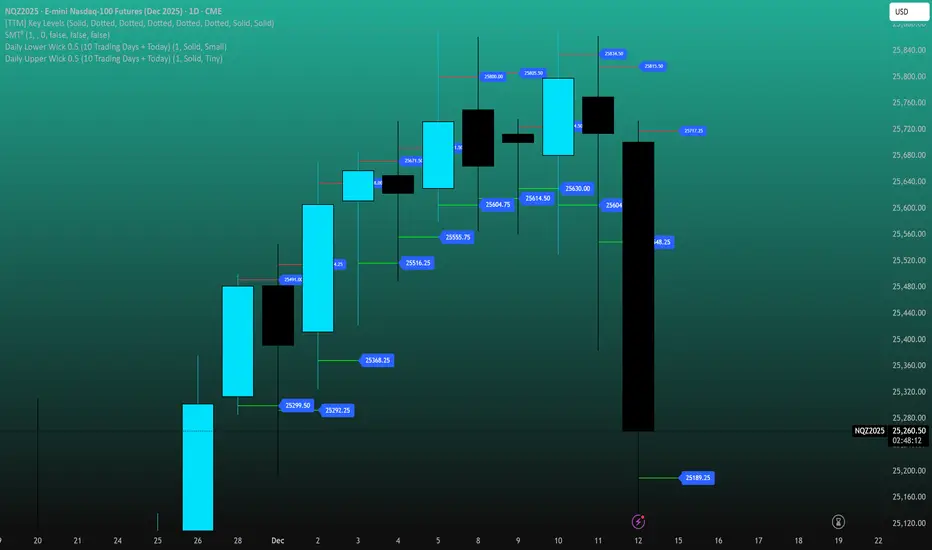
Daily Lower Wick 0.5 (10 Trading Days + Today)Adjust appearance in settings. (Line thickness, color, price labels, extended lines, line plot option.)

HTF Candle BoxFor HTF pattern in real time LTF view.
Used for AMD pattern, to always keep eye on the progress of HTF, but with stay in the LTF.
It will improve your confirmations.

Daily Auto-Fib Zones (Custom Colors)This indicator automatically draws daily Fibonacci-based zones using the current session’s high and low. The levels update dynamically as new price action forms and include optional visual regions for several commonly referenced retracement percentages.
Features include:
• Automatic detection of the daily high and low
• Real-time updates throughout the session
• Optional zones for 0.11–0.17, 0.5, and 0.618–0.786 levels
• Custom color inputs for every line and zone
• Dynamic boxes that expand with the day’s range
• Lightweight visual layout with toggleable components
The tool is intended purely for chart visualization. It does not provide signals or trade recommendations.

Weekly Auto-Fib Zones (Custom Colors) This script automatically plots weekly Fibonacci-based zones using the current week’s high and low. It updates dynamically as new price action forms and provides optional visual regions for key retracement areas.
The indicator includes:
• Weekly high/low anchor lines
• Optional 0.11–0.17 zones
• Optional 0.5 midpoint (premium/discount)
• Optional 0.618–0.786 retracement band
• Customizable colors for each level
• Dynamic boxes that expand as the week progresses
It is designed as a visual aid for identifying weekly ranges, contextual zones, and potential areas of interest based solely on Fibonacci percentages. No signals, alerts, or trading recommendations are included.

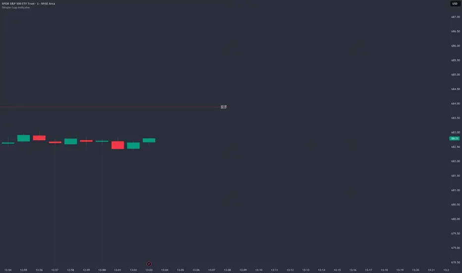
Simple Gap IndicatorTitle: Simple Gap Indicator
Description: This is a utility script designed to automate the tracking and management of price gaps (also known as "Windows") on the chart. Unlike static drawings, this indicator dynamically monitors open gaps and automatically "closes" them (stops drawing) once price has filled the area, keeping your chart clean and focused on active levels only.
Why Use This Tool? Traders often mark gaps manually, but charts quickly become cluttered with old, invalid levels. This script solves that problem by using an array-based management system to track every open gap in real-time and remove it the moment it is invalidated by price action.
Technical Methodology:
Gap Detection: The script identifies "Full Gaps" where the Low of the current candle is higher than the High of the previous candle (Bullish), or vice versa (Bearish). This indicates a total disconnect in price delivery.
Dynamic Filtering:
ATR Filter: Users can filter out insignificant "noise" gaps by setting a minimum size threshold based on the Average True Range (ATR).
Time Filter: Option to restrict gap detection to specific session hours (e.g., ignoring overnight gaps on 24h charts).
Auto-Closure: The script loops through all active gaps on every new bar. If the current price wick touches an open gap, the box is visually terminated at that specific bar index and removed from the tracking array.
Visuals:
Green Box: Bullish Gap (Support Zone).
Red Box: Bearish Gap (Resistance Zone).
Labels: Optional text displaying the precise Top/Bottom price coordinates of the gap.
How to Use:
Enable "Auto-Close Gap on Retest" to keep your chart clean.
Use the ATR Filter if you are getting too many signals on lower timeframes (e.g., set to 0.5x ATR).
Set alerts for "New Gap" or "Gap Filled" to automate your workflow.
Credits: Calculations based on standard Gap/Window price action theory. Array management logic custom-coded for Pine Script v6.
DMcTrades Trading EngineDMcTrades Trading Engine
Multi-Layer Trend, Structure & Momentum Analysis
This indicator is a comprehensive, rule-based trading framework designed to identify high-quality buy and sell opportunities through multi-timeframe confluence, trend alignment, and price-action confirmation. It combines structure breaks, moving-average alignment, volatility filters, and momentum confirmation into a single, unified visual system.
The script is intended for intraday and short-term swing trading, with particular effectiveness on lower timeframes when higher-timeframe trend alignment is respected.
Core Architecture
The indicator is divided into two independent but complementary engines:
1) Multi-Timeframe Structure & Trend Engine
This engine focuses on directional bias and structural validation.
Key components:
Multi-timeframe EMA alignment (fast and slow timeframes)
Supertrend direction agreement across timeframes
Swing-based Break of Structure (BOS) detection
Configurable trend strictness (Conservative / Balanced / Aggressive)
Optional wick-based or close-based structure confirmation
Signals generated here establish trend-qualified entry permission, not standalone entries.
2) Momentum & Breakout Signal Engine
This engine evaluates entry quality and follow-through probability.
Key components:
Breakout and breakdown detection from recent swing levels
ATR-adjusted volatility and impulse candle filtering
MACD and RSI momentum confirmation
VWAP and higher-timeframe EMA confluence (optional)
Retest-based and impulse-based entry logic
Overextension protection to avoid late entries
Signals are classified as:
CONFIRMED (strong multi-filter confluence)
BASE (core conditions met, fewer filters passed)
Signal Types & Visuals
The indicator provides multiple visual layers:
BUY / SELL triangles for core entries
CONFIRMED BUY / SELL labels for high-confluence setups
Classification boxes highlighting active signal zones
Supertrend overlays (current timeframe + optional 5-minute overlay)
EMA stack visualization (9 / 21 / 50 / 200)
Impulse candle highlighting
Optional reversal warning triangles based on momentum divergence
All visuals are fully configurable and can be enabled or disabled independently.
Risk & Trade Context Features
To help filter lower-probability trades, the suite includes:
Minimum ATR and volume thresholds
Trend stability checks (avoids fresh flips unless momentum is strong)
EMA slope and distance validation
Liquidity sweep and recent structure awareness
Optional higher-timeframe trend agreement
These filters are designed to reduce over-trading and improve signal quality during ranging or low-volatility conditions.
Recommended Usage
Best suited for 1-minute to 15-minute charts
Designed for trend-following and momentum continuation
Works across Forex, indices, commodities, and crypto
Use in conjunction with proper risk management and session awareness
This indicator does not provide take-profit or stop-loss levels and should be used as a decision-support tool, not an automated trading system.
Disclaimer
This script is provided for educational and analytical purposes only.
It does not constitute financial advice. Trading involves risk, and past performance does not guarantee future results.


Custom RSI + Divergence + Bold Lines (v6, matched)📌 Custom RSI with Divergence & Dynamic Coloring
This indicator enhances the classic Relative Strength Index (RSI) by combining
dynamic visual feedback with automatic regular divergence detection.
It is designed to help traders quickly identify overbought / oversold conditions
and potential momentum shifts through clear and intuitive visualization.
⸻
🔍 Key Features
1️⃣ Dynamic RSI Line Coloring
• Overbought zone (RSI > Overbought level) → RSI line turns green
• Oversold zone (RSI < Oversold level) → RSI line turns red
• Neutral zone → RSI line remains white
This allows instant recognition of the current RSI state.
⸻
2️⃣ Overbought / Oversold Visual Highlighting
• Clear overbought and oversold reference lines
• Background shading when RSI enters these zones
→ improves signal visibility and reaction speed
⸻
3️⃣ Automatic Regular Divergence Detection
• Bullish Divergence
• Price makes a lower low
• RSI makes a higher low
• Pivot lows are connected with a bold green line
• Bearish Divergence
• Price makes a higher high
• RSI makes a lower high
• Pivot highs are connected with a bold red line
Pivot points are connected directly, making divergence structures easy to identify at a glance.
⸻
4️⃣ Clear Signal Markers
• Bullish divergence: ▲ (bottom of the RSI pane)
• Bearish divergence: ▼ (top of the RSI pane)
⸻
⚙️ Inputs
• RSI Length
• Overbought / Oversold Levels
• Pivot Length (controls divergence sensitivity)
⸻
💡 How to Use
• Oversold + Bullish Divergence → Potential rebound setup
• Overbought + Bearish Divergence → Potential pullback or reversal
• Best used in combination with trend analysis, support/resistance, and volume
⸻
⚠️ Notes
• Divergence signals are probabilistic, not guaranteed.
• In ranging markets, divergences may appear more frequently.
• Always apply proper risk management.
⸻
🎯 Best For
• Traders who actively use RSI
• Traders looking for clean and intuitive divergence visualization
• Users who prefer minimal but informative indicators
