Rails v2Centered around a Variable Moving Average (Rail Line). The Variable Moving Average (VMA) is a study that uses an Exponential Moving Average being able to automatically adjust its smoothing factor according to the market volatility.
In addition to the Rail Line or VMA, the indicator makes use of Bollinger Bands in two ways. First, it displays when the Bollinger Bands are in a squeeze and the potential direction of the breakout. The "squeeze" is the central concept of Bollinger Bands. When the bands come close together, constricting the moving average, it is called a squeeze. A squeeze signals a period of low volatility and is considered by traders to be a potential sign of future increased volatility and possible trading opportunities. The Bollinger Bands are also utilized to highlight when price action might reverse. This signals when price closes outside of the bands, quickly reverts and closes within the bands
The indicator makes use of the Hull Moving Average as a method to quickly capture price action moves thanks to its ability to eliminate lag while managing to improve smoothing at the same time.
Finally, the indicator utilizes Volume Point of Control (VPOC) to determine points in price where the highest amount of volume was traded. Unlike the market profile, the indicator will plot the Volume POC per candle. The script will also plot Trapped Volume. This is important as it tends to serve a signal for reversal. The more price moves away from the trapped volume, Long/Short traders might be forced to cover and price could quickly move away from the area.
DEFAULT SIGNALS: All signals can be turned Off/On by user
Dots = Short Term Trend
Rails Bar Color = Medium Term Trend
Rail Line (VMA) = Long Term Trend
Crossover of Moving Averages = X
Volume Pulse = Large Up/Down Triangle
Potential Bullish Reversal = Light Blue Candle
Potential Bearish Reversal = Pink Candle
Potential Reversal Confirmation = Orange Candle
Squeeze = Shaded White Cloud
Potential Breakout Direction = Small Golden Triangle
Hull Moving Average = Thin Golden Line
Volume POC = Thin Horizontal White Line on Candle
Volume Threshold POC = Thin Horizontal Yellow Line on Candle
Trapped Volume POC = Thin Horizontal Red Line on Candle
在腳本中搜尋"GOLD"
Trend Indicator with RSI and Fibbonacci Band 0.702 crossingsToday we have a new Indicator set, which I created using inspiration from the Trend Magic Indicator from KivancOzbilgic and adding several new aspects to it and a slightly modified calculation of the trend indicator itself.
You can change the inputs by changing the pre set values in the settings, but I found the current settings quite accurate. Feel free to experiment to fine tune the indicators.
Here are the details of the script:
Trend indicated within candles and as a line
- bullish and bearish trends are now also indicated within the candle based on the CCI calculation.
- Bullish is indicated by a green circle below the candle or as one may call it a "dot"
- bearish trend is indicated by a red circle above the candle
Entry Signal based on RSI crossing its EMA
- my motivation was to have a clearer entry signal besides highlighting a trend, which can not really be used to identify a good entry but to give confidence or when loosing trend to give an exit signal.
- after studiying the RSI and how it works together with its EMA it looks quite interesting as an entry or exit signal. But be cautios if the EMA and RSI values are moving in a narrow area we get a lot of crosses and therefore signals which should rather be ignored rather to be act on. So the the range where the cross happens is also quite important. But this aspect is not yet reflected as a rule/ logic.
But I am thinking of adding something.. or alternativly best to switch to another timeframe to get some better data
RSI overbought and oversold as Diamonds
- I also added key indications of oversold or overbought as Blue and Pink diamonds, can be considered as additional information to maybe identify a short term top or bottom.. but its not very accurate.
Entry signal based on crossing Fibbonachi Band 0.702
- So far the 0.702 seems to be quite an interesting retracement level which seems to be met a lot of times
- based on the assumption the price will evantually hit the 0.702 either direction I wanted to get a signal when this happens
- BUT! a big but, unfortunalty the Fibbonachi bands tend to bloat up in case of high volatility so it is not easy to find the crossing on higher timeframes
Here are the standard value which I found quite accurate for the assets I use this indicator set:
CCI Period = 5
ATR Multiplier = 1
ATR Period = 1
Source = High Low Close (hlc3 average value of the candle
Here the inputs used for the RSI Crossing signal (here you should play around a little to see which entry would have been best..)
RSI Length = 14
RSI Oversold = 25 (to be used for the "golden" entry signal based on the FBB crossing)
RSI Overbought = 80 (to be used for the "golden" entry signal based on the FBB crossing)
RSI Moving Average Length
In future versions I will add options to activate or deactive some of the plotting and espacially this golden dot when the fibbonachi band is being crossed needs some fine tuning..
And lets see if there is a way to fix the bloating of those bands..
Move Magnitude Visualizer (beta)This experimental visualizer measures all price differences across a range of samples to determine what is normal for a measure of time. Based on whether a recent change in price over time has exceeded the norm, a line is drawn to indicate the magnitude/severity of that move. In short, it attempts to visualize when a move is outside the norm and when it may be risky to join that move.
A thick red line = greater than 3 standard deviations.
An orangish/goldish line = greater than 2 standard deviations.
A thin dotted yellow = greater than 1 standard deviation.
In the end, I've always wanted a tool that gave me a visual warning to when a move is abnormally severe and shouldn't be trusted. RSI and other indicators only work with specific lengths, this attempt to be a deviation detector that isn't bound by length or time-frame.
This is a work in progress, so feedback is appreciated. I don't have a strong idea yet how to properly visualize this data.
It is very compute heavy and some users may experience timeouts. I've done everything I can think of to eliminate redundant computer and to optimize for PineScript.
PATIThis indicator is part of our educational suite focused on teaching price structure, momentum, and mean reversion trading strategies for intraday trading. Our team has selected this set of tools and metrics, which define our trading style and serve as the foundation for our teaching, to be included in this indicator. We are displaying each component in a way we believe is helpful to their understanding which also provides a clean, comprehensive look.
This indicator is for Intraday Trading
Our Traders most commonly use this indicator on the 1,3 or 5 minute chart.
Components of this Indicator:
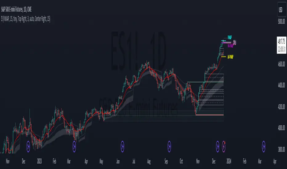
Multiple VWAP Levels: monthly, weekly, standard (anchored to the right of price)
Dynamically Anchored VWAP Cloud (trend tool)
13 EMA (trend tool)
Structural Orderblocks
Multi-Timeframe Fair Value Gap detection
Key Daily Price Levels (anchored to the right of price)
Customizable Opening Range (anchored to the right of price)
15 minute “Golden Zone” (shows the .5-.618 zone of the previous 15m candle)
ADR (Average Daily Range)
A4R (Average 4hr Range)
These tools are used in conjunction with the education we provide to help our users determine their optimal trade plan to utilize their edge.
Specific Functionalities and Uses:
Monthly-VWAP & Weekly-VWAP (M-VWAP/W-VWAP):
VWAP = “Volume Weighted Average Price”
These levels provide probable zones where price may mean revert and risk should be taken off/ put on. We have anchored these to the right-hand side of your chart by default to minimize the noise on your chart.
Average Daily Range (ADR): The Average Daily Range is a technical indicator used to measure the volatility of an asset. It displays how much an instrument can move on average during a given day. The significance is that each market has a unique range that is likely to be covered on any given day.
Average 4hr Range (A4R): The Average 4hr Range is a technical indicator used to measure the volatility of an asset twice in a single session. It displays how much an instrument can move on average during a session and is measured twice in a day. Calculating a smaller volatility range may seem strange at first but can be a huge advantage by analyzing the volatility of the intraday action, giving you average price targets based on more recent market data.
Tip: When used in conjunction with key support and resistance levels, ADR & A4R can be a huge edge to traders to determine where to push/pull risk.
Opening Range: The open often establishes the trend and sentiment for the day, but there is also statistical significance to the open that is overlooked. Statistically, on average, the open is near the high or low of the day and offers plenty of opportunities to build trading strategies. The chart below provides some potential trades that could be taken once the opening range has been established.
Dynamically Anchored VWAP Cloud: Our dynamically anchored VWAP cloud tracks the most recent impulsive move and re-anchors to show you potential bounce points in a trend. We re-anchor at each structural shift to give the most probable targets for buyers/sellers to defend their positions to continue the current trend push.
By utilizing the re-anchoring at each significant structural inflection point, we can establish a much less lagging trend following technique.
We have also included the feature to substitute this cloud for a 34/55 EMA cloud for the traders already familiar with that system.
The chart below provides potential trades that could be taken using the VWAP cloud system.
FVGS (Fair Value Gaps/ Imbalances): These areas represent potential buy/sell side liquidity imbalances where price is pushed aggressively, sweeping the orderbook and will likely return to “fix” the structure before continuing. Below is an example of 3 possible trade paths we look for inside these structural imbalances.
Structural Orderblocks:
These areas are based on structural pivots that have been pushed out of with aggression determined by subsequent structural breaks to confirm their validity. Because of this, when price returns to these areas we can anticipate this area to be defended.
The blue boxes track Orderblocks. These highlight instances of past participation which create areas likely to be defended again when retested.
Swing High/Low/Previous:
We use swing high and lows as points of short-term support and resistance, a break of these levels can signify a shift in market sentiment.
-The dashed green line shows the previous structural swing high or low pivot point.
-The solid green lines show the high and low in our current trading structure.
Note: Displaying the previous swing can provide us with context of the current market trend, and will assist us make better decisions.
15 Minute Golden Zone:
Displayed as a gray box, it tracks the .5-.618 of the previous 15m candle and gives us an area where we look for short-term resistance/support on smaller time frame price action. This area can be viewed as an equilibrium of the current range. If the price can hold this area, it can show a likely support area for continuation.
13 EMA:
This is the choice length ema of our traders, they use this ema to confirm (short-term) trend direction and reference it for a common bounce point for re-entries. Our traders consider this as a crucial point to speculate reversals and break of short-term trends.
Note: Typically in a trend we see the price hold to one side of this ema, by looking for this characteristic, it brings confidence to staying in trades.
Please check the Author Instructions Below for how to gain access to our indicators.
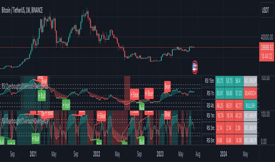
RSI Overbought/Oversold + Divergence IndicatorDESCRIPTION:
This script combines the Relative Strength Index ( RSI ), Moving Average and Divergence indicator to make a better decision when to enter or exit a trade.
- The Moving Average line (MA) has been made hidden by default but enhanced with an RSIMA cloud.
- When the RSI is above the selected MA it turns into green and when the RSI is below the select MA it turns into red.
- When the RSI is moving into the Overbought or Oversold area, some highlighted areas will appear.
- When some divergences or hidden divergences are detected an extra indication will be highlighted.
- When the divergence appear in the Overbought or Oversold area the more weight it give to make a decision.
- The same color pallet has been used as the default candlestick colors so it looks familiar.
HOW TO USE:
The prerequisite is that we have some knowledge about the Elliot Wave Theory, the Fibonacci Retracement and the Fibonacci Extension tools.
Wave 1
(1) When we receive some buy signals we wait until we receive some extra indications.
(2) On the RSI Overbought/Oversold + Divergence Indicator we can see a Bullish Divergence and our RSI is changing from red to green ( RSI is higher then the MA).
(3) If we are getting here into the trade then we need to use a stop loss. We put our stop loss 1 a 2 pips just below the lowest wick. We also invest maximum 50% of the total amount we want to invest.
Wave 2
(4) Now we wait until we see a clear reversal and here we starting to use the Fibonacci Retracement tool. We draw a line from the lowest point of wave(1) till the highest point of wave (1). When we are retraced till the 0.618 fib also called the golden ratio we check again the RSI Overbought/Oversold + Divergence Indicator. When we see a reversal we do our second buy. We set again a stop loss just below the lowest wick (this is the yellow line on the chart). We also move the stop loss we have set in step (3) to this level.
Wave 3
(5) To identify how far the uptrend can go we need to use the Fibonacci Extension tool. We draw a line from the lowest point of wave(1) till the highest point of wave (1) and draw it back to the lowest point of wave (2). Wave (3) is most of the time the longest wave and can go till it has reached the 1.618 or 2.618 fib. On the 1.618 we can take some profit. If we don't want to sell we move our stop loss to the 1 fib line (yellow line on the chart).
(6) We wait until we see a clear reversal on the Overbought/Oversold + Divergence Indicator and sell 33% to 50% of our investment.
Wave 4
(7) Now we wait again until we see a clear reversal and here we starting to use the Fibonacci Retracement tool. We draw a line from the lowest point of wave(2) till the highest point of wave (3). When we are retraced till the 0.618 fib also called the golden ratio we check again the RSI Overbought/Oversold + Divergence Indicator. When we see a reversal we buy again. We set again a stop loss just below the lowest wick (this is the yellow line on the chart).
(8) If we bought at the first reversal ours stop los was triggered (9) and we got out of the trade.
(9) If we did not bought at step (7) because our candle did not hit the 0.618 fib or we got stopped out of the trade we buy again at the reversal.
Wave 5
(10) To identify how far the uptrend can go we need to use the Fibonacci Extension tool. We draw a line from the lowest point of wave(2) till the highest point of wave (3) and draw it back to the lowest point of wave (4). Most of the time wave 5 goes up till it has reached the 1 fib. And that is the point where we got out of the trade with all of our investment. In this trade we got out of the trade a bit earlier. We received the sell signals and got a reversal on the Overbought/Oversold + Divergence Indicator.
We are hoping you learned something so you can make better decisions when to get into or out of a trade.
If you have any question just drop it into the comments below.
FEATURES:
• You can show/hide the RSI .
• You can show/hide the MA.
• You can show/hide the lRSIMA cloud.
• You can show/hide the Stoch RSI cloud.
• You can show/hide and adjust the Overbought and Oversold zones.
• You can show/hide and adjust the Overbought Extended and Oversold Extended zones.
• You can show/hide the Overbought and Oversold highlighted zones.
• Etc...
HOW TO GET ACCESS TO THE SCRIPT:
• Favorite the script and add it to your chart.
REMARKS:
• This advice is NOT financial advice.
• We do not provide personal investment advice and we are not a qualified licensed investment advisor.
• All information found here, including any ideas, opinions, views, predictions, forecasts, commentaries, suggestions, or stock picks, expressed or implied herein, are for informational, entertainment or educational purposes only and should not be construed as personal investment advice.
• We will not and cannot be held liable for any actions you take as a result of anything you read here.
• We only provide this information to help you make a better decision.
• While the information provided is believed to be accurate, it may include errors or inaccuracies.
Good Luck and have fun,
The CryptoSignalScanner Team
Trend Movement S1-TMIdea:
This script combines: Moving Average (MA), Directional Movement (DMI), MACD
When condition of long or short position from all mentioned indicator are met script opens position. Once trend changes, it closes the position.
Then add some filter conditions to avoid noise.
Concept:
(Note that we take the close to get the closing price)
-Using only cross up down with MA will give a reversal point, but the downside is that it can be noisy.
-MACD will show the current trend detected by cross point.
-Then the +DI , -DI , ADX values are taken into account to confirm the price direction and movement strength.
-This strategy solves this problem by combining 2 more moving averages called 2 trend lines 1 long and 1 short. When the short line crosses up, it will show that the price trend is increasing (at this time the background between these 2 lines will be green) and vice versa (red). To determine if the current trend is bullish or bearish . This will avoid buying when price tend to go down.
-However, there will be many points where some more complex logic is needed. It will add conditions and calculate the probabilities before triggering the signals (You can see them through the item symbols B1, B2, ... ).
How it works:
1. The thin line is stand for short term moving average, and the thick line is stand for long term moving average.
If thin lines cross the thick lines, their color and background will turn green, the price is tend to go up (Uptrend).
If thin lines cross down thick lines, their color and background will turn red, the price is tend to go down (Downtrend).
2. Ability to check the checkbox in setting to show the Golden/De*ath cross.
The yellow symbol "+" is the Golden cross.
The black symbol "+" is the De*th cross.
3. Buy and Sell are show clearly on strategy as the buy and sell point. The default source from bar is CLOSE
4. Setting "Buy only" it using for spot market.
5. When "Not buy in down trend" is checked, it will not trigger buy when in down trend (thin lines cross down thick lines like description in 1.)
6. Setting High spread will call Close buy when it match the High spread bar with the High spread % value
7. It provides setting "Back test From date/To date" for backtest feature. You can set "BacktestFrom date" as the begin of test period. If check box "Using To Date" is check: "Backtest To Date" will be the end of test period.
Suitable time frames:
4h, 1D, 1W
* Please note that this logic does not attempt to predict future prices or 100% accurate signal; Strategy Tester are available to test the profitability of this strategy.
(INVITE ONLY indicator. Please direct message or visit website to try it out)
Hope you guys enjoy!
Examples:
BTCUSD 4H
TSLA 4H

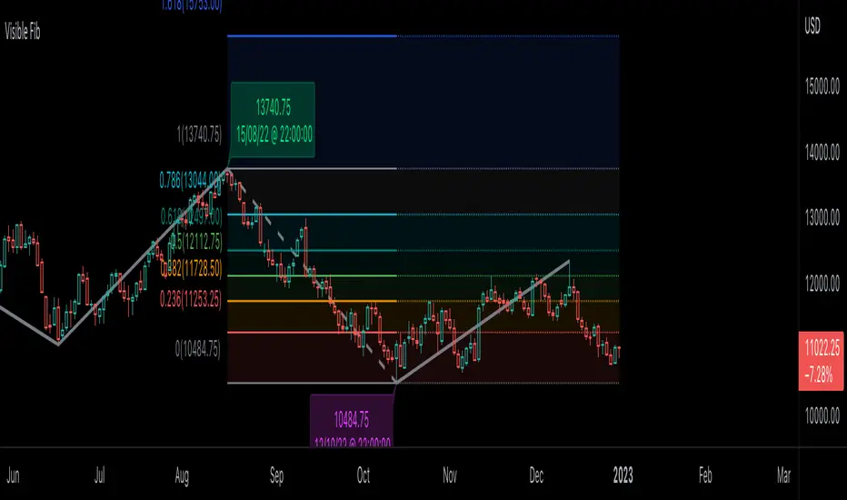
Visible Fibonacci█ OVERVIEW
This indicator displays Fibonacci retracement and extension levels on the price chart using data within the chart's visible range, providing traders with an automated alternative to our well-known drawing tool .
█ CONCEPTS
Fibonacci sequence and the Golden ratio
The Fibonacci sequence is a sequence of numbers where each term is the sum of the previous two terms. In his book Liber Abaci , Fibonacci used this sequence to estimate the growth of rabbit populations. Although most commonly associated with Fibonacci, this numeric sequence appeared in Indian mathematics as early as 200 BC. As this sequence approaches infinity, the ratio of the last element to the preceding approaches the Golden ratio (1.618033...), a well-known metallic ratio theoretically observed in many natural and synthetic systems. Many traders believe that the Fibonacci sequence and the Golden ratio carry significance in the financial markets.
Fibonacci retracements and extensions
Fibonacci retracements and extensions are extremely popular in technical analysis. They are created by connecting two extreme points, typically pivot points, by a trend line and multiplying the range between them by the ratios of steps in the Fibonacci sequence, or more precisely, powers of the Golden Ratio, to produce estimated levels of support and resistance. The ratios used for retracement multipliers are typically the Golden ratio raised to the power of 0, -0.5, -1, -2, and -3, or 1, 0.786, 0.618, 0.382, and 0.236, respectively. It is also common to see traders use a retracement ratio of 0.5. The ratios used for extension multipliers are typically the Golden ratio raised to the power of 0.5, 1, 2, and 3, or 1.272, 1.618, 2.618, and 4.236, respectively. Traders often combine these retracement and extension ratios with others they deem significant for a more personalized output.
Zig Zag
Zig Zag is a popular indicator that filters out minor price fluctuations to denoise data and emphasize trends. Traders commonly use Zig Zag for trend confirmation, identifying potential support and resistance, and pattern detection. It is formed by identifying significant local high and low points in alternating order and connecting them with straight lines, omitting all other data points from their output. There are several ways to calculate the Zig Zag's data points and the conditions by which its direction changes. This script uses the highest and lowest values over a specified length to estimate the locations of pivots. The Zig Zag reverses its direction when a new high or low emerges in the opposite direction. Additionally, enabling the "Detect additional pivots" option in the script settings will locate extra pivots when the number of bars in which no new pivot occurs exceeds the Zig Zag length.
Visible Fibonacci
This script uses the chart's visible bars to calculate and display an automated Fibonacci retracement tool with extreme points based on either of two calculation methods:
• Visible Chart Range: This method uses the highest and lowest points from the visible chart range for Fibonacci level calculation.
• Visible Zig Zag: This method uses historical pivots from a Zig Zag indicator for level calculation. The "nth Last Pivot" input in the script settings controls how many pivots back from the last visible one will be used to calculate the Fibonacci levels.
As traders pan and zoom on their charts, the script dynamically recalculates its values explicitly using the bars within the visible range.
Note that levels drawn outside the range between the high and low points may affect the scale of the chart. To prevent this, select the "Scale price chart only" option in the chart settings.
█ FOR Pine Script™ CODERS
• This script utilizes functions from the VisibleChart library by our resident PineCoders . The library exploits the chart.left_visible_bar_time and chart.right_visible_bar_time variables, which return the opening time of the leftmost and rightmost bars on the chart. They are only two of many new built-ins in the `chart.*` namespace. See this blog post for more information, or look them up by typing "chart." in the Pine Script™ Reference Manual .
• This script's architecture utilizes user-defined types (UDTs) to create custom objects which are the equivalent of variables containing multiple parts, each able to hold independent values of different types . The recently added feature was announced in this blog post.
Look first. Then leap.
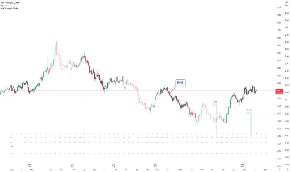
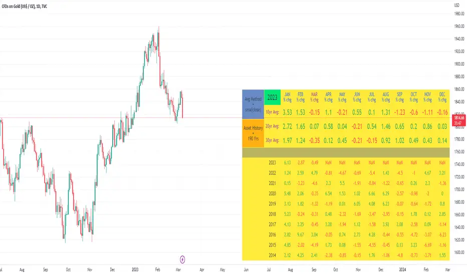
Seasonal tendency: week-on-week % change and 10yr Averages-shows week-on-week % change, and 10yr averages of these % changes
-scan across the 10yr averages to get a good idea of the seasonality of an asset
-best used on commodities with strong seasonal tendencies (Gold, Wheat, Coffee, Lean hogs etc)
-works only on daily timeframe
-by default it will compare SMA(length) in the following way, BTC: Sunday cf previous Sunday | ES/Gold: Monday cf previous Monday
-for most assets, 5 daily bars in a week (SMA(5)) => that's the default. For BTC can change this to 7.
~~inputs:
-change input year to show any previous decade of asset's history; the table will display over that year on the chart
-choose expression for Average of % change week on week: SMA, ohlc4, vwma, vwap (default SMA)
-choose number of daily bars in a week (i.e. SMA length)
-change label sizes/colors
~~notes:
-When applied to current year: will print the 10yr average for previous weeks in the year; 9yr average for future weeks in the year
-drawings and SMA plot on the above chart are just to show visually how the week's average is calculated, and how this lines up with the label
-current week of year will highlight in large font orange by default
-the first 2 weeks of the year are omitted because of a bug i can't figure out, which throws out bad numbers.
-cannot print all the values for each of previous 10yrs; 'code too long' error. Could likely do this via using matrices but would require a rewrite
17th Dec 2022
@twingall
I_MACD#I_MACD #Version_1_0_3
Hello Traders from all over the world! Today I would like to share a cool customizing tool our team recently has made. If you have ever used MACD or any other seemingly indicators that visualize the degree of converging/diverging of any two values, you are very lucky today. This one should be one of the most optimal tools for you guys that enables you to customize your own CD indicator perfectly fitted for your trading styles. Moreover, you can even set up optimized parameters for each different trading commodities or products.
There is no doubt that MACD (Moving Average Convergence Divergence) is one of the most popular indicators currently in trading world along with RSI and Stochastic. Google and old textbooks say that MACD is a technical indicator that helps you identify market trends and potential trend reversal point. Well, which existing indicators doesn’t? The problem is, how well the indicator reflects the market trends with least amount of lagging. We want to use an indicator that can provide best-fitted trend data as early as possible.
Anyway, this indicator is made of 3 different components: MACD line, a signal line, and an oscillator, which is usually plotted with histogram. MACD line is basically the level of difference between two EMAs, 12 and 26 (default settings). In other words, MACD Line visualizes the amount of gap between 12 and 26 EMA.
- When bullish, 12 EMA would be above 26 EMA and as the trend becomes more bullish, they will diverge more and MACD line would be positive (above the base line).
- When bearish, 12 EMA would be below 26 EMA and as the trend becomes more bearish, they will diverge more and MACD line would be negative (below the base line).
MACD Line = (Faster, sensitive) EMA – (Slower, dull) EMA = 12 EMA – 26 EMA
Then you add another EMA on the MACD line itself which then becomes a signal line. The default length of the signal line is 9. In other words, Signal line is a 9 EMA of the difference level between 26 and 12 EMA. Now the difference between Signal line and MACD line are called oscillator usually plotted with histograms.
- When MACD line is above the Signal Line, histogram would face upward (Positive Side)
- When MACD line is below the Signal Line, histogram would face downward (Negative Side)
Signal Line = 9 EMA of MACD Line
Two meaningful signals should be monitored to effectively spot the trend reversal point.
1. Pay attention to the crossover made by the two lines. Higher the golden-cross and the lower the death-cross is located, more weights added on the possibility of trend reverse. I personally ignore most of the crossovers signaled near the base line.
2. Search for the histogram peak outs. When two lines start to converge (heading towards each other), histogram will leave a significant peak and approach towards baseline meaning that the oscillator started to lose its strength.
Remember, both the signals (lines’ crossovers and histogram peak outs) are more reliable and meaningful as they are located farther away from the baseline.
As mentioned, the default parameters for MACD are 12, 26, and 9. The first two numbers are the lengths of prices’ moving averages that are used to compute MACD line. 9 is length of signal line. Furthermore, the types of moving averages and signal line used in this setting provided by Tradingview are EMAs (Exponential moving averages). Therefore, the proper way to express the default setting of MACD would be 12, 26, 9, EMA, EMA.
I have a question for you MACD users. How is MACD doing lately? Are you fully satisfied with the performance? Some might say yes, but most wouldn’t. Well, I personally believe that the default parameters are bit outdated. It surely was a powerful weapon 50 years ago when MACD was just created by Gerald Appel and only few knew how to use it. Things are different now. We have witnessed so many cases where everyone starts to all use the same types and parameters of indicators, techniques, and theories which eventually drops accuracy and preciseness. Come on, we are not living in fairy tales, instead in an extremely competitive world called capitalism where only a few survives.
As we are already aware, this market keeps changing over time. Encountering various patterns, price actions, wave structures, and trend flows that are unfamiliar and untraditional, traders easily get frustrated. Market is not like it used to be in the old days where trading was much easier. What worked yesterday doesn’t anymore work today and not even tomorrow. Such evidences we see every day are broadening channel, stoploss hunting, Bart Simpson, whipsaw, and bull/bear trap were once considered as rare phenomenon.
I_MACD might be useful tool for you to back/forward test to find the optimized types and parameters of the CD indicator just fitted for your unique trading styles and preferences. There are infinite number of combinations of types and parameters within this indicator you can try. For example, not only the lengths of the moving averages, but different types of technical indicators to compute the CD lines can also be tested. Try all the possible combinations of parameters and if you find a good one, please share it with us on the comment section below! I will also let you guys know if I do. In fact, the default settings, ohlc4, 60, 140, 30 EMA, EMA, are one of many that I have found useful.
Furthermore, for your convenience when testing, we added a few side features as listed below. You can turn these on and off according to your preferences and circumstances.
1. Crossovers of MACD and Signal line: Death-crosses above the baseline and golden-crosses below the baseline will be spotted with a vertical line.
2. Divergence Sensitivity: This feature finds out both the regular and hidden divergences of MACD line. Higher sensitivity searches for the divergences within the waves of the larger degree and vice versa for the lower sensitivity.
3. Histogram Peak out: Triangle signals will appear when oscillator peak outs are possibility assumed in advance. Similarly, as the first feature positive peak outs are searched only when MACD line is positive and vice versa for the negative peak outs.
We all know there is no ‘Perfect’ method in this industry other than becoming Elon Musk, but there surely are ‘Better’ methods. Contemporary traders should track and reflect trends of the latest market on developing their methods. In order to process that task, testing and experimenting new and different techniques through insightful ways is required. I_MACD might be the ‘Perfect’ tool for you to be a ‘Better’ trader. Thanks for reading.
#아이맥디 #I_MACD #Version_1_0_3
안녕하세요. 트레이더 여러분. 토미입니다.
오늘은 MACD와 같은 CD(Convergence Divergence)류의 보조지표를 써 보신 분들이 정말 좋아하실 만한 지표 툴 하나를 소개 드리겠습니다. 이름하여 I_MACD! 아무나 자유롭게 사용하실 수 있습니다. 여러분의 트레이딩 성향, 종목 특성, 타임 프레임, 현대 시장 상황, 그리고 요즘 여러분이 생각하는 차트 흐름에 딱 맞는 지표를 만들고 사용해보세요.
MACD는 딱 두가지 신호만 주목하시면 됩니다. 첫번째 신호는 MACD선과 Signal선, 이 두 곡선이 서로 크로스 할 때, 즉 오실레이터가 양에서 음으로 혹은 음에서 양으로 변환되는 시점입니다. 두번째 신호는 오실레이터가 고/저점(Peak out)을 찍고 변곡이 시작되는 시점입니다. 이 외에 제가 전 다이버전스 강의에서 언급 드렸듯 두 곡선과 히스토그램의 다이버전스 역시 참고해볼 수 있습니다.
흔히 쓰이는 MACD의 기본(디폴트) 설정 값은 12, 26, 9이며 현재 트레이딩뷰에서 제공하는 MACD의 두 이평선, 즉 MACD선을 도출할 때 사용되는 주가의 12와 26 이평선의 종류는 EMA(Exponential Moving Average)입니다. 또한 저 설정 값에서 9는 Signal선의 길이를 의미하며 본 이평선 종류 역시 EMA입니다.
MACD는 제럴드 아펠이라는 아저씨가 1970년대에 개발한 지표입니다. 하지만 여러분들도 알다시피 현대 금융 시장은 50년 전과 많이 다릅니다. 세상은 점점 더 빠르고 예측불가하게 변하고 있으며 금융 시장도 예외는 아닙니다. 기술적분석 관점으로도 이전에는 흔히 나오지 않았던 패턴, 경향성, 규칙, 그리고 흐름들이 지금은 비일비재하게 나오고 있습니다. 이쪽 시장은 정해진 답안지가 없으며 시시각각 변하는 시장에 맞게 우리가 참고하는 기법과 전략들을 항상 업데이트해줄 필요가 있습니다.
MACD 역시 모든 사람들이 사용하는 12, 26, 9, EMA, EMA 보다 더 나은 설정 값이 분명 존재할 겁니다. 그래서 저희 팀은 여러분들이 CD지표의 파라미터 값과 곡선 산출법을 변경하여 더 요즘 시장에 그리고 여러분 트레이딩 성향에 최적화된 지표로 만들어 사용할 수 있는 툴을 만들어봤습니다. 두 곡선과 Signal 선의 길이는 물론이고 타 이평선들을 포함 RSI, OBV, CCI, MFI 등과 같은 다른 종류의 지표로도 CD선을 구할 수 있게끔 해 놨습니다.
예를 들어 조금 더 장기적인 추세를 반영하는 MACD를 만들고 싶다면 12, 26이 아니라 50, 100의 길이를 사용해볼 수도 있고 이평선의 민감도를 조절하고 싶다면 EMA가 아닌 HMA나 RMA 같은 종류로 설정해볼 수도 있습니다. 또한 이평선이 아니라 아예 다른 지표들을 가지고 MACD화(정확히 말하면 CD화죠) 시켜볼 수도 있습니다. 저도 이것저것 시도 중인데 꽤 흥미로운 셋팅 값들이 보이네요. 참고로 디폴트로 설정해 놓은 시고저종/4, 60, 140, 30, EMA, EMA 조합도 제가 현재 테스트하고 있는 나쁘지 않은 값입니다. 여러분들도 괜찮은 설정 값들을 찾으면 혼자만 쓰지 마시고 댓글에 공유 좀 부탁드립니다~
또한 주요 시그널들을 쉽게 잡아낼 수 있게 아래와 같이 몇 가지 자동 기능들을 추가했습니다. 여러분들의 편의와 상황에 따라 사용하셔도 되고 거슬리면 끄셔도 됩니다.
1. MACD선과 Signal선의 크로스: 기준선 위에선 데드크로스, 아래에선 골든크로스를 표시해줍니다.
2. 다이버전스 민감도: MACD선의 다이버전스 출현 여부를 알려줍니다. 다이버전스 민감도를 내릴수록 더 작은 (단기) 단위 파동들의, 올릴수록 더 큰 (장기) 단위의 파동들의 다이버전스를 잡습니다.
3. 히스토그램 피크 아웃: MACD선이 기준선 위에 있을 때는 양, 아래에 있을 때는 음 히스토그램의 변곡점으로 의심되는 곳을 표기해줍니다.
제가 매번 강조 드리지만 지표는 보조로만 참고하는 도구이며 절대적으로 다 맞는 지표, 이론, 그리고 방법론은 세상에 존재하지 않습니다. 시장 상황에 따라 적절히 활용하고 본인이 사용하는 기술적분석 기법들 조합의 일부로 참고만 하시는 게 좋습니다.

[blackcat] L3 YACD38Level 3
Background
"3/8 moving average" golden cross enters, and dead cross exits.
Function
This set of methods is an improved moving average usage - "38 moving average usage", we need to use three moving averages:
3-day, 8-day and 21-day moving averages.
Why is it the 3-day, 8-day, and 21-day moving averages? Most of my friends may not be clear. 3, 8, and 21 are all Fibonacci numbers, also known as the golden section numbers. The Fibonacci number is a basic pattern of nature, which exists in all things. If you don’t understand it, you can go to a certain degree to understand it. In short, it is a very magical existence.
Keep in mind the principle of only doing uptrends and not downtrends. Then we have to use our 21-day moving average skillfully. The 21-day moving average happens to be the average price line for one month. We take it as the decision-making line. When the decision-making line goes down or goes flat, we mainly wait and see; , the operation success rate is higher!
Let's directly share the technical points of "38 moving average usage":
1. Entry point: the 3-day line crosses the 8-day line to form a golden cross, or both the 3-day and 8-day line cross the 21-day moving average; the position of the golden cross must be above the 21-day moving average, and it is invalid if it is below;
2. Basis for holding shares: After entering the market, the moving averages are arranged in a long position, and the K-line rises along the 3-day and 8-day moving averages, hold it patiently, and sell for whatever reason you buy!
3. Exit point: When the 3-day moving average crosses the 8-day moving average to form a dead cross, or the 3-day and 8-day moving averages break below the 21-day moving average, then decisively leave the market;
Note: "38 moving average usage" only needs to refer to the moving average, and the other most reference quantities can be changed. As long as the above conditions are met, you can boldly intervene, and after the intervention, you will rise to the top! Don't underestimate the usage of this set of moving averages, carefully comprehend and memorize them by heart, and be able to achieve the unity of knowledge and action, and you will be able to stand up and be the master from now on!
Remarks
Feedbacks are appreciated.

Ghost Ninja Moving Average by HassonyaThe Ghost Ninja Moving Average indicator contains three ema averages. These are ema 21, ema 55 and ema 233.
The values of the averages appearing on the screen are adjusted according to their own lengths. If you want, you can change the settings from the "Numbers of bars back" setting.
The 1st moving average (EMA-21) will follow the price and will disappear if the price is above it. It will only appear where needed.
The 2nd moving average (EMA-55) will be red if not orange when EMA-21 is greater than EMA-55.
The 3rd moving average (EMA-233) will appear if EMA-55 is greater than it, otherwise it will not.
The system will also display Golden and Death crosses.
I hope you will be satisfied using it. Yours sincerely. Happy Trading
TÜRKÇE AÇIKLAMA
Ghost Ninja Hareketli Ortalama indikatörü, üç adet ema ortalaması barındırıyor. Bunlar ema 21, ema 55 ve ema 233 tür.
Ortalamaların ekranda gözükme değerleri, kendi uzunluklarına göre ayarlanmıştır. İsterseniz ayarları "Numbers of bars back" ayarından değiştirebilirsiniz.
1nci hareketli ortalama olan (EMA-21), fiyatı izleyerek eğer fiyat onun üzerindeyse gözükecek değilse yok olacak. Sadece gerektiği yerlerde gözükecek.
2nci hareketli ortalama(EMA-55), EMA-21 EMA-55'ten büyük olduğunda turuncu değilse kırmızı olacak.
3ncü hareketli ortalama(EMA-233), Eğer EMA-55 ondan büyükse gözükecek yoksa gözükmeyecek.
Sistem aynı zamanda Golden ve Death crossları da gösterecek.
Güle güle kullanın. Bereket bulun. Sevgiler

MPI(only signal)I have removed the MACD and Parabolic SAR displays used in the calculations from my work, MPI, and changed them to show only buy/sell signals.
There is no difference from the previously posted MPI other than the appearance, including the alerts.
Please use whichever looks better.
In case you are interested, I will post the same description again as the MPI I posted last time.
- - - - - - - - -
This indicator is used to make trading decisions for ETFs and mutual funds ( TQQQ , QLD , SPXL , etc.) that are leveraged to stock indices.
It displays buy and sell signals and sends notifications when both MACD and Parabolic SAR give trend reversal signals.
Specifically, the following cases are considered as buy/sell signals.
Buy signal
-When Parabolic SAR shows a buy signal after MACD has made a golden cross
-When MACD shows a golden cross after Parabolic SAR shows a buy signal
Sell signal
-When Parabolic SAR shows a sell signal after MACD has made a dead cross
-When MACD shows a dead cross after Parabolic SAR shows a sell signal
Apply this indicator to the underlying index of the leveraged ETF ( NDX for TQQQ and QLD ) and trade the leveraged ETF using the buy or sell signal on the underlying index.
Note that the stocks to which you apply this indicator and make trading decisions are different from the stocks that you actually trade.
- - - - - - - - -
私の作品であるMPIから計算に使用しているMACDとパラボリックSARの表示を取り除き、売買シグナルのみ表示するように変更しました。
アラートを含め、見た目以外に前回投稿したMPIとの違いはありません。
どちらか見た目が好きな方を使ってください。
興味のある方向けに、前回投稿したMPIと同じ説明文を再度掲載します。
- - - - - - - - -
株価指数にレバレッジをかけたETFや投資信託( TQQQ , QLD , SPXL など)の売買判断をするためのインジケーターです。
MACDとパラボリックSARの両方でトレンド転換シグナルが出たところで売買シグナルを表示し、通知を送ります。
具体的には以下のような場合を売買シグナルとします。
買いシグナル
・MACDがゴールデンクロスした後、パラボリックSARが買いシグナルを示したとき
・パラボリックSARが買いシグナルを示した後、MACDがゴールデンクロスしたとき
売りシグナル
・MACDがデッドクロスした後、パラボリックSARが売りシグナルを示したとき
・パラボリックSARが売りシグナルを示した後、MACDがデッドクロスしたとき
このインジケーターをレバレッジETFの元指数( TQQQ , QLD ならば NDX )に適用し、元指数での売買シグナルでレバレッジETFを売買してください。
このインジケーターを適用し売買判断を行う銘柄と実際に売買する銘柄が違うことに注意してください。
- - - - - - - - -
MPI(Monthly MACD & Parabolic Investment Indicator)This indicator is used to make trading decisions for ETFs and mutual funds (TQQQ, QLD, SPXL, etc.) that are leveraged to stock indices.
It displays buy and sell signals and sends notifications when both MACD and Parabolic SAR give trend reversal signals.
Specifically, the following cases are considered as buy/sell signals.
Buy signal
-When Parabolic SAR shows a buy signal after MACD has made a golden cross
-When MACD shows a golden cross after Parabolic SAR shows a buy signal
Sell signal
-When Parabolic SAR shows a sell signal after MACD has made a dead cross
-When MACD shows a dead cross after Parabolic SAR shows a sell signal
Apply this indicator to the underlying index of the leveraged ETF ( NDX for TQQQ and QLD ) and trade the leveraged ETF using the buy or sell signal on the underlying index.
Note that the stocks to which you apply this indicator and make trading decisions are different from the stocks that you actually trade.
株価指数にレバレッジをかけたETFや投資信託( TQQQ , QLD , SPXL など)の売買判断をするためのインジケーターです。
MACDとパラボリックSARの両方でトレンド転換シグナルが出たところで売買シグナルを表示し、通知を送ります。
具体的には以下のような場合を売買シグナルとします。
買いシグナル
・MACDがゴールデンクロスした後、パラボリックSARが買いシグナルを示したとき
・パラボリックSARが買いシグナルを示した後、MACDがゴールデンクロスしたとき
売りシグナル
・MACDがデッドクロスした後、パラボリックSARが売りシグナルを示したとき
・パラボリックSARが売りシグナルを示した後、MACDがデッドクロスしたとき
このインジケーターをレバレッジETFの元指数( TQQQ , QLD ならば NDX )に適用し、元指数での売買シグナルでレバレッジETFを売買してください。
このインジケーターを適用し売買判断を行う銘柄と実際に売買する銘柄が違うことに注意してください。
[blackcat] L1 Slope OscillatorLevel 1
Background
This technical indicator can judge the upside potential of individual stocks based on the slope
Function
This technical indicator determines whether the trend continues or reverses by defining a fast slope and a slow slope. If it shows a golden cross to buy at a low level, a dead cross to sell. It can be combined with other types of fast technical indicators to determine the resonance of buying and selling points. The premise of buying stocks is that this indicator has a golden cross and the individual stocks are trending upwards.
Remarks
Feedbacks are appreciated.

Quantitative Kernel DelimiterQuantitative Kernel Delimiter QKD - aka "Fire and ICE" - is a six-level multiple Kernel regression estimator with cross-timeframe semi-coordinated delimiters (bands) enabled by mathematical validation to our own Kernel regression code with historical Kernel formulas having custom variable bandwidths , mults , and window width – all achieving an advanced alerting system and directional price-action pointers for Novice, Intermediate and Advanced Traders within the TradingView Graphical User Interface.
In the course of our work, we have found that such six delimiters are ideal for generating signals of varying strengths.
99.9% of observations should be in our delimiters' range:
Kernel regression is a nonparametric smoothing method for data modeling.
Kernel regression of statistics was derived independently by Nadaraya and Watson in 1964 with a mathematical foundation given by Parzen’s earlier work on kernel density estimation.
If you are interested in reading more about the mathematical basis of this method from which our code is derived, you can follow these scholarly links:
Expert Trading Systems: Modeling Financial Markets with Kernel Regression
Estimation of the bandwidth parameter in Nadaraya-Watson
Adaptive optimal kernel density estimation for directional data
How kernel regression differs from the other Moving Averages?
In most MA's data points in the specified lookback window are weighted equally. In contrast, the Gaussian Kernel function used in this indicator assigns a higher weight to data points that are closer to the current point. This means that the indicator will react more quickly to changes in the market.
Regression method from which our code is derived is a widely known formula that is laid out in many sources, we used this source:
Kernel regression estimation
Kernel
During the regression counting process, a `kernel function` is used, which is traditionally chosen from a wide variety of symmetric functions.
In this indicator, we use the Gaussian density of statistics as the kernel function.
The Gaussian Kernel is one of the most commonly used Kernel functions and is used extensively in many Machine Learning algorithms due to its general applicability across a wide variety of datasets.
The kernel regression averages all the data contained within the range of the kernel function.
The effective range of the kernel function is defined by its window width .
Kernel Delimiters (Bands / Levels)
This indicator has 6 tailored price range* delimiters:
Cold / Fire - the furthest delimiters. In a range market when the price enters the cold/fire zones it is assumed that it has deviated strongly from the average and there is a high probability that it will immediately return to the average, or at least into the underlying zone, also in a trending market it signals a change in trend.
ALERT: the indicator performs best during relatively sideways price action within an established range. The trader must check higher timeframes during hits on the extreme Cold or Fire delimiter bands as a break in the lower, or even higher timeframe price range may result in a need to reset the regression calculation once price velocity calms down after a major move allowing the indicator to best function again. The reset will be done automatically by the indicator’s code. The indicator is not intended for use with unusually aggressive pricing behavior. Always beware of extreme market conditions. The indicator is intended as an ordinary range trading tool.
Gold / Green - we call it the middle ground / golden mean / happy medium zone. When the price comes out here but the momentum is not enough to get to the higher zone we consider it a good signal.
Pro - most often we receive signals in this area. We call it the professional zone because it is literally the zone for professional traders who know what they are dealing with.
*NOTE: the indicator is intended to be used as a range trading tool, and does not protect against total BREAKS from one Range to a new Range, wherein the bands reset for the trader.
Alerts / Labels
We have spent a lot of time implementing and testing signal labels* and alerts**.
Now you have access to an advanced alert system.
*NOTE: DUE TO the ongoing regression calculations performed by our code, the trader will note that a label may change color at a later point in time, or even soon after the hit on the quantitative delimiter band in question. This is a process that was reviewed and is favored to achieve visual clarity over historical accuracy for the trader. Real-time trading hits of price line to band, along with alerts generated, remain accurate. We look forward to receiving feedback on this issue from the end users. Additional revisions by our team on this matter are anticipated if a harmony between visual clarity and historical accuracy is not satisfied.
**NOTE: Smaller and especially micro timeframes will result in more repeated alerts given the tight proximity with price vis-à-vis the quantitative delimiter. Larger timeframes tend to eliminate any issue with repeated alerts aside from obvious re-contacting of the quantitative delimiter by the active price line.
You can turn off alerts you don't need in the indicator settings.
All alerts are set with one click.
Themes
Different people like different things, which is why we decided to make several visual design themes so you can choose what suits you.
Themes will continue to evolve over time.
Pro Theme:
Modern Theme:
How to remove colored text labels next to price scale to maximize screen space on mobile:
Go to General Chart Settings :
Click on “SCALES”
Un select “Indicators and financial name.”
Dynamic Mode
Projection of Indicator bands on history is subject to repainting due to its regressive calculation nature. Be cautious: old signals are drawn once at the first loading of the chart and by default (to speed up the start-up time of the indicator) correspond to the current regression levels. All labels remain in their places as the chart progresses. Also new, real-time labels appear on the chart, and do not disappear. In order to display the old signals on the chart as they were at the time of their appearance, uncheck the "History labels transition" in the indicator settings (it may increase the initial loading time of the chart but will give you an opportunity to check the alerts you received before and may also be useful for visual backtesting).
Because of the very nature of modeling financial markets (i.e., thousands of data records and perhaps hundreds of candidate predictors), the need for computational speed is paramount.
The use of kernel regression in data modeling for the types of problems associated with financial markets requires careful consideration of computational time.
Once we acknowledge that the order of the data is important, then the choice of the learning-data-set becomes crucial. The time dimension introduces another level of complexity to the analysis: how much importance do we attach to recent data records as opposed to earlier records? Is there a simple way to take this effect into consideration? Common sense leads us to the basic conclusion that if we are to predict a value of Y at a given time, we should only use learning data from an earlier time. But this procedure tends to be overly restrictive. This problem has a simple solution: All that one must do is to make the learning data set dynamic . In other words, once a record has been tested, it is then available for updating the learning data set prior to testing the next record. The analyst can allow the learning data set to grow, or, alternatively, for each record added, the earliest remaining record in the learning set can be discarded. These two alternatives have led us to the necessity of using moving window option and adding a disclaimer that dynamic mode is enabled.
This indicator will be updated frequently based on community feedback see the Author’s instructions below to get instant access
―――――――――――――――――――――
Liability Disclaimer
Never fully rely on one indicator as you trade. Successful trading may require an orchestral mindset and harmonіc blend of trading tools, know-how, and devices. VIP Trader . com is not responsible for any damages or losses incurred by use or misused of this indicator. Neither this description above, nor the indicator, is intended to be used as financial advisory tool, nor to be used without proper education or training in the field of trading.
Supertrend GoldSignalThis indicator is a combination of two atr with numbers 1.6 and 0.8
The signals that are displayed on the chart are the points where both atr signaled at the same time (if distance = 0).
-The atr1 check box is only for displaying atr signals with the number 1.6. You can choose the atr1 number in the slow multiplier section.
-The atr2 check box is only for displaying atr signals with a number of 0.8. You can select the number of atr2 in the fast multiplier section.
-Note: If the atr1 and atr2 checkboxes are off, only simultaneous signals will be displayed on the chart (that is, points where atr1 and atr2 signaled at the same time).
-In the distance section, you can specify the distance between the atr1 and atr2 signals, if it is zero, it means that the atr1 and atr2 signals must be given on the same candle.
For example, if the value of distance is 5, it means that atr1 and atr2 signals can have a distance of 5 candles.
-The filter check box is for filtering signals using boxes 9, 26 and 52 in Ichimoku.
At the points where we have signals, boxes of 9 candles, 26 candles and 52 candles are drawn, and for long signals, the bottom of the boxes must be equal, and for short signals, the top of the boxes must be equal,Signals that do not meet this condition are removed.

[blackcat] L3 RMI Trading StrategyLevel 3
Background
My view of correct usage of RSI and the relationship between RMI and RSI. A proposed RMI indicator with features is introduced
Descriptions
The Relative Strength Index (RSI) is a technical indicator that many people use. Its focus indicates the strength or weakness of a stock. In the traditional usage of this point, when the RSI is above 50, it is strong, otherwise it is weak. Above 80 is overbought, below 20 is oversold. This is what the textbook says. However, if you follow the principles in this textbook and enter the actual trading, you would lose a lot and win a little! What is the reason for this? When the RSI is greater than 50, that is, a stock enters the strong zone. At this time, the emotions of market may just be brewing, and as a result, you run away and watch others win profit. On the contrary, when RSI<20, that is, a stock enters the weak zone, you buy it. At this time, the effect of losing money is spreading. You just took over the chips that were dumped by the whales. Later, you thought that you had bought at the bottom, but found that you were in half mountainside. According to this cycle, there is a high probability that a phenomenon will occur: if you sell, price will rise, and if you buy, price will fall, who have similar experiences should quickly recall whether their RSI is used in this way. Technical indicators are weapons. It can be either a tool of bull or a sharp blade of bear. Don't learn from dogma and give it away. Trading is a game of people. There is an old saying called “people’s hearts are unpredictable”. Do you really think that there is a tool that can detect the true intentions of people’s hearts 100% of the time?
For the above problems, I suggest that improvements can be made in two aspects (in other words, once the strategy is widely spread, it is only a matter of time before it fails. The market is an adaptive and complex system, as long as it can be fully utilized under the conditions that can be used, it is not easy to use. throw or evolve):
1. RSI usage is the opposite. When a stock has undergone a deep adjustment from a high level, and the RSI has fallen from a high of more than 80 to below 50, it has turned from strong to weak, and cannot be bought in the short term. But when the RSI first moved from a low to a high of 80, it just proved that the stock was in a strong zone. There are funds in the activity, put into the stock pool.
Just wait for RSI to intervene in time when it shrinks and pulls back (before it rises when the main force washes the market). It is emphasized here that the use of RSI should be combined with trading volume, rising volume, and falling volume are all healthy performances. A callback that does not break an important moving average is a confirmed buying point or a second step back on an important moving average is a more certain buying point.
2. The RSI is changed to a more stable and adjustable RMI (Relative Momentum Indicator), which is characterized by an additional momentum parameter, which can not only be very close to the RSI performance, but also adjust the momentum parameter m when the market environment changes to ensure more A good fit for a changing market.
The Relative Momentum Index (RMI) was developed by Roger Altman and described its principles in his article in the February 1993 issue of the journal Technical Analysis of Stocks and Commodities. He developed RMI based on the RSI principle. For example, RSI is calculated from the close to yesterday's close in a period of time compared to the ups and downs, while the RMI is compared from the close to the close of m days ago. Therefore, in principle, when m=1, RSI should be equal to RMI. But it is precisely because of the addition of this m parameter that the RMI result may be smoother than the RSI.
Not much more to say, the below picture: when m=1, RMI and RSI overlap, and the result is the same.
The Shanghai 50 Index is from TradingView (m=1)
The Shanghai 50 Index is from TradingView (m=3)
The Shanghai 50 Index is from TradingView (m=5)
For this indicator function, I also make a brief introduction:
1. 50 is the strength line (white), do not operate offline, pay attention online. 80 is the warning line (yellow), indicating that the stock has entered a strong area; 90 is the lightening line (orange), once it is greater than 90 and a sell K-line pattern appears, the position will be lightened; the 95 clearing line (red) means that selling is at a climax. This is seen from the daily and weekly cycles, and small cycles may not be suitable.
2. The purple band indicates that the momentum is sufficient to hold a position, and the green band indicates that the momentum is insufficient and the position is short.
3. Divide the RMI into 7, 14, and 21 cycles. When the golden fork appears in the two resonances, a golden fork will appear to prompt you to buy, and when the two periods of resonance have a dead fork, a purple fork will appear to prompt you to sell.
4. Add top-bottom divergence judgment algorithm. Top_Div red label indicates top divergence; Bot_Div green label indicates bottom divergence. These signals are only for auxiliary judgment and are not 100% accurate.
5. This indicator needs to be combined with VOL energy, K-line shape and moving average for comprehensive judgment. It is still in its infancy, and open source is published in the TradingView community. A more complete advanced version is also considered for subsequent release (because the K-line pattern recognition algorithm is still being perfected).
Remarks
Feedbacks are appreciated.

The Investment ClockThe Investment Clock was most likely introduced to the general public in a research paper distributed by Merrill Lynch. It’s a simple yet useful framework for understanding the various stages of the US economic cycle and which asset classes perform best in each stage.
The Investment Clock splits the business cycle into four phases, where each phase is comprised of the orientation of growth and inflation relative to their sustainable levels:
Reflation phase (6:01 to 8:59): Growth is sluggish and inflation is low. This phase occurs during the heart of a bear market. The economy is plagued by excess capacity and falling demand. This keeps commodity prices low and pulls down inflation. The yield curve steepens as the central bank lowers short-term rates in an attempt to stimulate growth and inflation. Bonds are the best asset class in this phase.
Recovery phase (9:01 to 11:59): The central bank’s easing takes effect and begins driving growth to above the trend rate. Though growth picks up, inflation remains low because there’s still excess capacity. Rising growth and low inflation are the Goldilocks phase of every cycle. Stocks are the best asset class in this phase.
Overheat phase(12:01 to 2:59): Productivity growth slows and the GDP gap closes causing the economy to bump up against supply constraints. This causes inflation to rise. Rising inflation spurs the central banks to hike rates. As a result, the yield curve begins flattening. With high growth and high inflation, stocks still perform but not as well as in recovery. Volatility returns as bond yields rise and stocks compete with higher yields for capital flows. In this phase, commodities are the best asset class.
Stagflation phase (3:01 to 5:59): GDP growth slows but inflation remains high (sidenote: most bear markets are preceded by a 100%+ increase in the price of oil which drives inflation up and causes central banks to tighten). Productivity dives and a wage-price spiral develops as companies raise prices to protect compressing margins. This goes on until there’s a steep rise in unemployment which breaks the cycle. Central banks keep rates high until they reign in inflation. This causes the yield curve to invert. During this phase, cash is the best asset.
Additional notes from Merrill Lynch:
Cyclicality: When growth is accelerating (12 o'clock), Stocks and Commodities do well. Cyclical sectors like Tech or Steel outperform. When growth is slowing (6 o'clock), Bonds, Cash, and defensives outperform.
Duration: When inflation is falling (9 o'clock), discount rates drop and financial assets do well. Investors pay up for long duration Growth stocks. When inflation is rising (3 o'clock), real assets like Commodities and Cash do best. Pricing power is plentiful and short-duration Value stocks outperform.
Interest Rate-Sensitives: Banks and Consumer Discretionary stocks are interest-rate sensitive “early cycle” performers, doing best in Reflation and Recovery when central banks are easing and growth is starting to recover.
Asset Plays: Some sectors are linked to the performance of an underlying asset. Insurance stocks and Investment Banks are often bond or equity price sensitive, doing well in the Reflation or Recovery phases. Mining stocks are metal price-sensitive, doing well during an Overheat.
About the indicator:
This indicator suggests iShares ETFs for sector rotation analysis. There are likely other ETFs to consider which have lower fees and are outperforming their sector peers.
You may get errors if your chart is set to a different timeframe & ticker other than 1d for symbol/tickers GDPC1 or CPILFESL.
Investment Clock settings are based on a "sustainable level" of growth and inflation, which are each slightly subjective depending on the economist and probably have changed since the last time this indicator was updated. Hence, the sustainable levels are customizable in the settings. When I was formally educated I was trained to use average CPI of 3.1% for financial planning purposes, the default for the indicator is 2.5%, and the Medium article backtested and optimized a 2% sustainable inflation rate. Again, user-defined sustainable growth and rates are slightly subjective and will affect results.
I have not been trained or even had much experience with MetaTrader code, which is how this indicator was originally coded. See the original Medium article that inspired this indicator if you want to audit & compare code.
Hover over info panel for detailed information.
Features: Advanced info panel that performs Investment Clock analysis and offers additional hover info such as sector rotation suggestions. Customizable sustainable levels, growth input, and inflation input. Phase background coloring.
⚠ DISCLAIMER: Not financial advice. Not a trading system. DYOR. I am not affiliated with Medium, Macro Ops, iShares, or Merrill Lynch.
About the Author: I am a patent-holding inventor, a futures trader, a hobby PineScripter, and a former FINRA Registered Representative.
10yr, 20yr, 30yr Averages: Month/Month % Change; SeasonalityCalculates 10yr, 20yr and 30yr averages for month/month % change
~shows seasonal tendencies in assets (best in commodities). In above chart: August is a seasonally bullish month for Gold: All the averages agree. And January is the most seasonally bullish month.
~averages represent current month/previous month. i.e. Jan22 average % change represents whole of jan22 / whole of dec21
~designed for daily timeframe only: I found calling monthly data too buggy to work with, and I thought weekly basis may be less precise (though it would certainly reduce calculation time!)
~choose input year, and see the previous 10yrs of monthly % change readings, and previous 10yrs Average, 20yr Average, 30yr Average for the respective month. Labels table is always anchored to input year.
~user inputs: colors | label sizes | decimal places | source expression for averages | year | show/hide various sections
~multi-yr averges always print, i.e if only 10yrs history => 10yr Av = 20yr Av = 30yr Av. 'History Available' label helps here.
Based on my previously publised script: "Month/Month Percentage % Change, Historical; Seasonal Tendency"
Publishing this as seperate indicator because:
~significantly slower to load (around 13 seconds)
~non-premium users may not have the historical bars available to use 20yr or 30yr averages =>> prefer the lite/speedier version
~~tips~~
~after loading, touch the new right scale; then can drag the table as you like and seperate it from price chart
##Debugging/tweaking##
Comment-in the block at the end:
~test/verifify specific array elements elements.
~see the script calculation/load time
~~other ideas ~~
~could tweak the array.slice values in lines 313 - 355 to show the last 3 consecutive 10yr averages instead (i.e. change 0, 10 | 0,20 | 0, 30 to 0, 10 | 10, 20 | 20,30)
~add 40yr average by adding another block to each of the array functions, and tweaking the respective labels after line 313 (though this would likely add another 5 seconds to the load time)
~use alternative method for getting obtaining multi-year values from individual month elements. I used array.avg. You could try array.median, array.mode, array.variance, array.max, array.min (lines 313-355)
ViVen - EXP - Signals with AlertsHi Friends,
Here the trading made easy with Signals...
The main purpose of this indicator is to identify the Support and Resistance levels well in advance to make ourselves ready for the Entries with confidence..
With this indicator we will be able to identify the Market Structure and Trend to initiate our trades.
Multi Timeframe Concepts are considered in some cases to capture the Golden Zones.
Details of the Indicator:
Method of Trading – Intraday, Positional or Swing – Indices, Stocks and Commodity Markets
Golden Zones : When two or more indicator levels are confluences at one price point which will act as Strong Support and Resistance in the Market. That is called Golden Zone.
CPR & Pivot (Daily / Weekly / Monthly) – Based on the previous Timeframe values, it will automatically calculates the Support and Resistance values for the upcoming Sessions.
BUY / SELL Levels (W-Refers the Weekly levels) – Possible Reversal in the market we can expect at this price level. Depends on the Time frame (Daily/Weekly)
Bull BO / Bear BO (W-Refers the Weekly levels) – Possible Breakout level, If breakout happens price will move to reach the Target 1 and 2 Points based on which side the price breaks ( BULLISH / BEARISH ). We can initiate our BUY/SELL Entries.
Target 1 & Target 2 – Once the Price breaks the Breakout (Bull BO / Bear BO) levels, it will try to reach the Target Points where we can book our profits.
Tomorrow Levels - This will help us to enable the next day trading session Support and Resistance Levels in advance to do pre-analysis to prepare for the Entry and Exits.
Colored Candles : Lime Green and Violet colored candles will indicate the Possible Trend Reversals.
Triangles : Orange and Violet triangles will indicate the Confirmation of Trend Reversal.
BUY / SELL Signal – Considering the momentum and the Trend change it will suggest the possible entry time.
Dashboard :
1. Weekly Trend : This will indicate how the current week trend is going to be – Trending / Sideways
2. Today – Current Session expectation in the Market ( Bullish / Bearish )
3. Sentiment – Indicates the Traders mind set (Positive/Negative Side)
4. Range - This will indicate how the current Day trend is going to be – Trending / Sideways
5. MB / MA Trend – This identifies the major trend (Is the Stock / script in Up Trend or Down Trend)
6. Other Parameters – Will indicates the present situation in the market
7. RSI Values – This is to know and understand the momentum of the particular script
Levels Name Explanations:
1. DPP – Daily Pivot Point
2. WPP – Weekly Pivot Point
3. WTC – Weekly Top Central Pivot
4. WBC – Weekly Bottom Central Pivot
5. PDH – Previous Day High
6. PDL – Previous Day Low
7. PWH – Previous Week High
8. PWL – Previous Week Low
9. PMH – Previous Month High
10. PML - Previous Month Low
11. WR1, WR2 – Weekly Resistance Levels 1 & 2
12. WS1, WS2 – Weekly Support 1 & 2
13. 5m 200 EMA – 5 Minutes 200 Period Exponential Moving Average
14. 15m 200 EMA – 15 Minutes 200 Period Exponential Moving Average
15. 1H 200 EMA – 1 Hour 200 Period Exponential Moving Average
16. 1H 200 SMA – 1 Hour 100 Period Simple Moving Average
17. 1D 200 EMA – Daily TF 100 Period Exponential Moving Average
Settings:
To turn ON and OFF any of these levels if it does not require, Go to Indicator Settings and disable the specific levels.
Alerts:
You can enable the Buy / Sell signal Alerts by creating new alert.
To Access the Indicator:
If you want to know more about the indicator & to access for your trading please check the link in the signature below.
If you have any doubts please mention it in the comment section.
Looking forward your valuable comments and feedbacks to improve further in accuracy of our Trading.
Thanks!!

MACD XDThis indicator is based on the classic MACD indicator, and with the following additional features:
1. Another set of MACD and signal lines (green and orange) is added for analyzing a bigger trend in a higher time frame. The default set of MACD and signal lines (red and blue) are used for the smaller trend (current time frame).
2. Small upward and downward triangles are added to mark the golden and death crosses of MACD and signal lines: Blue and red triangles (buy and sell signals) - golden and death crosses of MACD and signal lines for the smaller trend (current time frame), green and orange triangles (buy and sell signals) - golden and death crosses of MACD and signal lines for the bigger trend (a higher time frame).
3. The total areas of histograms above and below the MACD zero axis are calculated and shown by the numbers next to the histogram. This information can be used to analyze the top and bottom divergences of the smaller trend (current time frame).
4. A line connecting peaks of adjacent positive or negative histograms is drawn when top and bottom divergences occur, which indicates a potential trend reversal.
This indicator can be used in the following way: after a golden cross occurs in the bigger trend (green arrow), a death cross in the smaller trend (red arrow) may lead to a potential long entry at the pull back of the bigger up trend; after a death cross occurs in the bigger trend (orange arrow), a golden cross in the smaller trend (blue arrow) may lead to a potential short entry at the pull back of the bigger down trend. Note that in general, golden crosses occur when MACD and signal lines are above the zero axis means a higher high will be made, and death crosses occur when MACD and signal lines are below the zero axis means a lower low will be made. On the contrary, golden crosses occurring below the zero axis or death crosses occurring above the zero axis may only lead to a potential pull back in a trend.
本指标基于经典的MACD指标,适合与缠论指标结合使用:
1. 加入第二组MACD线和信号线,适用于辅助判断缠论中的线段背离。
2. 加入计算直方图(红绿柱子)面积的部分,有助于判断缠论中的笔背离。
3. 标注出两组MACD线与信号线的金叉死叉,以及用特殊颜色表示零轴上方金叉和零轴下方死叉的情况。
4. 用直线标注出顶底背离发生的情况,利于准确分辨和判断。
Trendlines Boll Ichi S1 by GammaprodI. How to use this indicator :
------------------------------
I.1. Set your teadingview theme to dark theme.
I.2. Gammaprod indicator is valid for forex, stock and but more valid for crypto.
I.3. Use three timeframe for more validation (choose between those, that fit to your trading style) :
- Timeframe 1m, 5m, and 15m for Scalping
- Timeframe 30m, 1h and 4h for Intraday
- Timeframe 4h, 1D and 1W for Swing Trading
I.4 Always use THREE INDICATORS FROM GAMMAPROD, those three indicators is back to back each other, by the way, I only made those three indicators only (for now) :
- Trendlines Boll Ichi S1 by Gammaprod
- MACD Volume S2 by Gammaprod
- Stoch RSI Divs Zone S2 by Gammaprod
============================================================================
II. How to setting :
--------------------
II.1. Trendlines Boll Ichi Crypto by Gammaprod
II.1.A. Support and Resistance
- Well if you familiar with this indicator you can add it, but recommended for Timeframe 30m or more
II.1.B. Trendlines Primary or Trendlines Secondary
- Timeframe 1m you DON'T NEED Trendlines Primary or Trendlines Secondary
- Timeframe 5m you DON'T NEED Trendlines Secondary, but you CAN ADD Trendlines Primary if you fell it helpful (for me, it is helpful to find where the candles start or the end trend or a consolidation or where the candles will surpass a resistance or a support).
- Timeframe 15m you DON'T NEED Trendlines Secondary, DEFENITELY add Trendlines Primary it will help to find where the candles stop or a consolidation or where the candles will surpass a resistance or a support).
- Timeframe 30m or more, DEFENITELY NEED BOTH Trendlines Primary and Secondary Trendlines, it will help to find where the candle stop or consolidation or where the candle will surpass a resistance or support).
II.1.C. Bollinger, Ichimoku Cloud and Lagging Span
- Please DON'T CHANGE IT at all, it's really helpful to know when and where to make an entry decesion or a trend or a consolidation, if you don't understand how to read it, you better to learn it first (on "how to read" section and "How to OPEN position" the section below)
II.2. Stoch RSI Divs Zone Crypto by Gammaprod (DON'T CHANGE IT)
II.3. MACD Volume Crypto by Gammaprod (DON'T CHANGE IT)
============================================================================
III. How to read :
------------------
III.1. Sell or Buy Priority :
III.1.A. Sell Priority
- Color background on macd and stoch rsi is pink or purple sell is the priority, (if you're not sure to buy, just wait until the best moment to sell)
III.1.B. Buy Priority
- Color background on macd and stoch rsi Teal or light green buy is the priority, (if you're not sure to sell, just wait until the best moment to buy)
III.1.C. Indecision / Golden Moment
- Color background on stoch rsi yellow is indecision / golden moment of reversal pattern (wait until it formed background only on Stoch RSI), please be careful at this moment.
III.2. Trend / Consolidation :
III.2.A. BULLISH trend
- When Stoch RSI and MACD have teal or light green background that's means BULLISH trend, better to confirm by the candle is above green cloud and lagging span (red line) is also above the candle.
III.2.B. BEARISH trend
- When Stoch RSI and MACD have the Pink or purple background that's means BEARISH trend, better to confirm by the candle is above purple cloud and lagging span (red line) is also below the candle.
III.2.C. CONSOLIDATION
- When Stoch RSI have the mix background that's means CONSOLIDATION, better to confirm by the candle is in or near to green / purple cloud and lagging span (red line) is also on the candle.
III.3. Special Mark
III.3.A. Ideal Bullish :
- Near line 20 and green / teal background = When Stoch RSI have the char R / H on lime color label, that's means divergence or hidden divergence for buy position, if you not see this label that's means just a standard confirmation for buy
III.3.B. Not an Ideal Bullish :
- Near line 80 and green / teal background = if this happens make sure you know what happen, it could be a false signal or bullish continual pattern
III.3.C. Ideal Bearish :
- Near line 80 and pink / purple background = When Stoch RSI have the char R / H on lime color label, that's means divergence or hidden divergence for buy position, if you not see this label that's means just a standard confirmation for sell position.
III.3.D. Not an Ideal Bearish:
- Near line 20 and pink / purple background = if this happens make sure you know what happen, it could be a false signal or bearish continual pattern
III.3.E. The Beginning of Reversal (from BEARISH to BULLISH) :
- When Stoch RSI line shaping GREEN position is near 20.
- MACD lines still PINK, position lines is UNDER the HISTOGRAM, but the HISTOGRAM start to SHAPE FALL PINK (light pink) and the BACKGROUND still PINK / PURPLE.
- Position CANDLES NEAR BLUE line, NEAR PURPLE CLOUD, and lagging span (red line) STILL ON the area candle. (it used to be confirmed with the golden moment).
III.3.F. The Beginning of Reversal (from BULLISH to BEARISH) :
- When Stoch RSI line shaping PINK position is near 80.
- MACD lines still GREEN, position lines is ABOVE the HISTOGRAM, but the HISTOGRAM start to SHAPE FALL GREEN (light green) and the BACKGROUND still TEAL / GREEN.
- Position CANDLES NEAR WHITE line, NEAR TEAL CLOUD, and lagging span (red line) STILL ON the area candle. (it used to be confirmed with the golden moment).
III.3.G. False Signals, or It could be a Golden Moment (better to see it on TF 15 or bigger):
- Near line 20 or 80 and yellow background = When Stoch RSI have the char R / H on color label, that's means divergence or hidden divergence for buy / sell position, if you not see this label that's means just a standard confirmation for buy / sell depends on where the Stoch RSI line if near 20 that's means buy, near 80 means sell
============================================================================
IV. How to OPEN position:
-------------------------
IV.1. Bullish
IV.1.A. Trendlines Boll Ichi S1 by Gammaprod
- The candles above the green cloud.
- Lagging span (red line) above the candles.
- then open buy near yellow line (the first option) / blue line (the second option) (always confirm the position with two other indicators below).
IV.1.B. MACD Volume S2 by Gammaprod
- Teal or Green background.
- The lines is shaped or shaping green.
- Better if at the green histogram.
IV.1.C. Stoch RSI Divs Zone S3 by Gammaprod
- Teal or Green background.
- The lines is shaping green.
- Better if on the bottom (at a range 20).
IV.2. Bearish
IV.2.A. Trendlines Boll Ichi S1 by Gammaprod
- The candles below the purple cloud.
- Lagging span (red line) below the candles.
- then open buy near yellow line (the first option) / white line (the second option) (always confirm the position with two other indicators below).
IV.2.B. MACD Volume S2 by Gammaprod
- Pink or purple background.
- The lines are shaped or shaping green.
- Better if at the pink histogram.
IV.2.C. Stoch RSI Divs Zone S3 by Gammaprod
- Pink or purple background.
- The lines are shaping pink.
- Better if the line on the top (at a range 80).
IV.3. Consolidation
IV.3.A. Trendlines Boll Ichi S1 by Gammaprod
- The candles on the cloud (green or purple).
- Lagging span (red line) on the candles.
- then open buy near the white or blue line (always confirm the position with two other indicators below).
IV.3.B. MACD Volume S2 by Gammaprod
- Changing the background.
- The line is near the middle line.
- Have small Histogram.
IV.3.C. Stoch RSI Divs Zone S3 by Gammaprod
- Mix background specially on a timeframe 15m or more.
- The line move fast up and down.
- Better if on the bottom or the top of the lines (at a range 20 or 80).
============================================================================
>> The secret ingredient is comparing the timeframe :
The example scalping (Timeframe 1m, 5m and 15m)
- TF 1m is for making an open position.
- TF 5m is for making a judgement of the trend market.
- TF 15m is to confirm that judgement from TF 5m, be careful if it not similar then it used to be a consolidation or the beginning of the reversal.
There's a lot a way to open the position than above information that i gave it to you, but consider there are a limit chars on this column, I hope it will help your trading and make a more profit on it.

VWAP/EMA50/EMA200We script this one for combining VWAP , EMA50 and EMA200. The tool is fantastic if traders know how VWAP , EMA work? Just adding this script in your favorite and work like charm:
VWAP: How to trade with that
- One of the simplest uses of the VWAP is gauging support and/or resistance.
- A trader who is long a stock can use the VWAP as a target exit if its trading below.
- A stock trading over intraday VWAP may be bullish , while a stock trading under may be bearish .
EMA 50/EMA200: How to trade with that timeframe 50-day or 200-day period
- Identify the trend of market in longterm
- Golden-cross (short term EMA cross above longterm EMA ) is call golden-cross signals. It is opportunity for buying.
- Deal-cross ( short term EMA cross below longterm EMA ) is call dead-cross signals. It is opportunity for selling.
- Identify support levels
- Identify resistance levels
Let me know if you see anything else that should be added/changed.