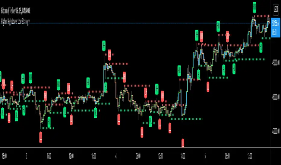
Higher High Lower Low Strategy (With Source Code)This script finds pivot highs and pivot lows then calculates higher highs & lower lows. And also it calculates support/resistance by using HH-HL-LL-LH points.
Generally HH and HL shows up-trend, LL and LH shows down-trend.
If price breaks resistance levels it means the trend is up or if price breaks support level it means the trend is down, so the script changes bar color blue or black. if there is up-trend then bar color is blue, or if down-trend then bar color is black. also as you can see support and resistance levels change dynamically.
If you use smaller numbers for left/right bars then it will be more sensitive.
source code of :
在腳本中搜尋"trendline"
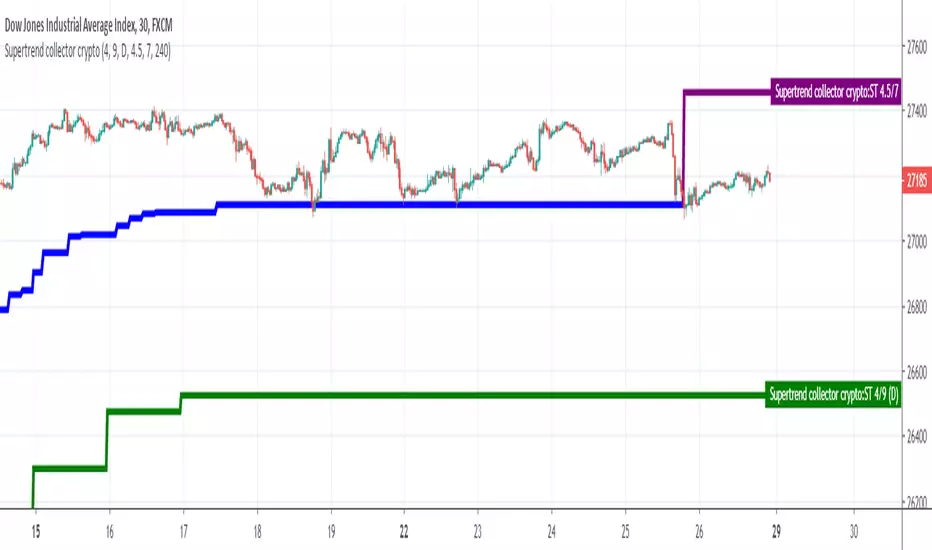
Supertrend collectorHello traders
This is an example of how you can add multiple indicators into a unique one
In this instance, I added two supertrend multitimeframes and draw them on a different timeframe chart
Enjoy
David
MACD Enhanced Strategy MTF with Stop Loss [LTB]I developed this script to analyse MACD, MACD Signal, MACD Histogram movements by using current and higher time frame. Script calculates higher time frame automatically, no manuel entry. I also added trailing stop loss line. You can change the parameters as you wish ;)
btw. you should know that MACD is more successful when there is trend.
If you like it please comment and check out my other scripts.

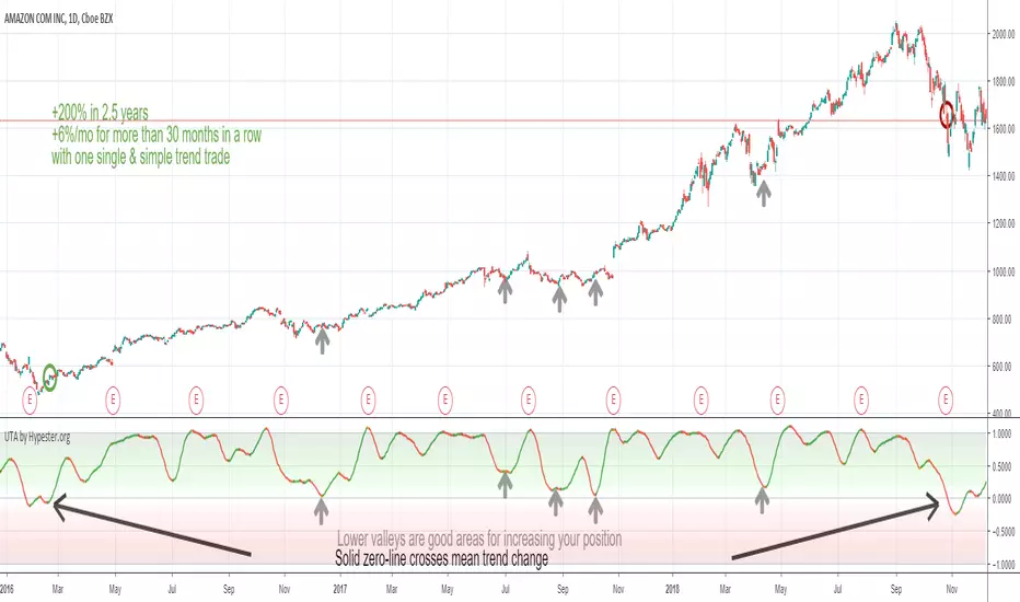
Ultimate Trend Analyzer by HypesterTrading is not all about scalping/day trading. To have a healthy and diversified portfolio, you should always have some trending long term assets to mitigate risks and keep your wallet always on the green side.
That's why Hypester once again innovates with the Ultimate Trend Analyzer. With the UTA you can check the trend's health with one glance.
Do not fool yourself, the Ultimate Trend Analyzer offers different trading profiles, so it doesn't matter what kind of trading you are doing, from long positions to intraday scalping - UTA can quickly adapt with one click. UTA offers Swing/Longterm, Day Trading and Scalping profile.
It also has two correlation methods, volume, and price. So you can decide what you want to prioritize most.
Not only that, there are two smoothing methods, linear regression and symmetrical averaging so you can remove noises from your indicator line.
The UTA offers you insight about the trend's health, just by looking at the background color, the stronger the color, stronger the trend. So higher up it is, stronger the uptrend is. The lower it is, stronger the downtrend.
Nevertheless, the UTA also gives you insight within trend corrections and peaks and bottoms with the indicator line color. So if you have a bullish trend and you see an orange line color, it means that direction is changing and you will observe a line color change, which means the course is now bearish even though the overall trend is going up. This feature is great for swing/scalp trading looking at the big picture.
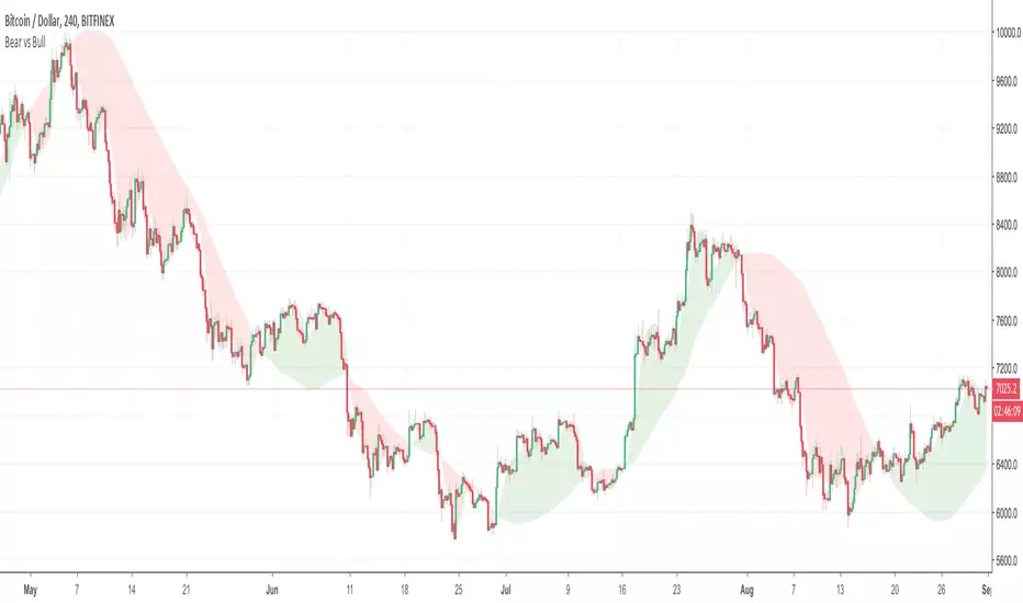
Bear vs Bull Trend indicator by Atilla YurtsevenHi Traders,
Bear vs Bull Trend indicator helps you to determine the trend direction easily. Using this indicator, you will not need to look for the cross-over anymore. You can simply choose your favorite Trend detection indicator from the properties (sma, wma, ema, linear). I usually use Linear trends.
Disclaimer: All the information in this article, including the algorithm & indicator, was provided and published for informational purposes only and should not be considered legal or financial advice.
PS: Please leave some comments and remember to follow me. I share only the indicators that i use.
Happy trading :)
Atilla Yurtseven
Auto trend (Spicytrader)
Automatically identifies bullish or bearish market.
Follow the trend is the first advice given by pro traders.
GET ACCESS : spicytrader.com

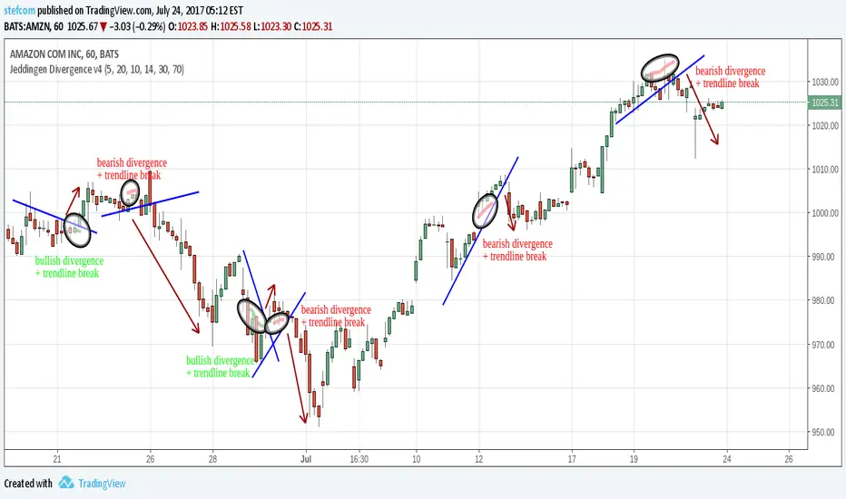
Jeddingen Divergence v4Momentum vs. price divergence. Sell signals on bearish divergence, buy signals on bullish divergence .
Indicator includes an RSI filter, alert-conditions and lots of other configuration options.
There is also a TradingView strategy available to backtest everything!
XAU/USD Master Prediction System📈 XAU/USD Master Prediction System
The XAU/USD Master Prediction System is a powerful trading tool designed to help traders make precise decisions in the gold market. This script combines classic technical indicators with advanced predictive modeling for enhanced signal accuracy.
🔍 Key Features:
Multi-indicator analysis: Combines RSI, MACD, Bollinger Bands, EMA, and ATR for comprehensive insight.
Multi-timeframe regression lines: Pulls data from 5m, 15m, 1H, and 4H to detect trend strength and reversals.
AI-inspired price forecasting: Calculates a prediction score based on trend strength and volatility.
Smart entry/exit signals:
🔁 Regular signals based on combined indicator confirmations
Manual forecasting support: Allows you to input custom target levels and monitor them visually.
Clear and clean visual design: Includes trendlines, predictive zones, volatility bands, and dynamic levels.
🎯 Who is it for?
Perfect for scalpers, intraday, and swing traders focused on XAU/USD, who want to combine traditional market structure with modern predictive techniques.

Golden Pocket SyndicateGPS – Golden Pocket Syndicate
The GPS indicator is a multi-tool designed for active traders who focus on reversals, precision scalping, and high-confluence entries. This script combines key market structure elements, dynamic support/resistance mapping, and real-time volume + liquidation metrics to help traders identify optimal entries based on supply/demand imbalances and liquidity targeting.
Rather than replicating existing open-source tools, GPS blends custom logic for:
• Golden Pocket Zone Mapping: Automatically highlights key Fibonacci retracement areas (0.618–0.65) across daily, weekly, monthly levels, including previous session extensions.
• Liquidation Clusters & Pre-Liq Zones: Real-time detection and visual display of high-risk liquidation areas using volume acceleration and candle-body displacement data.
• Reversal Confirmation Signals: Combines volume divergence, VWAP reclaims, and spiderline rejections with custom-coded “Snipe Points” that alert traders to potential exhaustion in trend.
• Market Sentiment Integration: Optional overlays include real-time bar color shifts based on bias change (from trend to range) and dynamic volume overlays.
This indicator is intended for traders who scalp or swing but require additional confirmation layers to prevent premature entries. It works well on 5m–4H charts and is especially powerful when paired with other manual tools such as trendlines, order blocks, or market structure breaks.

Profit Sniper RSI Based Buy/Sell📌 Profit Sniper RSI – Precision Buy/Sell Signals Based on RSI Zones
Profit Sniper RSI is a smart momentum-based indicator designed to catch high-probability market reversals and entries using Relative Strength Index (RSI) logic — with clearly defined zones and non-repeating buy/sell signals.
🔍 How It Works:
This indicator divides RSI into 5 strategic zones:
- 0–24 → 🔴 Power Sell Zone
- 24–40 → 🔻 Sell Zone
- 40–60 → ⚪ Consolidation Zone
- 60–76 → 🔼 Buy Zone
- 76–100 → 🟢 Power Buy Zone
Signals are generated when RSI crosses these zone levels only after candle close, ensuring signal accuracy and avoiding premature entries.
✅ Key Features:
- Non-repeating buy/sell signals for clean trade execution
- Visual label toggles to show/hide: Buy, Sell, Power Buy, Power Sell
- RSI-based Info Panel: Shows current RSI, last signal, RSI at signal, and price of signal
- Fully customizable RSI length and appearance
- Works on any timeframe and asset (crypto, stocks, forex, etc.)
- Lightweight, fast, and visually optimized for clarity
🎯 Ideal For:
- Intraday scalpers
- Swing traders
- Positional investors
- Anyone who wants confirmation-based RSI signals
Note: This script does not repaint. Signals are printed only after the candle closes.
💡 Use in combination with support/resistance, trendlines, or volume for best results.

Fractal Model (Lite) [MMT]Fractal Model (Lite)
The Fractal Model (Lite) is a versatile Pine Script® indicator designed to enhance your trading by overlaying higher timeframe (HTF) candlestick data and key market structure elements on your current chart. This tool helps traders visualize critical price levels, market imbalances, liquidity sweeps, and structural displacements, making it easier to identify potential trading opportunities. With customizable visuals, alerts, and Fibonacci projections, it’s suitable for traders of all levels looking to analyze price action across multiple timeframes.
What This Indicator Does
The Fractal Model (Lite) aggregates price data from a user-selected higher timeframe (e.g., 1-hour candles on a 5-minute chart) and displays it as candlesticks with customizable colors and sizes. It identifies and visualizes key market phenomena, including:
Fair Value Gaps (FVG) and Volume Imbalances: Highlight price gaps that may act as magnets for future price action.
Liquidity Sweeps: Detect when price takes out previous highs or lows and reverses, signaling potential liquidity grabs.
Midpoints: Mark the midpoint of HTF candles as potential support/resistance levels.
G-Spots: Based on TTrades's T-Spot concept. It helps identifying key price zones (50% of an HTF candle’s range) for potential reversals or continuations.
Change In State of Delivery (CISD): Track significant price levels after pullbacks, indicating shifts in market structure.
Fibonacci Projection: Project customizable Fibonacci levels after CISD based on candle bodies or wicks.
Information Table: Display key data like timeframe, symbol, bias, and remaining time for the HTF candle.
Trace Lines and Labels: Connect open, close, high, and low prices to their chart positions for clarity.
The indicator also supports alerts for sweeps, G-Spots, and CISD events, helping you stay informed of critical market movements.
How to Use This Indicator
Add to Chart:
Add the indicator to your TradingView chart via the Pine Script editor or indicator library.
Ensure your chart is set to a timeframe lower than the desired HTF (e.g., 5-minute chart for a 1-hour HTF).
Configure Settings:
Timeframe Settings:
Enable Auto Select Timeframe to dynamically choose an HTF based on your chart (e.g., 5m → 1h, 1h → 1D).
Alternatively, set a Manual Timeframe (e.g., 60 minutes) for specific analysis.
Adjust Max Candles to control how many HTF candles are displayed (default: 4).
Market Bias:
Choose Neutral to display all signals, or Bullish/Bearish to filter sweeps, G-Spots, and CISD based on market direction.
Styling:
Customize bullish/bearish candle colors (body, border, wick), width, and spacing for better visibility.
Imbalances:
Enable Fair Value Gaps and Volume Imbalances to highlight price gaps with customizable colors.
Sweeps:
Turn on Show Sweeps to detect liquidity grabs, with options for line style, width, and alerts.
Midpoints:
Enable Show Midpoint to mark the midpoint of HTF candles, useful for equilibrium levels.
G-Spots:
Activate Show G-Spot to highlight key price zones, with separate colors for bullish/bearish and optional alerts.
Use Keep Invalidated G-Spot to retain invalidated zones for reference.
CISD:
Enable Show CISD to track structural displacements, with customizable colors, text, and alerts.
Set Line Width and Style for visibility, and limit completed lines if desired.
Fibonacci Retracement:
Enable Show Fib Retracement and customize levels (e.g., 1, 0, -1, -2) and calculation method (Body or Wick).
Adjust line style, width, and label visibility.
Trace Lines:
Turn on Trace Lines to connect open, close, high, and low prices to their chart positions, with customizable styles and labels.
Labels:
Enable HTF Label, Price Label, or Remaining Time to display timeframe, price, or countdown information.
Choose Label Position (Top/Bottom) and customize colors and sizes.
Separators:
Enable Show Separator to draw vertical lines between HTF candles, with adjustable style and width.
Info Table:
Enable Show Info to display a table with timeframe, symbol, bias, remaining time, or date.
Customize table position, colors, and text size.
Interpret the Output:
HTF Candles: Appear as boxes (bodies) with lines (wicks) on the right side of the chart, representing the selected HTF’s price action.
Imbalances: Shown as semi-transparent boxes indicating FVGs or Volume Imbalances, potential price targets.
Sweeps: Horizontal lines marking where price took out a previous high/low and reversed, often signaling liquidity hunting.
Midpoints: Horizontal lines at the midpoint of HTF candles, useful for identifying balance points.
G-Spots: Boxes highlighting the 50% level of an HTF candle’s range, often acting as key reaction zones.
CISD Levels: Lines and labels marking confirmed structural displacements, indicating significant market shifts.
Fibonacci Levels: Horizontal lines showing retracement/projection levels based on HTF candles, with optional labels.
Trace Lines: Connect key price levels (open, close, high, low) to their chart positions, aiding in tracking price movement.
Info Table: Displays at the specified chart position (e.g., Top-Right) with relevant market data.
Set Alerts:
Enable alerts for Sweeps, Bullish/Bearish G-Spots, or Bullish/Bearish CISD to receive notifications when these events occur.
Configure alerts via TradingView’s alert system, referencing the indicator’s alert conditions.
Example Setup
Chart: 5-minute timeframe.
HTF: Set to 1-hour (manual) or auto-select.
Bias: Neutral to see all signals.
Styling: Set bullish candles to green (#00FF00) and bearish to red (#FF0000) for clarity.
Features: Enable FVGs, sweeps, G-Spots, and CISD with alerts.
Fibonacci: Use levels 0, 0.5, 1, 1.618 based on wicks.
Table: Display in Top-Right with symbol, bias, and remaining time.
Tips for Optimal Use
Match Timeframes: Ensure the HTF is significantly higher than your chart timeframe for clear visualization (e.g., 1h on a 5m chart).
Filter with Bias: Use Bullish/Bearish bias to reduce noise if you have a directional view.
Combine with Other Tools: Pair with support/resistance, trendlines, or volume indicators for confluence.
Monitor Alerts: Set up alerts for real-time notifications, especially in fast-moving markets.
Adjust Visuals: Customize colors and sizes to avoid clutter and match your chart theme.
Limit Candles: Reduce Max Candles if performance lags on lower timeframes.
Notes
Real-Time Data: Features like remaining time require real-time data for accuracy.
Time Zone: Set to America/New_York by default; adjust if needed for your market.
Compatibility: Works on any TradingView chart with a valid HTF (higher than the current timeframe).
Why Use This Indicator?
The Fractal Model (Lite) provides a clear, customizable way to analyze HTF price action without switching charts. Its focus on market structure, imbalances, and liquidity events makes it ideal for scalpers, swing traders, and those seeking to understand institutional price behavior. Whether you’re trading reversals, breakouts, or ranges, this indicator offers actionable insights with minimal setup.

Cumulative Volume Delta📊 Indicator Name:
Cumulative Volume Delta (CVD) + Candle Divergence (Color DIfference)
📌 Purpose:
This indicator visualizes volume delta over a user-defined time anchor and highlights divergence between volume-based momentum and price movement. It's especially useful for identifying potential reversals, fakeouts, or hidden buying/selling pressure.
🔍 How It Works:
1. Volume Delta Calculation (CVD Candles):
The script uses ta.requestVolumeDelta() to approximate volume delta data over a chosen anchor period (e.g., 1D).
Volume delta = Buy Volume – Sell Volume
Each candle on the CVD chart represents changes in cumulative volume delta, with OHLC-style values:
openVolume: cumulative delta at the start of the bar
lastVolume: cumulative delta at the end of the bar
maxVolume, minVolume: intra-bar high and low
2. Visual Representation (CVD Candles):
Green/Teal candle: Delta is increasing (buying pressure dominates)
Red candle: Delta is decreasing (selling pressure dominates)
3. Divergence Detection:
The script compares the direction of the price candle with the direction of the CVD candle:
Price Up + CVD Down → Possible hidden selling (bearish divergence)
Price Down + CVD Up → Possible hidden buying (bullish divergence)
4. Color Highlighting:
Orange candle on the CVD chart signals divergence between price and volume delta.
This color override helps you quickly spot potential discrepancies between price movement and underlying volume pressure.
5. Alerting:
An alertcondition is added so you can receive a notification whenever a divergence occurs.
⚙️ User Inputs:
Anchor period (e.g., 1D): Timeframe over which the CVD is anchored.
Use custom timeframe: Allows you to override and define the internal lower timeframe used for volume estimation (e.g., 1-min).
📈 How to Use It:
✅ Bullish Divergence (Price down, CVD up)
This may indicate:
Buyers absorbing selling pressure.
A potential reversal to the upside.
Hidden accumulation.
🚫 Bearish Divergence (Price up, CVD down)
This may indicate:
Sellers stepping in despite upward price.
A potential reversal to the downside.
Hidden distribution.
🧠 Trading Insights:
CVD is often used by order flow traders or those analyzing market depth and volume imbalances.
This version lets you visually align price action with underlying volume, improving decision-making.
The divergence signal can be combined with other technical tools like support/resistance, candlestick patterns, or trendlines for confirmation.

AI-Driven Sentiment Oscillator — Read the Market’s Mind!AI-Driven Sentiment Oscillator — Reading the Crypto Market’s Mind! 🔮
This innovative oscillator combines trading volume, price delta, and a simple AI-inspired smoothing algorithm to help you accurately gauge market sentiment on the daily timeframe. Designed for both beginner and professional traders, especially those focused on Bitcoin and the crypto market, it highlights emotional trends and potential reversal points.
🔍 Logic
By analyzing volume changes alongside price delta, this oscillator generates a smooth, oscillating curve around a zero line that reflects the market’s overall sentiment. The model accounts for both the direction and strength of price movements, filtering signals through AI-like logic to provide reliable insights.
⏱️ Timeframe
Built specifically for daily charts, this tool captures long-term trends and market emotions in the crypto space, with a particular focus on Bitcoin.
⚙️ Settings
Users can customize the oscillator’s length, volume sensitivity, and smoothing parameters to fit their trading style and risk tolerance.
🧰 Use Cases
Early detection of trend shifts when the oscillator crosses the zero line
Identifying overbought and oversold conditions beyond ±0.7 levels
Combining with trendlines and support/resistance for high-probability entries on Bitcoin charts
🚨 Alerts
Alert conditions trigger when the oscillator crosses above or below zero, signaling potential bullish or bearish momentum shifts.
📊 Visual Explanation
The blue oscillating curve displayed below the chart represents the sentiment oscillator. It fluctuates around the zero line:
Values above zero indicate bullish market sentiment with buyer dominance.
Values below zero reflect bearish pressure and seller dominance.
Dotted red and green lines mark overbought and oversold zones, respectively, which can signal possible trend reversals.
This visual tool helps you make better entry and exit decisions by tracking shifts in market sentiment in real-time.

Demand Index (Hybrid Sibbet) by TradeQUODemand Index (Hybrid Sibbet) by TradeQUO \
\Overview\
The Demand Index (DI) was introduced by James Sibbet in the early 1990s to gauge “real” buying versus selling pressure by combining price‐change information with volume intensity. Unlike pure price‐based oscillators (e.g. RSI or MACD), the DI highlights moves backed by above‐average volume—helping traders distinguish genuine demand/supply from false breakouts or low‐liquidity noise.
\Calculation\
\
\ \Step 1: Weighted Price (P)\
For each bar t, compute a weighted price:
```
Pₜ = Hₜ + Lₜ + 2·Cₜ
```
where Hₜ=High, Lₜ=Low, Cₜ=Close of bar t.
Also compute Pₜ₋₁ for the prior bar.
\ \Step 2: Raw Range (R)\
Calculate the two‐bar range:
```
Rₜ = max(Hₜ, Hₜ₋₁) – min(Lₜ, Lₜ₋₁)
```
This Rₜ is used indirectly in the exponential dampener below.
\ \Step 3: Normalize Volume (VolNorm)\
Compute an EMA of volume over n₁ bars (e.g. n₁=13):
```
EMA_Volₜ = EMA(Volume, n₁)ₜ
```
Then
```
VolNormₜ = Volumeₜ / EMA_Volₜ
```
If EMA\_Volₜ ≈ 0, set VolNormₜ to a small default (e.g. 0.0001) to avoid division‐by‐zero.
\ \Step 4: BuyPower vs. SellPower\
Calculate “raw” BuyPowerₜ and SellPowerₜ depending on whether Pₜ > Pₜ₋₁ (bullish) or Pₜ < Pₜ₋₁ (bearish). Use an exponential dampener factor Dₜ to moderate extreme moves when true range is small. Specifically:
• If Pₜ > Pₜ₋₁,
```
BuyPowerₜ = (VolNormₜ) / exp
```
otherwise
```
BuyPowerₜ = VolNormₜ.
```
• If Pₜ < Pₜ₋₁,
```
SellPowerₜ = (VolNormₜ) / exp
```
otherwise
```
SellPowerₜ = VolNormₜ.
```
Here, H₀ and L₀ are the very first bar’s High/Low—used to calibrate the scale of the dampening. If the denominator of the exponential is near zero, substitute a small epsilon (e.g. 1e-10).
\ \Step 5: Smooth Buy/Sell Power\
Apply a short EMA (n₂ bars, typically n₂=2) to each:
```
EMA_Buyₜ = EMA(BuyPower, n₂)ₜ
EMA_Sellₜ = EMA(SellPower, n₂)ₜ
```
\ \Step 6: Raw Demand Index (DI\_raw)\
```
DI_rawₜ = EMA_Buyₜ – EMA_Sellₜ
```
A positive DI\_raw indicates that buying force (normalized by volume) exceeds selling force; a negative value indicates the opposite.
\ \Step 7: Optional EMA Smoothing on DI (DI)\
To reduce choppiness, compute an EMA over DI\_raw (n₃ bars, e.g. n₃ = 1–5):
```
DIₜ = EMA(DI_raw, n₃)ₜ.
```
If n₃ = 1, DI = DI\_raw (no further smoothing).
\
\Interpretation\
\
\ \Crossing Zero Line\
• DI\_raw (or DI) crossing from below to above zero signals that cumulative buying pressure (over the chosen smoothing window) has overcome selling pressure—potential Long signal.
• Crossing from above to below zero signals dominant selling pressure—potential Short signal.
\ \DI\_raw vs. DI (EMA)\
• When DI\_raw > DI (the EMA of DI\_raw), bullish momentum is accelerating.
• When DI\_raw < DI, bullish momentum is weakening (or bearish acceleration).
\ \Divergences\
• If price makes new highs while DI fails to make higher highs (DI\_raw or DI declining), this hints at weakening buying power (“bearish divergence”), possibly preceding a reversal.
• If price makes new lows while DI fails to make lower lows (“bullish divergence”), this may signal waning selling pressure and a potential bounce.
\ \Volume Confirmation\
• A strong price move without a corresponding rise in DI often indicates low‐volume “fake” moves.
• Conversely, a modest price move with a large DI spike suggests true institutional participation—often a more reliable breakout.
\
\Usage Notes & Warnings\
\
\ \Never Use DI in Isolation\
It is a \filter\ and \confirmation\ tool—combine with price‐action (trendlines, support/resistance, candlestick patterns) and risk management (stop‐losses) before executing trades.
\ \Parameter Selection\
• \Vol EMA length (n₁)\: Commonly 13–20 bars. Shorter → more responsive to volume spikes, but noisier.
• \Buy/Sell EMA length (n₂)\: Typically 2 bars for fast smoothing.
• \DI smoothing (n₃)\: Usually 1 (no smoothing) or 3–5 for moderate smoothing. Long DI\_EMA (e.g. 20–50) gives a slower signal.
\ \Market Adaptation\
Works well in liquid futures, indices, and heavily traded stocks. In thinly traded or highly erratic markets, adjust n₁ upward (e.g., 20–30) to reduce noise.
---
\In Summary\
The Demand Index (James Sibbet) uses a three‐stage smoothing (volume → Buy/Sell Power → DI) to reveal true demand/supply imbalance. By combining normalized volume with price change, Sibbet’s DI helps traders identify momentum backed by real participation—filtering out “empty” moves and spotting early divergences. Always confirm DI signals with price action and sound risk controls before trading.
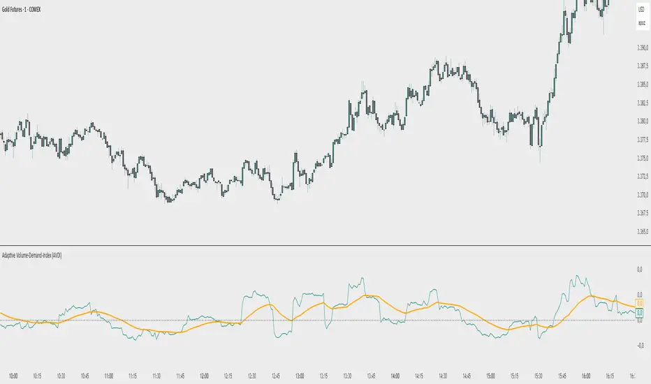
Adaptive Volume‐Demand‐Index (AVDI)Demand Index (according to James Sibbet) – Short Description
The Demand Index (DI) was developed by James Sibbet to measure real “buying” vs. “selling” strength (Demand vs. Supply) using price and volume data. It is not a standalone trading signal, but rather a filter and trend confirmer that should always be used together with chart structure and additional indicators.
---
\ 1. Calculation Basis\
1. Volume Normalization
$$
\text{normVol}_t
= \frac{\text{Volume}_t}{\mathrm{EMA}(\text{Volume},\,n_{\text{Vol}})_t}
\quad(\text{e.g., }n_{\text{Vol}} = 13)
$$
This smooths out extremely high volume spikes and compares them to the average (≈ 1 means “average volume”).
2. Price Factor
$$
\text{priceFactor}_t
= \frac{\text{Close}_t - \text{Open}_t}{\text{Open}_t}.
$$
Positive values for bullish bars, negative for bearish bars.
3. Component per Bar
$$
\text{component}_t
= \text{normVol}_t \times \text{priceFactor}_t.
$$
If volume is above average (> 1) and the price rises slightly, this yields a noticeably positive value; conversely if the price falls.
4. Raw DI (Rolling Sum)
Over a window of \$w\$ bars (e.g., 20):
$$
\text{RawDI}_t
= \sum_{i=0}^{w-1} \text{component}_{\,t-i}.
$$
Alternatively, recursively for \$t \ge w\$:
$$
\text{RawDI}_t
= \text{RawDI}_{t-1}
+ \text{component}_t
- \text{component}_{\,t-w}.
$$
5. Optional EMA Smoothing
An EMA over RawDI (e.g., \$n\_{\text{DI}} = 50\$) reduces short-term fluctuations and highlights medium-term trends:
$$
\text{EMA\_DI}_t
= \mathrm{EMA}(\text{RawDI},\,n_{\text{DI}})_t.
$$
6.Zero Line
Handy guideline:
RawDI > 0: Accumulated buying power dominates.
RawDI < 0: Accumulated selling power dominates.
2. Interpretation & Application
Crossing Zero
RawDI above zero → Indication of increasing buying pressure (potential long signal).
RawDI below zero → Indication of increasing selling pressure (potential short signal).
Not to be used alone for entry—always confirm with price action.
RawDI vs. EMA_DI
RawDI > EMA\_DI → Acceleration of demand.
RawDI < EMA\_DI → Weakening of demand.
Divergences
Price makes a new high, RawDI does not make a higher high → potential weakness in the uptrend.
Price makes a new low, RawDI does not make a lower low → potential exhaustion of the downtrend.
3. Typical Signals (for Beginners)
\ 1. Long Setup\
RawDI crosses zero from below,
RawDI > EMA\_DI (acceleration),
Price closes above a short-term swing high or resistance.
Stop-Loss: just below the last swing low, Take-Profit/Trailing: on reversal signals or fixed R\:R.
2. Short Setup
RawDI crosses zero from above,
RawDI < EMA\_DI (increased selling pressure),
Price closes below a short-term swing low or support.
Stop-Loss: just above the last swing high.
---
4. Notes and Parameters
Recommended Values (Beginners):
Volume EMA (n₍Vol₎) = 13
RawDI window (w) = 20
EMA over DI (n₍DI₎) = 50 (medium-term) or 1 (no smoothing)
Attention:\
NEVER use in isolation. Always in combination with price action analysis (trendlines, support/resistance, candlestick patterns).
Especially during volatile news phases, RawDI can fluctuate strongly → EMA\_DI helps to avoid false signals.
---
Conclusion The Demand Index by James Sibbet is a powerful filter to assess price movements by their volume backing. It shows whether a rally is truly driven by demand or merely a short-term volume anomaly. In combination with classic chart analysis and risk management, it helps to identify robust entry points and potential trend reversals earlier.
Gann Single SwingGann Single Swing Indicator
The Gann Single Swing indicator is a sophisticated tool rooted in the geometric and cyclical market analysis principles pioneered by William Delbert Gann. Designed for traders who value deep market structure analysis, this indicator leverages the interplay of price and time to identify key support and resistance zones, potential reversal points, and critical price-time synchronization areas. Its unique approach makes it an invaluable instrument for those employing Gann-based methodologies or seeking a systematic way to decode complex market dynamics.
What It Does
The Gann Single Swing indicator is built to pinpoint high-probability zones for price action, such as support and resistance levels, where traders can logically initiate long or short positions. By analyzing a user-defined price swing (a move between two selected points, such as a local high and low), the indicator constructs a geometric framework that reveals hidden patterns in market movements. It identifies:
Support and Resistance Zones: Key price levels where the market is likely to reverse or consolidate.
Temporal Reversal Zones: Specific time periods where price reversals are more probable due to time-price resonance.
Price-Time Synchronization Points: Areas where price and time align to signal potential market turning points.
How It Works
The indicator’s algorithm is grounded in Gann’s geometric principles, focusing on the relationship between price movements and time cycles. Here’s a high-level overview of its process:
Swing Selection: Traders select two key points on the chart (e.g., a local minimum and maximum) to define a price swing.
Channel Construction: The swing is encapsulated within a dynamic channel, forming the foundation of the geometric model.
Gann Fan Application: A Gann Fan is applied to the channel to calculate critical angles, representing the balance between price and time. These angles help identify resonant points that align with the channel’s central axis.
Squared Channel Analysis: The algorithm creates “squared” channels, geometrically derived sub-structures, analyzed for intersections and alignments to project external support and resistance zones beyond the base swing.
Internal Zone Mapping: Within the base swing, a reverse Gann Fan maps internal zones, highlighting areas of price-time convergence that may act as dynamic support or resistance.
Zone Projection: The indicator synthesizes these calculations to plot precise zones of support, resistance, and potential reversals, both spatially (price levels) and temporally (time-based zones).
While the exact mathematical formulations remain proprietary, the indicator relies on time-tested Gann techniques, such as angle-based analysis and cyclical resonance, to deliver actionable insights.
How to Use It
Select the Swing: Identify two significant points on the chart (e.g., a recent high and low) to define the swing. These points serve as the anchor for the indicator’s calculations.
Interpret the Zones: The indicator plots support and resistance zones (both price-based and time-based). Look for price action near these zones to identify potential entry or exit points.
Combine with Other Tools: For best results, use alongside other Gann-based tools (e.g., Gann Squares or Time Cycles) or traditional technical analysis (e.g., trendlines, Fibonacci levels) to confirm signals.
Monitor Temporal Zones: Pay attention to time-based reversal zones, as they may indicate when a price move is likely to occur, enhancing trade timing.
Why It’s Unique
Unlike conventional indicators that rely on moving averages, RSI, or other common metrics, the Gann Single Swing indicator offers a proprietary blend of Gann’s geometric and cyclical principles. Its ability to integrate price and time into a cohesive model sets it apart, providing traders with a deeper understanding of market structure. The indicator does not use public domain code or standard technical indicators, ensuring originality and value for traders seeking advanced tools.
Who It’s For
This indicator is ideal for:
Traders familiar with Gann’s methodologies who want to automate and enhance their geometric analysis.
Advanced traders looking to uncover hidden market patterns through price-time relationships.
Those seeking a robust, non-traditional tool for identifying high-probability trade setups.
The Gann Single Swing indicator is not a black-box forecasting tool but a powerful framework for dissecting market behavior. By combining user-defined inputs with sophisticated geometric calculations, it empowers traders to make informed decisions based on the timeless principles of Gann’s market philosophy.

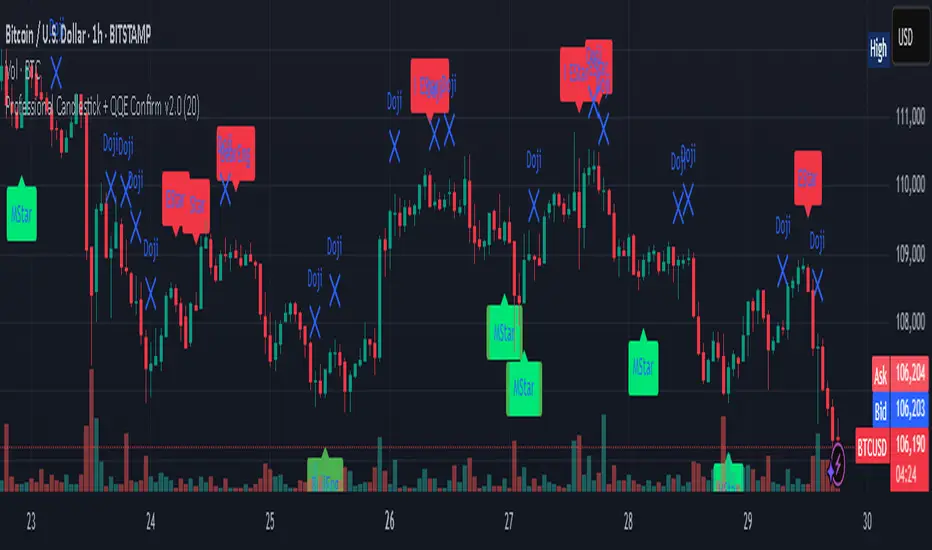
Professional Candlestick + QQE Confirm v2.0 Professional Candlestick + QQE Confirm v1.0
This script combines powerful candlestick pattern detection with QQE momentum confirmation to improve signal reliability for swing trading and trend entries.
🔍 What It Does:
- Detects high-probability candlestick patterns (e.g. Pin Bars, Engulfing, Morning/Evening Stars)
- Confirms signals with the QQE indicator to reduce false entries
- Highlights buy/sell zones using combined logic
⚙️ Key Features:
- Multiple candlestick patterns, each toggleable
- QQE filtering to confirm valid breakouts or reversals
- Signal labels with strength grading
- Optional alert settings
📊 Best Use:
- Works well on 1H, 4H, and Daily charts
- Combine with trendlines or support/resistance for stronger entries
- Avoids signals in sideways/choppy markets
---
This is a tool for traders who want to filter out weak candlestick signals using a trusted momentum indicator (QQE) for more accurate entries.
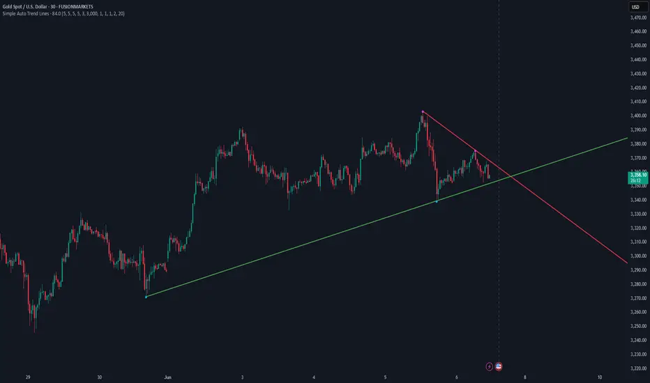
Simple Auto Trend LinesOpinionated way of drawing automatic trend lines. It draws automatically trend lines based on specified top/bottom strengths with multiple sets in order to keep track of multiple levels of interest.
Has the ability to hide invalidated trendlines if price moves away from it.
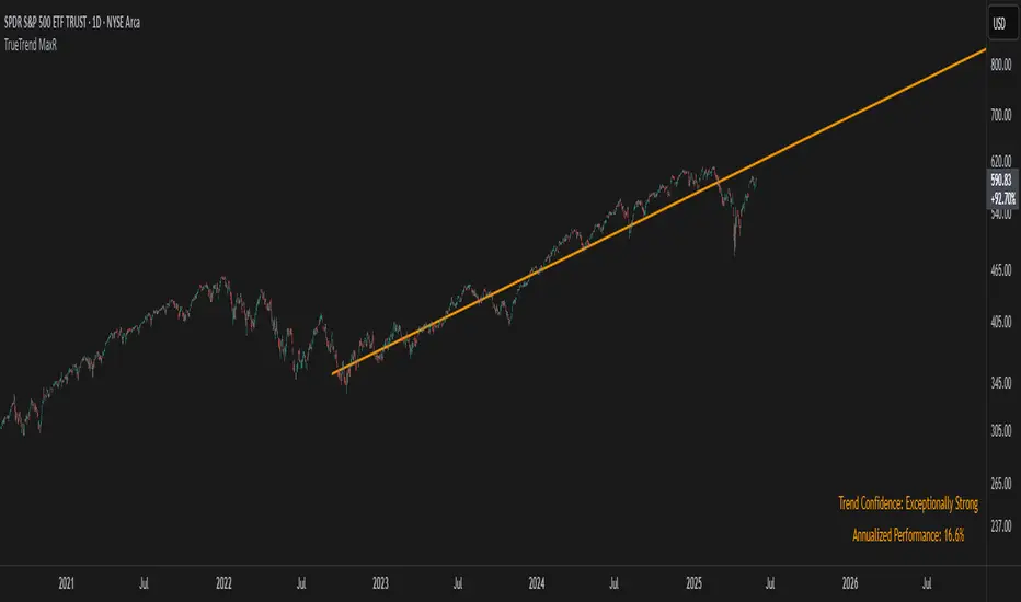
TrueTrend MaxRThe TrueTrend MaxR indicator is designed to identify the most consistent exponential price trend over extended periods. It uses statistical analysis on log-transformed prices to find the trendline that best fits historical price action, and highlights the most frequently tested or traded level within that trend channel.
For optimal results, especially on high timeframes such as weekly or monthly, it is recommended to use this indicator on charts set to logarithmic scale. This ensures proper visual alignment with the exponential nature of long-term price movements.
How it works
The indicator tests 50 different lookback periods, ranging from 300 to 1280 bars. For each period, it:
- Applies a linear regression on the natural logarithm of the price
- Computes the slope and intercept of the trendline
- Calculates the unbiased standard deviation from the regression line
- Measures the correlation strength using Pearson's R coefficient
The period with the highest Pearson R value is selected, meaning the trendline drawn corresponds to the log-scale trend with the best statistical fit.
Trendline and deviation bands
Once the optimal period is identified, the indicator plots:
- A main log-scale trendline
- Upper and lower bands, based on a user-defined multiple of the standard deviation
These bands help visualize how far price deviates from its core trend, and define the range of typical fluctuations.
Point of Control (POC)
Inside the trend channel, the space between upper and lower bands is divided into 15 logarithmic levels. The script evaluates how often price has interacted with each level, using one of two selectable methods:
- Touches: Counts the number of candles crossing each level
- Volume: Weighs each touch by the traded volume at that candle
The level with the highest cumulative interaction is considered the dynamic Point of Control (POC), and is plotted as a line.
Annualized performance and confidence display
When used on daily or weekly timeframes, the script also calculates the annualized return (CAGR) based on the detected trend, and displays:
- A performance estimate in percentage terms
- A textual label describing the confidence level based on the Pearson R value
Why this indicator is useful
- Automatically detects the most statistically consistent exponential trendline
- Designed for log-scale analysis, suited to long-term investment charts
- Highlights key price levels frequently visited or traded within the trend
- Provides objective, data-based trend and volatility insights
- Displays annualized growth rate and correlation strength for quick evaluation
Notes
- All calculations are performed only on the last bar
- No future data is used, and the script does not repaint
- Works on any instrument or timeframe, with optimal use on higher timeframes and logarithmic scaling
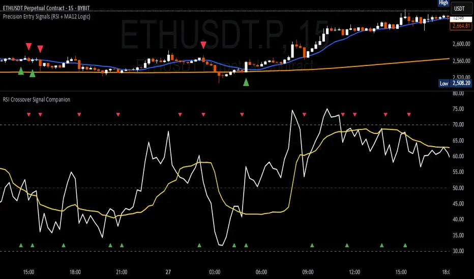
RSI Crossover Signal Companion - Alerts + Visuals🔷 RSI Crossover Signal Companion — Alerts + Visuals
The Relative Strength Index (RSI) is a momentum oscillator that measures the speed and change of recent price movements. It helps traders identify overbought or oversold conditions, possible trend reversals, and momentum strength.
This utility builds on TradingView’s classic Relative Strength Index (RSI) by adding real-time alerts and triangle markers when the RSI crosses its own moving average — a common technique for early momentum detection.
It is designed as a lightweight, visual companion tool for traders using RSI/MA crossover logic in manual or semi-automated strategies.
🔍 Features
✅ Preserves the full original RSI layout, including:
• Gradient fill and overbought/oversold zones
• Standard RSI input settings (length, source, etc.)
• MA smoothing options with user-defined type and length
🔺 Adds visual triangle markers:
🔼 Up triangle when RSI crosses above its MA
🔽 Down triangle when RSI crosses below its MA
📢 Built-in alerts for RSI/MA crosses:
“RSI Crossed Above MA”
“RSI Crossed Below MA”
📈 How to Use
This script is ideal for:
• Spotting early momentum shifts
• Confirming entries or exits in other systems (price action, trendlines, breakouts)
• Building alert-based automation (webhooks, bots, etc.)
Popular use cases:
• Combine with trend indicators like MA200 or MA12
• Use in confluence with price structure and divergence
• Validate breakout moves with momentum confirmation
⚙️ Customization
RSI length, MA length, MA type, and source are fully adjustable
Triangle marker size, shape, and color can be edited under Style
Alerts are pre-built and ready for use
Doji Candle with Horizontal Lines Raja Saien🔰 Doji Candle with Horizontal Lines By Raja Saien
Created by: Wasif Samejo
Script Type: Visual Doji Identifier with Key Level Markers
Overlay: Yes
📌 Description:
This indicator helps you visually identify Doji candles and automatically plots horizontal key levels based on their high, low, and a defined price zone.
A Doji candle is a powerful signal in price action trading that shows indecision in the market, often leading to strong reversals or breakouts. This script is especially useful for traders who want to mark such candles and prepare for possible trade setups.
📈 Features:
✅ Automatic Doji Detection – Based on customizable body size (20.0% of the total range).
✅ Highlights Doji Candle – Visually changes the bar color to yellow when a Doji is found.
✅ High/Low Horizontal Lines – Marks the candle's actual high and low for better visual analysis.
✅ Zone Lines Above/Below – Draws outer levels to form a zone around the Doji, helpful for breakout setups.
Zone Line Color – Set the color for the upper and lower zone lines.
High/Low Line Color – Set the color for the high and low candle levels.
💡 Combine this indicator with trendlines, volume, or Fibonacci tools for better confirmation.

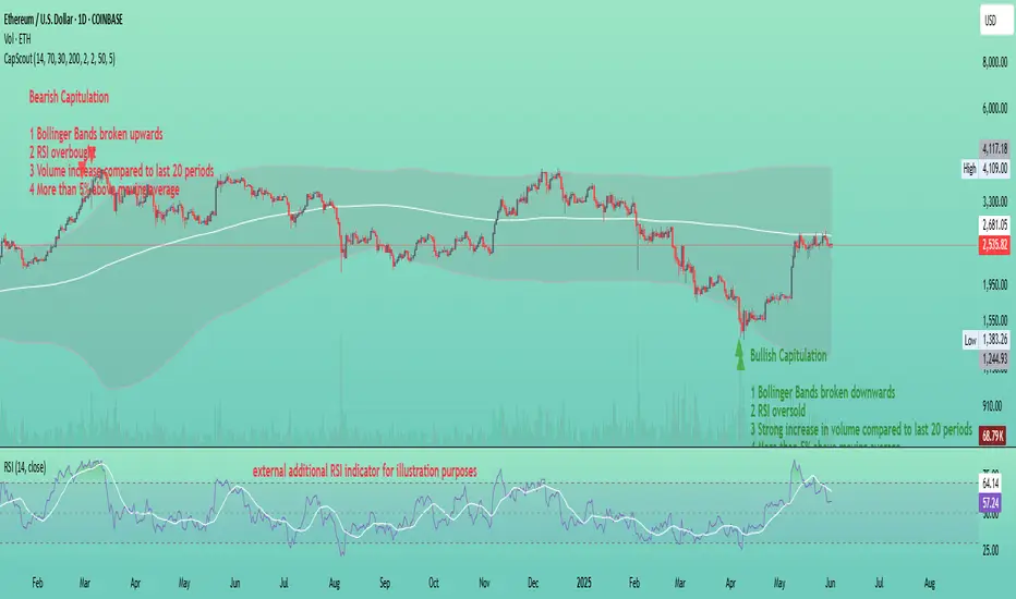
Capitulation ScoutCapitulation Scout - Description
Overview
The Capitulation Scout is a streamlined technical indicator designed to identify potential market reversals by spotting moments of "capitulation" – extreme fear ( bearish capitulation ) or euphoria ( bullish capitulation ). It combines two independent filter groups to provide reliable reversal signals: an Extremes Filter (RSI + Bollinger Bands) and a Confirmation Filter (Volume Spike + MA Deviation). The indicator dynamically adapts to the current chart timeframe, making it versatile for day traders and long-term investors alike.
How It Works
This indicator uses two filter groups to detect capitulation, which can be enabled or disabled individually:
1. Extremes Filter (RSI + Bollinger Bands) : Identifies overbought (default: RSI > 70) or oversold (default: RSI < 30) conditions combined with price breaking through the Bollinger Bands (default: 200-period, 2x multiplier), indicating an extreme price movement.
2. Confirmation Filter (Volume Spike + MA Deviation) : Requires both a significant volume increase (default: 2x the 20-period average volume on lower timeframes, dynamically adjusted on higher timeframes) and a significant price deviation from a moving average (default: 5% deviation from a 50-period SMA) to confirm the capitulation event.
A signal is generated if at least one filter is enabled and all enabled filters meet their respective conditions.
Signals
- Bearish Capitulation : Marked with a red downward triangle (customizable in the "Style" tab) above the candle. Occurs when the enabled filters detect a potential top, e.g., overbought RSI and price above the upper Bollinger Band (if Extremes Filter enabled), and/or a volume spike combined with a significant upward deviation from the MA (if Confirmation Filter enabled).
- Bullish Capitulation : Marked with a green upward triangle (customizable in the "Style" tab) below the candle. Occurs when the enabled filters detect a potential bottom, e.g., oversold RSI and price below the lower Bollinger Band (if Extremes Filter enabled), and/or a volume spike combined with a significant downward deviation from the MA (if Confirmation Filter enabled).
Note : At least one filter must be enabled to generate signals. If both filters are disabled, no signals will be shown.
How to Use
1. Add the Capitulation Scout to your chart.
2. Look for red downward triangles ( bearish capitulation ) at market tops or green upward triangles ( bullish capitulation ) at market bottoms as potential reversal signals.
3. Use the signals in conjunction with other technical analysis tools (e.g., support/resistance levels, trendlines) to confirm trades.
4. Set up alerts for bearish or bullish capitulation signals to get real-time notifications.
5. Adjust the settings to suit your trading style and timeframe. For smaller timeframes (e.g., 5M or 15M), consider reducing the Bollinger Bands length for more sensitivity.
Settings
- Extremes Filter Settings
- Use Extremes Filter (RSI + Bollinger Bands) : Enable/disable the RSI and Bollinger Bands filter (default: enabled).
- RSI Length : Period for RSI calculation (default: 14 periods, relative to the chart timeframe).
- RSI Overbought/Oversold Levels : Thresholds for overbought/oversold conditions (default: 70/30).
- Bollinger Bands Length/Multiplier : Settings for Bollinger Bands (default: 200 periods, 2x multiplier).
- Confirmation Filter Settings
- Use Confirmation Filter (Volume Spike + MA Deviation) : Enable/disable the combined Volume Spike and MA Deviation filter (default: enabled). When enabled, both a volume spike and a significant MA deviation are required to meet the filter condition.
- Volume Spike Threshold (Base Multiplier) : Multiplier for detecting volume spikes on lower timeframes (default: 2x the 20-period average). On higher timeframes (e.g., weekly or monthly), the threshold is dynamically reduced to be more sensitive (e.g., 1.5x on weekly, 1x on monthly).
- Moving Average Length : Period for the SMA (default: 50 periods, relative to the chart timeframe).
- MA Deviation Threshold (%) : Percentage deviation from the MA to consider the price stretched (default: 5%).
Features
- MA Deviation Filter Visualization : The moving average used for the MA deviation filter can be enabled in the "Style" tab under "MA for Deviation Filter (Optional)" and is displayed in blue by default. It is disabled by default and must be manually enabled in the "Style" tab. Its color, line width, and style can be customized in the "Style" tab.
- Customizable Visuals : In the "Style" tab, you can toggle the visibility of signal markers and customize their colors, sizes, and styles.
- Alerts : Set up alerts for bearish or bullish capitulation signals to get real-time notifications.
Notes
- The indicator automatically adapts to the current chart timeframe (e.g., 1M, 15M, 1H, 1D, etc.). On smaller timeframes, consider reducing the RSI Length, Bollinger Bands Length, and Volume Period for better sensitivity. For example, on a 5-minute chart, a Bollinger Bands Length of 200 covers 1,000 minutes (over 16 hours), which might be too long – try lowering it to 50 or 100.
- Capitulation events are generally more reliable on higher timeframes (e.g., 1H, 4H, 1D), but the indicator can be used on any timeframe with proper adjustments. On weekly or monthly timeframes, the volume spike threshold is dynamically reduced to detect capitulation events more effectively.
- You can enable any combination of filters to generate signals. For example, disabling the Extremes Filter and enabling only the Confirmation Filter will generate signals based solely on volume spikes combined with MA deviation.
- Always combine with other analysis methods to reduce false signals.
- Test the indicator on your preferred markets (stocks, ETFs, crypto, etc.) and tweak the settings as needed.
Example
The thumbnail shows the Capitulation Scout on a daily chart of ETHUSD on Coinbase. Two red downward triangles ( bearish capitulation ) marked a major local top in early 2024, and from there, the ETH price started to correct. Two green upward triangles ( bullish capitulation ) marked a major bottom in April 2025, followed by a significant rally. For more examples, follow my account – I’ll aim to share and track such signals with you in the future.
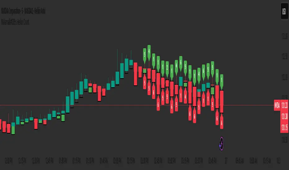
Malama's Heikin CountMalama's Heikin Count is a Pine Script indicator designed to enhance price action analysis by combining Heikin Ashi candlestick calculations with a normalized measurement of upper and lower shadow sizes. The indicator overlays Heikin Ashi candles on the chart and displays the relative sizes of upper and lower shadows as numerical labels (scaled from 1 to 10) for candles within the last two days, starting from 9:00 AM each day. This tool aims to help traders identify the strength of price movements and potential reversals by quantifying the significance of candlestick shadows in the context of Heikin Ashi’s smoothed price data. It is particularly useful for day traders and swing traders who rely on candlestick patterns to gauge market sentiment and momentum.
The indicator solves the problem of interpreting raw candlestick data by providing a smoothed visualization through Heikin Ashi candles and a simplified, numerical representation of shadow sizes. This allows traders to quickly assess whether a candle’s upper or lower shadow indicates strong buying or selling pressure, aiding in decision-making for entries, exits, or reversals.
Originality and Usefulness
Originality: While Heikin Ashi candles are a well-known technique for smoothing price data and reducing noise, Malama's Heikin Count introduces a novel feature by calculating and normalizing the sizes of upper and lower shadows relative to the total candle height. Unlike standard Heikin Ashi implementations, which focus solely on candle body trends, this indicator quantifies shadow proportions and presents them on a standardized 1–10 scale. This normalization makes it easier for traders to compare shadow significance across different timeframes and assets without needing to manually interpret raw measurements. The restriction of shadow size labels to the last two days from 9:00 AM ensures relevance for active trading sessions, avoiding clutter from older data.
Usefulness: The indicator is particularly valuable for traders who combine candlestick pattern analysis with trend-following strategies. By integrating Heikin Ashi’s trend-smoothing capabilities with shadow size metrics, it provides a unique perspective on market dynamics. For example, large upper shadows (high normalized values) may indicate rejection at resistance levels, while large lower shadows may suggest support or buying pressure. Unlike other open-source Heikin Ashi indicators, which typically focus only on candle plotting, this script’s shadow size normalization and time-based filtering offer a distinctive tool for intraday and short-term trading strategies.
Detailed Methodology ("How It Works")
The core logic of Malama's Heikin Count revolves around three main components: Heikin Ashi candle calculations, shadow size analysis, and time-based filtering for label display. Below is a breakdown of how these components work together:
Heikin Ashi Candle Calculations:
The script calculates Heikin Ashi candles to smooth price data and reduce market noise, making trends easier to identify.
Formulas:
haClose = (open + high + low + close) / 4: The Heikin Ashi close is the average of the current bar’s open, high, low, and close prices.
haOpen = na(haOpen ) ? (open + close) / 2 : (haOpen + haClose ) / 2: The Heikin Ashi open is either the average of the current bar’s open and close (for the first bar) or the average of the previous Heikin Ashi open and close.
haHigh = max(high, max(haOpen, haClose)): The Heikin Ashi high is the maximum of the current bar’s high, Heikin Ashi open, and Heikin Ashi close.
haLow = min(low, min(haOpen, haClose)): The Heikin Ashi low is the minimum of the current bar’s low, Heikin Ashi open, and Heikin Ashi close.
These calculations produce smoothed candles that emphasize trend direction and reduce the impact of short-term price fluctuations.
Shadow Size Analysis:
The script calculates the upper and lower shadows of each Heikin Ashi candle to assess market sentiment.
Formulas:
upperShadow = haHigh - max(haClose, haOpen): Measures the length of the upper shadow (distance from the top of the candle body to the high).
lowerShadow = min(haClose, haOpen) - haLow: Measures the length of the lower shadow (distance from the bottom of the candle body to the low).
totalHeight = haHigh - haLow: Calculates the total height of the candle (from high to low).
upperShadowPercentage = (upperShadow / totalHeight) * 100: Converts the upper shadow length to a percentage of the total candle height.
lowerShadowPercentage = (lowerShadow / totalHeight) * 100: Converts the lower shadow length to a percentage of the total candle height.
Normalization: The normalizeShadowSize function scales the shadow percentages to a 1–10 range using math.round(value / 10). This ensures that shadow sizes are presented in an easily interpretable format, where 1 represents a very small shadow (less than 10% of the candle height) and 10 represents a very large shadow (90–100% of the candle height). The normalization caps values between 1 and 10 for consistency.
Time-Based Filtering:
The script only displays shadow size labels for candles within the last two days, starting from 9:00 AM each day. This is achieved by calculating a start timestamp using timestamp(year(timenow), month(timenow), dayofmonth(timenow) - daysBack, startHour, startMinute), where daysBack = 2, startHour = 9, and startMinute = 0.
The condition time >= startTime ensures that labels are only plotted for candles within this time window, keeping the chart relevant for recent trading activity and avoiding clutter from older data.
Signal Generation:
The script does not generate explicit buy or sell signals but provides visual cues through shadow size labels. Large upper shadow sizes (e.g., 8–10) may indicate selling pressure or resistance, while large lower shadow sizes may suggest buying pressure or support. Traders can use these metrics in conjunction with the Heikin Ashi candle colors (green for bullish, red for bearish) to make trading decisions.
Strategy Results and Risk Management
Backtesting: The script is an indicator and does not include built-in backtesting or strategy logic for generating buy/sell signals. As such, it does not assume specific commission, slippage, or account sizing parameters. Traders using this indicator should incorporate it into their existing strategies, applying their own risk management rules.
Risk Management Guidance:
Traders can use the shadow size labels to inform risk management decisions. For example, a large upper shadow (e.g., 8–10) at a resistance level may prompt a trader to set a tighter stop-loss above the candle’s high, anticipating a potential reversal. Conversely, a large lower shadow at a support level may suggest a wider stop-loss below the low to account for volatility.
Default settings (e.g., 2-day lookback, 9:00 AM start) are designed to focus on recent price action, which is suitable for intraday and short-term swing trading. Traders should combine the indicator with other tools (e.g., support/resistance levels, trendlines) to define risk limits, such as risking 5–10% of equity per trade.
The indicator does not enforce specific risk management settings, allowing traders to customize their approach based on their risk tolerance and trading style.
User Settings and Customization
The script includes the following user-customizable inputs:
Days Back (daysBack = 2):
Description: Controls the lookback period for displaying shadow size labels. The default value of 2 means labels are shown for candles within the last two days.
Impact: Increasing daysBack extends the time window for label display, which may be useful for longer-term analysis but could clutter the chart. Decreasing it focuses on more recent data, ideal for intraday trading.
Start Hour (startHour = 9) and Start Minute (startMinute = 0):
Description: Defines the start time of the trading day (default is 9:00 AM). Labels are only shown for candles after this time each day within the lookback period.
Impact: Traders can adjust these settings to align with their preferred trading session (e.g., 9:30 AM for U.S. market open). Changing the start time shifts the time window for label display, affecting which candles are analyzed.
These settings allow traders to tailor the indicator to their trading timeframe and session preferences, ensuring that the shadow size labels remain relevant to their analysis.
Visualizations and Chart Setup
The indicator plots the following elements on the chart:
Heikin Ashi Candles:
Plotted using plotcandle(haOpen, haClose, haHigh, haLow), these candles overlay the standard price chart.
Color Coding: Green candles indicate bullish momentum (Heikin Ashi close ≥ open), while red candles indicate bearish momentum (Heikin Ashi close < open).
These candles provide a smoothed view of price trends, making it easier to identify trend direction and continuations.
Shadow Size Labels:
Upper Shadow Labels: Displayed above each candle at the Heikin Ashi high, showing the normalized upper shadow size (1–10). These labels are green with white text and use the label.style_label_down style for clear visibility.
Lower Shadow Labels: Displayed below each candle at the Heikin Ashi low, showing the normalized lower shadow size (1–10). These labels are red with white text and use the label.style_label_up style.
Labels are only shown for candles within the last two days from 9:00 AM, ensuring that only recent and relevant data is visualized.
Debugging Labels (Optional):
A blue label at the bottom of the chart displays the text "Upper: Lower: " for each candle, showing both shadow sizes for debugging purposes. This can be removed or commented out if not needed, as it is primarily for development use.
The visualizations are designed to be minimal and focused, ensuring that traders can quickly interpret the Heikin Ashi trend and shadow size metrics without unnecessary clutter. The use of color-coded candles and labels enhances readability, while the time-based filtering keeps the chart clean and relevant.