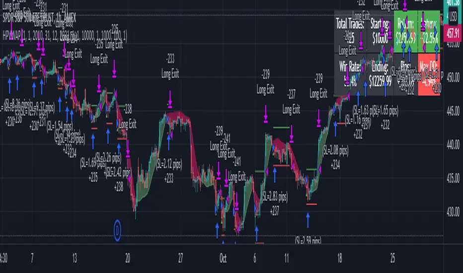
LPB MicroCycles StrategyWhat it is:
We use the Hodrick-Prescott filter applied to the closing price, and then take the outputted trendline and apply a custom vwap, the time frame of which is based on user input, not the default 1 day vwap . Then we go long if the value 2 bars ago is greater then one bar ago. We sell and color the bars and lines when the if the value of 2 bars ago is less than one bar ago.
Also included:
GUI for backtesting
ATR Based Stop Loss
How to use:
Go long when the indicators suggest it, and use the stop losses to reduce risk.
Best if paired with a volatility measurement (inside candles, average true range , bollingerband%B)
在腳本中搜尋"trendline"
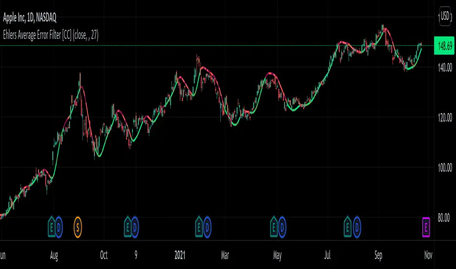
Ehlers Average Error Filter [CC]The Average Error Filter was created by John Ehlers and this is a variation of a Zero Lag Exponential Moving Average that uses a Super Smoother to filter out the noise and then uses a second Super Smoother of the difference between the current price and the filtered data. This works well as a trendline and does give out a few false signals like all indicators inevitably do but most signals do a good job of keeping up with the trend and providing clear entries and exits when the trend changes. I have included strong buy and sell signals in addition to normal ones so like always darker colors are strong signals and lighter colors are normal ones. Buy when the line turns green and sell when it turns red.
Let me know if there are any other scripts you would like to see me publish!
Heatmap Volume ColorBar trial v7FTJR20 This indicator is a heatmap of financial volume by repainting the candlesticks, I use three different ways to define the heatmap separating it into 3 phases:
Phase A: low volume
Phase B: average volume
Phase C: high volume
Don't worry about this data, the trial indicator is configured to auto-interpret the information.
The heat map uses the following colors and specifications
Red = Ultra High Volume
Orange = High volume
Yellow = Average Volume (balance)
Blue = Low volume
White = Volume below average
The heat map compares the phases to identify if it finds a standard deviation over time, that is, it is possible to see a smaller volume with the same red bar as before, because the aggressions are updated in real time.
I also created a trend line moved by the accumulated volume x the average price, there will always be an important zone, where the long/short can defend or not their position.
Tutorial:
1.0 - It is necessary that you have the minimum knowledge of waves, a quick explanation is that the market always works in 5 (1 to 5) or in 3 waves (ABC).
1.1- The Concept: When identifying the 3 wave or the C wave with a red cadle and a spread 2 to 3x larger than the average, mark the bottom and top of this red cadle.
-Note that in the example I marked it and named it "Support 3"
Note 1: Note that I had already marked the "Support 1" line from the moment the asset went down.
This candlestick is important for two reasons, it is a red candlestick with ultra volume and it was the beginning of the bullish impulse, if there was a place for the buyer to defend it was there.
Note 2: We don't know if the top or bottom of the candle was a support or resistance, check, be patient, watch the movement inside this red cadle and what the color of the cadles will be in the movements.
1.2 - see that the market makes several zig zags within our marking, and the color of the cadles turned white and blue (low volumes) someone was acting passively (probably who absorbed the red bar, we don't know yet).
1.3 - see that the price comes very close to the trend line and as it approaches the price drops with an aggression at the end, see that the cadle turned orange, even with the aggression the price goes back up, at this moment we already see that there is someone buying and defending the position.
Note: red, orange and yellow candles are aggressors.
1.4 - In the marking of point , see that the price falls in the region of the orange bar...
*remember, aggression bars are important regions, tick!
Note that the price drops with blue and white bars, breaks the previous bottom without aggression, see that the bars are blue, the seller has been absorbed and the buyer starts to attack.
On this occasion, see how many factors led you to believe that there was institutional defense there, be patient and study the attitudes within the chart.
1.5 - look at point 2 we see the price breaking the trend line,
there was a resistance there was a lot of money, so another red bar, the market from the sequence on the high and stops exactly at the line marked with "support 3", there was a region to protect the operation, my stop is below the red bar near 35k , where there is defense.
1.6 - Sequence market in the move and test the "resistance 1" and feel offer, see the perfection of the corrective zig zag in (ABC) on top of the red bar "the biggest red bar" of that move in point 4.
-see market tests 2x the top of "support 3" and takes the bear out of the game.
1.7 - From point 4 onwards, the market of the bullish sequence with aggression an orange bar and at point 5 we have another red bar, that is, we are close to a new resistance, "resistance 2", at this time the market is above this red bar from point 5, it is still bullish, below it, it may seek the trendline and its breakout may seek the "support 1" line.
- I like your feedback and leave your settings and experiences in the comments.

LT Elliott Wave AddendumLT Elliott Wave Addendum Indicator:
According to Elliott Wave Theory, price moves in 5 waves in the direction of the major trend and moves in 3 waves (ABC) when it moves against the major trend. The key purpose and value of elliott wave theory (EWT) is to provide context for chart analysis. According to the book The Elliott Wave Principle by Frost & Prechter: “This context provides both a basis for disciplined thinking and a perspective on the market's general position and outlook.” The benefit of having context is that one can identify and anticipate changes in direction.
In Elliott Wave theory, waves 1, 3, 5 and C are impulse waves (a five wave pattern that makes progress) whereas waves 2, 4, A and B are corrective waves (a three wave pattern – or combination of three waves - that moves against the direction of the larger trend). Although wave A can also be formed of 5 waves, it is commonly formed of 3 waves. Here is a brief summary of the waves:
Wave 3 tends to be the strongest and most dynamic wave – it is usually (but not always) the longest wave but it is never the shortest. Wave 4 is a corrective wave that is typically composed of 3 smaller waves (ABC) and is notorious for being messy and unpredictable in nature. Wave 5 is the final wave before a significant correction or reversal in trend and is often accompanied by divergences (e.g. negative divergences in an uptrend) and exhaustions in momentum. It is also possible for a wave 5 to form after a “blow-off top” pattern. Wave 2 is composed of 3 smaller waves (ABC) and is a retracement of wave 1 – the retracement can be shallow to moderate (23.6% to 38.2%) or deep (50%, 61.8% to 78.6%). Wave 1 is the first wave of a trend and is composed of 5 smaller waves – it usually occurs after divergences (in the prior move) and extremes in both sentiment and momentum. For example, the wave 1 of an uptrend can often begin after capitulation in the price (after a major decline), extremely pessimistic sentiment, extremely oversold momentum readings, positive divergences and sometimes accompanied by a volume breadth thrust. Waves A and C are often equal in measure. Wave A can be formed of either 5 waves or 3 waves - but more commonly it is composed of 3 waves. Wave B is always corrective and composed of 3 smaller waves. Wave C is a five wave impulse pattern.
The Elliott Wave indicator (and elliott wave addendum) seeks to simplify elliott wave theory (EWT) in that its main purpose is to identify the potential major trends and corrections. The indicator takes a more simple and direct approach to EWT in that it focuses more on trying to identify whether price is trending or not and if so, the probable wave pattern. It does this by mainly using the structure of the price chart and sometimes other factors such as divergences, momentum and the relationship of price to its key averages. The indicator then takes its best guess at whether price is in a trending environment, and if so, which wave it is probably forming. The wave count can therefore depend on the chart timeframe chosen. For example, what may appear as a major downtrend on a lower timeframe chart may potentially be a corrective drop on a much higher timeframe, due to the different price structure of the charts. To keep things simple and to avoid complexity, the indicator does not display the minor sub-waves within the major waves (probably with the exception of wave 4).
The main feature and benefit of the Elliott Wave indicator is that it can remove subjectivity in chart and wave analysis. It also for flexibility in that it allows the chartist to alter the wave count and the position of the wave counts if they choose to do so (within the parameters and rules set by the indicator). As with all of technical analysis, the wave counts shown by the elliott wave indicator are NOT certain – they are only a possibility or a probability. So the risk always exists of an alternative wave count. It is for the chartist to determine the probable wave counts and limit or control the risks based on their knowledge of technical analysis and risk management.
The LT Elliott Wave addendum indicator is meant to be used in combination with the main LT Elliott Waves indicator, so in this sense they supplement each other.
The settings of the LT Elliott Wave Addendum indicator (“EW addendum”) are fairly self-explanatory but here is a brief summary:
The Elliott Wave indicator has options in the settings to change the positions of certain wave counts based on the structure of the chart. This is achieved by choosing the different major and minor structures based on the zigzag patterns of the chart. So the user can alter the positions of certain wave counts (if needed) by modifying the zigzag structure on the chart.
The lookback period in the settings can be increased (or decreased) to include more data on the chart, when needed. In the majority of situations the lookback period can remain at the default setting of 200 bars – but the user can decide to take into account more (or less) data by changing the lookback period to 300 (or 100 if less data is required).
In the elliott wave addendum indicator, the most recent probable ABC waves are shown in pink and the probable 123 wave counts are shown in dark blue. The position of the wave counts can be changed and modified to a reasonable degree in the settings.
In certain circumstances where there are volatile conditions and charts, it is possible that the elliott wave addendum indicator may show an “unusual” wave count. For example, it is possible that the positions of certain wave counts (such as waves 1, 2, 3 and 5) may be in the “wrong” order. This happens rarely so it is not an issue that happens very often. However, if this issue occurs, the chartist can rectify the matter by first increasing the lookback period (e.g. to 300) to see if this resolves the issue. If it does not, then Alt9 “temporary wave shift” in the elliott wave addendum (EW addendum) can be enabled as this can usually resolve the issue and show the wave counts in a “proper” manner. Changing to a slightly lower timeframe can also usually resolve this issue. If Alt9 is enabled, care should be taken to unselect this option at a later date (as it is only a temporary solution).
The aggressive wave count setting (called “Aggressive 123”) is mainly for the addendum of the elliott wave indicator (i.e. EW addendum). Enabling this option can often change the wave count from an ABC to a 123 provided this is permitted by the parameters of the indicator. For example, if the elliott wave addendum indicator is showing an ABC wave count, it may be possible to change this wave count to a 123 wave count by enabling the “Aggressive 123” setting in the indicator. The other option is to change the wave count at the very top of the settings (where it says “Change recent ABC to 123”). This option as well as others are included for further flexibility in the wave count.
The user can also choose to enable the zigzags of the waves to be shown on the chart. This can display the minor and major wave structures and zigzags, if enabled. By default, it is set to off.
It may also be a good idea to reset the settings of the indicators whenever a new chart or timeframe is chosen. This then refreshes the settings back to its default.
It is important to appreciate that the elliott wave indicator generally requires between 1,500 to 2000 bars of data on the chart in order to display the wave counts adequately and appropriately. So if a chart or timeframe has less than the minimum number of historical data or bars on the chart, the wave counts may not display properly or not appear at all. Certain chart symbols and timeframes (such as the monthly timeframe) may have very limited amount of data on them. Therefore, the elliott wave indicator will likely not appear on these charts or may not display properly. In these situations, a different chart symbol or a lower timeframe with more data on it can be chosen. For example, instead of a monthly timeframe, a weekly or daily timeframe can be chosen.
The Elliott Wave Addendum indicator (“EW Addendum”) displays the most recent and “immediate” probable wave counts – usually after a potential wave 3 or a wave 5 of the main elliott wave indicator (i.e. LT Elliott Waves). So in this sense the EW addendum is more short term in that it focuses on the most recent price action (e.g. after a wave 5) in what may be either a possible corrective pattern (ABC) or the development of a potential new trend (123).
For example, let’s say the price has been trending up and we are seeing a probable wave 5 in the main elliott wave indicator (LT Elliott Waves), and then the price starts to reverse lower. The decline in price could either be an ABC correction or it may possibly be the beginning of a reversal or downtrend. The elliott wave addendum indicator (EW addendum) starts by showing the probable waves A, B and C of a correction (shown in pink). The EW addendum waits for the structure of the chart to develop before making its best guess at what may be an ABC pattern. However, if the price action begins to break support levels and the probability of a downward trend increases, then the wave count may change from ABC to 123 (shown in dark blue). The same principle can apply in the opposite direction: if the price has been trending down in a likely wave 5 and then suddenly price begins to reverse and move higher, at first we may see a potential ABC corrective pattern on the EW addendum indicator. However, if price continues to move up by a certain degree and break resistance levels the wave count may change on the EW addendum to a probable 123 uptrend.
The reason for why the possible ABC wave count may change to a possible 123 trending wave count is because the elliott wave indicator is programmed to look for and identify potential trending patterns (as well as corrective patterns). In this sense, we are looking to simplify elliott wave theory by taking a more flexible and common-sense approach to the wave patterns. So if the price action has broken key levels of support or resistance, momentum is increasing and price is moving deliberately in a specific direction, it becomes more likely that price is in a trending environment (rather than just a correction).
If the main elliott wave indicator (i.e. LT Elliott Waves) is showing a probable wave 3, and price begins to pullback or move in the opposite direction to the main trend of the wave 3, the EW addendum may be used to display the probable ABC wave counts. These ABC wave counts could be for the likely wave 4 correction. However, if price starts to break key support levels (e.g. after an uptrend) and then reverse lower in the opposite direction (to the mentioned wave 3), then it is likely that the main indicator will change the wave count from a wave 3 to a wave 5. This can indicate that the main uptrend may have probably ended and that we are in either a large correction or a trend reversal, as shown by the EW addendum. This example can also apply in reverse for downtrends (e.g. if price starts to break resistance levels and move higher after a downtrend).
We have allowed for further flexibility in the main elliott wave indicator (LT Elliott Waves) – including the EW addendum – so that the user can change the wave counts from a 123 to ABC (or vice versa) if they choose to do so. For example, if the EW addendum is showing a probable 123 wave count (in dark blue), the chartist can choose to change the wave counts to an ABC wave count from within the settings. Please allow up to minute or more for the change to take place as it can sometimes take some time for the modification to take effect.
The position of the wave counts (ABC or 123) can be changed as well to a reasonable degree. In the settings of the EW addendum the positions of the wave counts can be changed by applying Alt3 or by modifying the minor or major structure of the waves (or zigzags). There is also the option to modify or move the position of wave 2 (or Wave B) in Alt2 of the indicator. Please allow up to a minute or more for the change to take place as it can sometimes take some time for the modification to take effect.
The EW addendum indicator also has the option to show a probable projection for wave 4 by enabling this in the settings. This does not mean that the price has to move in the direction of that “wave 4” projection, but it is merely a guide on the basis of probabilities. The chartist can apply other methods of chart analysis – such as trendline breaks, oscillators, regression channels, breaks of support/resistance – to determine when a probable wave 4 has likely completed. However, confirmation that the probable wave 4 has completed will not come until price has taken out the highs prior to the decline (i.e. the highs before the pullback in the probable “wave 4” correction). The same applies in reverse for a downtrend: confirmation that the probable wave 4 has completed will not come until price has taken out the lows prior to the rally (in a probable wave 4 correction).
Here is a brief summary of the “aggressive 123” option in the EW addendum settings: the aggressive wave count setting is mainly for the EW addendum. Enabling this option can often change the wave count from an ABC to a 123 provided this is permitted by the parameters of the indicator. For example, if the elliott wave addendum indicator is showing an ABC wave count, it may be possible to change this wave count to a 123 wave count by enabling the “Aggressive 123” setting in the indicator. The other option is to change the wave count at the very top of the settings (where it says “Change recent ABC to 123”). This option as well as others are included for further flexibility in the wave count.
It should be remembered that the appearance of the most recent wave counts (or wave labels) shown by the indicator, by themselves do NOT mean that the specific waves in question have definitely completed or finished. Nothing in chart analysis is certain or definite. The wave label itself is simply an indication that the most recent wave is probably still in progress, not necessarily that it has completed. Chartists can apply other technical analysis tools and methods (e.g. trend lines, support/resistance breaks, moving averages and regression channels etc.) to increase the probability of when a specific wave has probably completed. The same also applies to past or “completed” wave counts (or past wave labels): they do NOT mean that the specific waves have definitely completed or finished – it is merely a possibility or probability. So the risk always exists that the wave counts may potentially be wrong, and that an alternative wave count interpretation may exist.
Price action, markets and their charts are non-linear and chaotic, which means that they are subject to uncertainty, variable change and being unpredictable in nature. So we must maintain a probabilistic mindset and attitude to technical analysis. Nothing is certain. Therefore, no wave count is certain or “set in stone”. Wave counts, just like the actions and emotions of human beings, are subject to change. Elliott Wave theory, just like all of technical analysis is about what is possible, what is probable and what the risks are of a particular outcome. The advantage of elliott wave theory, as explained previously, is about gaining an understanding of context and the likely big picture. The indicator is provided in good faith but we do not vouch for its accuracy.
As mentioned previously, chartists should be aware of the probabilistic and uncertain nature of price action and the markets, and therefore prepare to limit and control any potential risks.
The indicator can be used on the charts of the majority of markets (e.g. stocks, indices, ETFs, currencies, cryptocurrencies, precious metals, commodities etc.) and any timeframe. Nothing in this indicator, its signals or labels should be construed as a recommendation to buy or sell any market (e.g. stocks, securities, indices, ETFs, currencies, cryptocurrencies, metals, commodities etc.). The indicator is provided solely for educational purposes, to gain a better understanding of technical analysis and elliott wave theory. It should be noted that the degree of noise and randomness increases significantly on lower timeframes. So the lower the timeframe that is chosen (e.g. 15-min or lower) the greater the degree of noise and randomness and therefore the higher the frequency of false signals or whipsaws. The indicator can be applied to candlestick charts and bar charts.
If you would like access, please send me a PM on Tradingview.

Bitcoin Indicator AThe Bitcoin Indicator was developed especially for high leverage Bitcoin trading. It comes in two parts; Bitcoin Indicator A/B. Indicator A paints the Trendline, Trend Cloud and the Signals. The signals come from 3 different built in strategies.
The strategies named as "Continuation", "Trend Check" and "Pump&Dump". Colors can be changed manually so you can easily make a difference between the strategies when a signal appears. All of them look for trend continuation entries in oversold/ bought areas. There are several criteria in each strategy. Once all of them meet the signal gets triggered.
In settings you can set "Sensitivity" and "Strength" for each strategy. "Sensitivity" affects to the oversold/ bought areas while "Strength" affects to other conditions. Playing around with the values will change the amount of the signals on the chart. The less with better accuracy the better. You have to set the signals to your current chart from time to time.
For example: If you want to trade the signals the first thing is changing "Sensitivity" & "Strength" as long as the signals are pretty accurate on the chart. This way you can assume the next few signals can be traded, too. Check the Trend Cloud if it's wide and shows a strong trend. If so, you can wait for the signal. Once it's appears check Bitcoin Indicator B as a last confirmation before your trade. You can read more about the usage of the Indicator B at it's description.
These are entry signals. For exit you can use support/ resistance levels, previous high/ low or signs of trend change by analising the Trend Cloud and Indicator B.
There are alert options for literally everything.
The Bitcoin Indicator can be used on any timeframe. Also there are several strategies you can apply. Above mentioned is only one of many. For the other strategies you can read the Bitcoin Indicator user guide once you got access. For more information please go to the website.

CRYPTO TRADING BOT - 1min SCALPING LONG/SHORTHOW IT WORKS
The core concept behind the script is the determination of the current market mood in sense of creating a trendline indicator using EMA / SMA .
By using this trend indication alongside RSI / MACD value range, we are able to enter/exit the market in both directions: LONG and SHORT .
In case of confirmed false signals, we try to catch up the next good opportunity to minimise loss and to close the current trade.
If the chance for a good countertrade is given at this point, the market is going to be entered reversely.
Should the market move incredibly fast against our trade direction, we use proven Stop-loss targets, to bring our children into safety.
As many others, we could tell you now, that we used state-of-the-art machine learning algorithms
as well as highly sophisticated methods to gain our results.
As a fact, we started with an idea, using simple and common trading tools/indicators,
as a solid ground. We did not want to reinvent the wheel and it paid off.
GET A WORKING SCRIPT
The algorithm we are using has initially been created with a self-developed backtesting software.
To be able to deliver gas to our engine, we have bought a huge amount of OHLCV data for the 1min chart.
After many exhausting and frustrating weeks of our workflow-rotation (develop, fail, fix, test, repeat)
we finally got confirmation for all of our conditions/expectations, so we translated our algorithm into pine-code.
THE RESULTS
Since we have been using our Pine-Strategy alongside our backtesting software , we checked all the results provided by TradingView
and our tool to be 100% sure every outcome, every entry and every exit is exactly the same.
We did this for several months and since 2021 June we have been using it with real Alerts, coped to our binance account.
Below, you will find how the performance for the previous months looked like (every trade was made with 100% of the capital, of course using proper stop loss and take profit):
September 2020: 15.18%
October 2020: 36.17%
November 2020: 15.12%
December 2020: 48.58%
January 2021: 150.10%
February 2021: 45.96%
March 2021: 46.48%
April 2021: 4.96%
May 2021: 43.48%
June 2021: -28.99%
Juli 2021: 15.63%
August 2021 (so far): 11.57%
Accumulated Profit: 1,979.01%
To prove our results, we will link an excel sheet for every trade that was made within this timerange.
Link: docs.google.com
ABOUT US
We are two good friends, both incredibly interested in mathematics, software engineering, AI and algorithmics. After getting introduced into the crypto space
by a common friend, we started figuring out that there is a pattern behind every big or small move which happens in an asset.
This is where the passion for creating a CRYPTO TRADING BOT began. It was our goal, to create this script for the 1min Timeframe, so the software can react quickly when a
big or small move is happening - this is why it is called a SCALPING SCRIPT .
We are incredibly proud of this script and would like to share it with this amazing community - just hit us up on TradingView!
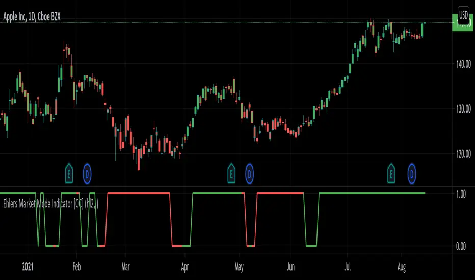
Ehlers Market Mode Indicator [CC]The Market Mode Indicator was created by John Ehlers (Rocket Science For Traders pgs 114-117) and this is a handy tool that will tell you if the market is currently in a cycle or a trend. When the current market is in a cycle or choppy state then the indicator will read 0 and when it is in a trend then it will read 1. He uses some advanced digital signal processing to figure out the current trend and for how long it has been trending. I have included buy and sell signals using the trendline and so buy when the line turns green and sell when it turns red. Let me know if this indicator is useful for you.
Let me know if there are any other indicators you would like to see me publish!
NIMBLE INVESTOR INDICATOR My indicators are based on market momentum (follow the trend), meaning if your trading strategy is based on momentum then it will fit with this indicator. If your strategy is based on buying dips and this is not the one. First of all, there are few basic technical analyses you need to understand before using this indicator: market structure, trend line, support and resistance.
1) IDENTIFY TREND:
You need to draw a line to identify the trend, in this case, it keeps on creating new lower high and lower low. What we are looking for is selling opportunities, we want to enter a trade when the market trying to push up but fail to create a new higher high.
2) APPLY INDICATOR:
When you apply the indicator to the chart it will look like this, the purple line is a moving average it also helps you to identify direction. When the price is below then you are looking for a sell (vice versa). Plus if the price is moving above the line but the trend is still a downward trend, do not look for a buy entry unless you’re advanced and understand about reversal. (MARKET TREND IS YOUR FRIEND).
3) COLOR FILTER:
The darker the red colours it will show strongly the momentum in price pushing down when the red colours became lighter meaning it running of momentum pushing the price and could change direction. Hints for reversal traders, if you think the market will change direction look for a weak momentum with a rejection candlesticks pattern.
4) A valid entry will require 3 things:
- Trendline
- Price below the purple line
- Momentum (background color red/green)

BT CloudBT Cloud is a trading system with an advanced chart overlay showing a very reliable Trend Indicator based off Price, Trend, Momentum, and Market Structure.
Inspired by the Ichimoku Cloud, Parabolic SAR, and Exponential Moving Averages the BT Cloud removes the unnecessary fluff and focuses on the Golden Zone 0.618 to 0.50 Levels on the current time frame for typical RSI length (14) settings.
User should pay attention to where the cloud reverses directions. These areas are 50% ranges of significance and have a high chance of acting like target zones for support and resistance in the future.
This indicator will allow the user to make observations around how extended the trends against each other as well as serving as basis for divergence and trendline studies drawn in manually by the user. The oscillator will turn green/red as observable on the main chart overlay.

Ehlers 3 Pole Super Smoother Filter [CC]The 3 Pole Super Smoother Filter was created by John Ehlers and this is an oldie but a goodie. A great moving average that clearly shows a good trendline and so buy when the line turns green and sell when it turns red.
Let me know if there are any other indicators you want me to publish!

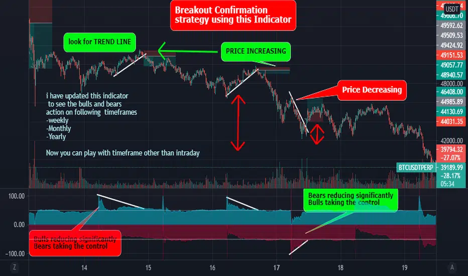
Best Bulls Bears Volume trend Breakout V2 [badshah_e_alam]This is a intraday indicator. Only to be used on timeframe less than daily charts.
This indicator purely uses volume to plot the graph. The indicator helps in conforming a breakout strategy.
This indicator is advanced version of my previously developed indicator you can check this link
Total volume is made up of buying volume and selling volume . Buying volume is the number of shares, contracts, or lots that were associated with green bars, and selling volume is the number that were associated with red bars.
The labels on the right side are the current bar value and that days bulls /bears weightage.
the first value shows the current bar volume.
second value show the bulls weight in %
third value show the bears weightage throughout the day ( %)
The Blue plot in graph keeps the track of bulls movement in intraday( %)
The Red plot in graph keeps the track of bears movement in intraday ( %)
X axis is time.
Y axis ranges from 100 to -100
I use 1:2 risk to reward ratio. Do your own research.
**not a financial advice**
Example of price increasing, volume decreasing
this indicator can be used for confirming a breakout strategy with bulls or bears in action. In the current example, the buyer’s volume percentage is reducing and the price is increasing throughout the day. Hence a breakout of the trendline is confirmation of a short trade.
Example of Price reducing, volume decreasing
example of price moving down , bears losing the grip
Example of price decreasing volume increasing
Thanks to nizar9599 for giving idea to improve my previous indicator.
DISCLAIMER
Any and all liability for risks resulting from investment transactions or other asset dispositions carried out by the user based on information received or a market analysis is expressly excluded by me.
All the information made available here is generally provided to serve as an example only, without obligation and without specific recommendations for action. It does not constitute and cannot replace investment advice. We therefore recommend that you contact your personal financial advisor before carrying out specific transactions and investments.
Do your own research, This is not a financial advice.
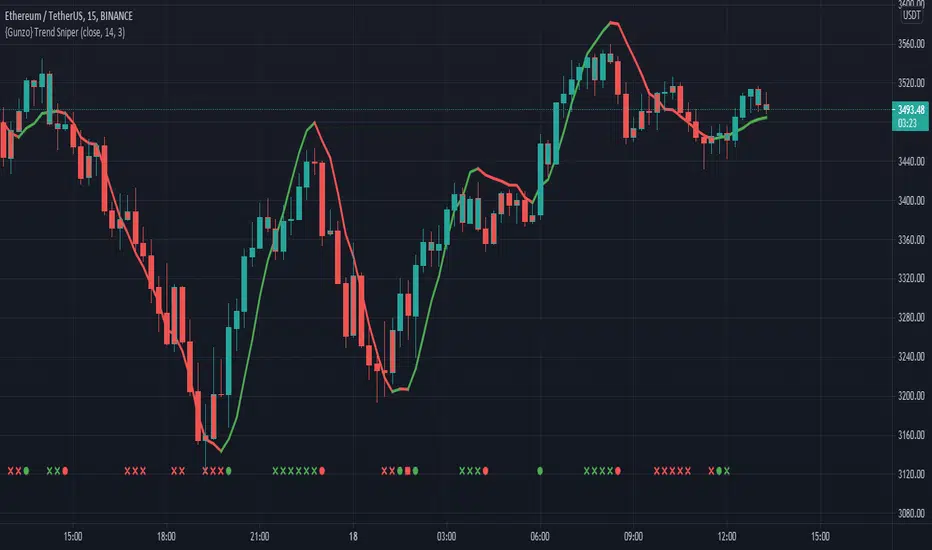
{Gunzo} Trend Sniper (WMA with coefficient)Trend Sniper is a trend-following indicator that sticks closer to the trend than others moving averages as it is using an upgraded weighted moving average implementation.
OVERVIEW :
It is typical to use a moving average indicator (SMA, EMA, WMA or TMA) to identify the trend of an asset. Standard moving averages indicators smooth the price and doesn’t stick very closely to the actual price, showing potential lagging information.
CALCULATION :
In order to have a trendline that sticks to the price, we are going to use a weighted moving average as it puts more weight on recent candles and less on past candles. The weight is usually calculated using the distance from current candle to the other candles used in the calculation. We have the following formula for the standard calculation as implemented in TradingView :
WMA_standard = (Price1 * Weight1 + …… + PriceN * WeightN)) / (Weight1 + …… + WeightN)
This “Trend Sniper” indicator uses an additional coefficient to alter even more the weight of each candle.
WMA_with_coefficient = (Price1 * (Weight1 - Coefficient) + …… + PriceN * (WeightN - Coefficient)) / ((Weight1 - Coefficient) + …… + (WeightN - Coefficient))
SETTINGS :
MA source : Source used for moving average calculation (ex : “close”)
MA length : Length of the moving average. Higher values will give a smoother line, lower values will give a more reactive line.
Use extra smoothing : Enable/disable usage of a EMA to extra smooth the line curve. If activated the indicator may be lagging, but it will also avoid many false buy/sell signals.
MA extra smoothing length : Length of the moving average of the extra smoothing.
Change candle colors : Enable/disable painting the candles of the chart with the colors of the weighted moving average.
Display buy/sell signals : Display buy/sell signals (circles) when the moving average is changing direction
VISUALIZATIONS :
This indicator has 3 possible visualizations :
Moving Average line : the line represents the weighted moving average that is following the price of the asset, when the line goes up we are in a uptrend (green line) when the line goes down we are in a downtrend (red line).
Candle coloring : the color of the moving average line can be applied to the candles of the chart for better readability.
Signals : Buy/Sell signals can be displayed at the bottom of the chart
USAGE :
This indicator can help analyze the trend directional changes :
First of all, if the moving average line is under the price (or above the price), then we can assume that the uptrend is strong (or downtrend is strong).
If the current candle crosses the moving average line, it is the first sign that the trend is weakening and possibly starting to revert.
If the weighted moving average is changing direction, then the trend change is confirmed and the color of the line changes
[KG] Intraday Key LevelsKey Level indicator is design to calculate potential Key Level which may act as Intraday Support or Resistance
Price is expected to bounce from these levels before break (or may not break at all)
There's 2 options in the indicator's setting:-
OPTION 1) Show Key Levels - Use this option for planning purposes.. Only use this before market open. Turn off this option when price is in motion.
-There are few lines.. GREEN, YELLOW and RED. Manually draw horizontal lines based on these lines and turn it off once done with planning.
-GREEN Line is intraday support, RED line is intraday resistance.
-YELLOW line will determine intraday BULLISH or BEARISH Bias.
-If price above and stay above YELLOW line, intraday bias will be BULLISH and it price stay below YELLOW line, intraday bias will be BEARISH.
Example of use case:-
1) If price open between YELLOW and RED, we will GO LONG if price bounce from YELLOW line and GO SHORT if price bounce from RED line.
2) We can also Short from RED line if price open near and below the RED (Resistance) line and Take profit when price bounce from YELLOW line.
3) If price open between YELLOW and GREEN, we will GO SHORT if price bounce from YELLOW line and GO LONG if price bounce from GREEN line.
4) We can also LONG from GREEN line if price open near and above the GREEN line (support) and Take profit when price bounce from YELLOW line.
OPTION 2) Show Trend - Use this option when to manage your trade.
- This option will draw all Key EMA and Trend Lines. Use trendline or EMA line as an indicator to hold onto your position until trend change.
Note: Best use with FiFT indicator during active session.

Moritsz's Customized RSIBasically just your standard RSI with a twist. Key differences:
1. Overbought and Oversold levels are moved to a higher and lower level following the nature of cryptocurrency.
2. Added a middle trendline at 50. Above is usually an uptrend, below is a downtrend.
3. Better looking than your typical RSI.
4. Nice pretty colors to please your eyes :)
Enjoy.

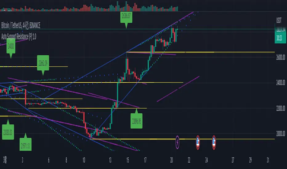
Auto Support Resistance [WS]This is paid version.
If you wanna use free version
This show support line, and resistance line.
moderately! and beautiful way!
also proper trend line .
you cannot see source code, but it doesnt have any secret formula.
It use just pivot function.
( i just wanna keep my design tech. )
it has 3 type line.
1. horizontal. yellow. default pivot size is 15
2. connection of top(peak, blue). pivot size 10
3. connection of bottom(green). pivot size 10
you can change pivot size.
it has one speical option about volume .
if the bottom has too small volume , it cannot be starting point.
if you want every bottom can be starting point, you can turn off the option.
each point has name like H6, G8.
this name help you to talk with someone about the point, sharing the infomation.
that name is base on the time of candle (it mean it is not randome). so in your friend chart(screen), the point has same name.
=========================================
한글 설명.
이 지표는 유료버전입니다.
무료버전은 위의 그림을 누르시면 됩니다.
아름답게 절제된, 그리고 적절한 추세선들을 자동으로 보여줍니다!!!
소스코드를 볼 수 없지만, 추세선을 결정하는 비밀 수식 같은 것은 없습니다.
오직 pivot피봇 함수만을 사용하여 고점과 저점을 찾고 있습니다.
선은 3가지가 있습니다.
1. 고점을 연결한 선. 파란색. 기본 피봇 10
2. 저점을 연결한 선. 녹색. 피봇 10
3. 고점 또는 저점의 수평선. 노란색. 피봇 15
특별한 기능이 하나 있는데, 볼륨이 낮은 저점은 녹색선의 시작점이 되지 못하게 하는 기능입니다.
이 기능은 옵션에서 끄거나, 정도를 조절할 수 있습니다.
각 고점 저점은 H4, G8 같은 이름을 가지고 있습니다.
이 이름은 여러분이 차트분석을 올리거나 친구와 차트에 대해 대화를 나눌 때 유용하게 쓰일 수 있습니다.
이 이름은 캔들의 시간값을 이용하며 (무작위로 지어진게 아니라는 의미), 그래서 친구의(모두의) 화면에서 같은 이름을 보여줍니다.
점선은 확장선이며, 기본은 30, 최대 55까지 늘릴 수 있습니다.
(너무 늘리면 화면이 복잡해집니다.)
가장 최근의 고점과 저점 수평선은 무한대의 길이를 가집니다.
그 외의 수평선은 적당한 길이로 조절되어 출력됩니다.
간혹 3개의 선으로 나뉘어 보이거나 투명도가 변하곤 하는데 이는 특별한 의미를 보이려는 것이 아닙니다. 트레이딩뷰 파인스크립트의 한계로 인한 현상입니다.
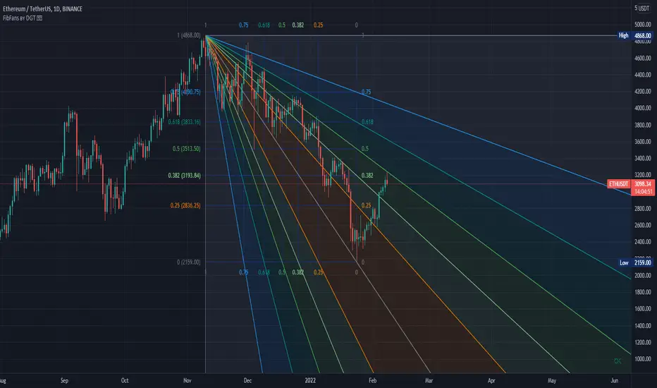
Auto Fib Speed Resistance Fans by DGTFibonacci Speed and Resistance Fan is an analytical drawing tool used to indicate the support and resistance levels of an existing trend and the price level at which possible changes in the trend may occur.
A Fibonacci Speed Resistance Fan consists of a trend line drawn between two extreme points - a trough and opposing peak or a peak and opposing trough - on which a set of sequential speed resistance lines are drawn above (which represents time) and below (which represents price). These lines are drawn based on time/price percentages of the distance between the beginning and the end of the trend line.
Speed resistance lines not only help to measure trend corrections but also measure the speed of a trend (the rate at which a trendline ascends or descends)
Traders can use the lines of the Fibonacci Speed and Resistance Fan to predict key points of resistance or support, at which they might expect price trends to reverse. Once a trader identifies patterns within a chart, they can use those patterns to predict future price movements and future levels of support and resistance. Traders use the predictions to time their trades. Key support and resistance levels tend to occur frequently at the 61.8-percent level on both uptrends and downtrends.
Please check for further details in the education post that I will share shortly after this publication :
Nobody appears to know whether Fibonacci tools work because markets exhibit some form of natural pattern or because many investors use Fibonacci ratios to predict price movements, making them a self-fulfilling prophecy.
█ Study OPTIONS
Auto Fibonacci Speed and Resistance Fan , the main aim of the study
- Pivot threshold can be adjusted via “Deviation” and “Depth” input options
- Historical Fans option will allow plotting of Speed and Resistance Fans on previous pivot high/lows
- Ability to set ALERTs for the Speed and Resistance Levels
- Price Grid Lines if extended it will result with Fib Retracement levels
- All lines, line levels are customizable, default values are set exactly to the same with the available Fib Speed and Resistance Fan drawing tool
Zig Zag – Derived from build-in Auto Fib Retracement with some customization options.
Example Usages :
Disclaimer :
Trading success is all about following your trading strategy and the indicators should fit within your trading strategy, and not to be traded upon solely
The script is for informational and educational purposes only. Use of the script does not constitute professional and/or financial advice. You alone have the sole responsibility of evaluating the script output and risks associated with the use of the script. In exchange for using the script, you agree not to hold dgtrd TradingView user liable for any possible claim for damages arising from any decision you make based on use of the script
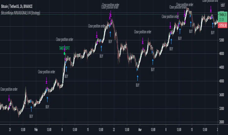
BitcoinNinjas NINJASIGNALS V4 (Script)BitcoinNinjas NINJASIGNALS V4 (Script)
(for Cryptocurrencies, Forex, GunBot, ProfitTrailer, Autoview, CryptoHopper, manual or automated trading, and more)
This is version 4 of our Ninja Signals trading script, with accompanying backtesting strategy.
BitcoinNinjas NINJASIGNALS V4 (Strategy)
•Allows users to easily set automated buy/long and sell/short alerts on TradingView for use with automatic and manual trading of cryptocurrencies, Forex securities, and more (alerts are compatible with automatic trading software such as GunBot, ProfitTrailer, Autoview, CryptoHopper, and more).
•Synthesizes many powerful indicators [e.g., Relative Strength Index (RSI), Stochastic RSI, Money Flow Index (MFI), Moving Average Convergence Divergence (MACD), etc.) into one powerful script to generate very precise buy and sell signals in virtually all market conditions.
•Features user-defined adjustable calibration settings, allowing traders to customize the script to fit any currency / security on any exchange available through TradingView.com, simply by adjusting settings.
•Buy/Long arrows, Sell/Short arrows, & EMA trendline can be customized or hidden, if desired.
•Complete with backtesting strategy version of script which allows users to test various trading strategies based on the alerts the script generates (see information and screenshots below).
•Backtesting strategy features a user-defined adjustable date range, so traders can estimate performance of the script over specific periods of time, such as the last week, month, or year.
•Script and backtesting strategy feature many user-adjustable settings including stop loss and take profit alerts, an ‘only sell for profit’ option (Gunbot-specific), many different buy and sell filters, and more. Simply adjust the script settings and the backtesting results will automatically refresh.
•Backtesting strategy allows for pyramid buying to test various average down / dollar cost average trading strategies. Simply adjust the number of pyramid buys and the quantity of each buy.
•Fully compatible with margin and futures trading for any currency / security on TradingView.com.
DISCLAIMER: By using our BitcoinNinjas ‘Ninja Signals’ planning script, you agree to the BitcoinNinjas 'Terms of Use'. No sharing, copying, reselling, modifying, or any other forms of use are authorized for our documents, script / strategy, and the information published with them. This informational planning script / strategy is strictly for individual use and educational purposes only. This is not financial or investment advice. Investments are always made at your own risk and are based on your personal judgement. BitcoinNinjas is not responsible for any losses you may incur. Please invest wisely.

BitcoinNinjas NINJASIGNALS V4 (Strategy)BitcoinNinjas NINJASIGNALS V4 (Strategy)
(for Cryptocurrencies, Forex, GunBot, ProfitTrailer, Autoview, CryptoHopper, manual or automated trading, and more)
This is version 4 of our Ninja Signals trading script, with accompanying backtesting strategy.
BitcoinNinjas NINJASIGNALS V4 (Script)
•Allows users to easily set automated buy/long and sell/short alerts on TradingView for use with automatic and manual trading of cryptocurrencies, Forex securities, and more (alerts are compatible with automatic trading software such as GunBot, ProfitTrailer, Autoview, CryptoHopper, and more).
•Synthesizes many powerful indicators [e.g., Relative Strength Index (RSI), Stochastic RSI, Money Flow Index (MFI), Moving Average Convergence Divergence (MACD), etc.) into one powerful script to generate very precise buy and sell signals in virtually all market conditions.
•Features user-defined adjustable calibration settings, allowing traders to customize the script to fit any currency / security on any exchange available through TradingView.com, simply by adjusting settings.
•Buy/Long arrows, Sell/Short arrows, & EMA trendline can be customized or hidden, if desired.
•Complete with backtesting strategy version of script which allows users to test various trading strategies based on the alerts the script generates (see information and screenshots below).
•Backtesting strategy features a user-defined adjustable date range, so traders can estimate performance of the script over specific periods of time, such as the last week, month, or year.
•Script and backtesting strategy feature many user-adjustable settings including stop loss and take profit alerts, an ‘only sell for profit’ option (Gunbot-specific), many different buy and sell filters, and more. Simply adjust the script settings and the backtesting results will automatically refresh.
•Backtesting strategy allows for pyramid buying to test various average down / dollar cost average trading strategies. Simply adjust the number of pyramid buys and the quantity of each buy.
•Fully compatible with margin and futures trading for any currency / security on TradingView.com.
DISCLAIMER: By using our BitcoinNinjas ‘Ninja Signals’ planning script, you agree to the BitcoinNinjas 'Terms of Use'. No sharing, copying, reselling, modifying, or any other forms of use are authorized for our documents, script / strategy, and the information published with them. This informational planning script / strategy is strictly for individual use and educational purposes only. This is not financial or investment advice. Investments are always made at your own risk and are based on your personal judgement. BitcoinNinjas is not responsible for any losses you may incur. Please invest wisely.
Volume Weighted Directional BiasThis indicator uses a series of five volume weighted moving averages cast out in successive powers of three to calculate a value which expresses the direction and momentum of a trend. It can be used as a contrary indicator to identify waning momentum at the top or bottom of a rally or selloff. It can be used to identify trendline divergence. It can also be used for trend confirmation.
The length of the moving averages can be changed in the indicator inputs, but each should be longer than the previous.
The problem with most trend indicators is that they are either too lagging or too noisy. This indicator seeks to combine smoothed data and a long lookback period with an exponentially forward weighted calculation, making it still very responsive to market changes without too much signal noise.

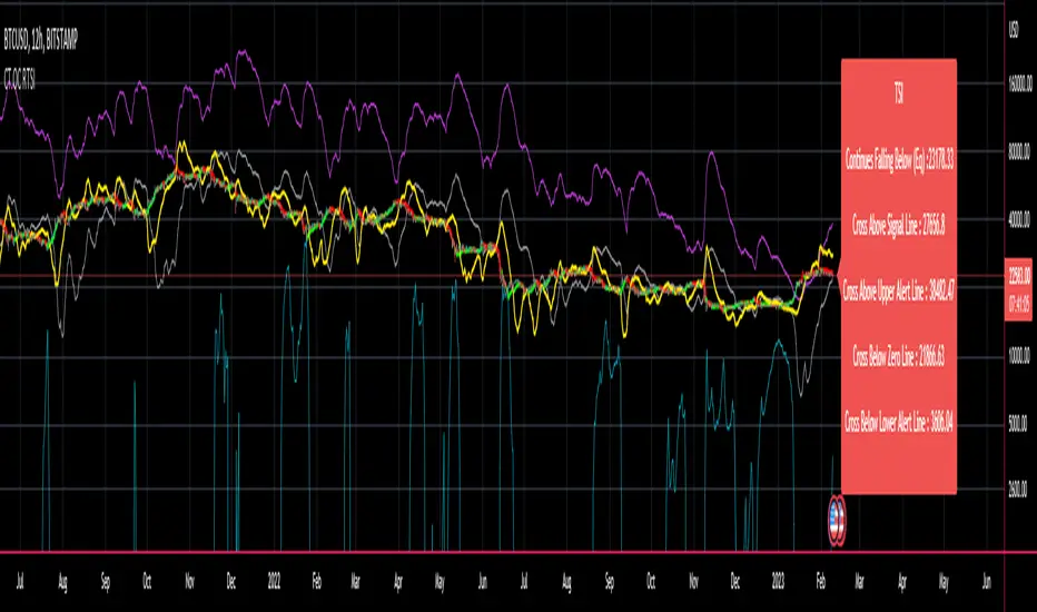
CT Reverse True Strength Indicator On ChartIntroducing the Caretakers “On Chart” Reverse True Strength Index.
According to Wikipedia….
“The True Strength Index (TSI) is a technical indicator used in the analysis of financial markets that attempts to show both trend direction and overbought/oversold conditions. It was first published William Blau in 1991.
The indicator uses moving averages of the underlying momentum of a financial instrument.
Momentum is considered a leading indicator of price movements, and a moving average characteristically lags behind price.
The TSI combines these characteristics to create an indication of price and direction more in sync with market turns than either momentum or moving average.”
The TSI has a normal range of values between +100 and -100.
Traditionally traders and analysts will consider:
Positives values above 25 to indicate an “overbought” condition
Negative values below -25 to indicate an “oversold” condition
I have reverse engineered the True Strength Index formula to derive 2 new functions.
1) The reverse TSI function is dual purpose which can be used to calculate….
The chart price at which the TSI will reach a particular TSI scale value.
The chart price at which the TSI will equal its previous value.
2) The reverse TSI signal cross function can be used to calculate the chart price at which the TSI will cross its signal line.
I have employed these functions here to return the price levels where the True Strength Index would equal :
Upper alert level ( default 25 )
Zero-Line
Lower alert level ( default -25 )
Previous TSI (eq) value
TSI signal line
In this “On Chart” version of the reverse True Strength Index the crossover levels are displayed both as lines on the chart and via an optional info-box with choice of user selected info.
Chart Line Colors
Upper alert level... ( Fuchsia )
Zero-Line............ ( White )
Lower alert level... ( Aqua )
TSI (eq)...............( TSI (eq) > close..Orange, TSI (eq) < close..Lime )
TSI signal line........( Signal Cross Line > Close..Aqua, Signal Cross Line < Close..Fuchsia )
How to interpret the displayed prices returned from the TSI scale zero line and upper and lower alert levels.
Closing exactly at the given price will cause the True Strength Index value to equal the scale value.
Closing above the given price will cause the True Strength Index to cross above the scale value.
Closing below the given price will cause the True Strength Index to cross below the scale value.
How to interpret the displayed price returned from the TSI (eq)
Closing exactly at the price will cause the True Strength Index value to equal the previous TSI value.
Closing above the price will cause the True Strength Index value to increase.
Closing below the price will cause the True Strength Index value to decrease.
How to interpret the displayed price returned from the TSI signal line crossover.
Closing exactly at the given price will cause the True Strength Index value to equal the signal line.
Closing above the given price will cause the True Strength Index to cross above the signal line.
Closing below the given price will cause the True Strength Index to cross below the signal line.
Common methods to derive signals from the TSI :
Zero-line crossovers
When the CMO crosses above the zero-line, a buy signal is generated.
When the CMO crosses below the zero-line, a sell signal is generated.
“Overbought” and “Oversold” crossovers
When the SMI crosses below -25 and then moves back above it, a buy signal is generated.
When the SMI crosses above +25 and then moves back below it, a sell signal is generated.
What Does the True Strength Index (TSI) Tell You?
The indicator is primarily used to identify overbought and oversold conditions in an asset's price, spot divergence, identify trend direction and changes via the zero-line, and highlight short-term price momentum with signal line crossovers.
Since the TSI is based on price movements, oversold and overbought levels will vary by the asset being traded. Some stocks may reach +30 and -30 before tending to see price reversals, while another stock may reverse near +20 and -20.
Mark extreme TSI levels, on the asset being traded, to see where overbought and oversold is. Being oversold doesn't necessarily mean it is time to buy, and when an asset is overbought it doesn't necessarily mean it is time to sell. Traders will typically watch for other signals to trigger a trade decision. For example, they may wait for the price or TSI to start dropping before selling in overbought territory. Alternatively, they may wait for a signal line crossover.
Signal Line Crossovers
The true strength index has a signal line, which is usually a seven- to 13-period EMA of the TSI line. A signal line crossover occurs when the TSI line crosses the signal line. When the TSI crosses above the signal line from below, that may warrant a long position. When the TSI crosses below the signal line from above, that may warrant selling or short selling.
Signal line crossovers occur frequently, so should be utilized only in conjunction with other signals from the TSI. For example, buy signals may be favoured when the TSI is above the zero-line. Or sell signals may be favoured when the TSI is in overbought territory.
Zero-line Crossovers
The zero-line crossover is another signal the TSI generates. Price momentum is positive when the indicator is above zero and negative when it is below zero. Some traders use the zero-line for a directional bias. For example, a trader may decide only to enter a long position if the indicator is above its zero-line. Conversely, the trader would be bearish and only consider short positions if the indicator's value is below zero.
Breakouts and Divergence
Traders can use support and resistance levels created by the true strength index to identify breakouts and price momentum shifts. For instance, if the indicator breaks below a trendline, the price may see continued selling.
Divergence is another tool the TSI provides. If the price of an asset is moving higher, while the TSI is dropping, that is called bearish divergence and could result in a downside price move. If the TSI is rising while the price is falling, that could signal higher prices to come. This is called bullish divergence.
Divergence is a poor timing signal, so it should only be used in conjunction with other signals generated by the TSI or other technical indicators.
The Difference Between the True Strength Index (TSI) and the Moving Average Convergence Divergence (MACD) Indicator.
The TSI is smoothing price changes to create a technical oscillator. The moving average convergence divergence (MACD) indicator is measuring the separation between two moving averages. Both indicators are used in similar ways for trading purposes, yet they are not calculated the same and will provide different signals at different times.
The Limitations of Using the True Strength Index (TSI)
Many of the signals provided by the TSI will be false signals. That means the price action will be different than expected following a trade signal. For example, during an uptrend, the TSI may cross below the zero-line several times, but then the price proceeds higher even though the TSI indicates momentum has shifted down.
Signal line crossovers also occur so frequently that they may not provide a lot of trading benefit. Such signals need to be heavily filtered based on other elements of the indicator or through other forms of analysis. The TSI will also sometimes change direction without price changing direction, resulting in trade signals that look good on the TSI but continue to lose money based on price.
Divergence also tends to unreliable on the indicator. Divergence can last so long that it provides little insight into when a reversal will actually occur. Also, divergence isn't always present when price reversals actually do occur.
The TSI should only be used in conjunction with other forms of analysis, such as price action analysis and other technical indicators.
This is not financial advice, use at your own risk.
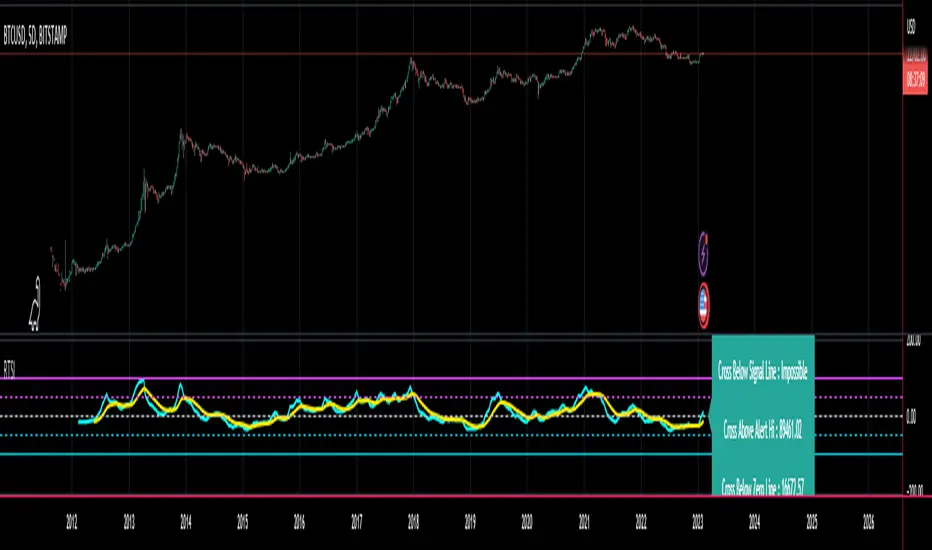
CT Reverse True Strength IndicatorIntroducing the Caretakers Reverse True Strength Index.
According to Wikipedia….
“The True Strength Index (TSI) is a technical indicator used in the analysis of financial markets that attempts to show both trend direction and overbought/oversold conditions. It was first published William Blau in 1991.
The indicator uses moving averages of the underlying momentum of a financial instrument.
Momentum is considered a leading indicator of price movements, and a moving average characteristically lags behind price.
The TSI combines these characteristics to create an indication of price and direction more in sync with market turns than either momentum or moving average.”
The TSI has a normal range of values between +100 and -100.
Traditionally traders and analysts will consider:
Positives values above 25 to indicate an “overbought” condition
Negative values below -25 to indicate an “oversold” condition
I have reverse engineered the True Strength Index formula to derive 2 new functions.
The reverse TSI function is dual purpose which can be used to calculate….
The chart price at which the TSI will reach a particular TSI scale value.
The chart price at which the TSI will equal its previous value.
The reverse TSI signal cross function can be used to calculate the chart price at which the TSI will cross its signal line.
I have employed these functions here to return the price levels where the True Strength Index would equal :
Upper alert level ( default 25 )
Zero-Line
Lower alert level ( default -25 )
Previous TSI (eq) value.
TSI signal line
These crossover levels are displayed via an optional info-box with choice of user selected info.
How to interpret the displayed prices returned from the TSI scale zero line and upper and lower alert levels.
Closing exactly at the given price will cause the True Strength Index value to equal the scale value.
Closing above the given price will cause the True Strength Index to cross above the scale value.
Closing below the given price will cause the True Strength Index to cross below the scale value.
How to interpret the displayed price returned from the TSI (eq)
Closing exactly at the price will cause the True Strength Index value to equal the previous TSI value.
Closing above the price will cause the True Strength Index value to increase.
Closing below the price will cause the True Strength Index value to decrease.
How to interpret the displayed price returned from the TSI signal line crossover.
Closing exactly at the given price will cause the True Strength Index value to equal the signal line.
Closing above the given price will cause the True Strength Index to cross above the signal line.
Closing below the given price will cause the True Strength Index to cross below the signal line.
Common methods to derive signals from the TSI :
Zero-line crossovers
When the CMO crosses above the zero-line, a buy signal is generated.
When the CMO crosses below the zero-line, a sell signal is generated.
“Overbought” and “Oversold” crossover
When the SMI crosses below -25 and then moves back above it, a buy signal is generated.
When the SMI crosses above +25 and then moves back below it, a sell signal is generated.
What Does the True Strength Index (TSI) Tell You?
The indicator is primarily used to identify overbought and oversold conditions in an asset's price, spot divergence, identify trend direction and changes via the zero-line, and highlight short-term price momentum with signal line crossovers.
Since the TSI is based on price movements, oversold and overbought levels will vary by the asset being traded. Some stocks may reach +30 and -30 before tending to see price reversals, while another stock may reverse near +20 and -20.
Mark extreme TSI levels, on the asset being traded, to see where overbought and oversold is. Being oversold doesn't necessarily mean it is time to buy, and when an asset is overbought it doesn't necessarily mean it is time to sell. Traders will typically watch for other signals to trigger a trade decision. For example, they may wait for the price or TSI to start dropping before selling in overbought territory. Alternatively, they may wait for a signal line crossover.
Signal Line Crossovers
The true strength index has a signal line, which is usually a seven- to 13-period EMA of the TSI line. A signal line crossover occurs when the TSI line crosses the signal line. When the TSI crosses above the signal line from below, that may warrant a long position. When the TSI crosses below the signal line from above, that may warrant selling or short selling.
Signal line crossovers occur frequently, so should be utilized only in conjunction with other signals from the TSI. For example, buy signals may be favoured when the TSI is above the zero-line. Or sell signals may be favoured when the TSI is in overbought territory.
Zero-line Crossovers
The zero-line crossover is another signal the TSI generates. Price momentum is positive when the indicator is above zero and negative when it is below zero. Some traders use the zero-line for a directional bias. For example, a trader may decide only to enter a long position if the indicator is above its zero-line. Conversely, the trader would be bearish and only consider short positions if the indicator's value is below zero.
Breakouts and Divergence
Traders can use support and resistance levels created by the true strength index to identify breakouts and price momentum shifts. For instance, if the indicator breaks below a trendline, the price may see continued selling.
Divergence is another tool the TSI provides. If the price of an asset is moving higher, while the TSI is dropping, that is called bearish divergence and could result in a downside price move. If the TSI is rising while the price is falling, that could signal higher prices to come. This is called bullish divergence.
Divergence is a poor timing signal, so it should only be used in conjunction with other signals generated by the TSI or other technical indicators.
The Difference Between the True Strength Index (TSI) and the Moving Average Convergence Divergence (MACD) Indicator.
The TSI is smoothing price changes to create a technical oscillator. The moving average convergence divergence (MACD) indicator is measuring the separation between two moving averages. Both indicators are used in similar ways for trading purposes, yet they are not calculated the same and will provide different signals at different times.
The Limitations of Using the True Strength Index (TSI)
Many of the signals provided by the TSI will be false signals. That means the price action will be different than expected following a trade signal. For example, during an uptrend, the TSI may cross below the zero-line several times, but then the price proceeds higher even though the TSI indicates momentum has shifted down.
Signal line crossovers also occur so frequently that they may not provide a lot of trading benefit. Such signals need to be heavily filtered based on other elements of the indicator or through other forms of analysis. The TSI will also sometimes change direction without price changing direction, resulting in trade signals that look good on the TSI but continue to lose money based on price.
Divergence also tends to unreliable on the indicator. Divergence can last so long that it provides little insight into when a reversal will actually occur. Also, divergence isn't always present when price reversals actually do occur.
The TSI should only be used in conjunction with other forms of analysis, such as price action analysis and other technical indicators.
This is not financial advice, use at your own risk.
MM DonBased on the nnfx trading style this algorithms has many different calculations to provide the best signal and confirmations
1. The SuperSmooth Forecast Moving Average
2. TrendLine Moving Average
3. Smoothed Heiken Ashi Moving Average
4. Baseline that can change between 15 different moving averages
Buy/Sell Alarms for all the moving averages
Exit buy/sell Alarms
Entry
3 TP
ATR x1.5 Stop Loss auto generated per signal.
Also be able to set tp alarms for both buy/sell entries. so you place your trade and be alerted when your take profits have been hit.
works on all timeframes for scalpers, intraday, or even swing.
effective on binary as well.
Directions are simple
combine simple Market Structure & as long as everything matches (Buy Signal & everything is blue + baseline is white) (Sell Signal & everything is Red + Baseline is Red) you can enter the signal generated, exit the trade when told to exit and Manage your trade.
this was made to make trading easy and create confidence with in the trader.
Link below or PM us for access to this indicator Happy Trading

Ripster EMA CloudsEMA Cloud By Ripster
EMA Cloud System is a Trading System Invented by Ripster where areas are shaded between two desired EMAs. The concept implies the EMA cloud area serves as support or resistance for Intraday & Swing Trading. This can be utilized effectively on 10 Min for day trading and 1Hr/Daily for Swings. Ripster himself utilizes various combinations of the 5-12, 34-50, 8-9, 20-21 EMA clouds but the possibilities are endless to find what works best for you.
“Ideally, 5-12 or 5-13 EMA cloud acts as a fluid trendline for day trades. 8-9 EMA Clouds can be used as pullback Levels –(optional). Additionally, a high level price over or under 34-50 EMA clouds confirms either bullish or bearish bias on the price action for any timeframe” – Ripster
