HTF Candle [Custom Time Period] by JustUncleL [SOMMI 1.0 edit]This is a custom High Time Frame indicator, originally created by JustUncleL. 💚
I have edited the Pine Script to allow a custom Time Period input. 💛
In the original version, you could only select from a few time periods as your High Time Frame. 💙
In this version you can put any time frame as your reference. 🧡
Example: 6-hour HTF or 2-Day HTF
SOMMI'S SPECIAL NOTES:
-This indicator works with Heikin-Ashi candles.
-Please change your candles to Heikin-Ashi and apply the indicator.
-Advised to disable "Body Wicks"
-Advised to also refresh your page a few times a day as it doesn't update properly due to limitations of TradingView / Pinescript currently.
💙💛💚🧡
在腳本中搜尋"candle"

MACD Profit CandlesThis tool is simple yet very effective. It creates new candles on the chart based on the MACD.
Candles are green when MACD is increasing and red when it is decreasing. All lengths can be adjusted in the input menu and there is an option to plot the signal line.
The rules for using it are pretty simple:
1.Buy on Green
2.Sell on red
~Happy Trading~

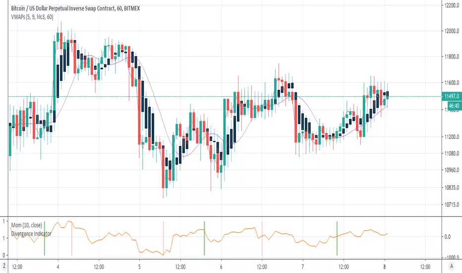
VWAP Candles & MVWAPI was getting sick of the useless VWAP indicator on Trading View and wrote something that is more comprehensive and quite interesting, in fact: candles for VWAP.
It uses the original open/high/low/close and combines them as you would the original hlc3 calculation, but separately, to draw the candles as a shadow of the current price.
There are a few parameters to make it more flexible: source, resolution timeframe, volume length, and moving average length.
Volume Length (default: 5) will determine the candle calculations, cumulative sum of the past X bars.
Moving Average Length (default: 9) will determine the simple moving average (sma) length for the true VWAP (hlc3*volume/cumulative volume)
Source will change the Moving Average VWAP from hlc3 to whatever you want.
Resolution will attune the candles and Moving Average VWAP line to a different periodicity.
Just to be a pain, I also included the old VWAP from Trading View, as a comparison. You can disable it from the Style settings.
Enjoy and happy trading!
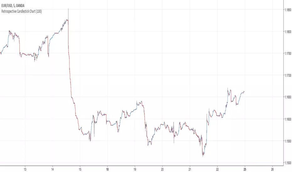
Retrospective Candlestick ChartWhen i was in Japan with some traders colleagues we talked about traditional charting tools from this country and how they changed the way we look at our charts today. Then suddenly one of the japanese traders i have met earlier said "Why not making another charting tool ? Smoother than Heikin-Ashi and including all the information a trader may need but easier to interpret".
So i had the idea of averaging the input and the output of the respective close / open / high and low price using a recursive exponential window functions, each values will be closer to their true value if they are volatile, if they are not then those values will look smoother, the length input represents the reactivity of the candles, high values represents smoother results but less reactive.The goal of those candles is to make all the information easier to interpret by a trader.
500 input length , the price look smoother, supports and resistances are easier to make.
The interpretation of highs and lows are important, the Retrospective Candlestick Chart save you time by showing only huge movements.
Ichimoku Signal + Candle Color + Candle Pattern1. Ichimoku Signal:
Bullish Signal:
- UP-S: A strong bullish signal occurs when the Tenkan Sen crosses from below to above the Kijun Sen and the cross is above the Kumo.
- UP: An neutral bullish signal occurs when the Tenkan Sen crosses from below to above the Kijun Sen and the cross is in the Kumo.
- UP-W: A weak bullish signal occurs when the Tenkan Sen crosses from below to above the Kijun Sen and the cross is bellow the Kumo.
- Fly: A strong bullish signal when Chikou Span raise above the Kumo.
Bearish Signal:
- DN-S: A strong bearish signal occurs when the Tenkan Sen crosses from above to bellow the Kijun Sen and the cross is bellow the Kumo.
- DN: An neutral bearish signal occurs when the Tenkan Sen crosses from above to bellow the Kijun Sen and the cross is in the Kumo.
- DN-W: A weak bearish signal occurs when the Tenkan Sen crosses from above to bellow the Kijun Sen and the cross is above the Kumo.
- Dig: A strong bearish signal when Chikou Span fall bellow the Kumo.
2. Candle Color based on RSI (from NazcaProjections)
- Yellow represents Super OverBought
- Lime Green represents OverBought
- Green represents Slightly OverBought
- Red represents Slightly OverSold
- Dark Red represents OverSold
- Gray White represents Super OverSold
3. Candlestick Patterns Identified: Doji , Evening Star , Morning Star , Shooting Star , Hammer , Inverted Hammer , Bearish Harami, Bullish Harami, Bearish Engulfing , Bullish Engulfing

Heiken Ashi Candles
This is a script to place Heiken Ashi candles on your chart alongside another candle type or more importantly, using the variables from this script, you can build a strategy using Heiken Ashi candles that will depict true/proper entries and exits in a strategy when using the backtest feature.
We hope this helps!
Smoothed Heiken Ashi Candles9-SMA Trading Method (Buy and Sell Rules)
Sell Rules
A candle closes above.
Buy Rules
A candle closes below the 9-SMA.

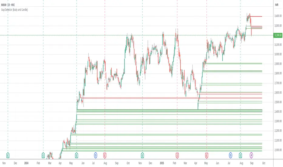
Gap Detector (Body and Candle)Finds/Detects gaps between candles and candle bodies for any chart/timeframe with O(n+delta) performance.
Candle Gaps (between wicks) act as strong support or resistance. They are drawn as solid boxes.
Body Gaps (ignores wicks) act as mild support or resistance. They are depicted with lines.
Adjust the settings for candle/body gap width, smaller the time frame, smaller the gap.
Adjust max historical bars to fine tune performance on your system/setup. The more historical bars the script scans, more time required to load the chart. At times based on system configuration, TradingView may timeout the script due to too many bars. Reducing the max bars helps in this scenario.
This is a revamped version of "Body Gap Detector".
Happy charting !
HTF CandlesFull credit to cdikici71 - this is a stripped down version of cd_sweep&cisd_Cx to provide a clean higher timeframe (HTF) candle overlay. Choose colors for candles & font along with timeframe to overlay the HTF on any other timeframe.
Simple and Clean!
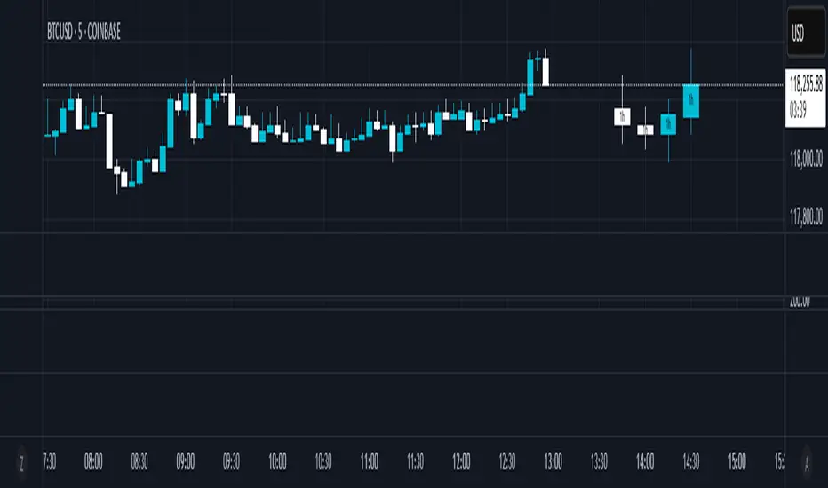
Candle Range % vs 8-Candle AvgCandle % Indicator – Measure Candle Strength by Range %
**Overview:**
The *Candle % Indicator* helps traders visually and analytically gauge the strength or significance of a price candle relative to its recent historical context. This is particularly useful for detecting breakout moves, volatility shifts, or overextended candles that may signal exhaustion.
**What It Does:**
* Calculates the **percentage range** of the current candle compared to the **average range of the past N candles**.
* Highlights candles that exceed a user-defined threshold (e.g., 150% of the average range).
* Useful for **filtering out extreme candles** that might represent anomalies or unsustainable moves.
* Can be combined with other strategies (like EMA crossovers, support/resistance breaks, etc.) to improve signal quality.
**Use Case Examples:**
***Filter out fakeouts** in breakout strategies by ignoring candles that are overly large and may revert.
***Volatility control**: Avoid entries when market conditions are erratic.
**Confluence**: Combine with EMA or RSI signals for refined entries.
**How to Read:**
* If a candle is larger than the average range by more than the set percentage (default 150%), it's flagged (e.g., no entry signal or optional visual marker).
* Ideal for intraday, swing, or algorithmic trading setups.
**Customizable Inputs:**
**Lookback Period**: Number of previous candles to calculate the average range.
**% Threshold**: Maximum percentage a candle can exceed the average before being filtered or marked.

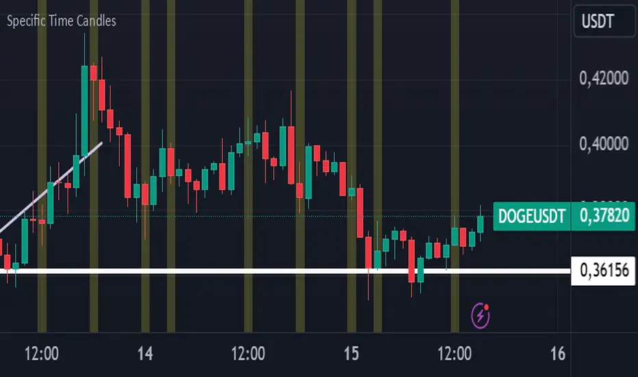
Specific Time CandlesSpecific Time Candles Indicator
The Specific Time Candles indicator is a powerful tool designed for traders who want to focus on specific time intervals within their charts. This custom indicator allows you to highlight and analyze price action during user-defined time periods, providing clarity and precision in your trading strategy.
Key Features:
Custom Time Intervals: Select any start and end time to create candles that focus on your preferred trading hours. This is particularly useful for traders who want to concentrate on market sessions, such as the London or New York session, or any other specific time frame relevant to their trading plan.
Enhanced Visualization: By isolating specific time periods, this indicator helps reduce noise and provides a clearer view of market movements during key trading hours. This can be beneficial for identifying trends, reversals, and potential breakout opportunities.
Flexible Configuration: Easily adjust the indicator settings to match your trading schedule. Whether you are a day trader, swing trader, or scalper, you can customize the time frames to suit your needs.
Compatibility: The indicator is compatible with multiple asset classes, including forex, stocks, commodities, and cryptocurrencies, making it a versatile tool for any trader.
User-Friendly Interface: Designed with simplicity in mind, the Specific Time Candles indicator is easy to set up and use, even for those who are new to TradingView.
How to Use:
Add the indicator to your chart from the TradingView library.
Set your desired start and end times in the indicator settings.
Observe the newly formed candles that represent the specified time intervals.
Use these candles to make informed trading decisions based on the focused analysis of market activity during your chosen periods.
Benefits:
Precision Trading: Focus on the most relevant market data, eliminating distractions from other time periods.
Improved Decision-Making: Gain insights into market behavior during critical times, enhancing your ability to make strategic trades.
Time Management: Efficiently manage your trading by concentrating on specific times, allowing for better planning and execution.
The Specific Time Candles indicator is a must-have for traders looking to refine their strategies by concentrating on precise market windows. Whether you are targeting high-volatility periods or specific trading sessions, this indicator provides the tools you need to succeed.
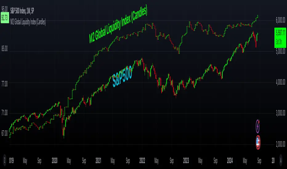
M2 Global Liquidity Index (Candles)M2 Global Liquidity Index (Candles)
In this enhanced version of the original M2 Global Liquidity Index script by Mik3Christ3ns3n , I've taken the foundational concept and expanded its capabilities for more in-depth analysis and user flexibility. This updated script aggregates M2 money supply data from major global economies—China, the U.S., the Eurozone, Japan, and the U.K.—adjusted by their respective exchange rates, into a customizable global liquidity index.
Key Enhancements:
Candlestick Visualization:
• Instead of a simple line chart, I've implemented a candlestick chart, providing a more detailed representation of liquidity trends with open, high, low, and close values for each period. This allows traders to analyze the index with the same technical tools used for price charts.
Customizable Components:
• Users can now select which components (M2 data and exchange rates) to include in the index calculation, giving you the flexibility to tailor the index to specific economic factors or regions of interest.
Dynamic Color Coding:
• Candles are color-coded based on their performance (bullish or bearish), with customized wick and border colors to enhance visual clarity, making it easier to spot liquidity trends at a glance.
Overlay Option:
• This script is designed to be an overlay, allowing you to plot the Global Liquidity Index directly on your price charts, facilitating comparison between liquidity trends and asset prices.
This enhanced script is ideal for traders and analysts who want a deeper understanding of global liquidity trends and their impact on financial markets.
Period Candle CounterThis is a very simple utility indicator.
Shockingly nothing similar was available and I really needed something to quickly count period lengths by candles (to make adjustments to indicators based on a desired lookback timeframe), so I created this.
I thought I would share it because chances are if I needed something like this, other people may need it, too.
What it does:
Its really simple and this really truly is just a utility indicator that gives you raw information to make adjustments to other indicators. It just counts the number of candles in a user defined period of time.
It will count the number of red candles, green candles and then display the total candle count.
It will also display in percent (i.e. 52% green candles vs 48% red candles, etc.).
Its point and click, so once launched you just click the area you want to start the count and click the area you want to end the count.
Purpose:
Personally, I use it to make adjustments to timeframe lengths on indicators that look at averages and also on my time series indicator. If I want the price average or range for a specific period in time (say, the past 1.5 days of an uptrend), I will use this to count the candles in that period so that I can manually adjust whichever indicator to the correct lookback length, as most indicators are adjusted by candle length (i.e. 1 candle, 2 candles, 3 candles, etc.)
And that's it, pretty straight forward. Honestly pretty boring but its actually really pivotal for me to make adjustments to certain indicators.
Hope you find it helpful, too!
Safe trades!

RSI In-Chart Indicator with Candle StickSimplified RSI with in Chart Indicator for better analysis, What is does? it simply plot OB/OS over candles for better understanding. Also you can on/of candle stick along side in setting but the RSI is always on.
Candle stick Patterns
Three White Soldier (TWS)
Three Black Crows (TBS)

Renko + CandlesThis indicator has been designed to show you both candle chart and Renko chart in one place.
I think most of you are familiar with candle chart which is working with the time and price movements but Renko chart is based on price differences and is not related to the "time" parameter.
so if you see a Renko brick is appear up(or down) to the previous brick it means that a certain and fixed price movement has been occurred (which mostly calculate by ATR). and also this indicator works in any time frame.
Remember because we want both charts we have time parameter in this indicator, and if the price doesn't move up or down a certain percentage from previous bars, it will plot a renko bar beside the previous one.
you can use this indicator to see if the price moves up or down.
Or you can determine the important support and resistances with much less noises.
it can be used as a confirmation for you to keep your positions or exit.
go ahead and discover it...
If you have any questions, don't hesitate! ask in the comments section below.

Simple Candle Info This script shows the following simple information about the last candle:
- Candle size
- Body size included %
- Top Wick size
- Bottom Wick size
- Top Wick + Body size
- Bottom Wick + Body size
You can change:
- colors and position for labels
- add information for previous candle too
- change language
