在腳本中搜尋"candle"

Previous Candle 50% line The intention of this is to mark the 50% mark of the previous candle. My use is to set stops and to spot reversals coming from the STRAT to see in real time 2's going 3

Two Candle Comparison - TMPThis about comparison two candles in chart and gives some idea for entry. this is most suitable for 4H chart

Custom Candle Colors by Day (Full Week)Highlight specific daily candles a different color (Monday - Sunday)
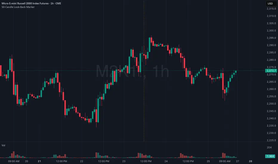
50-Candle Look-Back MarkerIt simply redraws one vertical dotted line that always sits exactly 50 bars behind the current bar, so you can check at a glance that any trend-line you draw has at least 50 candles of data to the right of it.
3 Bullish Candles + No Wick + SL unter BoS (Swing Low)1m strategie basierend auf price action and volume candle sticks
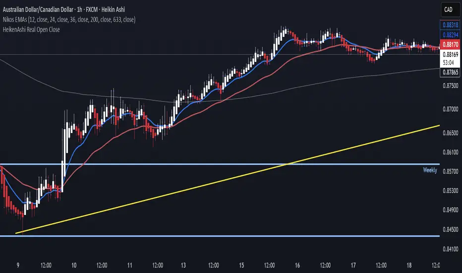
Real Open/Close Ticks for Heiken Ashi CandlesJapanese candle open and close prices. Good if you're using a HeikenAshi chart and you want to see real opens and closes.
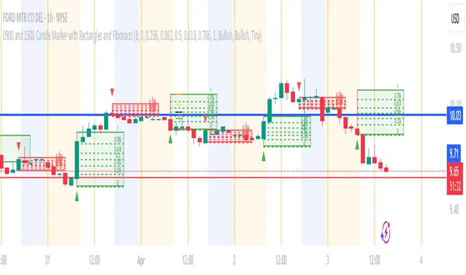
0900 and 1500 Candle Marker with Rectangles and FibonacciWelcome to the Indicator
// This tool is designed to help you analyze stock - crypto - or futures charts on TradingView by marking specific times - 9:00 AM and 3:00 PM (Eastern Time) - with colored rectangles and optional Fibonacci levels.
// It is perfect for spotting key moments in your trading day - like market opens or afternoon shifts - and understanding price ranges with simple lines and numbers.
// Whether you are new to trading or just want an easy way to visualize these times - this indicator is here to assist you.
//
// What It Does
// - Draws a green rectangle at 9:00 AM and a red rectangle at 3:00 PM on your chart - based on Eastern Time (America/New_York timezone).
// - Adds dashed lines inside these rectangles (called Fibonacci levels) to show important price points - like 0.236 or 0.618 of the rectangle’s height.
// - Places numbers on these lines (e.g. "0.5") so you can see exactly what each level represents.
// - Works on different chart types (stocks - crypto - futures) and adjusts for futures trading hours if needed.
// - Is designed to work best on timeframes of 1 hour or shorter (like 1-hour - 30-minute - 15-minute - 5-minute - or 1-minute charts) - where you can see the 9:00 AM and 3:00 PM candles clearly.
// - Lets you customize what you see through a settings menu - like hiding some lines or changing colors.
YOU MAY NOT MONETIZE
ANY PORTION OF THIS CODE.
WE ARE ALL IN THIS THING TOGETHER TO WIN.
BE A BLESSING ONTO THE WORLD AND GIVE.:)
Plot Closed CandlesOnly shows closed candles
( You must turn off normal candles first by right clicking on the candles , going to setting , and turning borders , bodies , and wicks off

xRaymon's Body Candle Indicator
Shows a triangle above candles that satisfy a desired body size (%).
The default body size is 85%.
Lowering or increasing the precentage significantly affects to precision.
I do not recommend lowering the default value.

10% CandlesThe 10% Candles indicator tags all candles which have a 10% or more gain/loss
gains are calculated based on the open and high for green candles
losses are calculated based on the open and low for red candles
you can change the percentage in settings, default value is 10%. this would be the minimum gain/loss percentage
0.1 => 10%
0.2 => 20%
hover over the triangle to see the actual gain/loss percentage
Current Candle Vertical LineDescription
The Current Candle Vertical Line indicator draws a fully customizable vertical line on the most recent candle (live bar). This provides a clear visual anchor for active traders, especially during fast-moving markets or multi-chart setups.
The line extends from the top of the chart to the bottom, ensuring maximum visibility—regardless of zoom level or price scale.
Features
✔ Fully customizable line color
✔ Adjustable opacity (0–100%)
✔ Custom line thickness
✔ Three selectable line styles: Solid, Dashed, or Dotted
✔ Automatically deletes old line and redraws on the newest bar
✔ Works on any timeframe, chart type, and asset
Use Cases
Highlight the current candle during live trading
Keep visual focus when scalping or trading futures
Align entries with indicators on lower or higher timeframes
Improve visibility during high volatility
Support multi-monitor or multi-chart layouts
Notes
The indicator draws the line only on the last active bar.
Since overlay=true, the line appears in the main chart panel.
This script does not generate alerts (visual marker only).


RSI Percentage - Current Candle Only - BHAFANTA FX
**Title:** RSI Percentage - Current Candle Only - BHAFANTA FX
**Description:**
This indicator displays the **Relative Strength Index (RSI)** as a percentage for the **current candle only**, giving traders an immediate view of market momentum. Perfect for short-term analysis and quick decision-making, it avoids clutter by showing only the most relevant RSI value.
**Key Features:**
* Shows **RSI percentage of the current candle** only
* Display is **clean and readable**, positioned above the current candle
* Adjustable RSI length and source for flexibility
* Designed for traders who want **fast, actionable insight** without visual clutter
**Use Case:**
* Ideal for **scalpers and intraday traders** who want to gauge overbought or oversold conditions quickly.
* Can be combined with other indicators like EMA, MACD, or trend filters for more robust strategies.
**Developer:** BHAFANTA FX


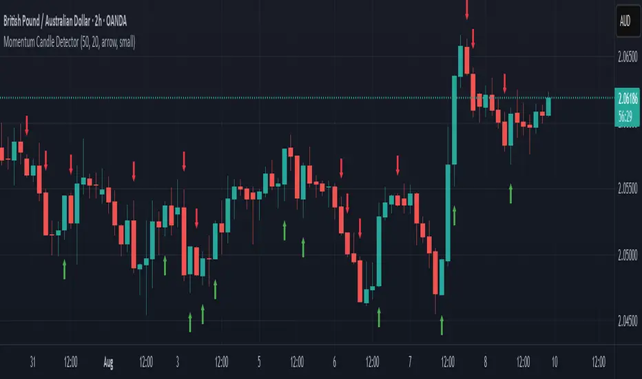
Momentum Candle DetectorThe momentum candle indicator highlights a candle with a body having a defined % of the range, and a close within a defined % of the high/low.

First Candle Low Break SignalTheory: If the SPY (or anything really) starts the day with a green candle, it never breaks below that candle on that day.
This indicator was quickly made to check that theory with some interesting results.
Requirement: The Symbol must be set to "extended trading hours", otherwise the script cannot see the changes between days.

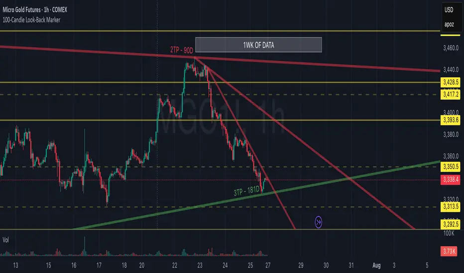
100-Candle Look-Back MarkerIt simply redraws one vertical dotted line that always sits exactly 100 bars behind the current bar, so you can check at a glance that any trend-line you draw has at least 100 candles of data to the right of it.
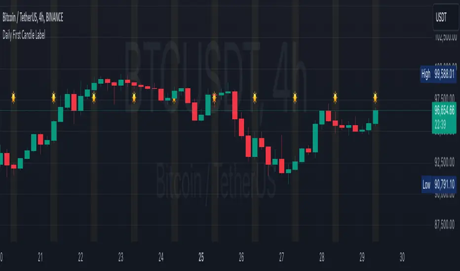
Daily First Candle LabelDaily First Candle Label
The Daily First Candle Label indicator is designed to visually highlight the first candle of each trading day directly on your chart. This tool is ideal for traders who need to quickly identify the start of a new trading session. Key features include:
Candle Marker: A triangle icon labeled with a "☀️" is plotted at the top of the chart to mark the first candle of the day.
Background Highlight: The background of the first candle is subtly shaded in yellow for better visibility.
Clean and Minimalist Design: Keeps your chart clutter-free while providing essential daily context.
This indicator is perfect for scalpers, day traders, and those analyzing session-based trading strategies.
Usage:
Add the indicator to your chart.
The marker and background highlight will automatically update to reflect the first candle of each trading day.
Customizable Options:
None, as this indicator is optimized for simplicity and immediate utility.
Happy Trading! 🚀
每日第一支蜡烛标签
指标旨在直观地标记每个交易日的第一根蜡烛。这对需要快速识别新交易日开盘的交易者非常实用。功能特点如下:
蜡烛标记: 在图表顶部标记每日的第一根蜡烛,使用三角形图标及“☀️”符号。
背景高亮: 自动为第一根蜡烛添加淡黄色背景,增强视觉效果。
简洁设计: 确保图表清晰,提供每日交易日开盘的重要参考点。
此指标适用于日内交易者、剥头皮交易者以及任何分析交易时段策略的用户。
使用说明:
将指标添加到图表。
每日第一根蜡烛会自动显示标记及背景高亮。
可自定义选项:
暂无,指标已优化为简洁实用的设计。
祝交易顺利!🚀
Open - Candlestick-ChartIt forces the Open indicator to use the candlestick open values. For example, if you need to use a Heikin-Ashi chart with the Open indicator based on regular candlestick data, this indicator will ensure it does not change.

Midpoint Candle and BodyThis script provides the options to mark the:
1. Midpoint of the candle body and/or
2. Midpoint of the full candle (including the wicks)
Works on all timeframes. This indicator can be used to help determine the mean (midpoint) reversion of price.
-

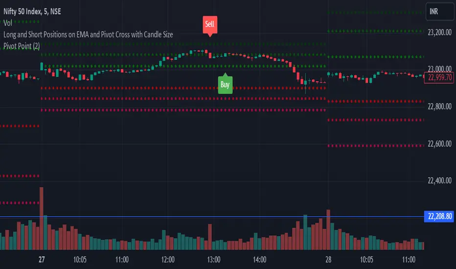
Long and Short Positions on EMA and Pivot Cross with Candle Size
This Pine Script indicator identifies long and short trading signals based on specific criteria involving candle body size, EMA, and pivot levels.
Long Position ("Buy" Signal): A "Buy" signal is triggered when a green candle (close > open) with a body size of at least 10 crosses above the 9 EMA and any of the daily pivot levels (R1, R2, R3, R4, R5, S1, S2, S3, S4, S5).
Short Position ("Sell" Signal): A "Sell" signal is triggered when a red candle (close < open) with a body size of at least 10 crosses below the 9 EMA and any of the pivot levels.
The script plots only the "Buy" and "Sell" signals on the chart, without displaying the EMA or pivot levels.