[ACR+]©AudenFXHTF ACR Pattern Detection
Detects ACR Sweep (Advanced Candle Reaction) with C1–C5 labeling, complete with sweep line, mid-line, and projection to LTF.
Dynamic Equilibrium Zones
Zones automatically appear according to the ACR phase (C2→C3, C3→C4, C4→C5). Previous zones are cleared, only the active phase zone remains visible.
Change in State of Delivery (CISD)
Highlights supply–demand structure shifts with confirmation lines (Bullish / Bearish / Neutral).
Liquidity Sweep (LTF)
Detects high/low sweeps on LTF, marking liquidity trap momentum.
Fair Value Gap (FVG)
Automatically detects FVGs based on ACR bias. FVG boxes are auto-deleted once mitigated.
Double Sweep Quality Filter
Evaluates pattern quality (Single vs Double Sweep) and flags setups with lower reliability.
Glassmorphism UI
Modern, mobile-friendly status table displaying ACR direction, quality, zone phase, and CISD in real time.
Alert System (Compact & Discord Webhook)
Ready-to-use alerts for personal trading or direct integration with Discord servers.
📈 How to Use
Select your main trading timeframe (M1, M5, H1, etc.).
Let the indicator auto-select the HTF (or set manually).
Wait for a valid ACR Sweep (C1–C2).
Monitor the zone phase (C2→C3, C3→C4, etc.).
Confirm with CISD & Liquidity Sweep.
Enter/re-enter in the zone or FVG aligned with the ACR bias.
🎯 Who Is It For?
Scalpers who need multi-timeframe confirmation.
Intraday traders aiming for precision entries.
Swing traders seeking clear HTF bias.
Prop firm traders focused on risk & consistency.
⚠️ Disclaimer
This indicator is not a standalone buy/sell signal. Always use with proper risk management. Past performance does not guarantee future results.
AudenFX mempersembahkan indikator premium untuk trader profesional yang ingin membaca struktur pasar dengan pendekatan ICT (Inner Circle Trader) yang lebih sistematis, modern, dan mudah dipahami.
🔑 Fitur Utama:
HTF ACR Pattern Detection
Mendeteksi ACR Sweep (Advanced Candle Reaction) dengan labeling C1–C5, lengkap dengan sweep line, mid-line, dan proyeksi ke LTF.
Dynamic Equilibrium Zones
Zona otomatis muncul sesuai fase ACR (C2→C3, C3→C4, C4→C5). Zona lama akan hilang, hanya fase aktif yang tampil.
Change in State of Delivery (CISD)
Menggambarkan perubahan struktur supply–demand dengan garis konfirmasi (Bullish/Bearish/Neutral).
Liquidity Sweep (LTF)
Deteksi sweep high/low pada LTF, menandai momentum jebakan likuiditas.
Fair Value Gap (FVG)
Deteksi otomatis FVG berbasis bias ACR. Kotak FVG akan auto-delete saat mitigasi.
Double Sweep Quality Filter
Menilai kualitas pola (Single/Double Sweep), memberi tanda peringatan jika kualitas setup lebih rendah.
Glassmorphism UI
Status table modern & mobile-friendly: menampilkan arah ACR, kualitas, fase zona, dan CISD secara real-time.
Alert System (Compact & Discord Webhook)
Siap pakai untuk alert personal atau integrasi langsung ke server Discord komunitas.
📈 Cara Pakai:
Pilih timeframe utama Anda (M1, M5, H1, dst.).
Biarkan indikator auto memilih HTF (atau set manual).
Tunggu ACR Sweep valid (C1–C2).
Perhatikan zona fase (C2→C3, C3→C4, dst.).
Konfirmasi dengan CISD & Liquidity Sweep.
Entry/re-entry di zona atau FVG yang selaras dengan bias ACR.
🎯 Untuk Siapa?
Scalper yang butuh konfirmasi multi-timeframe.
Intraday trader yang mengincar precision entry.
Swing trader yang ingin membaca bias HTF dengan jelas.
Trader prop firm yang fokus ke risk & consistency.
⚠️ Disclaimer
Indikator ini bukan sinyal trading. Gunakan bersama manajemen risiko yang baik. Hasil masa lalu tidak menjamin hasil di masa depan.
➡️ Info lebih lengkap: audenfx.com
在腳本中搜尋"fvg"

The Barking Rat LiteMomentum & FVG Reversion Strategy
The Barking Rat Lite is a disciplined, short-term mean-reversion strategy that combines RSI momentum filtering, EMA bands, and Fair Value Gap (FVG) detection to identify short-term reversal points. Designed for practical use on volatile markets, it focuses on precise entries and ATR-based take profit management to balance opportunity and risk.
Core Concept
This strategy seeks potential reversals when short-term price action shows exhaustion outside an EMA band, confirmed by momentum and FVG signals:
EMA Bands:
Parameters used: A 20-period EMA (fast) and 100-period EMA (slow).
Why chosen:
- The 20 EMA is sensitive to short-term moves and reflects immediate momentum.
- The 100 EMA provides a slower, structural anchor.
When price trades outside both bands, it often signals overextension relative to both short-term and medium-term trends.
Application in strategy:
- Long entries are only considered when price dips below both EMAs, identifying potential undervaluation.
- Short entries are only considered when price rises above both EMAs, identifying potential overvaluation.
This dual-band filter avoids counter-trend signals that would occur if only a single EMA was used, making entries more selective..
Fair Value Gap Detection (FVG):
Parameters used: The script checks for dislocations using a 12-bar lookback (i.e. comparing current highs/lows with values 12 candles back).
Why chosen:
- A 12-bar displacement highlights significant inefficiencies in price structure while filtering out micro-gaps that appear every few bars in high-volatility markets.
- By aligning FVG signals with candle direction (bullish = close > open, bearish = close < open), the strategy avoids random gaps and instead targets ones that suggest exhaustion.
Application in strategy:
- Bullish FVGs form when earlier lows sit above current highs, hinting at downward over-extension.
- Bearish FVGs form when earlier highs sit below current lows, hinting at upward over-extension.
This gives the strategy a structural filter beyond simple oscillators, ensuring signals have price-dislocation context.
RSI Momentum Filter:
Parameters used: 14-period RSI with thresholds of 80 (overbought) and 20 (oversold).
Why chosen:
- RSI(14) is a widely recognized momentum measure that balances responsiveness with stability.
- The thresholds are intentionally extreme (80/20 vs. the more common 70/30), so the strategy only engages at genuine exhaustion points rather than frequent minor corrections.
Application in strategy:
- Longs trigger when RSI < 20, suggesting oversold exhaustion.
- Shorts trigger when RSI > 80, suggesting overbought exhaustion.
This ensures entries are not just technically valid but also backed by momentum extremes, raising conviction.
ATR-Based Take Profit:
Parameters used: 14-period ATR, with a default multiplier of 4.
Why chosen:
- ATR(14) reflects the prevailing volatility environment without reacting too much to outliers.
- A multiplier of 4 is a pragmatic compromise: wide enough to let trades breathe in volatile conditions, but tight enough to enforce disciplined exits before mean reversion fades.
Application in strategy:
- At entry, a fixed target is set = Entry Price ± (ATR × 4).
- This target scales automatically with volatility: narrower in calm periods, wider in explosive markets.
By avoiding discretionary exits, the system maintains rule-based discipline.
Visual Signals on Chart
Blue “▲” below candle: Potential long entry
Orange/Yellow “▼” above candle: Potential short entry
Green “✔️”: Trade closed at ATR take profit
Blue (20 EMA) & Orange (100 EMA) lines: Dynamic channel reference
⚙️Strategy report properties
Position size: 25% equity per trade
Initial capital: 10,000.00 USDT
Pyramiding: 10 entries per direction
Slippage: 2 ticks
Commission: 0.055% per side
Backtest timeframe: 1-minute
Backtest instrument: HYPEUSDT
Backtesting range: Jul 28, 2025 — Aug 17, 2025
Note on Sample Size:
You’ll notice the report displays fewer than the ideal 100 trades in the strategy report above. This is intentional. The goal of the script is to isolate high-quality, short-term reversal opportunities while filtering out low-conviction setups. This means that the Barking Rat Lite strategy is very selective, filtering out over 90% of market noise. The brief timeframe shown in the strategy report here illustrates its filtering logic over a short window — not its full capabilities. As a result, even on lower timeframes like the 1-minute chart, signals are deliberately sparse — each one must pass all criteria before triggering.
For a larger dataset:
Once the strategy is applied to your chart, users are encouraged to expand the lookback range or apply the strategy to other volatile pairs to view a full sample.
💡Why 25% Equity Per Trade?
While it's always best to size positions based on personal risk tolerance, we defaulted to 25% equity per trade in the backtesting data — and here’s why:
Backtests using this sizing show manageable drawdowns even under volatile periods.
The strategy generates a sizeable number of trades, reducing reliance on a single outcome.
Combined with conservative filters, the 25% setting offers a balance between aggression and control.
Users are strongly encouraged to customize this to suit their risk profile.
What makes Barking Rat Lite valuable
Combines multiple layers of confirmation: EMA bands + FVG + RSI
Adaptive to volatility: ATR-based exits scale with market conditions
Clear, actionable visuals: Easy to monitor and manage trades

TRI - Smart Zones============================================================================
# TRI - SMART ZONES v2.0
## Professional Smart Money Concepts Indicator for Pine Script v6
============================================================================
## 📊 OVERVIEW
**TRI - Smart Zones** is a comprehensive Smart Money Concepts indicator that
combines multiple institutional trading concepts into a single, powerful tool.
Built with Pine Script v6 for optimal performance and reliability.
## 🎯 CORE FEATURES
### **Fair Value Gaps (FVG)**
- **Detection**: Automatic identification of price imbalances
- **Types**: Bullish and Bearish Fair Value Gaps
- **Threshold**: Customizable gap size requirements (0.1% default)
- **Extension**: Configurable zone projection length
- **Mitigation**: Real-time tracking of gap fills
### **Order Blocks (OB)**
- **Detection**: Volume-based institutional footprint identification
- **Types**: Bullish and Bearish Order Blocks
- **Method**: Pivot-based volume analysis with configurable lookback
- **Validation**: Market structure confirmation required
- **Extension**: Adjustable zone projection
### **BSL/SSL Liquidity Levels**
- **Multi-Timeframe**: Automatic higher timeframe reference
- **Dynamic**: Real-time level updates and extensions
- **Visual**: Clear line markings with timeframe labels
- **Smart**: Adaptive timeframe selection based on current chart
### **Fibonacci Extensions**
- **ZigZag Integration**: Advanced pivot point detection
- **Levels**: Customizable Fibonacci ratios (38.2%, 61.8%, 100%, 161.8%)
- **Projection**: Dynamic extension from swing points
- **Visual**: Subtle dashed lines with level/price labels
### **Smart Dashboard**
- **Zone Statistics**: Real-time FVG and OB counts
- **Success Rates**: Mitigation percentages for each zone type
- **Market Bias**: Intelligent bullish/bearish/neutral assessment
- **Positioning**: Customizable location and size
### **Zone Analysis Engine**
- **Technical Confluence**: RSI, ADX, ATR, Volume analysis
- **VWAP Integration**: Institutional price reference
- **Confidence Scoring**: High/Mid/Low signal classification
- **Signal Arrows**: Visual trade direction indicators
## 🔔 ALERT SYSTEM
### **Market Structure Alerts**
- `Market Bias Changed` - Shift in overall market sentiment
- `BSL Touched` - Buy Side Liquidity level reached
- `SSL Touched` - Sell Side Liquidity level reached
### **Zone Touch Alerts**
- `OB Touched` - Any Order Block interaction
- `Bullish OB Touched` - Bullish Order Block touch
- `Bearish OB Touched` - Bearish Order Block touch
- `FVG Touched` - Any Fair Value Gap interaction
- `Bullish FVG Touched` - Bullish FVG touch
- `Bearish FVG Touched` - Bearish FVG touch
- `Zone Touched` - Any Smart Zone interaction
- `Bullish Zone Touched` - Any bullish zone touch
- `Bearish Zone Touched` - Any bearish zone touch
## ⚙️ CONFIGURATION
### **Zone Detection**
- Enable/disable FVG and OB detection independently
- Maximum zones per type (3-15, default: 8)
- Zone-specific threshold and extension settings
### **Visual Customization**
- Individual color schemes for each zone type
- Adjustable transparency levels
- Configurable line styles and widths
- Dashboard positioning and sizing options
### **Technical Analysis**
- RSI, ADX, ATR period customization
- Volume threshold multipliers
- Confidence level color coding
- Signal display toggle
## 🚀 PINE SCRIPT v6 OPTIMIZATIONS
- **User-Defined Types**: Structured data for zones and statistics
- **Methods**: Type-specific operations for better code organization
- **Enhanced Arrays**: Optimized memory management
- **Switch Statements**: Improved performance for zone classification
- **Error Handling**: Robust input validation and edge case management
- **Performance**: Efficient algorithms for real-time analysis
## 📈 TRADING APPLICATIONS
### **Entry Strategies**
- Zone confluence for high-probability setups
- Multi-timeframe confirmation via BSL/SSL
- Fibonacci extension targets
- Signal arrows for directional bias
### **Risk Management**
- Zone mitigation for stop-loss placement
- Market bias for position sizing
- Dashboard statistics for strategy validation
### **Market Analysis**
- Institutional footprint identification
- Liquidity level mapping
- Market structure assessment
- Trend continuation vs reversal analysis
## 🔧 TECHNICAL SPECIFICATIONS
- **Version**: Pine Script v6
- **Overlay**: True (draws on price chart)
- **Max Objects**: 100 boxes, 100 lines, 50 labels
- **Performance**: Optimized for real-time analysis
- **Compatibility**: All TradingView chart types and timeframes

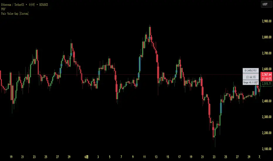
Fair Value Gap [Custom]📌 FVG Indicator – Smart Money Concepts Tool
This script is based on Smart Money Concepts (SMC) and automatically detects and marks Fair Value Gaps (FVG) on the chart, helping traders identify unbalanced price areas left behind by institutional moves.
🧠 What is an FVG?
An FVG (Fair Value Gap) is the price gap formed when the market moves rapidly, leaving behind a candle range where no trading occurred — typically between Candle 1’s high and Candle 3’s low (in a three-candle pattern). These gaps often signal imbalance, created during structural breaks or liquidity grabs, and may act as retrace zones or entry points.
🛠 Features:
✅ Automatically detects and highlights FVG zones (high-low range)
✅ Differentiates between open (unfilled) and closed (filled) FVGs
✅ Adjustable timeframe settings (works best on 1H–4H charts)
✅ Option to toggle display of filled FVGs
✅ Great for identifying pullback entries, continuation zones, or reversal setups
💡 Recommended Use:
After BOS/CHoCH, watch for price to return to the FVG for entry
Combine with Order Blocks and liquidity zones for higher accuracy
Best used as part of an ICT or SMC-based trading system
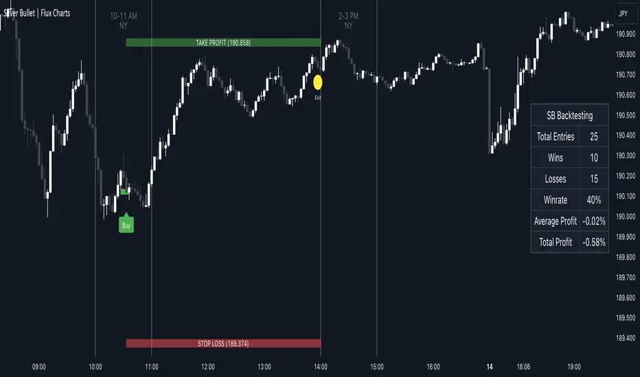
ICT Silver Bullet | Flux Charts💎 GENERAL OVERVIEW
Introducing our new ICT Silver Bullet Indicator! This indicator is built around the ICT's "Silver Bullet" strategy. The strategy has 5 steps for execution and works best in 1-5 min timeframes. For more information about the process, check the "HOW DOES IT WORK" section.
Features of the new ICT Silver Bullet Indicator :
Implementation of ICT's Silver Bullet Strategy
Customizable Execution Settings
2 NY Sessions & London Session
Customizable Backtesting Dashboard
Alerts for Buy, Sell, TP & SL Signals
📌 HOW DOES IT WORK ?
ICT's Silver Bullet strategy has 5 steps :
1. Mark your market sessions open (This indicator has 3 -> NY 10-11, NY 14-15, LDN 03-04)
2. Mark the swing liquidity points
3. Wait for market to take down one liquidity side
4. Look for a market structure-shift for reversals
5. Wait for a FVG for execution
This indicator follows these steps and inform you step by step by plotting them in your chart. You can switch execution types between FVG and MSS.
🚩UNIQUENESS
This indicator is an all-in-one suit for the ICT's Silver Bullet concept. It's capable of plotting the strategy, giving signals, a backtesting dashboard and alerts feature. It's designed for simplyfing a rather complex strategy, helping you to execute it with clean signals. The backtesting dashboard allows you to see how your settings perform in the current ticker. You can also set up alerts to get informed when the strategy is executable for different tickers.
⚙️SETTINGS
1. General Configuration
Execution Type -> FVG execution type will require a FVG to take an entry, while the MSS setting will take an entry as soon as it detects a market structure-shift.
MSS Swing Length -> The swing length when finding liquidity zones for market structure-shift detection.
Breakout Method -> If "Wick" is selected, a bar wick will be enough to confirm a market structure-shift. If "Close" is selected, the bar must close above / below the liquidity zone to confirm a market structure-shift.
FVG Detection -> "Same Type" means that all 3 bars that formed the FVG should be the same type. (Bullish / Bearish). "All" means that bar types may vary between bullish / bearish.
FVG Detection Sensitivity -> You can turn this setting on and off. If it's off, any 3 consecutive bullish / bearish bars will be calculated as FVGs. If it's on, the size of FVGs will be filtered by the selected sensitivity. Lower settings mean less but larger FVGs.
2. TP / SL
TP / SL Method -> If "Fixed" is selected, you can adjust the TP / SL ratios from the settings below. If "Dynamic" is selected, the TP / SL zones will be auto-determined by the algorithm.
Risk -> The risk you're willing to take if "Dynamic" TP / SL Method is selected. Higher risk usually means a better winrate at the cost of losing more if the strategy fails.
Close Position @ Session End -> If this setting is enabled, the current position (if any) will be closed at the beginning of a new session, regardless if it hit the TP / SL zone. If it's off, the position will be open until it hits a TP / SL zone.
RSI TrendsThis TradingView script combines RSI trend analysis with FVG (Fair Value Gap) detection to identify potential buy and sell opportunities in financial markets. The script is customizable and provides extensive visual feedback directly on the chart, enhancing both strategic entry and exit points for traders. Raw code of FVG was taken from LuxAlgo
Features
FVG Detection: Identifies Fair Value Gaps (FVG), and provides options to display these gaps based on user settings.
RSI Trend Bars: Utilizes the Relative Strength Index (RSI) to paint bars indicating overbought and oversold conditions. This helps traders understand current market sentiment and potential reversal points.
Customizable Settings: Users can customize the timeframe, FVG types, and RSI thresholds. This flexibility allows the script to be adapted to various trading styles and timeframes.
Historical Analysis: Option to display or hide historical FVGs, helping users analyze past market behavior without cluttering the chart.
Alert System: Integrated alerts for detected buy and sell signals based on RSI conditions and the presence or absence of FVGs. This feature notifies traders of potential trading opportunities.
Trading Signals
Buy, Buy+, and Buy++ Signals: These signals are triggered based on overbought conditions without corresponding bearish FVG presence, with increasing stringency for higher tiers of buy signals.
Sell, Sell+, and Sell++ Signals: These signals are based on oversold conditions devoid of bullish FVG presence, with each subsequent plus sign indicating a higher level of confirmation required to trigger the signal.
Use Case
Ideal for traders who rely on technical analysis and are looking for an automated way to spot potential buy and sell points using both price action gaps and momentum indicators.
Customization
All input parameters are adjustable directly from the indicator's settings panel, making it easy to tailor the tool to your trading needs and preferences.

Fair Value Gap Finder with Integrated Gann BoxTitle: Fair Value Gap Finder with Integrated Gann Box Analysis
Description:
The "Fair Value Gap Finder with Integrated Gann Box Analysis" is a unique technical indicator designed for traders who wish to incorporate the concepts of Fair Value Gaps (FVG) and Gann Box methodologies into their trading strategy. This tool is beneficial for both trend-following and scalping techniques across various markets and timeframes.
Functionality:
The indicator identifies Fair Value Gaps, which are areas on the chart where price has skipped a range, creating a 'gap'. Recognizing these zones can be crucial for understanding potential price support and resistance areas. Alongside FVG detection, this script employs Gann Box principles to project potential levels of interest. Gann Boxes are drawn automatically when an FVG is identified, providing additional insights based on W.D. Gann's theories, which relate to time and price symmetry.
Usage:
Upon detecting an FVG, the indicator will highlight the gap on the chart and overlay a Gann Box between the high and low points of the gap. Traders can use these zones to make informed decisions about entry and exit points, stop loss, and take profit levels. The script offers customization options for the appearance and behavior of the FVG boxes and Gann Lines, allowing users to adapt the tool to their preferences.
Originality:
What sets this indicator apart is the integration of FVG with Gann Box levels within a single tool, streamlining the analysis process. It takes the classic approach of identifying gaps and enriches it with the geometric significance of Gann's work, all while allowing users to visualize and interact with these levels in a user-friendly manner.
Open-Source Nature:
This script is open-source, making it a transparent solution for those who wish to understand the underlying calculations. While not all traders are versed in Pine Script, the logic of identifying FVGs and applying Gann Box levels is explained through the script's annotations and the user interface itself.
Instructions for Use:
Apply the script to your chart, and it will automatically detect FVGs.
Adjust the settings in the indicator's input menu to match your trading style and preferences.
Use the FVG and Gann Box levels as potential areas of interest for trade setups.
This script does not guarantee profits and should be used as part of a comprehensive trading plan. It is best used in conjunction with other analysis methods to confirm signals and strategies.

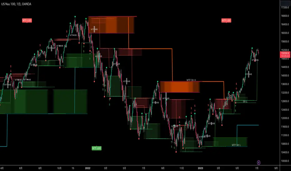
MTF Smart Money ConceptsOverview
This indicator displays major elements of Smart Money Concepts and price action trading with multi-timeframes(MTF) and layered market structures with color visualization.
What is Smart Money Concepts?
Smart Money Concepts(SMC) is one of the methodologies to interpret how financial market moves and to analyze it and execute trades, focusing on liquidity and order flow of financial institutions.
Smart money means the funds invested by large financial institutions such as banks, institutional traders/investors, market makers, hedge funds etc. contrary to retail traders/investors' money.
It is important to note that there is no proof or evidence that those institutions move the market as described in Smart Money Concepts.
Personally speaking, it is one of the interpretation of the market and another angle to view the market just like other technical analysis methodologies such as Elliott Wave Principle, Gann Theory, Wyckoff Method and even traditional price action trading.
Importance of MTF Analysis
MTF analysis(a.k.a Topdown analysis) is the foundation to technically analyze charts and the most fundamental skill in trading because lower timeframes are always influenced by upper timeframes where large financial institutions operate.
How to use
This indicator is designed to help traders analyze how the market moves in terms of SMC and price action with multi-timeframes and color visualization of the market structures, which makes this indicator unique and different from other indicators.
There is two key settings that you can use based on your trading style.
1.Upper timeframe selection
You have two options to determine upper timeframe; Auto mode and Manual mode.
When Auto mode selected, upper timeframe will be determined based on chart timeframe as follows.
Chart timeframe => Upper timeframe
1M=>15M
5M/15M=>1H
30M/1H=>4H
4H=>D
D=>W
W=>M
If you select Manual mode, you can fix an upper timeframe.
2.High/low settings
This affects all other settings of the indicator and most importantly designs the market structure.
This is the key setting to determine how you view the market as price action trading is all about highs and lows and story of how highs and lows have been created with the market structure.
You can specify left bars and right bars to identify swing highs/lows and these highs/lows become the basis to design the market structure and determine how SMC elements are displayed.
Example:
Left bar&right bar: 10
You can see bigger wave(magenta line) in the market structure(stepped line).
(Magenta line is a drawn object by manual)
Left bar&right bar: 4
With this setting, you can see smaller wave in the market structure.
Since market moves like wave as there is a lot of wave theories in financial investment/trading industry such as Elliott wave, Wolf wave etc., users can define market structure with this setting depending on what degree of wave they aim to trade.
Functions:
MTF Order Block
Concept
Order block is a block of orders where buying orders and selling orders are accumulated. Order blocks are created when the institutions move the market up and down, temporality placing orders in an opposite direction to the way they want to move, in order to match their own orders with counter-orders.
Visualization by the indicator
The indicator displays both chart timeframe's order blocks and upper timeframe's order blocks(MTF).
You can also select from two options how to display order blocks;
1. Show all order blocks
2. Show strong order blocks only
Note: Strong order blocks mean order blocks created at strong highs/lows. See also strong high/low below.
Alerts can be set when prices reach strong order blocks.
MTF Fair Value Gap(FVG)/Imbalance
Concept
Fair Value Gap(FVG)(Imbalance) is a void generated among three consecutive candlesticks.
FVG(s) is created when the market moves so rapidly generating buy side or sell side order imbalances.
FVG(s) is characterized by price action that prices tend to come back to the area where FVG(s) exists, filling in the space among the candlesticks.
Visualization by the indicator
The indicator displays both chart timeframe's FVG and upper timeframe's FVG.
MTF Liquidity Grab
Concept
Liquidity grab is price action to sweep liquidity for the institutions to move the market.
This price action often happens because the size of their orders is so huge and they need a bunch of counter-orders to match their orders. This is why prices sometimes come to areas where liquidity rest and swipe them before the market goes up/down.
Liquidity visualization
Where does liquidity rest?
The answer is above highs(buy side liquidity) and below lows(sell side liquidity).
Among all highs and lows, swing highs and lows are where liquidity is accumulated the most because swing highs and lows can be created only by the institutions, therefore massive liquidity is indicated.
Visualization by the indicator
The indicator displays liquidity dots so that users can easily identify where liquidity rests and liquidity grab of both a chart timeframe and an upper timeframe.
Alerts can be set when liquidity grab happens.
MTF Strong High/Low
Concept
Strong high/low literally means strong highs and lows among all highs and lows including swing highs and lows.
There is a few different definitions of strong high/low in price action trading and the definition in this indicator is as follows.
Strong high
A high that that breaks higher low or lower low
Strong low
A low that breaks lower high or higher high
Visualization by the indicator
The indicator displays strong highs and lows of both a chart timeframe and an upper timeframe.
MTF Market Structure Visualization
Concept
Market structure is a series of price movement with highs and lows which outlines the way the market directs. It is a basis to see trend occurrence, trend reversal and sideways and analyzing the market structures in multi-timeframes is the most fundamental technical skill in trading/investment.
Visualization by the indicator
The indicator displays market structures of both a chart timeframe and an upper timeframe and provide color visualization depending on bullish and bearish market structures.
The definition of bullish and bearish market structure is as follows.
Bullish market structure
When a price breaks a Lower High or Higher High
Bearish market structure
When a price breaks a Higher Low or Lower Low
Settings
All the functions above, colors and line settings are parameterized and can be turned on/off depending on users’ needs.
———————————————————————————
概要
Smart Money Concepts(SMC)およびプライスアクショントレードにおける重要な要素をマルチタイムフレームで表示することのできるインジケーターです。
相場構造(Market structure)をマルチタイムフレームで表示し、相場構造の強弱を色で可視化することができます。
Smart Money Concepts(スマートマネーコンセプト)とは?
Smart Money Concepts(以下SMC) は金融市場がどのように動くかを解釈し、分析し、取引を執行するための相場理論の一つであり、Liquidity(リクイディティ)および機関投資家のオーダーフロー(注文の流れ)に焦点を置いていることが特徴です。
Smart Money(スマートマネー)とは、銀行や機関投資家、マーケットメーカー、ヘッジファンドといった金融機関が動かす資金を意味し、個人投資家の資金と対をなす概念です。
重要な点は、実際に上記の金融機関がSmart Money Conceptsで語られているような相場の動かし方をしているかどうかを証明する明確なエビデンスはないということです。
個人的には、エリオット波動理論やギャン理論、ワイコフ理論、伝統的なプライスアクショントレーディングの方法論と同様に、マーケットの動きを解釈するための一つの方法論であり、マーケットの動きを別の角度から見る枠組みと捉えています。
マルチタイムフレーム(MTF)分析の重要性
MTF分析はチャートをテクニカルに分析する上での基礎であり、トレードにおいて最も重要なスキルです。なぜなら下位のタイムフレームは上記のような金融機関が資金運用を行う上位のタイムフレームの影響を常に受けるためです。
使い方
このインジケーターは、SMCまたはプライスアクショントレードの観点から、トレーダーがマーケットをマルチタイムフレームで分析することを支援するために開発しています。
相場構造(Market structure/マーケットストラクチャー)を方向性に応じて色で可視化することができるため、視覚的に相場の構造を判断できることがこのインジケータのユニークな点であり、他のインジケーターと異なる点です。
ユーザーのトレードスタイルに応じて、以下の二つの設定を行うことができます。
1.上位足の決定方法
ユーザーは上位足のタイムフレームを決定するにあたり、AutoモードとManualモードを選択することができます。
Autoモードを選択した場合、上位足はチャートのタイムフレームに応じて以下のように決定されます。
チャートタイムフレーム => 上位足タイムフレーム
1M=>15M
5M/15M=>1H
30M/1H=>4H
4H=>D
D=>W
W=>M
Manualモードを選択すると上位足のタイムフレームを固定することができます。
2.High/low(高値/安値) 設定
当設定はインジケーターの他の全ての機能に影響し、また最も重要である相場構造の定義に影響します。
当設定はユーザーがマーケットをどのように見るか(=どの程度の粒度)を決定する重要な設定です。なぜならプライスアクショントレードは、高値、安値とそれらが相場構造をどのように構築してきたかの一連の流れを分析することが全てだからです。
ユーザーは相場構造を決定付けるスイングハイ·スイングローを特定するためのバーの本数を設定することができます。ここで設定した内容が、相場構造を定義し、以下で説明するSMCの要素の表示を決定することになります。
例:
Left bar&right bar(左右のバーの数): 10
この場合、ステップラインで示した相場構造の中に大きな波(マゼンタの波)を見ることができます。
(マゼンタのラインは手動で描いたオブジェクト)
Left bar&right bar: 4
この設定では、上記に比べて小さい波を描いていることが確認できます。
相場理論の中にエリオット波動理論やウォルフ波動といった数多くの波動理論があることからわかるように、相場は波として動きます。どの粒度の波を狙うかというトレーダーのスタイルに応じて、設定を変更することができます。
機能
MTFオーダーブロック
コンセプト
オーダーブロックとは買い注文と売り注文が一連となって蓄積されたオーダー(注文)のブロックのことです。
オーダーブロックは機関投資家が相場を動かす際に、本来意図する方向とは一時的に逆に動かすことで、彼ら自身の注文をマッチングさせるための反対注文を発生させることで形成されます。
インジケーターによる表示
インジケーターはチャートタイムフレームのオーダーブロックと上位足のオーダーブロックの両方を表示することができます。
また、オーダーブロックの表示オプションとして、
1.全てのオーダーブロックを表示
2.Strong(ストロング)オーダーブロックのみを表示
を選択することが可能です。
注: StrongオーダーブロックはStrong High/Lowで形成されるオーダーブロックを指します。(下記参照)
また、オーダーブロック到達でのアラート設定も可能です。
MTFフェアーバリューギャップ(FVG)/インバランス
コンセプト
フェアーバリューギャップ(FVG)/インバランスとは連続する3つのローソク足の間に形成される溝(Gap)のことです。
フェアーバリューギャップはマーケットが非常に早く動いたことにより、買いオーダーと売りオーダーの需給バランスが崩れることによって発生します。
フェアーバリューギャップには、価格がフェアーバリューギャップが発生したエリアまで戻ってくる傾向があるという特徴が存在します。
インジケーターによる表示
インジケーターはチャートタイムフレームのフェアーバリューギャップと上位足のフェアーバリューギャップの両方を表示することができます。
MTF Liquidity Grab(リクイディティ·グラブ)
コンセプト
Liquidity(リクイディティ)とはマネー、つまり注文です。
Liquidity Grab(リクイディティ·グラブ)とは、機関投資家がマーケットを動かす際にLiquidityを取得するプライスアクションのことを指します。
このプライスアクションは、機関投資家が処理する注文サイズが非常に大きいため、自身の注文を出す際に大量の反対注文を必要とすることからしばしば発生します。
これが、価格がLiquidity(注文)の集まっているエリアに接近し、それら注文をスワイプ(狩り取る)した後に上昇·下落する理由です。
Liquidityの可視化
一般的にLiquidityは高値の上(buy side liquidity)、安値の下(sell side liquidity)に存在します。
全ての高値·安値の中で、スイングハイ·ローがliquidityが最も蓄積されているエリアということができます。なぜならスイングハイ·ローは機関投資家の注文によってのみ形成されるからです。
インジケーターによる表示
ユーザーがLiquidityポイントを簡単に識別できるようにLiquidityをドット表示することが可能です。またチャートタイムフレームと上位足の両方のLiquidity Grabを表示することができます。
Liquidity Grab発生時にアラートも設定可能です。
MTF Strong High/Low(ストロングハイ·ロー)
コンセプト
Strong high/lowは文字通り、強い高値·安値のことを指します。
トレーダーの間でいくつかの異なる定義が存在しますが、当インジケーターでの定義は以下の通りです。
Strong high
Higher low(ハイアーロー) または Lower low(ロワーロー)をブレイクした高値
Strong low
Lower higher (ロワーハイ) または Higher High(ハイアーハイ)をブレイクした安値
インジケーターによる表示
チャートタイムフレーム、上位足のStrong High/Lowを表示することが可能です。
相場構造可視化
コンセプト
相場構造(Market structure/マーケットストラクチャー)とは、相場の流れを成り立たせる高値と安値を元にした一連の値動きです。建物における骨組みに該当します。
トレンドの発生、転換、レンジを見極めるための基礎であり、マルチタイムフレームで相場構造を分析することは、投資·トレードにおいて最も重要なテクニカルスキルです。
インジケーターによる表示
チャートタイムフレームと上位足タイムフレーム両方の相場構造を表示することができます。
また、相場構造が強気の状態か弱気の状態かを色で可視化するため、上位足含めた相場の流れを視覚的に判断することが可能です。
相場構造の強弱の定義は以下の通りです。
強気の相場構造(Bullish market structure)
価格がLower HighまたはHigher Highをブレイクしたとき
弱気の相場構造(Bearish market structure)
価格がHigher LowまたはLower Lowをブレイクしたとき
設定
上記の全ての機能は色やライン設定含めパラメーターで設定が可能です。またユーザの必要に応じて表示·非表示を切り替えることができます。
BanShen MACD Ultimate Multi Signal System[SpeculationLab]🧠 How This Script Works (Detailed Logic Breakdown)
This script is a closed-source, fully self-developed modular trading system centered around MACD divergence detection. It also includes auxiliary modules such as:
Vegas Tunnel trend filtering
Dynamic ATR-based stop placement
Engulfing candlestick pattern detection
RSI/OBV divergence modules
Fair Value Gap (FVG) recognition
A smart signal panel that consolidates all signals in real time
These components work together through a signal resonance framework, helping traders identify high-confluence, high-probability entry opportunities.
🔍 Why MACD Divergence Is the Core (Real-World Strategy Basis)
This system is based on a real-world trading strategy I’ve personally used and refined over time.
Through discretionary trading and backtesting, I discovered that divergence between price action and the MACD histogram — especially when certain structural conditions are met — produces a very high win rate.
Key observations include:
MACD peaks/troughs that are clean and well-shaped (defined pivot structure)
Large vertical differences between two MACD histogram extremes
Price making a higher high or lower low, while MACD does the opposite
Two or more divergences appearing consecutively, which creates a powerful reversal signal
These setups have proven extremely reliable in my experience. This script automates the detection of these conditions using strict logic filters.
🔷 1. MACD Divergence Engine (Core Module)
At its core, this script implements a multi-layered MACD divergence detection system, capable of identifying both **regular** and **consecutive** bullish/bearish divergences.
Key components of the logic:
- **Pivot-Based Peak Detection:**
Peaks and troughs in the MACD histogram are located using left/right lookback lengths.
These define valid turning points by requiring the center bar to be the highest (or lowest) compared to its neighbors.
- **Peak Size Thresholding:**
The height of the histogram peaks is compared to the standard deviation of MACD values.
Only peaks above a configurable multiplier (e.g., 0.1× stdev) are considered significant, filtering out noise.
- **Peak Ratio Filtering:**
For divergence to be valid, the size ratio between two histogram peaks must exceed a minimum threshold.
This prevents "flat" divergences with no meaningful MACD movement from triggering false signals.
- **Noise Suppression:**
A customizable threshold filters out weak histogram fluctuations between divergence points.
- **Price Action Confirmation:**
The divergence is only confirmed when the price forms a new high or low (depending on the type), and the MACD forms an opposing structure.
- **Consecutive Divergence Detection:**
For high-conviction setups, the script detects sequences of two or more divergences in the same direction.
These use stricter filters and flag rare but powerful market turning points.
Signals are plotted using plotshape() with visual differentiation between regular and consecutive setups. You can enable/disable each type individually.
⏰ Note: Histogram colors are styled similarly to TradingView’s built-in MACD for visual familiarity. However, this script is built entirely from scratch and does not reuse any internal TV code.
---
🔷 2. Trend Filtering via Vegas Tunnel
The **Vegas Tunnel** module plots 5 configurable EMAs (default: 12, 144, 169, 576, 676) to evaluate trend direction.
The trend is considered **bullish** when short EMAs (144/169) are positioned above long EMAs (576/676), and the price is interacting with the short EMA tunnel.
Conversely, a bearish condition is detected when the opposite is true.
A visual triangle marker highlights trend zones, and users can hide/show individual EMAs.
---
🔷 3. ATR-Based Dynamic Stop Loss
This module plots dynamic stop levels above and below the current price based on ATR.
Default setting uses 13-period ATR, and users can customize the multiplier or disable the plot.
It serves as a visual guide for risk management in live trades.
---
🔷 4. Engulfing Pattern Recognition
Candlestick-based signal detection:
- **Bullish Engulfing** occurs when a candle closes above the prior high, and the prior bar is bearish.
- **Bearish Engulfing** when a candle closes below the prior low, and the prior bar is bullish.
Users can modify the logic to use open/close levels for looser or stricter detection.
These patterns are highlighted using plotshape markers and optionally included in the signal table.
---
🔷 5. RSI and OBV Divergence Modules
These modules follow similar logic to the MACD engine:
- Use pivotlow() / pivothigh() to detect swing points.
- Confirm divergence only when price moves in one direction while RSI or OBV moves in the opposite direction.
- Require a minimum distance (in bars) between the two pivots.
- Require a certain ratio between two indicator values and their corresponding prices.
You can only enable **one of MACD/RSI/OBV divergences at a time** to avoid visual overlap, as they share the same subplot.
---
🔷 6. FVG (Fair Value Gap) Auto Detection
This module detects large single-direction price moves where price leaves a visible gap between candle 3 bars ago and 1 bar ago.
- **Bullish FVG**: high < low
- **Bearish FVG**: low > high
ATR-based filters are applied to eliminate minor gaps.
Each gap is drawn as a box and optionally extended, with a central line marking the midpoint (CE - Consequent Encroachment) level.
Traders often look for price to return to this level as an entry signal.
---
🔷 7. Smart Signal Table
All active signals (MACD, Vegas, RSI, OBV, Engulfing) are collected into a **real-time table** that displays current market bias.
- Each module reports whether it is currently giving a bullish (🟢) or bearish (🔴) condition.
- Helps users assess signal alignment (confluence).
- The table is updated every bar and appears in the bottom-right corner.
---
🔷 8. Watermark & Branding
The watermark displays the script name and author at the top-right, and can be toggled via settings.
📌 Not a Mashup — Structured System, Not a Stack of Indicators
⚠️ This is not a random mashup of unrelated indicators.
Every module in this system was intentionally designed to support the core MACD divergence logic by filtering, validating, or amplifying its signals.
Here's how the system achieves signal confluence and structure:
Vegas Tunnel acts as a macro trend filter, helping users determine whether to favor long or short trades.
For example, bullish MACD divergence is more reliable when confirmed by an uptrend in the Vegas EMAs. This prevents users from trading against momentum.
Engulfing Patterns serve as entry-level price action confirmation.
When a bullish engulfing candle appears near a MACD bullish divergence — and trend conditions from Vegas are aligned — the confluence increases dramatically.
This is especially powerful when multiple modules confirm in the same direction on the right side of the chart.
RSI and OBV Divergence modules offer redundant but independent momentum views.
Users may enable them selectively to validate MACD signals, or to use them as standalone alternatives when MACD is flat or noisy.
FVG Zones provide context for entries or targets.
For instance, a MACD bullish divergence forming near a bullish FVG gap increases the odds of reversal.
Price often "fills" these imbalances, which aligns well with reversal setups.
The Smart Signal Table aggregates signals from all modules and provides a visual, real-time overview of the current market bias.
This allows traders to act only when multiple signals are aligned — for example, when MACD is bullish, trend is up, and a bullish engulfing just printed.
Together, this framework creates a coherent decision-making system, where each tool has a defined role: trend filtering, signal confirmation, risk management, or entry detection.
🧩 It is modular in architecture, but not modular in purpose.
This system was not built by stacking indicators, but by integrating logic across modules to support a high-conviction MACD-based strategy.
🧬 Originality Statement
This script is entirely original, developed from scratch without using external libraries or public script code. The logic is fully custom, especially the consecutive divergence detection system and signal integration.
⚠️ Disclaimer
This script is for educational and informational purposes only and does not constitute financial advice. Trade at your own risk.
---
📘 中文简要说明:
这是一个完全原创、闭源的交易系统,核心逻辑为 MACD 柱状图背离信号的识别,配合多模块共振判断,构建出一个高胜率的多信号共振策略。
本指标模块化结构清晰,主要包括:
- MACD 背离识别(支持连续背离)
- Vegas EMA 隧道趋势过滤
- RSI / OBV 背离模块
- 吞没形态识别
- FVG 平衡区间自动标注
- ATR 动态止损提示
- 智能信号面板(整合所有信号并可视化)
所有模块均可单独开启/关闭,适配顺势、逆势或多周期的交易风格。
本脚本为个人实战策略的程序化实现,逻辑完全由零开发,未使用任何公用代码。适合希望提高交易胜率和信号精准度的用户使用。
免责声明:本指标仅用于技术分析学习与参考,不构成任何投资建议。请您独立判断,自行承担交易风险。

Fair Value Gap MTF [by Oberlunar]Fair Value Gap MTF is a multi-timeframe indicator designed to detect and display Fair Value Gaps (FVGs) across up to five customizable timeframes. Fair Value Gaps are price inefficiencies—zones where the market moved too quickly, leaving unfilled areas between candles. These gaps are often used by traders as reference points for future price retracements, as they tend to be revisited or “mitigated” over time.
This indicator extends the traditional FVG concept by introducing dynamic multi-timeframe tracking. Each timeframe has its own visual layer, with distinct user-defined colors for bullish and bearish gaps. The script not only highlights newly formed FVGs but also updates them visually when they are touched by price. Mitigated FVGs are recolored in real time, and an optional setting allows the size of these zones to shrink progressively, reflecting only the remaining untested portion.
Labels at the center of each box display the originating timeframe, offering clear visual context. All calculations are properly aligned with the display chart, ensuring that each FVG is correctly projected into the current view, regardless of its timeframe of origin.
Fair Value Gaps often act as support or resistance levels. Bullish FVGs can serve as areas where price may find support, while bearish FVGs can signal potential resistance. When these zones are mitigated repeatedly, it typically reflects areas of institutional interest, liquidity pools, or zones of accumulation and distribution. Such behavior makes them particularly significant in breakout and reversal strategies.
— Oberlunar 👁️★

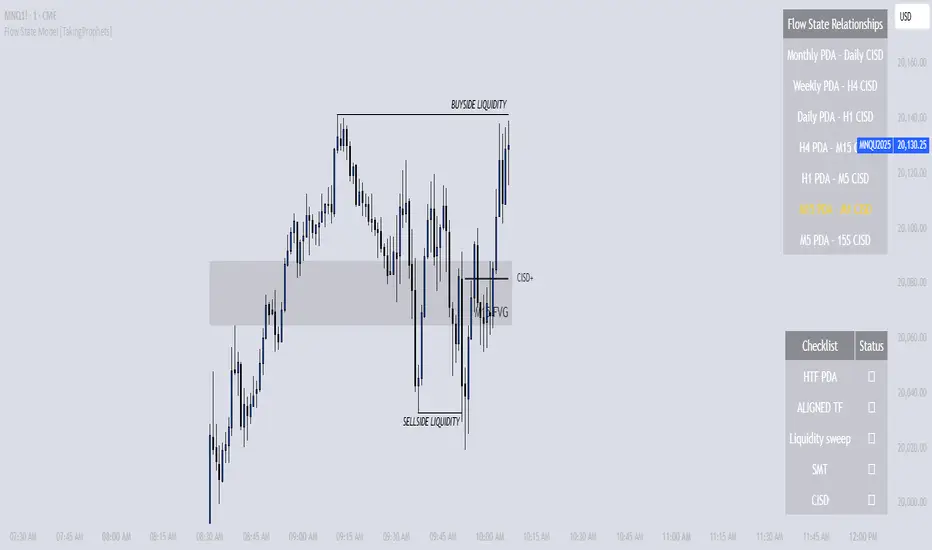
Flow State Model [TakingProphets]🧠 Indicator Purpose:
The "Flow State Model" by Taking Prophets is a precision-built trading framework based on the Inner Circle Trader (ICT) methodology. This script implements and automates the Flow State Model, a highly effective multi-timeframe trading system created and popularized by ITS Johnny.
It is designed to help traders systematically align higher timeframe liquidity draws with lower timeframe confirmation patterns, offering a clear roadmap for catching institutional moves with high confidence.
🌟 What Makes This Indicator Unique:
This is not a simple liquidity indicator or a basic FVG plotter. The Flow State Model executes a full multi-step process:
Higher Timeframe PD Array Detection: Automatically identifies and displays Fair Value Gaps (FVGs) from Daily, Weekly, and Monthly timeframes.
Liquidity Sweep Monitoring: Tracks swing highs and lows to detect Buyside or Sellside Liquidity sweeps into the HTF PD Arrays.
CISD Detection: Waits for a Change in State of Delivery (CISD) by monitoring bullish or bearish displacement after a sweep.
Full Trade Checklist: Visual checklist ensures all critical conditions are met before signaling a completed Flow State setup.
Sensitivity Control: Adapt detection strictness (High, Medium, Low) based on market volatility.
⚙️ How the Indicator Works (Detailed):
Fair Value Gap Mapping:
The indicator constantly scans higher timeframes (4H, Daily, Weekly) for valid bullish or bearish Fair Value Gaps that are large enough (based on ATR multiples) and not weekend gaps.
These FVGs are displayed on the current timeframe with full extension logic and mitigation handling (clearing when invalidated).
Liquidity Sweep Detection:
Swing highs and lows are identified using pivot logic (3-bar pivots). When price sweeps beyond a recent liquidity point into an active FVG, it flags the potential for a Flow State setup.
Change in State of Delivery (CISD) Confirmation:
After a sweep, the script monitors price action for a sequence of bullish or bearish candles followed by displacement (break in delivery).
Only after displacement closes beyond the initiating sequence does a CISD level plot, confirming the market's new delivery state.
Execution Checklist:
An optional table tracks whether critical components are present:
Higher Timeframe PD Array.
Aligned Timeframe Bias.
Liquidity Sweep into FVG.
SMT Divergence (optional manual confirmation).
CISD Confirmation.
Dynamic Management:
Active gaps are extended automatically.
Cleared gaps and mitigated CISDs are deleted to keep charts clean.
Distance-to-FVG prioritization keeps only the nearest active setups visible.
🎯 How to Use It:
Step 1: Identify the bias by locating active higher timeframe FVGs.
Step 2: Wait for a Liquidity Sweep into a PD Array (active FVG).
Step 3: Watch for a CISD event (the Flow State confirmation).
Step 4: Once all conditions are checked off, execute trades based on retracements to CISD levels or continuation after displacement.
Best Timing:
During ICT Killzones: London Open, New York AM.
After daily or weekly liquidity events.
🔎 Underlying Concepts:
Liquidity Theory: Markets seek to engineer liquidity for real institutional entries.
Fair Value Gaps: Imbalances where price is expected to react or rebalance.
Change in State of Delivery (CISD): Confirmation that the market's delivery mechanism has shifted, validating bias continuation.
Flow State Principle: Seamlessly aligning higher timeframe liquidity draws with lower timeframe confirmation to maximize trade probability.
🎨 Customization Options:
Adjust sensitivity (High / Medium / Low) for volatile or calm conditions.
Customize FVG visibility, CISD display, labels, line colors, and sizing.
Set checklist visibility and manual tracking of SMT or aligned bias.
✅ Recommended for:
Traders studying Inner Circle Trader (ICT) models.
Intraday scalpers and swing traders seeking confluence-driven setups.
Traders looking for a structured, checklist-based execution process.
Inner Circle Toolkit [TakingProphets]Inner Circle Toolkit — A Complete ICT Trading Companion
The Inner Circle Toolkit is a closed-source, all-in-one trading tool designed for traders following ICT (Inner Circle Trader) and Smart Money Concepts strategies. Every part of this script is built with purpose — not just a mashup of indicators, but a structured framework to help you follow price through the lens of institutional behavior and liquidity theory.
Let’s walk through what it does and how it can help you:
🕒 Session Liquidity Levels (Asia, London, New York, NY Lunch)
The indicator automatically marks the highs and lows of the major trading sessions:
-Asian Session
-London Session
-New York AM Session
-New York Lunch
These levels are important because price often returns to these points to grab liquidity before making a move. This gives traders clear areas to watch for potential sweeps, rejections, or reversals — without having to manually track session timings every day.
REQHs and REQLs — Equal Highs and Lows
This script detects Relatively Equal Highs and Lows (REQHs/REQLs), which are often used by institutions as stop-run targets.
It’s not just looking for copy-paste double tops or bottoms — it uses a tolerance-based algorithm that checks for clusters of similar highs or lows over a given time period. These are likely to hold stops and become magnets for price. When you see these on the chart, you’ll know where the “juice” is sitting.
Fair Value Gaps (FVG) — Multi-Timeframe
The script automatically plots Fair Value Gaps (FVGs) on both:
-Your current chart timeframe
-One or more higher timeframes (like H1 or H4)
These are three-candle gaps that form when price moves aggressively without filling in value. Price often comes back to these areas to rebalance. Seeing both local and higher-timeframe FVGs on your chart gives better context and helps with entries and exits.
The script is optimized so your chart doesn’t get messy — higher timeframe FVGs show up in a cleaner format with visual labels and lighter shading.
SMT Divergence — With Session Logic
This tool includes a real-time SMT divergence detector, based on the behavior of correlated markets like ES vs. NQ.
Here’s how it works:
If ES sweeps a liquidity level (like Asia Low), but NQ doesn’t, the script detects and marks that divergence.
This often signals institutional accumulation or distribution — a high-probability setup.
You won’t have to flip between charts or manually compare — the SMT logic runs automatically and only fires when it matters (at key session levels). It’s a smarter, more focused way to track intermarket divergences.
Daily Highs and Lows — Week-to-Week Structure
The indicator keeps track of the high and low for each day of the week — Monday through Friday — helping you understand how price is evolving across the week.
This helps build a weekly profile:
Did Monday set the high of the week?
Are we sweeping Tuesday’s low on Thursday?
These levels stay visible and labeled, helping you frame daily setups inside the bigger picture.
🕛 Midnight Open & 8:30 AM Open Levels
These two levels are core ICT concepts used to judge whether price is in premium or discount:
Midnight Open (00:00 EST): Used to determine daily bias
New York Open (08:30 EST): Often a launch point for key moves
Both are drawn automatically and extend throughout the day. This helps you align your trades with potential algorithmic bias, especially during NY session volatility.
⏰ 9:45 AM Vertical Marker — Macro Time Reminder
The script draws a subtle vertical line at 9:45 AM EST, which is the start of the NY AM macro session — one of the most likely times to see setups play out.
This is more than just a timer — it’s a visual cue that something important might be setting up soon, especially if you’re already watching SMT, FVGs, or liquidity zones from earlier.
How It All Connects — A Workflow, Not a Mashup
Every feature in this script is connected to the same goal: helping you trade with the Smart Money.
Here’s how the pieces work together:
Session levels → potential stop hunts
Equal highs/lows → targets
FVGs → entry points
SMT divergence → confirmation or warning
Daily highs/lows → Weekly structure frames bias
Open levels → premium vs. discount
Macro line → timing clue for execution
It’s built to help you flow with price action and trade the story, not just random signals.
Why It’s Closed Source — and Original
This script is closed-source because it contains:
A proprietary system for real-time SMT logic (with intermarket sweep detection)
Multi-timeframe FVG detection that auto-filters overlaps
Smart equal-high/low detection using range-based clustering
Optimized UI that shows a lot without overwhelming the chart
There are no moving averages, no public-domain indicators, and no mashup of standard tools. Everything here is purpose-built for traders who follow ICT strategies.
Let us know how we can improve!

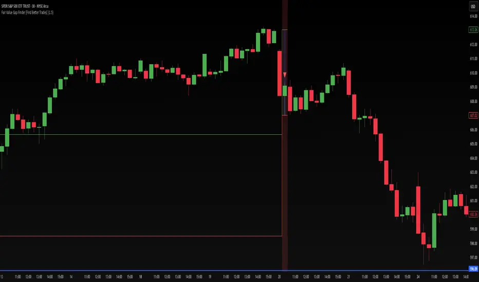
Fair Value Gap Finder [Find Better Trades]Fair Value Gap Finder (FVG) – Spot Institutional Imbalances
📈 Identify Key Market Imbalances
The Fair Value Gap Finder automatically detects price inefficiencies where aggressive buying or selling has created an imbalance in liquidity. These gaps, often left by institutional traders, can serve as key areas for price to revisit before continuing its trend.
🔍 How It Works:
Highlights bullish Fair Value Gaps (FVGs) in green, signaling potential support zones.
Highlights bearish Fair Value Gaps (FVGs) in red, signaling potential resistance zones.
Uses ATR-based filtering to eliminate small, insignificant gaps, focusing only on high-probability setups.
Alerts included! Get notified when a valid Fair Value Gap is detected.
📊 How to Trade Using FVGs:
✅ For Buy Trades: Wait for price to return to a bullish FVG and confirm support before entering long.
✅ For Sell Trades: Wait for price to revisit a bearish FVG and confirm resistance before entering short.
✅ Use with candlestick patterns, trend analysis, or volume for additional confirmation.
⚙️ Customizable Settings:
Adjust the ATR Multiplier to control how large a gap must be before triggering a signal.
Enable alerts to stay informed in real time when new FVGs appear.
💡 Why Use This Indicator?
Fair Value Gaps are widely used by professional traders to spot areas of liquidity, making them valuable for scalping, swing trading, and institutional-style trading.
🚀 Add it to your TradingView chart and start trading with precision!
Directional Targets & POC TableThe "Directional Targets & POC Table" Pine Script™ is a comprehensive tool designed to help traders identify directional bias, potential price targets, and important levels like the Point of Control (POC). Additionally, it detects fair value gaps (FVGs) and order blocks, which are crucial concepts in Smart Money Concepts (SMC) trading. Here's an overview of its functionality:
1. Indicator Overview:
The script combines multiple technical tools into a single visual aid:
Directional Targets: Fibonacci-based upper and lower targets that provide a forecast of where the price might move.
Point of Control (POC): Midpoint of the daily range, displayed visually on the chart.
Fair Value Gaps (FVGs): Areas of imbalance in the market, potentially leading to price reversals.
Order Blocks: Areas where institutional traders might have entered large positions, potentially serving as support or resistance.
2. Key Features:
Directional Targets & POC Table:
A table is displayed in the top-right corner of the chart, showing:
Direction: Based on whether the price is above or below the POC.
Target ↑: The upper target, calculated using Fibonacci's 0.618 level, which acts as a potential resistance.
POC: The midpoint between the daily high and low, serving as the central level of interest.
Target ↓: The lower target, also calculated using the 0.618 Fibonacci level, which serves as potential support.
The table uses colors to make each level easily distinguishable, with green for bullish targets, red for bearish, and yellow for the POC.
POC Visualization:
The Point of Control (POC) is drawn on the chart as a box that stretches horizontally. It highlights the central price range where the highest volume or interest may have occurred, providing a key level for traders to watch.
The POC can act as a support or resistance area, with price frequently reacting at or near this level.
FVG Detection:
Fair Value Gaps are identified when there’s a price imbalance between two bars. These gaps occur when the high of one bar is lower than the low of a bar two periods earlier, or vice versa.
The script draws lines at the boundaries of these gaps, helping traders spot potential areas where the price may return to fill the gap.
If the price revisits and fills the gap, the FVG lines are automatically deleted, signaling the gap is no longer relevant.
Order Blocks Detection:
Bullish Order Blocks are detected when a strong bullish candle forms, where the close equals the high, and it’s higher than the previous bar’s low. This represents potential institutional buying interest.
Bearish Order Blocks are detected when a strong bearish candle forms, where the close equals the low, and it’s lower than the previous bar’s high, representing potential selling interest.
The order blocks are drawn as rectangles on the chart, marking significant price zones that may act as future support (bullish) or resistance (bearish).
3. Direction Determination:
The script calculates the daily high, low, and mid-point (POC). If the current price is above the POC, the market is deemed bullish; if it’s below, the market is bearish. If it’s near the POC, the market is considered neutral.
This directional bias is then displayed in the table, giving traders an easy way to assess whether they should be looking for long or short opportunities.
4. Use Case:
This script is particularly useful for traders who:
Want to identify key levels like the POC and potential price targets based on Fibonacci retracement.
Follow Smart Money Concepts (SMC) and need tools to detect FVGs and order blocks, which can signal areas of market imbalance or institutional involvement.
Need a simple visual aid to determine market direction and structure, helping them make informed trading decisions.
5. Additional Features:
The script is highly visual, providing both numeric information in a table and plotted elements (lines, boxes) directly on the chart.
The automatic detection and clearing of FVGs and order blocks make this tool dynamic and easy to follow.
The script helps identify areas where price might react, giving traders a roadmap to follow for potential entries, exits, or take-profit levels.
This indicator is designed for traders looking to incorporate both conventional and advanced concepts like Fibonacci targets, POC, and SMC principles (FVGs and Order Blocks) into their strategy.

IMGCore - V1.0IMG Core uses five sequential stages to analyse price action and alert users to potential Trade Setups using various Price Action Concepts as detailed below:
1. Identify Higher Timeframe Market Structure and Points of Interest (HTF-POIs)
2. Calculate position size based on your risk appetite, fees and account leverage and customisable maximum trade risk
3. Alert you to risk managed trade setups at enabled HTF-POIs
4. Alert you to trade exits based on your set criteria
5. Provide Additional Alerts such as Higher Timeframe SFPs and Market Structure Breaks that act as potential early warnings that a trade setup may be forming
1. HTF POIs Available with IMG CORE:
a. HTF Market Structure Range Highs and Lows
b. HTF Order Blocks
c. HTF Breakers
d. HTF FVGs
a. Higher Timeframe Market Structure Range High and Low through Multiple Timeframe Analysis:
Market Structure can be defined using several techniques. The IMG indicators employ the Close through High/Low technique, which necessitates a candle to close through a structural level to validate a structural break and designate a new range.
Example: H12 Market Structure visualisation on a H12 Chart with annotations:
By selecting a particular Market Structure timeframe in the settings, the indicator immediately illustrates both current and historical market structures for the chosen timeframe across all subordinate timeframes, subject to the limitations of your Tradingview subscription.
Example: H12 Market Structure visualisation on a H1 Chart with annotations:
b. Higher Timeframe Order Blocks
An Order Block represents the last candle of the opposite direction preceding a Market Structure Break. For instance, a bullish Order Block is identified as the final bearish candle leading to a bullish market structure break, and vice versa for bearish Order Blocks.
Example: H12 OB visualisation on a H12 Chart with annotations:
When activated, the indicator will highlight the Higher Timeframe Order Blocks responsible for a Market Structure Break on all subordinate timeframes relative to the chosen Market Structure Timeframe.
Note: if multiple OBs exist, the indicator will display the OB closest to the new range extreme
Example: H12 OB visualisation on a H1 Chart with annotations:
c. Higher Timeframe Breakers
A Breaker Block is identified as the most recent Order Block that has been breached by price, leading to an opposite Market Structure Break. For example, a bullish Breaker Block is the last bearish Order Block that price has passed through, confirming a bullish structural break, and the inverse is true for bearish Breakers.
Example: H12 Breaker visualisation on a H12 Chart with annotations:
Once enabled, the system will display Higher Timeframe Breaker Blocks after an opposite Market Structure Break is confirmed on all subordinate timeframes.
Example: H12 Breaker visualisation on a H1 Chart with annotations:
d. Higher Timeframe Fair Value Gaps (FVGs)
A Fair Value Gap is a concept used by price action traders to identify market inefficiencies, where buying and selling are not balanced. It appears on a chart as a triple-candle pattern, with a large candle flanked by two others whose highs and lows do not overlap with the large candle, creating a gap. This gap often attracts the price towards it before the market resumes its previous direction.
Example of the indicator displaying a Higher Timeframe’s FVGs on a Lower Timeframe (LTF) chart:
-The upper chart labelled H12/H12 is the indicator displaying H12 Structure and FVGs on a H12 chart.
-The lower chart labelled H12/H1 is the indicator displaying H12 FVGs on a H1 chart
2. Risk Management and Position Sizing:
a. Automated Position Sizing:
The System will automatically calculate position size based on the account size, max leverage and risk appetite (capital risk per trade) details input in settings. Calculated trade details are included in the Tradingview Alerts as well as interactive labels on the charts.
Details include but are not limited to:
Trade Timeframe
Side: Long/Short
Type: Limit/Market
Position Size in $ and Units
Lot sizes if applicable
Trade Risk %
Take Profit Level
Entry Price
Stoploss Price
b. Maximum Trade Risk:
IMG Core has the ability to invalidate potential trade entries if it exceeds your maximum Trade Risk threshold. Trade Risk is the % price difference between entry and stoploss.
When an invalid signal is generated, the signal will not be shaded and the interactive label will display the reason for invalidation
In the example below, Max Trade Risk is set to 2% , but the trade signal had a trade risk of 5.11% , invalidating the signal with a grey triangle
3. Trade Setup Types Available with IMG CORE:
The system will alert you to potential trade setups at these HTF POIs: .
a. Higher Timeframe (HTF) Swing Failure followed by a Lower Timeframe (LTF) MSB at Range Extremes
b. Higher Timeframe (HTF) Swing Failure followed by a Higher Timeframe (HTF) MSB at enabled HTF POIs
c. Lower Timeframe (LTF) Swing Failure followed by a Lower Timeframe (LTF) MSB at enabled HTF POIs
d. Multiple LTF Entry Options once a signal is confirmed
a. HTF Swing Failure followed by a Lower Timeframe (LTF) MSB at Range Extremes
A Swing Failure Pattern (SFP) is a technical analysis concept used in trading to identify potential reversals in price trends. It occurs when the price attempts to surpass a previous high or low but fails to sustain that level, indicating a possible change in market direction. There are multiple methods to define a SFP but this indicator uses the failure to close through a Key Level. When confirmed, HTF SFPs will be displayed on-screen and an alert will fire if enabled.
Example: H12 SFPs at Range Extremes on a H1 Chart:
Alerts to Enter at Lower Timeframe MSBs
When enabled, a potential trade setup label and alert will generate when a HTF SFP is confirmed at a Range Extreme followed by a Chart Timeframe (Lower Timeframe) Market Structure Break (MSB). These signals are agnostic to current Market Structure bias and will generate at both extremes.
b. HTF Swing Failure followed by a Lower Timeframe (LTF) MSB at HTF POIs:
When enabled, a potential trade setup label and alert will generate when a HTF SFP is confirmed at an enabled Higher Timeframe POI (Order Blocks / Breakers / FVGs) followed by a Chart Timeframe (Lower Timeframe) Market Structure Break (MSB). These signals are always in line current Market Structure bias.
Example: H12 SFPs and Trade Setups at HTF POIs with Fluid Exits on a H1 Chart:
c. LTF Swing Failure followed by a LTF MSB at Range Extremes at enabled HTF POIs
The system will alert you to a lower timeframe setup if these conditions are met inside enabled HTF POIs (OBs / Breakers / FVGs):
- LTF SFP
- LTF MSB
Signals will alert you to enter a Limit Entry at the LTF MSB Level OR LTF Breaker
Example:
d. LTF Entry Options:
IMG CORE provides the following options for LTF Entries:
i. Limit Entry at Lower Timeframe MSB Levels
ii. Limit Entry at Lower Timeframe Breakers
Based on this selection, the trade setup alert will provide entry price details to set limit orders at the MSB level or LTF Breaker High.
4. Trade Exit Types Available with IMG CORE:
The system provides the following options for trade exit alerts:
i. User defined Risk to Reward (R:R)
ii. On a confirmed Opposite Signal (Fluid Exits)
Example: H12 Long Entry and Exit Signal using Fluid Exits H1 Chart:
5. IMG CORE Alerts Overview
The system provides notifications of:
1. Confirmed HTF Market Structure Breaks
2. Confirmed HTF SFPs at Range Extremes
3. Confirmed HTF SFPs at HTF POIs
4. Potential Trade Setups at Range Extremes
5. Potential Trade Setups at HTF Points of Interest (HTF-LTF and LTF-LTF)
6. Fixed R Trade Exits
7. Exit on Opposing Signals (Fluid Exits)
To enable alerts, right-click on the indicator and select “Add Alert on IMG ...”. You may customise the alert name as desired and then click 'Create' to finalise the alert setup.
General Note:
There is no system, indicator, algorithm, or strategy that can provide absolute certainty in predicting market movements. Use trading indicators as a tool to assist with trading decisions; manage your risk wisely.
Stay safe and Happy Trading!
MistaB SMC Navigation ToolkitThe MistaB SMC Navigation Toolkit is a multi-functional price action and Smart Money Concepts (SMC) tool designed to help traders quickly identify key market structure shifts, order blocks, fair value gaps (FVGs), premium/discount zones, and higher timeframe (HTF) trend alignment.
This indicator integrates multiple SMC elements into one chart overlay, reducing the need for multiple scripts and improving workflow efficiency.
Main Features:
Automatic Order Block Detection – Identifies bullish and bearish order blocks with optional displacement and volume filters.
Fair Value Gap Highlighting – Marks bullish and bearish FVG zones with optional HTF confirmation.
Market Structure Shift Labels – Detects BoS and CHoCH events with fractal-based swing logic.
HTF Trend Confirmation – Color-codes structure and FVGs based on higher timeframe alignment.
Premium/Discount Zones – Visually divides the range for optimal trade entries.
Custom Cleanup System – Automatically removes broken or filled OB/FVG zones after a user-defined delay.
How to Use
Apply to Your Chart
Add the indicator to your preferred trading timeframe (e.g., 1H, 15M, 5M).
Select your desired HTF Confirmation Timeframe in the settings.
Interpreting the Chart Elements
Green/Red Order Blocks: Potential demand (green) or supply (red) zones.
Green/Red FVG Zones: Imbalances where price may return before continuing.
Market Structure Labels:
HH BoS / HL BoS → Bullish structure breaks.
LH BoS / LL BoS → Bearish structure breaks.
CHoCH → Change of Character (potential reversal).
Premium Zone (red): Above the midline — potential selling areas in a bearish bias.
Discount Zone (green): Below the midline — potential buying areas in a bullish bias.
Trade Example Workflow
Identify overall HTF trend (HTF label at top of chart).
Wait for structure shifts (BoS/CHoCH) aligned with HTF bias.
Look for OB or FVG in discount (buy) or premium (sell) zones.
Manage trade risk with stop-loss below/above the zone.
Disclaimer
This indicator is for educational purposes only.
It does not constitute financial advice and should not be relied upon for investment decisions.
Trading financial markets involves significant risk, and you may lose more than your initial investment.
Always do your own research, test strategies in a demo account, and consult a licensed financial advisor before trading with real capital.
The creator and publisher of this script assume no responsibility for any losses incurred from its use.

Scalper - Pattern Recognition & Price Action Scalper - Pattern Recognition & Price Action Educational Indicator
**Originality and Educational Innovation**
**Why This Comprehensive Integration Merits a New Publication**
This indicator addresses a specific educational gap in technical analysis learning: **the lack of integrated pattern recognition systems that systematically combine traditional candlestick analysis with modern price action concepts in a unified confluence framework**. While individual components like moving averages, RSI, CCI, and basic candlestick patterns are well-established tools, this indicator's originality lies in its **comprehensive educational methodology** and **systematic multi-signal confluence engine**.
**Original Educational Framework:**
1. **Multi-Layer Confluence System**: Original algorithm that systematically combines 6+ different signal categories with customizable threshold requirements for educational analysis
2. **Modern Price Action Integration**: Educational implementation of Fair Value Gaps (FVG) and Order Block detection integrated with traditional pattern recognition
3. **Dynamic Support/Resistance Education**: Original strength-validated S/R system using statistical touch-count methodology rather than simple pivot points
4. **Comprehensive Pattern Library**: Educational collection combining basic and advanced candlestick patterns with mathematical validation criteria
5. **Customizable Multi-Timeframe Framework**: Educational tool allowing cross-timeframe analysis for understanding trend context
**How the Educational Components Work Together Systematically**
**Educational Layer 1 - Trend Context Understanding**: Multi-timeframe moving averages (customizable SMA/EMA/WMA/VWMA/HMA) establish directional bias for learning trend analysis
**Educational Layer 2 - Pattern Recognition Learning**: 15+ mathematically-defined candlestick patterns from basic engulfing to complex three-soldier formations demonstrate systematic pattern identification
**Educational Layer 3 - Modern Price Action Education**: Fair Value Gaps and Order Blocks teach institutional footprint recognition and market structure analysis
**Educational Layer 4 - Dynamic S/R Framework**: Strength-validated support/resistance levels demonstrate statistical validation methodology
**Educational Layer 5 - Momentum Analysis Education**: RSI and CCI extreme reversal detection teaches momentum exhaustion identification
**Educational Layer 6 - Confluence Analysis Methodology**: Original multi-signal combination system demonstrates how to systematically analyze multiple factors
This integrated educational approach provides a comprehensive framework for learning how different technical analysis concepts work together in real market conditions, addressing the common problem of studying indicators in isolation.
**Detailed Technical Implementation and Educational Methodology**
**Original Multi-Signal Confluence Algorithm**
**Educational Confluence Scoring System:**
The indicator implements an original systematic approach to signal combination:
```
Bullish Signal Categories (Educational Analysis):
- Candlestick Patterns: Strong Engulfing, Morning Star, Hammer, Three White Soldiers
- Momentum Indicators: RSI oversold exit (75→70), CCI extreme reversal (-200→-180)
- Price Action: Volume-confirmed breakouts above resistance levels
Bearish Signal Categories (Educational Analysis):
- Candlestick Patterns: Bearish Engulfing, Evening Star, Hanging Man, Three Black Crows
- Momentum Indicators: RSI overbought exit (25→30), CCI extreme reversal (200→180)
- Price Action: Volume-confirmed breakdowns below support levels
Original Confluence Calculation:
User-configurable minimum threshold (2-6 signals required)
Real-time signal counting with dynamic visual feedback
Educational labels showing current signal strength
```
**Why This Systematic Approach is Original:**
Most indicators show patterns individually without systematic combination methodology. This indicator provides an educational framework for understanding how to weight and combine different types of analysis systematically.
**Advanced Pattern Recognition with Educational Validation**
**Original Pattern Validation Methodology:**
Each pattern includes multiple educational validation criteria:
```
Strong Engulfing Educational Criteria:
- Body size > ATR (volatility filter for market significance)
- Current body > previous body (strength confirmation)
- Complete price engulfment (mathematical validation)
- Volume confirmation (market participation validation)
Morning/Evening Star Educational Framework:
- First candle: Directional (bull/bear confirmation)
- Second candle: Indecision (body < 30% of current body)
- Third candle: Reversal confirmation with penetration validation
Three Soldiers/Crows Educational Requirements:
- Three consecutive candles meeting directional criteria
- Each candle body > ATR * 0.5 (significance filter)
- Progressive price advancement (momentum validation)
```
**Modern Price Action Educational Implementation**
**Original Fair Value Gap Detection Algorithm:**
```
Educational FVG Identification:
Bullish FVG: current_low > high AND close > open AND close < open
Bearish FVG: current_high < low AND close < open AND close > open
Educational Purpose: Understanding institutional inefficiencies
Visual Education: Semi-transparent boxes showing gap zones
Practical Learning: Identifying potential reversal or continuation areas
```
**Original Order Block Educational Detection:**
```
Educational Order Block Criteria:
Bullish: Previous candle bullish AND current close > previous high AND volume > 20-period average
Bearish: Previous candle bearish AND current close < previous low AND volume > 20-period average
Educational Purpose: Recognizing institutional accumulation/distribution
Visual Education: Highlighted zones showing institutional interest
Learning Application: Understanding market structure concepts
```
**Dynamic Support/Resistance Educational System**
**Original Strength-Validation Algorithm:**
```
Educational S/R Methodology:
1. Identify recent swing highs/lows over user-defined period
2. Calculate ATR-based tolerance levels (volatility adjustment)
3. Count historical touches within tolerance (statistical validation)
4. Create levels only when touches ≥ minimum strength requirement
5. Project levels forward for future price interaction analysis
Educational Advantage over Simple Pivots:
- Statistical validation through touch counting
- Volatility-adjusted tolerance (adapts to market conditions)
- Strength-based filtering (reduces noise)
- Forward-looking projection (practical application)
```
**Comprehensive Educational Features and Customization**
**Multi-Timeframe Educational Framework**
- **MA 1**: SMA 34 with customizable timeframe (short-term trend education)
- **MA 2**: SMA 63 with customizable timeframe (medium-term trend education)
- **MA 3**: User-selectable type (SMA/EMA/WMA/VWMA/HMA) with customizable timeframe
- **MA 4**: User-selectable type for long-term trend context
- **Educational Purpose**: Understanding cross-timeframe trend analysis
**Educational Pattern Detection Parameters**
- **ATR Length**: Volatility measurement for pattern significance (default: 14)
- **Volume Validation**: Historical volume comparison for pattern confirmation
- **Mathematical Ratios**: Precise wick/body ratios for pattern classification
- **Strength Filters**: Size and volume thresholds ensuring pattern validity
**Educational Price Action Configuration**
- **FVG Detection**: Three-candle gap analysis with directional confirmation
- **Order Block Settings**: Volume threshold and visual projection length
- **S/R Parameters**: Detection period, minimum touch count, tolerance calculation
- **Educational Visualization**: Clear boxes and labels for learning identification
**Customizable Educational Dashboard**
- **Position Control**: 6 different dashboard positions for optimal viewing
- **Color Customization**: Full color control for text, backgrounds, and signals
- **Real-Time Education**: Current RSI, CCI, ATR values for learning
- **Signal Analysis**: Live bullish/bearish signal counts for confluence education
- **Educational Branding**: Clear identification as learning tool
Educational Applications and Learning Outcomes
**Progressive Learning Structure for Technical Analysis**
**Beginner Level Education:**
- Moving average trend identification across timeframes
- Basic candlestick pattern recognition with mathematical criteria
- Introduction to support/resistance concepts with visual validation
**Intermediate Level Education:**
- Multi-pattern analysis and pattern strength assessment
- RSI and CCI momentum analysis with extreme level identification
- Volume analysis integration with pattern confirmation
**Advanced Level Education:**
- Fair Value Gap theory and practical institutional analysis
- Order Block detection and market structure understanding
- Multi-signal confluence methodology and systematic signal combination
**Practical Educational Workflow**
1. **Setup Phase**: Configure moving averages for chosen timeframes and enable desired patterns
2. **Context Analysis**: Study trend direction using multi-timeframe MA alignment
3. **Pattern Study**: Identify candlestick formations meeting mathematical validation criteria
4. **Price Action Learning**: Analyze FVG and Order Block formations for institutional insight
5. **Confluence Education**: Count and analyze multiple signal types for probability assessment
6. **Real-Time Practice**: Use dashboard for ongoing market analysis and signal tracking
**Educational Risk Management Concepts**
- **Pattern Reliability Understanding**: Learning which patterns have higher success rates
- **Signal Strength Analysis**: Understanding how confluence affects probability
- **Market Context Education**: Learning when patterns are most/least reliable
- **Systematic Analysis**: Developing consistent methodology for market evaluation
**Technical Requirements and Optimization**
**Performance Optimization for Education**
- **Visual Element Limits**: 500 maximum boxes, lines, and labels for stable performance
- **Efficient Calculations**: S/R updates every 10 bars for smooth operation
- **Memory Management**: Proper array management for dynamic level storage
- **Clean Interface**: Organized input groups for easy educational navigation
**Educational Visualization Standards**
- **Color-Coded Learning**: Consistent color scheme for pattern identification
- **Clear Labeling**: Educational text labels for all major patterns and signals
- **Professional Layout**: Organized visual hierarchy for systematic learning
- **Customizable Display**: User control over visual elements and positioning
**Educational Disclaimers and Learning Focus**
**Educational Purpose Statement**
This indicator is designed as a comprehensive educational tool for learning technical analysis concepts. It demonstrates how traditional candlestick analysis, modern price action concepts, and systematic confluence methodology can be integrated for educational purposes.
**Learning Tool Disclaimer**
The indicator provides an educational framework for studying:
- Traditional and modern technical analysis integration
- Systematic pattern recognition methodology
- Multi-signal confluence analysis techniques
- Price action and market structure principles
- Statistical validation approaches for support/resistance
**Risk Education and Understanding**
Technical analysis education requires understanding that:
- Patterns and indicators show historical relationships, not future guarantees
- Confluence analysis increases probability understanding but not certainty
- Educational study should focus on methodology rather than signal generation
- Proper risk management principles must be learned alongside technical analysis
- Real market conditions may differ from educational examples
**Systematic Learning Approach**
This educational tool emphasizes:
- **Methodology over Signals**: Focus on learning systematic analysis approaches
- **Understanding over Automation**: Developing analytical skills rather than relying on automated signals
- **Education over Trading**: Comprehensive learning framework for technical analysis concepts
- **Progressive Development**: Building skills systematically from basic to advanced concepts
**Technical Documentation and Implementation**
**Original Algorithm Documentation**
All custom algorithms are documented for educational transparency:
- Pattern detection mathematics with specific criteria
- Confluence scoring methodology with threshold requirements
- Support/resistance validation with statistical touch counting
- Price action detection with institutional footprint identification
**Educational Code Structure**
- **Comprehensive Comments**: Every section includes educational purpose explanation
- **Version Tracking**: Clear version documentation for educational development
- **Performance Notes**: Optimization techniques explained for learning
- **Customization Guidance**: Clear parameter explanation for educational experimentation
---
**Educational Innovation Summary:**
This implementation represents an original approach to technical analysis education, systematically combining traditional pattern recognition with modern price action concepts in an integrated confluence framework. The educational methodology addresses common learning gaps by providing systematic approaches to multi-signal analysis, statistical validation, and institutional footprint recognition.
**Learning Value:**
The comprehensive educational framework eliminates the need to study multiple separate indicators by providing an integrated learning platform that demonstrates how different technical analysis concepts work together systematically in real market conditions.
**Educational Commitment:**
This indicator prioritizes education and systematic learning over simple signal generation, providing traders with the analytical framework needed to develop comprehensive technical analysis skills through hands-on practice and systematic methodology development.

The Barking Rat ReversionsMean Reversion with Multi-Layered Precision
The Barking Rat Reversions is a short-term mean reversion strategy tailored for high-volatility markets. It combines several well-established technical tools in a configuration to identify overextended price movements likely to revert toward equilibrium. The goal is to isolate high-quality, short-term reversal opportunities while filtering out low-conviction setups.
At its core, our strategy triggers off Fair Value Gaps (FVGs) that occur a considerable distance away from a dynamically defined equilibrium band. It then validates these gaps by checking proximity to recent support and resistance drawn from swing extremes.
Additional confirmation comes from momentum filters and wick-rejection patterns, ensuring each entry aligns with both price structure and stretched momentum. Exits use volatility-adjusted profit targets. Keeping the approach disciplined and adaptive.
🧠Core Logic: Selectivity & Structure
This strategy is intentionally very selective. We have designed it to filter out roughly 95% of all market noise, highlighting only setups that pass multiple validation layers outlined below.
Fair Value Gaps (FVGs) as the Primary Trigger
FVGs identify imbalance zones where price historically retraces. These inefficient zones often become magnets for reversion as the market seeks to rebalance.
Dynamic Equilibrium Band + S/R
Defines a fair value zone with a long-term moving average and combines it with shorter-term swing pivots to establish support/resistance. Only FVGs that occur outside the band and near recent pivots are considered, ensuring reversals are sufficiently distanced and not taken too close to the mean.
Proximity to Support/Resistance
Setup validity depends on location. The strategy filters for FVGs near well-defined structural levels — areas where price has previously turned (i.e., recent swing highs or lows). This increases the likelihood that reversals are occurring at legitimate zones of confluence.
Wick-Rejection Confirmation
Confirms potential exhaustion through characteristic candle wick patterns beyond the equilibrium region. This acts as another filter to improve signal accuracy.
Sequential Filtered Signals
Custom logic ensures that a new signal in any direction must improve upon the previous one, preventing repetitive or suboptimal entries.
Multi-Step Confirmation
All validation layers must coincide on the same bar before a signal triggers, dramatically reducing false positives.
📈Chart Visuals: Designed for Clarity
To ensure transparency and easy interpretation, the script overlays intuitive visuals:
Green “▲” below a candle: Indicates a potential long entry
Red “▼” above a candle: Indicates a potential short entry
Green “✔️”: Marks exit from a trade when ATR target is met
Background shading (green/red): Indicates trade direction while active
Support/Resistance lines: Auto-plotted from recent swing levels
🔔Alerts: Stay Notified Without Watching
The strategy supports real-time alerts on candle close, ensuring that signals are only triggered once fully confirmed.
You must manually set up alerts within your TradingView account. Once configured, you’ll be able to set up one alert per instrument. This one alert covers all relevant signals and exits — ideal for hands-free monitoring.
⚙️Strategy report properties
Position size: 25% equity per trade
Initial capital: 10,000.00 USDT
Pyramiding: 10 entries per direction
Slippage: 2 ticks
Commission: 0.055% per side
Backtest timeframe: 1-minute
Backtest instrument: HYPEUSDT
Backtesting range: Jul 21, 2025 — Aug 7, 2025
Note on Sample Size:
You’ll notice the report displays fewer than the ideal 100 trades in the strategy report above. This is intentional. The goal of the script is to isolate high-quality, short-term reversal opportunities while filtering out low-conviction setups. This means that the Barking Rat Reversions strategy is ultra-selective, filtering out over 95% of market noise by enforcing multiple validation layers. The brief timeframe shown in the strategy report here illustrates its filtering logic over a short window — not its full capabilities. As a result, even on lower timeframes like the 1-minute chart, signals are deliberately sparse — each one must pass all criteria before triggering.
We conducted a broader backtest covering the period from December 5, 2024 to July 31, 2025, during which the strategy identified 968 high-probability setups on the same instrument and timeframe as the strategy report.
For a larger dataset:
Once the strategy is applied to your chart, users are encouraged to expand the lookback range or apply the strategy to other volatile pairs to view a full sample.
💡Why 25% Equity Per Trade?
While it's always best to size positions based on personal risk tolerance, we defaulted to 25% equity per trade in the backtesting data — and here’s why:
Backtests using this sizing show manageable drawdowns even under volatile periods
The strategy generates a sizeable number of trades, reducing reliance on a single outcome
Combined with conservative filters, the 25% setting offers a balance between aggression and control
Users are strongly encouraged to customize this to suit their risk profile.
🔍What Makes This Strategy Unique?
Multi-factor confirmation using FVGs, EMA deviation, RSI, wick rejection, and S/R
Clean, Intuitive Chart Experience
Real-time alerts triggered only on confirmation
Variables monitor prior reversal points, guaranteeing each new signal offers an improved entry
Tracks active positions and resets filters upon exit.

Helper Lib by tristanlee85Library "helpers"
This library offers various functions and types based on the algorithmic
concepts as authored by ICT.
kv(key, value)
Returns a string of the key/value set, suitable for debug logging
Parameters:
key (string)
value (string)
Returns: A string formatted as "{key}: {value}"
kv(key, value)
Parameters:
key (string)
value (int)
kv(key, value)
Parameters:
key (string)
value (float)
kv(key, value)
Parameters:
key (string)
value (bool)
method enable(this, enable)
Enable/Disable debug logging
Namespace types: Debugger
Parameters:
this (Debugger)
enable (bool) : Set to `true` by default.
method group(this, label)
Creates a group label for nested debug() invocations
Namespace types: Debugger
Parameters:
this (Debugger)
label (string)
method groupEnd(this, label)
Ends the specified debug group
Namespace types: Debugger
Parameters:
this (Debugger)
label (string)
method log(this, s, arg1, arg2, arg3, arg4, arg5)
Logs the param values if debug mode is enabled
Namespace types: Debugger
Parameters:
this (Debugger)
s (string) : Title of the log message
arg1 (string)
arg2 (string)
arg3 (string)
arg4 (string)
arg5 (string)
method logIf(this, expr, s, arg1, arg2, arg3, arg4, arg5)
Same behavior as debug() except will only log if the passed expression is true
Namespace types: Debugger
Parameters:
this (Debugger)
expr (bool) : Boolean expression to determine if debug logs should be logged
s (string) : Title of the log message
arg1 (string)
arg2 (string)
arg3 (string)
arg4 (string)
arg5 (string)
style_getLineStyleFromType(opt)
Returns the corresponding line style constant for the given LineStyleType
Parameters:
opt (series LineStyleType) : The selected line style type
Returns: The Pine Script line style constant
style_getTextSizeFromType(opt)
Returns the corresponding text size constant for the given TextSizeType
Parameters:
opt (series TextSizeType) : The selected text size type
Returns: The Pine Script text size constant
style_getTextHAlignFromType(t)
Returns the corresponding horizontal text align constant for the given HAlignType
Parameters:
t (series HAlignType) : The selected text align type
Returns: The Pine Script text align constant
style_getTextVAlignFromType(t)
Returns the corresponding vertical text align constant for the given VAlignType
Parameters:
t (series VAlignType) : The selected text align type
Returns: The Pine Script text align constant
format_sentimentType(sentiment, pd)
Used to produce a string with the sentiment and PD array type (e.g., "+FVG")
Parameters:
sentiment (series SentimentType) : The sentiment value (e.g., SentimentType.BULLISH)
pd (series PDArrayType) : The price data array (e.g., PDArrayType.FVG)
Returns: A formatted string with the sentiment and PD array (e.g., "+FVG")
format_timeToString(timestamp)
Formats a UNIX timestamp into a date and time string based on predefined formats
Parameters:
timestamp (int) : The UNIX timestamp to format
Returns: A formatted string as "MM-dd (E) - HH:mm"
method init(this)
Initializes the session and validates the configuration. This MUST be called immediately after creating a new instance.
Namespace types: Session
Parameters:
this (Session) : The Session object reference
Returns: The Session object (chainable) or throws a runtime error if invalid
method isActive(this, _time)
Determines if the session is active based on the current bar time
Namespace types: Session
Parameters:
this (Session) : The Session object reference
_time (int)
Returns: `true` if the session is currently active; `false` otherwise
method draw(this)
Draws the line and optional label
Namespace types: LineLabel
Parameters:
this (LineLabel) : The LineLabel object reference
Returns: The LineLabel object (chainable)
method extend(this, x)
Extends the line and label right to the specified bar index
Namespace types: LineLabel
Parameters:
this (LineLabel) : The LineLabel object reference
x (int) : The bar index to extend to
Returns: The LineLabel object (chainable)
method destroy(this)
Removes the line and label from the chart
Namespace types: LineLabel
Parameters:
this (LineLabel) : The LineLabel object reference
isFVG(includeVI, barIdx)
Checks if the previous bars form a Fair Value Gap (FVG)
Parameters:
includeVI (bool) : If true, includes Volume Imbalance in the FVG calculation
barIdx (int) : The index of the bar to check from (default is 0 for the current bar)
Returns: A Gap object if a FVG is detected; otherwise, `na`
isVolumeImbalance(barIdx)
Checks if the previous bars form a Volume Imbalance (VI)
Parameters:
barIdx (int) : The index of the bar to check from (default is 0 for the current bar)
Returns: A Gap object if a VI is detected; otherwise, `na`
isLiquidityVoid(barIdx)
Checks if the previous bars form a Liquidity Void (LV)
Parameters:
barIdx (int) : The index of the bar to check from (default is 0 for the current bar)
Returns: A Gap object if an LV is detected; otherwise, `na`
isSwingPoint(barIdx)
Checks if the previous bars form a swing point
Parameters:
barIdx (int) : The index of the bar to check from (default is 0 for the current bar)
Returns: A SwingPoint object if a swing point is detected; otherwise, `na`
Debugger
A debug logging utility with group support
Fields:
enabled (series bool)
_debugGroupStack (array)
Session
Defines a trading session with a name and time range. When creating a new instance of this type, you MUST call init() immediately.
Fields:
name (series string) : A display-friendly name (e.g., "NY AM")
session (series string) : A string defining the session time range (e.g., "1300-1400")
enabled (series bool) : Optional flag for custom logic; defaults to false
start (series int) : UNIX time representing the session start (set via isActive())
end (series int) : UNIX time representing the session end (set via isActive())
_t (series int)
_start_HH (series float)
_start_mm (series float)
_end_HH (series float)
_end_mm (series float)
Gap
Represents a price inefficiency (gap) with details on sentiment and price levels
Fields:
type (series SentimentType) : The sentiment of the gap (e.g., SentimentType.BULLISH)
name (series string) : A display-friendly name (e.g., "+FVG")
startTime (series int) : UNIX time value for the gap's start
endTime (series int) : UNIX time value for the gap's end
startIndex (series int) : Bar index where the gap starts
endIndex (series int) : Bar index where the gap ends
gapLow (series float) : The lowest price level of the gap
gapHigh (series float) : The highest price level of the gap
ce (series float) : The consequent encroachment level of the gap
SwingPoint
Represents a swing point with details on type and price level
Fields:
type (series SwingPointType) : The type of swing point (e.g., SwingPointType.HIGH)
time (series int) : UNIX time value for the swing point
barIdx (series int) : Bar index where the swing point occurs
price (series float) : The price level of the swing point which is either the high or low of the middle bar
LineLabel
Combines a line and box type to produce a line with a label that is properly aligned
Fields:
x (series int) : The X-axis starting point as a bar index
y (series float) : The Y-axis starting point as the price level
color (series color) : Both the line and text color
width (series int) : Thickness of the line
label (series string) : Text to display
showLabel (series bool) : Boolean to conditionally show/hide the label (default is false)
lineStyle (series LineStyleType) : The style of the line
textSize (series TextSizeType)
_b (series box)
_l (series line)
Josh SMC Key Features of Josh SMC
✅ Automatically detects Order Blocks (OB) — both Bullish and Bearish
✅ Accurately identifies Fair Value Gaps (FVG) and tracks whether they are “filled” or not
✅ Detects Change of Character (CHOCH) to signal potential trend reversals
✅ Analyzes price structure in real-time based on Smart Money Concepts
✅ Beginner-friendly, yet powerful for advanced traders
✅ Customizable zone colors and number of OB/FVG displays
✅ Works on all timeframes from 1-minute and up
📌 What You’ll Gain from Using Josh SMC
🔺 Spot potential reversal zones before the crowd
🔻 Avoid chasing fake trends and getting trapped
🎯 Plan your entries and exits with OB and FVG precision
🚫 Eliminate guesswork from your analysis
🚀 Trade with confidence and structure — like smart money does
🔍 Who Is This For?
Traders who follow Smart Money Concepts (SMC), ICT, or Price Action
Anyone seeking high-quality entry/exit zones
Traders who want to understand how institutions move the market
Josh SMC – Smart Money Concepts Indicator
🔍 เข้าใจเจตนารมณ์ของรายใหญ่ มองเห็นตลาดอย่างมืออาชีพ
🔧 จุดเด่นของอินดี้ Josh SMC
✅ ตรวจจับ Order Block (OB) ทั้งฝั่ง Bullish และ Bearish โดยอัตโนมัติ
✅ แสดง Fair Value Gap (FVG) อย่างแม่นยำ พร้อมระบบตรวจจับว่า FVG ถูก “เติมเต็ม” แล้วหรือยัง
✅ ตรวจจับ Change of Character (CHOCH) เพื่อหาสัญญาณกลับตัวในเทรนด์
✅ ใช้การวิเคราะห์โครงสร้างราคาตามหลัก Smart Money Concept แบบ Real-Time
✅ ใช้งานง่าย เหมาะทั้งเทรดเดอร์มือใหม่และมืออาชีพ
✅ ปรับแต่งสีและจำนวนโซนที่ต้องการแสดงได้อย่างยืดหยุ่น
✅ รองรับ Timeframe ตั้งแต่ 1 นาทีขึ้นไป
📌 สิ่งที่คุณจะได้เมื่อใช้ Josh SMC
🔺 มองเห็นจุดกลับตัวของราคาได้ก่อนใคร
🔻 หลีกเลี่ยงการติดดอยจากเทรนด์หลอก
🎯 วางแผนการเข้าออกออเดอร์อย่างแม่นยำตาม OB และ FVG
🚫 ลดความผิดพลาดจากการวิเคราะห์แบบเดาสุ่ม
🚀 เทรดด้วยความมั่นใจและมีระบบ เหมือนรายใหญ่ในตลาด
🔍 เหมาะสำหรับใคร?
เทรดเดอร์สาย Smart Money Concepts (SMC), ICT, Price Action
เทรดเดอร์ที่ต้องการกรอง "จุดเข้า-ออก" คุณภาพสูง
ผู้ที่ต้องการระบบช่วยมองภาพ "พฤติกรรมของรายใหญ่"
Advanced ICT Theory - A-ICT📊 Advanced ICT Theory (A-ICT): The Institutional Manipulation Detector
Are you tired of being the liquidity? Stop chasing shadows and start tracking the architects of price movement.
This is not another lagging indicator. This is a complete framework for viewing the market through the lens of institutional traders. Advanced ICT Theory (A-ICT) is an all-in-one, military-grade analysis engine designed to decode the complex language of "Smart Money." It automates the core tenets of Inner Circle Trader (ICT) methodology, moving beyond simple patterns to build a dynamic, real-time narrative of market manipulation, liquidity engineering, and institutional order flow.
AIT provides a living blueprint of the market, identifying high-probability zones, tracking structural shifts, and scoring the quality of setups with a sophisticated, multi-factor algorithm. This is your X-ray into the market's true intentions.
🔬 THE CORE ENGINE: DECODING THE THEORY & FORMULAS
A-ICT is built upon a sophisticated, multi-layered logic system that interprets price action as a story of cause and effect. It does not guess; it confirms. Here is the foundational theory that drives the engine:
1. Market Structure: The Blueprint of Trend
The script first establishes a deep understanding of the market's skeleton through multi-level pivot analysis. It uses ta.pivothigh and ta.pivotlow to identify significant swing points.
Internal Structure (iBOS): Minor swings that show the short-term order flow. A break of internal structure is the first whisper of a potential shift.
External Structure (eBOS): Major swing points that define the primary trend. A confirmed break of external structure is a powerful statement of trend continuation. AIT validates this with optional Volume Confirmation (volume > volumeSMA * 1.2) and Candle Confirmation to ensure the break is driven by institutional force, not just a random spike.
Change of Character (CHoCH): This is the earthquake. A CHoCH occurs when a confirmed eBOS happens against the prevailing trend (e.g., a bearish eBOS in a clear uptrend). A-ICT flags this immediately, as it is the strongest signal that the primary trend is under threat of reversal.
2. Liquidity Engineering: The Fuel of the Market
Institutions don't buy into strength; they buy into weakness. They need liquidity. A-ICT maps these liquidity pools with forensic precision:
Buyside & Sellside Liquidity (BSL/SSL): Using ta.highest and ta.lowest, AIT identifies recent highs and lows where clusters of stop-loss orders (liquidity) are resting. These are institutional targets.
Liquidity Sweeps: This is the "manipulation" part of the detector. AIT has a specific formula to detect a sweep: high > bsl and close < bsl . This signifies that institutions pushed price just high enough to trigger buy-stops before aggressively selling—a classic "stop hunt." This event dramatically increases the quality score of subsequent patterns.
3. The Element Lifecycle: From Potential to Power
This is the revolutionary heart of A-ICT. Zones are not static; they have a lifecycle. AIT tracks this with its dynamic classification engine.
Phase 1: PENDING (Yellow): The script identifies a potential zone of interest based on a specific candle formation (a "displacement"). It is marked as "Pending" because its true nature is unknown. It is a question.
Phase 2: CLASSIFICATION: After the zone is created, AIT watches what happens next. The zone's identity is defined by its actions:
ORDER BLOCK (Blue): The highest-grade element. A zone is classified as an Order Block if it directly causes a Break of Structure (BOS) . This is the footprint of institutions entering the market with enough force to validate the new trend direction.
TRAP ZONE (Orange): A zone is classified as a Trap Zone if it is directly involved in a Liquidity Sweep . This indicates the zone was used to engineer liquidity, setting a "trap" for retail traders before a reversal.
REVERSAL / S&R ZONE (Green): If a zone is not powerful enough to cause a BOS or a major sweep, but still serves as a pivot point, it's classified as a general support/resistance or reversal zone.
4. Market Inefficiencies: Gaps in the Matrix
Fair Value Gaps (FVG): AIT detects FVGs—a 3-bar pattern indicating an imbalance—with a strict formula: low > high (for a bullish FVG) and gapSize > atr14 * 0.5. This ensures only significant, volatile gaps are shown. An FVG co-located with an Order Block is a high-confluence setup.
5. Premium & Discount: The Law of Value
Institutions buy at wholesale (Discount) and sell at retail (Premium). AIT uses a pdLookback to define the current dealing range and divides it into three zones: Premium (sell zone), Discount (buy zone), and Equilibrium. An element's quality score is massively boosted if it aligns with this principle (e.g., a bullish Order Block in a Discount zone).
⚙️ THE CONTROL PANEL: A COMPLETE GUIDE TO THE INPUTS MENU
Every setting is a lever, allowing you to tune the AIT engine to your exact specifications. Master these to unlock the script's full potential.
🎯 A-ICT Detection Engine
Min Displacement Candles: Controls the sensitivity of element detection. How it works: It defines the number of subsequent candles that must be "inside" a large parent candle. Best practice: Use 2-3 for a balanced view on most timeframes. A higher number (4-5) will find only major, more significant zones, ideal for swing trading. A lower number (1) is highly sensitive, suitable for scalping.
Mitigation Method: Defines when a zone is considered "used up" or mitigated. How it works: Cross triggers as soon as price touches the zone's boundary. Close requires a candle to fully close beyond it. Best practice: Cross is more responsive for fast-moving markets. Close is more conservative and helps filter out fake-outs caused by wicks, making it safer for confirmations.
Min Element Size (ATR): A crucial noise filter. How it works: It requires a detected zone to be at least this multiple of the Average True Range (ATR). Best practice: Keep this around 0.5. If you see too many tiny, irrelevant zones, increase this value to 0.8 or 1.0. If you feel the script is missing smaller but valid zones, decrease it to 0.3.
Age Threshold & Pending Timeout: These manage visual clutter. How they work: Age Threshold removes old, mitigated elements after a set number of bars. Pending Timeout removes a "Pending" element if it isn't classified within a certain window. Best practice: The default settings are optimized. If your chart feels cluttered, reduce the Age Threshold. If pending zones disappear too quickly, increase the Pending Timeout.
Min Quality Threshold: Your primary visual filter. How it works: It hides all elements (boxes, lines, labels) that do not meet this minimum quality score (0-100). Best practice: Start with the default 30. To see only A- or B-grade setups, increase this to 60 or 70 for an exceptionally clean, high-probability view.
🏗️ Market Structure
Lookbacks (Internal, External, Major): These define the sensitivity of the trend analysis. How they work: They set the number of bars to the left and right for pivot detection. Best practice: Use smaller values for Internal (e.g., 3) to see minor structure and larger values for External (e.g., 10-15) to map the main trend. For a macro, long-term view, increase the Major Swing Lookback.
Require Volume/Candle Confirmation: Toggles for quality control on BOS/CHoCH signals. Best practice: It is highly recommended to keep these enabled. Disabling them will result in more structure signals, but many will be false alarms. They are your filter against market noise.
... (Continue this detailed breakdown for every single input group: Display Configuration, Zones Style, Levels Appearance, Colors, Dashboards, MTF, Liquidity, Premium/Discount, Sessions, and IPDA).
📊 THE INTELLIGENCE DASHBOARDS: YOUR COMMAND CENTER
The dashboards synthesize all the complex analysis into a simple, actionable intelligence briefing.
Main Dashboard (Bottom Right)
ICT Metrics & Breakdown: This is your statistical overview. Total Elements shows how much structure the script is tracking. High Quality instantly tells you if there are any A/B grade setups nearby. Unmitigated vs. Mitigated shows the balance of fresh opportunities versus resolved price action. The breakdown by Order Blocks, Trap Zones, etc., gives you a quick read on the market's recent character.
Structure & Market Context: This is your core bias. Order Flow tells you the current script-determined trend. Last BOS shows you the most recent structural event. CHoCH Active is a critical warning. HTF Bias shows if you are aligned with the higher timeframe—the checkmark (✓) for alignment is one of the most important confluence factors.
Smart Money Flow: A volume-based sentiment gauge. Net Flow shows the raw buying vs. selling pressure, while the Bias provides an interpretation (e.g., "STRONG BULLISH FLOW").
Key Guide (Large Dashboard only): A built-in legend so you never have to guess. It defines every pattern, structure type, and special level visually.
📖 Narrative Dashboard (Bottom Left)
This is the "story" of the market, updated in real-time. It's designed to build your trading thesis.
Recent Elements Table: A live list of the most recent, high-quality setups. It displays the Type , its Narrative Role (e.g., "Bullish OB caused BOS"), its raw Quality percentage, and its final Trade Score grade. This is your at-a-glance opportunity scanner.
Market Narrative Section: This is the soul of A-ICT. It combines all data points into a human-readable story:
📍 Current Phase: Tells you if you are in a high-volatility Killzone or a consolidation phase like the Asian Range.
🎯 Bias & Alignment: Your primary direction, with a clear indicator of HTF alignment or conflict.
🔗 Events: A causal sequence of recent events, like "💧 Sell-side liquidity swept →
📊 Bullish BOS → 🎯 Active Order Block".
🎯 Next Expectation: The script's logical conclusion. It provides a specific, forward-looking hypothesis, such as "📉 Pullback expected to bullish OB at 1.2345 before continuation up."
🎨 READING THE BATTLEFIELD: A VISUAL INTERPRETATION GUIDE
Every color and line is a piece of information. Learn to read them together to see the full picture.
The Core Zones (Boxes):
Blue Box (Order Block): Highest probability zone for trend continuation. Look for entries here.
Orange Box (Trap Zone): A manipulation footprint. Expect a potential reversal after price interacts with this zone.
Green Box (Reversal/S&R): A standard pivot area. A good reference point but requires more confluence.
Purple Box (FVG): A market imbalance. Acts as a magnet for price. An FVG inside an Order Block is an A+ confluence.
The Structural Lines:
Green/Red Line (eBOS): Confirms the trend direction. A break above the green line is bullish; a break below the red line is bearish.
Thick Orange Line (CHoCH): WARNING. The previous trend is now in question. The market character has changed.
Blue/Red Lines (BSL/SSL): Liquidity targets. Expect price to gravitate towards these lines. A dotted line with a checkmark (✓) means the liquidity has been "swept" or "purged."
How to Synthesize: The magic is in the confluence. A perfect setup might look like this: Price sweeps below a red SSL line , enters a green Discount Zone during the NY Killzone , and forms a blue Order Block which then causes a green eBOS . This sequence, visible at a glance, is the story of a high-probability long setup.
🔧 THE ARCHITECT'S VISION: THE DEVELOPMENT JOURNEY
A-ICT was forged from the frustration of using lagging indicators in a market that is forward-looking. Traditional tools are reactive; they tell you what happened. The vision for A-ICT was to create a proactive engine that could anticipate institutional behavior by understanding their objectives: liquidity and efficiency. The development process was centered on creating a "lifecycle" for price patterns—the idea that a zone's true meaning is only revealed by its consequence. This led to the post-breakout classification system and the narrative-building engine. It's designed not just to show you patterns, but to tell you their story.
⚠️ RISK DISCLAIMER & BEST PRACTICES
Advanced ICT Theory (A-ICT) is a professional-grade analytical tool and does not provide financial advice or direct buy/sell signals. Its analysis is based on historical price action and probabilities. All forms of trading involve substantial risk. Past performance is not indicative of future results. Always use this tool as part of a comprehensive trading plan that includes your own analysis and a robust risk management strategy. Do not trade based on this indicator alone.
観の目つよく、見の目よわく
"Kan no me tsuyoku, ken no me yowaku"
— Miyamoto Musashi, The Book of Five Rings
English: "Perceive that which cannot be seen with the eye."
— Dskyz, Trade with insight. Trade with anticipation.

XSN Liquidity & VoidsThis indicator is a powerful tool for traders using Smart Money Concepts (SMC). It automatically identifies and plots key areas of liquidity and price imbalances directly on your chart, helping you to visualize the market's structure with ease and precision.
Core Concept: The Liquidity-Imbalance Relationship
This tool is built on the SMC principle of the relationship between the engineering of liquidity and resulting market imbalances. The script visualizes this critical process by:
Plotting key liquidity pools (Major and Internal swing points) from user-defined timeframes.
Showing when this liquidity is 'swept' by price action.
Highlighting Fair Value Gaps (FVGs), or imbalances, that often form immediately after a liquidity sweep.
By combining liquidity lines and FVGs into a single tool, traders can more easily identify high-probability setups where a liquidity grab leads to a market reversal or continuation into an FVG.
Key Features
Multi-Timeframe Major & Internal Liquidity: Automatically plot significant swing highs and lows (pivots) from any timeframe you choose (e.g., 15m, 1H, 4H) onto your current chart.
Automatic Sweep Detection: Lines are automatically marked as 'swept' when price trades through them. Unswept lines extend to the right, while swept lines are fixed in time and change their style for a clean chart.
Recent Sweep Highlighting : The indicator keeps the last few major liquidity sweeps highlighted in their original bright color to help you focus on the most recent price action.
Historical Confluence Labels: Automatically adds labels (e.g., D-HIGH, W-LOW) to liquidity lines that align with previous Daily, Weekly, or 4-Hour highs and lows, signifying areas of major historical importance.
Liquidity Voids / FVGs (Current Timeframe): Instantly identifies and draws Fair Value Gaps (FVGs) on your current chart timeframe, highlighting areas where price may be drawn to.
How to Use This Indicator
Identify Targets: Watch for price to gravitate towards the red (major) and purple (internal) liquidity lines. These represent pools of buy-side and sell-side liquidity.
Confirm Sweeps: A 'sweep' occurs when price wicks through a line, which then changes its appearance. This often signals a reversal or continuation.
Find Confluence: Pay close attention to the historical labels (D-HIGH, W-LOW, etc.). Sweeps of these levels are often significant market events.
Analyze Voids: Use the FVG boxes to identify price imbalances. Price will often seek to fill these voids, making them excellent targets or areas of interest for entries.
An enhanced version of this tool with real-time alerts and auto multi-timeframe FVG analysis is also available.

MTF Candles [Fadi x MMT]MTF Candles
Overview
The MTF Candles indicator is a powerful tool designed for traders who want to visualize higher timeframe (HTF) candles directly on their current chart. Built with flexibility and precision in mind, this Pine Script indicator displays up to six higher timeframe candles, complete with customizable styling, sweeps, midpoints, fair value gaps (FVGs), volume imbalances, and trace lines. It’s perfect for multi-timeframe analysis, helping traders identify key levels, market structure, and potential trading opportunities with ease.
Key Features
- Multi-Timeframe Candles : Display up to six higher timeframe candles (e.g., 5m, 15m, 30m, 4H, 1D, 1W) on your chart, with configurable timeframes and visibility.
- Sweeps Detection : Identify liquidity sweeps (highs/lows) with customizable line styles, widths, and colors, plus optional alerts for confirmed bullish or bearish sweeps.
- Midpoint Lines : Plot the midpoint (average of high and low) of the previous HTF candle, with customizable color, width, and style for enhanced market analysis.
- Fair Value Gaps (FVGs) : Highlight gaps between non-adjacent candles, indicating potential areas of interest for price action.
- Volume Imbalances : Detect and display volume imbalances between adjacent candles, aiding in spotting significant price levels.
- Trace Lines : Connect HTF candle open, close, high, and low prices to their respective chart bars, with customizable styles and optional price labels.
- Custom Daily Open Times : Support for custom daily candle open times (Midnight, 8:30, or 9:30) to align with specific market sessions.
- Dynamic Labels : Show timeframe names, remaining time until the next HTF candle, and interval labels (e.g., day of the week for daily candles) with adjustable positions and sizes.
- Highly Customizable : Fine-tune candle appearance, spacing, padding, and visual elements to suit your trading style.
How It Works
The indicator renders HTF candles as boxes (bodies) and lines (wicks) on the right side of the chart, with each timeframe offset for clarity. It dynamically updates candles in real-time, tracks their highs and lows, and displays sweeps and midpoints when conditions are met. FVGs and volume imbalances are calculated based on candle relationships, and trace lines link HTF candle levels to their originating bars on the chart.
Sweep Logic
- A bearish sweep occurs when the current candle’s high exceeds the previous candle’s high, but the close is below it.
- A bullish sweep occurs when the current candle’s low falls below the previous candle’s low, but the close is above it.
- Sweeps are visualized as horizontal lines and can trigger alerts when confirmed on the next candle.
Midpoint Logic
- A midpoint line is drawn at the average of the previous HTF candle’s high and low, extending until the next HTF candle forms.
- Useful for identifying potential support/resistance or mean reversion levels.
Imbalance Detection
- FVGs : Identified when a candle’s low is above the next-but-one candle’s high (or vice versa), indicating a price gap.
- Volume Imbalances : Detected between adjacent candles where the body of one candle doesn’t overlap with the next, signaling potential liquidity zones.
Settings
Timeframe Settings
- HTF 1–6 : Enable/disable up to six higher timeframes (default: 5m, 15m, 30m, 4H, 1D, 1W) and set the maximum number of candles to display per timeframe (default: 4).
- Limit to Next HTFs : Restrict the number of active timeframes (1–6).
Styling
- Body, Border, Wick Colors : Customize bull and bear candle colors (default: light gray for bulls, dark gray for bears).
- Candle Width : Adjust the width of HTF candles (1–4).
- Padding and Spacing : Set the offset from the current price action and spacing between candles and timeframes.
Label Settings
- HTF Label : Show/hide timeframe labels (e.g., "15m", "4H") at the top/bottom of candle sets.
- Remaining Time : Display the countdown to the next HTF candle.
Interval Value: Show day of the week for daily candles or time for intraday candles.
- Label Position/Alignment : Choose to display labels at the top, bottom, or both, and align them with the highest/lowest candles or follow individual candle sets.
Imbalance Settings
- Fair Value Gap : Enable/disable FVGs with customizable color (default: semi-transparent gray).
- Volume Imbalance : Enable/disable volume imbalances with customizable color (default: semi-transparent red).
Trace Settings
- Trace Lines : Enable/disable lines connecting HTF candle levels to their chart bars, with customizable colors, styles (solid, dashed, dotted), and sizes.
- Price Labels : Show price levels for open, close, high, and low trace lines.
- Anchor : Choose whether trace lines anchor to the first or last enabled timeframe.
Sweep Settings
- Show Sweeps : Enable/disable sweep detection and visualization.
- Sweep Line : Customize color, width, and style (solid, dashed, dotted).
- Sweep Alert : Enable alerts for confirmed sweeps.
Midpoint Settings
- Show Midpoint : Enable/disable midpoint lines.
- Midpoint Line : Customize color (default: orange), width, and style (solid, dashed, dotted).
Custom Daily Open
Custom Daily Candle Open : Choose between Midnight, 8:30, or 9:30 (America/New_York) for daily candle opens.
Usage
- Add the indicator to your TradingView chart.
- Configure the desired higher timeframes (HTF 1–6) and enable/disable features via the settings panel.
- Adjust styling, labels, and spacing to match your chart preferences.
Use sweeps, midpoints, FVGs, and volume imbalances to identify key levels for trading decisions.
- Enable sweep alerts to receive notifications for confirmed liquidity sweeps.
Notes
Performance: The indicator is optimized for up to 500 boxes, lines, and labels, with a maximum of 5000 bars back. Can be slow at a time
Time Zone: Custom daily opens use the America/New_York time zone for consistency with major financial markets.
Compatibility: Ensure selected HTFs are valid (higher than the chart’s timeframe and divisible by it for intraday periods).
