


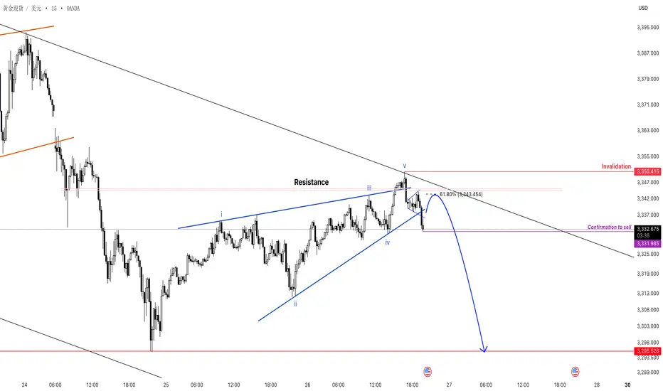
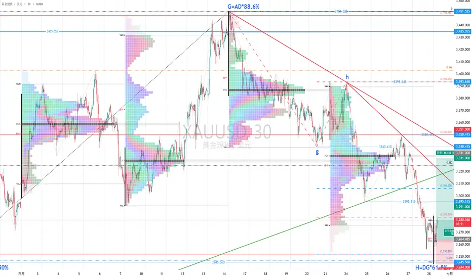
26.Jun-XAUUSD美盤規劃
黃金在亞盤~歐盤期間一路向上抬價
來到美盤新聞前走出上升楔形並且成型、成立,
目前小夥伴們會比較困擾的點應該是此時他的回測位該從哪裡算?
(也就是賣方成本應該要從M5 or M1的1分盤2高往下拉 還是從楔形頂部5浪的位子往下拉?)
大家請先決定出自己的想法
待會將答案公布在留言區~
目前Confirmation位子還沒有真的出來
要等他確定回調後的那個驅動浪底點才會是我們的確認位
所以一樣提醒大家,請按照學習的方式交易
切莫按照箭頭下單。
(待會要出門了~沒空更新,希望大家今晚賺大錢)
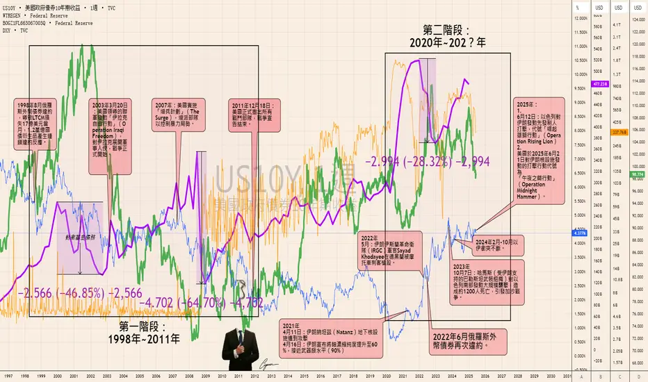
戰爭成為了維護美元世界儲備貨幣地位的一種工具及去美元化悖論戰爭成為了維護美元世界儲備貨幣地位的一種工具及去美元化悖論:
在1998年至2011年以及2020年至2025年的兩個階段中,戰爭成為了維護美元世界儲備貨幣地位的一種工具,這一點從圖表數據和地緣政治事件中清晰可見。
首先,回顧1998年至2011年的階段。當時,美元指數在1998年左右迎來了一個顯著的高峰,這與後續的伊拉克戰爭密切相關。與此同時,1998年俄羅斯因石油價格低迷(美元上漲造成的)和亞洲金融危機導致的財政危機,宣布外幣債券違約,經濟陷入混亂,稅收急劇下降。這種情況促使全球資本流向美國資產,進一步推高了美元價值。而對衝基金的保證金賬戶資產水平——也就是它們的債務——也隨之攀升,達到
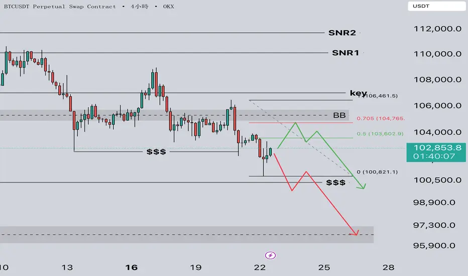
0622 BTC下跌拿掉前低流動性 下一步如何操作 ?📌 市場現況
BTC 經過大幅下跌後,目前於底部區間進行弱勢反彈整理
整體仍處於偏空結構,若未能有效站回關鍵反壓區($105,700 上方),偏空主導格局不變
短線若反彈至 BB 區並出現轉弱訊號,為主空機會
若再次跌回 $$$ 區無吸籌跡象,恐有破底風險
🏗 關鍵區域解析
📍 Key 多空分界:$107,000
→ 為本波下跌前最後明確供應點,若無放量突破,整體結構仍偏空
📍 BB 反壓區:$104,900 - $105,700
→ 為前波供應帶堆疊區,反彈至此若無法突破,為放空首選區域
📍 $$$ 區(前低流動性):$100,300
→ 流動性密集支撐區,若測試未出現吸籌反應,則空
不怕急跌,只怕慢死好像已經沒人理會貿易戰了。本週波動全看伊朗。背後的資金動力,其實更受週期性的影響:各大央行包括美聯儲局議息、美國假期,更為重要的是美指6月期貨到期日。 第二季度尾,也是年中,資金都不願出錯,希望盡力在數據上保持戰績。很快地,新戰線要開打了。目前標普的價錢壓縮在6000大關,而納指則22000。情況並不樂觀,看來是個供應區,是大戶散貨給散戶的大賣場。左邊SPX日線看得出6000以上是不斷被排斥,右邊ES週線也是高位排斥,而且按VWAP計算,(九月份期貨)已到達2x標準差外環,也是6099阻力位。還記得不久之前,價錢升得多凌厲,分別有兩週都是高開的,而且其空隙並還未被填充?現在是填充的時候了,最怕


14/6 黃金下週部署週一開市後先回調至上週提及的阻力3339,出動能反
彈後未有跌穿前底3293,反而在週二亞盤出動能向上
,形成higher low 和 higher high,短線方向睇上
先。
1) 1M圖,週三早段價格在阻力3335下形成橫行,向上
突破後延續失敗跌穿返橫行頂,即市短線向下可試,
但由於前面有向下的假突破,短線睇上,所以向下
只睇到前頂3327會較安全,因為隨時在這反彈向返
上行。最後向下跌得急,3327入市風險可能會較高
,沒有優勢。
2) 週五早段在小時圖前頂3435出動能向下,1M圖,
歐盤前在下行震盪頂做假突破,即市短線向下可試
,亦可看作橫行頂發力,剛好行到橫行1:
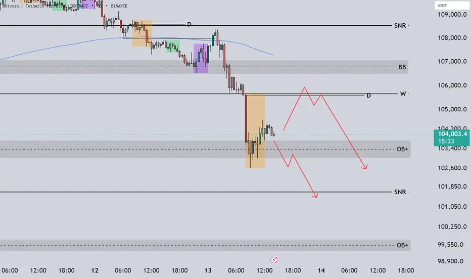
0613 BTC大回調將至? 繫好安全帶 日內交易計畫📌 市場現況
BTC 日前破位大跌後 OB+ 區短線止跌反彈
目前反彈至 OB+ 上方整理,結構仍偏空
圖形紅線主線明確 → 反彈至 W 區受壓做空主線
若 OB+ 區失守 → 空方延伸目標下看 SNR / 更下方 OB+
🏗 關鍵區域解析
📍 SNR 延伸壓力:$108,600
👉 中期攻擊目標,若行情強勢轉多可關注該區
📍 BB 區:$106,500 - $107,000
👉 上方供應防守區,若反彈至此受壓,空方優勢維持
📍 W OPEN:$105,800
👉 反彈主壓區,今日 W/D 很近,直接以 W 為關鍵判斷 → 圖形紅線主線反彈至此區做空主思路
📍 OB+ 吸籌區(當前整
不是花俏技術也能抓趨勢,線圖教你怎麼化繁為簡在分析市場結構時,有時「少即是多」。這正是線圖(Line Chart)大顯身手的時候。雖然大多數交易者習慣使用 K 線圖,但當你需要快速判斷趨勢方向、波段高低點或關鍵轉折位時,轉換為單純收盤價繪製的線圖,往往能提供更清晰的視角。
這並非要你完全放棄 K 線,而是將線圖作為一項工具,幫助你剔除雜訊、專注於真正重要的內容:結構。
為什麼要使用線圖?
線圖僅以每一根 K 線的收盤價繪圖,省略了高低點。這樣的處理方式排除了許多因影線或短期波動造成的「假訊號」。
主要好處包括:
簡化趨勢判斷: 更容易看出高點逐漸升高或下降的節奏。
結構更清晰: 關鍵支撐、壓力與轉折點在圖上更一
富貴能不能銀1. 富貴不能淫:
在富貴的時候,不能被金錢和地位所影響,而變得放縱、不守規矩、不守原則。
2. 貧賤不能移:
在貧賤的時候,不能因為貧困而改變自己的意志和追求。
3. 威武不能屈:
即使面對強權和威脅,也不能屈服,保持自己的尊嚴和原則。
這句話總結來說,是說一個真正的君子或大丈夫,應該在各種環境下都能保持自己的意志和原則,不受外界因素的影響。
chatGPT講得非常好,以下是我的看法:
富貴要靠銀,停利不能移,空空不能屈。
多多繼續贏~

2025 恆指 長線分析(7) 月線圖五月高低價都比4月高低價高
收市價亦都高於中間價
代表恆生指數中期趨勢再次向上
因此尋找機會進行中線時間維度的股票操作
(中線時間維度)=不需要止蝕情況下(最少持有)一個月 不多於3個月
任何分析都總會有錯
因此現在用五月中間價作為分界線
假如將來任何一週(週)線圖(收)市價低於分界線
代表分析可能出錯
就要停止開股票新倉
至於已經持有的股票就要視乎情況決定是繼續持有還是提早離場

查看所有編輯精選的想法
True Close – Institutional Trading Sessions (Zeiierman)█ Overview
True Close – Institutional Trading Sessions (Zeiierman) is a professional-grade session mapping tool designed to help traders align with how institutions perceive the market’s true close. Unlike the textbook “daily close” used by retail traders, institutional desks often anchor their

Open Interest Footprint IQ [TradingIQ]Hello Traders!
Th e Open Interest Footprint IQ indicator is an advanced visualization tool designed for cryptocurrency markets. It provides a granular, real-time breakdown of open interest changes across different price levels, allowing traders to see how aggressive market participation is distribu
Zigzag CandlesCan't deny that I am obsessed with zigzags. Been doing some crazy experiments with it and have many more in pipeline. I believe zigzag can be used to derive better trend following methods. Here is an attempt to visualize zigzag as candlesticks. Next steps probably to derive moving average, atr (alth

MathStatisticsKernelFunctionsLibrary "MathStatisticsKernelFunctions"
TODO: add library description here
uniform(distance, bandwidth) Uniform kernel.
Parameters:
distance : float, distance to kernel origin.
bandwidth : float, default=1.0, bandwidth limiter to weight the kernel.
Returns: float.
triangular(distance
MathConstantsLibrary "MathConstants"
Mathematical Constants
E() The number e
Log2E() The number log (e)
Log10E() The number log (e)
Ln2() The number log (2)
Ln10() The number log (10)
LnPi() The number log (pi)
Ln2PiOver2() The number log (2*pi)/2
InvE() The number 1/e
SqrtE() The n

taLibrary "ta"
█ OVERVIEW
This library holds technical analysis functions calculating values for which no Pine built-in exists.
Look first. Then leap.
█ FUNCTIONS
cagr(entryTime, entryPrice, exitTime, exitPrice)
It calculates the "Compound Annual Growth Rate" between two points i

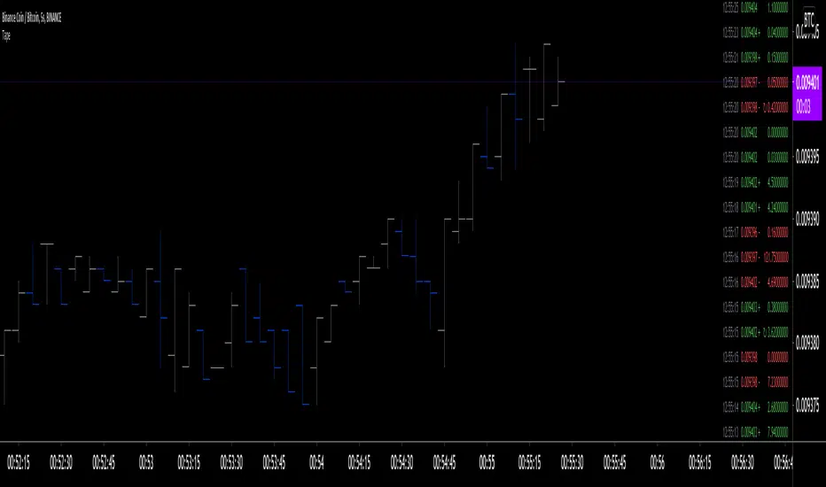
Tape [LucF]█ OVERVIEW
This script prints an ersatz of a trading console's "tape" section to the right of your chart. It displays the time, price and volume of each update of the chart's feed. It also calculates volume delta for the bar. As it calculates from realtime information, it will not display info
Dominance Pie ChartA different type of charting, the pie chart,
here for showing the available dominance on one chart,
together with the total % dominance per ticker and between brackets
the % rise/fall.
Can be used in every timeframe
(It is normal it takes some time to be loaded)
Cheers!

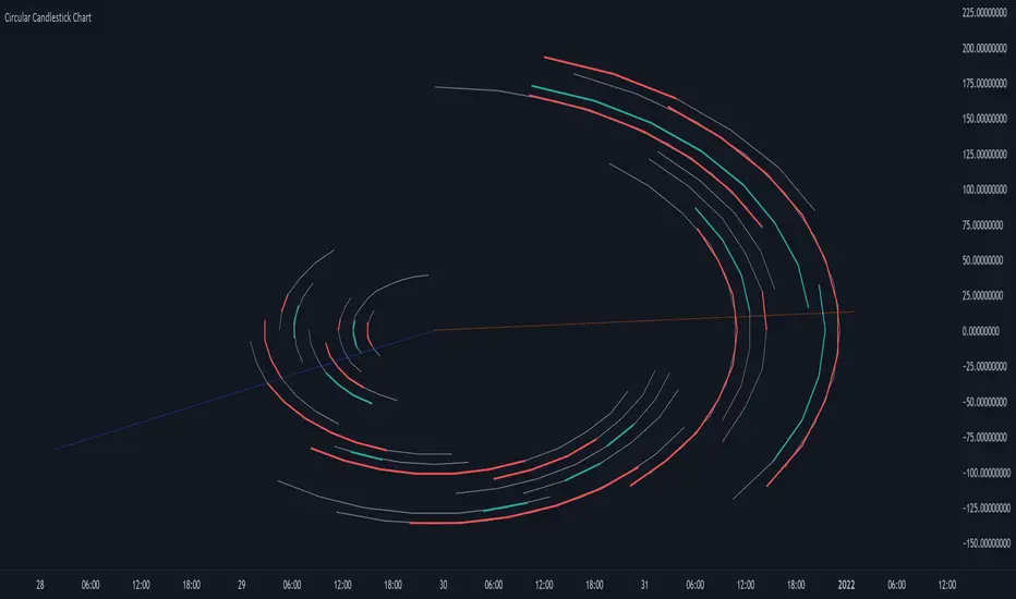
Circular Candlestick ChartAn original (but impractical) way to represent a candlestick chart using circles arc.
The most recent candles are further away from the circle origin. Note that OHLC values follow a clockwise direction. A higher arc length would indicate candles with a higher body or wick range.
The Length setti
Color█ OVERVIEW
This library is a Pine Script® programming tool for advanced color processing. It provides a comprehensive set of functions for specifying and analyzing colors in various color spaces, mixing and manipulating colors, calculating custom gradients and schemes, detecting contrast, and con
查看所有指標和策略
社群趨勢


如何將DELTA TRADING FORCE提供的策略 加到自己圖表上回測!!如何將DELTA TRADING FORCE提供的策略 加到自己圖表上回測!!
真的很抱歉
我到現在才知道
還有很多朋友不太清楚怎麼利用我給的策略做回測
今天我就手把手教學^^

接近第一波跌幅滿足接近第一波跌幅滿足,現在看空空間較小,但長期看空不變!
若跌破第一波滿足點933以下(最好低於925),則看第二波跌幅滿足
但要注意的是,第二波跌幅滿足前的大量區(846~803)及大頸線
會有強力支撐。
注意:此貼文純屬個人研究紀錄用,非投資建議!

Guessing the trend of 2330(TSMC)Using support & resistance, trend lines, Fibonacci retracement, Order block, and week FVG+.
Fun guessing. Not a trading advice.
This chart is for reference only, please use your personal analysis to trade


突破、強攻的訊達訊達因資安題材而受到主力的青睞,無論是在MACD或者是QP的訊號上都出現了攻擊訊號。
明天3/24雖然有隔日沖在週五進場,但希望他能站穩$38.8 ,然後經過一兩天整理能夠帶量突破$40.3這樣子整個攻擊型態就算出來。
另外類股資金的輪動也很重要,A I硬體的題材在去年應該已經發酵到尾聲了,現在剩下來就是系統整合這一塊,如果資金能夠繼續在資安/系統整合這邊持續發酵的話,未來應該還會有另一個小波段的出現。

查看所有股票的想法
社群趨勢
0702 BTC關鍵價位是否突破? 本週大行情到來 日內交易計畫📌 市場現況:
BTC 當前價格反彈至 $106,900 附近,結構仍處區間震盪中,靠近短期 EMA 與前波壓力區交界
整體仍處於下方上BB 支撐與上方 SNR 壓力之間,若放量突破 SNR,行情有望挑戰 OB-
若反彈無力,則仍可能回測支撐帶,屬區間震盪偏中繼階段
🏗 關鍵區域解析:
📍SNR 主壓力區:$108,600
→ 為前波多次測試未果的高點區,若放量突破此區,短線結構將轉為偏多
並開啟對 OB- 的上攻動能。否則此區仍為空方主力的第一道防線
📍W(週開盤):$108,400
→ 與 SNR 壓力相近,為本週起跌起點,具結構判斷意義。站穩此價位將加速行情轉強
📍OB- 區域(

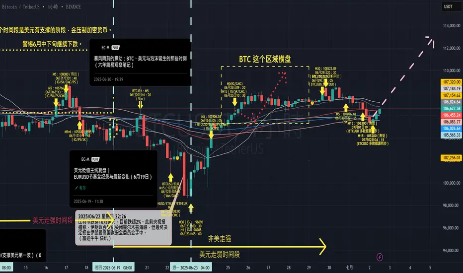
一次完整的復盤:計劃、執行與節奏的共振(BTC 07月02日再啟動)大家好,我是EC。
今天想和大家聊的,不是預測,而是一段已經走完的節奏,以及背後的一些思考。
故事的起點是6月20日,我在那篇長文(原文連結)裡,分享了過去六年我對BTC和美元關係的觀察。核心結論很簡單:在美元沒有出現大級別轉向訊號之前,我的結構性假設不變,會耐心等待並利用市場的回調進行積累。
這,是我們的劇本。
06月20日觀點與連結:《暴風雨前的躁動:BTC、美元與泡沫誕生的那些時刻(六年簡易觀察筆記)》
接下來,就是市場的演繹:
6月22日 (週日 20:00) & 23日 (週一 13:26):
市場如期給出了「試煉」。BTC價格回落至10萬及9萬8附近。這兩天,我用
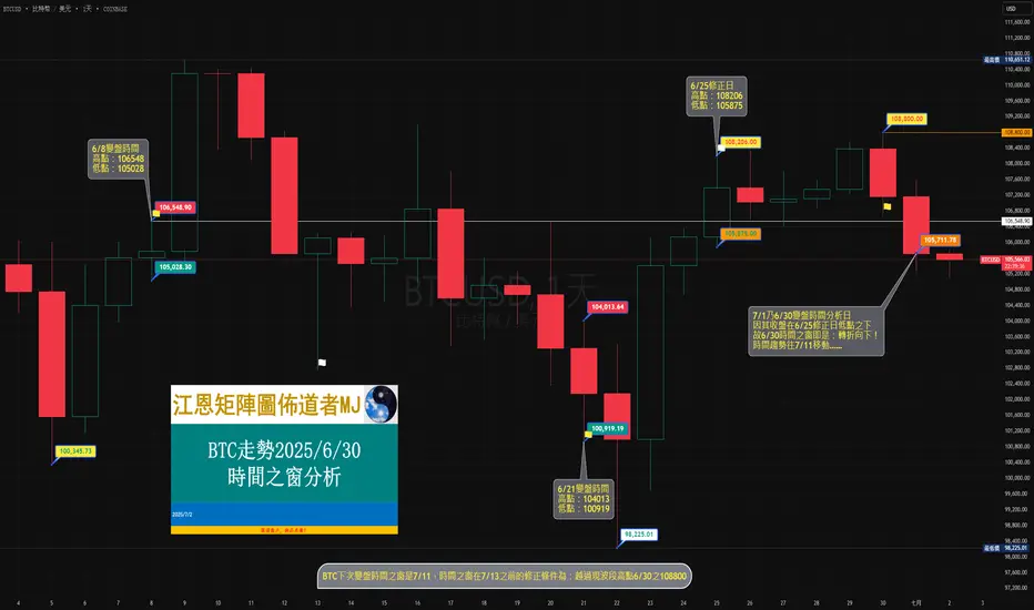
108、江恩矩陣圖佈道者MJ~BTC走勢2025/6/30時間之窗分析6/25盤中越過前一變盤時間6/8高點106548時,6/21時間之窗修正為:轉折向上!
7/1是6/30變盤時間分析日,以6/25修正日高點108206、低點105875為研判轉折標準;
7/1收盤105711,在6/25修正日低點之下;
依“時間=趨勢”分析,6/30時間之窗即是:轉折向下! (參考《甘氏矩陣圖-時間推算新篇》P438)
時間趨勢往7/11移動……
時間之窗在7/13之前的趨勢修正為:越過現波段高點6/30之108800。
(免責聲明:本想法所有信息僅供參考!不代表任何投資建議!!不承擔任何法律責任!!!)
COINBASE:BTCUSD
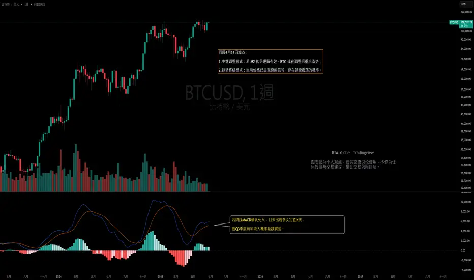
【RTA加密貨幣行情分析-BTC】Q2期權交割落幕,Q3走勢聚焦周線MACD訊號與關鍵價位上週五是BTC第二季度期權的交割日,本次交割的最大痛點位於102000美元,最終交割價格則定格在107000美元。
回溯6月初的分析可知,當時曾指出6月底Q2季度期權買方的損益平衡區間集中在95000-110000美元,並預期BTC價格大概率會在此區間內運行。 從實際走勢來看,整個6月比特幣延續震盪格局,Q2季度也由此成為一個典型的震盪季度。
隨著第三季度的開啟,有必要對整個季度的走勢進行提前推演。 當前對於後市的預期,與此前分析基本一致,主要存在兩種可能的模式:
-中繼調整模式:若M2傳導邏輯持續有效,BTC在經歷調整後有望重啓漲勢;
-趨勢終結模式:當前價格已顯現出一定的衰竭訊號,後
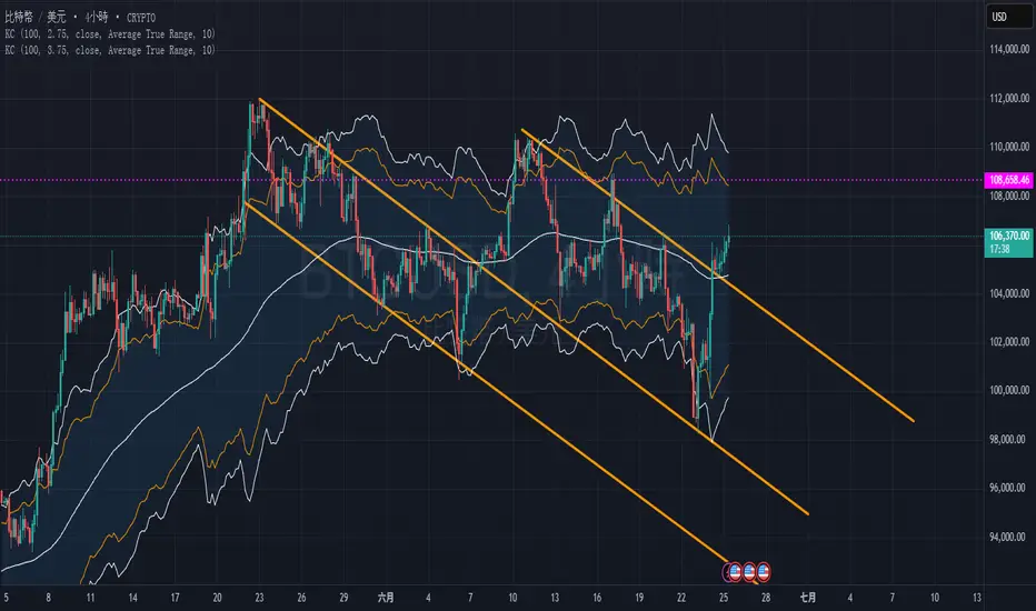
BTC雙下降通道測試從4小時圖表明顯可以看出BTC目前已走出第二的下降通道的突破階段
TP1目前放在下降通道的第二高峰,約在108500左右,可止盈50%倉位
剩下的可以放在TP2約110200左右做止盈,到的話跌超過109000就快收
以太坊的最後機會?以太坊自從5月9號的拉升後就一直處於震盪,一直再等待一個回調或是型態來看漲
如今因為以伊戰爭迎來了一波回測,價格回踩了1386-2878這段的斐波納契0.5
如果能複製202411月的行情(拉升後價格穩定在0.382之上),那麼這次有望能再度看到4000美元的以太幣
這樣也就再次完成一個AMD
交易計畫:
2345 2315 2280 介入多單 比例(20:30:50)
止損 2110
止盈 4111

查看所有加密貨幣的想法
02.July-XAUUSD亞盤規劃
這個月的非農改到明天
昨晚的半夜走出了楔形,但沒有按照原訂想法一路上去給出5浪
反而在半夜破了趨勢並在亞盤走出擴散三角跌破區間
目前H4大1走完,等待回測來到好的位子準備做多
小時區目前M15以下都是偏空~
今晚有新聞(非農前哨戰)
但記得非農前觀賞就好。

圖形已經非常明確——現在黃金所需要的,僅僅是一個確認訊號。大家好!希望你們會喜歡我在中國 TradingView 平台上發布的第一篇分析文章!
在成功且有說服力地突破下降通道之後,黃金目前穩守在3,280美元附近的支撐區,這被視為當前短期上升趨勢的重要戰略錨點。值得注意的是,四小時圖上正清晰地形成頭肩底(反轉型態),進一步強化市場對於黃金有望挑戰3,390美元關鍵價位的預期。
從消息面來看,黃金同時受到美元走弱及美國公債殖利率下滑的雙重利多支撐。具體而言,美國最新的ISM製造業指數僅達48.7,低於市場預期,顯示產業活動出現放緩。同時,10年期美國公債殖利率已降至4.15%,使黃金成為市場動盪時期中更具吸引力的避險資產。
目前,市場焦點集中在本

【XAUUSD】3245生死線告急!央行購難敵拋售潮,黃金熊市來了?基本面驅動要素
地緣局勢降溫:
中東停火協議達成後,避險需求持續回落,伊朗拒絕核談判但淡化衝突,美國討論放鬆制裁以推動談判,市場對地緣風險的擔憂減弱;
美聯儲政策分歧:
鴿派信號:美聯儲理事Waller和Bowman表示可能會支持7月份降息,他們認爲關稅可能只會一次性推高通脹;
鷹派壓制:美聯儲主席Powell、紐約聯儲主席Williams和芝加哥聯儲主席Goolsbee在內的約十位美聯儲官員對“7月降息”這一觀點“潑下冷水”,他們基本都選擇站在“觀望”陣營;
經濟數據疲軟:美國GDP下修、貿易逆差擴大,消費支出創年初最大降幅,經濟疲軟支撐黃金保值屬性;
通脹數據溫和上升:美聯儲最
1 - July XAUUSDH1 框架:目前仍維持空方思維,結構尚未被突破,趨勢偏向空方,尚未出現對多方有利的訊號。
M5 與 M15 框架:延續昨日的方向,持續觀察兩個重點:(1) 關鍵價位是否出現明確訊號;(2) 是否形成空方Impulse。靜待歐盤及美盤時段是否帶來進一步的機會。
⚠️ 以上為個人觀點分享,不構成投資建議,請謹慎評估

黃金 07月02日 —— 若3330支撐有效,第(5)浪有望啟動📊 宏觀基本面解析:
市場今日聚焦美國公佈的 ADP非農就業數據,預測為 99K,遠高於前值37K,該數據被視為本週五官方非農就業報告的前哨指標。
與此同時,川普對稅改法案的評論再次引發對美國財政赤字擴大的擔憂,導致資金湧入黃金等避險資產。
美元走弱、財政不確定性與地緣政治風險仍是近期支撐金價的主要因素。
🧠 技術面分析 —— 艾略特波浪 + SMC + ICT 模型:
黃金似乎已完成第(4)浪修正,修正範圍落在Fibonacci的 0.382–0.5–0.618 共振區。
市場結構顯示價格可能正進入 第(5)浪上升階段,上方目標為 FE 1.618延伸位:3380–3413。
內部

7/2黃金分析【非農週】個人分享,以下有任何討論與論述觀點,不構成任何投資建議。
黃金下跌空間有機會看至3325價位,目標價位3310,可以關注3336-3342價位是否突破區間,上漲空間趨勢看至3350價位。
投資有風險,入市須謹慎,個人記錄分享,僅供參考。
飽暖思銀欲
大週期還是多方的情況底下,就找多方做就好
本週收K收得如何蠻關鍵的
銀仔的習性最喜歡玩的就是跌破區間後來個魚躍龍門破底翻
所以看起來就還是一個收斂狀態,配合7/5世界末日(?)到7/9川川發瘋日
看會不會來個升龍拳,一拳揍開紫線鍋蓋
來,請你揍開

靜觀週期性上文很不幸地,下跌空間非常少,壓縮的價錢最終向上突破,做空的止損已成為進場長倉的機會,short squeeze一番。正在迎接下半年的此刻,先靜觀這兩週資金的流向。目前一切繼續利好,(右下)市場資金流通量保持良好並上升,(左下)AD line: 上升下跌股,也保持上升股較多,指數內在動力還在。只是這週,不是一個利好的週期性,(右中)粉藍色線,顯示每三個的期貨到期日後,資金經理們都增持,但不持續,甚至已超買,接下來的一週基本都升不了多少。另外,貿易戰又在蠢蠢欲動了。別做先下錯棋的人吧。

29/6 黃金下週部署週一開市裂口高開升穿橫行後急速拉回,短線方向會傾
向看跌,因為上行震盪未有形成假突破,反而是擴大了上
週未的橫行範圍,即變成減速的市況,之後會較大機會
向下行。
1H圖週二亞盤大動能收穿橫行底後,更在週四歐盤
回測底部範圍後向下延續。現價3274,價格跌到大
圖明顯支持位3250範圍後收了長針,但仍未出現明
顯的動能反彈升穿返下跌結構,所以小時圖級別暫
時未能向上看,可能要等下週再試3250範圍後反彈
破結構或震盪後上破才可試向上。
3250是5月中至6月中升段的0.618,又是一個發力
突破向上的範圍,如細圖出力反彈,短線可積極
入市,關鍵阻力位是前底3293,如小時圖有機會
大力升穿返這範

查看所有期貨的想法
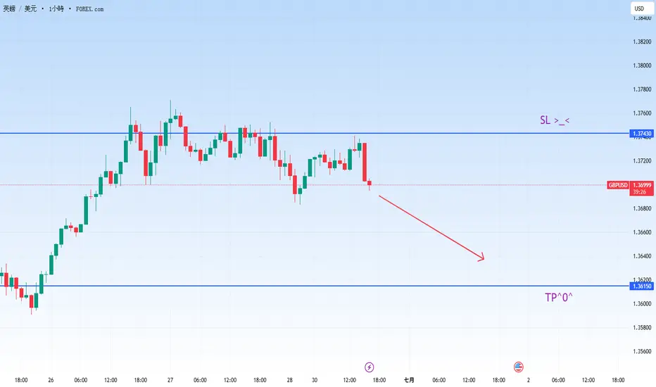
英鎊兑美元(GBPUSD) 短線做空🟢GBPUSD 做 1 手空單 (SELL)
🟢進場價:1.36961
🟢止損:1.37430 ( -469 USD)
🟢目標:1.36150 ( 811 USD)
每次下單前都分心?這四招幫你找回交易專注力!「執行力就是一切。」這句話在交易圈屢聽不鮮,原因不難理解。有策略固然重要,但若無法集中注意力並堅持執行,再好的計劃也只是一紙空談。只需一刻猶豫、一個分心的點擊,你辛苦建立的優勢可能瞬間蒸發。
專注是執行的入口。少了它,再好的機會也容易失手。但在這個充滿干擾的世界裡,隨時更新的圖表、無止盡的通知、社群媒體與背景噪音,要保持當下的專注前所未有地困難。以下四個方法可以幫助你提升交易時的專注力,其中兩個務實可行,另兩個稍微跳脫框架,但都能幫你在關鍵時刻更清晰地做出判斷。
1. 先寫下你的交易計劃
這是基本功。在打開交易平台之前,請簡單寫下你的交易想法、關鍵價位,以及可能影響市場的新聞或事件
2025/05/25-TMAの財經仮眠室-番外篇 美元對台幣補充 5/23日 :收盤價29.945元,如預期進入盤整滿區30~30.5元後,再度啟動升值,目前區間低點待突破30元確認(3-5個交易日收盤價皆站上30元,將再度啟動波段升值行情短線目標價29元!將在啟動一波升值趨勢短期目標價28.9~29.2元.
上週美元對台幣回顧 5/18日 :如預期短線進行乖離修正,2023.12.28日低點30.569元,惟短線貶值壓力,果然打到30.5元後進行盤整,目前預期短線30.5~30元之間進行盤整,待台均線下行壓力趨緩,升值趨勢確定前提下.待突破30元確立將在啟動一波升值趨勢短期目標價28.9~29.2元.
上週美元對台幣補充 5/12日 : 本波一次就打

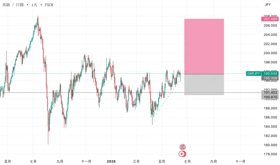
英鎊/日圓(GBP/JPY)4小時技術分析:多頭趨勢目標202.500📈 趨勢:
價格在上升通道內運行
🔵 支撐線在下方
🔴 阻力線在上方
---
關鍵區域與價格水準:
📍 需求區(買入區域):
區間介於 191.753 – 194.016
價格可能會在此反彈再繼續上升
🔵 預期會有回調發生
🎯 目標點位:
202.500
🚀 若價格守住需求區,有機會漲至此點位
🟢 進場點(Entry Point):
約在 193.964 – 194.016
是理想的買入區域
❌ 停損點(Stop Loss):
設在 191.700 以下
🛑 若價格跌破,將控制風險止損
---
技術指標:
📉 70期EMA(指數移動平均線):

03.May-USDTWD美元兌台幣(月線)
許多人都在表示新台幣近期的升值是因為川普的影響
其實身為一個專業操盤手,
我們從不關注新聞,只關注新聞發動的時間點
以月線結構來看
台幣仍然維持多方格局,但顯然地進入回調階段
手中持有美元現貨的朋友們基本上應該可以先換匯回台幣
等美元在低檔時再重新買進。


查看所有外匯的想法
| - | - | - | - | - | - | - | - | ||
| - | - | - | - | - | - | - | - | ||
| - | - | - | - | - | - | - | - | ||
| - | - | - | - | - | - | - | - | ||
| - | - | - | - | - | - | - | - | ||
| - | - | - | - | - | - | - | - | ||
| - | - | - | - | - | - | - | - | ||
| - | - | - | - | - | - | - | - | ||
| - | - | - | - | - | - | - | - |


