TMT Supply and Demand Zones - Hitesh Nimje📊 TMT Supply and Demand Zones - Hitesh Nimje
🎯 Overview
A professional-grade Supply & Demand zone indicator that automatically identifies and plots high-probability reversal zones across multiple timeframes. Perfect for institutional trading, smart money concepts, and price action analysis.
🔥 Key Features
✅ Multi-Timeframe Zone Detection
* 30m, 45m, 1H, 2H, 3H, 4H, Daily, Weekly zones (customizable)
* Lower timeframe zones (1m, 5m, 15m) available
* Forming zones (real-time detection of potential zones)
🎨 Full Customization
📦 Zone Settings
├── Zone Difference Scale (1.8 default) - Controls zone strength
└── Zone Extension (15 bars default)
🎭 Display Settings
├── Enable/Disable Supply & Demand independently
├── Background & Border colors for each zone type
└── Lower timeframe zone display
✍️ Text Settings
├── Separate Supply/Demand text colors
├── Text size (Auto/Tiny/Small/Normal/Large/Huge)
├── Horizontal & Vertical alignment options
└── High/Low price display option
⏰ Timeframe Options
├── Individual toggle for each timeframe
└── Smart filtering (prevents higher TF from showing lower TF zones)
🧠 Smart Zone Logic
Supply Zones form when:
* Red candle follows green/neutral candle
* Current candle is ≥1.8x larger than previous
* Price respects previous candle levels
Demand Zones form when:
* Green candle follows red/neutral candle
* Current candle is ≥1.8x larger than previous
* Price respects previous candle levels
⚡ Dynamic Zone Management
* Auto-extension to right (15 bars default)
* Auto-deletion when price breaks through
* Max 500 boxes for optimal performance
* Real-time updates on every bar
📈 How to Use
1. Basic Setup
✅ Enable desired timeframes (recommended: 30m/1H/4H/D)
✅ Keep "Zone Difference Scale" at 1.8
✅ Set Zone Extension to 15-20 bars
✅ Use white text on dark zones
2. Trading Strategy
🔴 SUPPLY ZONES (Sell Zones)
├── Price approaches from below
├── Rejection/wick at zone top
├── Sell on confirmation
🟢 DEMAND ZONES (Buy Zones)
├── Price approaches from above
├── Rejection/wick at zone bottom
├── Buy on confirmation
3. Best Combinations
💎 Pro Setup:
├── 4H + 1H zones (primary structure)
├── 30m zones (entries)
├── Daily zones (bias)
🎯 Scalping Setup:
├── 30m + 15m + 5m zones
⚙️ Input Recommendations
SettingRecommendedPurposeZone Scale1.8Strong zones onlyZone Extension15-25Good visibilitySupply ColorBlack (94% transparency)Clean lookDemand ColorBlue (94% transparency)Clear distinctionText SizeSmallReadableText ColorWhiteHigh contrast
🚀 Why This Indicator?
✅ Institutional-grade zone detection
✅ No repainting (confirmed bars only)
✅ Multi-timeframe confluence
✅ Full customization
✅ Performance optimized (500 max boxes)
✅ Clean, professional appearance
📱 Contact
Author: Hitesh Nimje
Phone: 8087192915
Source: Thought Magic Trading
"Trade the zones where smart money accumulates and distributes" 💰
TRADING DISCLAIMER
RISK WARNING
Trading involves substantial risk of loss and is not suitable for all investors. Past performance is not indicative of future results. You should carefully consider whether trading is suitable for you in light of your circumstances, knowledge, and financial resources.
NO FINANCIAL ADVICE
This indicator is provided for educational and informational purposes only. It does not constitute:
* Financial advice or investment recommendations
* Buy/sell signals or trading signals
* Professional investment advice
* Legal, tax, or accounting guidance
LIMITATIONS AND DISCLAIMERS
Technical Analysis Limitations
* Pivot points are mathematical calculations based on historical price data
* No guarantee of accuracy of price levels or calculations
* Markets can and do behave irrationally for extended periods
* Past performance does not guarantee future results
* Technical analysis should be used in conjunction with fundamental analysis
Data and Calculation Disclaimers
* Calculations are based on available price data at the time of calculation
* Data quality and availability may affect accuracy
* Pivot levels may differ when calculated on different timeframes
* Gaps and irregular market conditions may cause level failures
* Extended hours trading may affect intraday pivot calculations
Market Risks
* Extreme market volatility can invalidate all technical levels
* News events, economic announcements, and market manipulation can cause gaps
* Liquidity issues may prevent execution at calculated levels
* Currency fluctuations, inflation, and interest rate changes affect all levels
* Black swan events and market crashes cannot be predicted by technical analysis
USER RESPONSIBILITIES
Due Diligence
* You are solely responsible for your trading decisions
* Conduct your own research before using this indicator
* Verify calculations with multiple sources before trading
* Consider multiple timeframes and confirm levels with other technical tools
* Never rely solely on one indicator for trading decisions
Risk Management
* Always use proper risk management and position sizing
* Set appropriate stop-losses for all positions
* Never risk more than you can afford to lose
* Consider the inherent risks of leverage and margin trading
* Diversify your portfolio and trading strategies
Professional Consultation
* Consult with qualified financial advisors before trading
* Consider your tax obligations and legal requirements
* Understand the regulations in your jurisdiction
* Seek professional advice for complex trading strategies
LIMITATION OF LIABILITY
Indemnification
The creator and distributor of this indicator shall not be liable for:
* Any trading losses, whether direct or indirect
* Inaccurate or delayed price data
* System failures or technical malfunctions
* Loss of data or profits
* Interruption of service or connectivity issues
No Warranty
This indicator is provided "as is" without warranties of any kind:
* No guarantee of accuracy or completeness
* No warranty of uninterrupted or error-free operation
* No warranty of merchantability or fitness for a particular purpose
* The software may contain bugs or errors
Maximum Liability
In no event shall the liability exceed the purchase price (if any) paid for this indicator. This limitation applies regardless of the theory of liability, whether contract, tort, negligence, or otherwise.
REGULATORY COMPLIANCE
Jurisdiction-Specific Risks
* Regulations vary by country and region
* Some jurisdictions prohibit or restrict certain trading strategies
* Tax implications differ based on your location and trading frequency
* Commodity futures and options trading may have additional requirements
* Currency trading may be regulated differently than stock trading
Professional Trading
* If you are a professional trader, ensure compliance with all applicable regulations
* Adhere to fiduciary duties and best execution requirements
* Maintain required records and reporting
* Follow market abuse regulations and insider trading laws
TECHNICAL SPECIFICATIONS
Data Sources
* Calculations based on TradingView data feeds
* Data accuracy depends on broker and exchange reporting
* Historical data may be subject to adjustments and corrections
* Real-time data may have delays depending on data providers
Software Limitations
* Internet connectivity required for proper operation
* Software updates may change calculations or functionality
* TradingView platform dependencies may affect performance
* Third-party integrations may introduce additional risks
MONEY MANAGEMENT RECOMMENDATIONS
Conservative Approach
* Risk only 1-2% of capital per trade
* Use position sizing based on volatility
* Maintain adequate cash reserves
* Avoid over-leveraging accounts
Portfolio Management
* Diversify across multiple strategies
* Don't put all capital into one approach
* Regularly review and adjust trading strategies
* Maintain detailed trading records
FINAL LEGAL NOTICES
Acceptance of Terms
* By using this indicator, you acknowledge that you have read and understood this disclaimer
* You agree to assume all risks associated with trading
* You confirm that you are legally permitted to trade in your jurisdiction
Updates and Changes
* This disclaimer may be updated without notice
* Continued use constitutes acceptance of any changes
* It is your responsibility to stay informed of updates
Governing Law
* This disclaimer shall be governed by the laws of the jurisdiction where the indicator was created
* Any disputes shall be resolved in the appropriate courts
* Severability clause: If any part of this disclaimer is invalid, the remainder remains enforceable
REMEMBER: THERE ARE NO GUARANTEES IN TRADING. THE MAJORITY OF RETAIL TRADERS LOSE MONEY. TRADE AT YOUR OWN RISK.
Contact Information:
* Creator: Hitesh_Nimje
* Phone: Contact@8087192915
* Source: Thought Magic Trading
© HiteshNimje - All Rights Reserved
This disclaimer should be prominently displayed whenever the indicator is shared, sold, or distributed to ensure users are fully aware of the risks and limitations involved in trading.
指標和策略

Smart Money Scanner Suite v6 - OptimizedWHAT IT DOES (longer version in the script):
// Identifies "Smart Money Stepping Back" (SMSB) zones where institutions quietly
// build positions without moving the market. Signals appear when ALL 4 conditions align:
//
// 1. OBV DIVERGENCE → Price up/OBV down (distribution) or Price down/OBV up (accumulation)
// 2. LOW VOLUME → Below 1.5x average (stealth activity)
// 3. NEAR VWAP → Within 0.5% (institutional fair value)
// 4. HTF CONFIRMATION → Higher timeframe shows directional momentum

SYXX - HTF Candle Overlay
This script, titled "HTF Candle Overlay by SYXX," is designed to visualize the full range and structure of a higher-timeframe (HTF) candle directly onto a lower-timeframe chart. It helps traders maintain context by showing where the current price action sits relative to a much larger candle's boundaries. Combined with LuxAlgo Volume Node Profile.
1. 🔍 Primary Feature: Higher Timeframe Candle Projection
Configurable Timeframe: The user sets the desired HTF using the Interval input, which defaults to 'D' (Daily). The indicator then tracks the High, Low, Open, and Close of that HTF bar.
Live and Historical Drawing: The script uses box.new to draw boxes representing the candle's full range (High to Low).
Historical Boxes (if changeHTF): When a new HTF candle closes, the completed box for the previous period is drawn.
Live Box (if barstate.islast): The indicator draws a live, dynamic box for the current, incomplete HTF candle, which expands with every new High or Low on the lower chart.
2. 🎨 Visualization & Customization
Color-Coded Bias: The boxes are colored based on the HTF candle's direction:
Bullish/Long (BgLong): Green color is used if the HTF candle closed higher than it opened (close > htfOpen).
Bearish/Short (BgShort): Red color is used if the HTF candle closed lower than it opened.
Box Styling: Users can customize the box's appearance, including border color and style, border thickness, and background opacity (BoxOpacity).
Midline: An optional MidLine is calculated as the average of the HTF High and Low, acting as a potential support/resistance reference point.
Range Display: The indicator can display the range of the box in pips (BoxRangePips) or the percentage of movement relative to the full range (BoxRangePercentage).
Time Labels: It plots time labels that show the start and end time of the completed HTF period (e.g., "07:00 - 11:00").
3. 🚨 Alert System (Placeholders)
The script includes placeholder inputs for standard trading alerts, though the internal logic for checking these conditions is currently commented out or set to false:
Alert: Break Above/Below Box: To signal a breakout of the HTF High or Low.
Alert: Price Re-Enters Box: To signal a pullback back into the range.

Top 20 Adaptive Momentum [Trend Aligned]his script is an automated End-of-Day Momentum Dashboard designed to predict the next trading day's directional bias for the top 20 most volatile stocks. It analyzes institutional price action during the final 10 minutes of the trading session and filters signals based on the long-term trend.
How It Works
Trend Identification: The script calculates a 50-Day Moving Average proxy (using 5-minute data) to determine if a stock is in a Long-Term Uptrend or Downtrend.
Adaptive Signal Logic: Instead of a simple reversal strategy, the script adapts its prediction based on the trend context:
Trend Following: If a stock closes strong (Green) in an Uptrend, it signals Bullish Momentum (continuation).
Mean Reversion: If a stock closes strong (Green) in a Downtrend, it signals Bearish Reversion (fade the bounce).
Dip Buying: If a stock closes weak (Red) in an Uptrend, it signals Bullish Reversion (buy the dip).
Live Backtesting: The dashboard features a "Win Rate (3M)" column. This metric backtests the strategy over the past 3 months for each specific ticker, calculating the percentage of time the predicted bias resulted in a winning trade the following day.
Dashboard Columns
Ticker: The stock symbol.
Prev Day: The overall close vs. open of the previous session.
Trend (50d): The long-term trend direction (UP or DOWN).
BIAS TODAY: The actionable signal for the current session (📈 BULLISH or 📉 BEARISH).
Win Rate: The historical probability of success for this strategy on this specific stock.
Usage: Use this tool pre-market to identify high-probability setups where the previous day's closing momentum aligns with the long-term trend.
To effectively use the Top 20 Adaptive Momentum script, you need to treat it as a Pre-Market Screener. It performs the heavy lifting of analyzing trend, momentum, and historical probability instantly, giving you a "Cheat Sheet" for the trading day.
Here is a step-by-step guide on how to integrate it into your routine:
1. The Setup
Timeframe: Set your chart to 5 Minutes. The logic specifically hunts for the 15:50 (3:50 PM) and 15:55 (3:55 PM) candles, so the calculation works best on this timeframe.
Timing: Check this dashboard before the market opens (e.g., 9:00 AM EST) or shortly after the close (4:05 PM EST) to plan for the next session.
2. Reading the Dashboard Columns
Column What to Look For Actionable Insight
Trend (50d) UP (Green) or DOWN (Red) This tells you the "Big Picture." Only trade in this direction. If Trend is UP, you only want to see Bullish signals. If Trend is DOWN, you only want Bearish signals.
BIAS TODAY 📈 BULLISH Plan: Look for Long/Buy setups at the open. The algorithm predicts price will close higher today.
📉 BEARISH Plan: Look for Short/Sell setups at the open. The algorithm predicts price will close lower.
Win Rate (3M) Percentage (e.g., 65%) Confidence Filter. Only take trades on stocks with a Win Rate above 55-60%. This proves the stock historically respects this specific strategy.
3. The Strategy Scenarios (How to Trade)
Scenario A: The "Trend Continuation" (High Probability)
Dashboard: Trend is UP + Bias is BULLISH.
Context: The stock is strong long-term, and it closed strong yesterday (Momentum).
Execution: Watch for an opening gap up or an early breakout above the pre-market high. Go Long.
Scenario B: The "Dip Buy" (High Probability)
Dashboard: Trend is UP + Bias is BULLISH.
Context: The stock is strong long-term, but it pulled back yesterday (Weak Close). The script identifies this as a discount, not a reversal.
Execution: Watch for the stock to find support early. Use the "Master Sniper" (from your other script) to find a Discount Entry FVG.
Scenario C: The "Trap" (Avoid)
Dashboard: Win Rate is < 50%.
Context: The stock is choppy or news-driven. It does not follow technical momentum rules reliably.
Execution: Skip this stock. Move to the next one on the list.
4. Execution Workflow
Scan: Glance at the dashboard. Identify the 2-3 stocks with Green Bias + Green Trend (for Buys) or Red Bias + Red Trend (for Shorts).
Filter: Ensure their "Win Rate" is decent (over 55%).
Trade: Open the charts for those specific stocks. Use your execution indicators (like the Master Sniper) to time the entry on the 1-minute or 5-minute chart.
By using this dashboard, you stop guessing which stock to trade and focus entirely on executing the best setups.

ZY Target TerminatorThe indicator follows trends and generates short and long signals. Furthermore, when it generates a signal, it displays the maximum profit margins for the last three signals it generated in the same direction. It also clearly indicates the number of candles for which no signal has been generated for the pair. Avoid trading pairs whose profit margins do not align with your trading strategy.

Grok/Claude AI Neural Fusion Pro V2AI Neural Fusion Pro V2 - New Features
Overview
Version 2 of AI Neural Fusion Pro introduces two complementary protection systems designed to preserve capital during market extremes. The first prevents over-buying during violent crashes. The second prevents over-selling during powerful rallies. Together, they transform a reactive trading system into one that adapts intelligently to market conditions.
Feature 1: Cascade Protection
Purpose
Cascade Protection prevents capital destruction during violent market crashes by implementing two independent safeguards that must both pass before any buy signal can fire.
The Problem It Solves
During market crashes, several dangerous conditions occur simultaneously. Volatility spikes to extreme levels, indicators scream "oversold," and each dip looks like the bottom. Traditional systems fire buy after buy, depleting capital reserves while price continues falling. By the time the actual bottom forms, there's no capital left to capture it.
How It Works
Layer 1: BBWP Freeze
Bollinger Band Width Percentile measures current volatility relative to historical volatility. When BBWP exceeds 92%, it indicates the market is experiencing abnormal volatility—typically during liquidation cascades or panic selling. During these periods, all buy signals are frozen regardless of how oversold conditions appear. This is an absolute freeze with no exceptions.
Layer 2: Consecutive Buy Counter
This layer limits the maximum number of buy orders that can execute without an intervening sell. The default limit is 3 consecutive buys. Once reached, additional buy signals are blocked until a sell signal fires and resets the counter. This prevents the common scenario where a bot keeps averaging down position after position during an extended decline.
Configuration
SettingDefaultDescriptionEnable Cascade ProtectionONMaster toggle for entire featureBBWP Length7Period for Bollinger Band calculationBBWP Lookback100Historical period for percentile rankingBBWP Freeze Level92%Threshold above which buys freezeMax Consecutive Buys3Maximum buys before forced pause
Panel Display
The info panel shows real-time protection status with color-coded feedback:
BBWP row: Shows current percentage and status (OK in green, FROZEN in red)
Buy Counter row: Shows current count versus maximum (green when available, orange approaching limit, red when blocked)
Key Behavior
Sell signals are never affected by cascade protection
The buy counter resets to zero after any sell signal fires
BBWP freeze is absolute—even extreme oversold conditions cannot bypass it
Feature 2: Dynamic Cooldown
Purpose
Dynamic Cooldown prevents over-selling during powerful rallies by automatically extending the minimum time between signals when the market enters a strong trend.
The Problem It Solves
During strong rallies, traditional indicators repeatedly hit overbought conditions, triggering sell after sell as price climbs. A trader might execute 10-15 sells during a sustained move from $86K to $93K, selling away their position piece by piece instead of letting profits run. Each sell captures a small gain while missing the larger move.
How It Works
The system monitors ADX (Average Directional Index) to detect trend strength. When ADX exceeds 50 and is rising, the market has entered a powerful trending phase. During these conditions, the cooldown period between signals automatically increases from 5 bars to 10 bars.
This means signals fire less frequently during strong trends, allowing positions more time to develop before the next potential exit. The extended cooldown applies equally to both buy and sell signals, though the primary benefit is reducing premature sells during rallies.
Normal Market (ADX < 50 or falling):
Cooldown = 5 bars (25 minutes on 5-minute chart)
Standard signal frequency
Strong Trend (ADX > 50 and rising):
Cooldown = 10 bars (50 minutes on 5-minute chart)
Reduced signal frequency to let trends develop
Configuration
SettingDefaultDescriptionEnable Dynamic CooldownONMaster toggle for featureSignal Cooldown5 barsStandard cooldown between signalsStrong Trend ADX Threshold50ADX level that triggers extended cooldownStrong Trend Cooldown10 barsExtended cooldown during strong trends
Panel Display
The info panel provides visual indication of current cooldown state:
ADX row: Shows value with arrow indicator (ADX ↑) when in strong trend mode, blue background when above threshold
Cooldown row: Shows active cooldown period with arrow indicator (Cooldown ↑) when extended, blue background during strong trends
Key Behavior
Cooldown applies to both buy and sell signals equally
Transition between modes is automatic based on ADX conditions
ADX must be both above threshold AND rising to trigger extended cooldown
When ADX stops rising or drops below threshold, cooldown returns to normal immediately
Combined Effect
These two features work together to create a more intelligent trading system:
During Crashes:
BBWP spikes above 92% → Buys frozen
System waits for volatility to normalize
When BBWP drops, limited buys (3 max) capture the actual bottom
Capital preserved for recovery
During Rallies:
ADX rises above 50 → Cooldown extends to 10 bars
Fewer sell signals fire during the move
Positions held longer, capturing more of the trend
Profits allowed to run
During Normal Markets:
Standard 5-bar cooldown
No BBWP restrictions
Full signal frequency for active trading
Summary
Version 2 transforms AI Neural Fusion Pro from a purely reactive indicator into an adaptive system that recognizes market extremes and adjusts its behavior accordingly. Cascade Protection guards against buying into crashes. Dynamic Cooldown guards against selling out of rallies. Together, they help preserve capital during adverse conditions while allowing full participation when markets behave normally.

Dynamic TP Based on RR - Position ToolSimple indicator that automatically plots the take-profit (TP) level based on the below inputs:
- Entry price
- Stop-loss (SL)
- Risk-to-reward (RR)
The long/short-position drawing tools are simple enough to use, but wanted something that will automatically plot the TP instead. Couldn't find anything basic and free of extra features so built this instead.
This is how I use it.
1 (optional): Use the long/short-position drawing tool to plot the entry and stop-loss levels
2: Enable the indicator and enter the inputs
- Entry
- SL
- RR
3: The TP will automatically plot. Change the RR to your liking.

Fabio-Style Order Flow SystemFabio-Style Order Flow System — LVN • Delta • Big Trades • FVG • Order Blocks • Liquidity • Volume Profile
This indicator brings together all major components of Fabio Valentino’s order-flow strategy in one unified tool. It visualizes where smart money is active, where inefficiencies form, and where price is likely to react next.
🔍 FEATURES
1. Order Flow & Delta
Smoothed delta to show true market imbalance
Background color shifts to bullish/bearish delta dominance
Alerts for delta spikes & order-flow flips
2. Big Trade Detection
Highlights Big Buy and Big Sell prints (relative to average volume)
Helps identify institutional aggression on both sides
3. Low Volume Nodes (LVNs)
Automatically detects low-volume zones
Flags retests of LVNs for high-probability reactions
Uses dynamic volume thresholds for accuracy
4. Volume Profile (Lightweight)
Bucket-based intrabar profile across user-defined lookback
Highlights volume distribution without heavy TradingView CPU load
Auto-scales bucket density & transparency
5. Fair Value Gaps (FVGs)
Detects both bullish & bearish three-bar imbalances
Marks gaps visually using colored boxes
Updates dynamically with a user-set lookback
6. Order Blocks (OBs)
Identifies valid displacement bars and their origin OB
Plots clean, minimalist rectangles around key OB zones
Uses ATR-based impulse filtering
7. Liquidity Grabs
Detects wick-based liquidity sweeps
Highlights both equal high/low and stop-run type wicks
Useful for spotting reversals & trap setups
8. Strategy Dashboard
Shows real-time order flow state
Displays delta strength, big trades, LVNs, and last directional impulse
Auto-positions in all corners
🎯 PERFECT FOR
Traders who use:
Order Flow
Smart Money Concepts (SMC)
ICT / FVG / Liquidity models
Market Structure + Volume
Fabio Valentino-style analysis
⚙️ PERFORMANCE
All elements optimized
Uses automatic box-clearing to avoid array overload
Works on all timeframes & markets (crypto, FX, indices, stocks)

Buy & Sell Arrows - MACD + Best_Solve WPRMACD + Best_Solve Williams %R – Aggressive Trend-Reversal Catcher
(Allow Signals Even in Overbought/Oversold Zones)
This indicator combines the classic MACD histogram with Best_Solve’s popular custom Williams %R (a 0–100 momentum oscillator that behaves more like a fast Stochastic) to deliver clean, high-conviction entry signals on daily (and higher) timeframes.
Core Logic – Only TWO conditions are required
BUY (large green arrow below bar)
MACD histogram is green (bullish momentum)
Williams %R fast line is crossing above OR already above its EMA
SELL (large red arrow above bar)
MACD histogram is red (bearish momentum)
Williams %R fast line is crossing below OR already below its EMA
Unlike most oscillators, this version deliberately removes the traditional “do not buy when overbought / do not sell when oversold” filters. This allows the script to catch powerful trend reversals and explosive moves immediately — even on violent earnings gaps or panic sell-offs (example: META’s -11 % drop on Oct 30 2025 triggered an instant sell even though %R was deeply oversold).
Built-in Clean-Signal Logic
No consecutive buys or sells — each new signal must be preceded by the opposite direction.
This keeps the chart extremely clean and prevents whipsaw clusters during strong trends.
Best Use Cases
Daily and 4H swing trading on stocks, indices, crypto, forex
Excellent for catching sharp reversals after earnings, news events, or overextended moves
Works especially well on high-beta names and growth stocks
Visuals
Large green/red arrows with “BUY” / “SELL” text (your favorite style)
Subtle transparent MACD histogram overlaid on price for instant momentum context
Ready-to-use alerts (“Buy Alert” / “Sell Alert”)
Set it, alert it, trade it — one of the cleanest and most responsive daily reversal systems you’ll find.
Enjoy the edge!

Multi-Pivot Plotter//================================================================================
//📌 Manual Pivot Plotter (4 Sets: P, R1–R3, S1–S3)
// - Up to 4 indices
// - Each index: Name + P/S/R values
// - One shared Style block: colors, visibility, line width (applies to all indices)
// - Lines start at 00:00 UTC+8 and extend a few bars
// - Labels at line end or start, with optional "Index Name" and price value
//================================================================================

Clean Day End TradingThis script visualizes the complete Clean Box Breakout framework.
It automatically detects the intraday boundary window, builds a dynamic High/Low box, and locks levels at boundary close.
Features include:
• Dynamic boundary High/Low with optional historical day-1 & day-2 levels
• Automatic box visualization and real-time level updates
Ideal for traders who want clean, visual confirmation of the breakout model without running a strategy.

Мой скриптinputs:
window(1),
type(0), // 0: close, 1: high low, 2: fractals up down, 3: new fractals
persistent(False),
exittype(1),
nbars(160),
adxthres(40),
nstop(3000);
vars:
currentSwingLow(0),
currentSwingHigh(0),
trailStructureValid(false),
downFractal(0),
upFractal(0),
breakStructureHigh(0),
breakStructureLow(0),
BoS_H(0),
BoS_L(0),
Regime(0),
Last_BoS_L(0),
Last_BoS_H(0),
PeakfilterX(false);
BoS(window,persistent,type,Bos_H,BoS_L,upFractal,downFractal,breakStructureHigh,breakStructureLow);
//BOS Regime
If BoS_H <> 0 then begin
Regime = 1; // Bullish
Last_BoS_H = BoS_H ;
end;
If BoS_L <> 0 Then begin
Regime = -1; // Bearish
Last_BoS_L = BoS_L ;
end;
//Entry Logic: if we are in BoS regime then wait for break swing to entry
if ADX(5) of data2 < adxthres then begin
if time>900 and Regime = 1 and EntriesToday(date)= 0 and Last_BoS_H upFractal then buy next bar at market;
end;
if time>900 and EntriesToday(date)= 0 and Regime = -1 and Last_BoS_L>downFractal then
begin
if close < downFractal then sellshort next bar at market;
end;
end;
// Exits: nbars or stoploss or at the end of the day
if marketposition <> 0 and barssinceentry >nbars then begin
sell next bar at market;
buytocover next bar at market;
end;
setstoploss(nstop);
setexitonclose;

Opening Range with Breakouts & Targets w/ Alerts [LuxAlgo]This is the exact Lux Algo opening range with Breakouts and Targets, but added the ability to fire alerts on buy and sell signals

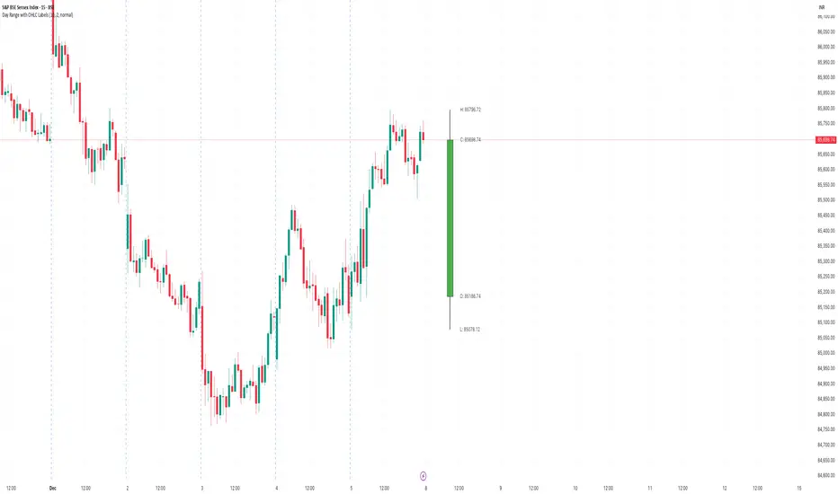
Day Range with OHLC LabelsThis indicator creates a synthetic daily candlestick that appears to the right of the chart, visually separated from real price bars.
It helps traders quickly view each day’s High, Low, Open, and Close without zooming, scrolling, or switching to higher timeframes.
What This Tool Does
✔ Draws a floating daily candle to the right of the current chart
✔ Displays the true Daily Open, High, Low, and Close
✔ Shows a center-aligned wick representing the full high-low range
✔ Shows a box-style candle body positioned using real OHLC values
✔ Labels the values (O, H, L, C) with large, clear fonts
✔ Automatically updates at each new day
✔ Works on any timeframe
✔ Helps intraday traders track daily structure visually
Why This Indicator Is Useful
This script is ideal for intraday traders who want instant awareness of the current day’s range.
Instead of guessing or drawing manual lines, you get a clean daily candlestick rendered off to the right side, avoiding chart clutter.
Great for:
Range traders
Breakout traders
Liquidity zone analysis
High/Low reference tracking
Traders who prefer non-intrusive visuals
Customization
Adjustable offset: position the candle further right
Configurable colors for wick + body
Large-font labels for easy reading
Automatically clears and redraws cleanly each day
Summary
This tool creates a clear, minimalistic, right-side daily candlestick complete with OHLC labels and centralized wick.
It’s designed to improve chart clarity and support quick decision-making without blocking price candles.
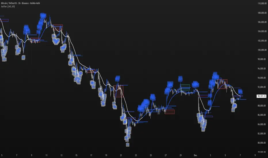
Aether Market MapAether Market Map A multi-component structure-based tool that aids chart analysis by visually displaying various market structure elements.
It combines order blocks, fair value gaps, liquidity segments, trend-shifting signals, and more to help users interpret the pricing structure more clearly.
This script does not provide specific trading strategies or investment advice and is a reference tool for chart analysis.
🔍 Key Features
1. Order Blocks (OB)
Displays the potential inflection sections in box form according to the specified conditions.
This feature helps to visually grasp the price segments that market participants have repeatedly responded to.
2. Fair Value Gaps (FVG)
It detects the area where the imbalance between the candles has occurred and displays it in a box form.
The area represents the section where there has been a fast movement or abnormal flow of prices.
3. Liquidity Levels
Shapes the points where liquidity was gathered through a short-term high-point and low-point pivot structure.
You can see the structural levels at which prices can react repeatedly.
4. BOS / CHOCH (Structural Change Detection)
Label changes in market structure based on recent high/low breakthroughs.
This is not just trend tracking, it helps us to visually grasp the changes in the structure itself.
📈 Analysis of multi-time frame trends
We compute the comprehensive trend state by leveraging the moving average slope of the swing and macro higher order time frames.
These values are reflected in chart background and EMA color changes to intuitively display the overall market mood.
Positive Environment (Regime > 0) → Green Family
Negative Environment (Regime < 0) → Red Series
This is a simple visualization of the flow of the market to the user, not a specific trading direction.
🔧 Signal Engine (Confluence-Based Visual Tool)
The script does not provide a transaction signal and does not induce a particular trading decision.
The Signal feature is a visual notification element that appears on the chart when a number of conditions overlap.
a change in the ratio of trading volume
Structural activities in recent analysis sections
Trending Environment
short-term momentum change
This feature is a reference visual element for interpreting market data from multiple perspectives.
🎛 Setting Items
Show Order Blocks — Visualize Order Blocks
Show Fair Value Gaps — Show FVG Detection
Show Liquidity Levels — Show pivot-based liquidity areas
Show BOS/CHoCH — Show Structural Switching Points
Show Trade Signals — Display visual signal notifications
HTF Settings — Enter parent timeframe analysis values
💡 Precautions for Use
This script is a market structure visualization tool and does not guarantee specific trading strategies, forecasts, or returns.
Components are calculated based on historical data and may not fully reflect real-time market changes.
All features are intended for research and chart analysis assistance purposes.
📌 Official Disclaimer
This script does not provide investment, finance, or trading advice.
All trading judgments made by the user and their consequences are the user's own responsibility.
This tool only provides a reference visualization function to assist with analysis.
Market Structure +21 EMA Hariss 369This indicator combines Market Structure, 21-EMA trend filtering, and Break of Structure (BOS) signals to help identify trend continuation and reversal opportunities. It automatically detects swing highs and lows using a pivot-based method and classifies them into the four core structure types: HH (Higher High), HL (Higher Low), LH (Lower High), and LL (Lower Low).
Short trendline segments are drawn between consecutive pivots to visualize the evolving structure without cluttering the chart. When price breaks above a previous structure high or below a previous structure low, the indicator marks a BOS event using a dotted line on the breakout candle and a small horizontal “break line”.
A 21-period EMA acts as directional confirmation:
BUY signals appear only when price breaks structure upward and is above the EMA.
SELL signals appear only when price breaks structure downward and is below the EMA.
This makes it easier to follow the dominant trend while filtering out false breakouts. The indicator is clean, lightweight, and suitable for intraday as well as swing trading.

Candle Leverage OnlyThe Candle Leverage Only indicator displays the maximum theoretical leverage a trader could achieve within each candle, based on the full price movement — from the low to the close (on bullish candles) or from the high to the close (on bearish candles).

Minho Index | SETUP (Safe Filter 90%)//@version=5
indicator("Minho Index | SETUP (Safe Filter 90%)", shorttitle="Minho Index | SETUP+", overlay=false)
//--------------------------------------------------------
// ⚙️ INPUTS
//--------------------------------------------------------
bullColor = input.color(color.new(color.lime, 0), "Bull Color (Minho Green)")
bearColor = input.color(color.new(color.red, 0), "Bear Color (Red)")
neutralColor = input.color(color.new(color.white, 0), "Neutral Color (White)")
lineWidth = input.int(2, "Line Width")
period = input.int(14, "RSI Period")
centerLine = input.float(50.0, "Central Line (Fixed at 50)")
//--------------------------------------------------------
// 🧠 BASE RSI + INTERNAL SMOOTHING
//--------------------------------------------------------
rsiBase = ta.rsi(close, period)
rsiSmooth = ta.sma(rsiBase, 3) // light smoothing
//--------------------------------------------------------
// 🔍 TREND DETECTION AND NEUTRAL ZONE
//--------------------------------------------------------
trendUp = (rsiSmooth > rsiSmooth ) and (rsiSmooth > rsiSmooth )
trendDown = (rsiSmooth < rsiSmooth ) and (rsiSmooth < rsiSmooth )
slopeUp = (rsiSmooth > rsiSmooth )
slopeDown = (rsiSmooth < rsiSmooth )
lineColor = neutralColor
if trendUp
lineColor := bullColor
else if trendDown
lineColor := bearColor
else if slopeUp or slopeDown
lineColor := neutralColor
//--------------------------------------------------------
// 📈 MAIN INDEX LINE
//--------------------------------------------------------
plot(rsiSmooth, title="Dynamic RSI Line (Safe Filter)", color=lineColor, linewidth=lineWidth)
//--------------------------------------------------------
// ⚪ FIXED CENTRAL LINE
//--------------------------------------------------------
plot(centerLine, title="Central Line (Highlight)", color=neutralColor, linewidth=1)
//--------------------------------------------------------
// 📊 NORMALIZED MOVING AVERAGES (SMA20 and EMA20)
//--------------------------------------------------------
SMA20 = ta.sma(close, 20)
EMA20 = ta.ema(close, 20)
// Normalization 0–100
minPrice = ta.lowest(low, 100)
maxPrice = ta.highest(high, 100)
rangeCalc = maxPrice - minPrice
rangeCalc := rangeCalc == 0 ? 1 : rangeCalc
normSMA = ((SMA20 - minPrice) / rangeCalc) * 100
normEMA = ((EMA20 - minPrice) / rangeCalc) * 100
//--------------------------------------------------------
// 🩶 MOVING AVERAGES PLOTS (GHOST-GREY STYLE)
//--------------------------------------------------------
ghostColor = color.new(color.rgb(200,200,200), 65)
plot(normSMA, title="SMA 20 (Ghost Grey)", color=ghostColor, linewidth=2)
plot(normEMA, title="EMA 20 (Ghost Grey)", color=ghostColor, linewidth=2)
//--------------------------------------------------------
// 🌈 FILL BETWEEN MOVING AVERAGES
//--------------------------------------------------------
bullCond = normSMA < normEMA
bearCond = normSMA > normEMA
fill(
plot(normSMA, display=display.none),
plot(normEMA, display=display.none),
color = bearCond ? color.new(color.red, 55) :
bullCond ? color.new(color.lime, 55) : na
)
//--------------------------------------------------------
// ✅ END OF INDICATOR
//--------------------------------------------------------

Buy-Call Arrows – SuperTrend Entries OnlyRecommended Rules
Signal from Script Your Action (Calls Only)
Green BUY arrow → Enter calls (ATM or slightly OTM, 45 DTE)
Red SELL arrow → Immediately exit the call (market order or tight stop) — do NOT wait
No position between signals Stay in cash — no calls open during red SuperTrend phases

MACD Zero-Line Dominance (no ta.sum)Description Option 1 (Simple & Clear)
“This indicator compares how many recent bars have the MACD line above the zero line versus below it.
It plots the resulting strength as a green/red histogram showing whether bullish or bearish momentum is dominating.”
“MACD Zero-Line Dominance measures the strength balance between bullish and bearish momentum by counting how many candles in a lookback period have MACD above or below the zero line.
The histogram turns green when bullish pressure dominates and red when bearish momentum takes control.
Useful for trend confirmation, regime detection, and higher-timeframe alignment.”

NEXFEL – Quantum Adaptive MACD System v2.0# NEXFEL – Quantum Adaptive MACD System v2.0
## 📌 Overview
The **NEXFEL – Quantum Adaptive MACD System v2.0** is an advanced, fully integrated decision-support tool built upon an enhanced adaptive MACD engine.
Unlike traditional MACD implementations that rely on fixed parameters, this system uses **R² correlation** to dynamically adjust sensitivity based on current market behavior.
This indicator **does not simply merge tools**; it unifies:
- Adaptive MACD calculation
- Multi-timeframe sentiment (1H + 4H)
- Market regime detection
- Volume confirmation
- Confidence scoring (0–100%)
- ATR stop-loss visualization
- Session filtering
- Daily trade limit control
into a **single coherent trading framework**.
This publication replaces my previous “Adaptive MACD Flow PRO”, as this version is a complete rewrite with new logic, improved structure, and expanded analytical capabilities.
---
## ⚙️ How It Works
### **1. Adaptive MACD Core (R²-Based)**
The MACD sensitivity is adjusted using R² correlation:
- High R² → smoother & more stable response
- Low R² → more reactive & faster response
This adaptation allows the oscillator to naturally adjust to different volatility environments.
---
### **2. Multi-Timeframe Sentiment**
The system analyzes:
- **1H EMAs (10/30)**
- **4H EMAs (20/50)**
A directional sentiment score is generated, allowing signals only when the local timeframe aligns with the higher timeframe structure.
---
### **3. Market Regime Detection**
The indicator identifies whether the market is:
- **TRENDING**
- **RANGING**
- **NEUTRAL**
Signals are validated or filtered depending on the active regime.
---
### **4. Confidence Scoring System (0–100%)**
The signal quality is measured by weighting:
- Momentum
- Volume confirmation
- Market regime compatibility
- Multi-timeframe alignment
- Local trend direction
- Short-term momentum
Only **high-confidence** conditions produce the safest BUY/SELL signals.
---
### **5. ATR Stop-Loss Visualization**
Dynamic stop levels are displayed using:
- ATR × multiplier
A visual reference for risk management without executing trades.
---
### **6. Daily Trade Limit Control**
To prevent overtrading, the system tracks daily signals and restricts new ones once a limit is reached.
---
### **7. Multi-Language Interface**
The panel can display:
- **English**
- **Portuguese**
depending on user selection.
(TradingView requires English as the primary language, which is why it appears first in this description.)
---
## 👤 Who This Script Is For
- Traders seeking a more reliable and adaptive MACD
- Scalpers who prefer high-confirmation entries
- Swing traders analyzing market regimes
- Users needing a clean, objective analytical panel
---
## ⚠️ Important
This indicator does **not** execute trades and does not guarantee results.
It is a **decision-support system**, not a trading bot.
# 📝 Author’s Notes
This version is a complete redesign of my previous indicator.
All components were rebuilt, expanded, and optimized to offer a more structured and reliable trading system.

The Flody SniperA trend-following sniper strategy that uses two EMAs (21/55) and RSI to confirm momentum.
It enters long when price crosses above the fast EMA during an uptrend and RSI shows strength.
It enters short when price crosses below the fast EMA during a downtrend and RSI shows weakness.
Pyramiding is enabled so the strategy can add more positions as the trend continues.
Positions close when momentum weakens or price breaks back through the fast EMA.

Responsive ADX (RADX)Introducing the new Responsive ADX (RADX), running with a (length = 9) and exactly how it differs from the standard built-in ADX you see on TradingView chart.
This indicator is still a true ADX at its core — it measures trend strength from 0 to 100 and uses the classic +DI and –DI lines to show direction — but it has been carefully "tuned" to react noticeably faster while staying smooth and usable. With the length set to 9, it is one of the most responsive versions you can run without turning into noise.
How it behaves differently from the normal (Wilder) ADX
Normal ADX is lagging, now this version gives you the same trend-strength reading 4–8 bars earlier than the built-in ADX. On a daily chart that can easily be 4–8 calendar days of earlier warning. On a 4-hour chart it’s 16–32 hours earlier. That head-start is the whole point.
The ADX line rises and falls much quicker.
When a new trend actually starts, you will often see this Fast ADX cross above 18–20 while the built-in ADX is still sleeping below 15. Conversely, when a trend dies, this version drops faster, so you’re not left holding a dead trade for an extra week.
The +DI and –DI lines are almost identical to the original, but lightly smoothed with a 5-period EMA (you can turn this off). This makes the DI crossovers cleaner and reduces whipsaws without adding meaningful lag.
The final ADX smoothing uses a lightweight Hull-style technique instead of Wilder’s very slow RMA. This is the main “secret sauce” that removes roughly half the lag while keeping the line smooth and readable.
Values are realistic and tradable.
With length 9 you will typically see:
– 0–18 = flat / chop
– 15–20 = emerging trend (background starts colouring)
– 20–50 = strong trend (most people take this as confirmation)
– above 50–60 only in very powerful moves (same as normal ADX)
The aqua / purple background only appears when both conditions are met: the correct DI is on top and Fast ADX is above your chosen “weak-to-trending” level (default 18).
This prevents the background from flashing on and off in sideways markets — exactly the same logic you liked in the original Trinity ADX, but now much earlier.
In very simple terms
Think of the normal built-in ADX as a diesel truck — reliable but slow to accelerate and slow to stop. Fast Responsive ADX with length 9 is the same truck with a turbocharger — same destination and same load capacity, but it gets up to speed twice as fast and brakes earlier when the road turns.
We would recommend people who switch to this version keep the (length 9–12) because the edge in timing is obvious on the chart.
That’s it — this is a new more responsive version, still-logical ADX!
