SMC Strategy Tool v1.0 - Institutional SuiteDescription: The SMC Strategy Tool v1.0 is a comprehensive technical analysis suite designed for traders following the Smart Money Concepts (SMC) methodology. It combines market structure, institutional liquidity zones, and mathematical pivots to provide a high-probability trading environment.
Key Features:
Automatic Market Structure: Real-time detection of CHoCH (Change of Character) and BOS (Break of Structure) based on price action confirmation.
Institutional Order Flow (FVG): Identifies Fair Value Gaps with a dynamic mitigation system (boxes disappear once the price fills the inefficiency).
Premium & Discount Zones: Automatically calculates the current trading range and highlights the "cheap" (Discount) and "expensive" (Premium) areas for optimal entry.
Daily Pivot Points: Seamless integration of Daily Pivots (P, R1-R3, S1-S3) for institutional confluence.
Live Analytics Dashboard: A clean, non-intrusive table monitoring Market Phase, RSI (Momentum), and ATR (Volatility).
Smart Alerts: Built-in logic for "Discount Entry" during Bullish trends and "Premium Entry" during Bearish trends.
How to Trade:
Identify the Trend: Look at the Dashboard for the current Market Phase (Bullish/Bearish).
Wait for Value: Do not chase the price. Wait for the price to return to the Discount Zone (for Longs) or Premium Zone (for Shorts).
Find Confluence: The highest probability trades occur when a Discount/Premium entry aligns with an FVG and a Daily Pivot level.
Confirmation: Check the RSI cell. If it's red/green, the move might be exhausted; wait for a neutral reading or a structural reaction.
Available Alerts:
Trend Shift (CHoCH): Get notified immediately when the market structure shifts (e.g., from Bearish to Bullish).
Trend Continuation (BOS): Signals when the current trend is confirmed by a new structural break.
Discount Zone Entry (Long Bias): Notifies you when the price enters the Discount Zone while the Market Phase is Bullish. This prevents FOMO buying at high prices.
Premium Zone Entry (Short Bias): Notifies you when the price enters the Premium Zone while the Market Phase is Bearish. This ensures you are selling at institutional "expensive" prices.
How to set up Alerts:
Click the Alerts icon in the right sidebar.
Under Condition, select: SMC Strategy Tool v1.0 - Institutional Suite.
Select "Any alert() function call" (or Qualsiasi chiamata alla funzione alert()).
Choose your preferred notification method (Popup, Email, or App notification).
The alert message will automatically include the Ticker, Timeframe, and the specific action to take!
指標和策略

Kijun Sen Standard Deviation | QuantLapse SystemsOverview
The Kijun Sen Standard Deviation indicator by QuantLapse Systems is a volatility-aware trend-following framework that combines the structural equilibrium of the Kijun Sen (基準線) with statistically adaptive standard deviation bands.
By anchoring trend detection to market structure and confirming direction through volatility expansion, the indicator delivers a cleaner, more reliable regime classification across varying market conditions.
Rather than reacting to short-term noise, the system focuses on identifying statistically justified trend phases , making it well-suited for disciplined, rule-based trading.
Technical Composition, Calculation, Key Components & Features
📌 Kijun Sen (基準線) – Structural Trend Baseline
Calculated as the midpoint between the highest high and lowest low over a user-defined period.
Represents market equilibrium and structural balance rather than short-term momentum.
Naturally adapts to expanding and contracting price ranges.
Provides a stable baseline for regime detection and volatility validation.
Acts as the anchor for deviation bands and persistent trend-state logic.
Unlike fast or reactive moving averages, the Kijun Sen emphasizes price structure and equilibrium , making it especially effective for higher-quality trend confirmation.
📌 Volatility Adjustment – Standard Deviation Bands
Standard deviation is calculated over a configurable lookback to measure current price dispersion.
Upper and lower envelopes are formed by applying a deviation multiplier to the Kijun Sen.
Band width expands during volatility surges and contracts during consolidation.
Creates proportional, volatility-aware thresholds instead of static offsets.
Visually represents market energy through expanding and compressing channels.
These adaptive bands ensure that trend signals only occur when volatility supports directional movement.
📌 Trend Signal & Regime Calculation
Bullish Trend is confirmed when price closes above the upper deviation band.
Bearish Trend is confirmed when price closes below the lower deviation band.
Once established, the trend state persists until an opposing volatility break occurs.
This persistence reduces whipsaws and improves regime stability.
Trend state is reinforced with color-coded lines, envelopes, and background shading.
This volatility-confirmed persistence model is visible in the chart, where trends remain intact through minor pullbacks and only flip on decisive expansion.
How It Works in Trading
✅ Volatility-Confirmed Trend Detection – Requires expansion beyond deviation bands.
✅ Noise Suppression – Filters low-energy price movement within volatility envelopes.
✅ Regime Persistence – Maintains trend state until statistical invalidation.
✅ Immediate Visual Context – Direction, strength, and transitions are clear at a glance.
Visual Representation
Trend signals are displayed directly on price using both line and background context:
🟢 Green / Teal Kijun & Envelope → Confirmed bullish regime.
🔴 Red / Pink Kijun & Envelope → Confirmed bearish regime.
Semi-transparent band fill visualizes volatility expansion and compression.
Buy and Sell labels appear only on confirmed regime transitions.
The lower panel includes:
Strategy equity curve based on trend exposure.
Buy & Hold equity for performance comparison.
Background regime shading synchronized with trend state.
Features and User Inputs
The Kijun Sen Standard Deviation framework offers a focused yet powerful set of configurable inputs:
Kijun Sen Length – Controls structural trend sensitivity.
Standard Deviation Controls – Adjust lookback length and multiplier for regime strictness.
Backtesting & Date Filters – Define evaluation periods and starting conditions.
Display Options – Toggle labels, equity curves, and background shading.
Color Customization – Fully configurable buy/sell colors for trends and equity curves.
These controls allow users to balance responsiveness, stability, and clarity without overfitting.
Practical Applications
The Kijun Sen Standard Deviation indicator is designed for traders who prioritize structure, volatility confirmation, and regime awareness.
Primary Trend Filtering – Identify and stay aligned with dominant market direction.
Volatility-Aware Trend Following – Participate only when price expansion confirms intent.
Risk-Managed Exposure – Avoid chop during compression and transitional phases.
Systematic Strategy Development – Use as a regime engine or higher-timeframe filter.
Performance Evaluation – Compare trend-following equity against buy-and-hold benchmarks.
This framework bridges classical Ichimoku structure with modern statistical validation.
Conclusion
The Kijun Sen Standard Deviation indicator by QuantLapse Systems represents a refined evolution of Ichimoku-based trend analysis.
By integrating the structural equilibrium of the Kijun Sen with adaptive standard deviation confirmation, the system delivers clearer regime classification, reduced noise, and more reliable trend participation.
Rather than attempting to predict price, it focuses on confirming when trends are statistically justified .
Who should use Kijun Sen Standard Deviation:
📊 Trend-Following Traders – Stay aligned with dominant market structure.
⚡ Momentum & Swing Traders – Enter only on volatility-backed expansions.
🤖 Systematic & Algorithmic Traders – Ideal as a regime filter or trend-state engine.
Past performance is not indicative of future results.
Disclaimer: All trading involves risk, and no indicator can guarantee profitability.
Strategic Advice: Always backtest thoroughly, optimize parameters responsibly, and align settings with your timeframe, asset class, and risk tolerance before live deployment.

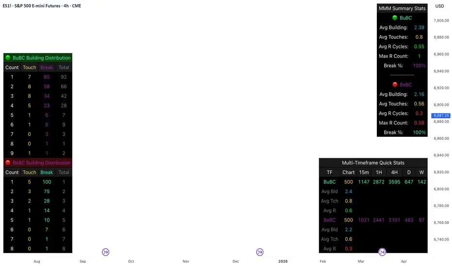
Body Close Continuity & failure Backtesting @MaxMaseratiThis indicator, is a highly advanced institutional-grade tool designed to track the "lifespan" of a trend based on Body Close (BC) sequences.
Unlike basic indicators that just show direction, this script analyzes the structural integrity of a trend by monitoring how many candles continue the move before a "Touch" (retest) or a "Break" (failure) occurs.
The Continuity & Failure Stats indicator tracks sequences of Bullish Body Closes (BuBC) and Bearish Body Closes (BeBC). It measures three critical phases: Building (pure momentum), Touching (price retesting the low/high of the sequence), and Resumption (price continuing the trend after a retest). It provides a statistical distribution of how long these "buildings" typically last before failing, allowing traders to know exactly when a trend is overextended.
This comprehensive analysis blends the statistical breakdown of the Continuity & Failure Stats indicator to provide a deep understanding of the structural momentum for the S&P 500 E-mini (ES1!) on a 4-hour timeframe.
1. Extensive Table Breakdown
A. Building Distribution (Left Table): The Fatigue Gauge
This table acts as a histogram of momentum, tracking the "Building Count"—the number of consecutive candles closing in a trend without price returning to its origin.
Count Column: Represents the streak length (e.g., 1, 2, or 3 candles).
Touch Column: Shows how many times a streak was interrupted by a retest ("touch") but remained structurally intact.
Break Column: Counts total structural failures where price closed beyond the sequence's anchor.
Data Insight: For BuBC, 92 sequences reached Count 1, but only 28 remained by Count 4. This reveals a steep momentum decay after the 3rd candle, establishing a "Statistical Wall" where only 2 sequences in history reached a count of 9.
B. MMM Summary Stats (Top Right): The Mathematical DNA
This table provides the "Expected Value" and behavior of a trend over the lookback period.
Avg Building (2.39 for BuBC): On average, a bullish move lasts ~2.4 candles of pure momentum before a retest or reversal occurs.
Avg Touches (0.8): This low number indicates "clean" trends that rarely wobble back to retest levels multiple times before reaching a conclusion.
Avg R Cycles (0.55): This suggests that once a bullish trend is interrupted, it only successfully resumes its momentum about half the time.
Max R Count (1): Typically, once a trend is "touched," it only manages one more push before failing.
C. Multi-Timeframe (MTF) Quick Stats (Bottom Right): Trend Weight
This compares the 4H chart against other layers of the market to identify "global" alignment.
Sample Comparison: There are 3,594 tracked BuBC sequences on the 4H compared to only 142 on the Weekly chart.
Fractal Law: The Avg Building (2.4) is consistent across several timeframes, implying that the "Rule of Three" (momentum fading after 3 candles) is a fractal characteristic of this asset.
2. Table Comparison: Synthesizing the Data
To trade effectively, you must compare Distribution (timing) against Summary Stats (averages):
Continuity vs. Failure: The Summary Stats show an average building of 2.39. When checking the Distribution table at Count 2, the "Break" count (58) is already high relative to the "Total". This confirms that the risk of failure increases exponentially the moment you exceed the average.
Momentum vs. Mean Reversion: Distribution tells you when a trend is "tired". If the 4H is at a "Building Count 4" (statistically overextended) while the Weekly chart is at "Building Count 1" (fresh momentum), you may choose to prioritize the higher timeframe's strength despite the local overextension.
3. Strategic Summary & Application
This indicator proves that market momentum follows a predictable "Building" cycle rather than an infinite streak.
The "Rule of Three" for ES1! 4H:
The Entry Zone (Momentum Start): The most profitable entries occur at Building Count 1. Statistically, you have a high probability of reaching a count of 2 or 3.
The Exit Zone (Momentum Limit): Take profits or tighten stops at Count 3. The data shows the sample size drops by nearly 50% between Count 3 and Count 4.
The "Touch" Rule (Retest Reliability): If price returns to the sequence low (a "Touch"), do not expect a massive continuation. The Max R Count of 1 tells us that resumptions are usually short-lived.
Danger Zone: Entering at Building Count 4 or higher is statistically dangerous, as the "Break" probability significantly outweighs the "Touch" or continuation probability.
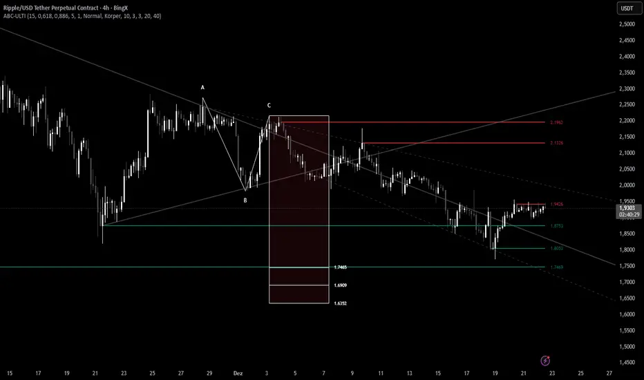
ABC Pro Ultimate S/RABC Pro Ultimate is a high-precision trading tool designed to identify harmonic ABC (Zigzag) patterns and combine them with institutional Support & Resistance levels. Unlike standard indicators that clutter your chart with noise, this script filters for high-relevance pivot points from the distant past to provide truly meaningful trade setups.
V-Max Tactical Clock & Price make Crypto Price bigger📘 Tactical Clock & Price 14.1 — 功能介紹 / Features
這是一個輔助看盤的小工具,主要解決 TradingView 原生加密貨幣價格字體較小 以及時間顯示不直覺的問題。 This is a supplementary monitoring tool designed to address TradingView’s small native cryptocurrency price fonts and non-intuitive time displays。
動態變色價格 / Dynamic Price Coloring:
價格文字會隨當前 K 線漲跌變色(漲綠跌紅),方便觀察即時強弱。
Price text changes color based on the current candle's movement (green for up, red for down) for instant momentum tracking。
大字體設計 / Large Font Design:
採用較大的字體規格與等寬字體,確保在解析度較高或視距較遠時仍能清晰辨識價格。
Utilizes larger font scales and monospace typography to ensure price clarity on high-resolution displays or from a distance。
全球時區定義 / Global Timezone Definition:
內建時區偏移(GMT Offset)設定,使用者可根據所在城市手動調整,確保顯示時間與本地同步。
Includes a built-in GMT Offset setting, allowing users to manually adjust the time to sync with their local city。
視覺自定義 / Visual Customization:
支援自定義背景、文字與邊框顏色,可隨個人習慣調整透明度。
Supports custom background, text, and border colors with adjustable transparency to suit individual preferences。
🛡️ 支持開發 / Support Development
若工具對您有幫助,歡迎支持團隊以釋出更多公益模組。詳細支持資訊請參閱 我的個人簡介或置頂留言。 If this tool helps you, feel free to support the team to help release more public-benefit modules. For support details, please check my profile or pinned comments。

Participation-Weighted Orderflow Bubbles (HTF / LTF Context ToolThis indicator visualizes participation-weighted market pressure by aggregating lower-timeframe price and volume data into higher-timeframe context bubbles. It is designed to help identify directional dominance, balance, and absorption across timeframes. This is a context and bias tool, not a trade signal generator.
What the indicator shows
Each bubble represents a single chart bar, built from lower-timeframe candles.
Total Notional
Aggregated volume multiplied by price from lower-timeframe candles.
Buy / Sell Proxies
Lower-timeframe candles are classified based on where they close within their range:
– Close near the high → buy-side proxy
– Close near the low → sell-side proxy
– Middle of the range → neutral
Delta (USD and %)
Buy proxy notional minus sell proxy notional, expressed as both absolute USD delta and percentage of total notional.
Bubble colors
Green
Buy-side participation dominance.
Sell color (user configurable)
Sell-side participation dominance. The default is chosen for visibility on bearish candles and can be changed in settings.
Grey
Balanced participation. Indicates two-way trade, consolidation, or auction.
Yellow (Absorption)
High notional with limited price movement, suggesting potential absorption or distribution.
Coloring uses both relative dominance (delta percentage) and absolute dominance (minimum delta in USD), which improves behavior on higher timeframes.
Bubble size and visuals
Bubble size scales with total notional.
HD glow layers adapt automatically by timeframe.
Bubbles are drawn in front of candles for clarity.
Optional text displays delta and total notional.
Hovering over a bubble shows detailed information including total notional, buy/sell/neutral proxies, delta values, absorption status, and the number of lower-timeframe candles used.
Timeframe behavior
The indicator is designed to work across multiple timeframes. On higher timeframes, more grey bubbles are expected due to natural auction and balance behavior. Colored bubbles on higher timeframes represent sustained participation rather than short-term momentum. Visual density and performance are automatically adjusted on higher timeframes.
How to use it
Recommended workflow:
1. Higher timeframe (1H, 4H, Daily)
Use the bubbles to identify dominant buy or sell participation, balance zones, and absorption near highs or lows.
2. Lower timeframe (5m, 15m)
Take trades in alignment with the most recent higher-timeframe dominance. Be cautious or range-focused inside higher-timeframe balance zones. Use structure and price action for entries.
What this indicator is not
This indicator does not show true bid/ask data.
It does not display actual market versus limit orders.
It does not replace a DOM or exchange orderflow feed.
It should not be used as a standalone entry signal.
The indicator works within TradingView’s available data and provides a probabilistic, participation-weighted view of market pressure rather than true tape or orderflow data.
Best practices
Use a 1-minute lower timeframe for best results.
Avoid setting the lower timeframe too high relative to the chart timeframe.
Combine this tool with structure, levels, and session context.
Treat grey bubbles as information about balance, not as noise.
This tool is intended for traders who want better context and bias, not more signals.

Malama's Quantum Fusion Malama's Quantum Fusion is a unified trading system that integrates swing-based probability zones, multi-timeframe trend confirmation, and a reversal signal engine into a single indicator.
Differences from "Malama's Quantum Swing Modulator" (Why this is a new script): While this script utilizes the probability zone logic from my previous "Quantum Swing Modulator" (MQSM), it represents a distinct evolution in functionality:
From Analysis to Signals: MQSM was a passive analysis tool for visualizing zones. This script (MQF) adds an active Reversal Signal Engine that generates specific "BUY/SELL" diamond signals based on candle patterns and confluence.
Trend Cloud & Structure: MQF introduces a Dual-Supertrend Cloud and Fast/Slow EMA structure to filter trades, features not present in the original oscillator-based tool.
Automated Confluence: Unlike the previous tool which required manual interpretation, MQF mathematically fuses the Zone Score, Trend Cloud, and Volume analysis to filter false positives automatically.
How it Works: The system relies on a "Confluence of Three" approach:
The Context (Uncertainty Zones): Using ATR bands and Pivot Points, the script identifies where price is statistically likely to reverse (Overextended).
The Trend (Cloud & MTF): A dual Supertrend cloud (Fast & Slow) visualizes the immediate trend direction. Optional Multi-Timeframe (MTF) logic checks higher timeframe alignment.
The Trigger (Signal Engine): A valid signal is generated only when a specific reversal candle pattern occurs coincident with the trend direction and (optionally) within a high-probability zone.
Key Features:
Dynamic Dashboard: Displays real-time Regime (Trending vs. Choppy via ADX), Support/Resistance Probabilities, and MTF status.
Visual Signals: Plots Diamond labels with Stop Loss and 2:1 Take Profit targets.
Regime Detection: Automatically adjusts oscillator weighting based on whether the market is Trending or Ranging (ADX Filter).
Settings:
Signal Filters: You can toggle specific filters (Volume Spike, Cloud Alignment, Zone Proximity) to make the script more aggressive or conservative.
MTF: Enable/Disable Auto-MTF selection to filter noise using higher timeframe trends.
Visuals: Fully customizable colors for the Cloud, Zones, and Dashboard.

Long Short Trading System With TableSmart Trading System Pro is an advanced TradingView indicator designed for precision and clarity.
It combines Order Blocks, Liquidity Zones, EMA trend alignment, MACD, RSI, Volume, and ATR-based risk management to generate high-quality LONG / SHORT signals.
🔹 Clear trade direction
🔹 Smart entry, stop-loss & multi-level take-profit
🔹 Automatic risk/reward & leverage calculation
🔹 Clean visual dashboard for fast decision-making
Built for traders who value structure, confirmation, and risk control.
Best suited for crypto, forex, and indices on all timeframes.
Disclaimer:
This indicator is for educational and informational purposes only and does not constitute financial advice.
Trading involves risk, and past performance does not guarantee future results.
You are solely responsible for your trading decisions and outcomes.

XAUUSD M15 momentum real Detects when xausd enters a healthy directional phase during the NY session, and only flags entries with real momentum and controlled volatility.

Impulse Trend Suite LITE🚀 Impulse Trend Suite LITE
Smart trend visualization with precise flip arrows. A lightweight, momentum-filtered trend tool designed to stay clean, avoid repeated signals, and keep you focused only on real market direction.
🔍 Quick Guide
BUY setup = green arrow + green background
SELL setup = red arrow + red background
Stay in the move while color doesn’t change
ATR channel helps avoid chasing overextended candles

RSI Divergence Indicator (Fixed RSI Color + MTF Table)This script combines a classic RSI divergence indicator with a multi–timeframe RSI dashboard.
Main features:
Detects and plots:
Regular bullish & bearish RSI divergence
Hidden bullish & hidden bearish RSI divergence
Dynamic RSI line color:
Green in strong bullish zone
Red in strong bearish zone
Yellow in neutral zone
Standard RSI levels:
70 / 30 overbought–oversold
50 midline with highlighted band
MTF RSI table:
Compact RSI dashboard on the right side of the chart
Timeframes: 1m, 5m, 15m, 30m, 1h, 4h, 8h, 12h, 1D (each can be turned on/off)
Background color highlights extreme RSI:
Red / orange for overbought
Lime for oversold
This tool is designed to help traders quickly see divergence signals on the current chart while also monitoring RSI conditions across multiple timeframes in one place.

rosh Swift ALGO-X based on ema for xauusd scalping use with original settings, assured 100 pips per day

virgin wick theorybased off of www.youtube.com strategy.
shows levels for the next HTF period to trade off of
make sure to check your htf to double check as the max lookback doesnt cover some levels occasionally

Highs & LowsIntroduction: This indicator marks highs and lows from the previous New York, Asian, and London sessions, including the daily high and low. It is made to be as user friendly/adjustable as possible.
It was designed around trading during the New York morning session, using the 1 hour and 1 minute(or similar) timeframes in conjunction.
Settings: Common settings for the cleanest viewing are as follows:
1 Hour Chart Settings:
Box #3 "Label Vertical Offset" to "18".
Box #4 "Label X Offset" to "2".
1 Minute Chart Settings:
Box #3 "Label Vertical Offset" to "2".
Box #4 "Label X Offset" to "0".
Note: Adjusting text to the darkest "black" setting may provide the best contrast.

ATR Volatility FilterA Basic Volatility Filter
3 Modes
1- Absolute ATR filter
2- Filter Based on ATR threshold relative percentage of the price
3- ATR Threshold relative to its moving average

Kira Buy Sell EMA & VWAP Trend IndicatorThis indicator provides buy and sell signals based on short-term
momentum shifts while aligning trades with the broader market
trend.
Core logic:
• Fast and slow EMAs are used to identify short-term momentum
changes
• VWAP is applied to confirm price acceptance in the trade
direction
• A higher-period EMA is used as a trend filter to reduce
counter-trend signals
Buy signals are generated when bullish momentum aligns with
VWAP positioning and the prevailing trend. Sell signals are
generated when bearish momentum aligns with VWAP and the
broader trend direction.
This approach keeps the logic simple and responsive while
helping to avoid signals during unfavorable market conditions.
Best suited for liquid stocks and indices on intraday
timeframes such as 5-minute to 1-hour charts.
This script does not repaint and is intended as a
decision-support indicator, not a standalone trading system.

V-Max Crypto Scaling & Risk Calculator【讓物理數學接管你的恐懼 / Let Math & Physics Overcome Your Fear】
為什麼多數交易者會爆倉?因為他們在下單前根本不知道「本次最大損失」是多少。本指標是 V-Max 體系的公益風控模組,旨在為加密貨幣交易者提供精準的執行指令。
Why do most traders blow up their accounts? It is because they do not know their "Maximum Possible Loss" before placing an order. This indicator is a public-benefit risk management module from the V-Max ecosystem, designed to provide precise execution commands for cryptocurrency traders.
💡 核心戰術功能 / Core Tactical Features
全指令執行 / Full Execution Commands:
支援「做多/做空」切換,直接輸出「建議止損價位」,讓你不再糾結參數設定。
Supports "Long/Short" switching with direct "Suggested Stop-Loss Price" output, eliminating parameter confusion。
物理波動感應 / Volatility Sensing:
支援 3M Range、ATR 及自動結構 K 低點偵測。
Supports 3M Range, ATR, and automatic detection of Structural K-line highs and lows。
高精度運算 / High-Precision Engine:
支援 6 位小數點精度,完美適配所有山寨幣種。
Supports 6-decimal precision, making it perfectly compatible with all Altcoins。
動態安全提醒 / Dynamic Safety Alerts:
當市場進入「低波動窒息區」時,系統將自動跳出警告,守護你的本金。
Automatic warnings are triggered when the market enters a "Low Volatility Choke Zone" to protect your capital。
🛠️ 使用說明 / Instructions
設定你的「總保證金」與「願意承擔的風險 %」。 Set your "Total Capital" and "Risk Per Trade %".
選擇交易方向 (Long/Short)。 Choose your trade direction (Long/Short).
參考儀表板給出的「建議止損價位」與「建議建倉數量(最大)」進行執行。 Execute based on the dashboard's "Suggested Stop-Loss Price" and "Suggested Entry Units (Max)".
「若此工具幫您守住了本金,歡迎至作者個人主頁給予支持。」
"If this shield has successfully guarded your bankroll, feel free to support the author through my profile page."
「想要了解更多 V-Max 物理交易邏輯,歡迎點擊我的頭像進入個人主頁,關注我們的社群動態。」 "To learn more about V-Max's physical trading logic, click my profile and follow our social media updates."

Witch-Fire ALMA signals: Dynamic Liquidity & Trend GlowThe Witch-Fire ALMA is a high-precision trend bias and liquidity mapping tool designed for price action traders and Smart Money practitioners. Unlike traditional indicators that clutter your chart with lagging signals, this script provides a "clean-yet-powerful" visual anchor to help you stay on the right side of the market while identifying key Points of Interest (POIs).
At its core, the script utilizes an optimized Arnaud Legoux Moving Average (ALMA). Known for its superior ability to balance smoothness and responsiveness, the ALMA effectively filters out market noise and "whipsaws" that often plague standard EMAs.
Key Features:
The Witch-Fire Glow: A neon-styled ALMA line that shifts between Bullish Green and Bearish Red. The white core provides surgical precision for price intersection, while the outer glow visualizes the strength and dominance of the current trend.
Scaled Liquidity Levels: Automatically maps Buy Side Liquidity (BSL) and Sell Side Liquidity (SSL). These levels are dynamic—they scale proportionally with your ALMA settings. This ensures that the liquidity zones you see are always relevant to the trend cycle you are analyzing.
Strategic Bias Background: A subtle background tint provides an instant psychological filter. Only look for Longs in the green zone and Shorts in the red zone to maintain a high-probability strike rate.
How to Trade with Witch-Fire:
Identify the Bias: Look at the Fire ALMA. If the "fire" is red and the price is below the line, your bias is strictly bearish.
Watch the Sweeps: Wait for the price to "sweep" (pierce with a wick) the horizontal SSL (Green) or BSL (Red) lines.
Execution: Look for a strong rejection candle (long wick, small body) at these levels that closes back towards the ALMA line.
Best Used On: 15m, 1H, and 4H timeframes. Works exceptionally well for Crypto, Forex, and Indices.

Continuation Failure Engine 2-F2 (A+ Only)Continuation Failure – High-Prob 2-F2 (A+ Only)
Best Timeframe: 15-minute chart
Usage:
Designed to detect high-probability 2-bar continuation failures (Failed 2 setups) graded A+. Works best when combined with the Strat Structure Engine 3-F2 Tiered. You will also find the same high-probability failures occurring in the 3-F2 setups, providing complementary confirmation.
Key Areas for Setup Identification:
Session highs and lows from Sessions & ICT Killzones (0xCryptoVince)
Fair Value Gap Extend FVG to 300
Strat Assistant
30-minute Opening Range Breakout (ORB)
VWAP
Signal Logic:
Failed 2-Up (red label): Price attempted upward continuation but reversed — potential short.
Failed 2-Down (green label): Price attempted downward continuation but reversed — potential long.
A+ Grade Criteria: Strong ATR range, close against trend, large body, above-average volume.
Alerts: Configurable for all A+ setups, triggers at bar close when a 2→F2 occurs.
Notes: Use this script to identify high-probability failures at the defined key zones. Works best in conjunction with the 3-F2 structure for a complete Strat analysis and to locate overlapping failure setups.
Supplementary Information / Facts:
What a Failed 2 actually represents (fact)
In The Strat, a Failed 2 is objectively defined as:
Price attempts continuation in one direction (breaks a prior high or low),
Fails to follow through, and
Closes back inside / opposite.
That is not just a candle pattern — it is failed acceptance of price, which aligns with auction market theory:
Markets probe for value
If participation is weak → rejection occurs
Source: CME Group – Understanding Market Profile & Auction Theory
Why session highs/lows matter (fact)
Asia / London / NY highs & lows are:
Liquidity pools
Areas where resting stop orders accumulate
Known reference points for both discretionary and systematic traders
Large participants expect liquidity there. When price breaks a session high/low:
Stops trigger
Liquidity is accessed
If no higher-timeframe acceptance appears → price snaps back
That snapback is exactly what your Failed 2 is capturing.
Source: CME Group – Liquidity, Stops, and Market Structure
Why VWAP keeps lining up (fact)
VWAP is not mystical — it is:
The average price weighted by volume, used institutionally as a fair-value benchmark.
Institutions actively defend VWAP:
Above VWAP = favorable for longs
Below VWAP = favorable for shorts
When price:
Extends away from VWAP,
Attempts continuation,
Fails and reclaims VWAP,
You often get a Failed 2 reversal because the auction rejected “unfair” price.
Source: Berkowitz et al., VWAP Trading Strategies (Journal of Trading); CME Group – VWAP as Institutional Benchmark
Why Fair Value Gaps are magnets for Failed 2s (fact + interpretation)
Fact: A Fair Value Gap (FVG) represents:
Inefficient price discovery
One-sided aggressive order flow
Thin participation
Markets statistically revisit inefficiencies.
What happens at an FVG:
Price returns
Liquidity is tested
Either acceptance or rejection occurs
When price:
Tags an FVG,
Attempts continuation,
Immediately fails,
You get a textbook Failed 2 at an inefficiency — the market saying:
“We checked — no agreement here.”
Source: ICT Concepts (FVG definition); CME Market Microstructure Research on inefficiencies
Concise, Factual Summary / Market Logic:
Liquidity Concentration: Session highs/lows and VWAP are key points where liquidity (orders) naturally accumulates. Price reacting there creates conditions for patterns like your Failed 2 setups.
Market Efficiency: VWAP represents fair value in the session, so price churn near it can trigger imbalance formations or pattern failures.
Imbalance Correction: FVGs are inefficiencies — when price interacts with them after an impulsive move, setups often occur because unfilled orders and market makers revisit those prices.
Confluence = Higher Probability: The strongest reactions happen when FVGs overlap session highs/lows or interact with VWAP, because confluence magnifies where market structure and liquidity converge.

CryptoFlux Dynamo [JOAT]CryptoFlux Dynamo: Velocity Scalping Strategy
This Pine Script v6 strategy is designed for cryptocurrency markets operating on 5-minute and faster timeframes. It combines volatility regime detection, multi-path signal confirmation, and adaptive risk management to identify momentum-based trading opportunities in perpetual futures markets.
Core Design Principles
The strategy addresses three challenges specific to cryptocurrency trading:
24/7 market operation without session boundaries requires continuous monitoring and execution logic
Volatility regimes shift rapidly, demanding adaptive stop and target calculations
Tick-level responsiveness is critical for capturing momentum moves before they complete
Strategy Architecture
1. Signal Generation Stack
The strategy uses multiple technical indicators calibrated for cryptocurrency momentum:
MACD with parameters 8/21/5 (fast/slow/signal) optimized for crypto acceleration phases
EMA ribbon using 8/21/34 periods with slope analysis to assess trend structure
Volume impulse detection combining SMA baseline, standard deviation, and z-score filtering
RSI (21 period) and MFI (21 period) for momentum confirmation
Bollinger Bands and Keltner Channels for squeeze detection
2. Volatility Regime Classification
The strategy normalizes ATR as a percentage of price and classifies market conditions into three regimes:
Compression (< 0.8% ATR): Reduced position sizing, tighter stops (1.05x ATR), lower profit targets (1.6x ATR)
Expansion (0.8% - 1.6% ATR): Standard risk parameters, balanced risk-reward (1.55x stop, 2.05x target)
Velocity (> 1.6% ATR): Wider stops (2.1x ATR), amplified targets (2.8x ATR), tighter trailing offsets
ATR is calculated over 21 periods and smoothed with a 13-period EMA to reduce noise from wicks.
3. Multi-Path Entry System
Four independent signal pathways contribute to a composite strength score (0-100):
Trend Break (30 points): Requires EMA ribbon alignment, positive slope, and structure breakout above/below recent highs/lows
Momentum Surge (30 points): MACD histogram exceeds adaptive baseline, MACD line crosses signal, RSI/MFI above/below thresholds, with volume impulse confirmation
Squeeze Release (25 points): Bollinger Bands compress inside Keltner Channels, then release with momentum bias
Micro Pullback (15 points): Shallow retracements within trend structure that reset without breaking support/resistance
Additional scoring modifiers:
Volume impulse: +5 points when present, -5 when absent
Regime bonus: +5 in velocity, -2 in compression
Cycle bias: +5 when aligned, -5 when counter-trend
Trades only execute when the composite score reaches the minimum threshold (default: 55) and all filters agree.
4. Risk Management Framework
Position sizing is calculated from:
RiskCapital = Equity × (riskPerTradePct / 100)
StopDistance = ATR × StopMultiplier(regime)
Quantity = min(RiskCapital / StopDistance, MaxExposure / Price)
The strategy includes:
Risk per trade: 0.65% of equity (configurable)
Maximum exposure: 12% of equity (configurable)
Regime-adaptive stop and target multipliers
Adaptive trailing stops based on ATR and regime
Kill switch that disables new entries after 6.5% drawdown
Momentum fail-safe exits when MACD polarity flips or ribbon structure breaks
5. Additional Filters
Cycle Oscillator : Measures price deviation from 55-period EMA. Requires cycle bias alignment (default: ±0.15%) before entry
BTC Dominance Filter : Optional filter using CRYPTOCAP:BTC.D to reduce long entries during risk-off periods (rising dominance) and short entries during risk-on periods
Session Filter : Optional time-based restriction (disabled by default for 24/7 operation)
Strategy Parameters
All default values used in backtesting:
Core Controls
Enable Short Structure: true
Restrict to Session Window: false
Execution Session: 0000-2359:1234567 (24/7)
Allow Same-Bar Re-Entry: true
Optimization Constants
MACD Fast Length: 8
MACD Slow Length: 21
MACD Signal Length: 5
EMA Fast: 8
EMA Mid: 21
EMA Slow: 34
EMA Slope Lookback: 8
Structure Break Window: 9
Regime Intelligence
ATR Length: 21
Volatility Soothing: 13
Low Vol Regime Threshold: 0.8% ATR
High Vol Regime Threshold: 1.6% ATR
Cycle Bias Length: 55
Cycle Bias Threshold: 0.15%
BTC Dominance Feed: CRYPTOCAP:BTC.D
BTC Dominance Confirmation: true
Signal Pathways
Volume Baseline Length: 34
Volume Impulse Multiplier: 1.15
Volume Z-Score Threshold: 0.5
MACD Histogram Smoothing: 5
MACD Histogram Sensitivity: 1.15
RSI Length: 21
RSI Momentum Trigger: 55
MFI Length: 21
MFI Momentum Trigger: 55
Squeeze Length: 20
Bollinger Multiplier: 1.5
Keltner Multiplier: 1.8
Squeeze Release Momentum Gate: 1.0
Micro Pullback Depth: 7
Minimum Composite Signal Strength: 55
Risk Architecture
Risk Allocation per Trade: 0.65%
Max Exposure: 12% of Equity
Base Risk/Reward Anchor: 1.8
Stop Multiplier • Low Regime: 1.05
Stop Multiplier • Medium Regime: 1.55
Stop Multiplier • High Regime: 2.1
Take Profit Multiplier • Low Regime: 1.6
Take Profit Multiplier • Medium Regime: 2.05
Take Profit Multiplier • High Regime: 2.8
Adaptive Trailing Engine: true
Trailing Offset Multiplier: 0.9
Quantity Granularity: 0.001
Kill Switch Drawdown: 6.5%
Strategy Settings
Initial Capital: $100,000
Commission: 0.04% (0.04 commission_value)
Slippage: 1 tick
Pyramiding: 1 (no position stacking)
calc_on_every_tick: true
calc_on_order_fills: true
Visualization Features
The strategy includes:
EMA ribbon overlay (8/21/34) with customizable colors
Regime-tinted background (compression: indigo, expansion: purple, velocity: magenta)
Dynamic bar coloring based on signal strength divergence
Signal labels for entry points
On-chart dashboard displaying regime, ATR%, signal strength, position status, stops, targets, and risk metrics
Recommended Usage
Timeframes
The strategy is optimized for 5-minute charts. It can operate on 3-minute and 1-minute timeframes for faster scalping, or 15-minute for swing confirmation. When using higher timeframes, consider:
Increasing structure lookback windows
Raising RSI trigger thresholds above 58 to filter noise
Extending volume baseline length
Markets
Designed for high-liquidity cryptocurrency perpetual futures:
BTC/USDT, BTC/USD perpetuals
ETH perpetuals
Major L1 tokens with sufficient volume
For thinner order books, increase volume impulse multiplier and adjust quantity granularity to match exchange minimums.
Limitations and Compromises
Backtesting Considerations
TradingView strategy backtesting does not replicate broker execution. Actual fills, slippage, and commissions may differ
The strategy uses calc_on_every_tick=true and calc_on_order_fills=true to reduce bar-close distortions, but real execution still depends on broker infrastructure
At least 200 historical bars are required to stabilize regime classification, volume baselines, and cycle context
Market Structure Dependencies
BTC dominance feed ( CRYPTOCAP:BTC.D ) may lag during low-liquidity periods or weekends. Consider disabling the filter if data quality degrades
Volume impulse detection assumes consistent order book depth. During extreme volatility or exchange issues, volume signatures may be unreliable
Regime classification based on ATR percentage assumes normal volatility distributions. During black swan events, regime thresholds may not adapt quickly enough
Parameter Sensitivity
Default parameters are tuned for BTC/ETH perpetuals on 5-minute charts. Different assets or timeframes require recalibration
The composite signal strength threshold (55) balances selectivity vs. opportunity. Higher values reduce false signals but may miss valid setups
Risk per trade (0.65%) and max exposure (12%) are conservative defaults. Aggressive scaling increases drawdown risk
Execution Constraints
Same-bar re-entry requires broker support for rapid order placement
Quantity granularity must match exchange contract minimums
Kill switch drawdown (6.5%) may trigger during normal volatility cycles, requiring manual reset
Performance Expectations
This strategy is a framework for momentum-based cryptocurrency trading. Performance depends on:
Market conditions (trending vs. ranging)
Exchange execution quality
Parameter calibration for specific assets
Risk management discipline
Backtest results shown in publications reflect specific market conditions and parameter sets. Past performance does not indicate future results. Always forward test with paper trading or broker simulation before deploying live capital.
Code Structure
The strategy is organized into functional sections:
Configuration groups for parameter organization
Helper functions for position sizing and normalization
Core indicator calculations (MACD, EMA, ATR, RSI, MFI, volume analytics)
Regime classification logic
Multi-path signal generation and composite scoring
Entry/exit orchestration with risk management
Visualization layer with dashboard and chart elements
The source code is open and can be modified to suit your trading requirements. Everyone is encouraged to understand the logic before deploying and to test thoroughly in their target markets.
Modification Guidelines
When adapting this strategy:
Document any parameter changes in your publication
Test modifications across different market regimes
Validate position sizing logic for your exchange's contract specifications
Consider exchange-specific limitations (funding rates, liquidation mechanics, order types)
Conclusion
This strategy provides a structured approach to cryptocurrency momentum trading with regime awareness and adaptive risk controls. It is not a guaranteed profit system, but rather a framework that requires understanding, testing, and ongoing calibration to market conditions.
You should thoroughly understand the logic, test extensively in their target markets, and manage risk appropriately. The strategy's effectiveness depends on proper parameter tuning, reliable execution infrastructure, and disciplined risk management.
Disclaimer
This script and its documentation are for educational and informational purposes only. They do not constitute financial advice, investment recommendations, or trading advice of any kind. Trading cryptocurrencies and derivatives involves substantial risk of loss and is not suitable for all investors. Past performance, whether real or indicated by backtesting, does not guarantee future results.
This strategy is provided "as is" without any warranties or guarantees of profitability
You should not rely solely on this strategy for making trading decisions
Always conduct your own research and analysis before making any financial decisions
Consider consulting with a qualified financial advisor before engaging in trading activities
The authors and contributors are not responsible for any losses incurred from using this strategy
Cryptocurrency trading can result in the loss of your entire investment
Only trade with capital you can afford to lose
Use this strategy at your own risk. The responsibility for any trading decisions and their consequences lies entirely with you.

RSI (Any Source) StrategyThis is a simple RSI crossover/crossunder strategy. It calculates RSI on a user-selected Source (default close) using the chosen Length (default 14). It enters a long when RSI crosses up through the Oversold level (default 30), and enters a short when RSI crosses down through the Overbought level (default 70). It does not include explicit exits—each new signal effectively flips/replaces the position via a new entry.

Supply-Demand Dominance & Energy RibbonOverview:
This indicator is specifically fine-tuned for the Nasdaq (NAS100) market. It combines volume-based Delta analysis (Supply-Demand) with price kinetic energy (Slope) to identify high-probability reversal points and trend strength.
Key Features & Usage:
Supply-Demand Dominance (Top-Right Label):
Analyzes volume spikes over a 50-period lookback to determine market control.
Displays "매수 우위" (Bullish Dominance) or "매도 우위" (Bearish Dominance) in real-time.
Energy Ribbon (Bottom Visualization):
Calculates the slope of the TCI oscillator to visualize momentum intensity.
Solid Green/Red: Strong momentum.
Faded Green/Red: Weakening momentum or minor trend.
Momentum Combo Signals (Circle Shapes):
Triggered when WaveTrend and TCI oscillators cross in extreme zones (Overbought 70 / Oversold 30).
Smart Filter: Signals are only shown when they align with the current Supply-Demand dominance, reducing "market noise."
Volume Spikes (Arrow Symbols):
Indicates abnormal volume activity (1.5x average delta). These arrows (↑/↓) help identify potential breakout points or the climax of a move even when a full combo signal isn't present.

Price Action High 2 + Risk/Reward VisualizerIntroduction: Price Action High 2 (Bull Flag) Setup
This script identifies the High 2 (H2) setup, a staple price action pattern popularized by Al Brooks. The High 2 is a high-probability continuation pattern designed to catch the resumption of a bull trend after a two-legged pullback (a "complex" bull flag).
In a strong uptrend, the first attempt to end a pullback often fails (High 1). The High 2 represents the second, and usually more reliable, attempt by bulls to take control, often forming a "double bottom" structure within the flag.
How the Logic Works
The indicator follows a strict state-machine logic to ensure the pattern is valid:
Trend Confirmation: The script filters for an established uptrend where price is above a rising EMA (adjustable in settings).
Pullback Identification: It looks for a sequence of bars making lower highs.
High 1 (H1): The first bar in the correction that breaks above the high of the prior bar.
The Second Leg: The script then waits for the price to again fail to break a high, confirming a second leg of the pullback.
High 2 (H2): The signal is triggered when a bar breaks the high of the previous bar for the second time.
Key Features
Signal Bar Quality Filter: Not all High 2s are equal. This script includes a filter ensuring the signal bar closes in the upper portion of its range (bullish conviction) to avoid "weak" breakouts.
Automated Risk/Reward Visualizer: Upon a signal, the script automatically projects a Stop Loss (at the signal bar low) and a Take Profit level based on a customizable R:R ratio.
Clean Visuals: Labeled "H2" markers and dashed trend lines keep the chart uncluttered.
How to Trade It
Entry: Place a buy-stop order 1 tick above the High 2 signal bar.
Stop Loss: Traditionally placed below the low of the signal bar or the most recent swing low.
Target: Common targets include a 1:2 Risk/Reward ratio or the previous major swing high.
Settings Guide
EMA Length: Adjust this to match your timeframe (e.g., 20 for intraday, 50 for daily).
Min Close %: Set this to 50% or higher to ensure you only take trades where the bulls finished the bar strong.
Risk:Reward Ratio: Customize your profit targets to align with your personal trading plan.
