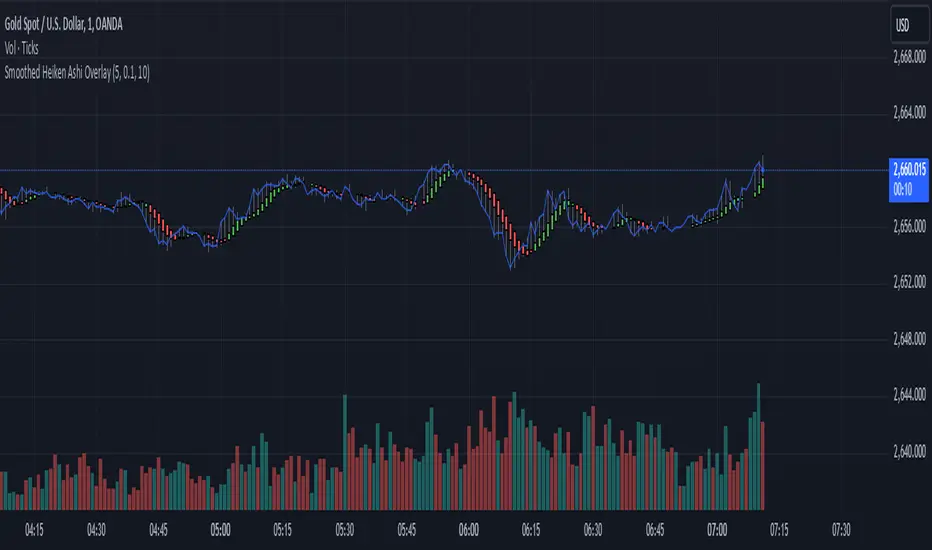
Smoothed Heiken Ashi Trend FilterThis indicator applies the Heiken Ashi technique with added smoothing and trend filtering to help reduce noise and improve trend detection.
Components of the Indicator:
Heiken Ashi Calculations:
Heiken Ashi Close (ha_close): This is the smoothed average of the current bar’s open, high, low, and close prices, calculated with a simple moving average (SMA) to filter out noise.
Heiken Ashi Open (ha_open): This is the average of the previous Heiken Ashi Open and the current Heiken Ashi Close. It’s also initialized to smooth the transition on the first bar.
Heiken Ashi High (ha_high) and Low (ha_low): These values are calculated as the highest and lowest values among the high, Heiken Ashi Open, and Heiken Ashi Close for each bar.
Smoothing and Noise Reduction:
Smoothing Length: The indicator applies a smoothing length to the Heiken Ashi Close, calculated with an SMA. This reduces minor fluctuations, giving a clearer view of the price action.
Minimum Body Size Filter: This filter calculates the body size of each Heiken Ashi candle and compares it to a percentage of the Average True Range (ATR). Only significant candles (those with larger bodies) are plotted, reducing weak or indecisive signals.
Trend Filtering with Moving Average:
The indicator uses a simple moving average (SMA) as a trend filter. By comparing the Heiken Ashi Close to the moving average:
Bullish Trend: The Heiken Ashi candle is green when it’s above the moving average.
Bearish Trend: The Heiken Ashi candle is red when it’s below the moving average.
How to Use This Indicator:
Trend Identification:
Green candles signify a bullish trend, while red candles signify a bearish trend.
The smoothing and trend filtering make it easier to identify sustained trends and avoid reacting to short-term fluctuations.
Filtering Out Noise:
Minor price fluctuations and small-bodied candles (often resulting in indecisive signals) are filtered out, leaving only significant signals.
Adjustable Parameters:
Smoothing Length: Controls the degree of smoothing applied to the Heiken Ashi Close value. Increasing this value will make the Heiken Ashi candles smoother.
Minimum Body Size: This is a percentage of the ATR, used to filter out small or indecisive candles.
Trend Moving Average Length: Controls the period of the moving average used as a trend filter.
This Smoothed Heiken Ashi Trend Filter indicator is useful for identifying trends and filtering out noisy signals. By smoothing and filtering, it helps traders focus on the overall trend rather than minor price movements.
Let me know if there’s anything more you’d like to add or adjust!
在腳本中搜尋"trend"
Trend Magic Enhanced [AlgoAlpha]🔥✨ Trend Magic Enhanced - Boost Your Trend Analysis! 🚀📈
Introducing the Trend Magic Enhanced indicator by AlgoAlpha, a powerful tool designed to help you identify market trends with greater accuracy. This advanced indicator combines the Commodity Channel Index (CCI) and Average True Range (ATR) to calculate dynamic support and resistance levels, known as the Trend Magic. By smoothing the Trend Magic with various moving average types, this indicator provides clearer trend signals and helps you make more informed trading decisions.
Key Features :
🎯 Unique Trend Identification : Combines CCI and ATR to detect market trends and potential reversals.
🔄 Customizable Smoothing : Choose from SMA, EMA, SMMA, WMA, or VWMA to smooth the Magic Trend for clearer signals.
🎨 Flexible Appearance Settings : Customize colors for bullish and bearish trends to suit your charting preferences.
⚙️ Adjustable Parameters : Modify CCI period, ATR period, ATR multiplier, and smoothing length to align with your trading strategy.
🔔 Alert Notifications : Set alerts for trend shifts to stay ahead of market movements.
📈 Visual Signals : Displays trend direction changes directly on the chart with up and down arrows.
Quick Guide to Using the Trend Magic Enhanced Indicator
🛠 Add the Indicator : Add the indicator to your chart by pressing the star icon to add it to favorites. Customize settings such as CCI period, ATR multiplier, ATR period, smoothing options, and colors to match your trading style.
📊 Analyze the Chart : Observe the Trend Magic line and the color-coded trend signals. When the Trend Magic line turns bullish (e.g., green), it indicates an upward trend, and when it turns bearish (e.g., red), it indicates a downward trend. Use the visual arrows to spot trend direction changes.
🔔 Set Alerts : Enable alerts to receive notifications when a trend shift is detected, so you can act promptly on trading opportunities without constantly monitoring the chart.
How It Works:
The Trend Magic Enhanced indicator integrates the Commodity Channel Index (CCI) and Average True Range (ATR) to calculate a dynamic Trend Magic line. By adjusting price levels based on CCI values—upward when CCI is positive and downward when negative—and factoring in ATR for market volatility, it creates adaptive support and resistance levels. Optionally smoothed with various moving averages to reduce noise, the indicator changes line color based on trend direction, highlights trend changes with arrows, and provides alerts for significant shifts, aiding traders in identifying potential entry and exit points.
Enhancements Over the Original Trend Magic Indicator
The Trend Magic Enhanced indicator significantly refines the trend identification method of the original Trend Magic script by introducing customizable smoothing options and additional analytical features. While the original indicator determines trend direction solely based on the Commodity Channel Index (CCI) crossing above or below zero and adjusts the Magic Trend line using the Average True Range (ATR), the enhanced version allows users to smooth the Magic Trend line with various moving average types (SMA, EMA, SMMA, WMA, VWMA). This smoothing reduces market noise and provides clearer trend signals. Additionally, the enhanced indicator incorporates price action analysis by detecting crossovers and crossunders of price with the Magic Trend line, and it visually marks trend changes with up and down arrows on the chart. These improvements offer a more responsive and accurate trend detection compared to the original method, enabling traders to identify potential entry and exit points more effectively.
Enhance your trading strategy with the Trend Magic Enhanced indicator by AlgoAlpha and gain a clearer perspective on market trends! 🌟📈

Stochastic Trendlines with Breakouts [Jamshid] - EnhancedStochastic Trendlines with Breakouts - Enhanced Version
This advanced Stochastic Trendlines with Breakouts script combines several powerful features to provide enhanced breakout detection based on the Stochastic Oscillator and additional confirmation signals. This script is designed to help traders identify key trend reversals, breakout points, and pivot levels with more accuracy by integrating advanced filters such as RSI confirmation, moving average trend filtering, volatility filtering, divergence detection, and multi-timeframe analysis.
Key Features:
Stochastic Oscillator-Based Breakouts:
Automatically detects breakouts based on the smoothed Stochastic Oscillator values (%K and %D), providing insights into overbought and oversold conditions.
Customizable overbought and oversold levels, with a mid-level (50) line for additional reference.
Trendlines on Pivot Points:
Automatically plots dynamic trendlines based on pivot highs and lows of the smoothed Stochastic %K, helping to visualize potential reversal points.
RSI Confirmation (Optional):
Filters breakout signals using the Relative Strength Index (RSI) to confirm breakouts only when the RSI is below 50 for downtrend breakouts and above 50 for uptrend breakouts.
Visual confirmation with a green "RSI Conf." label displayed on the chart when the RSI condition is met.
Moving Average Filter (Optional):
Confirms breakout signals in the direction of a user-defined Moving Average (MA) to trade in the overall market trend direction.
MA length is fully customizable.
Stochastic Divergence Filter (Optional):
Detects bullish or bearish divergence between the price and Stochastic Oscillator values, adding an extra layer of confirmation.
Multi-Timeframe Confirmation (Optional):
Confirms breakouts by checking the Stochastic %K and %D values from a higher timeframe. This helps in avoiding false signals by aligning with the broader market trend.
The higher timeframe can be customized to any timeframe (e.g., daily, weekly, etc.).
Volatility Filter (Optional):
Uses the ATR (Average True Range) to filter out breakouts during periods of low volatility, ensuring signals are only triggered when there is sufficient price movement.
ATR length and multiplier are fully customizable.
Custom Alerts:
Alerts are available for new trendline detections (both pivot high and pivot low) and for confirmed breakout signals. These alerts help traders stay informed in real-time without needing to monitor the chart continuously.
How to Use:
Customize the Stochastic Oscillator settings, such as %K smoothing and %D line parameters, to fit your trading strategy.
Enable or disable additional filtering features (RSI, MA, divergence, MTF, volatility) as needed.
Set up alerts for specific breakout conditions directly in TradingView to stay notified when breakout signals are triggered.
This script is designed for traders who are looking for precision breakout signals with added layers of confirmation to avoid false breakouts and enhance trading accuracy.
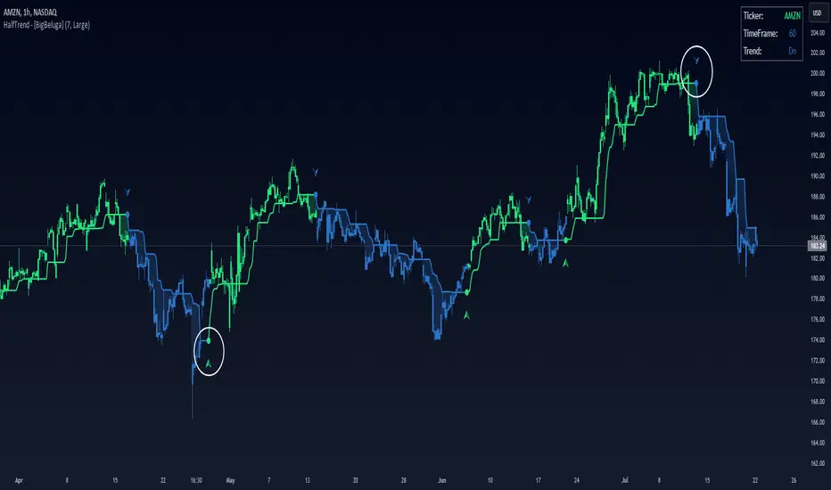
Half Trend HeikinAshi [BigBeluga]This indicator is a cool combo of the half-trend methodology and Heikin Ashi candles. The main idea is to help spot where the market is trending and where it might be reversing by using a mix of moving averages and the highest and lowest price data values. What’s nice is that it doesn’t just give you trend lines but also converts them into Heikin Ashi candles, so you can visually gauge the strength of a trend based on candle sizes.
NIFTY50:
NVIDIA:
🔵 IDEA
The thinking behind this Half Trend HeikinAshi indicator is pretty straightforward: it’s designed to give you a flexible way to detect trends and trend reversals, but with an added bonus—measuring trend strength via Heikin Ashi candles. The core idea is based on the classic half-trend strategy, where it adjusts to the highest and lowest price values within a certain period. The Heikin Ashi transformation smooths out half-trend line, making it easier to spot solid trends and potential reversals.
🔵 KEY FEATURES & USAGE
◉ Half Trend Calculation with Reversal Signals:
The main feature here is spotting trends based on a moving average of the close price and the highest/lowest price data.
//#region ———————————————————— Calculations
// Calculate moving average of close prices
series float closeMA = ta.sma(close, amplitude)
// Calculate highest high and lowest low
series float highestHigh = ta.highest(amplitude)
series float lowestLow = ta.lowest(amplitude)
// Initialize hl_t on the first bar
if barstate.isfirst
hl_t := close
// Update hl_t based on conditions
switch
closeMA < hl_t and highestHigh < hl_t => hl_t := highestHigh
closeMA > hl_t and lowestLow > hl_t => hl_t := lowestLow
=> hl_t := hl_t
When the trend flips, you’ll see arrows on your chart—either pointing up or down—marking the exact price where that reversal occurred. This makes it easy to see where the market might turn, which is helpful for timing entries and exits.
◉ Heikin Ashi Candlestick Transformation:
There’s a Heikin Ashi mode that transforms the half-trend line into Heikin Ashi candles.
These smooth out market noise and make the overall trend much clearer.
◉ Trend Strength Calculation:
The indicator doesn’t just stop at showing trends. It also calculates trend strength based on the size of the Heikin Ashi candles. Bigger candles mean stronger trends, and smaller ones indicate weaker momentum. You can see this displayed on the dashboard, so you know exactly how strong the current trend is at any moment.
◉ Graphical Dashboard Display:
You’ve got a small dashboard right on the chart that shows key info like the ticker, timeframe, and whether the trend is up or down. If you’re in Heikin Ashi mode, it shows trend strength instead. So, no need to dig through the data—you can just glance at the dashboard for a quick market read.
🔵 CUSTOMIZATION
Amplitude Input: You can tweak the amplitude to control how sensitive the half-trend line is. A lower setting makes it more reactive to small price moves, while a higher setting smooths it out for longer-term trends.
Heikin Ashi Toggle: You can easily switch between standard half-trend lines and Heikin Ashi candle mode, depending on how you prefer to see the market.
Trend Colors: You’ve got control over the colors for up and down trends, so you can adjust the appearance to fit your charting style.
Signal Labels size: Change Labels signal sizes for your preference
🔵 CONCLUSION
The Half Trend HeikinAshi indicator is a solid tool for tracking trends and measuring their strength. By combining the usual half-trend signals with Heikin Ashi candles, you get a clearer picture of what’s happening in the market. Whether you're looking to spot potential reversals or just want to measure the strength of a current trend, this indicator gives you plenty of flexibility to do both.
Trend Bars (HTF PO3)Hello Traders!
The innovative TRN Trend Bars are designed to help traders to analyze markets in an intuitive way. The TRN Trend Bars show bullish and bearish trends and reversals based on color coding the bars and give high probability trade opportunities.
How does the Trend Detection work in detail?
The trend analysis is based on a new algorithm that includes several different inputs:
detection of classical and advanced bar patterns
the statistical frequency of these bar patterns and their statistical outcomes are computed based on historical data
probability distributions of price expansions after certain bar patterns
bar information such as wick length in %, overlapping of the previous bar in % and many more
The algorithm weighs these inputs and computes the likelihood of a trend continuation, or a reversal. The likelihood is computed based on statistical information such as occurrence frequency of certain patterns and their historical performance.
The algorithm then outputs a color scheme for the chart bars.
Analyzing the market with the TRN Trend Bar color scheme
Green Bars signify a bullish uptrend. On the other hand, Red Bars indicate a bearish downtrend. The transition from red to green denotes a bullish trend reversal. Conversely, the shift from green to red signals a bearish trend reversal. By monitoring these color changes, traders can identify potential trend reversals and make informed trading decisions.
The presence of gray and black bars indicates a neutral market state, often observed before an impending color change from red to green or green to red. These neutral bars serve as a transition phase between the previous trend and the potential reversal.
How to use TRN Trend Bars for trading?
The TRN Trend Bars are very sensitive. Therefore, they make it easy to find strong short-term trends and pullbacks of the main trend. This can result in high probability entry and exit signals. Here are some trading strategies examples:
Breakouts
After an up breakout of a consolidation or range (or any other chart pattern) you can enter the moment TRN Trend Bars turn green. Alternatively, you wait for a pullback with red bars and enter once a green bar occurs.
Pullbacks
In a trending market you use the TRN Trend Bars for pullback entries. For example, if we are in a strong downtrend and a few green bars occur, then you can enter short once a red bar is displayed.
Exit signals/Trade Management
If you are in a position, you can use the TRN Trend Bars to manage the trade or find good exit points. In case the bar color is not in favor of your position anymore, you can either adjust your stop loss or exit the position completely. E.g. you are in a long position and the bars turn red, then you can either close the trade or tighten your stop loss.
Conclusion
While signals from TRN Trend Bars can be informative, it is important to recognize that their reliability may vary. Various external factors can impact market prices, and it is essential to consider your risk tolerance and investment goals when executing trades.
Risk Disclaimer
The content, tools, scripts, articles, and educational resources offered by TRN Trading are intended solely for informational and educational purposes. Remember, past performance does not ensure future outcomes.

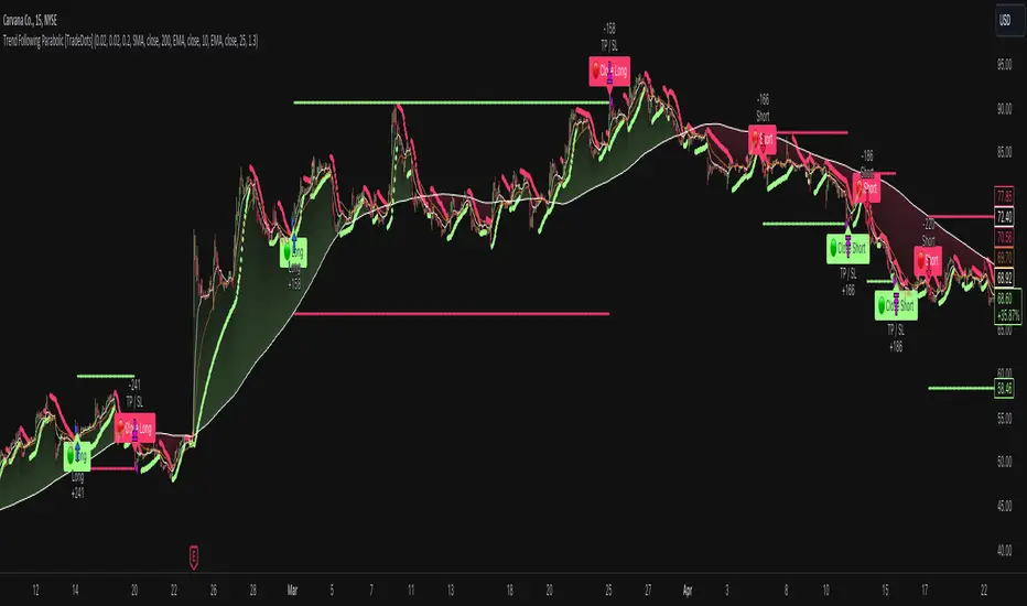
Trend Following Parabolic Buy Sell Strategy [TradeDots]The Trend Following Parabolic Buy-Sell Strategy leverages the Parabolic SAR in combination with moving average crossovers to deliver buy and sell signals within a trend-following framework.
This strategy synthesizes proven methodologies sourced from various trading tutorials available on platforms such as YouTube and blogs, enabling traders to conduct robust backtesting on their selected trading pairs to assess the strategy's effectiveness.
HOW IT WORKS
This strategy employs four key indicators to orchestrate its trading signals:
1. Trend Alignment: It first assesses the relationship between the price and the predominant trendline to determine the directional stance—taking long positions only when the price trends above the moving average, signaling an upward market trajectory.
2. Momentum Confirmation: Subsequent to trend alignment, the strategy looks for moving average crossovers as a confirmation that the price is gaining momentum in the direction of the intended trades.
3. Signal Finalization: Finally, buy or sell signals are validated using the Parabolic SAR indicator. A long order is validated when the closing price is above the Parabolic SAR dots, and similarly, conditions are reversed for short orders.
4. Risk Management: The strategy institutes a fixed stop-loss at the moving average trendline and a take-profit level determinable by a prefixed risk-reward ratio calculated from the moving average trendline. These parameters are customizable by the users within the strategy settings.
APPLICATION
Designed for assets exhibiting pronounced directional momentum, this strategy aims to capitalize on clear trend movements conducive to achieving set take-profit targets.
As a lagging strategy that waits for multiple confirmatory signals, entry into trades might occasionally lag beyond optimal timing.
Furthermore, in periods of consolidation or sideways movement, the strategy may generate several false signals, suggesting the potential need for additional market condition filters to enhance signal accuracy during volatile phases.
DEFAULT SETUP
Commission: 0.01%
Initial Capital: $10,000
Equity per Trade: 70%
Users are advised to adjust and personalize this trading strategy to better match their individual trading preferences and style.
RISK DISCLAIMER
Trading entails substantial risk, and most day traders incur losses. All content, tools, scripts, articles, and education provided by TradeDots serve purely informational and educational purposes. Past performances are not definitive predictors of future results.
ATR TrendTL;DR - An average true range (ATR) based trend
ATR trend uses a (customizable) ATR calculation and highest high & lowest low prices to calculate the actual trend. Basically it determines the trend direction by using highest high & lowest low and calculates (depending on the determined direction) the ATR trend by using a ATR based calculation and comparison method.
The indicator will draw one trendline by default. It is also possible to draw a second trendline which shows a 'negative trend'. This trendline is calculated the same way the primary trendline is calculated but uses a negative (-1 by default) value for the ATR calculation. This trendline can be used to detect early trend changes and/or micro trends.
How to use:
Due to its ATR nature the ATR trend will show trend changes by changing the trendline direction. This means that when the price crosses the trendline it does not automatically mean a trend change. However using the 'negative trend' option ATR trend can show early trend changes and therefore good entry points.
Some notes:
- A (confirmed) trend change is shown by a changing color and/or moving trendline (up/down)
- Unlike other indicators the 'time period' value is not the primary adjustment setting. This value is only used to calculate highest high & lowest low values and has medium impact on trend calculation. The primary adjustment setting is 'ATR weight'
- Every settings has a tooltip with further explanation
- I added additional color coding which uses a different color when the trend attempts to change but the trend change isn't confirmed (yet)
- Default values work fine (at least in my back testing) but the recommendation is to adjust the settings (especially ATR weight) to your trading style
- You can further finetune this indicator by using custom moving average types for the ATR calculation (like linear regression or Hull moving average)
- Both trendlines can be used to determine future support and resistance zones
- ATR trend can be used as a stop loss finder
- Alerts are using buy/sell signals
- You can use fancy color filling ;)
Happy trading!
Daniel
Bollinger Bands Trend - Boosted [UOI]The legendary John Bollinger, the creator of Bollinger Bands , has done it again. He recently observed that an interaction between a long-term Bollinger band (BB 50) and a shorter-term Bollinger band (BB 20) can not only provide a frame of reference for price action and volatility but also identify trends and offer excellent entry and exit guidance. Although the concept of Bollinger Bands is not new, the concept of BB trend is. The 'Bollinger Bands Trend - Boosted' indicator is an advanced and versatile trading tool, designed to offer comprehensive analysis of market trends, price action, and volatility. This new concept captures interesting market dynamics invisible to other indicators. In addition to the power of Bollinger Band trends, this indicator is boosted and skillfully combines several technical analysis elements, including Bollinger Bands, Donchian Channels, an Exponential Moving Average (EMA), Super Trend, and a Choppiness Index, to further improve the model's performance. Each component is crafted to provide a multi-dimensional view of market dynamics. Key features include:
Dual Bollinger Bands: The indicator uses two sets of Bollinger Bands with distinct periods (50 and 20) to capture different aspects of market volatility and trend momentum. Users have the flexibility to show or hide the upper, middle, and lower bands for both sets, allowing for a customized view of market movements. Users can also enable a fill function with 90% transparency to show the area between the upper and lower BB bands. By default, only the midlines of BB 20 and BB 50 are shown on the chart, and the rest are hidden and need to be enabled by the user. Here is the default plot of BB20 and BB50:
Dynamic Color Coding of Lines: The middle bands of the Bollinger Bands dynamically change colors based on their relation to the price, offering an intuitive visual representation of the trend direction. The color turns green when the price is above the band and red when below. Dynamic Line Coloring aids traders in easily identifying trends and never going against the market trend. In this image below: BB20, BB50, Mid Donchian, EMA 100, and Super Trend all change color relative to the position of the price:
Crossover and Crossunder Detection: Detects crossovers and crossunders between the 20-period and 50-period Bollinger Bands, which can signal potential trading opportunities. Color filling and the change of color of the Bollinger midlines provide a great visual for trend detection. The color filling even without the Buy and Sell signal clearly shows the direction of the trend:
Customizable Buy and Sell Signals: The indicator generates buy and sell signals based on a complex set of conditions involving the relationship between price, Bollinger Bands, EMA, Donchian Channel, and other elements. Users can customize the length and parameters of these conditions to tailor the signals to the specific equity or market they are trading. This flexibility allows traders to optimize the indicator for different equities, trading strategies, and market conditions, making it a versatile tool for various trading styles, including short-term trading and longer-term trend following. The beauty of the "buy and sell signal" of this indicator is that users control the frequency and accuracy of the signals by changing the numbers in the setting for their favorite equity to trade:
Donchian Channel: This tool incorporates a customizable Donchian Channel to pinpoint potential support and resistance areas, providing key insights into market trends. It is especially effective in highlighting breakout points by showing the highest high and lowest low over a set number of periods, thus helping traders to identify potential entry and exit points based on price movements. The middle line of the channel changes color (lime or fuchsia) based on its position relative to the price, aiding in trend identification and strength assessment, with an option for traders to toggle its visibility on the chart.
Exponential Moving Average (EMA): Features a 100-period EMA (default but users can change the value), with an option for traders to toggle its visibility on the chart. The color of the EMA line adapts to green or red depending on whether the price is above or below it, further aiding in trend analysis.
Super Trend Indicator: Adds a Super Trend line to the analysis, providing insights into market trend direction and potential reversal points. This feature is customizable, allowing users to adjust its visibility and settings as per their analysis needs. The Super Trend is an adjustable indicator to help traders not lose sight of the longer trend:
Choppiness Index: An additional tool to assess market chop or trend robustness, with customizable settings for changing candle colors based on a defined choppiness threshold. Here is an example:
The Bollinger Band Width: BBW is a separate technical indicator derived from Bollinger Bands, used to measure market volatility. It has been added to this BB Trend indicator in an innovative manner to improve the BBT indicator. It calculates the gap between the upper and lower Bollinger Bands. A narrow BBW indicates low volatility, often seen in consolidating markets leading to a squeeze or buying opportunity, while a wide BBW signals high volatility, as observed during strong price movements or breakouts which often leads to distribution in Wyckoff terms. This indicator is crucial for traders to identify periods of market contraction and expansion, aiding in predicting volatility changes and potential trend shifts. Here is a visual presentation of BB Width:
User-Friendly Customizability: The indicator offers inputs for adjusting lengths, visibility, and parameters of its various components, empowering traders to customize the tool according to their individual trading style and preferences.
This indicator is ideal for traders who prefer a single but multi-faceted strategy, offering a blend of trend analysis, volatility measurement, and market momentum insights. Its adaptability makes it suitable for a wide range of markets and trading approaches.

Trend Direction Sequence | Auto-Multi-TimeframeThe main benefit of this indicator is the ability to see multiple higher timeframes at ones to get a better overview of signals that could mark possible trend reversals with more weight than those on the selected timeframe. Since the higher timeframes are calculated automatically, the user needs to set a Period Multiplier that multiplies the selected timeframe several times to determine the higher timeframes. Equal periods are filtered out. And the current highest timeframe is capped at 1 year by TradingView.
It is possible to alter the sequence Count Limit and the underlying Wavelength. The Wavelength defines the distance between the starting and ending candle. This builds the minimum condition to find a trend. A longer Wavelength means that the distortions between the start and end candle can be bigger, so it can become easier to find a trending sequence. But be careful not to set the length too high as this could mean that the resulting sequence does not really represent a trend anymore. The Count Limit defines the completion of a trending sequence. A higher number makes it more difficult to find a completed sequence, but also makes the result more reliable. If the Wavelength is changed, the Count Limit should be adjusted accordingly.
There is also a qualifier for the completion of a sequence. A completed sequence only will be labeled on the chart, if it is proved that the lowest low/highest high of the last two candlesticks of a period is lower/higher than that of the previous two candlesticks. It does not require the trend to be continuous on the last candlestick. On the contrary, a trend shift may already have begun.
By default, the labeling of completed sequences will appear on the highs and lows of the specific periods. Because the higher periods will take time and several candlesticks to appear, the labels will be redrawn accordingly. As an option it is possible to disable the Count Limit for completed sequences so that the labels will be fluently redrawn until the corresponding sequences are interrupted by trend breaks. Only activate this option, if it can serve a plausible strategy.
The count status of all sequences in the specific timeframe periods is listed in a table. Also the results of the trends in higher timeframes are accumulated and combined into an overall trend. Positive trends are counted as positive, negative in the opposite case. To see the resulting Trend Shift Signals, the user can set a filter under 100% so that not all of them will be filtered out and therefore labeled on the chart (this signals cannot be redrawn). An “External Indicator Analysis Overlay” can be used to analyze the profitability with the provided Trend Shift Signal (TSS) which switches from 0 to 1, if the trend becomes positive or from 0 to -1, if the trend becomes negative.

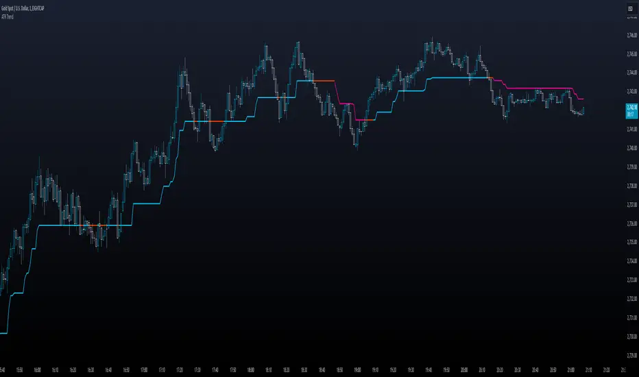
Market Flow Trend Lines & Liquidity [LuxAlgo]The Market Flow Trend Lines & Liquidity indicator is a script that aims to automate key insights such as trend lines, liquidity zones, opening ranges, & gaps on the chart. The aim of this script is to provide a functional breakout trader toolkit with various familiar tools as well as unique capabilities to further improve the user experience.
🔶 USAGE
There are various methods for using the features within this script, even with the included take profit levels users can pre-define.
The dotted lines represent an Opening Range with levels we can use as support & resistance. This opening range can be traded within the levels; however, it can also be used to tell the sentiment of price to see how it reacts to it.
In the image below, we can see after price was holding above the Opening Range whilst printing bullish trendline breakout signals, it made its way to the TP level we enabled from within the indicator to calculate a potential level for taking profits in a breakout trade.
The Market Flow Trend Lines & Liquidity indicator's key feature reside within its multi-timeframe capabilities for the main trendlines, as well as its key zones for potential entries.
In the image above we can see multiple areas where multi-timeframe (1H) trendlines on the 30m chart acted as support & resistance, alongside the Liquidity Zones & Opening Range as optimal points of interest for a breakout trader.
🔶 SETTINGS
🔹 Trendlines
Trendlines Lookback: Determines the frequency of detected tops/bottoms used to construct trendlines.
Slope: Trendlines slope, with higher values returning steeper trendlines.
Timeframe: Trendline timeframe.
🔹 Liquidity Zones
Liquidity Lookback: Determines the frequency of detected tops/bottoms used to construct liquidity zones.
🔹 Take Profits
Take profit settings. Up to 3 ATR based take profits can be enabled, with a numerical setting controlling the ATR multiplier.
🔹 Opening Range
From Time: 15min opening range starting time.
Extend: Extension length of Opening Range lines (in bars).
🔹 Gap Imbalance
Gap Up: Display upward gaps.
Gap Down: Display downward gaps.
🔹 EMA
Show EMA: Displays an EMA on the chart.
EMA Length: Length of the displayed EMA.
🔶 RELATED SCRIPTS
Liquidity Swings
Trendlines with Breaks
Trended and BlendedWhat up guys and welcome to the CoffeeShop. This is your host and "baristo", Eric.
This is a simple little set of 3 moving averages. Smoothed moving averages that you can use in the 10 /28 strategy, or any other strategy you choose.
Among themselves there is nothing special about these moving averages, but because of their settings they will help you find entries for long and short positions and for divergence trading.
These moving averages have conditional colors built into the code, using the pinescript "color from gradient" feature.
All three moving averages, are green when they are all lined up in a bullish form.
All three are red when they're all lined up in a bearish form.
And they are colored Gray when price action and the moving averages are mixed up in any way.
But this is not enough to help you determine whether you have a true trend or not also it is not enough to tell you whether you have a strong or weak trend so there's more.
Add to this color command, the candles are colored ONLY when there is a true uptrend or downtrend.
If you believe for any reason that price action is telling you this is going to a a short term trend, you can
wait for your long or short color confirmations and then drop down to a lower timeframe to make your trades.
STRONG TREND:
for a strong uptrend you would look for the candles to close bullish above all three green moving averages that were already lined up. This would be a strong uptrend. If price action closed below all three downward lined up moving averages they were all red and your candle is red then you have a strong downtrend.
Week Trend
However if your candle closes bearish and it closes red below a mixed set of moving averages then you have a week downtrend.
The same applies if you have a bullish closing candle but your fast and medium moving average are facing up however they are below your slow moving average. You may have a green line up however if you're moving averages are mixed up then you have a weak trend.
Summary
In short a strong trend is when you close above or below moving averages that are lined up in the same direction and they are not mixed in any way. A weak trend is when you close above or below your fast and medium moving averages as they're lined up in that same direction however they are on the wrong side of your third moving average.
When you have a weak trend you should be scalping and when you have a strong trend you should be able to ride that trend more appropriately.

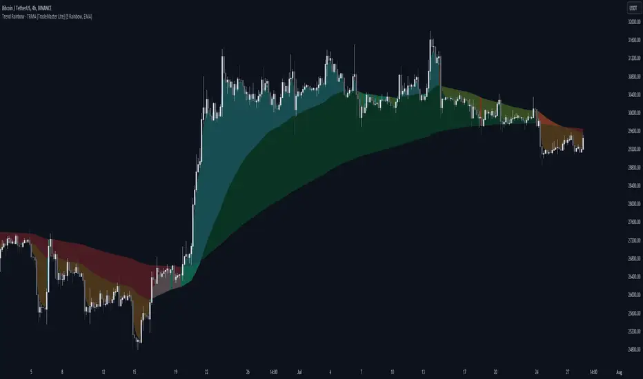
Trend Rainbow Moving Averages [TradeMaster Lite]The Trend Rainbow indicator is a simple technical analysis tool that uses moving averages to identify trends and potential buy and sell signals. It utilizes simple visualization techniques to present trend information in an intuitive, easily interpretable manner. This 21st-century tool is tailored for the modern trader who values both precision and simplicity.
The indicator uses our unique TRMA method to define short-term, intermediate, and long-term market trends. The TRMA (Trend Rainbow Moving Averages) is our own invention: a complex but flexible moving average matrix calculation that is designed to measure market trend direction, strength and shifting. Traders have the flexibility to choose from four types of moving average calculation bases to create a "rainbow".
👉 Example of usage:
General trend direction of the asset can be identified by looking at the slope of the rainbow. If the rainbow is generally pointing up, the asset is in an uptrend, if it is pointing down, the asset is in a downtrend. The indicator can also be used to assess the strength of a trend, identify potential resistance and support levels, and manage risk.
The Lite version of the indicator has 2 main trends to help you assess information about the direction and strength of asset's trend:
Intermediate trend: teal for bull trend, orange for bear trend.
Long-term trend: green for bull trend, red for bear trend.
Left side:
The image clearly shows that during the decline, the bearish intermediate trend was tested multiple times, acting as a resistance. This is a sign of weakness in the intermediate trend. The price did not have enough strength test the long-term trend yet, which is a sign that the long-term trend is still bearish.
Right side:
The intermediate trend first turned into neutral, then bullish. This is a sign of strength in the short-term and medium-term trends. This strength did not weaken and eventually. By maintaining the bullish intermediate trend, the long term trend was able to turn bullish again and a strong uptrend is now unfolding. This is a sign that the long-term trend is changing to bullish.
The Trend Rainbow also helps in risk management. On the right side of the chart the price is making a very steep move and both the intermediate and long-term trends are very far away from the current price. This shows us potential risk and the possibility of a deeper pullback. Trend edges can be used as potential entries or targets, depending on the situation.
👉 General advice
Confirming Signals with other indicators:
As with all technical indicators, it is important to confirm potential signals with other analytical tools, such as support and resistance levels, as well as indicators like RSI, MACD, and volume. This helps increase the probability of a successful trade.
Use proper risk management:
When using this or any other indicator, it is crucial to have proper risk management in place. Consider implementing stop-loss levels and thoughtful position sizing.
Combining with other technical indicators:
The indicator can be effectively used alongside other technical indicators to create a comprehensive trading strategy and provide additional confirmation.
Keep in Mind:
Remember that the example presented highlights how the Trend Rainbow indicator can be used. However, like all indicators, it is not a definitive market predictor. Thorough research and backtesting are essential before making any trading decisions. Furthermore, it's crucial to have a solid understanding of the indicator and its behavior. Additionally, incorporating fundamental analysis and considering market sentiment can be vital factors to take into account in your trading approach.
Limitations:
The indicators within the TradeMaster Lite package aim for simplicity and efficiency, while retaining their original purpose and value. Some settings, functions or visuals may be simpler than expected.
⭐ Conclusion
We hold the view that the true path to success is the synergy between the trader and the tool, contrary to the common belief that the tool itself is the sole determinant of profitability. The actual scenario is more nuanced than such an oversimplification. Our aim is to offer useful features that meet the needs of the 21st century and that we actually use.
🛑 Risk Notice:
Everything provided by trademasterindicator – from scripts, tools, and articles to educational materials – is intended solely for educational and informational purposes. Past performance does not assure future returns.
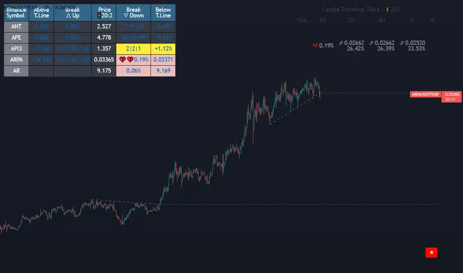
(1-20)Dashboard trendlines PriceThis is a script about 20 trading pairs with trendline.
-on each chart of a trading pair, there is only one trendline pair: 1 uptrendline and 1 downtrendline
-so when the statistics on the table also show the column of the uptrend and the column of the downtrend
-When the price approaches any trendline but the ratio is 1%, that trendline will be colored blue (downtrend), red (uptrend)
-the column above T.line(below T.line) is the value of the current trendline compared to the closing price of the candle
-The Break up (Break down) column when the price breaks will show the green heart (break up), the red heart break (break down) and the percentage value when breaking through the point of the trendline.
-price column is the current price of the candle
-especially when a candle has closed above the trendline (assuming an uptrend), then from the 2nd tree to the current , it will count according to memory so that traders know when the price broke, and how many candles already.
-The breakdown parameter is displayed (for example, 3|8|10), which means that the price has broken through 10 candles, of which 8 trees are closing above the breakout point, and the last 3 are closing above. break point
-In addition, when displaying 3 parameters as above, the next column (above/below T.line) will display the percentage from when the price breaks that point to the current price of the candle.
-you can change the time in Resolution indicator settings to show multiple time arcs
Thank you everyone for your interest and trust
- 5 pairs are free for traders :https://vn.tradingview.com/script/KGSjrLC3/
---------------------------------------------------------------------------------
Vietnamese
Đây là script về bảng thống kê 20 cặp giao dịch với đường trendline .
-trên mỗi biểu đồ của cặp giao dịch chỉ tồn tại duy nhất 1 cặp trendline là: 1trendline tăng và 1 trendline giảm
-vì vậy khi thống kê trên bảng cũng hiển thị cột của trend tăng và cột của trend giảm
-khi giá tiến gần đến 1 đường trendline bất kì mà tỉ lệ còn 1% thì đường trendline đó tô màu xanh(trend giảm) ,màu đỏ(trend tăng)
-cột above T.line(below T.line) là giá trị của đường trendline hiện tại so với giá đóng cửa của nến
-cột Break up(Break down) khi giá phá vỡ sẽ thể thiện trái tim xanh(phá vỡ lên),trái tim đỏ vỡ(phá vỡ xuống) và giá trị phần trăm khi phá qua điểm của trendline.
-cột giá là giá hiện tại của nến
-đặc biệt khi 1 cây nến đã đóng cửa trên đường trendline(giả sử trend tăng) thì từ cây thứ 2 đến hiện tại nó sẽ đếm theo bộ nhớ để các trader biết được giá đã phá khi nào,và qua bao nhiêu nến rồi.
-thông số khi phá vỡ hiển thị (ví dụ là 3|8|10) thì hiểu là giá đã phá vỡ qua 10 nến, trong đó có 8 cây đóng cửa trên điểm phá vỡ,và 3 cây gần nhất đang đóng cửa trên điểm phá vỡ
-ngoài ra khi hiện 3 thông số như trên thì cột bên cạnh (above/below T.line) sẽ hiển thị được số phần trăm tính từ khi giá phá vỡ điểm đó đến giá hiện tại của cây nến.
-các bạn có thể thay đổi thời gian trong cài đặt chỉ báo Resolution để hiển thị nhiều cung thời gian
Cảm ơn mọi người đã quan tâm và tin dùng
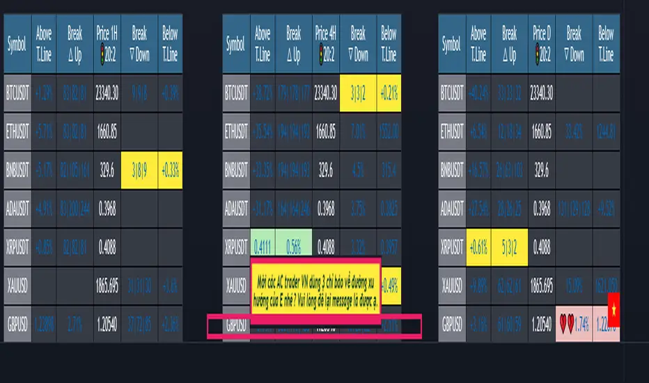
Dashboard trendlines Price(ichimoku14642)Happy new year 2023
Dedicated to traders, the trendline indicator of 5 trading pairs is automatically listed in this table. Wish success
-on each chart of a trading pair, there is only one trendline pair: 1 uptrendline and 1 downtrendline
-so when the statistics on the table also show the column of the uptrend and the column of the downtrend
-When the price approaches any trendline but the ratio is 1%, that trendline will be colored blue (downtrend), red (uptrend)
-the column above T.line(below T.line) is the value of the current trendline compared to the closing price of the candle
-The Break up (Break down) column when the price breaks will show the green heart (break up), the red heart break (break down) and the percentage value when breaking through the point of the trendline.
-price column is the current price of the candle
-SYMBOL is all taken from Binance in the perpetual contract
-especially when a candle has closed above the trendline (assuming an uptrend), then from the 2nd tree to the current , it will count according to memory so that traders know when the price broke, and how many candles already.
-The breakdown parameter is displayed (for example, 3|8|10), which means that the price has broken through 10 candles, of which 8 trees are closing above the breakout point, and the last 3 are closing above. break point
-In addition, when displaying 3 parameters as above, the next column (above/below T.line) will display the percentage from when the price breaks that point to the current price of the candle.
Thank you everyone for your interest and trust
Đây là script về bảng thống kê đường trendline .
-trên mỗi biểu đồ của cặp giao dịch chỉ tồn tại duy nhất 1 cặp trendline là: 1trendline tăng và 1 trendline giảm
-vì vậy khi thống kê trên bảng cũng hiển thị cột của trend tăng và cột của trend giảm
-khi giá tiến gần đến 1 đường trendline bất kì mà tỉ lệ còn 1% thì đường trendline đó tô màu xanh(trend giảm) ,màu đỏ(trend tăng)
-cột above T.line(below T.line) là giá trị của đường trendline hiện tại so với giá đóng cửa của nến
-cột Break up(Break down) khi giá phá vỡ sẽ thể thiện trái tim xanh(phá vỡ lên),trái tim đỏ vỡ(phá vỡ xuống) và giá trị phần trăm khi phá qua điểm của trendline.
-cột giá là giá hiện tại của nến
-SYMBOL là toàn bộ lấy của sàn Binance trong hợp đồng vĩnh cửu
-đặc biệt khi 1 cây nến đã đóng cửa trên đường trendline(giả sử trend tăng) thì từ cây thứ 2 đến hiện tại nó sẽ đếm theo bộ nhớ để các trader biết được giá đã phá khi nào,và qua bao nhiêu nến rồi.
-thông số khi phá vỡ hiển thị (ví dụ là 3|8|10) thì hiểu là giá đã phá vỡ qua 10 nến, trong đó có 8 cây đóng cửa trên điểm phá vỡ,và 3 cây gần nhất đang đóng cửa trên điểm phá vỡ
-ngoài ra khi hiện 3 thông số như trên thì cột bên cạnh (above/below T.line) sẽ hiển thị được số phần trăm tính từ khi giá phá vỡ điểm đó đến giá hiện tại của cây nến.
Cảm ơn mọi người đã quan tâm và tin dùng
Immediate Trend - VHXIMMEDIATE TREND - VULNERABLE_HUMAN_X
This indicator is used to identify the immediate trend in the market.
When a Short Term High (STH) is engulfed and closed above, we consider that as a bullish trend.
And Similarly, when a Short Term Low (STL) is engulfed and closed below, we consider that as a bullish trend.
STH - A candle that is higher than the one candle towards it's left and one candle towards it's right.
STL - A candle that is lower than the one candle towards it's left and one candle towards it's right.
HOW TO USE:
1. Do not take trades purely based on the immediate trend showcased by the indicator. Rather, use them as confluence with your trading strategy.
2. When you are expecting price to reverse at your point of interest (Denamd/Supply zone), this indicator can help you predict the reversal by showcasing the current trend.
3. Using this indicator you can travel the trend as long as there is a change of trend predicted by this indicator.

Rate Of Change Trend Strategy (ROC)This is very simple trend following or momentum strategy. If the price change over the past number of bars is positive, we buy. If the price change over the past number of bars is negative, we sell. This is surprisingly robust, simple, and effective especially on trendy markets such as cryptos.
Works for many markets such as:
INDEX:BTCUSD
INDEX:ETHUSD
SP:SPX
NASDAQ:NDX
NASDAQ:TSLA

Support & Resistance/Supply & Demand/Liquidity/Trendlines (Expo)Real-Time Support & Resistance/Supply & Demand/Liquidity Zones /Trendlines / Key Levels
This trading tool automatically identifies real-time Support/Resistance, Supply and Demand, Liquidity Zones, Key levels, and Trendlines.
FEATURES
This indicator includes all necessary features for traditional technical analysis, such as Trendlines, Support/Resistance, Supply/Demand, and Liquidity Zones. In addition to that, we have added key market levels.
Support/Resistance: Identifies areas in real-time where the price finds support and resistance.
Supply/Demand: The indicator analyzes the market structure in real-time and maps out key supply and demand zones. The user gets an instant understanding of the current market structure.
Liquidity Zones: Liquidity zones are displayed where there is a significant level of trading activity and when there is both high supply and demand for an asset, security, or contract.
TrendLines: Trendlines help traders determine the current direction of market prices. A trendline is displayed when a price action trend is detected.
Key Levels: Key levels are psychological levels that are under the attention of many traders. There is a lot of buying or selling pressure at these levels. At these key levels, price decides its direction, either to go bearish or bullish.
HOW TO USE
Use the indicator to identify several important and commonly used levels and zones. All zones work as a future reference where the price has a higher likelihood to react at, bounce off from, or reverse.
-----------------
Disclaimer
Copyright by Zeiierman.
The information contained in my Scripts/Indicators/Ideas/Algos/Systems does not constitute financial advice or a solicitation to buy or sell any securities of any type. I will not accept liability for any loss or damage, including without limitation any loss of profit, which may arise directly or indirectly from the use of or reliance on such information.
All investments involve risk, and the past performance of a security, industry, sector, market, financial product, trading strategy, backtest, or individual’s trading does not guarantee future results or returns. Investors are fully responsible for any investment decisions they make. Such decisions should be based solely on an evaluation of their financial circumstances, investment objectives, risk tolerance, and liquidity needs.
My Scripts/Indicators/Ideas/Algos/Systems are only for educational purposes!

MTF Trend WidgetThis indicator identifies trends in multiple higher timeframes (D, W, M) and shows them in a widget off to the right of the chart.
It's meant to be used as an alternative filter for "trading with the trend." Typically people use moving averages of varying lengths for this (i.e. if over 200 MA it's an uptrend, etc.), but I wanted to see if it might be more effective to see if the higher timeframes were actually trending or not in a certain direction.
For the purposes of this indicator, an uptrend is defined as higher highs and higher lows. So if currently in a downtrend and the highs are broken, the indicator will flip to an uptrend because now we have a higher high. Vice versa for downtrends.
The user can choose the lookback period for defining these highs/lows (the pivot points). A smaller lookback number will give you more frequent pivot points.
The user can toggle on visibility of all historical pivot points to make sure the frequency and placement of the swing highs/lows is to their liking.
The user can show the support/resistance lines of those most recent swing high/low points on the multiple timeframes as well.
When these lines are breached, that is when the trends change, so you can see if you are close to changing any longer term trends.
My hope is that this gives people a quick glance at the overall trend without having to cycle through different timeframes.
ATR Trend & ATR Top/Bottom (Expo)
ATR Trend & ATR Top/Bottom (Expo) is an advanced and multifunctional trading tool that gives insight into Trends, Pullbacks, and where Top/Bottom pattern can occur. The indicator is simple to use and understand therefore valuable to all trading styles.
One key feature is the ability to adjust settings according to the type of Trader you are. Trend Followers can easily enable Trend and Pullback settings and Scalpers can enable the Top/Bottom feature. The Trend, Pullback, and Top/Bottom setting can be displayed simultaneously for those that want to maximize their trading results!
Insights and Value the indicator brings:
✔ Clear perspective identifying short-term and long-term Trends
✔ A simple and convenient way to recognize Pullbacks and market impulses.
HOW TO USE
Identify the short-term and long-term Trend
Identify Pullbacks
Identify market impulses
Identify potential Tops/Bottoms
INDICATOR IN ACTION
1-hour chart (Trend-Setting used)
I hope you find this indicator useful , and please comment or contact me if you like the script or have any questions/suggestions for future improvements. Thanks!
I will continually work on this indicator, so please share your experience and feedback as it will enable me to make even better improvements. Thanks to everyone that has already contacted me regarding my scripts. Your feedback is valuable for future developments!
-----------------
Disclaimer
Copyright by Zeiierman.
The information contained in my scripts/indicators/ideas does not constitute financial advice or a solicitation to buy or sell any securities of any type. I will not accept liability for any loss or damage, including without limitation any loss of profit, which may arise directly or indirectly from the use of or reliance on such information.
All investments involve risk, and the past performance of a security, industry, sector, market, financial product, trading strategy, or individual’s trading does not guarantee future results or returns. Investors are fully responsible for any investment decisions they make. Such decisions should be based solely on an evaluation of their financial circumstances, investment objectives, risk tolerance, and liquidity needs.
My scripts/indicators/strategies/ideas are only for educational purposes!
ACCESS THE INDICATOR
• Contact me on TradingView or use the links below

TBS - Trend Buy and Sell IndicatorTrend Buy and Sell Indicator
TBS identifies trend based on price cross-over/cross-under to a moving average. Confirmed Up-trend is displayed in green and Down-trend in red backgrounds. Before a trend is confirmed price cross-over is displayed in blue and cross-under in orange backgrounds. Once an uptrend is confirmed, TBS suggest buys based on touch downs to a Support moving average by a green arrow under the candle . A sell is suggested by TBS by a red arrow on top of the candle when the price reaches a certain percentage above support moving average. Motivation and Tolerance levels are provided to fine tune buying and selling signals.
Example : Default settings for BTC Weekly charts are Trend Moving Average = 50, Support Moving Average = 21, Motivation Buy = 10, Tolerance Buy = 5, Motivation Sell = 50 and Tolerance Sell = 90. That means in uptrend identified by green background every time the closing price touches 10% higher than 21 week moving average value TBS suggests buy, so a trader can choose to buy 80% of intended position at this level. If the price continues to drop down and touches 5% below 21 week moving average, a trader may choose to buy another 20% at this level. In the likely scenarios of price hike from here a trader may choose to sell 80% at the Motivation Sell level 50% higher than 21 week moving average. If the price reaches Tolerance Sell level at 90% higher than 21 week moving average a trader may choose to sell remaining 20% of the position.
Note 1 : TBS suggest Buys and sells but the execution of buy and sell is up to trader's discretion for example using Stop Buy order or Limit Buy order etc.
Note 2 : TBS is designed to be a medium to long term indicator for example weekly and monthly timescales. Traders might find it useful on shorter term time-frames but its not designed for short term time frame in mind.
Note 3 : Most of the parameters in TBS indicator are configurable as Trend Moving Average and Support Moving Average vary significantly across assets. Default parameters are set for Bitcoin Weekly time frame. Traders should play around with parameters to find best fit for Trend Moving Average and Support Moving Average for the asset of interest. For example TBS is very relevant and useful for Gold Weekly time frame with Trend Moving Average = 100, Support Moving Average = 30, Motivation Buy = 1, Tolerance Buy = 0, Motivation Sell = 11 and Tolerance Sell = 20.

Trend Direction Force IndexThis is my own version of the famous Trend Direction Force Index and I modified the original to make my version react quickly to any trend. I have color coded the indicator to make it extremely easy to read so if it is green then buy and red then sell.
This was a custom request so if you would like more then just send me a message!
Auto Trend Channel by Atilla YurtsevenHi traders,
I have coded this "Auto Trend Channel" script to help myself to draw a perfect trend. I usually use "Open / Close" as source. Play around with the "Lookback" period to find the best fit. Hope you enjoy it.
Note: This indicator repaints as highs and lows changed.
Remember to follow me and drop some comments below.
Disclaimer: This is not financial advice
Trade safe,
Atilla Yurtseven
Auto Trend Lines [Anan]Hello Friends..
This is Auto Trend Lines, A script that draws trendlines from the pivot points in the price chart,,
So helpful and smart !
Play with the options to adjust the precision.
This is my simple edition from " Trendlines - JD "
