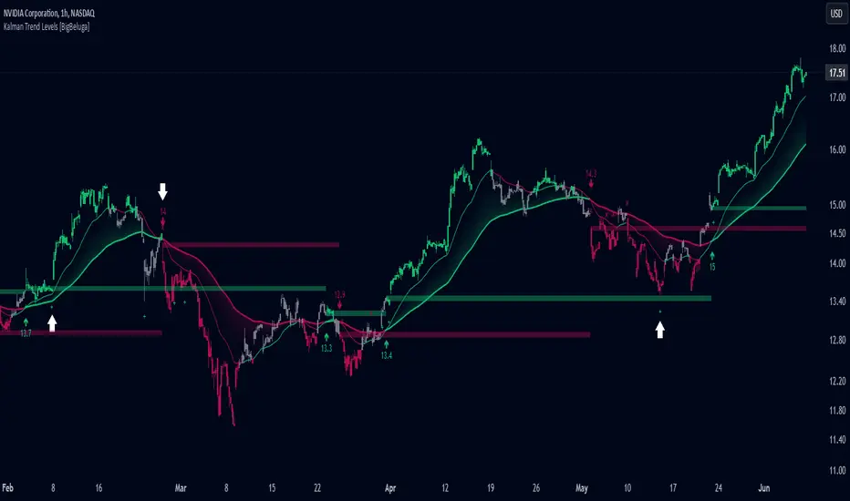
Kalman Trend Levels [BigBeluga]Kalman Trend Levels is an advanced trend-following indicator designed to highlight key support and resistance zones based on Kalman filter crossovers. With dynamic trend analysis and actionable signals, it helps traders interpret market direction and momentum shifts effectively.
🔵 Key Features:
Trend Levels with Crossover Boxes: Identifies trend shifts by tracking crossovers between fast and slow Kalman filters. When the fast line crosses above the slow line, a green box level appears, indicating a potential support zone. When it crosses below, a red box level forms, acting as a resistance zone.
Retest Signals for Support and Resistance Levels: Enable retest signals to capture price rejections at the established levels, providing possible re-entry points where the price confirms a support or resistance area.
Adaptive Candle Coloring by Trend Momentum: Candle colors adjust based on the trend's strength:
> During a downtrend, if the fast Kalman line shows upward movement, indicating reduced bearish momentum, candles turn gray to signal the weakening trend.
> In an uptrend, when the fast Kalman line declines, showing lower bullish momentum, candles become gray, signaling a potential slowdown in upward movement.
Crossover Signals with Price Labels: Displays arrows with price values at crossover points for quick reference, marking where the fast line overtakes or dips below the slow line. These labels provide a precise price snapshot of significant trend changes.
🔵 When to Use:
The Kalman Trend Levels indicator is ideal for traders looking to identify and act upon trend changes and significant price zones. By visualizing key levels and momentum shifts, this tool allows you to:
Define support and resistance zones that align with trend direction.
Identify and react to trend weakening or strengthening via candle color changes.
Use retest signals for potential re-entries at critical levels.
See crossover points and price values to gain a clearer view of trend changes in real time.
With its focus on trend direction, support/resistance, and momentum clarity, Kalman Trend Levels is an essential tool for navigating trending markets, providing actionable insights with every crossover and trend shift.
在腳本中搜尋"trend"
The Most Powerful TQQQ EMA Crossover Trend Trading StrategyTQQQ EMA Crossover Strategy Indicator
Meta Title: TQQQ EMA Crossover Strategy - Enhance Your Trading with Effective Signals
Meta Description: Discover the TQQQ EMA Crossover Strategy, designed to optimize trading decisions with fast and slow EMA crossovers. Learn how to effectively use this powerful indicator for better trading results.
Key Features
The TQQQ EMA Crossover Strategy is a powerful trading tool that utilizes Exponential Moving Averages (EMAs) to identify potential entry and exit points in the market. Key features of this indicator include:
**Fast and Slow EMAs:** The strategy incorporates two EMAs, allowing traders to capture short-term trends while filtering out market noise.
**Entry and Exit Signals:** Automated signals for entering and exiting trades based on EMA crossovers, enhancing decision-making efficiency.
**Customizable Parameters:** Users can adjust the lengths of the EMAs, as well as take profit and stop loss multipliers, tailoring the strategy to their trading style.
**Visual Indicators:** Clear visual plots of the EMAs and exit points on the chart for easy interpretation.
How It Works
The TQQQ EMA Crossover Strategy operates by calculating two EMAs: a fast EMA (default length of 20) and a slow EMA (default length of 50). The core concept is based on the crossover of these two moving averages:
- When the fast EMA crosses above the slow EMA, it generates a *buy signal*, indicating a potential upward trend.
- Conversely, when the fast EMA crosses below the slow EMA, it produces a *sell signal*, suggesting a potential downward trend.
This method allows traders to capitalize on momentum shifts in the market, providing timely signals for trade execution.
Trading Ideas and Insights
Traders can leverage the TQQQ EMA Crossover Strategy in various market conditions. Here are some insights:
**Scalping Opportunities:** The strategy is particularly effective for scalping in volatile markets, allowing traders to make quick profits on small price movements.
**Swing Trading:** Longer-term traders can use this strategy to identify significant trend reversals and capitalize on larger price swings.
**Risk Management:** By incorporating customizable stop loss and take profit levels, traders can manage their risk effectively while maximizing potential returns.
How Multiple Indicators Work Together
While this strategy primarily relies on EMAs, it can be enhanced by integrating additional indicators such as:
- **Relative Strength Index (RSI):** To confirm overbought or oversold conditions before entering trades.
- **Volume Indicators:** To validate breakout signals, ensuring that price movements are supported by sufficient trading volume.
Combining these indicators provides a more comprehensive view of market dynamics, increasing the reliability of trade signals generated by the EMA crossover.
Unique Aspects
What sets this indicator apart is its simplicity combined with effectiveness. The reliance on EMAs allows for smoother signals compared to traditional moving averages, reducing false signals often associated with choppy price action. Additionally, the ability to customize parameters ensures that traders can adapt the strategy to fit their unique trading styles and risk tolerance.
How to Use
To effectively utilize the TQQQ EMA Crossover Strategy:
1. **Add the Indicator:** Load the script onto your TradingView chart.
2. **Set Parameters:** Adjust the fast and slow EMA lengths according to your trading preferences.
3. **Monitor Signals:** Watch for crossover points; enter trades based on buy/sell signals generated by the indicator.
4. **Implement Risk Management:** Set your stop loss and take profit levels using the provided multipliers.
Regularly review your trading performance and adjust parameters as necessary to optimize results.
Customization
The TQQQ EMA Crossover Strategy allows for extensive customization:
- **EMA Lengths:** Change the default lengths of both fast and slow EMAs to suit different time frames or market conditions.
- **Take Profit/Stop Loss Multipliers:** Adjust these values to align with your risk management strategy. For instance, increasing the take profit multiplier may yield larger gains but could also increase exposure to market fluctuations.
This flexibility makes it suitable for various trading styles, from aggressive scalpers to conservative swing traders.
Conclusion
The TQQQ EMA Crossover Strategy is an effective tool for traders seeking an edge in their trading endeavors. By utilizing fast and slow EMAs, this indicator provides clear entry and exit signals while allowing for customization to fit individual trading strategies. Whether you are a scalper looking for quick profits or a swing trader aiming for larger moves, this indicator offers valuable insights into market trends.
Incorporate it into your TradingView toolkit today and elevate your trading performance!

Open Interest Ribbon Trend [Orderflowing]Open Interest Data Aggregation | Multiple Exchange Sources | Open Interest Delta & Relative Volume | Ribbon Trend Analysis & Forecasting
Built using Pine Script V5.
Introduction
The Open Interest Ribbon Trend Indicator is designed to offer traders analysis of Open Interest across multiple exchanges, merging volume-based analysis with Ribbon Trend. Practically Integrating Open Interest data with customizable trend detection.
This Indicator pulls Open Interest data from major cryptocurrency exchanges Binance, Bybit, BitMEX, Kraken, and Bitfinex, combining these sources into a aggregated format. With Ribbon Trend logic, the tool can potentially help identify trend shifts in the open interest data.
Use of Open-Source Code
Specific parts of this Indicator's code have been inspired by & further developed from publicly available code originally developed for the MetaTrader platform.
All such integrations have been wired to work within the TradingView environment, specifically using Pine Script Version 5.
Elements have been made to benefit the overall functionality, the code logic, to make sure it offers unique value to TradingView's users.
Innovation and Inspiration
This Indicator builds on Open Interest analysis by integrating the Ribbon Trend component. It is inspired by the potential need for traders to aggregate volume data with trend-following methods to see potential direction, strength, and reversals. It combines Open Interest Delta with relative volume analysis.
How To Use Open Interest - Cheat Sheet
The Open Interest Cheat Sheet outlines four primary scenarios based on the relationship between Price Action and Open Interest.
Bullish Market
Price Up + Open Interest Up
This indicates that long positions are being opened, signaling a strong market.
The uptrend is likely to continue as traders increase their positions in the direction of the price movement.
A strong market where the uptrend should persist.
Neutral Bullish (Long Squeeze)
Price Down + Open Interest Down
Positions are being closed, particularly long positions, which are being squeezed out of the market.
This suggests a neutral or slightly bullish outlook as the downtrend weakens.
The market is neutral or slightly bullish, with a potential weakening of the downtrend.
Neutral Bearish (Short Squeeze)
Price Up + Open Interest Down
Short positions are being closed, indicating a short squeeze.
While price is increasing, the decrease in OI reflects weakening momentum.
The uptrend could be losing strength.
Neutral to slightly bearish, as the uptrend may be weakening.
Bearish Market
Price Down + Open Interest Up
Short positions are being opened, indicating a weak market.
The downtrend is likely to continue as traders open new positions betting on further price declines.
A weak market where the downtrend is expected to continue.
OI Going Up usually means traders are opening new positions in the direction of price action.
OI Going Down often indicates positions are being closed, which could signal a potential price reversal.
Core Features
Multi-Exchange Open Interest Data
Aggregates Open Interest from multiple exchanges
Open Interest Delta & Relative Volume
Example
1st Oscillation: Open Interest Delta & 2nd Oscillation Relative Volume
Includes options to display Open Interest Delta alongside Relative Volume, allowing traders to monitor market participation and volume pressure.
Ribbon Trend Analysis
Uses customizable MAs to create a Ribbon Trend visualization. The goal is to visualize trends in the aggregated Open Interest data.
High Market Activity Visuals
Option to highlight relatively significant increases or decreases in the Open Interest, color-coded for identification.
Forecasting Feature
Includes Ribbon Trend's forecasting feature that projects future trends based on current market conditions, providing a forward-looking view of potential market movements.
Application
Open Interest Aggregation
The Indicator pulls Open Interest data from cryptocurrency exchanges: Binance, Bybit, BitMEX, Kraken, and Bitfinex, aggregating this information to offer a view of volume participation.
Ribbon Trend Logic
The Ribbon Trend visually tracks direction, with customizable smoothing options. This feature allows traders to detect potential trend shifts and market momentum.
Delta & Relative Volume Analysis
By visualizing the Open Interest Delta alongside relative volume, traders can identify moments of intense buying or selling pressure, giving potential clues on how market participants are positioned.
High-Volume Visuals
Traders can receive visual cues for significant changes in Open Interest, potentially helping to spot large market movements before they happen.
Customization
Moving Average Types. Select from EMA, DEMA, HMA, Laguerre, and others for Ribbon Trend logic.
Color Customization. Set different colors for uptrends and downtrends, making it easier to follow the Ribbon Trend.
Thresholds & Alerts. Customize the thresholds for significant Open Interest changes to suit your trading style.
Conclusion
The Open Interest Ribbon Trend Indicator is a tool for traders looking to integrate Open Interest data with trend analysis. Its multi-exchange aggregation and integrated trend logic offers a different perspective, providing visuals potentially useful for trend following, market reversals, and volume-based trading strategies.
Disclaimer
While the Indicator is a tool to analyzing trends in open interest & volume, traders should not solely rely on it for trading decisions. As with all trading tools, it should be used as part of a complete trading strategy.
Note that the is independent from the script. This Indicator focuses specifically on analyzing Open Interest and volume trends.

Trend Following Composite Index ( TFCI ) 🏆 Trend Following Composite Index (TFCI) 🏆
Overview 🔎
The Trend Following Composite Index (TFCI) is designed to provide traders with a comprehensive view of market trends by combining several technical indicators in a single, unified tool. Each component brings its unique perspective, and together they create a well-rounded signal that may help traders better understand the current market condition. TFCI simplifies the decision-making process by aggregating these signals into one easy-to-read confidence percentage, allowing traders to quickly gauge whether the market is trending upwards, downwards, or is in a period of indecision.
Combining Multiple Indicators for a Unique Edge 🔀
TFCI integrates six different technical indicators, each tuned to capture distinct aspects of market behavior. Rather than relying on any single indicator, TFCI merges their signals into one, providing a more nuanced and potentially more reliable view of the market. This combination helps reduce the weaknesses inherent in any one indicator, offering a more balanced and holistic trend signal.
RSI Filter: The RSI helps identify potential overbought or oversold conditions, but when used alone, it can generate false signals. In TFCI, the RSI is smoothed and combined with other metrics to avoid reacting to small fluctuations, making the signals more robust.
Kijun-Based Band: This component, inspired by the Kijun-sen line from the Ichimoku system, defines adaptive price bands based on market equilibrium. When combined with a smoothing filter, it provides traders with clear visual cues for potential trend reversals, reducing the guesswork.
Boosted Moving Average: By combining short- and long-term EMAs, this component reacts quickly to price changes, while the "boost" factor enhances its ability to confirm trends early. This combination helps filter out market noise, making it easier to spot genuine trend shifts.
Deviation Condition: This proprietary moving average adjusts dynamically based on volatility, which means it adapts to fast-changing market conditions. By adjusting its sensitivity based on market deviations, it helps smooth out erratic price movements, creating clearer trend signals.
VWTSI (Volume-Weighted Trend Strength Indicator): Volume is an essential factor in confirming trends. This indicator looks at price movements in relation to volume to assess the strength of the trend. By factoring in volatility, it ensures that traders are focusing on the strongest market moves, further enhancing the reliability of the signals.
Supertrend: A volatility-based trailing stop that defines buy and sell points. Its role in TFCI is to help maintain positions during trending markets while avoiding premature exits due to minor pullbacks.
A Streamlined Confidence Signal 🧮
One of the main advantages of TFCI is that it simplifies the multitude of signals into one easy-to-read confidence percentage. The aggregation of multiple indicators means that no single indicator drives the signal; instead, the combined analysis ensures that only when several conditions align do you get a clear trend indication. This reduces false positives and gives traders a more confident view of the overall market direction.
Bullish signals from several components push the percentage higher.
Bearish signals lower the percentage.
A neutral score indicates indecision, signaling a potential range-bound or consolidating market.This consolidated signal allows traders to make quicker decisions without having to interpret several individual indicators, making the tool more user-friendly and practical for daily trading.
Why TFCI’s Combination is Unique and Useful 🔍
What makes TFCI stand out is how each of these indicators works together to offer a more comprehensive view of the market:
Reduced Noise: By combining multiple indicators, TFCI reduces the likelihood of acting on false signals. The integration of smoothing mechanisms and volume-based confirmations further increases signal reliability.
More Balanced Analysis: Using indicators that analyze price, volume, volatility, and trend strength, TFCI provides a balanced view of market conditions. Traders can trust that the signal reflects multiple facets of the market rather than just one aspect, making it more adaptable to different market environments.
Easier to Read: Instead of juggling multiple charts or relying on complex setups, TFCI combines everything into one clear percentage and visual signal. This saves time and reduces the complexity of decision-making.
Tested Across Market Conditions 📅
While no indicator can predict the future, TFCI has been tested in a range of market conditions. Its ability to adapt to different environments (trending, volatile, or range-bound) makes it a versatile tool, though like any technical tool, it should be used alongside other forms of analysis and risk management.
Custom Display Options for Readability 📊
To make TFCI even more versatile, it includes two display modes:
Table Mode: This mode breaks down the signals from each component, showing traders exactly how each element is contributing to the overall confidence score. Ideal for those who want to dig deeper into the details.
Gauge Mode: A simplified visual display, perfect for traders who want a quick, at-a-glance view of market conditions.
Color Blindness Mode 🌈
TFCI also includes several color palettes for traders affected by color blindness, ensuring everyone can easily interpret the signals.
Conclusion 🔒
TFCI brings together multiple technical indicators in a unique way that aims to improve trend detection by providing a balanced and easy-to-read signal. Its proprietary adjustments and combination of price, volume, and volatility indicators offer a comprehensive view of market conditions, making it a valuable tool for traders of all experience levels. However, it is essential to remember that no past performance can guarantee future results.

Trend Magic with EMA, SMA, and Auto-TradingRelease Notes
Strategy Name: Trend Magic with EMA, SMA, and Auto-Trading
Purpose: This strategy is designed to capture entry and exit points in the market using the Trend Magic indicator and three moving averages (EMA45, SMA90, and SMA180). Specifically, it uses the perfect order of the moving averages and the color changes in Trend Magic to identify trend reversals and potential trading opportunities.
Uniqueness and Usefulness
Uniqueness: The strategy utilizes the Trend Magic indicator, which is based on price and volatility, along with three moving averages to assess the strength of trends. The signals are generated only when the moving averages are in perfect order, and the Trend Magic color changes, ensuring that the entry is made during established trends. This combination provides a higher degree of reliability compared to strategies that rely solely on price action or single indicators.
Usefulness: This strategy is particularly useful for traders looking to capture trends over longer periods. It is effective at reducing noise in the market, only providing signals when the moving averages align and the Trend Magic indicator confirms a trend reversal. It works well in both trending and volatile markets.
Entry Conditions
Long Entry:
Condition: A perfect order (EMA45 > SMA90 > SMA180) is established, and Trend Magic changes color from red to blue.
Signal: A buy signal is generated, indicating the start of an uptrend.
Short Entry:
Condition: A perfect order (EMA45 < SMA90 < SMA180) is established, and Trend Magic changes color from blue to red.
Signal: A sell signal is generated, indicating the start of a downtrend.
Exit Conditions
Exit Strategy:
This strategy automatically enters and exits trades based on signals, but traders are encouraged to manage exits manually according to their own risk management preferences. The strategy includes stop loss and take profit settings based on risk-to-reward ratios for better risk management.
Risk Management
The strategy includes built-in risk management by using the SMA90 level at the time of entry as the stop-loss point and setting the take profit at a 1:1.5 risk-to-reward ratio. The stop-loss level is fixed at the entry point and does not move as the market progresses. Traders are advised to implement additional risk management, such as trailing stops, for added protection.
Account Size: ¥100,000
Commissions and Slippage: Assumes 94 pips for commissions and 1 pip for slippage per trade
Risk per Trade: 10% of account equity (adjust this based on personal risk tolerance)
Configurable Options
Configurable Options:
CCI Period: Set the period for the CCI used to calculate the Trend Magic indicator (default is 21).
ATR Multiplier: Set the multiplier for ATR used in the Trend Magic calculation (default is 1.0).
EMA/SMA Periods: The periods for the three moving averages (default is EMA45, SMA90, and SMA180).
Signal Display Control: An option to toggle the display of buy and sell signals on the chart.
Adequate Sample Size
To ensure the robustness and reliability of this strategy, it is recommended to backtest it with a sufficiently long period of historical data. Testing across different market conditions, including high and low volatility periods, is also advised.
Credits
Acknowledgments:
This strategy is based on the Trend Magic indicator combined with moving averages and draws on contributions from the technical analysis and trading community.
Clean Chart Description
Chart Appearance:
To maintain a clean and simple chart, this strategy includes options to turn off the display of Trend Magic, moving averages, and entry signals. Traders can adjust these display settings as needed to minimize visual clutter and focus on effective trend analysis.
Addressing the House Rule Violations
Omissions and Unrealistic Claims
Clarification:
This strategy does not make any unrealistic or unsupported claims about its performance. All signals are intended for educational purposes only and do not guarantee future results. It is important to note that past performance does not guarantee future outcomes, and proper risk management is crucial.

BX-Volume Trend and OscillatorBX-Volume Trend and Oscillator (VTO)
This is my second indicator. I created this indicator for myself. I was inspired by the indicators created by Bjorgum, Duyck and QuantTherapy and decided to create multiple indicators that either work well combined with their indicators or something new that applies some of their indicator concepts. I decided to share this because I believe in learning and earing together as a community. I will later share the rest of the indicators I have created. If you guys have any questions or suggestions write them.
The BX-Volume Trend and Oscillator (VTO) is a comprehensive trading indicator designed to help traders identify trends, momentum shifts, and potential reversals by analyzing volume and price action through various metrics. This indicator combines relative volume analysis with custom Xtrender oscillators and moving averages to provide valuable insights into market behavior.
Image: BX-Volume Trend and Oscillator (VTO)
Features:
Relative Volume Analysis: Measures the current volume relative to the average volume over a specified period, helping traders understand if the current trading activity is unusually high or low.
Short-Term Xtrender Oscillator: This oscillator analyzes the difference between two short-term Exponential Moving Averages (EMAs) and smooths it with a custom RSI, highlighting short-term trends and potential reversal points.
Long-Term Xtrender Oscillator: Similar to the short-term oscillator but uses longer-term EMAs and RSI for identifying more sustained trends and shifts.
T3 Moving Average: A smoothed version of the Xtrender oscillator that helps in detecting trend changes more clearly.
Volume Trend Plot: Shows the smoothed relative volume to understand how trading activity aligns with the trend.
Visual Indicators: Uses colors and shapes to highlight significant changes and trends, such as circles to mark potential reversal points.
How to Use the Indicator
Analyze Relative Volume:
Relative Volume Plot: The smoothed relative volume is displayed in white, helping you assess if current trading volumes are above or below the historical average.
High Relative Volume: Indicates strong trading interest, which could support or contradict the prevailing trend.
Image above: is set to daily timeframe
Monitor Short-Term Xtrender Oscillator
Short-Term Xtrender: Plotted as a column histogram with colors changing from green to red based on the oscillator's movement and momentum. Green and lime colors indicate bullish trends, while maroon and red suggest bearish conditions.
Smoothed Short-Term Xtrender (T3): Plotted as a line that adjusts color based on the short-term Xtrender's trend. The line changes color to match the histogram's color, providing a clearer view of momentum shifts.
Reversal Markers: Small circles indicate potential short-term trend reversals, where changes in the T3 moving average suggest shifts in momentum.
Assess Long-Term Xtrender Oscillator:
Long-Term Xtrender: Plotted as a histogram, with color changes similar to the short-term Xtrender. It shows longer-term trends and shifts.
Color Indicators: Lime and green colors suggest an uptrend, while red and maroon indicate a downtrend.
Look for Zero Line Crossings:
The zero line serves as a reference point. Crossings above the zero line may indicate bullish trends, while crossings below may signal bearish trends.
Image above: is set to daily timeframe, and it showcases the Short-Term Xtrender (T3) applied.
Image above: is set to 8hr timeframe: Using the lower timeframe you can spot better details of pullbacks and potential reversals.
Example of Use:
Identify Trend and Momentum: Use the combination of the short-term and long-term Xtrender oscillators to gauge the prevailing market trend. For instance, if both oscillators are above zero and showing upward momentum, it suggests a strong bullish trend.
Spot Reversals: Observe the short-term Xtrender and its smoothed T3 version. If the T3 line changes direction and crosses through previous peaks and troughs, it could signal a potential reversal.
Volume Confirmation: Check the relative volume and its smoothed version to confirm the strength of price movements. Significant changes in volume can validate the trends indicated by the Xtrender oscillators.
By combining these elements, the BX-Volume Trend and Oscillator (VTO) provides a holistic view of market dynamics, helping traders make more informed decisions based on trend strength, potential reversals, and volume activity.
Lastly, my Scripts/Indicators/Ideas /Systems that I share are only for educational purposes!

Fibonacci Retracements & Trend Following Strategy V2This Pine Script strategy generates trading signals using Fibonacci levels and trend-following indicators.
1. Strategy Summary
This strategy analyzes price movements using a combination of Fibonacci levels and trend-following indicators, providing potential trading signals. The strategy includes Fibonacci levels as well as EMA (Exponential Moving Average) and ADX (Average Directional Index) indicators.
2. Indicators and Parameters
Fibonacci Levels
Fibonacci Level 1, Level 2, Level 3, Level 4: Used as Fibonacci retracement levels. These levels are typically set at 0.236, 0.382, 0.618, and 0.786. Users can adjust these values according to their preferences.
Trend-Following Indicator
Trend Length: The period for calculating the EMA used as the trend-following indicator. For example, if set to 20, the EMA will be calculated over 20 periods.
ADX (Average Directional Index)
ADX Length: The period for calculating the ADX. ADX measures the strength of the price trend and is usually set to 14 periods.
ADX Threshold: A threshold value for the ADX. This value determines when trading signals will be activated.
3. Usage Steps
Displaying the Indicator on the Chart:
On the TradingView platform, paste the code into the Pine Editor and click the "Add to Chart" button to add it to the chart.
Analyzing the Indicators:
Fibonacci Levels: Show retracement levels of price movements. When the price reaches one of these levels, potential reversals may occur.
Trend-Following Indicator: EMAs determine the direction of the trend. Green EMA represents an uptrend, while red EMA represents a downtrend.
ADX: Measures the strength of the trend. When ADX surpasses the threshold value, it indicates a strong trend.
Trading Signals:
Long Signal: Generated when the price is above the second Fibonacci level and the trend is upward. Additionally, the ADX value must be above the set threshold.
Short Signal: Generated when the price is below the second Fibonacci level and the trend is downward. Additionally, the ADX value must be above the set threshold.
Target Prices:
Long Targets: Determines upward targets based on Fibonacci levels. These targets indicate expected prices if the price reverses from Fibonacci levels.
Short Targets: Determines downward targets based on Fibonacci levels. These targets indicate expected prices if the price reverses from Fibonacci levels.
4. Chart Displays
Trend Up (Green Line): Shows the rising EMA.
Trend Down (Red Line): Shows the falling EMA.
Fibonacci Levels (Blue Lines): Shows Fibonacci retracement levels.
Long Targets (Green Circles): Shows targets for long positions.
Short Targets (Red Circles): Shows targets for short positions.
Long Signal (Green Label): Buy signal.
Short Signal (Red Label): Sell signal.
5. Important Notes
Retracement and Target Levels: Fibonacci levels can act as potential retracement or support/resistance levels. However, they should always be used in conjunction with other technical analysis tools.
Trend and ADX: ADX is used to determine the strength of the trend. Be aware that when ADX is low, trends may be weak.
6. Example Scenarios
Example 1: If the trend is upward (green EMA) and the price is above the second Fibonacci level, you may receive a long position signal. If the ADX value is above the threshold, the signal may be stronger.
Example 2: If the trend is downward (red EMA) and the price is below the second Fibonacci level, you may receive a short position signal. If the ADX value is above the threshold, the signal may be stronger.
This updated version contains significant improvements in both technical aspects and user experience. Innovations such as ADX calculations and dynamic Fibonacci levels make the strategy more robust and flexible. The code's readability and comprehensibility have been enhanced, and errors have been corrected.
This guide will help you understand the basic operation of the strategy. It is always recommended to conduct your own research and test the strategy before using it.
GOOD LUCK. // halilvarol

Trend Momentum Strength Indicator, Built for Pairs TradingOverview:
This script combines multiple indicators to provide a comprehensive analysis of both trend strength and trend momentum. It is tailored specifically for pairs trading strategies but can also be used for other trading strategies.
Benefit of Comprehensive Analysis:
Having an indicator that evaluates both trend strength and trend momentum is crucial for traders looking to make informed decisions. It allows traders to not only identify the direction and intensity of a trend but also gauge the momentum behind it. This dual capability helps in confirming potential trade opportunities, whether for entering trades with strong trends or considering reversals during overbought or oversold conditions. By integrating both aspects into one tool, traders can gain a holistic view of market dynamics, enhancing their ability to time entries and manage risk effectively.
Features:
* Trend Strength:
Enhanced ADX Formula: The script includes modifications to the standard ADX formula along with DI+ and DI- to provide more responsive trend strength readings.
Directional Indicators: DI+ (green line) indicates positive directional movement, while DI- (red line) indicates negative directional movement.
Trend Momentum:
Modified Stochastic Indicators: The script uses %K and %D indicators, modified and combined with ADX to give a clear indication of trend momentum.
Momentum Strength: This helps determine the strength and direction of the momentum.
Trading Signals:
Combining Indicators: The script combines ADX, DI+, DI-, %K, and %D to generate comprehensive trading signals.
Optimal Entry Points: Designed to identify optimal entry points for trades, particularly in pairs trading.
Colored Area at Bottom:
This area provides two easy-to-read functions:
Color:
Green: Upward momentum (ratio above 1)
Red: Downward momentum (ratio below 1)
Height:
Higher in green: Stronger upward momentum
Lower in red: Stronger downward momentum
Legend:
Green Line: DI+ (Positive)
Red Line: DI- (Negative)
Black Line: ADX
How to Read This Indicator:
1) Trend Direction:
DI+ above DI-: Indicates an upward trend.
DI- above DI+: Indicates a downward trend.
2) Trend Strength:
ADX below 20: Indicates a neutral trend.
ADX between 20 and 25: Indicates a weak trend.
ADX above 25: Indicates a strong trend.
Trading Signals in Pairs Trading:
Neutral Trend: Ideal for pairs trading when no strong trend is detected.
Overbought/Oversold: Uses %K and %D to identify overbought/oversold conditions that support trade decisions.
Entry Signals: Green signals for long positions, red signals for short positions, based on combined criteria of neutral trend strength and supportive momentum.
Application in Pairs Trading:
Neutral trend: In pairs trading strategies, where neutral movement is often sought, this indicator provides signals that are especially relevant during periods of neutral trend strength and supportive momentum, aiding traders in identifying optimal entry
Risk Management: Combining signals from ADX, DI+, DI-, %K, and %D helps traders make more informed decisions regarding entry points, enhancing risk management.
Example Chart (The indicator is on the upper right corner):
Clean Presentation: The chart only includes the necessary elements to demonstrate the indicator’s functionality.
Demonstrates: Overbought/oversold conditions, upward/downward/no momentum, and trading signals with/without specific scenarios.

Trend Bars Pro (HTF PO3)Hello Traders!
The innovative TRN Trend Bars Pro are designed to help traders to analyze markets in an intuitive way and provide high probability entry and exit signals. It combines three core concepts:
TRN Trend Bars to see the current trend and reversals (replaces the default chart bars)
Bar Ranges to highlight consolidations
Dynamic Trend to see the overall trend.
First, let's have a look at each of these concepts individually. Afterwards, we describe how a combination of all three gives you a crystal-clear picture of the market.
TRN Trend Bars Pro
They show bullish and bearish trends and reversals based on color coding the bars and give high probability trade opportunities with special colors. The trend analysis is based on a new algorithm that includes several different inputs:
classical and advanced bar patterns and their statistical frequency
probability distributions of price expansions after certain bar patterns
bar information such as wick length in %, overlapping of the previous bar in % and many more
historical trend and consolidation analysis
The algorithm weighs these concepts and outputs a color scheme for the chart bars or candlesticks.
Bar Types
Trend bars in green and red
Reversal Bars in blue and fuchsia
Continuation Bars in turquoise and orange
Breakout Bars in dark green and pink
Green Bars signify a sustained uptrend, indicating bullish market sentiment. On the other hand, Red Bars indicate a persistent downtrend, representing bearish market sentiment. The transition from red to green denotes a bullish trend reversal, suggesting a shift from bearish to bullish sentiment. Conversely, the shift from green to red signals a bearish trend reversal, indicating a transition from bullish to bearish sentiment. By monitoring these color changes, traders can identify potential trend reversals and make informed trading decisions.
The presence of gray and black bars indicates a neutral market state, often observed before an impending color change from red to green or green to red. These neutral bars serve as a transition phase between the previous trend and the potential reversal.
The TRN Trend Bars Pro incorporate signal bars, distinguished by their distinct colors, to offer potential buy and sell signals and deeper insights into market dynamics.
Reversal Bars
The presence of blue Reversal Bars indicates a trend reversal to the upside, while pink Reversal Bars indicate a reversal to the downside. These bars not only serve as signals for potential trend shifts but also present favorable opportunities to enter the market or increase one's position size.
Continuation Bars
In addition to the reversal bars, the indicator also includes bullish continuation bars (colored turquoise) and bearish continuation bars (colored orange). These bars act as signals for the continuation of an existing trend. Like the reversal bars, they can be utilized as entry points or opportunities to augment one's position size.
Breakout Bars
The dark green breakout bars within TRN Trend Bars Pro show a powerful breakout from a price range detected by our integrated bar range feature. They signify the continuation or potential change in a trend following a consolidation phase. As such, these bars hold dual functionality, serving as reversal signals and validating the persistence of an ongoing trend.
Bar Ranges
The bar range feature automatically finds consolidations where the price range of several consecutives bars is rather small. The detection of the bar ranges includes among other things the overlapping percentage of these bars.
How to Use Price Ranges
Here are a few ways you can use the bar ranges in your trading:
Identify Support and Resistance Levels
The price ranges can help you identify key support and resistance levels on a chart. By observing price ranges and identifying these levels, you can make more informed decisions about entering or exiting trades.
Breakout Trading
Price ranges can also provide insights into potential breakout opportunities. Breakouts occur when the price breaks out of a defined range, signaling a potential shift in market sentiment and the start of a new trend. The Color highlighted Breakout Bars from the TRN Trend Bars Pro are signaling a powerful breakout of a price range. Traders can enter positions in the direction of the breakout and set appropriate stop-loss orders to manage risk. Note that not every price range is left by a powerful breakout.
Dynamic Trend
The Dynamic Trend combines elements from standard trend strength indicators (e.g. DI-, DI+, Parabolic SAR) and volatility indicators (e.g. ATR, Standard Deviation). It produces a moving average line that adapts to changing market volatility. It is inspired by the ideas of the programmer and trader Fat Tails. The adaptive behavior provides more relevant information for traders when compared to traditional moving averages which do not consider volatility and trend strength together. This makes the Dynamic Trend completely unique, and no other moving average indicator can give you this precision.
How to use Dynamic Trend
Generally, a rising Dynamic Trend line, displayed in green, indicates that an uptrend is strong, while a falling Dynamic Trend, displayed in red, suggests that the downtrend is sharp. The Dynamic Trend turns gray when there is insufficient clarity to establish a distinct trend and especially when there is not volatility in the market.
Identify potential trade entries and exits: When used in conjunction with price action, the Dynamic Trend can provide potential trade signals. For example, if the price crosses above the Dynamic Trend, it may be a bullish sign, suggesting a potential buy entry. Conversely, if the price crosses below the Dynamic Trend, it may indicate bearish conditions and a potential sell signal.
Trend Identification and Pullback trading
Observe the Dynamic Trend's color. When it's on the rise and appears green, it indicates a bullish trend. Conversely, if it's in decline and displayed in red, it signals a bearish trend.
If Dynamic Trend is green and price pulls from above back to the Dynamic Trend, then this can be considered as a bullish signal.
If Dynamic Trend is red and price pulls from below back to the Dynamic Trend, then this can be considered as a bearish signal.
In the event of a bearish signal, such as a bearish TRN Signal Bar, and the Dynamic Trend is red, it provides additional confirmation to the bearish signal. Likewise, bullish signals gain added conviction when the Dynamic Trend is green.
Crossovers
As with other moving averages, crossovers between the Dynamic Trend and the price can be significant.
If price is crossing above the Dynamic Trend, then this can be considered as a bullish signal.
If price is crossing below the Dynamic Trend, then this can be considered as a bearish signal.
If you currently hold a position, both bullish and bearish crossovers can serve as potential exit signals. For instance, in the case of a long position, a bearish crossover can indicate a potential shift in sentiment, signaling a bearish reversal and a potential opportunity to close your long position.
Filtering Noise
Due to its adaptive nature, the Dynamic Trend can be a useful tool to filter out market noise. When the market is choppy or consolidating, the Dynamic Trend tends to remain flat and colored gray, signaling traders to potentially stay out of the market.
Stop Losses
The Dynamic Trend can also be used as a dynamic stop loss. For instance, in a long trade, traders can use the Dynamic Trend as a trailing stop, selling their position if the price crosses below the Dynamic Trend.
Combining TRN Trend Bars Pro, Bar Ranges and Dynamic Trend together
Combining all three concepts gives you a crystal-clear picture of the market. The Dynamic Trend shows you the overall trend. If price pulls back to the dynamic trend line and then price picks up the trend direction again, then the TRN Trend Bars Pro immediately switches the color to the trend direction. Therefore, you can easily identify high probability entry signals based on the bar color.
As a simple trading model, you can set the stop loss below the last swing or below a TRN signal bar (vice versa for short entries) and use 2.5 R or 3 R as target.
You can increase the success rate of the high probability TRN signal bars entries even more if they are in line with the Dynamic Trend line.
On the other hand, the TRN Bar Ranges help you to stay out of the market in case the price does not really change. As a confluence signal to stay flat in this period the dynamic trend line tends to be grey as well. If the price breaks out of the range, then the indicator prints a breakout bar which serves as a high probability entry signal.
Although it is possible to switch off any of these concepts, it is highly recommended to use all three in combination to get a crystal-clear picture of the market.
Alerts
Experience the power of our TRN Trend Bars Pro alerts, delivering real-time notifications for trend changes, price range breakouts, and signal bar formations or confirmations. Stay on top of the market with these versatile alerts, customizable to your preferred assets and timeframes.
Conclusion
While signals from TRN Trend Bars Pro can be informative, it is important to recognize that their reliability may vary. Various external factors can impact market prices, and it is essential to consider your risk tolerance and investment goals when executing trades.
Risk Disclaimer
The content, tools, scripts, articles, and educational resources offered by TRN Trading are intended solely for informational and educational purposes. Remember, past performance does not ensure future outcomes.

ZigZag Smart Trend [TradingFinder] Major & Minor Structured Wave🔵 Introduction
🟣 Zigzag
Zigzag is a lagging indicator; this indicator identifies points on a price chart that have more significant changes than its previous wave and then by connecting these lines to each other, it assists traders in trend detection.
This indicator reduces random price fluctuations and attempts to make the primary price trend clearer.
🟣 Pivot
Pivots are points where the price chart changes direction. Pivots, also called reversal points, form when supply and demand forces dominate one another.
Different types of technical analysis pivots can be introduced into two categories, minor pivots, and major pivots, each of which has a specific meaning in analysis.
Major Pivot : These pivots actually indicate major changes in the direction of the chart and occur at the end of trends. Analysts seeking to reach the primary analysis focus more on major pivot points. In fact, most technical analysis tools are examined and determined based on major pivots.
Minor Pivot : This type of pivot focuses more on small and subsidiary points and directions. Therefore, it occurs at the end of corrections. Analysts focusing on minor pivots represent small trends, and it should be noted that minor pivots are not suitable for use in primary technical tools.
How to identify minor and major pivots :
Minor pivots are pivots formed between two major pivots and fail to break the opposite major pivot.
Major pivots are pivots that have either successfully broken the opposite pivot or have moved more than the previous pivot of the same type.
🔵 How to use
Based on identifying pivots and drawing zigzag lines, you can have various uses for this indicator.
Identifying support and resistance levels :
Identifying Elliott Waves :
Identifying classic patterns :
Identifying pivots with higher validity :
Identifying internal and external breakouts :
Identifying trends and range areas :
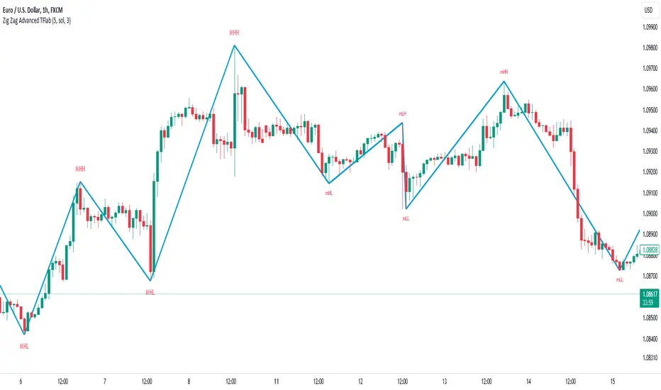
Identifying pivot types along with major and minor recognition :
MHH : Major Higher High
MLH : Major Lower High
MLL : Major Lower Low
MHL : Major Higher Low
mHH : Minor Higher High
mLH : Minor Lower High
mLL : Minor Lower Low
mHL : Minor Higher Low
🔵 Settings
Pivot Period Zigzag Line : Using this input, you can determine the pivot period for identifying zigzag swings.
Show Zigzag Line : To show or not to show the zigzag line.
Zigzag Line Color : Change the color of the zigzag line.
Zigzag Line Style : Change the Style of the zigzag line.
Zigzag Line Width : Change the Width of the zigzag line.
Show Label : To show or not to show Pivot Type.
Color Label : Change the color of the Pivot Type Label.
smart money - main trend and counter trendIn today's dynamic financial markets, keeping ahead requires more than just technical analysis.
Introducing the Smart Money indicator – a Pine Script tool made to discover the activity of market maker.
Smart Money is a helpful method for traders seeking a deeper understanding of market dynamics. This method shows the actions of big investors and large financial firms.
Keen traders pay close attention to what market makers do to stay ahead.
Trading strategies based on the Smart Money aim to align with the actions of these informed players.
Similar to the price action method, Smart Money method involves using classic concepts like supply and demand, price patterns, and support and resistance.
This indicator not only identifies usual parameters like Break of Structure (BOS), Change of Character (CHOCH), Inducement (IDM), Engineering Liquidity (Eng), and Order Blocks (OB), but also excels at uncovering these market events within counter-trend (internal trend).
Break of Structure (BOS)
BOS is formed when the price breaks the market structure (reliable support or resistance level) in the direction of the trend.
Change of Character (CHOCH)
CHOCH is formed when the price breaks the market structure in the opposite direction of the trend. This indicates a change in the market behavior. When traders can see these changes, they can adjust their strategies early on.
Inducement (IDM)
Inducement is a concept based on liquidity principles and technically is the last price pullback in the market structure.
IDM is the extreme point of the last pullback in the structure when the price makes a BOS or CHOCH. It's like a trap that makes traders jump into the market too early.
Engineering Liquidity (Eng Liq)
Also known as trend line liquidity and technically is the first extreme point in that trend.
Order Blocks (OB)
Order blocks are strategic market areas that indicate the final bearish or bullish activity before a significant price shift.
An Order Block is a handy tool that helps us see where the big guys are likely to put their money (potential reversal zones).
OB is determined based on the extreme points by considering last opposite candle (before a significant price movement) and fair value gaps.
This indicator has the ability to identify the decisional order block (the closest OB) and the extremum order blocks (the farthest OB).
Counter Trend
The standout feature of this indicator lies in its ability to detect and display all above features within internal trends.
Internal trends or counter trend, where the market moves against the main trend, are often challenging to navigate.
This comprehensive feature enables traders to navigate market complexities with confidence, identifying potential trend reversals and strategic entry points even when the broader trend suggests otherwise.
Some features of this indicator:
- Ability to identify BOS, CHOCH, IDM, Eng Liq and OBs in both main trend and counter trend.
- The text, color and size of each characteristic of the main trend and the counter trend are optional and you can manage their display type on the chart
- Ability to display swings with HH, LH, LL and HL labels
- Sending alarms when the price hits any of the levels (alarm levels are optional for both the main trend and the counter trend)
- Sending sweep alarms of each level (optional)
- Ability to display main structures and internal structures with desired color and thickness
- The possibility of displaying live and real-time structures
- Ability to see decision boxes
- Showing the structure trend by changing the background color

Trending RSI [ChartPrime]Trending RSI takes a new approach to RSI intended to provide all of the missing information that traditional RSI lacks. Questions such as "why does the price continue to decline even during an oversold period?" can be aided using the Trending RSI.
These types of movements are due to the market still trending and traditional RSI can not tell traders this. Trending RSI fixes this by introducing trend information back into the oscillator. By reverse engineering RSI we have been able to make a new indicator that is no longer bound between 0 and 100. Instead it provides the traditional 70 and 30 zones as bands, and 50 as a center line that still represent these zones perfectly. This transforms RSI into a centered oscillator instead of a normalized oscillator. When the market is trending our indicator represents this as the center line being below or above 0. Just like MACD the center line is colored to represent the market phases. This helps in identifying reversals more clearly by adding a layer of confluence to the already renowned RSI. We have also included a novel filtering technique that has a low lag to smoothing ratio. This is primarily used to smooth the bands by default but you can also utilize this on the RSI. Several alerts have been included to provide users with easy to configure signals.
You can use the center line as a directional filter for your trades by only picking trades in the direction of the center line. When the center line is above 0, the market is trending up. Conversely, when the center line is below 0 the market is trending down trend. Use the polarity of the center line to estimate the strength of retracements from the oversold and overbought zones. We have also included a special moving average to help you find the momentum of a move. The Binomial MA filter approximates a normal curve making it similar to a gaussian filter. We have also included standard divergences which are fully configurable in the settings. Finally, we have built this indicator to be compatible with the built in multi time frame option to allow users to freely pick the time frame they wish to use. It is worth noting that due to the limitations of the standard MTF implementation divergences will not plot as expected when using time frames outside of the charts time frame. This is standard and also affects the built in RSI.
All of the colors are fully adjustable with the option to enable or disable the glow effect. We have also designed this indicator to only display the information for plots that are enabled to reduce clutter and provide a cleaner charting experience. All alerts are built to work with the standard alert builder and do not have to be enabled or disabled inside of the indicator.
Included Alerts:
RSI Cross Over Center
RSI Cross Under Center
RSI Cross Under Upper Range
RSI Cross Over Upper Range
RSI Cross Over Lower Range
RSI Cross Under Lower Range
RSI Cross Over MA
RSI Cross Under MA
RSI Cross Over 0
RSI Cross Under 0
Center Cross Over 0
Center Cross Under 0
Center Bullish
Center Bearish
Bullish Divergence
Bearish Divergence
In wrapping up, the Trending RSI aims to enhance the conventional RSI by adding trend insights directly into the oscillator, addressing the gap that traditional RSI leaves regarding market trends. This version of RSI breaks away from the 0 to 100 range, offering bands and a center line that better represent market conditions. It includes a set of features like the Binomial MA for momentum analysis, configurable settings for divergence detection, and compatibility with multi-time frame analysis. The color customization and glow effects aim to improve visual clarity, and the inclusion of alerts is designed to streamline alert configuration. Overall, this indicator is designed to provide a more view of the markets, suitable for traders looking to incorporate trend analysis into their RSI-based strategies.
Enjoy

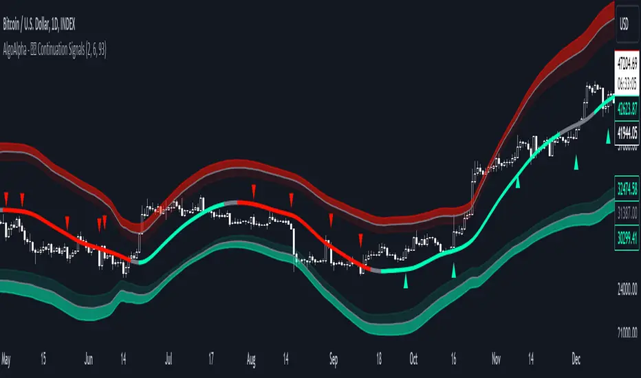
Trend Continuation Signals [AlgoAlpha]Introducing the Trend Continuation Signals by AlgoAlpha 🌟🚀
Elevate your trading game with this multipurpose indicator, designed to pinpoint trend continuation opportunities as well as highlight volatility and oversold/overbought conditions. Whether you're a trading novice or a seasoned market veteran, this tool offers intuitive visual cues to boost your decision-making and enhance your market analysis. Let's explore the key features, how to use it effectively, and delve into the operational mechanics that make this tool a game-changer in your trading arsenal:
Key Features:
🔥 Advanced Trend Detection : Leverages the Hull Moving Average (HMA) for superior trend tracking as compared to other MAs, offering unique insights into market momentum.
🌈 Volatility Bands : Implements adjustable bands around the trend line, which evolve with market conditions to highlight potential trading opportunities.
⚡ Trend Continuation Signals : Identifies bullish and bearish continuation signals, equipping you with actionable signals to exploit the prevailing market trend.
🎨 Intuitive Color Coding : Employs a vibrant color scheme to distinguish between uptrends, downtrends, and neutral phases, facilitating easy interpretation of the indicator's insights.
🛠 How to Use "Trend Continuation Signals ":
🔍 Setting Up : Incorporate the indicator onto your chart and customize the indicator to suite your preferences.
👀 Reading the Signals : Pay attention to the color-coded trend lines and volatility bands. Green indicates an uptrend, red signifies a downtrend, and gray denotes a neutral market condition.
📈 Identifying Entry Points : Look for bullish (▲) and bearish (▼) continuation icons below or above the price bars as signals for potential entry points for long or short positions, respectively.
🔄 Confirmation : Validate your trades with further analysis or other indicators. The Trend Continuation Signals are most effective when complemented by other technical analysis tools or fundamental insights.
📉 Risk Management : Implement stop-loss orders in line with your risk appetite and adjust them based on the volatility bands provided by the indicator to safeguard your investments.
How It Operates:
The essence of the indicator is captured through the hull moving averages for both the primary and secondary lines, set at periods of 93 and 50, respectively, to reflect market trends and pullbacks that trigger the continuation signals every time price recovers from a detected pullback.
Volatility is quantified through the standard deviation of the midline, magnified by a factor, establishing the upper and lower trend band boundaries.
Further volatility bands are plotted around the main volatility band, providing a granular view of market volatility and potential breakout or breakdown zones.
Market trend direction is determined by comparing the HMA line's current position to its previous value, enhanced by the secondary line to identify continuation patterns.
Embrace the power of the Trend Continuation Signals to enhance your trading strategy! It is important to note that all indicators are best used in confluence with other forms of analysis, happy trading! 📊💥
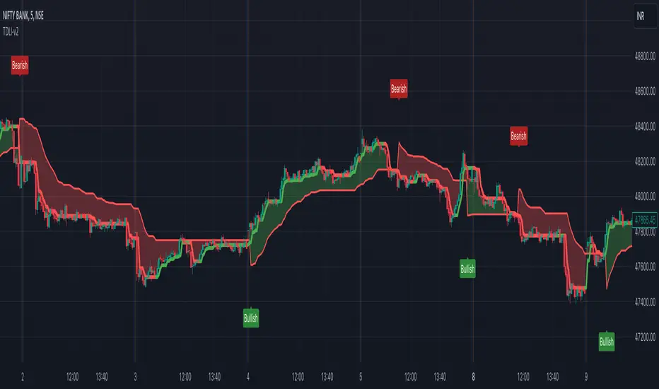
Trend Direction & Levels IdentifierOverview : Trend Direction & Levels Identifier (TDLI) provides you with two lines - Resistance/Support line (RSLine) and Trend Line. These two lines form a channel which is filled with a colour showing current market direction, which also prints Bullish or Bearish text. Trend Line calculation is similar but follows different approach than Super Trend indicator. RSLine calculation is done using EMA and dynamic ATR.
How does this work?
Firstly understand Supertrend - The Supertrend indicator is a freely available technical analysis tool that helps traders identify the direction of the trend . It is based on the concept of volatility, and it provides a simple way to identify whether the current market trend is bullish or bearish.
Here's a basic explanation of the Supertrend indicator's logic and how it is commonly used:
Supertrend Indicator Logic:
Calculation of Average True Range (ATR) : The first step involves calculating the Average True Range (ATR) over a specified period. ATR measures market volatility by considering the average range between the high and low prices over a given number of periods.
Multiplier Factor : A multiplier factor is then applied to the ATR. The multiplier is usually set by the trader or analyst and determines the sensitivity of the Supertrend to changes in volatility.
Calculation of Upper and Lower Bands:The Supertrend indicator calculates two bands - an upper band and a lower band.
Upper Band (UB) = High price - (Multiplier * ATR)
Lower Band (LB) = Low price + (Multiplier * ATR)
Determining Trend Direction : If the current market price is above the Upper Band, the Supertrend suggests a bearish trend (sell signal). If the current market price is below the Lower Band, the Supertrend suggests a bullish trend (buy signal).
Now, Let's understand how we use this logic with some modification to build our Trend line -
Let's break down the key differences:
1. Calculation of Trend Switch Points:
- Supertrend: The Supertrend indicator primarily relies on the Average True Range (ATR) to calculate the volatility of the market. It then determines trend direction based on whether the closing price is above or below the Supertrend line.
- Our Trend: We use a modified ATR for volatility measurement (ATR / x), our code introduces modifications in the calculation of trend switch points. It incorporates moving averages (SMA - Simple Moving Averages) to define high and low prices, adding a dynamic element to the identification of trend reversal points.
2. Trend States and Switch Logic:
- Supertrend: The Supertrend generally has two states: uptrend or downtrend. It switches its state when the closing price crosses the Supertrend line.
- Our Trend: Our code introduces an additional variable, which is not binary (0 or 1) but rather represents the state of the trend (0 for uptrend, 1 for downtrend). The indicator uses a more complex logic involving previous trend states and moving averages to determine trend switches.
So, our trend line incorporates additional elements such as moving averages, dynamic amplitude, and channel deviation to modify the Supertrend logic and provide a more nuanced and visually informative representation of market trends. These modifications offer traders more flexibility in adapting the indicator to different market conditions and trading preferences.
Remember the underlying logic is of Supertrend which is freely available to all.
Another line is RSLine, lets dive into its logic and calculation -
Average True Range (ATR) Calculation : Calculates the Average True Range, a measure of market volatility. The ATR can be dynamically adjusted based on user preference.
Chande Momentum Oscillator (CMO) and Variable (VAR) Calculation : Calculates the CMO, which measures momentum, and uses it to compute the VAR value. This introduces an adaptive element to the indicator.
Other Moving Averages : Calculates various moving averages, including Wilder's Moving Average (WWMA), Zero-Lag Exponential Moving Average (ZLEMA), and Time Series Forecast (TSF), providing different perspectives on trend direction.
Main Moving Average (MAvg) Calculation : Computes the main moving average based on EMA and length.
Stop Level Calculation : Determines stop levels for both long and short positions. The levels are influenced by the moving average (MAvg) and ATR, with an option to normalize them.
The Stop Levels forms the RSLine which acts as either resistance or support based on market direction.
Lets see how the indicator tells you probable market direction -
Direction Identification : Identifies the current trend direction (uptrend or downtrend) based on the relationship between the moving average and the previous stop level. It also prints Bullish or Bearish on chart based on crossovers and crossunders between the Trend Line and the RSLine.
Fill Coloring for Highlighting : It Fills the area between the Trend Line and RSLine with either green or red color to visually emphasize the trend direction. The colors change based on whether the Trend Line and MAvg is above or below the stop levels.
So there are 3 major things -
1. RSLine - Uses EMA and dynamic ATR to calculate stop levels. This acts as support or resistance to current trend. It is always red in colour.
2. Trend Line - Unlike Super Trend this Trend Line calculation uses a combination of highest high, lowest low, and EMA of a fixed range of candles to determine trend changes. It uses a fixed amplitude for calculating the highest high, lowest low, and EMA values, but it doesn't incorporate dynamic volatility adjustments like ATR. Its colour varies from red to green based on calculation.
3. Channel Colour - Channel colour is decided based on crossover of Trend Line and RSLine, if Trend Line crosses RSLine from bottom then channel colour becomes green, similarly red colour is calculated.
How to use this?
Refer this snapshot for content below -
1. Once a crossover happens between Trend Line and RSLine, bullish / bearish text is printed with change in colour of channel. RSLine acts as support/resistance.
2. Look for colour of Trend Line - when it matches channel colour, it means favourable direction is that colour (green - long, red - short)
3. Remember any ongoing trend can reverse any second, so follow price action for better results.
Preferred Timeframe : It works best in 5 minute timeframe, but can also be used in other time frames.
Reason to use these two lines ?
The Trend Line tells current trend direction using a line which keeps changing colours, for double confirmation we use the RSline and channel colour which is calculated using Trend line and RSLine crossover. When both Trend line and RSLine channel colour is same that gives a more solid confirmation (not 100%) of a trend
Why it is worth paying for :
As mentioned earlier this indicator is built over freely available Supertrend and EMA indicators. The modifications which we have done for better calculation and visualisation makes it worth.
The indicator may be considered valuable for traders who appreciate a visual representation of market trend direction and important stop levels. Normal indicators like supertrend just shows a line which gives you idea about the trend but our indicator apart from telling trend direction tells important levels and provide a channel filled with current trend direction significance which helps in following trend precisely.
1. The customization options and visual clarity could enhance decision-making for those who prefer a more tailored approach.
2. Traders willing to pay for this indicator may find it useful in complementing their existing analysis and strategy.
Although one should understand using premium indicator doesnt mean it will generate magic results, if you know price action and risk management properly then only consider trying our indicator else practice trading on free indicators first.
IMPORTANT : As Stock markets are dynamic in nature, no indicator is a magic indicator which will give you 100% accurate results on one click. You still have to use price action for best results.
DISCLAIMER : This indicator isn't a get rich quick scheme, neither it can provide 100% accurate results. It is meant to be used as an aid to Price Action Trading and proper risk management.
Harmonic Trend Fusion [kikfraben]📈 Harmonic Trend Fusion - Your Personal Trading Assistant
This versatile tool combines multiple indicators to provide a holistic view of market trends and potential signals.
🚀 Key Features:
Multi-Indicator Synergy: Benefit from the combined insights of Aroon, DMI, MACD, Parabolic SAR, RSI, Supertrend, and SMI Ergodic Oscillator, all in one powerful indicator.
Customizable Plot Options: Tailor your chart by choosing which signals to visualize. Whether you're interested in trendlines, histograms, or specific indicators, the choice is yours.
Color-Coded Trends: Quickly identify bullish and bearish trends with the color-coded visualizations. Stay ahead of market movements with clear and intuitive signals.
Table Display: Stay informed at a glance with the interactive table. It dynamically updates to reflect the current market sentiment, providing you with key information and trend direction.
Precision Control: Fine-tune your analysis with precision control over indicator parameters. Adjust lengths, colors, and other settings to align with your unique trading strategy.
🛠️ How to Use:
Customize Your View: Select which indicators to display and adjust plot options to suit your preferences.
Table Insights: Monitor the dynamic table for real-time updates on market sentiment and trend direction.
Indicator Parameters: Experiment with different lengths and settings to find the combination that aligns with your trading style.
Whether you're a seasoned trader or just starting, Harmonic Trend Fusion equips you with the tools you need to navigate the markets confidently. Take control of your trading journey and enhance your decision-making process with this comprehensive trading assistant.
TrendLine CrossThis indicator "TrendLine Cross", is designed to plot trend lines so you can spot potential trend reversal points on the charts. The main function is to draw several lines on the chart and identify the crossings between these lines, which can be significant indicators for trading. The lines are based on different periods which can be changed in the settings tabs.
Let's see the characteristics of the trend lines:
_Low Line Color(Green Line): This line connects the lowest point of low prices in the "low_time" period with the lowest point of low prices in the "high_time" period. Indicates a possible short-term support level on the chart.
_Liquidity Up Line Color (Golden Line): This line connects the lowest point of low prices in the "low_time" period with the highest point of low prices in the same period. It represents a liquidity zone and an important resistance in the chart.
_Lower Line Color (Blue Line): This horizontal line connects the lowest point of low prices in the "LowerLine_period" with the lowest point of low prices in the "high_time" period. Indicates a possible long-term support level.
_Upper Line Colorr: This line represents a connection between the highest points of the "high_time" period and the lowest point of the "LowerLine_period". Indicates a possible long-term resistance level.
_Up Line Color (Red Line): This line connects the highest point of high prices in the "high_time" period with the highest point of high prices in the "LowerLine_period". It represents a possible long-term resistance level.
_Liquidity Down Line Color(Golden Line): This line connects the highest point of high prices in the "high_time" period with the highest point of low prices in the "low_time" period. It represents a liquidity point and an important support zone.
The indicator becomes particularly interesting when the lines make crossings. These crossovers could suggest a potential trend change in the market. For example:
Change from Bearish to Bullish: If the "long-term" line (black) crosses the "short- or long-term" line (green or blue) from top to bottom, it could indicate a shift from a bearish to a bullish market , suggesting the opportunity for long positions.
_Changing from Bullish to Bearish: If the "long-term" line (blue) crosses the "short-term" line (red or black) from bottom to top, it could indicate a shift from a bullish to a bearish market, suggesting the opportunity for short positions.
Generally speaking, crossings between these lines can be key points of interest for traders, as they can signal significant changes in price direction.

Multi Timeframe Trend StrengthThis code is an advancement of my previous percentile-based trend strength. It follows the same concept, except this code display the trend and trend strength in multiple timeframe (1 min, 5 min, 15 min, 1hr and 4hr).
This gives an indication of the trend is evolving and allows to see how short-term trend matches with the long-term trend.
How it works:
The script assesses trend strength through percentile values derived from high and low prices across various time periods. It categorizes the current trend as either Bullish, Bearish, or N/A (No Trend) with the following steps:
Percentile Calculations: The code calculates the 75th percentile of high prices (e.g., percentile_13H) and the 25th percentile of low prices (e.g., percentile_13L) for specified Fibonacci-based periods (13, 21, 34, 55, 89, and 144). These percentiles serve as thresholds for identifying strong trends.
Calculate Highest High and Lowest Low: It computes the highest high (75th percentile high price of the longest period) and lowest low (25th percentile low price of the longest period), referred to as highest_high and lowest_low. These values establish critical price levels.
Trend Strength Conditions: For each percentile and period, the code checks if the percentile exceeds the highest high (trendBull) or falls below the lowest low (trendBear). These conditions gauge the strength of bullish and bearish trends.
Count Bull and Count Bear: Variables countBull and countBear tally the number of bullish and bearish conditions met, helping assess trend strength.
Weak Bull and Weak Bear Count: The code calculates weak bullish and bearish conditions, occurring when percentiles fall within the range defined by highest_high and lowest_low but don't meet strong trend criteria.
Bull Strength and Bear Strength: bullStrength and bearStrength are calculated based on counts of bullish, bearish, weak bullish, and weak bearish conditions, representing overall trend strength.
Strong Bull and Bear Conditions: These conditions arise when the 75th percentile of high prices (bull conditions) or the 25th percentile of low prices (bear conditions) surpass or dip below the highest high or lowest low, respectively, for the specified period. Strong conditions indicate robust trends with significant price movements.
Weak Bull and Bear Conditions: Weak conditions occur when percentiles fall within the range between highest_high and lowest_low, suggesting some bullish or bearish tendencies without reaching extreme levels. These imply less decisive trends.
Current Trend Identification: The current trend is determined by comparing bullStrength and bearStrength. A greater bullStrength indicates a Bull trend, greater bearStrength implies a Bear trend, and equal values denote No Trend (N/A).

LNL Trend SystemLNL Trend System is an ATR based day trading system specifically designed for intra-day traders and scalpers. The System works on any chart time frame & can be applied to any market. The study consist of two components - the Trend Line and the Stop Line. Trend System is based on a special ATR calculation that is achieved by combining the previous values of the 13 EMA in relation to the ATR which creates a line of deviations that visually look similar to the basic moving average but actually produce very different results ESPECIALLY in sideways market.
Trend Line:
Trend Line is a simple line which is basically a fast gauge represented by the 13 EMA that can change the color based on the current trend structure defined by multiple averages (8,13,21,34 EMAs). Trend Line is there to simply add the confluence for the current trend. Colors of the line are pretty much self-explanatory. Whenever the line turns red it states that the current structure is bearish. Vice versa for green line. Gray line represents neutral market structure.
Stop Line:
Stop Line is an ATR deviaton line with special calculation based on the previous bar ATRs and position of the price in relation to the current and previous values of 13 EMA. As already stated, this creates an ATR deviation marker either above or below the price that trails the price up or down until they touch. Whenever the price comes into the Stop Line it means it is making an ATR expansion move up or down .This touch will usually resolve into a reaction (a bounce) which provides trade opportunities.
Trend Bars:
When turned ON, Trend Bars can provide additional confulence of the current trend alongside with the Trend Line color. Trend Bars are based on the DMI and ADX indicators. Whenever the DMI is bearish and ADX is above 20 the candles paint themselfs red. And vice versa applies for the green candles and bullish DMI. Whenever the ADX falls below the 20, candles are netural (Gray) which means there is no real trend in place at the moment.
Trend Mode:
There are total of 5 different trend modes available. Each mode is visualizing different ATR settings which provides either aggressive or more conservative approach. The more tigher the mode, the more closer the distance between the price and the Stop Line. First two modes were designed for slower markets, whereas the "Loose" and "FOMC" modes are more suitable for products with high volatility.
Trend Modes:
1. Tight
Ideal for the slowest markets. Slowest market can be any market with unusually small average true range values or just simply a market that does have a personality of a "sleeper". Tight Mode can be also used for aggresive entries in the most ridiculous trends. Sometimes price will barely pullback to the Trend Line not even the Stop Line.
2. Normal
Normal Mode is the golden mean between the modes. "Normal" provides the ideal ATR lengths for the most used markets such as S&P Futures (ES) or SPY, AAPL and plenty of other highly popular stocks. More often than not, the length of this mode is respected considering there is no breaking news or high impact market event scheduled.
3. Loose
The "Loose" mode is basically a normal mode but a little bit more loose. This mode is useful whenever the ATRs jump higher than usual or during the days of highly anticipated news events. This mode is also better suited for more active markets such as NQ futures.
4. FOMC
The FOMC mode is called FOMC for a reason. This mode provides the maximum amount of wiggle room between the price and the Stop Line. This mode was designed for the extreme volatility, breaking news events or post-FOMC trading. If the market quiets down, this mode will not get the Stop Line touch as frequently as othete modes, thus it is not very useful to run this on markets with the average volatlity. Although never properly tested, perhaps the FOMC mode can find its value in the crypto market?
5. The Net
The net mode is basically a combination of all modes into one stop line system which creates "the net" effect. The Net provides the widest Stop Line zone which can be mainly appreciated by traders that like to use scale-in scale-out methods for their trading. Not to mention the visual side of the indicator which looks pretty great with the net mode on.
HTF (Higher Time Frame) Trend System:
The system also includes additional higher time frame (HTF) trend system. This can be set to any time frame by manual HTF mode. HTF mode set to "auto" will automatically choose the best suitable higher time frame trend system based on how appropriate the aggregation is. For everything below 5min the HTF Trend System will stay on 5min. Anything between 5-15min = 30min. 30min - 120min will turn on the 240min. 180min and higher will result in Daily time frame. Anything above the Daily will result in Weekly HTF aggregation, above W = Monthly, above M = Quarterly.
Background Clouds:
In terms of visualization, each trend system is fully customizable through the inputs settings. There is also an option to turn on/off the background clouds behind the stop lines. These clouds can make the charts more clean & visible.
Tips & Tricks:
1. Different Trend Modes
Try out different modes in different markets. There is no one single mode that will fit to everyone on the same type of market. I myself actually prefer more Loose than the Normal.
2. Stop Line Mirroring
Whenever the Stop Lines start to mirror each other (there is one above the price and one below) this means the price is entering a ranging sideways market. It does not matter which Stop Line will the price touch first. They can both be faded until one of them flips.
3. Signs of the Ranging Market
Watch out for signs of ranging market. Whenever the Trend System looses its colors whether on trend line or trend bars, if everything turns neutral (gray) that is usually a solid indication of a range type action for the following moments. Also as already stated before, the Stop Line mirroring is a good sign of the range market.
4. Trailing Tool, Trend System as an Additional Study?
In case you are not a fan of the colorful green / red charts & candles. You can switch all of them off and just leave the Stop Line on. This way you can use the benefits of the trend system and still use other studies on top of that. Similarly as the Parabolic SAR is often used.
5. The Flip Setup
One of my favorite trades is the Flip Setup on the 5min charts. Whenever the Stop Line is broken , the very first opposing touch after the Trend System flips is a usually a highly participated touch. If there is a strong reaction, this means this is likely a beginning of a new trend. Once I am in the position i like to trail the Stop Line on the 1min charts.
Hope it helps.

[tradinghook] - Renko Trend Reversal Strategy - Renko Trend Reversal Strategy
Short Title: - Renko TRS
Description:
The Renko Trend Reversal Strategy ( - Renko TRS) is a powerful and original trading approach designed to identify trend reversals in financial markets using Renko charts. Renko charts differ from traditional time-based charts, as they focus solely on price movements and ignore time, resulting in a clearer representation of market trends. This strategy leverages Renko charts in conjunction with the Average True Range (ATR) to capture trend reversals with high precision and effectiveness.
Key Concepts:
Renko Charts: Renko charts are unique chart types that only plot price movements beyond a predefined brick size, ignoring time and noise. By doing so, they provide a more straightforward depiction of market trends, eliminating insignificant price fluctuations and making it easier to spot trend reversals.
Average True Range (ATR): The strategy utilizes the ATR indicator, which measures market volatility and provides valuable insights into potential price movements. By setting the brick size of the Renko chart based on the ATR, the strategy adapts to changing market conditions, ensuring optimal performance across various instruments and timeframes.
How it Works:
The Renko Trend Reversal Strategy is designed to identify trend reversal points and generate buy or sell signals based on the following principles:
Renko Brick Generation: The strategy calculates the ATR over a user-defined period (ATR Length) and utilizes this value to determine the size of Renko bricks. Larger ATR values result in bigger bricks, capturing higher market volatility, while smaller ATR values create smaller bricks for calmer market conditions.
Buy and Sell Signals: The strategy generates buy signals when the Renko chart's open price crosses below the close price, indicating a potential bullish trend reversal. Conversely, sell signals are generated when the open price crosses above the close price, suggesting a bearish trend reversal. These signals help traders identify potential entry points to capitalize on market movements.
Stop Loss and Take Profit Management: To manage risk and protect profits, the strategy incorporates dynamic stop-loss and take-profit levels. The stop-loss level is calculated as a percentage of the Renko open price, ensuring a fixed risk amount for each trade. Similarly, the take-profit level is set as a percentage of the Renko open price to secure potential gains.
How to Use:
Inputs: Before using the strategy, traders can customize several parameters to suit their trading preferences. These inputs include the ATR Length, Stop Loss Percentage, Take Profit Percentage, Start Date, and End Date. Adjusting these settings allows users to optimize the strategy for different market conditions and risk tolerances.
Chart Setup: Apply the - Renko TRS script to your desired financial instrument and timeframe on TradingView. The Renko chart will dynamically adjust its brick size based on the ATR Length parameter.
Buy and Sell Signals: The strategy will generate green "Buy" labels below bullish reversal points and red "Sell" labels above bearish reversal points on the Renko chart. These labels indicate potential entry points for long and short trades, respectively.
Risk Management: The strategy automatically calculates stop-loss and take-profit levels based on the user-defined percentages. Traders can ensure proper risk management by using these levels to protect their capital and secure profits.
Backtesting and Optimization: Before implementing the strategy live, traders are encouraged to backtest it on historical data to assess its performance across various market conditions. Adjust the input parameters through optimization to find the most suitable settings for specific instruments and timeframes.
Conclusion:
The - Renko Trend Reversal Strategy is a unique and versatile tool for traders looking to identify trend reversals with greater accuracy. By combining Renko charts and the Average True Range (ATR) indicator, this strategy adapts to market dynamics and provides clear entry and exit signals. Traders can harness the power of Renko charts while effectively managing risk through stop-loss and take-profit levels. Before using the strategy in live trading, backtesting and optimization will help traders fine-tune the parameters for optimal performance. Start exploring trend reversals with the - Renko TRS and take your trading to the next level.
(Note: This description is for illustrative purposes only and does not constitute financial advice. Traders are advised to thoroughly test the strategy and exercise sound risk management practices when trading in real markets.)

DCA-Integrated Trend Continuation StrategyIntroducing the DCA-Integrated Trend Continuation Strategy 💼💰
The DCA-Integrated Trend Continuation Strategy represents a robust trading methodology that harnesses the potential of trend continuation opportunities while seamlessly incorporating the principles of Dollar Cost Averaging (DCA) as a risk management and backup mechanism. This strategy harmoniously blends these two concepts to potentially amplify profitability and optimize risk control across diverse market conditions.
This strategy is well-suited for both trending and ranging markets. During trending markets, it aims to capture and ride the momentum of the trend while optimizing entry points. In ranging markets or pullbacks, the DCA feature comes into play, allowing users to accumulate more assets at potentially lower prices and potentially increase profits when the market resumes its upward trend. This cohesive approach not only enhances the overall effectiveness of the strategy but also fosters a more resilient and adaptable trading approach in ever-changing market dynamics.
💎 How it Works:
▶️ The strategy incorporates a customizable entry signal based on candlestick patterns, enabling the identification of potential trend continuation opportunities. By focusing on consecutive bullish candles, it detects the presence of bullish momentum, indicating an optimal time to enter a long position.
To refine the precision of the signals, traders can set a specific percentage threshold for the closing price of the candle, ensuring it is above a certain percentage of its body. This condition verifies strong bullish momentum and confirms significant upward movement within the candle, thereby increasing the reliability of the signal.
In addition, the strategy offers further confirmation by examining the relationship between the closing price of the signal candle and its previous candles. If the closing price of the signal candle is higher than its preceding candles, it provides an additional layer of assurance before entering a position. This approach is particularly effective in detecting sharp movements and capturing significant price shifts, as it focuses on identifying instances where the closing price shows clear strength and outperforms the previous candle's price action. By prioritizing such occurrences, the strategy aims to capture robust trends and capitalize on notable market movements.
▶️ During market downturns, the strategy incorporates intelligent management of price drops, offering flexibility through fixed or customizable price drop percentages. This unique feature allows for additional entries at specified drop percentages, enabling traders to accumulate positions at more favorable prices.
By strategically adjusting the custom price drop percentages, you can optimize your entry points to potentially maximize profitability. Utilizing lower percentages for initial entries takes advantage of price fluctuations, potentially yielding higher returns. On the other hand, employing higher percentages for final entries adopts a more cautious approach during significant market downturns, emphasizing enhanced risk management. This adaptive approach ensures that the strategy effectively navigates challenging market conditions while seeking to optimize overall performance.
▶️ To enhance performance and mitigate risks, the strategy integrates average purchase price management. This feature dynamically adjusts the average buy price percentage decrease after each price drop, expediting the achievement of the target point even in challenging market conditions. By reducing recovery times and ensuring investment safety, this strategy optimizes outcomes for traders.
▶️ Risk management is at the core of this strategy, prioritizing the protection of capital. It incorporates an account balance validation mechanism that conducts automatic checks prior to each entry, ensuring alignment with available funds. This essential feature provides real-time insights into the affordability of price drops and the number of entries, enabling traders to make informed decisions and maintain optimal risk control.
▶️ Furthermore, the strategy offers take profit options, allowing traders to secure gains by setting fixed percentage profits from the average buy price or using a trailing target. Stop loss protection is also available, enabling traders to set a fixed percentage from the average purchase price to limit potential losses and preserve capital.
▶️ This strategy is fully compatible with third-party trading bots, allowing for easy connectivity to popular trading platforms. By leveraging the TradingView webhook functionality, you can effortlessly link the strategy to your preferred bot and receive accurate signals for position entry and exit. The strategy provides all the necessary alert message fields, ensuring a smooth and user-friendly trading experience. With this integration, you can automate the execution of trades, saving time and effort while enjoying the benefits of this powerful strategy.
🚀 How to Use:
To effectively utilize the DCA-Integrated Trend Continuation Strategy, follow these steps:
1. Choose your preferred DCA Mode - whether by quantity or by value - to determine how you want to size your positions.
2. Customize the entry conditions of the strategy to align with your trading preferences. Specify the number of consecutive bullish candles, set a desired percentage threshold for the close of the signal candle relative to its body, and determine the number of previous candles to compare with.
3. Adjust the pyramiding parameter to suit your risk tolerance and desired returns. Whether you prefer a more conservative approach with fewer pyramids or a more aggressive stance with multiple pyramids, this strategy offers flexibility.
4. Personalize the price drop percentages based on your risk appetite and trading strategy. Choose between fixed or custom percentages to optimize your entries in different market scenarios.
5. Configure the average purchase price management settings to control the percentage decrease in the average buy price after each price drop, ensuring it aligns with your risk tolerance and strategy.
6. Utilize the account balance validation feature to ensure the strategy's actions align with your available funds, enhancing risk management and preventing overexposure.
7. Set take profit options to secure your gains and implement stop loss protection to limit potential losses, providing an additional layer of risk management.
8. Use the date and time filtering feature to define the duration during which the strategy operates, allowing for specific backtesting periods or integration with a trading bot.
9. For automated trading, take advantage of the compatibility with third-party trading bots to seamlessly integrate the strategy with popular trading platforms.
By following these steps, traders can harness the power of the DCA-Integrated Trend Continuation Strategy to potentially maximize profitability and optimize their trading outcomes in both trending and ranging markets.
⚙️ User Settings:
To ensure the backtest result is representative of real-world trading conditions, particularly in the highly volatile Crypto market, the default strategy parameters have been carefully selected to produce realistic results with a conservative approach. However, you have the flexibility to customize these settings based on your risk tolerance and strategy preferences, whether you're focusing on short-term or long-term trading, allowing you to potentially achieve higher profits. The backtesting was conducted using the BTCUSDT pair in 15-minute timeframe on the Binance exchange. Users can configure the following options:
General Settings:
- Initial Capital (Default: $10,000)
- Currency (Default: USDT)
- Commission (Default: 0.1%)
- Slippage (Default: 5 ticks)
Order Size Management:
- DCA Mode (Default: Quantity)
- Order Size in Quantity (Default: 0.01)
- Order Size in Value (Default: $300)
Strategy's Entry Conditions:
- Number of Consecutive Bullish Candles (Default: 3)
- Close Over Candle Body % (Default: 50% - Disabled)
- Close Over Previous Candles Lookback (Default: 14 - Disabled)
- Pyramiding Number (Default: 30)
Price Drop Management:
- Enable Price Drop Calculations (Default: Enabled)
- Enable Current Balance Check (Default: Enabled)
- Price Drop Percentage Type (Default: Custom)
- Average Price Move Down Percentage % (Default: 50%)
- Fixed Price Drop Percentage % (Default: 0.5%)
- Custom Price Drop Percentage % (Defaults: 0.5, 0.5, 0.5, 1, 3, 5, 5, 10, 10, 10)
TP/SL:
- Take Profit % (Default: 3%)
- Stop Loss % (Default: 100%)
- Enable Trailing Target (Default: Enabled)
- Trailing Offset % (Default: 0.1%)
Backtest Table (Default: Enabled)
Date & Time:
- Date Range Filtering (Default: Disabled)
- Start Time
- End Time
Alert Message:
- Alert Message for Enter Long
- Alert Message for Exit Long
By providing these customizable settings, the strategy allows you to tailor it to your specific needs, enhancing the adaptability and effectiveness of your trading approach.
🔐 Source Code Protection:
The source code of the DCA-Integrated Trend Continuation Strategy is designed to be robust, reliable, and highly efficient. Its original and innovative implementation merits protecting the source code and limiting access, ensuring the exclusivity of this strategy. By safeguarding the code, the integrity and uniqueness of the strategy are preserved, giving users a competitive edge in their trading activities.

Vola2vola volatility Trade & TrendHello everyone!
For those who remember Vola2vola volatility Trade & Trend script, we are excited to bring it back within the Myfractalrange Tradingview account!
If you already chose to have access to Vola2vola volatility indicator, this one is using the same formula but instead of having a separate indicator to display Volatility, Volatility has now been converted into price values, which makes it possible to visualise it on the ticker chart directly.
It is more volatile than Myfractalrange Trend but it will give you a complementary view on the asset current situation: Bullish/Bearish with an additional timeframe view named Trade.
As you know, Volatility is very important to assets and many people use it to trade. This tool automate the calculation of the volatility of every asset as well as provide an estimated value of its "Trend" and "Trade" projected onto price.
The idea in this script is to allow users to have an idea of the current volatility regime of the asset he is monitoring: Is its volatility Bullish or Bearish Trend, Bearish or Bullish Trade?
What are the data provided by the script:
- Trade : Trade is generated using an arbitrary and fixed look back period, it acts as a short-term Trend. It will give the user the possibility to know if the asset is still trending up or down short-term. Default colour is black
- Trend: Trend is also generated using an arbitrary and fixed look back period (20 times the one used for Trade), it acts as a longer-term view of the asset trendiness. It works the same way as Trade and will give the user the possibility to know if the volatility of the asset is trending a longer-term basis or not. Default colours are: red when the Trend of the asset is Bearish and green when the Trend of the asset is Bullish
Here are some of the questions you need to know the answer to before using this script:
- How do you define a "Bullish/Bearish Trade"? Volatility is Bullish Trade when Price is above Trade and it is Bearish Trade when Price is below Trade
- How do you define a "Bullish/Bearish Trend"? Volatility is Bullish Trend when Price is above Trend and it is Bearish Trend when Price is below Trend
- On which time frame should i use this script? You want to use the Daily time frame. Although, for short term moves in the volatility space, users could monitor the Hourly timeframe
Understanding the volatility of an asset, along with the bullish or bearish nature of its Trade and Trend, is crucial for investors. Assets that are Bullish Trend and Trade tend to appreciate in value, while those that are Bearish Trend and Trade tend to depreciate. Therefore, we recommend investors be aware of the volatility Trend and Trade situation of the asset they are holding in their portfolio.
Here are the different scenarios that you will encounter on a Daily timeframe and how to interpret them:
- Price is above Trade & Trend: It is the most Bullish set up for the price of an asset
- Price is below Trade & Trend: It is the most Bearish set up for the price of an asset
- Any other set up suggests uncertainty, caution is therefore recommended
These are some cases that you could experience while using this script:
1) Bullish set up on a daily timeframe:
In this example using AAPL, when it is Bullish Trend and Trade on a daily timeframe, the price of AAPL tends to appreciate
2) Bearish set up on a daily timeframe:
In this example using IWM, when it is Bearish Trend and Trade on a daily timeframe, the price of IWM tends to depreciate
The idea of opening this script is to give you another layer of confidence when using our other scripts, especially when using Myfractalrange Trend.
We hope that you will find these explanations useful, please contact us by private message for access.
Enjoy!
DISCLAIMER: No sharing, copying, reselling, modifying, or any other forms of use are authorised. This script is strictly for individual use and educational purposes only. This is not financial or investment advice. Investments are always made at your own risk and are based on your personal judgement. Myfractalrange is not responsible for any losses you may incur. Please invest wisely.
Super Momentum Trend IndicatorThis is a trend momentum indicator that uses some of Ichimoku Cloud's core trading concepts and Supertrend, so before using this indicator, you can first understand Ichimoku Cloud, which is very helpful for understanding this indicator.
There are mainly the following ways to identify trends in Ichimoku Cloud.
1. The price is above or below the Tenkan-sen and the Kijun-sen
2. The Tenkan-sen crosses the Kijun-sen
3. The price breaks or falls below Leading Span B
4. Leading Span A crosses Leading Span B
I converted the above signal into the following expression (see chart):
1. Green dot: the price is above the Tenkan-sen and Kijun-sen
2. Red dot: the price is below Tenkan-sen and the Kijun-sen
3. Orange or blue dot: the price is between Tenkan-sen and Kijun-sen
4. Triangular symbol: the Tenkan-sen crosses the Kijun-sen, and the price continues to stand firmly above or below Kijun-sen by 2 candles (prevent fake moves)
5.B1 signal: the price breaks or falls below Leading Span B
6. B2 signal: Leading Span A crosses Leading Span B (this expresses whether the color of the cloud is green or red in Ichimoku cloud)
The default for this indicator is Ichimoku Cloud turned off so that the charts are simpler, but you can turn it on if you want to check Ichimoku Cloud.
When you use this indicator, you can observe the changes of the dots:
1. The upward trend reverses to a downward trend (see chart)
What you will see is: green dots, orange dots, red dots, unless the price suddenly falls below the Tenkan-sen and the Kijun-sen, then you will see red dots directly without orange dots .
2. The downward trend reverses to an upward trend (see chart)
What you will see is: red dots, blue dots, green dots, unless the price suddenly breaks through the Tenkan-sen and Kijun-sen, then you will see the green dots directly without the blue dots.
The dot is usually the signal on the left-hand side, the triangle is between the left-hand side and the right-hand side, and B1/B2 is the signal on the right-hand side.
I recommend entry trades separately , and using Supertrend to judge the trend. This is why this indicator also adds two Supertrends.
Why not just use the Super Trend indicator?
Because SuperTrend only provides a pure uptrend or downtrend, it does not show the upcoming reversal.
And with the momentum dots added, when you see orange or blue dots, the trend may be about to reverse.
Therefore, this indicator can better capture the changing process of the trend.
What if the momentum dots are not trending as indicated by the SuperTrend indicator?
If the Super Trend shows a downward trend, but you frequently see green and blue dots, it means that the trend is likely to reverse upwards.
On the contrary, if the Super Trend shows an upward trend, but you frequently see red or orange dots, it means that it is likely to reverse downward.
Please remember that when you want to open a position, the trend direction of SuperTrend should be consistent with the direction of the dots momentum and signals. If they are inconsistent, you need more patience to judge the trend direction.
Which signal is most important?
When using these signals, you must remember that the dot belongs to the left-hand side signal, the triangle belongs to the half left-hand side and half right-hand side signal, and B1/B2 is the right-hand side signal. So I think the B1/B2 signal is the most important because of the meaning of B1 It means that the price has broken through the support or resistance of the cloud layer, and the meaning of B2 in Ichimoku Cloud is that the cloud (kumo) has reversed.
I backtested COINBASE:BTCUSDT for several signals of this indicator, and the B2 signal has a higher win rate.
Why two SuperTrends are used?
Because I found that there are many fake moves in the market, using two SuperTrends with different ATR multipliers can effectively identify fake moves.
Most Important Reminder:
The dot display, triangle signal, and B1/B2 signals have a sequential relationship with the timing of their appearance. During the process of trend change, you will definitely see the change of the dot first, then the triangle, and finally B1/B2, this is why I suggest that you should add positions separately.
If the signals on the chart are not displayed in sequence, it means that the trend has not reversed. Then adding positions separately at the beginning can just reduce your loss.
In addition, it is strongly recommended that you must understand the formula of Ichimoku Cloud, otherwise you may misuse this indicator.
How do I use this indicator?
1. I will build positions in batches when I see the triangle, B1, and B2 signals.
2. When you see Supertrend changing trend, or reverse triangle, you can consider ending position.
3. Triangle/B1/B2 and other signals should be in the same direction as Supertrend before entering the market.
4. When you see the green dot, you don’t need to rush to get into the market, you can wait for a triangle signal, because the triangle means that the conversion line (Tenkan-sen) crosses the base line (Kijun-sen), and the price stands firm on the base line (Kijun-sen) two candles above or below
5. If you are not sure why there is a triangle/B1/B2 signal in a certain place, you can open Ichimoku Cloud in settings to confirm for yourself.
========== 中文說明 (Chinese Explanation) ==========
這是一隻趨勢動量指標,使用了部分 Ichimoku Cloud 的核心交易理念與Supertrend,所以在使用這支指標之前,您可以先搞懂 Ichimoku Cloud,對於理解這隻指標很有幫助。
在 Ichimoku Cloud 中主要有以下幾種方式來確定趨勢。
1.價格在轉換線(Tenkan-sen)與 基準線(Kijun-sen)上方或下方
2.轉換線(Tenkan-sen)與 基準線(Kijun-sen)交叉
3.價格突破或跌破 Leading Span B
4. Leading Span A 與 Leading Span B 交叉
我將上述訊號轉換成以下表達方式(看圖):
1.綠點:價格在轉換線(Tenkan-sen)與 基準線(Kijun-sen)之上
2.紅點:價格在轉換線(Tenkan-sen)與 基準線(Kijun-sen)之下
3.橘點或藍點:價格在轉換線(Tenkan-sen)與 基準線(Kijun-sen)之間
4.三角形符號:轉換線(Tenkan-sen)與 基準線(Kijun-sen)交叉,並且價格持續站穩 Kijun-sen 兩根K線(防止假突破)
5.B1 訊號:價格突破或跌破 Leading Span B
6.B2 訊號:Leading Span A 與 Leading Span B 交叉(這表達為雲的顏色是綠色還是紅色)
這隻指標的預設 Ichimoku Cloud 是關閉的,這樣圖表會更簡單,但如果你想檢查 Ichimoku Cloud ,可以隨時打開。
在你使用這支指標時,可以觀察圓點的變化:
1、向上趨勢反轉成向下趨勢(看圖)
你會看到的點順序是:綠點、橘點、紅點,除非價格突然跌破轉換線(Tenkan-sen)與 基準線(Kijun-sen),這時會直接看到紅點而沒有橘點。
2、向下趨勢反轉成向上趨勢(看圖)
你會看到的點順序是:紅點、藍點、綠點,除非價格突然突破轉換線(Tenkan-sen)與 基準線(Kijun-sen),這時會直接看到綠點而沒有藍點。
圓點通常是左側訊號,三角形介於左側與右側之間,而B1/B2則是右側訊號,我建議將倉位根據訊號顯示的前後順序分批下單,並且搭配 Supertrend來判斷趨勢,這也是為什麼這隻指標還加上了兩條 Supertrend 的原因。
為什麼不單純使用 Super Trend 指標?
因為 SuperTrend 只提供了單純的向上趨勢或向下趨勢,而不會顯示即將到來的反轉。
而加上動量圓點之後,當你看見橘點或藍點時,代表趨勢可能即將反轉。
因此這隻指標更能捕捉到趨勢的變化過程。
如果動量圓點跟 SuperTrend 指標顯示的趨勢不一樣怎麼辦?
如果 Super Trend 顯示向下趨勢,而你卻頻繁看到綠點跟藍點,代表趨勢很可能會向上反轉。
相反的,如果 Super Trend 顯示向上趨勢,而你卻頻繁看到紅點或橘點,代表很可能要向下反轉。
請記得,當你要建立倉位時,SuperTrend 的趨勢方向應該跟原點動量的方向是一致的,如果這兩個方向不一致,你需要更多的耐心來判別趨勢方向。
哪個訊號最重要?
使用這些訊號時必須記得,圓點屬於左側訊號,三角形屬於半左側半右側訊號,而B1/B2則是右側訊號,真的要我說的話,我認為B1/B2訊號最重要,因為B1的意義代表價格突破了雲層支撐或阻力,而B2在 Ichimoku Cloud 裡面的意義是雲朵(kumo)發生了反轉。
我針對這隻指標的幾個訊號對COINBASE:BTCUSDT進行了回測,B2訊號有較高的勝率。
為什麼使用了兩條 SuperTrend ?
因為我發現在市場經常會產生假突破,使用兩條 SuperTrend 並設置不同的 ATR 乘數,可以有效識別假突破。
最重要的提醒:
圓點的顯示、三角形訊號、B1/B2 這幾種訊號,它們出現的時間點是有順序關係的,趨勢轉變的過程,你一定會先看見圓點的變化,然後是出現三角形,最後出現B1/B2,這也是為什麼我建議你應該分批下單,如果圖表上的訊號沒有按照順序先後顯示,表示趨勢並沒有反轉,那麼一開始的分批下單,剛好可以降低你的虧損。
另外強烈建議,務必搞懂 Ichimoku Cloud 的公式,否則你可能會誤用這個指標。
我是如何使用這隻指標?
1.我會在看見三角形、B1、B2訊號時,分批建倉。
2.當你看到Supertrend改變趨勢,或是反向三角形時,可以考慮賣出。
3.三角形/B1/B2等訊號應該跟Supertrend是同一個方向時才可以進場。
4.當你看見綠點時,可以不用著急做多,可以再等一個三角形的訊號,因為三角形表示轉換線(Tenkan-sen)與 基準線(Kijun-sen)交叉,並且價格站穩在基準線(Kijun-sen)之上或之下兩天
5.如果你不確定某個地方為什麼會有三角形/B1/B2訊號,可以打在設定中打開Ichimoku Cloud自行確認。

Trend Reversal System with SR levelsHello All,
This is the Trend Reversal System with Support/Resistance levels script. long time ago I published it as closed source but now I upgraded it and and published as open-source with a different name. I hope it would be useful for you all while trading/analyzing.
The script has some parts in it: Setup, Count, SR levels, Risk levels & Targets . Now lets check them:
Setup Part: it has two part, Buy or Sell Setup. one of them can be active only. Buy setup: if current close checks if current is lower/equal than the close of the 5. bar. if yes then the script increases number of buy setup. and if it reaches 9 then the script checks if current low is lower/equal than the lows of last 3. and 4. bars, or if the low of the last bar is lower/equal than the lows of last 3. and 4. bars. if yes then the script increases the buy setup by 1. if these conditions met then it puts the label 'S' , same for Sell setup. S labels on both setup are potential reversals.
Count Part: If buy or sell setup reaches the 9 then Count part starts from 1. lets see buy count: If current close is lower/equal than the low of the 3. bar and buy count is lower than 12 or low of the bar 13 is less than or equal to the close of bar 8 then buy count increase or it's completed. if it's completed then the script puts C label, and it's potential reversal. of course there are some conditions that can cancel the count buy/sell or recycle/restart.
By using Setup and Count levels the script can show Support/Resistance Levels, Risk levels & Targets. SR levels are potential reversal levels.
Lets see some example screenshots:
Support/Resistance levels:
Potential Reversal levels and how setup/counts are shown:
Count part can recycle and the script shows it as 'R' , ( you can see the conditions for Recycle in the script ):
Count can be cancelled and and it's shown as 'x'
If the scripts find 9 on Setup or 13 on Count then it checks if it's a good level to buy/sell and if it decides it's good level then it shows TRSSetup Buy/Sell or TRSCount Buy/Sell and also shows the target. in following example the script checks and decide it's a good level to take long position. it can be aggressive or conservative, Conservative is recommended.
Enjoy!